Mosaic plot
The mosaic plot, also known as a mosaic diagram, is a graphic method for the visualization of data sets with two or more qualitative variables (characteristics). It gives an overview of the data and enables connections between the various characteristics to be identified.
example
The data set used for this example has 2201 observations and 3 variables. The observations are all persons who were on the Titanic on April 15, 1912 . The variables are:
- The gender of the person (male / female)
- The class (1st, 2nd and 3rd class and crew)
- Did this person survive the downfall (yes / no)?
In a form analogous to the graphic, the following table results:
| gender | Survived | 1st Class | 2nd Class | 3rd grade | crew |
|---|---|---|---|---|---|
| Male | No | 118 | 154 | 422 | 670 |
| Yes | 62 | 25th | 88 | 192 | |
| Female | No | 4th | 13 | 106 | 3 |
| Yes | 141 | 93 | 90 | 20th |
However, this table is rather tedious to read and difficult to interpret.
Construction of the mosaic plot
| sequence | variable | axis |
|---|---|---|
| 1. | gender | Vertical |
| 2. | class | Horizontal |
| 3. | Survived | Vertical |
The categorical variables are first arranged in an order. Then each variable is assigned to an axis. The table on the right shows the sequence and assignment for the example. A different order or assignment will result in a different mosaic plot, i.e. H. As in all multivariate diagrams, the order of the variables plays a role.
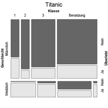
The first variable ( gender ) is plotted on the left edge . The entire data is first divided into two blocks: The lower strip contains all female persons, the upper, larger block all male. You can see immediately that much fewer (around a quarter) of the people on the ship were female.
The second variable ( class ) is plotted at the top . The four vertical columns therefore stand for the four characteristics of this variable (1st, 2nd, 3rd class and crew). These columns are not equally wide. The width of a column shows the relative frequency of this occurrence. You can see that the crew is the largest group among men, while those in 3rd class are the largest group among women. There were only a few crew members among the women.
The third variable ( survived ) is shown on the right-hand side and is also highlighted by the coloring: The dark gray rectangles represent the people who did not survive the accident. You can see immediately that the women in 1st grade had the best chance of survival. In general, women were more likely to survive the disaster than men, and first-class travelers were more likely than other travelers. Overall, about 1/3 of all people survived (light gray areas).
Independence in the mosaic plot
| class | Absolutely | Relative |
|---|---|---|
| 1. | 325 | 14.8% |
| 2. | 285 | 12.9% |
| 3. | 706 | 32.1% |
| crew | 885 | 40.2% |
| gender | Absolutely | Relative |
| Male | 1731 | 78.6% |
| Female | 470 | 21.4% |
| Survived | Absolutely | Relative |
| No | 1490 | 67.7% |
| Yes | 711 | 32.3% |
| gender | Survived | 1st Class | 2nd Class | 3rd grade | crew |
|---|---|---|---|---|---|
| Male | No | 173.0 | 151.7 | 375.9 | 471.2 |
| Yes | 82.6 | 72.4 | 179.4 | 224.8 | |
| Female | No | 47.0 | 41.2 | 102.1 | 127.9 |
| Yes | 22.4 | 19.7 | 48.7 | 61.0 |
Mosaic plots can provide information about the independence of the variables shown. One possible question would be: does the chance of survival depend on what gender you are, whether you are traveling in a certain class or a combination of both? In this case the three variables would not be independent.
If the three variables gender , class and survival are independent of one another, then the frequency in each cell in the table above is the product of the marginal relative frequencies multiplied by the number of observations. For the example this results in the upper left table entry
In the following graphic you can see the mosaic plot of the Titanic data ( titanic ) on the left and the mosaic plot on the right if the three variables were independent ( independent ). The right mosaic plot is therefore a visualization of the Frequencies table with complete independence . If the three variables were independent, then all rectangles in each column of the mosaic plot would have to have the same width, or all rectangles in each row of the mosaic plot would have to have the same height.
This is obviously not the case in the titanic mosaic plot and the three variables are interdependent. I.e. the chance of survival depends on gender, class, or a combination of both. The independence of two variables can also be checked graphically; It may be necessary to rearrange the variables for easier visualization.
Properties of the mosaic plot
- The variables to be displayed are scaled categorically or ordinally .
- At least two variables are shown. In principle, there is no upper limit to the number, but if there are too many variables the graphic will quickly become confusing.
- The number of observations is not limited, but it cannot be read in the graph either.
- The areas of the rectangular fields that stand for a combination of features are proportional to the number of observations that have this combination of features.
- Unlike z. B. With the box plot or QQ diagram , it is not possible to draw in a confidence interval with the mosaic plot . The significance of the different frequencies of the different characteristics cannot therefore be determined optically. However, there are statistical tests for this.
- In principle, the order of the variables can be chosen arbitrarily. However, it is important to note which sequence favors the interpretation. All options can possibly be tried out.
Clarification of the terms used
- The term variable is to be understood here in the sense of multivariate statistics, not in the sense of programming. A variable is therefore one of several characteristics that were recorded for each observation. The different variables of a (multivariate) data set can belong to different variable types.
- The variable type means the division into categorical, ordinal or metric (quantitative) characteristics (the latter can be further subdivided, but this is not necessary here).
- Categorical (nominal) variables are variables for which the various possible characteristics cannot be meaningfully represented by numbers. They also cannot be put in a meaningful order. Examples from the area of demographic variables are: gender, hair color, mother tongue.
- Ordinal data are data for which the various characteristics can be put in a meaningful order. Examples: the different booking classes for hotels or airline tickets, school grades.
literature
- John Hartigan, Beat Kleiner: Mosaics for contingency tables . In: Computer Science and Statistics: Proceedings of the 13th Symposium on the Interface . 1981, p. 268-273 .


