
Wikipedia:Graphics Lab/Illustration workshop: Difference between revisions
Lokal Profil (talk | contribs) →Scout Wikiproject logo (our own image, so free to tweak): how about now |
Lokal Profil (talk | contribs) →BBFC U Cert: reply |
||
| Line 432: | Line 432: | ||
'''Graphist opinion:''' |
'''Graphist opinion:''' |
||
:Not sure I see what you mean. /[[:User:Lokal Profil|Lokal]][[Special:Contributions/Lokal Profil|_]][[:User talk:Lokal Profil|Profil]] 20:01, 12 October 2008 (UTC) |
|||
== The Prisons Department == |
== The Prisons Department == |
||
Revision as of 20:01, 12 October 2008
This page is deprecated and will not be monitored. Please use one of the three workshop pages. This specific page is {{{1}}}
A simple equation

Articels: Equals sign
Request: SVGify this equation, so that it can be displayed as part of a {{double image stack}} alongside the original (hard to read by modern eyes) equation. 68.39.174.238 (talk) 22:30, 1 September 2008 (UTC)
Oppinion: How's this? Debate 木 09:31, 2 September 2008 (UTC)
- The second looks a little internally strange. EG. Is the "x" in a different fontface? 68.39.174.238 (talk) 00:27, 3 September 2008 (UTC)
- I freely admit that I'm no expert in mathematical symbology, but that's the way the x is displayed when written as an equation in Word, as well as how it's displayed in the mathematical mark-up you used above (ie : <math>14\sqrt{x}+|15|=|71|\,\!</math>), so I presume that the typeface of the x is mathematically significant. Nonetheless, the type-face can be easily changed if required. Debate 木 02:59, 3 September 2008 (UTC)

- For this it doesn't have to be perfect. I strongly suspect that a featured image could be found of some part of this, but will let others decide... 68.39.174.238 (talk) 23:41, 3 September 2008 (UTC)
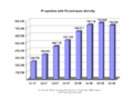
A few graphs on the housing buble
-
-
 original
 -
 SVG
SVG -
 original
 -
 SVG
SVG -
 original
 -
 SVG
SVG -

-
 original
 -
 SVG
SVG -


Articels: Subprime mortgage crisis and related articels.
Request: For all of them, SVGify if possible, since they are perfect for it (Boxes, colors and text). For the graphs, they should be recreated with (if possible) a standard look, but definitely free of unneeded dimensions (EG. Spurious 3D effects or shading). 68.39.174.238 (talk) 20:49, 7 September 2008 (UTC)
- Question: Who vectorized these and didn't tell me? 68.39.174.238 (talk) 22:34, 29 September 2008 (UTC)
- Answer:Checking who uploaded them would be a good start, although the line graph doesn't look that accurate?. §hep • ¡Talk to me! 23:00, 29 September 2008 (UTC)
- A question for some other people: Do you think having the exact #s at the head of the bars is an improvement or not? 68.39.174.238 (talk) 22:39, 30 September 2008 (UTC)
Opinion:
Sinuiju Special Administrative Region Flag and Emblem
Article(s): Sinuiju Special Administrative Region
Request: SVG please --SelfQ (talk) 11:24, 16 September 2008 (UTC)
Graphist opinion: I gave a shot at converting the flag to Svg. What do you think? §hep • ¡Talk to me! 23:43, 26 September 2008 (UTC)
Sarah Palin
-
 Sarah Palin
 -
Attempt 1: wider crop
-
Attempt 2: Even wider, my personal favorite (despite the waving hand on the right :)
-
Attempt 3: Slightly modified version of Ferrylodge's crop

Article(s): Sarah Palin Request: Hi, this image is at the top of the article. As you'll see at the image page, it was created by cropping a much larger image, zooming, and sharpening. I did all this myself, but my software is crummy. Can you do a better job? Thanks.Ferrylodge (talk) 01:00, 21 September 2008 (UTC) Graphist opinion: Would you object to a wider crop—closer to the lectern, maybe just above the sheet of paper she's holding, and all the way to her right shoulder? Fvasconcellos (t·c) 01:23, 21 September 2008 (UTC)
- The main thing is to have the eyes centered. Some people asked for that at the article talk page. As far as how wide the crop is, please use your best judgment. You folks are the experts, not me. :-) Maybe you could do one with the existing crop, and one with the wider crop?Ferrylodge (talk) 01:27, 21 September 2008 (UTC)
- Will give this a go tomorrow morning. Eyes will be centered :) Fvasconcellos (t·c) 02:00, 21 September 2008 (UTC)
- The main thing is to have the eyes centered. Some people asked for that at the article talk page. As far as how wide the crop is, please use your best judgment. You folks are the experts, not me. :-) Maybe you could do one with the existing crop, and one with the wider crop?Ferrylodge (talk) 01:27, 21 September 2008 (UTC)
(undent) Thanks, I'll look forward to seeing what you come up with. Do you think this image or this image might be better at the top of the article?Ferrylodge (talk) 07:18, 21 September 2008 (UTC)
- Quality-wise, the "tracksuit" image (which was in the article for quite a while) is still the best, despite the awkward composition. I think the one above is the best substitute right now. Fvasconcellos (t·c) 15:19, 21 September 2008 (UTC)
- OK, here we go. I've made three attempts; I recommend no. 2, but I'll leave it up to you to decide which is best :) Please let me know which one you'd like to keep and I'll move it to Commons under a more descriptive filename. Best, Fvasconcellos (t·c) 15:44, 21 September 2008 (UTC)
- Okay, I'll go with your choice, despite the hand (it kind of humanizes the whole thing, makes it look real and spontaneous, and will make for an interesting topic of conversation). #2 it is!. BTW, did you do any sharpening?Ferrylodge (talk) 20:27, 21 September 2008 (UTC)
- On second thought, I think the head's too tiny on #2, so I went with #1 (after a little bit of sharpening). Thanks.Ferrylodge (talk) 21:09, 21 September 2008 (UTC)
- No, I didn't do any sharpening as I didn't think it would be much of an improvement. Would you like any of the above versions kept or should I delete them? Fvasconcellos (t·c) 22:01, 21 September 2008 (UTC)
- On second thought, I think the head's too tiny on #2, so I went with #1 (after a little bit of sharpening). Thanks.Ferrylodge (talk) 21:09, 21 September 2008 (UTC)
- Okay, I'll go with your choice, despite the hand (it kind of humanizes the whole thing, makes it look real and spontaneous, and will make for an interesting topic of conversation). #2 it is!. BTW, did you do any sharpening?Ferrylodge (talk) 20:27, 21 September 2008 (UTC)
- OK, here we go. I've made three attempts; I recommend no. 2, but I'll leave it up to you to decide which is best :) Please let me know which one you'd like to keep and I'll move it to Commons under a more descriptive filename. Best, Fvasconcellos (t·c) 15:44, 21 September 2008 (UTC)
- Thanks for your help and suggestions. I did a crop that is sort of a compromise between #1 and #2, and uploaded it, so I think we're all set now. The extras can be deleted, I think, unless you think the image now at Sara Palin can be substantially improved. Cheers.Ferrylodge (talk) 22:06, 21 September 2008 (UTC)
- The new version is a good compromise. There are plenty of images of Palin on Commons, and I don't think these work-in-progress versions are necessary; that's why I uploaded them locally in the first place. Fvasconcellos (t·c) 22:13, 21 September 2008 (UTC)
- Thanks for your help and suggestions. I did a crop that is sort of a compromise between #1 and #2, and uploaded it, so I think we're all set now. The extras can be deleted, I think, unless you think the image now at Sara Palin can be substantially improved. Cheers.Ferrylodge (talk) 22:06, 21 September 2008 (UTC)
(undent)Fvasconcellos, an editor has created another image that he thinks is better, though I disagree. What do you think? I've inserted the two images side by side (the one on the right is the current image in the article, as I write this).Ferrylodge (talk) 03:49, 23 September 2008 (UTC)
- Yes, that was me. I sharpened and tweaked the levels and highlights so that it is not so washed out. ≈ jossi ≈ (talk) 04:36, 23 September 2008 (UTC)
- More accurate skin tone
- More accurate hair color and detail
- Face features looks sharper
- Noise on blouse is less obvious
- Sharper overall, such as mics, glasses details, etc.
- We could tweak it further by keeping the original background, but using the sharper foreground portion
- ≈ jossi ≈ (talk) 04:39, 23 September 2008 (UTC)
- The subject's shirt is so black in Jossi's image that you can't see the folds and wrinkles. The colors in the background are so bright they look like neon. I'm not convinced that the image on the right can be improved, but surely a compromise would be better than the image on the left.Ferrylodge (talk) 05:06, 23 September 2008 (UTC)
- In all fairness, I do think it is a bit excessive, but the white balance has improved, and I can see still see the detail of her shirt just fine. Are you sure it's not your monitor?
- I actually did do some color correction myself but decided against uploading the version because (as with the sharpening) I didn't think it was a real improvement. I said it above, and I'll say it again: this image is certainly not the best in terms of quality. Let's just try not to make this an issue, shall we? The article has seen more than enough of those as it is... Fvasconcellos (t·c) 12:57, 23 September 2008 (UTC)
- I agree that the color saturation is excessive. It is also dark and has lost detail. I have worked on this image in Photoshop and have other versions with more subtle corrections that look better. IP75 75.25.28.167 (talk) 18:08, 23 September 2008 (UTC)
- I'm just noting that I can see the folds fine, the blouse doesn't look that dark really. Make sure you have your monitor calibrated to this and this. §hep • ¡Talk to me! 23:03, 26 September 2008 (UTC)
- I agree that the color saturation is excessive. It is also dark and has lost detail. I have worked on this image in Photoshop and have other versions with more subtle corrections that look better. IP75 75.25.28.167 (talk) 18:08, 23 September 2008 (UTC)
- The subject's shirt is so black in Jossi's image that you can't see the folds and wrinkles. The colors in the background are so bright they look like neon. I'm not convinced that the image on the right can be improved, but surely a compromise would be better than the image on the left.Ferrylodge (talk) 05:06, 23 September 2008 (UTC)
Sarah Palin again
-
 This photo of Sarah Palin is, in itself, notable, as it is a unique piece of photographic evidence relevant to a high-profile part of her biography.
(Retouched)

Article(s): Sarah Palin (note: top Wikipidea article for the last two months, I think), Gravina Island Bridge
Request: . As you can see, the image quality is poor due to backlight. If anybody could fix this up - fixing the contrast and color balance and, if possible, removing the purple fringing around her head - that would be really appreciated. Thanks. Homunq (talk) 18:54, 22 September 2008 (UTC)
Graphist opinion: Hi Homunq, how is it now? you can compare them here (old) (new), i am still working on it, you can find orginal version HERE. ■ MMXXtalk 19:52, 22 September 2008 (UTC)
- (better here than my talk page) That is much better on the flesh tones. However, the whites (both on the T-shirt and in the background) are still too blue. Thanks for your work. Homunq (talk) 20:02, 22 September 2008 (UTC)
- I think the text on T-shirt is originally blue, compare with the t-shirt label. ■ MMXXtalk 20:13, 22 September 2008 (UTC)
- Good point. However, the paper on her desk and the stuff outside still have a blue cast which I think is an artifact. Anyway, thanks. Homunq (talk) 20:15, 22 September 2008 (UTC)
- Why does it look better when I follow your "new" link than on the image page itself? Baffled, Homunq (talk) 20:18, 22 September 2008 (UTC)
- I think the text on T-shirt is originally blue, compare with the t-shirt label. ■ MMXXtalk 20:13, 22 September 2008 (UTC)
- Could you do the same edit with the uncropped version please?

.jpg)
It can be found here: http://commons.wikimedia.org/wiki/Image:Palin_Nowhere_99901.jpg. Also, we could use a cropped version of Ivy Frye, the troopergate related woman on the left part of the image.Duuude007 (talk) 20:29, 22 September 2008 (UTC)
- What do you think? is it better now? new old LiveChocolate (talk) 22:04, 22 September 2008 (UTC)
- Very nice, yes thanks ^^ Could we also get a cropped version availble of the left person (Ivy Frye) in this enlarged image? cheers :) Duuude007 (talk) 22:42, 22 September 2008 (UTC)
- here it is, I copied the descriptions and license from Image:Palin Nowhere 99901.jpg please update them. LiveChocolate (talk) 11:47, 23 September 2008 (UTC)
- Very nice, yes thanks ^^ Could we also get a cropped version availble of the left person (Ivy Frye) in this enlarged image? cheers :) Duuude007 (talk) 22:42, 22 September 2008 (UTC)
-
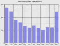 Bar graph

Article(s): Banaba Island
Request: Hello! I want to know if it is possible to extract or to make some graphs and maps from this PDF file. I mean if it is OK to do that, because of the author rights. I need that location map (p. 7), the Mean monthly rainfall graph (Figure 1.2, p. 8), the Mean annual rainfall over Western Kiribati map (Figure 1.3, p. 8), Figure 1.4 and Figure 1.5. If it is possible, it would be great. Thanks in advance, Sebi (talk) 15:53, 26 September 2008 (UTC)
Graphist opinion:
- There is currently nothing suggsting that the images from SOPAC are free from copyright. Sorry. /Lokal_Profil 16:14, 3 October 2008 (UTC)
- OK, I understand that, but the location map can be generated from existing Oceania/Kiribati maps. Thanks, Sebi (talk) 14:15, 6 October 2008 (UTC)
- Has the island geography been updated since 1936? §hep • ¡Talk to me! 14:33, 6 October 2008 (UTC)
- And with the bar graph. Since there wasn't any real data there I made my own. How's that look? §hep • ¡Talk to me! 14:58, 6 October 2008 (UTC)
- Has the island geography been updated since 1936? §hep • ¡Talk to me! 14:33, 6 October 2008 (UTC)
- OK, I understand that, but the location map can be generated from existing Oceania/Kiribati maps. Thanks, Sebi (talk) 14:15, 6 October 2008 (UTC)
Better color? Also, the map in the PDF is pretty much unusable due to quality. Has the island changed since this map? If not, it would be very easy to make a color version. §hep • ¡Talk to me! 21:03, 7 October 2008 (UTC)
- Yes, now it is much better. No, the map has not changed, but I need the location map. Sebi (talk) 12:00, 8 October 2008 (UTC)
- Sorry, I misread your request! I have a location map that is PD. I should be able to upload it later tonight to see if it fits your needs. §hep • ¡Talk to me! 19:09, 8 October 2008 (UTC)
- OK, thank you very much. — Sebi talk 13:48, 9 October 2008 (UTC)
- The map I had won't work. If it's close enough to even identify Banaba, you can't see any of the other islands. Once you cn see the other islands Banaba isn't visible. Sorry. Anyone else have a good map? §hep • ¡Talk to me! 21:46, 11 October 2008 (UTC)
- OK, thank you very much. — Sebi talk 13:48, 9 October 2008 (UTC)
- Sorry, I misread your request! I have a location map that is PD. I should be able to upload it later tonight to see if it fits your needs. §hep • ¡Talk to me! 19:09, 8 October 2008 (UTC)
Map of Queluz National Palace
-
 Description of image

Article(s): Queluz National Palace
Request: New map because, it's a old this !! Cancelos (talk) 12:32, 27 September 2008 (UTC)
Graphist opinion:
- Comment To whoever does this one, it's currently used in an imagemap. The source is in the article, of course that can be redone fairly easily so maybe no worries. §hep • ¡Talk to me! 18:18, 28 September 2008 (UTC)
Map of Ratanakiri
-
 I made this crappy thing a while ago
 -
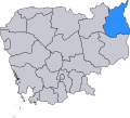 The already existing useful scalable map
 -
 A topographical map made by User:Demoeconomist from Ratanakiri.svg


Article(s): Ratanakiri Province
Request: I'd like to have a vector map of Ratanakiri showing the province's physical geography (not administrative divisions, like we have now). The best map I've found is this. There's also this one. If someone could make something based on the first one, that would be great. Please, no administrative divisions. Also, the tourist sites are not needed. What I'd like is a map that shows the rivers, maybe the roads, and the towns. Thanks a million!! Calliopejen1 (talk) 18:58, 27 September 2008 (UTC)
Graphist opinion: You find a scalable map showing the district Ratanakiri already at commons(the second one above): commons:Image:Ratanakiri.svg
I made the third one above based on it: commons:Image:Ratanakiri_topography.svg--Demoeconomist (talk) 14:45, 12 October 2008 (UTC)
Paul Newman
-

-
Edit 1

Article(s): Paul Newman
Request: trim out unnecessary sky and sharpen image if possible... Chris (クリス • フィッチ) (talk) 12:25, 29 September 2008 (UTC)
Graphist opinion: I was going for face detail so it might be a little sharp heavy. Should it be a tad softer? §hep • ¡Talk to me! 03:16, 30 September 2008 (UTC)
- I also removed the blue hue, I thought it looked out of place. §hep • ¡Talk to me! 16:25, 30 September 2008 (UTC)
- That is so much better! Please upload it over the original! Chris (クリス • フィッチ) (talk) 00:26, 1 October 2008 (UTC)
I just saw this one, I took the liberty of cleaning up all the dust, scratches and other damage as well and uploaded it over the last edit. Please revert it if you don't prefer it. Mfield (talk) 01:06, 1 October 2008 (UTC)
- Thanks! Please upload it over the original! Chris (クリス • フィッチ) (talk) 01:02, 2 October 2008 (UTC)
 Done §hep • ¡Talk to me! 04:11, 12 October 2008 (UTC)
Serbian Empire

Article(s): Serbian Empire
Request: SVG ification. Example w:sr:Грб Душановог Царства према Илирским грбовницима --Lord Leatherface (talk) 09:03, 30 September 2008 (UTC)
Graphist opinion:
First Balkan War
-
JPG Template:Puic
Article(s): First Balkan War
Request: SVG ification.--Lord Leatherface (talk) 10:24, 1 October 2008 (UTC)
Graphist opinion:
Map for German and British fleet dispositions, 16 Dec. 1916

Article(s): SMS Von der Tann, SMS Roon, will eventually be added to others as they are expanded.
Request: SVG-ification, translate legend to English in new version.
Graphist opinion:
Steven Page

Article(s): Steven Page
Request: define head better against dark backdrop... Chris (クリス • フィッチ) (talk) 02:02, 2 October 2008 (UTC)
Graphist opinion:
Making the parsley green/bright
-
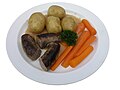 A traditional Danish dish
 -
 Edit
Edit


Article(s): none yet, but Danish cuisine would be appropiate
Request: How do I make the parsley brighter? It is too dark! I have only a little bit of experience with GIMP. Nils Emil (talk) 18:54, 3 October 2008 (UTC)
Graphist opinion: How's this? I may have overdone it a bit (the carrots may be a tad too... colorful :) Fvasconcellos (t·c) 19:39, 3 October 2008 (UTC)
- Hmm, indeed the parsley is better, but rest of the photo now looks weird (sausages too black, carrots too bright). Nils Emil (talk) 21:25, 3 October 2008 (UTC)
- Yep, that's what I thought. Let's try something different—how's this? (Purge your cache if you don't see a difference). Fvasconcellos (t·c) 22:02, 3 October 2008 (UTC)
- It's much better, and indeed usable now. Thanks! May I ask you how you did it? I am making several similar photographs. Nils Emil (talk) 08:03, 4 October 2008 (UTC)
- In GIMP, with the Curves tool. After increasing contrast in the image as a whole, I masked the parsley and worked on the Green channel (again, with Curves) and did a tiny bit of sharpening. Have a look over here for some information on how to use the Curves tool. Best, Fvasconcellos (t·c) 12:51, 4 October 2008 (UTC)
- It's much better, and indeed usable now. Thanks! May I ask you how you did it? I am making several similar photographs. Nils Emil (talk) 08:03, 4 October 2008 (UTC)
- Yep, that's what I thought. Let's try something different—how's this? (Purge your cache if you don't see a difference). Fvasconcellos (t·c) 22:02, 3 October 2008 (UTC)
iPod lineup
-
 Model (make something like this with the new models)
 -
 Or like this, without blurring the screens
 -
 iPod Classic
 -
 iPod nano (only use the front)
 -
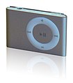 iPod shuffle


Article(s): iPod
Request: Apple announced their new iPod line a week or so ago, and the iPod article is without an image. Unfortunately, we don't have a free iPod Touch 2G pic yet, but in the mean time, I would like a conglomeration (much like the samples above) of the iPods shuffle, nano, and classic (we can add the touch later). I have linked what I think are the best images we have to work with in the gallery, but you can use anything you can find, provided the iPod resembles the ones in the above images (no point in using an old model).
A note about copyright: some users contest that Apple's interface is copyrighted and therefore we must blur the screens. I think this is absurd. It mischaracterizes the iPod, misleads users, and lessens the enc value. The nano is turned off anyway, and the classic (bereft of other iPods) is on the Commons without issue. Make a fair use claim (here, not on Commons), or make the screen look likes it's off (the nano would make a good guide), but don't blur the screen. Ideally, let sleeping dogs lie and worry about making the iPods look nice. Thanks in advance for you patience, understanding, and work.HereToHelp (talk to me) 02:13, 5 October 2008 (UTC)
Graphist opinion:
Smart Telecommunications and TV5 logos
Article(s): Smart Communications and Associated Broadcasting Company
Request: Could you guys, like, vectorize them? I suck at SVG, so maybe if you give these two some TLC... Blake Gripling (talk) 10:29, 5 October 2008 (UTC)
Graphist opinion: These are "Fair use" images. Vectorising them violates the fair use requirement for a low resolution copy since vector can be upscaled to any resolution. They will be deleted. Sorry, no can do. Dhatfield (talk) 15:10, 5 October 2008 (UTC)
- But, I was pretty sure that as long as they were nominally at a low res they were fine. We have plenty of copyrighted SVGs. §hep • ¡Talk to me! 20:03, 5 October 2008 (UTC)
- As well as copyrighted logos lifted off the Brands of The World site... Blake Gripling (talk) 04:16, 6 October 2008 (UTC)
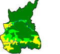
Oeste region
Article(s): pt:Região de Turismo do Oeste, ...
Request: It's this map : http://europedirect.draplvt.min-agricultura.pt/imagens/mapa_regiao_oeste.png
Please Cancelos (talk) 19:55, 5 October 2008 (UTC)
Graphist opinion:I was looking for a different map, and it would help to know where the map is located. Portugal from the looks of it? Also, what article would this go into? Thanks! §hep • ¡Talk to me! 21:12, 6 October 2008 (UTC)
A quick one
-
 From the Fed Board
 -
 SVG
SVG


Articles: United States housing market correction
Request: Please remove the clip art background and make into a normal, sober graph. 68.39.174.238 (talk) 21:11, 6 October 2008 (UTC)
Opinion: I extracted the above from the PDFs, I can't get InkScape to snap the boundaries to the image though. (HELP welcomed with a cookie!) But is this generally what you wanted? §hep • ¡Talk to me! 00:03, 7 October 2008 (UTC)
- Go to "Document properties" (File menu) and click "Fit page to selection". You can keep your cookie.--HereToHelp (talk to me) 01:16, 7 October 2008 (UTC)
- It won't work with this one for me. I have some cracked-out InkScape that won't minimize and only unfreezes when it wants to. If you could do it, feel free to overwrite. §hep • ¡Talk to me! 02:10, 7 October 2008 (UTC)
- Could that SVG be Commonized? 68.39.174.238 (talk) 00:12, 8 October 2008 (UTC)
- Almost forgot. Should be done. §hep • ¡Talk to me! 03:16, 8 October 2008 (UTC)
- Could that SVG be Commonized? 68.39.174.238 (talk) 00:12, 8 October 2008 (UTC)
Universal edit button - PNG to SVG
-
 Universal edit button icon

Article(s): Universal edit button
Request: This icon needs converting into .svg, badly. Please help. If it's done quickly, it'll remain eligible for DYK, and the universal edit button is something that really could do with some widespread awareness and support, as it is an awesome idea. Thanks. fish&karate 07:34, 8 October 2008 (UTC)
Graphist opinion:
- Shouldn't be hard to SVGify, but I'm somewhat concerned about the uncertain attribution chain. Someone really ought to ask John Abbe whether they drew it, or if not, who did, and whether they have a vector version. —Ilmari Karonen (talk) 12:20, 8 October 2008 (UTC)
- Although he uploaded the image universaleditbutton:Image:UEBfullsize.png, which is definetely not a digital zoom of the standard logo universaleditbutton:Image:Wiki.png, he says at universaleditbutton:Questions that it is the highest resolution he "know[s] of". Accordingly, he doesn't seem to be able to render a bigger file using a scalable image. At that community page, they even don't know under which license the image has been created firstly. So, it is better to imitate it and make a new one, as that logo doesn't seem to be so complicated. This attempt exists also at universaleditbutton(see universaleditbutton:Questions).--Demoeconomist (talk) 15:22, 12 October 2008 (UTC)
Scout Wikiproject logo (our own image, so free to tweak)
-

-
 Symmetrical version with filled in trifoil


Article(s): 1500+
Request: Please make the green behind the yellow symmetrical (you can tell it's not), have the hollow trefoil filled in with green (textured like the yellow petals), so that both the boy emblem and the girl emblem have substance, bulk and texture. When I first designed the original, I didn't even think about that, I was trying to simply incorporate both emblems. Now this seems like a natural progression. Chris (クリス • フィッチ) (talk) 01:12, 9 October 2008 (UTC)
- Ps-enlarge stars so they are clearly visible, and remove the black shading behind them. Thanks! Chris (クリス • フィッチ) (talk) 01:16, 9 October 2008 (UTC)
- We generally use this logo on a green background; at smaller sizes the trefoil is very washed out. --—— Gadget850 (Ed) talk - 10:28, 9 October 2008 (UTC)
Graphist opinion:
- I'm on it. /Lokal_Profil 17:40, 10 October 2008 (UTC) —Preceding unsigned comment added by 92.236.228.40 (talk)
- Done. everything in that image was asymmetrical actually. Made it symmetrical and filled in trifoil. Do you want even bigger stars? /Lokal_Profil 23:38, 10 October 2008 (UTC)
- Looks good. Make the stars about 50% larger; compare to Image:BSA universal emblem.svg. --—— Gadget850 (Ed) talk - 10:40, 11 October 2008 (UTC)
- Done. everything in that image was asymmetrical actually. Made it symmetrical and filled in trifoil. Do you want even bigger stars? /Lokal_Profil 23:38, 10 October 2008 (UTC)
- Proportionally, the stars should be about 1/3 the width of the petal, so actually larger, please. Chris (クリス • フィッチ) (talk) 00:59, 12 October 2008 (UTC)
- Chris- How about making the trefoil larger so the height is the height of the FdL? --—— Gadget850 (Ed) talk - 01:14, 12 October 2008 (UTC)
- Usually that proportion is not done, because the trefoil has no lower bulk, see Image:Sweden SSF.svg. Chris (クリス • フィッチ) (talk) 01:22, 12 October 2008 (UTC)
- Chris- How about making the trefoil larger so the height is the height of the FdL? --—— Gadget850 (Ed) talk - 01:14, 12 October 2008 (UTC)
- This is really beautiful work, by the way! Chris (クリス • フィッチ) (talk) 01:25, 12 October 2008 (UTC)
(once this is complete, please upload it over the original name, so we don't have to change it thousands of times, thanks)
BBFC U Cert

Article(s): BBFC
Request: There is a lot of noise around the edge of this image. Please could someone remove this noise. Thanks Mangwanani (talk) 18:02, 9 October 2008 (UTC)
Graphist opinion:
The Prisons Department


Articels: Bureau of Prisons
Request: SVGify the seal, based on the Justice Department's one.
Oppinion:
Nkwenkwe Nkomo

Article(s): Nkwenkwe Nkomo
Request: define head better against dark backdrop... Chris (クリス • フィッチ) (talk) 01:13, 12 October 2008 (UTC)
Graphist opinion:
Georgia COA 1918-1921


Article(s):
Request: In the revision history, there are two variants-a red one and a silver one. Please merge them so that they have the dimensions and the texture of the silver one, and the coloration of the red one. Thanks. Chris (クリス • フィッチ) (talk) 02:25, 12 October 2008 (UTC)
Graphist opinion:
Margaret Thatcher
-
 1
1 -
 2
2 -
 3
3 -
 4
4 -
 5
5 -
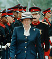 6
6 -
 7
7 -
 8
8


Article(s): Margaret Thatcher, among others
Request: I have attempted for many months now to find a good looking, color, free use image of Margaret Thatcher which focuses solely on her. Most are copyrighted, and the ones that we can use usually do not work or do not look decent. I need a graphists opinion: which of the above images could be cropped to focus solely on Margaret Thatcher? And could a graphist perhaps experiment with cropping them, because I do not have the tools to reduce noise or change a background to improve the image when it is cropped. I would prefer an image of her during her tenure as Prime Minister (all images but number 8), though number 8 may be the easiest to work with. If nothing comes of this, it's okay, but it is worth a shot. My best, Happyme22 (talk) 03:56, 12 October 2008 (UTC)
Graphist opinion:
Colonialism

Article(s): Colonialism
Request: remove spaces on template at left Chris (クリス • フィッチ) (talk) 13:43, 12 October 2008 (UTC)
Graphist opinion:

.svg)
.svg)
Article(s): Colonialism
Request: the US Ethiopia and Saudi flags are wrong... Chris (クリス • フィッチ) (talk) 13:43, 12 October 2008 (UTC)
Graphist opinion:
Torii

Article(s): Shinto template
Request: change from black to E34234 Vermilion... Chris (クリス • フィッチ) (talk) 14:50, 12 October 2008 (UTC)
Graphist opinion: The task here is really simple, but in order to avoid redundant uploads, do you want it to be overwritten to the existing file?--Demoeconomist (talk) 15:37, 12 October 2008 (UTC)
- Yes, please! Chris (クリス • フィッチ) (talk) 15:52, 12 October 2008 (UTC)