
Eagle Cash and Wikipedia:Graphics Lab/Illustration workshop: Difference between pages
m fix |
m Marking 1 section stale; archiving 1 stale section and 4 resolved sections. |
||
| Line 1: | Line 1: | ||
{{Wikipedia:Graphic Lab/Image workshop/top}} |
|||
'''Eagle Cash''' and '''EZPay''' are two related systems of stored-value cards developed for the [[U.S. Military]] for use at military facilities domestically and overseas. The systems center around a small plastic card, similar to a [[credit card|credit]] or [[debit card]], which has an embedded [[microchip]] to keep track of the amount of money stored on the card. This allows [[soldier]]s with the card to purchase goods and services at US military posts and canteens, without having to carry around [[US dollar|cash]], or manage their personal [[bank account]]s while on deployment or in training. The program reduces the amount of US [[currency]] required overseas, reduces theft, speeds up transactions, and helps reduce the cost of transferring military pay into disposable income, by eliminating the need for [[money order]]s.<ref name="ans">{{cite news | title = Army Adopts EZPat for Trainees, Tests Eagle Cash in Bosnia| publisher = Army News Service| date = 2000-08-17| accessdate = 2008-02-16}}</ref> |
|||
__NEWSECTIONLINK__ |
|||
==Overview and history== |
|||
Originally developed in 1997, the EZPay system was originally a pilot project aimed at inductees going into [[basic training]]. After receiving an [[Advance payment|advance]] on their wages in the form of the EZPay card, soldiers were then allowed to use the card to purchase goods and services, such as haircuts, snacks, and recreational activities at on-base [[shop]]s and stores. At the end of basic training, the [[Balance (accounting)|Balance]] on the card would be reconverted into cash, and paid back to the soldiers.<ref name="ans"/> The project was a great success, since it eliminated the need for bases to keep money on hand, and saved soldiers approximately $125,000 a year in banking fees.<ref>{{Citation| last = Snyder| first = Lisa Beth| year = 2000| title = Army Adopts EZPay and Eagle Cash| volume = 55| issue = 11 | publisher = Soldiers | accessdate = 2008-02-16}}</ref> |
|||
<div style="display:block; float:left; width:100%;"> |
|||
At the same time, the EZPay system was expanded for overseas use during the aftermath of the 1992-1995 [[War in Bosnia and Herzegovina]], where U.S. personnel were deployed on [[peace-keeping]] missions, and was fully adopted in 1999.<ref name="ans"/><ref name="centcom">{{cite web| last = Clayton| first = Debra | authorlink = | coauthors = | title = Eagle Cash Helps Manage Money| publisher = [[United States Central Command]] / [[Military.com]]| date = 2008-05-14| url = http://www.military.com/features/0,15240,135749,00.html| accessdate = 2008-02-16 }}</ref> Eagle Cash functions similarly to the EZPay system, but with the added ability of soldiers to attach their personal bank accounts to the card, allowing them to load, and reload, without having to access their bank or credit unions back home. As [[386th Air Expeditionary Wing]] financial manager, Master Sgt. Catherine Miles explained in a 2007 article, "It's like a gift card. [...] You can put as little or as much money as you want on it and it comes from your checking account."<ref name="fam">{{cite web| last = Butterfield| first = Phillip | title = Eagle Cash card: Money spreads its wings| publisher = The Military Family Network| date = 2007-09-13| url = http://www.emilitary.org/article.php?aid=12174| accessdate = 2008-02-16}}</ref> Unlike regular debit cards, the Eagle Cash was managed on-base, which ensured that the cards remained useful even when connections to banks and [[credit union]]s State-side were severed.<ref name="bl"/> |
|||
__TOC__ |
|||
<br /> |
|||
[[Category:Non-talk pages that are automatically signed]] |
|||
[[de:Wikipedia:Bilderwerkstatt]] |
|||
For soldiers, the benefits are straightforward, but for the officers in charge of the system the benefits are much more extensive. Transporting US currency overseas costs the military hundreds of thousands of dollars annually — during the [[Iraq War]], for every $1,000,000 sent to pay soldiers in Iraq, it cost $60,000 in security, [[logistics]] and support fees.<ref name="bl">{{cite news | last = Conner| first = Nicholas | title = Eagle Cash Card comes to Camp Taji | publisher = Blackanthem Military News| date = 2007-03-31| url = http://www.blackanthem.com/News/U_S_Military_19/Eagle_Cash_Card_comes_to_Camp_Taji5403.shtml| accessdate = 2008-02-16 }}</ref> In addition, the use of a cashless economy at military stores reduces transaction times, freeing up personnel from non-essential tasks like stamping money orders or counting pennies — during 9 months of the Iraq War, this saved approximately 5000 hours of processing time for financial personnel.<ref name="bl"/><ref>{{cite web| title = Overview: Eagle Cash | publisher = [[United States Department of the Treasury]]| date = 2008-02-05| url = http://www.fms.treas.gov/eaglecash/index.html| accessdate = 2008-02-16 }}</ref> It also prevents [[counterfeiting]] and reduces the impact US servicemen have on the local economy — an important consideration, since as Juan DeJesus at the [[Department of the Army]] explains, "[e]very time a servicemember spends U.S. dollars in the Middle East theater, it's potentially helping fund [[terrorism]] because the U.S. dollar has stronger market value in this region."<ref name="centcom"/> |
|||
[[fr:Wikipédia:Atelier graphique/Images à améliorer]] |
|||
[[es:Wikiproyecto:Ilustración/Taller gráfico/Peticiones]] |
|||
[[it:Progetto:Laboratorio grafico/Immagini da migliorare]] |
|||
<!-- |
|||
Since the initial adoption of the Eagle Cash system, it has been augmented by [[Automated teller machine|ATM-like]] kiosks which allow soldiers to add funds to the card without having to visit the base's finance office.<ref name="fam"/> Originally, this requirement forced them to wait in long lines to refill their cards, reducing the utility of the system.<refwdads> |
|||
| Line 14: | Line 19: | ||
--------- requests start from here ----------------------> |
|||
==See also== |
|||
==References== |
|||
{{reflist}} |
|||
==External links== |
|||
== |
== A simple equation == |
||
{{resolved}} [[Special:Contributions/68.39.174.238|68.39.174.238]] ([[User talk:68.39.174.238|talk]]) 00:27, 3 September 2008 (UTC) |
|||
<center> |
|||
<math>14\sqrt{x}+|15|=|71|\,\!</math> |
|||
{{Double image stack|center|First Equation Ever.png|First Equation Ever.svg|200}} |
|||
*{{cite news |
|||
</center> |
|||
| last = Conner |
|||
| first = Nicholas |
|||
'''Articels:''' [[Equals sign]] |
|||
| title = Eagle Cash Card comes to Camp Taji |
|||
| publisher = Blackanthem Military News |
|||
'''Request:''' SVGify this equation, so that it can be displayed as part of a {{tl|double image stack}} alongside the original (hard to read by modern eyes) equation. [[Special:Contributions/68.39.174.238|68.39.174.238]] ([[User talk:68.39.174.238|talk]]) 22:30, 1 September 2008 (UTC) |
|||
| date = 2007-03-31 |
|||
| url = http://www.blackanthem.com/News/U_S_Military_19/Eagle_Cash_Card_comes_to_Camp_Taji5403.shtml |
|||
'''Oppinion:''' How's this? [[User:Debate|<font color="550000">Debate</font>]] [[User talk:Debate|<font color="8b9b74">'''木'''</font>]] 09:31, 2 September 2008 (UTC) |
|||
| accessdate = 2008-02-16 }} |
|||
*{{cite web |
|||
:The second looks a little internally strange. EG. Is the "x" in a different fontface? [[Special:Contributions/68.39.174.238|68.39.174.238]] ([[User talk:68.39.174.238|talk]]) 00:27, 3 September 2008 (UTC) |
|||
| title = Overview: Eagle Cash |
|||
::I freely admit that I'm no expert in mathematical symbology, but that's the way the x is displayed when written as an equation in [[Microsoft Word|Word]], as well as how it's displayed in the mathematical mark-up you used above (ie <math>{x}</math>: <nowiki><math>14\sqrt{x}+|15|=|71|\,\!</math></nowiki>), so I presume that the typeface of the x is mathematically significant. Nonetheless, the type-face can be easily changed if required. [[User:Debate|<font color="550000">Debate</font>]] [[User talk:Debate|<font color="8b9b74">'''木'''</font>]] 02:59, 3 September 2008 (UTC) |
|||
| publisher = [[United States Department of the Treasury]] |
|||
| date = 2008-02-05 |
|||
:::For this it doesn't have to be perfect. I strongly suspect that a featured image could be found of some part of this, but will let others decide... [[Special:Contributions/68.39.174.238|68.39.174.238]] ([[User talk:68.39.174.238|talk]]) 23:41, 3 September 2008 (UTC) |
|||
| url = http://www.fms.treas.gov/eaglecash/index.html |
|||
| accessdate = 2008-02-16 }} |
|||
*{{cite web |
|||
| last = Clayton |
|||
| first = Debra |
|||
| authorlink = |
|||
== A few graphs on the housing buble == |
|||
| coauthors = |
|||
| title = Eagle Cash Helps Manage Money |
|||
<center><gallery> |
|||
| publisher = [[United States Central Command]] / [[Military.com]] |
|||
Image:Subprime diagram.png |
|||
| date = 2008-05-14 |
|||
Image:Foreclosure Trend - 2007.png | original |
|||
| url = http://www.military.com/features/0,15240,135749,00.html |
|||
Image:Foreclosure trend - 2007.svg | SVG |
|||
| accessdate = 2008-02-16 }} |
|||
Image:Existing_Home_Sales_Chart_-_v_1.0.png | original |
|||
*{{cite news |
|||
Image:Existing home sales chart.svg | SVG |
|||
| last = Harris |
|||
| first = Bryan |
|||
Image:Mortgage loan fraud.png | original |
|||
| title = Smart cards, kiosks ease Army life |
|||
Image:Mortgage loan fraud.svg | SVG |
|||
| publisher = Kiosk Marketplace |
|||
Image:Borrowing Under a Securitization Structure.gif |
|||
| date = 2006-01-17 |
|||
Image:MBS Downgrades Chart.png | original |
|||
| url = http://www.kioskmarketplace.com/article.php?id=15276 |
|||
Image:MBS downgrades chart.svg | SVG |
|||
| accessdate = 2008-02-16}} |
|||
Image:FDIC Bank Profits - Q1 Profile.png |
|||
*{{cite web |
|||
</gallery></center> |
|||
| last = Butterfield |
|||
| first = Phillip |
|||
'''Articels:''' [[Subprime mortgage crisis]] and related articels. |
|||
| title = Eagle Cash card: Money spreads its wings |
|||
| publisher = The Military Family Network |
|||
'''Request:''' For all of them, SVGify if possible, since they are perfect for it (Boxes, colors and text). For the graphs, they should be recreated with (if possible) a standard look, but definitely free of unneeded dimensions (EG. Spurious 3D effects or shading). [[Special:Contributions/68.39.174.238|68.39.174.238]] ([[User talk:68.39.174.238|talk]]) 20:49, 7 September 2008 (UTC) |
|||
| date = 2007-09-13 |
|||
| url = http://www.emilitary.org/article.php?aid=12174 |
|||
:Question: Who vectorized these and didn't tell me? [[Special:Contributions/68.39.174.238|68.39.174.238]] ([[User talk:68.39.174.238|talk]]) 22:34, 29 September 2008 (UTC) |
|||
| accessdate = 2008-02-16}} |
|||
*{{Citation |
|||
::Answer:Checking who uploaded them would be a good start, although the line graph doesn't look that accurate?. <font color="green" face="Comic Sans MS">[[User:Stepshep|§hep]]</font> • <font color="green" face="Comic Sans MS">[[User talk:Stepshep|¡Talk to me!]]</font> 23:00, 29 September 2008 (UTC) |
|||
| last = Snyder |
|||
| first = Lisa Beth |
|||
::A question for some other people: Do you think having the exact #s at the head of the bars is an improvement or not? [[Special:Contributions/68.39.174.238|68.39.174.238]] ([[User talk:68.39.174.238|talk]]) 22:39, 30 September 2008 (UTC) |
|||
| year = 2000 |
|||
| title = Army Adopts EZPay and Eagle Cash |
|||
'''Opinion:''' |
|||
| volume = 55 |
|||
| issue = 11 |
|||
| publisher = Soldiers |
|||
| accessdate = 2008-02-16}} |
|||
*{{cite news |
|||
| title = Army Adopts EZPat for Trainees, Tests Eagle Cash in Bosnia |
|||
==Sinuiju Special Administrative Region Flag and Emblem== |
|||
| publisher = Army News Service |
|||
| date = 2000-08-17 |
|||
<center> |
|||
| accessdate = 2008-02-16}} |
|||
[[:Image:Sinuiju.png|SSAR Flag.]] |
|||
[[:Image:Sinuiju2.png|SSAR Emblem.]] |
|||
[[:Image:Sinuiju.svg|SSAR Flag SVG]] |
|||
</center> |
|||
'''Article(s): [[Sinuiju Special Administrative Region]]''' |
|||
'''Request:''' SVG please --[[User:SelfQ|SelfQ]] ([[User talk:SelfQ|talk]]) 11:24, 16 September 2008 (UTC) |
|||
'''Graphist opinion:''' I gave a shot at converting the flag to Svg. What do you think? <font color="green" face="Comic Sans MS">[[User:Stepshep|§hep]]</font> • <font color="green" face="Comic Sans MS">[[User talk:Stepshep|¡Talk to me!]]</font> 23:43, 26 September 2008 (UTC) |
|||
==Sarah Palin== |
|||
<center><gallery> |
|||
Image:Palin_In_Carson_City_On_13_September_2008.jpg|Sarah Palin |
|||
Image:Palin crop 1.jpg|Attempt 1: wider crop |
|||
Image:Palin crop 2.jpg|Attempt 2: Even wider, my personal favorite (despite the waving hand on the right :) |
|||
Image:Palin crop 3.jpg|Attempt 3: Slightly modified version of Ferrylodge's crop |
|||
</gallery></center> |
|||
'''Article(s):''' [[Sarah Palin]] |
|||
'''Request:''' Hi, this image is at the top of the article. As you'll see at the image page, it was created by cropping a much larger image, zooming, and sharpening. I did all this myself, but my software is crummy. Can you do a better job? Thanks.[[User:Ferrylodge|Ferrylodge]] ([[User talk:Ferrylodge|talk]]) 01:00, 21 September 2008 (UTC) |
|||
'''Graphist opinion:''' Would you object to a wider crop—closer to the lectern, maybe just above the sheet of paper she's holding, and all the way to her right shoulder? [[User:Fvasconcellos|Fvasconcellos]]<small> ([[User talk:Fvasconcellos|t]]·[[Special:Contributions/Fvasconcellos|c]])</small> 01:23, 21 September 2008 (UTC) |
|||
::The main thing is to have the eyes centered. Some people asked for that at the article talk page. As far as how wide the crop is, please use your best judgment. You folks are the experts, not me. :-) Maybe you could do one with the existing crop, and one with the wider crop?[[User:Ferrylodge|Ferrylodge]] ([[User talk:Ferrylodge|talk]]) 01:27, 21 September 2008 (UTC) |
|||
:::Will give this a go tomorrow morning. Eyes will be centered :) [[User:Fvasconcellos|Fvasconcellos]]<small> ([[User talk:Fvasconcellos|t]]·[[Special:Contributions/Fvasconcellos|c]])</small> 02:00, 21 September 2008 (UTC) |
|||
(undent) Thanks, I'll look forward to seeing what you come up with. Do you think [http://en.wikipedia.org/wiki/Image:Sarah_Palin_Germany_3_Cropped.JPG this image] or [http://en.wikipedia.org/wiki/Image:Palin1.JPG this image] might be better at the top of the article?[[User:Ferrylodge|Ferrylodge]] ([[User talk:Ferrylodge|talk]]) 07:18, 21 September 2008 (UTC) |
|||
:Quality-wise, the "tracksuit" image (which was in the article for quite a while) is still the best, despite the awkward composition. I think the one above is the best substitute right now. [[User:Fvasconcellos|Fvasconcellos]]<small> ([[User talk:Fvasconcellos|t]]·[[Special:Contributions/Fvasconcellos|c]])</small> 15:19, 21 September 2008 (UTC) |
|||
::OK, here we go. I've made three attempts; I recommend no. 2, but I'll leave it up to you to decide which is best :) Please let me know which one you'd like to keep and I'll move it to Commons under a more descriptive filename. Best, [[User:Fvasconcellos|Fvasconcellos]]<small> ([[User talk:Fvasconcellos|t]]·[[Special:Contributions/Fvasconcellos|c]])</small> 15:44, 21 September 2008 (UTC) |
|||
:::Okay, I'll go with your choice, despite the hand (it kind of humanizes the whole thing, makes it look real and spontaneous, and will make for an interesting topic of conversation). #2 it is!. BTW, did you do any sharpening?[[User:Ferrylodge|Ferrylodge]] ([[User talk:Ferrylodge|talk]]) 20:27, 21 September 2008 (UTC) |
|||
::::On second thought, I think the head's too tiny on #2, so I went with #1 (after a little bit of sharpening). Thanks.[[User:Ferrylodge|Ferrylodge]] ([[User talk:Ferrylodge|talk]]) 21:09, 21 September 2008 (UTC) |
|||
:::::No, I didn't do any sharpening as I didn't think it would be much of an improvement. Would you like any of the above versions kept or should I delete them? [[User:Fvasconcellos|Fvasconcellos]]<small> ([[User talk:Fvasconcellos|t]]·[[Special:Contributions/Fvasconcellos|c]])</small> 22:01, 21 September 2008 (UTC) |
|||
{{double image|right|Palin In Carson City Sep 13 2008 v2.jpg |200|Palin In Carson City Sep 13 2008.jpg|200}} |
|||
::::::Thanks for your help and suggestions. I did a crop that is sort of a compromise between #1 and #2, and uploaded it, so I think we're all set now. The extras can be deleted, I think, unless you think the image now at [[Sara Palin]] can be substantially improved. Cheers.[[User:Ferrylodge|Ferrylodge]] ([[User talk:Ferrylodge|talk]]) 22:06, 21 September 2008 (UTC) |
|||
:::::::The new version is a good compromise. There are plenty of images of Palin on Commons, and I don't think these work-in-progress versions are necessary; that's why I uploaded them locally in the first place. [[User:Fvasconcellos|Fvasconcellos]]<small> ([[User talk:Fvasconcellos|t]]·[[Special:Contributions/Fvasconcellos|c]])</small> 22:13, 21 September 2008 (UTC) |
|||
(undent)Fvasconcellos, an editor has created another image that he thinks is better, though I disagree. What do you think? I've inserted the two images side by side (the one on the right is the current image in the article, as I write this).[[User:Ferrylodge|Ferrylodge]] ([[User talk:Ferrylodge|talk]]) 03:49, 23 September 2008 (UTC) |
|||
: Yes, that was me. I sharpened and tweaked the levels and highlights so that it is not so washed out. [[User:Jossi|≈ jossi ≈]] <small>[[User_talk:Jossi|(talk)]]</small> 04:36, 23 September 2008 (UTC) |
|||
:* More accurate skin tone |
|||
:: More accurate hair color and detail |
|||
:* Face features looks sharper |
|||
:* Noise on blouse is less obvious |
|||
:* Sharper overall, such as mics, glasses details, etc. |
|||
: We could tweak it further by keeping the original background, but using the sharper foreground portion |
|||
: [[User:Jossi|≈ jossi ≈]] <small>[[User_talk:Jossi|(talk)]]</small> 04:39, 23 September 2008 (UTC) |
|||
::The subject's shirt is so black in Jossi's image that you can't see the folds and wrinkles. The colors in the background are so bright they look like neon. I'm not convinced that the image on the right can be improved, but surely a compromise would be better than the image on the left.[[User:Ferrylodge|Ferrylodge]] ([[User talk:Ferrylodge|talk]]) 05:06, 23 September 2008 (UTC) |
|||
:::In all fairness, I do think it is a ''bit'' excessive, but the white balance has improved, and I can see still see the detail of her shirt just fine. Are you sure it's not your monitor? |
|||
:::I actually did do some color correction myself but decided against uploading the version because (as with the sharpening) I didn't think it was a real improvement. I said it above, and I'll say it again: this image is certainly not the best in terms of quality. Let's just try not to make this an issue, shall we? The article has seen more than enough of those as it is... [[User:Fvasconcellos|Fvasconcellos]]<small> ([[User talk:Fvasconcellos|t]]·[[Special:Contributions/Fvasconcellos|c]])</small> 12:57, 23 September 2008 (UTC) |
|||
::::I agree that the color saturation is excessive. It is also dark and has lost detail. I have worked on this image in Photoshop and have other versions with more subtle corrections that look better. '''IP75''' [[Special:Contributions/75.25.28.167|75.25.28.167]] ([[User talk:75.25.28.167|talk]]) 18:08, 23 September 2008 (UTC) |
|||
:::::I'm just noting that I can see the folds fine, the blouse doesn't look that dark really. Make sure you have your monitor calibrated to [[:Image:Gray contrast test image.svg|this]] and [[:Image:Colortest.png|this]]. <font color="green" face="Comic Sans MS">[[User:Stepshep|§hep]]</font> • <font color="green" face="Comic Sans MS">[[User talk:Stepshep|¡Talk to me!]]</font> 23:03, 26 September 2008 (UTC) |
|||
== Sarah Palin again == |
|||
{{Stale|1=[[User:DyceBot|DyceBot]] ([[User talk:DyceBot|talk]]) 07:02, 10 October 2008 (UTC)}} |
|||
<center><gallery> |
|||
Image:palin nowhere.jpg|This photo of Sarah Palin is, in itself, notable, as it is a unique piece of photographic evidence relevant to a high-profile part of her biography. <br /> '''(Retouched)''' |
|||
</gallery></center> |
|||
'''Article(s):''' [[Sarah Palin]] (note: top Wikipidea article for the last two months, I think), [[Gravina Island Bridge]] |
|||
'''Request:''' . As you can see, the image quality is poor due to backlight. If anybody could fix this up - fixing the contrast and color balance and, if possible, removing the purple fringing around her head - that would be really appreciated. Thanks. [[User:Homunq|Homunq]] ([[User talk:Homunq|talk]]) 18:54, 22 September 2008 (UTC) |
|||
'''Graphist opinion:''' |
|||
Hi Homunq, how is it now? you can compare them here [http://upload.wikimedia.org/wikipedia/en/archive/4/4b/20080922194126%21Palin_nowhere.jpg (old)] [http://upload.wikimedia.org/wikipedia/en/4/4b/Palin_nowhere.jpg (new)], i am still working on it, you can find orginal version [http://upload.wikimedia.org/wikipedia/en/archive/4/4b/20080922194126%21Palin_nowhere.jpg HERE]. '''[[User:Mmxx|<span style='color:#800000;background-color:#FFE4E1;'> ■ MMXX</span>]]'''<sup>[[User talk:Mmxx|''<span style='color: #800000;'>talk</span>'']] </sup> 19:52, 22 September 2008 (UTC) |
|||
:(better here than my talk page) That is much better on the flesh tones. However, the whites (both on the T-shirt and in the background) are still too blue. Thanks for your work. [[User:Homunq|Homunq]] ([[User talk:Homunq#top|talk]]) 20:02, 22 September 2008 (UTC) |
|||
::I think the text on T-shirt is originally blue, compare with the t-shirt label. '''[[User:Mmxx|<span style='color:#800000;background-color:#FFE4E1;'> ■ MMXX</span>]]'''<sup>[[User talk:Mmxx|''<span style='color: #800000;'>talk</span>'']] </sup> 20:13, 22 September 2008 (UTC) |
|||
:::Good point. However, the paper on her desk and the stuff outside still have a blue cast which I think is an artifact. Anyway, thanks. [[User:Homunq|Homunq]] ([[User talk:Homunq|talk]]) 20:15, 22 September 2008 (UTC) |
|||
:::Why does it look better when I follow your "new" link than on the image page itself? Baffled, [[User:Homunq|Homunq]] ([[User talk:Homunq|talk]]) 20:18, 22 September 2008 (UTC) |
|||
::::I reduced the blue color you can compare them here: [http://upload.wikimedia.org/wikipedia/en/4/4b/Palin_nowhere.jpg (new)], [http://upload.wikimedia.org/wikipedia/en/archive/4/4b/20080924053713%21Palin_nowhere.jpg (old)], and about your question i don't know why this happen, try emptying your cache or refresh page by (Ctrl+F5). '''[[User:Mmxx|<span style='color:#800000;background-color:#FFE4E1;'> ■ MMXX</span>]]'''<sup>[[User talk:Mmxx|''<span style='color: #800000;'>talk</span>'']] </sup> 06:20, 24 September 2008 (UTC) |
|||
*Could you do the same edit with the uncropped version please? |
|||
<center><gallery> |
|||
Image:Palin_Nowhere_99901.jpg |
|||
Image:Nowhere 99901 (Crop2).jpg |
|||
</gallery></center> |
|||
It can be found here: http://commons.wikimedia.org/wiki/Image:Palin_Nowhere_99901.jpg. Also, we could use a cropped version of Ivy Frye, the troopergate related woman on the left part of the image.[[User:Duuude007|Duuude007]] ([[User talk:Duuude007|talk]]) 20:29, 22 September 2008 (UTC) |
|||
:What do you think? is it better now? [http://upload.wikimedia.org/wikipedia/commons/a/aa/Palin_Nowhere_99901.jpg new] [http://upload.wikimedia.org/wikipedia/commons/archive/a/aa/20080922215315%21Palin_Nowhere_99901.jpg old] [[User:LiveChocolate|LiveChocolate]] ([[User talk:LiveChocolate|talk]]) 22:04, 22 September 2008 (UTC) |
|||
::Very nice, yes thanks ^^ Could we also get a cropped version availble of the left person (Ivy Frye) in this enlarged image? cheers :) [[User:Duuude007|Duuude007]] ([[User talk:Duuude007|talk]]) 22:42, 22 September 2008 (UTC) |
|||
:::here it is, I copied the descriptions and license from [[:Image:Palin Nowhere 99901.jpg]] please update them. [[User:LiveChocolate|LiveChocolate]] ([[User talk:LiveChocolate|talk]]) 11:47, 23 September 2008 (UTC) |
|||
==[[Banaba Island]]== |
|||
<center> |
|||
[http://map.sopac.org/data/virlib/TR/TR0334.pdf WATER RESOURCES ASSESSMENT] |
|||
<gallery> |
|||
Image:Banaba rainfall average.svg|Bar graph |
|||
</gallery> |
|||
</center> |
|||
'''Article(s):''' [[Banaba Island]] |
|||
'''Request:''' Hello! I want to know if it is possible to extract or to make some graphs and maps from [http://map.sopac.org/data/virlib/TR/TR0334.pdf this] PDF file. I mean if it is OK to do that, because of the author rights. I need that location map (p. 7), the ''Mean monthly rainfall'' graph (Figure 1.2, p. 8), the ''Mean annual rainfall over Western Kiribati'' map (Figure 1.3, p. 8), Figure 1.4 and Figure 1.5. If it is possible, it would be great. Thanks in advance, [[User:Minisarm|Sebi]] ([[User talk:Minisarm|talk]]) 15:53, 26 September 2008 (UTC) |
|||
:Anybody there? [[User:Minisarm|Sebi]] ([[User talk:Minisarm|talk]]) 14:25, 3 October 2008 (UTC) |
|||
'''Graphist opinion:''' |
|||
:There is currently nothing suggsting that the images from SOPAC are free from copyright. Sorry. /[[:User:Lokal Profil|Lokal]][[Special:Contributions/Lokal Profil|_]][[:User talk:Lokal Profil|Profil]] 16:14, 3 October 2008 (UTC) |
|||
::OK, I understand that, but the location map can be generated from existing Oceania/Kiribati maps. Thanks, [[User:Minisarm|Sebi]] ([[User talk:Minisarm|talk]]) 14:15, 6 October 2008 (UTC) |
|||
:::Has the island geography been updated since [[:Image:Banaba Island.svg|1936]]? <font color="green" face="Comic Sans MS">[[User:Stepshep|§hep]]</font> • <font color="green" face="Comic Sans MS">[[User talk:Stepshep|¡Talk to me!]]</font> 14:33, 6 October 2008 (UTC) |
|||
::::And with the bar graph. Since there wasn't any real data there I made my own. How's that look? <font color="green" face="Comic Sans MS">[[User:Stepshep|§hep]]</font> • <font color="green" face="Comic Sans MS">[[User talk:Stepshep|¡Talk to me!]]</font> 14:58, 6 October 2008 (UTC) |
|||
:::::It is very good, but the blue color is a bit to dark, so, please, make it lighter. Thanks, [[User:Minisarm|Sebi]] ([[User talk:Minisarm|talk]]) 13:28, 7 October 2008 (UTC) |
|||
Better color? Also, the map in the PDF is pretty much unusable due to quality. Has the island changed since [[:Image:Banaba Island.svg|this map]]? If not, it would be very easy to make a color version. <font color="green" face="Comic Sans MS">[[User:Stepshep|§hep]]</font> • <font color="green" face="Comic Sans MS">[[User talk:Stepshep|¡Talk to me!]]</font> 21:03, 7 October 2008 (UTC) |
|||
:Yes, now it is much better. No, the map has not changed, but I need the location map. [[User:Minisarm|Sebi]] ([[User talk:Minisarm|talk]]) 12:00, 8 October 2008 (UTC) |
|||
::Sorry, I misread your request! I have a location map that is PD. I should be able to upload it later tonight to see if it fits your needs. <font color="green" face="Comic Sans MS">[[User:Stepshep|§hep]]</font> • <font color="green" face="Comic Sans MS">[[User talk:Stepshep|¡Talk to me!]]</font> 19:09, 8 October 2008 (UTC) |
|||
:::OK, thank you very much. — [[User:Minisarm|<font style="font-family:Verdana;color:#048">'''Sebi'''</font>]] [[User talk:Minisarm:Minisarm|<sup><font style="color:#37B">talk</font></sup>]] 13:48, 9 October 2008 (UTC) |
|||
== Map of [[Queluz National Palace]] == |
|||
<center><gallery> |
|||
Image:GianonewplanQueluz.JPG|Description of image |
|||
</gallery></center> |
|||
'''Article(s):''' [[Queluz National Palace]] |
|||
'''Request:''' New map because, it's a old this !! [[User:Cancelos|Cancelos]] ([[User talk:Cancelos|talk]]) 12:32, 27 September 2008 (UTC) |
|||
'''Graphist opinion:''' |
|||
*'''Comment''' To whoever does this one, it's currently used in an imagemap. The source is in the article, of course that can be redone fairly easily so maybe no worries. <font color="green" face="Comic Sans MS">[[User:Stepshep|§hep]]</font> • <font color="green" face="Comic Sans MS">[[User talk:Stepshep|¡Talk to me!]]</font> 18:18, 28 September 2008 (UTC) |
|||
== Map of Ratanakiri == |
|||
<center><gallery> |
|||
Image:Ratanakiri_districts.jpg|I made this crappy thing a while ago |
|||
</gallery></center> |
|||
'''Article(s):''' [[Ratanakiri Province]] |
|||
'''Request:''' I'd like to have a vector map of Ratanakiri showing the province's physical geography (not administrative divisions, like we have now). The best map I've found is [http://www.tourismcambodia.com/TravelGuides/images/Rattanakiri_Map.jpg this]. There's also [http://www.methodfinder.com/wfpatlas/userimages/map146a.gif this one]. If someone could make something based on the first one, that would be great. Please, no administrative divisions. Also, the tourist sites are not needed. What I'd like is a map that shows the rivers, maybe the roads, and the towns. Thanks a million!! [[User:Calliopejen1|Calliopejen1]] ([[User talk:Calliopejen1|talk]]) 18:58, 27 September 2008 (UTC) |
|||
'''Graphist opinion:''' |
|||
== Paul Newman == |
|||
<center><gallery> |
|||
Image:Paul newman menomonee falls wisconsin eugene mccarthy rally politics.jpg |
|||
Image:Paul newman menomonee falls wisconsin eugene mccarthy rally politics edit1.jpg|Edit 1 |
|||
</gallery></center> |
|||
'''Article(s):''' [[Paul Newman]] |
|||
'''Request:''' trim out unnecessary sky and sharpen image if possible... [[User:Kintetsubuffalo|Chris (クリス • フィッチ)]] ([[User talk:Kintetsubuffalo|talk]]) 12:25, 29 September 2008 (UTC) |
|||
'''Graphist opinion:''' I was going for face detail so it might be a little sharp heavy. Should it be a tad softer? <font color="green" face="Comic Sans MS">[[User:Stepshep|§hep]]</font> • <font color="green" face="Comic Sans MS">[[User talk:Stepshep|¡Talk to me!]]</font> 03:16, 30 September 2008 (UTC) |
|||
:I also removed the blue hue, I thought it looked out of place. <font color="green" face="Comic Sans MS">[[User:Stepshep|§hep]]</font> • <font color="green" face="Comic Sans MS">[[User talk:Stepshep|¡Talk to me!]]</font> 16:25, 30 September 2008 (UTC) |
|||
::That is so much better! Please upload it over the original! [[User:Kintetsubuffalo|Chris (クリス • フィッチ)]] ([[User talk:Kintetsubuffalo|talk]]) 00:26, 1 October 2008 (UTC) |
|||
I just saw this one, I took the liberty of cleaning up all the dust, scratches and other damage as well and uploaded it over the last edit. Please revert it if you don't prefer it. [[User:Mfield|Mfield]] ([[User talk:Mfield|talk]]) 01:06, 1 October 2008 (UTC) |
|||
:Thanks! Please upload it over the original! [[User:Kintetsubuffalo|Chris (クリス • フィッチ)]] ([[User talk:Kintetsubuffalo|talk]]) 01:02, 2 October 2008 (UTC) |
|||
== Serbian Empire == |
|||
<center><gallery> |
|||
Image:No red.svg|[http://upload.wikimedia.org/wikipedia/sr/9/97/Cardusan.jpg 1] |
|||
Image:No red.svg|[http://tr.wikipedia.org/wiki/Resim:COASerbDushan.png 2] |
|||
</gallery></center> |
|||
'''Article(s):''' [[Serbian Empire]] |
|||
'''Request:''' SVG ification. Example [[w:sr:Грб Душановог Царства према Илирским грбовницима]] --[[User:Lord Leatherface|Lord Leatherface]] ([[User talk:Lord Leatherface|talk]]) 09:03, 30 September 2008 (UTC) |
|||
'''Graphist opinion:''' |
|||
== First Balkan War == |
|||
<center><gallery> |
|||
Image:First Balkan War.JPG|JPG {{puic|1=Image:First Balkan War.JPG|log=2008 October 6}} |
|||
</gallery></center> |
|||
'''Article(s):''' [[First Balkan War]] |
|||
'''Request:''' SVG ification.--[[User:Lord Leatherface|Lord Leatherface]] ([[User talk:Lord Leatherface|talk]]) 10:24, 1 October 2008 (UTC) |
|||
'''Graphist opinion:''' |
|||
== Map for German and British fleet dispositions, 16 Dec. 1916 == |
|||
<center><gallery> |
|||
Image:Scheer's illustration of I SG disposition 16 Dec. 1916.JPG |
|||
</gallery></center> |
|||
'''Article(s):''' [[SMS Von der Tann]], will eventually be added to others as they are expanded. |
|||
'''Request:''' SVG-ification, translate legend to English in new version. |
|||
'''Graphist opinion:''' |
|||
== Steven Page == |
|||
<center><gallery> |
|||
Image:StevenPageMassey.jpg |
|||
</gallery></center> |
|||
'''Article(s):''' [[Steven Page]] |
|||
'''Request:''' define head better against dark backdrop... [[User:Kintetsubuffalo|Chris (クリス • フィッチ)]] ([[User talk:Kintetsubuffalo|talk]]) 02:02, 2 October 2008 (UTC) |
|||
'''Graphist opinion:''' |
|||
== Making the parsley green/bright == |
|||
<center><gallery> |
|||
Image:Medisterpølse_med_tilbehør.jpg|A traditional Danish dish |
|||
Image:Medisterpølse_med_tilbehør edit.jpg|Edit |
|||
</gallery></center> |
|||
'''Article(s):''' none yet, but Danish cuisine would be appropiate |
|||
'''Request:''' How do I make the parsley brighter? It is too dark! I have only a little bit of experience with GIMP. [[User:Nillerdk|Nils Emil]] ([[User talk:Nillerdk|talk]]) 18:54, 3 October 2008 (UTC) |
|||
'''Graphist opinion:''' How's this? I may have overdone it a bit (the carrots may be a tad too... colorful :) [[User:Fvasconcellos|Fvasconcellos]]<small> ([[User talk:Fvasconcellos|t]]·[[Special:Contributions/Fvasconcellos|c]])</small> 19:39, 3 October 2008 (UTC) |
|||
: Hmm, indeed the parsley is better, but rest of the photo now looks weird (sausages too black, carrots too bright). [[User:Nillerdk|Nils Emil]] ([[User talk:Nillerdk|talk]]) 21:25, 3 October 2008 (UTC) |
|||
::Yep, that's what I thought. Let's try something different—how's this? ([[WP:PURGE|Purge your cache]] if you don't see a difference). [[User:Fvasconcellos|Fvasconcellos]]<small> ([[User talk:Fvasconcellos|t]]·[[Special:Contributions/Fvasconcellos|c]])</small> 22:02, 3 October 2008 (UTC) |
|||
:::It's much better, and indeed usable now. Thanks! May I ask you how you did it? I am making several similar photographs. [[User:Nillerdk|Nils Emil]] ([[User talk:Nillerdk|talk]]) 08:03, 4 October 2008 (UTC) |
|||
::::In GIMP, with the Curves tool. After increasing contrast in the image as a whole, I masked the parsley and worked on the Green channel (again, with Curves) and did a tiny bit of sharpening. Have a look over [http://docs.gimp.org/en/gimp-tool-curves.html here] for some information on how to use the Curves tool. Best, [[User:Fvasconcellos|Fvasconcellos]]<small> ([[User talk:Fvasconcellos|t]]·[[Special:Contributions/Fvasconcellos|c]])</small> 12:51, 4 October 2008 (UTC) |
|||
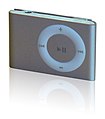
== iPod lineup == |
|||
<center><gallery> |
|||
Image:Image-IPod 5G, nano 2G, shuffle 2G.jpg|Model (make something like this with the new models) |
|||
Image:IPod Line.png|Or like this, without blurring the screens |
|||
Image:IPod Classic 6th Generation Black.jpg|iPod Classic |
|||
Image:IPod Nano 4G black.jpg|iPod nano (only use the front) |
|||
Image:IPod Shuffle Crop.jpg|iPod shuffle |
|||
</gallery></center> |
|||
'''Article(s):''' [[iPod]] |
|||
'''Request:''' Apple announced their new iPod line a week or so ago, and the [[iPod]] article is without an image. Unfortunately, we don't have a free iPod Touch 2G pic yet, but in the mean time, I would like a conglomeration (much like the samples above) of the iPods shuffle, nano, and classic (we can add the touch later). I have linked what I think are the best images we have to work with in the gallery, but you can use anything you can find, provided the iPod resembles the ones in the above images (no point in using an old model). |
|||
A note about copyright: some users contest that Apple's interface is copyrighted and therefore we must blur the screens. I think this is absurd. It mischaracterizes the iPod, misleads users, and lessens the enc value. The nano is turned off anyway, and the classic (bereft of other iPods) is on the Commons without issue. Make a fair use claim (here, not on Commons), or make the screen look likes it's off (the nano would make a good guide), but don't blur the screen. Ideally, let sleeping dogs lie and worry about making the iPods look nice. Thanks in advance for you patience, understanding, and work.[[User:HereToHelp|HereToHelp]] <sup>([[User talk:HereToHelp|''talk to me'']])</sup> 02:13, 5 October 2008 (UTC) |
|||
'''Graphist opinion:''' |
|||
== Smart Telecommunications and TV5 logos == |
|||
<center><gallery> |
|||
*[[:Image:Smartlogo.png]] - Smart Telecommunications logo |
|||
*[[:Image:TV5 Logo.png]] - TV5 logo |
|||
</gallery></center> |
|||
'''Article(s):''' [[Smart Communications]] and [[Associated Broadcasting Company]] |
|||
'''Request:''' Could you guys, like, vectorize them? I suck at SVG, so maybe if you give these two some TLC... [[User:Blakegripling ph|Blake Gripling]] ([[User talk:Blakegripling ph|talk]]) 10:29, 5 October 2008 (UTC) |
|||
'''Graphist opinion:''' These are "Fair use" images. Vectorising them violates the fair use requirement for a low resolution copy since vector can be upscaled to any resolution. They will be deleted. Sorry, no can do. [[User:Dhatfield|Dhatfield]] ([[User talk:Dhatfield|talk]]) 15:10, 5 October 2008 (UTC) |
|||
:But, I was pretty sure that as long as they were nominally at a low res they were fine. We have plenty of copyrighted SVGs. <font color="green" face="Comic Sans MS">[[User:Stepshep|§hep]]</font> • <font color="green" face="Comic Sans MS">[[User talk:Stepshep|¡Talk to me!]]</font> 20:03, 5 October 2008 (UTC) |
|||
::As well as copyrighted logos lifted off the Brands of The World site... [[User:Blakegripling ph|Blake Gripling]] ([[User talk:Blakegripling ph|talk]]) 04:16, 6 October 2008 (UTC) |
|||
== Oeste region == |
|||
'''Article(s):''' [[:pt:Região de Turismo do Oeste]], ... |
|||
'''Request:''' It's this map : http://europedirect.draplvt.min-agricultura.pt/imagens/mapa_regiao_oeste.png |
|||
Please [[User:Cancelos|Cancelos]] ([[User talk:Cancelos|talk]]) 19:55, 5 October 2008 (UTC) |
|||
'''Graphist opinion:'''I was looking for a different map, and it would help to know where the map is located. Portugal from the looks of it? Also, what article would this go into? Thanks! <font color="green" face="Comic Sans MS">[[User:Stepshep|§hep]]</font> • <font color="green" face="Comic Sans MS">[[User talk:Stepshep|¡Talk to me!]]</font> 21:12, 6 October 2008 (UTC) |
|||
==University of East Anglia Shield== |
|||
{{resolved}} |
|||
<center><gallery> |
|||
Image:Uea shield.jpg |
|||
</gallery></center> |
|||
'''Article(s):''' none, will be used in [[University of East Anglia]] once made into SVG |
|||
'''Request:''' I would greatly appreciate it if someone could make this image into an SVG. Many Thanks! [[User:Flaming Ferrari|Flaming Ferrari]] ([[User talk:Flaming Ferrari|talk]]) 15:05, 6 October 2008 (UTC) |
|||
'''Graphist opinion:'''Requester claimed ownership of a copyrighted logo. Image was deleted, nothing else to do. <font color="green" face="Comic Sans MS">[[User:Stepshep|§hep]]</font> • <font color="green" face="Comic Sans MS">[[User talk:Stepshep|¡Talk to me!]]</font> 03:22, 9 October 2008 (UTC) |
|||
== A quick one == |
|||
{{resolved}} [[Special:Contributions/68.39.174.238|68.39.174.238]] ([[User talk:68.39.174.238|talk]]) 00:12, 8 October 2008 (UTC) |
|||
<center><gallery> |
|||
Image:ARMs Indexes 1996-2006.png|From the Fed Board |
|||
Image:ARMs Indexes 1996-2006.svg|SVG |
|||
</gallery></center> |
|||
'''Articles:''' [[United States housing market correction]] |
|||
'''Request:''' Please remove the clip art background and make into a normal, sober graph. [[Special:Contributions/68.39.174.238|68.39.174.238]] ([[User talk:68.39.174.238|talk]]) 21:11, 6 October 2008 (UTC) |
|||
'''Opinion:''' I extracted the above from the PDFs, I can't get InkScape to snap the boundaries to the image though. (HELP welcomed with a cookie!) But is this generally what you wanted? <font color="green" face="Comic Sans MS">[[User:Stepshep|§hep]]</font> • <font color="green" face="Comic Sans MS">[[User talk:Stepshep|¡Talk to me!]]</font> 00:03, 7 October 2008 (UTC) |
|||
:Go to "Document properties" (File menu) and click "Fit page to selection". You can keep your cookie.--[[User:HereToHelp|HereToHelp]] <sup>([[User talk:HereToHelp|''talk to me'']])</sup> 01:16, 7 October 2008 (UTC) |
|||
::It won't work with this one for me. I have some cracked-out InkScape that won't minimize and only unfreezes when it wants to. If you could do it, feel free to overwrite. <font color="green" face="Comic Sans MS">[[User:Stepshep|§hep]]</font> • <font color="green" face="Comic Sans MS">[[User talk:Stepshep|¡Talk to me!]]</font> 02:10, 7 October 2008 (UTC) |
|||
:::Cropped. just copypasted it into a new incscape window of the right dimensions. /[[:User:Lokal Profil|Lokal]][[Special:Contributions/Lokal Profil|_]][[:User talk:Lokal Profil|Profil]] 21:04, 7 October 2008 (UTC) |
|||
::::Could that SVG be Commonized? [[Special:Contributions/68.39.174.238|68.39.174.238]] ([[User talk:68.39.174.238|talk]]) 00:12, 8 October 2008 (UTC) |
|||
:::::Almost forgot. Should be done. <font color="green" face="Comic Sans MS">[[User:Stepshep|§hep]]</font> • <font color="green" face="Comic Sans MS">[[User talk:Stepshep|¡Talk to me!]]</font> 03:16, 8 October 2008 (UTC) |
|||
== Universal edit button - PNG to SVG == |
|||
<center><gallery> |
|||
Image:UniversalEditButton.png|Universal edit button icon |
|||
</gallery></center> |
|||
'''Article(s):''' [[Universal edit button]] |
|||
'''Request:''' This icon needs converting into .svg, badly. Please help. If it's done quickly, it'll remain eligible for [[WP:DYK|DYK]], and the [[universal edit button]] is something that really could do with some widespread awareness and support, as it is an awesome idea. Thanks. [[User:Fish and karate|<u style="text-decoration:none;font:100% cursive;color:#28c"><b>fish</b></u>]]&[[User_talk:Fish and karate|<u style="text-decoration:none;font:100% cursive;color:#D33"><b>karate</b></u>]] 07:34, 8 October 2008 (UTC) |
|||
'''Graphist opinion:''' |
|||
:Shouldn't be hard to SVGify, but I'm somewhat concerned about the uncertain attribution chain. Someone really ought to ask [http://universaleditbutton.org/User:John_Abbe John Abbe] whether they drew it, or if not, who did, and whether they have a vector version. —[[User:Ilmari Karonen|Ilmari Karonen]] <small>([[User talk:Ilmari Karonen|talk]])</small> 12:20, 8 October 2008 (UTC) |
|||
== Scout Wikiproject logo (our own image, so free to tweak) == |
|||
<center><gallery> |
|||
Image:Scout logo2.svg |
|||
</gallery></center> |
|||
'''Article(s):''' 1500+ |
|||
'''Request:''' Please make the green behind the yellow symmetrical (you can tell it's not), have the hollow trefoil filled in with green (textured like the yellow petals), so that both the boy emblem and the girl emblem have substance, bulk and texture. When I first designed the original, I didn't even think about that, I was trying to simply incorporate both emblems. Now this seems like a natural progression. [[User:Kintetsubuffalo|Chris (クリス • フィッチ)]] ([[User talk:Kintetsubuffalo|talk]]) 01:12, 9 October 2008 (UTC) |
|||
:Ps-enlarge stars so they are clearly visible, and remove the black shading behind them. Thanks! [[User:Kintetsubuffalo|Chris (クリス • フィッチ)]] ([[User talk:Kintetsubuffalo|talk]]) 01:16, 9 October 2008 (UTC) |
|||
{{Quote box2 |
|||
|align = right |
|||
|bgcolor = #7BA05B |
|||
|quote = [[Image:Scout logo2.svg|25px]] |
|||
}} |
|||
::We generally use this logo on a green background; at smaller sizes the trefoil is very washed out. --—<i><b>— [[User:Gadget850|<font color = "gray">Gadget850 (Ed)</font>]]<font color = "darkblue"> <sup>[[User talk:Gadget850|''talk'']]</sup></font></b> - </i> 10:28, 9 October 2008 (UTC) |
|||
'''Graphist opinion:''' |
|||
== BBFC U Cert == |
|||
<center><gallery> |
|||
Image:NonFreeImageRemoved.svg|BBFC U Cert |
|||
</gallery></center> |
|||
'''Article(s):''' [[BBFC]] |
|||
'''Request:''' There is a lot of noise around the edge of this image. Please could someone remove this noise. Thanks '''[[User:Mangwanani|<font color="green">Mangwanani</font>]]''' <sup>[[User talk:Mangwanani|<font color="green">(talk)</font>]] </sup> 18:02, 9 October 2008 (UTC) |
|||
'''Graphist opinion:''' |
|||
Revision as of 07:02, 10 October 2008
This page is deprecated and will not be monitored. Please use one of the three workshop pages. This specific page is {{{1}}}
A simple equation

Articels: Equals sign
Request: SVGify this equation, so that it can be displayed as part of a {{double image stack}} alongside the original (hard to read by modern eyes) equation. 68.39.174.238 (talk) 22:30, 1 September 2008 (UTC)
Oppinion: How's this? Debate 木 09:31, 2 September 2008 (UTC)
- The second looks a little internally strange. EG. Is the "x" in a different fontface? 68.39.174.238 (talk) 00:27, 3 September 2008 (UTC)
- I freely admit that I'm no expert in mathematical symbology, but that's the way the x is displayed when written as an equation in Word, as well as how it's displayed in the mathematical mark-up you used above (ie : <math>14\sqrt{x}+|15|=|71|\,\!</math>), so I presume that the typeface of the x is mathematically significant. Nonetheless, the type-face can be easily changed if required. Debate 木 02:59, 3 September 2008 (UTC)

- For this it doesn't have to be perfect. I strongly suspect that a featured image could be found of some part of this, but will let others decide... 68.39.174.238 (talk) 23:41, 3 September 2008 (UTC)
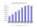
A few graphs on the housing buble
-
-
 original
 -
 SVG
SVG -
 original
 -
 SVG
SVG -
 original
 -
 SVG
SVG -

-
 original
 -
 SVG
SVG -


Articels: Subprime mortgage crisis and related articels.
Request: For all of them, SVGify if possible, since they are perfect for it (Boxes, colors and text). For the graphs, they should be recreated with (if possible) a standard look, but definitely free of unneeded dimensions (EG. Spurious 3D effects or shading). 68.39.174.238 (talk) 20:49, 7 September 2008 (UTC)
- Question: Who vectorized these and didn't tell me? 68.39.174.238 (talk) 22:34, 29 September 2008 (UTC)
- Answer:Checking who uploaded them would be a good start, although the line graph doesn't look that accurate?. §hep • ¡Talk to me! 23:00, 29 September 2008 (UTC)
- A question for some other people: Do you think having the exact #s at the head of the bars is an improvement or not? 68.39.174.238 (talk) 22:39, 30 September 2008 (UTC)
Opinion:
Sinuiju Special Administrative Region Flag and Emblem
Article(s): Sinuiju Special Administrative Region
Request: SVG please --SelfQ (talk) 11:24, 16 September 2008 (UTC)
Graphist opinion: I gave a shot at converting the flag to Svg. What do you think? §hep • ¡Talk to me! 23:43, 26 September 2008 (UTC)
Sarah Palin
-
 Sarah Palin
 -
Attempt 1: wider crop
-
Attempt 2: Even wider, my personal favorite (despite the waving hand on the right :)
-
Attempt 3: Slightly modified version of Ferrylodge's crop

Article(s): Sarah Palin Request: Hi, this image is at the top of the article. As you'll see at the image page, it was created by cropping a much larger image, zooming, and sharpening. I did all this myself, but my software is crummy. Can you do a better job? Thanks.Ferrylodge (talk) 01:00, 21 September 2008 (UTC) Graphist opinion: Would you object to a wider crop—closer to the lectern, maybe just above the sheet of paper she's holding, and all the way to her right shoulder? Fvasconcellos (t·c) 01:23, 21 September 2008 (UTC)
- The main thing is to have the eyes centered. Some people asked for that at the article talk page. As far as how wide the crop is, please use your best judgment. You folks are the experts, not me. :-) Maybe you could do one with the existing crop, and one with the wider crop?Ferrylodge (talk) 01:27, 21 September 2008 (UTC)
- Will give this a go tomorrow morning. Eyes will be centered :) Fvasconcellos (t·c) 02:00, 21 September 2008 (UTC)
- The main thing is to have the eyes centered. Some people asked for that at the article talk page. As far as how wide the crop is, please use your best judgment. You folks are the experts, not me. :-) Maybe you could do one with the existing crop, and one with the wider crop?Ferrylodge (talk) 01:27, 21 September 2008 (UTC)
(undent) Thanks, I'll look forward to seeing what you come up with. Do you think this image or this image might be better at the top of the article?Ferrylodge (talk) 07:18, 21 September 2008 (UTC)
- Quality-wise, the "tracksuit" image (which was in the article for quite a while) is still the best, despite the awkward composition. I think the one above is the best substitute right now. Fvasconcellos (t·c) 15:19, 21 September 2008 (UTC)
- OK, here we go. I've made three attempts; I recommend no. 2, but I'll leave it up to you to decide which is best :) Please let me know which one you'd like to keep and I'll move it to Commons under a more descriptive filename. Best, Fvasconcellos (t·c) 15:44, 21 September 2008 (UTC)
- Okay, I'll go with your choice, despite the hand (it kind of humanizes the whole thing, makes it look real and spontaneous, and will make for an interesting topic of conversation). #2 it is!. BTW, did you do any sharpening?Ferrylodge (talk) 20:27, 21 September 2008 (UTC)
- On second thought, I think the head's too tiny on #2, so I went with #1 (after a little bit of sharpening). Thanks.Ferrylodge (talk) 21:09, 21 September 2008 (UTC)
- No, I didn't do any sharpening as I didn't think it would be much of an improvement. Would you like any of the above versions kept or should I delete them? Fvasconcellos (t·c) 22:01, 21 September 2008 (UTC)
- On second thought, I think the head's too tiny on #2, so I went with #1 (after a little bit of sharpening). Thanks.Ferrylodge (talk) 21:09, 21 September 2008 (UTC)
- Okay, I'll go with your choice, despite the hand (it kind of humanizes the whole thing, makes it look real and spontaneous, and will make for an interesting topic of conversation). #2 it is!. BTW, did you do any sharpening?Ferrylodge (talk) 20:27, 21 September 2008 (UTC)
- OK, here we go. I've made three attempts; I recommend no. 2, but I'll leave it up to you to decide which is best :) Please let me know which one you'd like to keep and I'll move it to Commons under a more descriptive filename. Best, Fvasconcellos (t·c) 15:44, 21 September 2008 (UTC)
- Thanks for your help and suggestions. I did a crop that is sort of a compromise between #1 and #2, and uploaded it, so I think we're all set now. The extras can be deleted, I think, unless you think the image now at Sara Palin can be substantially improved. Cheers.Ferrylodge (talk) 22:06, 21 September 2008 (UTC)
- The new version is a good compromise. There are plenty of images of Palin on Commons, and I don't think these work-in-progress versions are necessary; that's why I uploaded them locally in the first place. Fvasconcellos (t·c) 22:13, 21 September 2008 (UTC)
- Thanks for your help and suggestions. I did a crop that is sort of a compromise between #1 and #2, and uploaded it, so I think we're all set now. The extras can be deleted, I think, unless you think the image now at Sara Palin can be substantially improved. Cheers.Ferrylodge (talk) 22:06, 21 September 2008 (UTC)
(undent)Fvasconcellos, an editor has created another image that he thinks is better, though I disagree. What do you think? I've inserted the two images side by side (the one on the right is the current image in the article, as I write this).Ferrylodge (talk) 03:49, 23 September 2008 (UTC)
- Yes, that was me. I sharpened and tweaked the levels and highlights so that it is not so washed out. ≈ jossi ≈ (talk) 04:36, 23 September 2008 (UTC)
- More accurate skin tone
- More accurate hair color and detail
- Face features looks sharper
- Noise on blouse is less obvious
- Sharper overall, such as mics, glasses details, etc.
- We could tweak it further by keeping the original background, but using the sharper foreground portion
- ≈ jossi ≈ (talk) 04:39, 23 September 2008 (UTC)
- The subject's shirt is so black in Jossi's image that you can't see the folds and wrinkles. The colors in the background are so bright they look like neon. I'm not convinced that the image on the right can be improved, but surely a compromise would be better than the image on the left.Ferrylodge (talk) 05:06, 23 September 2008 (UTC)
- In all fairness, I do think it is a bit excessive, but the white balance has improved, and I can see still see the detail of her shirt just fine. Are you sure it's not your monitor?
- I actually did do some color correction myself but decided against uploading the version because (as with the sharpening) I didn't think it was a real improvement. I said it above, and I'll say it again: this image is certainly not the best in terms of quality. Let's just try not to make this an issue, shall we? The article has seen more than enough of those as it is... Fvasconcellos (t·c) 12:57, 23 September 2008 (UTC)
- I agree that the color saturation is excessive. It is also dark and has lost detail. I have worked on this image in Photoshop and have other versions with more subtle corrections that look better. IP75 75.25.28.167 (talk) 18:08, 23 September 2008 (UTC)
- I'm just noting that I can see the folds fine, the blouse doesn't look that dark really. Make sure you have your monitor calibrated to this and this. §hep • ¡Talk to me! 23:03, 26 September 2008 (UTC)
- I agree that the color saturation is excessive. It is also dark and has lost detail. I have worked on this image in Photoshop and have other versions with more subtle corrections that look better. IP75 75.25.28.167 (talk) 18:08, 23 September 2008 (UTC)
- The subject's shirt is so black in Jossi's image that you can't see the folds and wrinkles. The colors in the background are so bright they look like neon. I'm not convinced that the image on the right can be improved, but surely a compromise would be better than the image on the left.Ferrylodge (talk) 05:06, 23 September 2008 (UTC)
Sarah Palin again
-
 This photo of Sarah Palin is, in itself, notable, as it is a unique piece of photographic evidence relevant to a high-profile part of her biography.
(Retouched)

Article(s): Sarah Palin (note: top Wikipidea article for the last two months, I think), Gravina Island Bridge
Request: . As you can see, the image quality is poor due to backlight. If anybody could fix this up - fixing the contrast and color balance and, if possible, removing the purple fringing around her head - that would be really appreciated. Thanks. Homunq (talk) 18:54, 22 September 2008 (UTC)
Graphist opinion: Hi Homunq, how is it now? you can compare them here (old) (new), i am still working on it, you can find orginal version HERE. ■ MMXXtalk 19:52, 22 September 2008 (UTC)
- (better here than my talk page) That is much better on the flesh tones. However, the whites (both on the T-shirt and in the background) are still too blue. Thanks for your work. Homunq (talk) 20:02, 22 September 2008 (UTC)
- I think the text on T-shirt is originally blue, compare with the t-shirt label. ■ MMXXtalk 20:13, 22 September 2008 (UTC)
- Good point. However, the paper on her desk and the stuff outside still have a blue cast which I think is an artifact. Anyway, thanks. Homunq (talk) 20:15, 22 September 2008 (UTC)
- Why does it look better when I follow your "new" link than on the image page itself? Baffled, Homunq (talk) 20:18, 22 September 2008 (UTC)
- I think the text on T-shirt is originally blue, compare with the t-shirt label. ■ MMXXtalk 20:13, 22 September 2008 (UTC)
- Could you do the same edit with the uncropped version please?

.jpg)
It can be found here: http://commons.wikimedia.org/wiki/Image:Palin_Nowhere_99901.jpg. Also, we could use a cropped version of Ivy Frye, the troopergate related woman on the left part of the image.Duuude007 (talk) 20:29, 22 September 2008 (UTC)
- What do you think? is it better now? new old LiveChocolate (talk) 22:04, 22 September 2008 (UTC)
- Very nice, yes thanks ^^ Could we also get a cropped version availble of the left person (Ivy Frye) in this enlarged image? cheers :) Duuude007 (talk) 22:42, 22 September 2008 (UTC)
- here it is, I copied the descriptions and license from Image:Palin Nowhere 99901.jpg please update them. LiveChocolate (talk) 11:47, 23 September 2008 (UTC)
- Very nice, yes thanks ^^ Could we also get a cropped version availble of the left person (Ivy Frye) in this enlarged image? cheers :) Duuude007 (talk) 22:42, 22 September 2008 (UTC)
-
 Bar graph

Article(s): Banaba Island
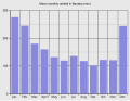
Request: Hello! I want to know if it is possible to extract or to make some graphs and maps from this PDF file. I mean if it is OK to do that, because of the author rights. I need that location map (p. 7), the Mean monthly rainfall graph (Figure 1.2, p. 8), the Mean annual rainfall over Western Kiribati map (Figure 1.3, p. 8), Figure 1.4 and Figure 1.5. If it is possible, it would be great. Thanks in advance, Sebi (talk) 15:53, 26 September 2008 (UTC)
Graphist opinion:
- There is currently nothing suggsting that the images from SOPAC are free from copyright. Sorry. /Lokal_Profil 16:14, 3 October 2008 (UTC)
- OK, I understand that, but the location map can be generated from existing Oceania/Kiribati maps. Thanks, Sebi (talk) 14:15, 6 October 2008 (UTC)
- Has the island geography been updated since 1936? §hep • ¡Talk to me! 14:33, 6 October 2008 (UTC)
- And with the bar graph. Since there wasn't any real data there I made my own. How's that look? §hep • ¡Talk to me! 14:58, 6 October 2008 (UTC)
- Has the island geography been updated since 1936? §hep • ¡Talk to me! 14:33, 6 October 2008 (UTC)
- OK, I understand that, but the location map can be generated from existing Oceania/Kiribati maps. Thanks, Sebi (talk) 14:15, 6 October 2008 (UTC)
Better color? Also, the map in the PDF is pretty much unusable due to quality. Has the island changed since this map? If not, it would be very easy to make a color version. §hep • ¡Talk to me! 21:03, 7 October 2008 (UTC)
- Yes, now it is much better. No, the map has not changed, but I need the location map. Sebi (talk) 12:00, 8 October 2008 (UTC)
- Sorry, I misread your request! I have a location map that is PD. I should be able to upload it later tonight to see if it fits your needs. §hep • ¡Talk to me! 19:09, 8 October 2008 (UTC)
Map of Queluz National Palace
-
 Description of image

Article(s): Queluz National Palace
Request: New map because, it's a old this !! Cancelos (talk) 12:32, 27 September 2008 (UTC)
Graphist opinion:
- Comment To whoever does this one, it's currently used in an imagemap. The source is in the article, of course that can be redone fairly easily so maybe no worries. §hep • ¡Talk to me! 18:18, 28 September 2008 (UTC)
Map of Ratanakiri
-
 I made this crappy thing a while ago

Article(s): Ratanakiri Province
Request: I'd like to have a vector map of Ratanakiri showing the province's physical geography (not administrative divisions, like we have now). The best map I've found is this. There's also this one. If someone could make something based on the first one, that would be great. Please, no administrative divisions. Also, the tourist sites are not needed. What I'd like is a map that shows the rivers, maybe the roads, and the towns. Thanks a million!! Calliopejen1 (talk) 18:58, 27 September 2008 (UTC)
Graphist opinion:
Paul Newman
-

-
Edit 1

Article(s): Paul Newman
Request: trim out unnecessary sky and sharpen image if possible... Chris (クリス • フィッチ) (talk) 12:25, 29 September 2008 (UTC)
Graphist opinion: I was going for face detail so it might be a little sharp heavy. Should it be a tad softer? §hep • ¡Talk to me! 03:16, 30 September 2008 (UTC)
- I also removed the blue hue, I thought it looked out of place. §hep • ¡Talk to me! 16:25, 30 September 2008 (UTC)
- That is so much better! Please upload it over the original! Chris (クリス • フィッチ) (talk) 00:26, 1 October 2008 (UTC)
I just saw this one, I took the liberty of cleaning up all the dust, scratches and other damage as well and uploaded it over the last edit. Please revert it if you don't prefer it. Mfield (talk) 01:06, 1 October 2008 (UTC)
- Thanks! Please upload it over the original! Chris (クリス • フィッチ) (talk) 01:02, 2 October 2008 (UTC)
Serbian Empire

Article(s): Serbian Empire
Request: SVG ification. Example w:sr:Грб Душановог Царства према Илирским грбовницима --Lord Leatherface (talk) 09:03, 30 September 2008 (UTC)
Graphist opinion:
First Balkan War
-
JPG Template:Puic
Article(s): First Balkan War
Request: SVG ification.--Lord Leatherface (talk) 10:24, 1 October 2008 (UTC)
Graphist opinion:
Map for German and British fleet dispositions, 16 Dec. 1916

Article(s): SMS Von der Tann, will eventually be added to others as they are expanded.
Request: SVG-ification, translate legend to English in new version.
Graphist opinion:
Steven Page

Article(s): Steven Page
Request: define head better against dark backdrop... Chris (クリス • フィッチ) (talk) 02:02, 2 October 2008 (UTC)
Graphist opinion:
Making the parsley green/bright
-
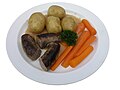 A traditional Danish dish
 -
 Edit
Edit


Article(s): none yet, but Danish cuisine would be appropiate
Request: How do I make the parsley brighter? It is too dark! I have only a little bit of experience with GIMP. Nils Emil (talk) 18:54, 3 October 2008 (UTC)
Graphist opinion: How's this? I may have overdone it a bit (the carrots may be a tad too... colorful :) Fvasconcellos (t·c) 19:39, 3 October 2008 (UTC)
- Hmm, indeed the parsley is better, but rest of the photo now looks weird (sausages too black, carrots too bright). Nils Emil (talk) 21:25, 3 October 2008 (UTC)
- Yep, that's what I thought. Let's try something different—how's this? (Purge your cache if you don't see a difference). Fvasconcellos (t·c) 22:02, 3 October 2008 (UTC)
- It's much better, and indeed usable now. Thanks! May I ask you how you did it? I am making several similar photographs. Nils Emil (talk) 08:03, 4 October 2008 (UTC)
- In GIMP, with the Curves tool. After increasing contrast in the image as a whole, I masked the parsley and worked on the Green channel (again, with Curves) and did a tiny bit of sharpening. Have a look over here for some information on how to use the Curves tool. Best, Fvasconcellos (t·c) 12:51, 4 October 2008 (UTC)
- It's much better, and indeed usable now. Thanks! May I ask you how you did it? I am making several similar photographs. Nils Emil (talk) 08:03, 4 October 2008 (UTC)
- Yep, that's what I thought. Let's try something different—how's this? (Purge your cache if you don't see a difference). Fvasconcellos (t·c) 22:02, 3 October 2008 (UTC)
iPod lineup
-
 Model (make something like this with the new models)
 -
 Or like this, without blurring the screens
 -
 iPod Classic
 -
 iPod nano (only use the front)
 -
 iPod shuffle


Article(s): iPod
Request: Apple announced their new iPod line a week or so ago, and the iPod article is without an image. Unfortunately, we don't have a free iPod Touch 2G pic yet, but in the mean time, I would like a conglomeration (much like the samples above) of the iPods shuffle, nano, and classic (we can add the touch later). I have linked what I think are the best images we have to work with in the gallery, but you can use anything you can find, provided the iPod resembles the ones in the above images (no point in using an old model).
A note about copyright: some users contest that Apple's interface is copyrighted and therefore we must blur the screens. I think this is absurd. It mischaracterizes the iPod, misleads users, and lessens the enc value. The nano is turned off anyway, and the classic (bereft of other iPods) is on the Commons without issue. Make a fair use claim (here, not on Commons), or make the screen look likes it's off (the nano would make a good guide), but don't blur the screen. Ideally, let sleeping dogs lie and worry about making the iPods look nice. Thanks in advance for you patience, understanding, and work.HereToHelp (talk to me) 02:13, 5 October 2008 (UTC)
Graphist opinion:
Smart Telecommunications and TV5 logos
Article(s): Smart Communications and Associated Broadcasting Company
Request: Could you guys, like, vectorize them? I suck at SVG, so maybe if you give these two some TLC... Blake Gripling (talk) 10:29, 5 October 2008 (UTC)
Graphist opinion: These are "Fair use" images. Vectorising them violates the fair use requirement for a low resolution copy since vector can be upscaled to any resolution. They will be deleted. Sorry, no can do. Dhatfield (talk) 15:10, 5 October 2008 (UTC)
- But, I was pretty sure that as long as they were nominally at a low res they were fine. We have plenty of copyrighted SVGs. §hep • ¡Talk to me! 20:03, 5 October 2008 (UTC)
- As well as copyrighted logos lifted off the Brands of The World site... Blake Gripling (talk) 04:16, 6 October 2008 (UTC)
Oeste region
Article(s): pt:Região de Turismo do Oeste, ...
Request: It's this map : http://europedirect.draplvt.min-agricultura.pt/imagens/mapa_regiao_oeste.png
Please Cancelos (talk) 19:55, 5 October 2008 (UTC)
Graphist opinion:I was looking for a different map, and it would help to know where the map is located. Portugal from the looks of it? Also, what article would this go into? Thanks! §hep • ¡Talk to me! 21:12, 6 October 2008 (UTC)
University of East Anglia Shield
Article(s): none, will be used in University of East Anglia once made into SVG
Request: I would greatly appreciate it if someone could make this image into an SVG. Many Thanks! Flaming Ferrari (talk) 15:05, 6 October 2008 (UTC)
Graphist opinion:Requester claimed ownership of a copyrighted logo. Image was deleted, nothing else to do. §hep • ¡Talk to me! 03:22, 9 October 2008 (UTC)
A quick one
-
 From the Fed Board
 -
 SVG
SVG


Articles: United States housing market correction
Request: Please remove the clip art background and make into a normal, sober graph. 68.39.174.238 (talk) 21:11, 6 October 2008 (UTC)
Opinion: I extracted the above from the PDFs, I can't get InkScape to snap the boundaries to the image though. (HELP welcomed with a cookie!) But is this generally what you wanted? §hep • ¡Talk to me! 00:03, 7 October 2008 (UTC)
- Go to "Document properties" (File menu) and click "Fit page to selection". You can keep your cookie.--HereToHelp (talk to me) 01:16, 7 October 2008 (UTC)
- It won't work with this one for me. I have some cracked-out InkScape that won't minimize and only unfreezes when it wants to. If you could do it, feel free to overwrite. §hep • ¡Talk to me! 02:10, 7 October 2008 (UTC)
- Could that SVG be Commonized? 68.39.174.238 (talk) 00:12, 8 October 2008 (UTC)
- Almost forgot. Should be done. §hep • ¡Talk to me! 03:16, 8 October 2008 (UTC)
- Could that SVG be Commonized? 68.39.174.238 (talk) 00:12, 8 October 2008 (UTC)
Universal edit button - PNG to SVG
-
 Universal edit button icon

Article(s): Universal edit button
Request: This icon needs converting into .svg, badly. Please help. If it's done quickly, it'll remain eligible for DYK, and the universal edit button is something that really could do with some widespread awareness and support, as it is an awesome idea. Thanks. fish&karate 07:34, 8 October 2008 (UTC)
Graphist opinion:
- Shouldn't be hard to SVGify, but I'm somewhat concerned about the uncertain attribution chain. Someone really ought to ask John Abbe whether they drew it, or if not, who did, and whether they have a vector version. —Ilmari Karonen (talk) 12:20, 8 October 2008 (UTC)
Scout Wikiproject logo (our own image, so free to tweak)

Article(s): 1500+
Request: Please make the green behind the yellow symmetrical (you can tell it's not), have the hollow trefoil filled in with green (textured like the yellow petals), so that both the boy emblem and the girl emblem have substance, bulk and texture. When I first designed the original, I didn't even think about that, I was trying to simply incorporate both emblems. Now this seems like a natural progression. Chris (クリス • フィッチ) (talk) 01:12, 9 October 2008 (UTC)
- Ps-enlarge stars so they are clearly visible, and remove the black shading behind them. Thanks! Chris (クリス • フィッチ) (talk) 01:16, 9 October 2008 (UTC)
- We generally use this logo on a green background; at smaller sizes the trefoil is very washed out. --—— Gadget850 (Ed) talk - 10:28, 9 October 2008 (UTC)
Graphist opinion:
BBFC U Cert
-
 BBFC U Cert

Article(s): BBFC
Request: There is a lot of noise around the edge of this image. Please could someone remove this noise. Thanks Mangwanani (talk) 18:02, 9 October 2008 (UTC)
Graphist opinion: