
Illustration of the road signs in the Republic of Italy from 1959 to 1992
The illustration of the road signs in the Republic of Italy from 1959 to 1992 shows the road signs in the Republic of Italy as approved by the Italian Road Traffic Act ( Codice della Strada ) in the version of June 15, 1959 by a decree of the President. This road traffic regulation, which has been the longest-lived in Italy to date, remained in force until December 31, 1992. The subsequent new regulations came into effect on January 1, 1993.
After the Second World War , the traffic signs were not rearranged for a long time. As a rule, the requirements of the previous road traffic regulations were adopted and continued. It was not until the new version of 1959 that new rules came into force. They concerned the shape, size and color of the various traffic signs. In addition, a new breakdown of the various classifications has been established:
- warning sign
- Prohibition sign
- Mandatory sign
- Notice signs

The protest of some Italian associations against the introduction of the road traffic regulations of 1959 was one of the reasons for the overthrow of the then Prime Minister Amintore Fanfani (1908-1999). In the course of their long service life, the original requirements for the traffic signs changed. Among other things, the symbols were partially modernized and the signs themselves were given a thin, white border. In 1988, the road traffic regulations, which were initially considered exemplary, were considered completely out of date, as not a single amendment had been published to adapt them to the steadily increasing traffic density.
Colours
The colors were based on the CIE Lab color space established in 1931 . Red and white surfaces should have a reflective effect. The reflective materials had to be heat-resistant, withstand sunlight, and be resistant to winter salt, thermal shock, abrasion and solvents. In particular, the self-adhesive Scotchlite reflective films were used for this purpose. These foils could be purchased in different colors and were 0.2 millimeters thick. They had a smooth surface under which microscopic glass beads were embedded, which caused a self-reflecting effect when the light fell on them. The extensive manufacturing process prevented the film from spreading widely, as the films had to be cut out by hand.
The definition of the specified color standard values followed the CIE standard valence system . Compliance with the color limits for the red and white retro-reflective material should be checked with devices that a bulb had, the filaments of tungsten passed and a white light of 2848 K generated. The minimum temperature should not fall below 2300 K.
typography
The typographical basis was formed by grotesque font styles , which had already been used in the 1920s and which were used in a similar form across Europe. From 1979 a new font found its way into sign making, the Alfabeto Normale with its narrow cut, the Alfabeto Stretto . In 1993 the documents became an official part of the Road Traffic Regulations. The Italian state railway Ferrovie dello Stato also used the new font family from 1982 to 2000. Italy followed typographical efforts to improve legibility at that time. In Germany, among others, at the same time - 1980 - new typographical design specifications were introduced into the road traffic regulations.
Manufacturing
The white and colored areas of the signs had to be reflective, while the black symbols should not have a reflective effect. Advertising - especially neon advertising - was prohibited in connection with traffic signs in order to avoid dazzling vehicles or confusing them with traffic facilities. With the sheet metal versions of the signs, which are typical for Italy , the primer was applied in the plunge pool at the beginning of the 1960s. Then the desired basic color could be sprayed on by hand. The edges were profiled - especially with the round signs - using a press prior to priming . With the later characters, after the introduction of the white border, this profiling was omitted.
Warning signs (Segnali di Pericolo)
The warning signs were in the shape of an equilateral triangle. The background of the shield was white, the border red. The symbols had to appear in black. In their normal size, the long sides of the signs were 90 centimeters long. Smaller versions had to guarantee a length of 60 centimeters. You should warn 150 meters in front of the danger zone. A more detailed list could only be made in cases in which such a distance was not possible. In such a case, the distance had to be indicated on a white, rectangular additional board.

Image 1: Cross channel (Cunetta o dosso)

Image 2: Dangerous curve (Curve Pericolose): a) Right curve (Curva a destra)

Image 3: Dangerous curve (Curve Pericolose): b) Left curve (Curva a sinistra)

Image 4: Dangerous curve (Curve Pericolose): c) Double curve - initially on the right (Doppia curva la prima a destra)

Image 5: Dangerous curve (Curve Pericolose): d) Double curve - initially on the left (Doppia curva la prima a sinistra)

Image 6: Crossing (Incrocio)

Photo 7: Right of way (Incrocio con una strada senza diritto di precedenza)

Image 8: Level crossing (Passenger a livelli): Barrier level crossing, (Passenger a livelli con barriere)

Image 9: Level crossing (Passenger a livelli): Unlocked level crossing (Passenger a livelli senza barriere)

Figure 10 a: Level crossing (Passage a livelli): Warning cross (Croce di S. Andrea)

Fig. 11 a: Level crossing (Passenger a livelli): double warning cross for multi-track level crossing (Doppia croce di S. Andrea)

Figure 14: Dangerous slope (Discesa pericolosa)

Figure 15: Bottleneck (Strettoia), 1960

Figure 15: Bottleneck (Strettoia)

Figure 16: Movable bridge (Ponte mobile)

Photo 17: Construction site (Lavori)

Image 18: Risk of skidding (Strada sdrucciolevole), 1960

Image 18: Risk of skidding (Strada sdrucciolevole)

Figure 19: Pedestrian crossing (passaggio per pedoni)

Photo 20: Children (Bambini)

Figure 21 a: Deer crossing (Animali selvatici)

Figure 21 b: Animals (Animali)

Figure 22: General danger point (Pericolo generico)

Fig. 23 a Pay attention to the right of way! (Dare precedenza)

Photo 25: Two-way traffic (Doppio senso di circolazione)

Figure 26 a: Traffic flow from the right (Confluenza a destra)

Figure 26 b: Traffic flow from the left (Confluenza a sinistra)


Prohibition sign (Segnali di divieto)
The disc-shaped prohibition and mandatory signs had a diameter of 60 centimeters, with the exception of the stop sign and the sign for the prohibition of overtaking and the lifting of the prohibition to overtake, smaller versions had to be 40 centimeters. To lift the prohibition or mandatory sign, the sign had to be set up again. But then with an additional white board on which the word FINE (end) appeared in black letters . The additional panels had to have maximum dimensions of 45 × 25 meters and minimum dimensions of 40 × 20 meters.
Art. 53: General (Caratteristiche generali)
a) Prohibition signs (Segnali di divieto)

Photo 27 a: No right turns (Divieto svolta a destra)

Photo 27 b: No left turns (Divieto svolta a sinistra)

Fig. 28: Prohibition of passage in both directions (Divieto di transit nei due sensi)

Fig. 29: Prohibition of entry (Divieto di accesso)

Photo 30: No U-turn (Divieto di inversione)

Figure 31 a: No overtaking for vehicles of any kind (Divieto di sorpasso per tutti gli autoveicoli)
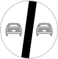
Fig. 31 b: End of the ban on overtaking for vehicles of all kinds (Fine del divieto di sorpasso per tutti gli autoveicoli)

Figure 32 a: No overtaking between trucks (Divieto di sorpasso fra gli autotreni)
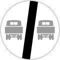
Fig. 32 b: End of the ban on overtaking between trucks (Fine del divieto di sorpasso tra autotreni)

Fig. 33: Ban on carts (Transito vietato ai veicoli a trazione animale)

Figure 34: Prohibition for pedestrians (Transito vietato ai pedoni)

Photo 35: Ban on bicycles (Transito vietato alle biciclette)

Figure 36: Ban on motorcycles (Transito vietato ai motocicli)

Figure 37: Ban on hand vehicles (Transito vietato ai veicoli a braccia)

Figure 38: Prohibition for all vehicles (Transito vietato agli autoveicoli)

Figure 39: Ban on buses and coaches (Transito vietato agli autobus)

Photo 40: Prohibition for trucks (Transito vietato agli autocarri)

Fig. 41: Prohibition for vehicles with a total width of ... meters (Transito vietato ai veicoli aventi larghezza superiore a ... metri)

Figure 42: Prohibition for vehicles whose total height exceeds… meters (Transito vietato ai veicoli aventi altezza totale superiore a… metri)

Fig. 43: Prohibition for vehicles that weigh more than ... tons with a full load weight (Transito vietato ai veicoli aventi un peso a pieno carico superiore a ... tonn.)

Figure 44: Prohibition for vehicles with an axle load of more than ... tons (Transito ai veicoli aventi peso per asse superiore a ... tonn.)

Figure 45 a: Maximum permitted speed (Limitazione di velocità)

Figure 45 a: Maximum permitted speed (Limitazione di velocità)

Figure 45 a: Maximum permitted speed (Limitazione di velocità)

Image 45 b: End of the permitted maximum speed (Fine della limitazione di velocità)

Image 45 b: End of the permitted maximum speed (Fine della limitazione di velocità)

Image 45 b: End of the permitted maximum speed (Fine della limitazione di velocità)

Figure 46: Ban on acoustic signals (Divieto di segnalazioni acustiche)
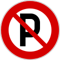
Image 47: No parking (Sosta regolamentata)

Image 48: No stopping (Sosta vietata)

Image 49 a: No stopping on alternating days (Sosta vietata a giorni alterni)

Image 49 b: No stopping on alternating days (Sosta vietata a giorni alterni)

Photo 50: Stop! Respect the right of way! (Arresto all'incrocio), 1960

Photo 50: Stop! Respect the right of way! (Arresto all'incrocio)

Photo 50: Stop! Respect the right of way! (Arresto all'incrocio), 1975-1992

Photo 52: Stop signs at police checkpoints (Alt-Polizia)


b) Mandatory signs (Segnali di Obbligo)

Fig. 53: Obligation to stop bus buses on mountain roads. (Obbligo di arresto all'incrocio con autobus di linea su strade di montagna)

Fig. 54 b: Prescribed driving direction - right (Direzione obbligatoria a sinistra)

Photo 57: roundabout; Mandatory direction of travel: Right (Rotatoria)

Photo 59: Cycle path (Pista ciclabile)

Photo 60: Pedestrian path (Viale pedonale)

Photo 61: Bridle path (Riservato ai quadrupedi)

Figure 62: Motorcycles (Motopista)

Fig. 63: Motorway (Riservato alle autovetture)

Figure 64: Prescribed minimum speed (Limite minimo di velocità)

Figure 65: Priority over oncoming traffic (Precedenza nei sensi unici alternati)


.svg)


Indicative signs (Segnali di indicazione)
a) Signs for quick orientation (Segnali di indicazione semplice)

Fig. 66 a: Parking lot (Parcheggio). The square sign is usually 60 centimeters long, at least 40 centimeters. Should it be necessary to add arrows for orientation, the sign had a size of 90 × 60 meters or 60 × 40 meters.

Image 67: Hospital (Ospedale)

Figure 78: End of traffic in both directions (Fine del doppio senso di circolazione)

Picture 84: Semaforo a ... m. The sign should have a size of 80 × 140 centimeters.

Photo 85: Taxi stand (taxi)

Image 89: Passing through with snow chains or winter tires (Transito con catene o pneumatici da neve)

Fig. 91: Forest fire risk (Foresta facilmente infiammabile). This sign could be arranged according to the situation.


b) Signpost before crossings (Segnale di preavviso di bivio)
Signposts had to be set up at a distance of between 100 and 250 meters before the intersection. A greater distance had to be chosen, especially on motorways. Depending on the importance of the announced place, its name could be displayed in bold and larger. The signs were 1000 × 1500 millimeters in size, the white border 15 millimeters wide. The larger font was to be displayed 160 millimeters high. Their font weight was 25 millimeters. With the smaller font, the letters were 120 millimeters high and the font weight was 15 millimeters.

Fig. 84 a

c) Signpost (Segnali di direzione)
d) place-name signs (Segnali di località)
e) Direction indicators (Segnali di conferma)

Fig. 82 a: One-way street pointing to the right (Senso unico a destra). The sign should normally have a size of 80 × 25 centimeters.

Fig. 82 b: One-way street pointing left (Senso unico a sinistra)
f) Road marking signs (Segnali di identificazione stradale)
g) Signs for priority roads (Segnali di inizio, ripetizione e fine del diritto di precedenza)

Fig. 99 a: Right of way (Strada con diritto di precedenza deve essere usato per indicare l 'inizio di una strada, al cui traffico e' accordato il diritto di precedenza)

Fig. 99 a: End of the priority road (Fine del diritto di precedenza)


h) tourist signs (Segnale turistico)
literature
- Il codice della strada. Testo Unico e Regolamento con tutte le tavole a colori dei segnali stradali. Edizione ufficiale adottata dal Ministero dell'Interno e dal Ministero dei Lavori Pubblici. Edizioni Vito Bianco, Roma 1959
Web links
Remarks
- ↑ Massimario amministrativo. Raccolta annotata delle Massime, delle Decisioni e della Corte Costituzionale, della Corte di Cassazione, del Consiglio di Stato, della Corte dei Conti, del Tribunale Superiore delle Acque Pubbliche e del Consiglio di Giustizia Amministrativa per la Regione Siciliana. A cura di R. Chieppa, L. Conte ecc. Anni II-IV. Giuffrè. Milano 1962, p. 161.
- ↑ Rivista giuridica dell'edilizia . Giuffrè, 1993, p. 461.
- ^ Klaus von Beyme : The parliamentary systems of government in Europe. Piper, Munich 1970, p. 829.
- ↑ Pointless chatter. End the frenzy on Italy's autostradas - until September 11th. In: Der Spiegel. 31, 1988, p. 130.
- ↑ Codice della strada , 1959, Article 184
- ↑ Industry reports: Scotchlite reflective film for sea mark purposes In: Hansa. Central organ for shipping, shipbuilding, harbor , 94, 29/30, 1957, p. 1640, published weekly .
- ↑ Eberhard Lendle: The production of traffic signs with the help of the screen printing process. In: Druck - Print. Archive for printing technology 12/1969, Keppler, Heusenstamm 1969, p. 990.
- ↑ Codice della strada , 1959, Article 191
- ^ Lex, legislazione italiana. Raccolta cronologica con richiami alle leggi attinenti e ricchi indici semestrali ed annuali. Part 1, Unione Tipografico-Editrice Torinese, Turin 1993, p. 169 ff .; here: p. 233.
- ↑ P. Krieg: Design and execution of traffic signs and testing of durability. In: Straße und Autobahn , 4, 1980, pp. 196-200; here: p. 196.
- ↑ a b Codice della strada , 1959, Article 35
- ↑ Codice della strada , 1959, Article 20
- ↑ Codice della strada , 1959, Article 53
- ↑ Codice della strada , 1959, Article 78
- ↑ Codice della strada , 1959, Article 81
- ↑ a b c Codice della strada , 1959, Article 84
- ↑ Codice della strada , 1959, article 85; Dimensions see illustration.
- ↑ Codice della strada , 1959, Article 83
- ↑ Codice della strada , 1959, Article 90