Scagnostics
Scagnostics (from English Scatterplot diagnostics ) describes a series of measures that identify certain properties of a point cloud in a scatter diagram , which occur more frequently in practice. The term was coined by John W. Tukey and Paul A. Tukey and later worked out by Wilkison, Anand and Großmann. The following nine measures are considered:
- For the outliers in the data:
- Outlier proportion (outlying)
- For the density of the data points:
- Skewed
- Clumpy
- Sparse (sparse)
- Striated
- For the shape of the point cloud:
- Convexity (convex)
- Thinness
- Fibrousness (stringy)
- For a context in the data:
- Monotonicity
Tukey's idea
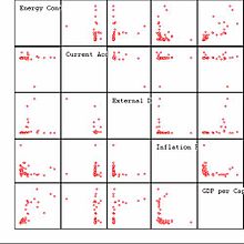
One way to visualize a multivariate data set with variables is a scatter plot matrix ; see the example on the right for five variables. The disadvantage of this representation is that the diagram may only contain a few variables, otherwise it will be confusing and data structures can hardly be recognized. The idea of the Tukey brothers was to reduce the problem of scatter plots to a smaller number of scatter plots for the measures. The coefficients of the scatter diagrams can then be displayed again in a scatter diagram matrix and the scatter diagrams of the data that show unusual values of the coefficients can be picked out using linking methods.
The Tukey brothers used different coefficients, e.g. B. Dimensions based on a "peeled" convex envelope of the data (area, diameter), on closed contour lines of the estimated density function (area, diameter, modality, convexity), non-linear principal curves , etc. With this they wanted special features of the point clouds in relation reveal on the density of the data, shape, direction, etc.
However, their metrics had a couple of issues:
- Some of the measures had a computational complexity of order ( number of observations in the data set), which made them unsuitable for data sets with many observations.
- It was implicitly assumed that for every pair of variables there was a bivariate continuous density function. In practice, however, many variables are discrete (or classified).
Calculation of the coefficients
To avoid these problems, Wilkinson, Anand and Grossman have chosen graph-theoretic approaches for the calculation of the measures :
- A Delaunay triangulation of the data and a minimal spanning tree based on it ; see graphic on the right. In a minimal spanning tree, all data points are connected with their neighbors in such a way that a graph of minimal length is created that includes all data points.
- The convex hull of the data points, which results as the outer edges in the graphic on the right.
- The shape of the data points. It results from the boundaries of the triangles of the Delaunay triangulation, the circumference of which has a radius . In contrast to the convex hull, the shape can also lead to holes. is the 90% quantile of the edge lengths of the minimum spanning tree.
Since outliers in the data can have a strong influence on the measures, these were based on robust methods on the one hand (as was the case with the Tukey brothers) and on the other hand they were excluded from the triangulation. Furthermore, the metrics were chosen so that the calculation did not exceed the complexity. Binning was used to speed up the calculation . H. data points that were close together were grouped together.
All dimensions are in the interval from zero to one. In order to achieve this, all variables of the data set are rescaled to the interval in a first step :
- .
The following measures are then calculated with the rescaled data.
Outlier percentage
First the 25% quantile and the 75% quantile of the edge lengths in the minimum spanning tree (MST) are calculated . Edges whose length is greater than are marked as long edges.
This is a measure of the proportion of long edges on all edges in the MST and
Crookedness
The 10% quantile , the 50% quantile and the 90% quantile of the edge lengths are calculated in the MST.
This is a robust measure of the skewness of the distribution of the edge lengths in the MST. This gives information about the relative density of the data points.
Lumpiness
A skewed distribution of the edge lengths in the MST does not necessarily mean that the data are broken down into subgroups. For this reason, a measure of the lumpiness is defined: If one edge is removed from the MST, then the MST breaks down into two subgraphs. The longest edge is now sought in the smaller of the two subgraphs:
The measure is close to one if z. B. a (long) edge between two clusters is removed. Within a cluster, the distances are small so that the ratio is close to zero and therefore becomes large.
Scarcity
Sparse is defined as the 90% quantile of the edge lengths of the MST:
Stripedness
Here all edges of the Delaunay triangulation are considered. If two adjacent edges have an angle of more than 138.5 degrees (more precisely:) then they are referred to as "streaked".
convexity
To assess the convexity of the data, the area of the shape is compared with the area of the convex hull:
Thinness
The shape is used to check how “thin” the data points are distributed
This is a standardized measure. If the shape is a circle then it turns out to be zero.
Fibrousness
The fibrousness tests whether the MST consists of a continuous path, i.e. H. has no branches. To do this, the diameter of the MST is determined as the length of the longest continuous path.
If the MST has no branches, the result is a value of one.
monotony
To see a trend in the data, Spearman's rank correlation coefficient is used:
example
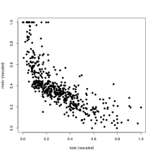
The right graphic shows the mean house price (medv) for each district as a function of the proportion of the lower class population (lstat) of the Boston Housing data . The following Scagnostics measures were calculated and the results compared with the example data sets above.
| = 0.1459 | The value almost approaches the maximum value of the sample records. This indicates some outliers in the data; in fact, there are large gaps between the data points on the right edge. | |
| = 0.7755 | Here, too, the maximum value of the sample data sets is almost reached. You can clearly see in the data a central region in which the data points are denser and less dense outside. | |
| = 0.0322 | This value is relatively small. The data also does not break down into individual clusters. | |
| = 0.0353 | The value is still below the smallest value in the example data records. I.e. the data cover only part of the total area. | |
| = 0.0463 | The value is at the lower limit of the sample data sets. A clear, streaky structure cannot therefore be seen. | |
| = 0.3501 | The value is in the middle of the sample data sets. This value occurs in the example data records especially in the case of non-linear relationships. | |
| = 0.5833 | This value is also in the middle of the sample data sets. This indicates a structure that suggests a relationship between these variables. | |
| = 0.3557 | This value is at the bottom of the sample records. There is no smooth structure in the data; H. the data set contains some variation. | |
| = 0.7484 | This value is at the top of the sample records. Since there is a clear relationship between the two variables this is not surprising. |
In summary, it can be said: This scatter diagram contains a clear non-linear relationship with presumably greater scatter. The data break down into a more central dense region and a less dense outer region that contains some outliers.
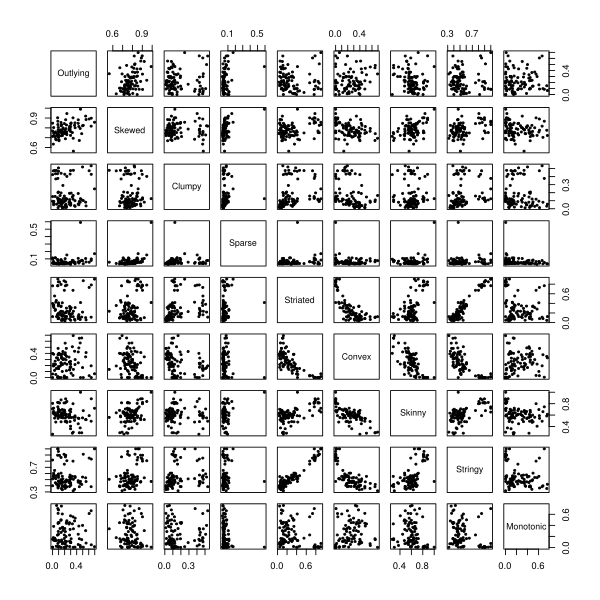
The Boston Housing data consists of 14 variables, so there are 91 scatter plots to look at. The following scatter diagram matrix shows the nine measures for the 91 scatter diagrams. E.g. at Sparse an extreme value is noticeable. This is the scatter plot of the variable Charles River Index with two characteristic values (district borders the Charles River or not) and the index of access to the radial highways with eight characteristic values. I.e. all observations in the scatter plot of these two variables need to focus on 16 points!
Web links
- R package scagnostics
Individual evidence
- ^ Leland Wilkinson, Anushka Anand, Robert Grossman: High-Dimensional Visual Analytics: Interactive Exploration Guided by Pairwise Views of Point Distributions . In: IEEE Transactions on Visualization and Computer Graphics . tape 12 , no. 6 , 2006, p. 1363-1372 , doi : 10.1109 / TVCG.2006.94 .
- ↑ JW Tukey, PA Tukey: Computer graphics and exploratory data analysis: An introduction . In: National Computer Graphics Association (Ed.): Proceedings of the Sixth Annual Conference and Exposition: Computer Graphics85 . tape III . Fairfax, VA. 1985.
- ^ Leland Wilkinson, Anushka Anand, Robert Grossman: Graph-Theoretic Scagnostics . In: Proceedings of the 2005 IEEE Symposium on Information Visualization . 2005, p. 157–164 , doi : 10.1109 / INFOVIS.2005.14 ( psu.edu [PDF; accessed October 6, 2012]).


![[0; 1]](https://wikimedia.org/api/rest_v1/media/math/render/svg/bc3bf59a5da5d8181083b228c8933efbda133483)


