
Warm color

Warm colors are yellow, orange and red, but also brown, ocher and gold. Most perceive red as the warmest color. Warm colors have a pleasantly warming to dramatically hot effect on a viewer.
evolution
Red plays a role in three important areas in human history: food procurement, blood and fire.
- First of all, the procurement of food should be mentioned. Edible fruits are red to stand out in the green surroundings. People can recognize the energy-rich food more easily and the fruits need to be eaten in order to spread and reproduce over a large area.
- The most important aspect regarding the warming effect of red is the blood . Blood plays an important role in hunting, war and accidents. The highest level of attention, quick reaction, strength, strength and often aggression are required here. It also shows the importance of blood in reproduction . The reddening is a sign of sexual arousal or readiness. Blood leaks from the body during menstruation or childbirth. Overall, humans have greater chances of survival if they react to red.
- Other factors are the fire and the sun . Both donate light and warmth. This should actually make the colors yellow and orange look particularly warm. But on the one hand, red is the first and most important color that humans can perceive. On the other hand, the effect of blood is so drastic that the red has been able to prevail physiologically and anthropologically over yellow and orange.

Influence of individual experience
Every child knows that the yellow-red flames of the candle and the fire stand for hot, but with sufficient distance for cozy warmth. But it is much more common these days that children come across all sorts of colors in toys, picture books and clothing, often in any context. And the effect of the colors is far too spontaneous for everyone to be the result of an individual learning experience. So it is likely that the genetic influence caused by evolution is decisive for the color effect of red and blue. However, there are individual differences in terms of the rating. So one can find the warmth pleasant and comfortable, while the other associates it with a feeling of threat, confinement and oppression. Overall, it can be said that the temperature effect of red represents synaesthesia that is widespread worldwide , but that there are temporal, individual and cultural variations.
physiology
Scientists often investigate the effects of warm and cold colors in so-called color space experiments . Harry Wolfarth (1921–1996) from the University of Alberta in Canada found a significant increase in the pulse and respiratory rate of test subjects with red body colors, on the other hand a decrease in blue colors. The color psychologist and physiologist Heinrich Frieling (1910–1996) demonstrated that test subjects perceive a red room to be at least 4 ° C warmer than a blue one. The physiological responses are stronger in men than in women. This can possibly be explained with the phylogenetic development of humans. Men were mostly leaders and protectors of their horde. As such, they required not only physical strength, but also quick and precise reactions to changes in color in the environment.
physics
In the spectrum of the electromagnetic waves, the invisible infrared (ultrared, thermal radiation) is located directly after the long-wave, red area . The absorption of infrared light leads almost exclusively to the conversion of the radiant energy into heat, so that infrared triggers a considerable sensation of heat. However, the reflectivity only depends on the material (e.g. canvas, wallpaper, wall) and not on the color. No physical influence of the color red or blue can be demonstrated. Whether a room or a canvas is painted red or blue has no influence on the measurable temperature.
Color psychology
The warm effect of red is mainly shaped by the human primal experience with blood, i.e. with reproduction, hunting, war, victims and accidents. Even if the contact with red blood is extremely low compared to then, the effect remains the same. Red stands for adventure, activity, attention, dynamism, strength, passion, love, temperament, but also for aggression, danger, hate, belligerence, anger and anger. The findings of color psychology are used in many areas, especially in the advertising industry.
Use in everyday life
We associate red with danger and warning . For example, stop signs around the world are red with white lettering. Red traffic lights, red barriers, prohibition signs and warnings mark "Halt!", Danger and vigilance. Sales strategists use the strong signal effect with special offers and discount campaigns. Even if there is no danger to life here, the customer is asked to stop immediately and take action. On the other hand, red stands for love and passion . A red sports car looks even sportier, faster and stronger than a model of a different color, and lips with red make-up look more erotic than natural ones. Red chocolate hearts inspire on Valentine's Day. The best example of all is the reddest product in the whole world: CocaCola. The lemonade is considered a pick-me-up and energy drink. At the same time, the brand promotes community and social issues, for feelings that are shared with family and friends. In the living area, bright red tones look exciting, lively and young. However, there is a risk that they appear too aggressive, pushy and over-the-top. Mostly dark, light or muted red tones are more suitable for living rooms, as they look cozy and warm.

The stop sign in Malaysia is understandable worldwide thanks to its red color and octagonal shape.

A red sports car looks faster and stronger than a model of a different color.

The world-famous red lemonade is an energy drink and pick-me-up.


Use in art
In art, too, there are largely two poles in the use of red. The effect can be moderately warm and pleasant or overheated and exciting. A shade of red illustrates, for example, a loving, protective mother-child relationship or a sublime, majestic moonrise. A bright yellow and orange illustrates the blazing danger and power of a fire and a bright red illustrates the ecstasy and passion of a dance.
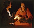
Warm motherly love: George de la Tour: The Newborn, 1645–1648.

Idyllic moonlight: Caspar David Friedrich: Mountainous river landscape at night, between 1830 and 1835.
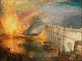
Dangerous and attention-grabbing fire: Joseph Mallord William Turner: The Fire in the Houses of Parliament, 1834 or 1835.

.jpg)

Individual evidence
- ↑ Monika Krüger: The temperature effect of colors in the fine arts. A search for the origins and the functionality of the warm-cold contrast . 1st edition. Der Other Verlag, Osnabrück 2003, ISBN 3-89959-141-0 , p. 53 and 54 .
- ↑ Monika Krüger: The temperature effect of colors in the fine arts. A search for the origins and the functionality of the warm-cold contrast . 1st edition. Der Other Verlag, Osnabrück 2003, ISBN 3-89959-141-0 , p. 101 .
- ↑ Max Jürgen Kobbert: The book of colors . 2nd Edition. Scientific Book Society, Darmstadt 2019, ISBN 978-3-8062-3920-1 , p. 167 .
- ↑ Ruth Hampe: Picture ideas. An art and cultural psychological examination of pictorial formations . Verlag an der Lottbek, Peter Jensen, Munich 1990, ISBN 978-3-926987-35-8 , p. 14 .
- ↑ Max Lüscher : Lüscher Test . Testverlag, Basel undated
- ^ Heinrich Frieling, Else Lieselotte Browers, Sigrid Lechner-Knecht: Vibrant Color. About the use of colors and their power . Musterschmidt KG, Göttingen 1974, ISBN 978-3-7881-4033-5 , p. 18 .
- ↑ Monika Krüger: The temperature effect of colors in the fine arts. A search for the origins and the functionality of the warm-cold contrast . 1st edition. Der Other Verlag, Osnabrück 2003, ISBN 3-89959-141-0 , p. 51 .
- ↑ Gisela Gniech, Michael Aurel Stadler: The color psychology for all . 1st edition. Donat Verlag, Bremen 2000, ISBN 3-931737-75-6 , p. 31 .
- ↑ Monika Krüger: The temperature effect of colors in the fine arts. A search for the origins and the functionality of the warm-cold contrast . 1st edition. Der Other Verlag, Osnabrück 2003, ISBN 3-89959-141-0 , p. 19, 20 and 28 .
- ↑ Monika Krüger: The temperature effect of colors in the fine arts. A search for the origins and the functionality of the warm-cold contrast . 1st edition. Der Other Verlag, Osnabrück 2003, ISBN 3-89959-141-0 , p. 108 .
- ↑ Associations with individual colors with examples. In: Colors and Life - Online. The portal for colors and color effects. Retrieved on March 25, 2020 (German).
literature
- Monika Krüger: The temperature effect of colors in the fine arts. A search for the origins and the functionality of the warm-cold contrast . 1st edition. The other publishing house, Osnabrück 2003, ISBN 3-89959-141-0 .
- Max Jürgen Kobbert: The book of colors . 2nd Edition. Wissenschaftliche Buchgesellschaft, Darmstadt 2019, ISBN 978-3-8062-3920-1 , pp. 160-173.
- Hans Gekeler : DuMont's handbook of colors. DuMont, Cologne 1988, ISBN 3-7701-2111-2 , pp. 130 ff.
- Bridget Bodoano: Living with color . Callwey Verlag, Munich 2008, ISBN 3-7667-1744-8 .
