
G.I. Joe (comics) and Wikipedia:Graphics Lab/Illustration workshop: Difference between pages
No edit summary |
Chromenano (talk | contribs) No edit summary |
||
| Line 1: | Line 1: | ||
{{Wikipedia:Graphic Lab/Image workshop/top}} |
|||
{{Articleissues|original research=August 2007|tone=August 2008}} |
|||
Since its debut in 1982, the [[comic book]] history of [[G.I. Joe]] has seen three separate publishers and four main-title series, all of which have been based on the [[Hasbro]] toyline of the same name. The first series was produced by [[Marvel Comics]] between 1984 and 1994, running for 155 issues and spawning several spin-off titles through out the course of its run; the second series was a short-lived run published by [[Dark Horse Comics]] in 1996; the third and fourth series were published by [[Devil's Due Productions]] from 2001 to 2008. The fifth series will be published by [[IDW Publishing]] starting in October 2008. |
|||
__NEWSECTIONLINK__ |
|||
==Marvel Comics== |
|||
===A Real American Hero (Main series)=== |
|||
Hasbro relaunched their G.I. Joe franchise with [[G.I. Joe: A Real American Hero]]. It was supported by a Marvel Comics series. It was unique at the time in that it was a comic book series that was promoted on [[television]] commercials which also supported the toy line. This 155-issue series is considered to be one of the longest-running [[comic book]] tie-ins to a toy line. Much of its success is to be credited to [[Larry Hama]], who wrote the entire series save for a few issues with guest writers. Rather than treating the stories as a mere promotion for the toys, Hama wrote the series with seriousness and infused it with doses of realism, humor, and drama. Other than [[Transformers (comic)|Transformers]], no other series was able to duplicate its success. Notable artists include [[Herb Trimpe]], [[Ron Wagner]], [[Rod Whigham]], and [[Marshall Rogers]]. |
|||
<div style="display:block; float:left; width:100%;"> |
|||
Issue #21 became a fan-favorite, not only because the [[Cobra Organization|Cobra]] ninja [[Storm Shadow (G.I. Joe)|Storm Shadow]] was introduced, but that issue also became a prime example of comics' visual storytelling power, having no dialogue or sound effects. |
|||
__TOC__ |
|||
<br /> |
|||
[[Category:Non-talk pages that are automatically signed]] |
|||
[[de:Wikipedia:Bilderwerkstatt]] |
|||
A number of differences existed between the comic book and the animated TV series. Certain characters who were very prominent in the comic book, such as [[Stalker (G.I. Joe)|Stalker]], were featured very little in the cartoon, while characters who were less prominent in the comic book, such as Shipwreck, were very prominent in the cartoon series. Another difference was that in the comic book featured a romance between [[Scarlett (G.I. Joe)|Scarlett]] and [[Snake-Eyes (G.I. Joe)|Snake-Eyes]], whereas in the cartoon, a romance between Scarlett and [[Duke (G.I. Joe)|Duke]] was hinted at instead (most likely due to the differences between writing for a comic book audience and writing for an animated series). The most notable difference between the comic and the cartoon, however, is in its handling of combat. While the cartoon showed that nearly every soldier in every battle survived (for example, many shots of different aircraft being shot down were shown to have its pilot escape in a parachute), the comic did not shy away from mass character deaths. |
|||
[[fr:Wikipédia:Atelier graphique/Images à améliorer]] |
|||
[[es:Wikiproyecto:Ilustración/Taller gráfico/Peticiones]] |
|||
[[it:Progetto:Laboratorio grafico/Immagini da migliorare]] |
|||
<!-- |
|||
Shortly after the final issue (which was released in December 1994), a ''G.I. Joe Special'' #1 was released, with alternate art for issue #61 by [[Todd McFarlane]]. The first 37 issues were also released in 13 digests. In 2001, with the success of Devil's Due Comics run of ''G.I. Joe'', Marvel Comics collected the first 50 issues in five trade paperbacks, with ten issues in each book. All covers for the trade paperbacks were drawn by [[J. Scott Campbell]]. Marvel will not publish the rest of the series, because Hasbro has purchased the rights to the comics. Hasbro has since released reprints of some issues with some of their action figures. |
|||
====G.I. Joe Yearbooks==== |
|||
The four ''Yearbooks'' (1985-1988) collected some previous stories, summarized events, etc. and, aside from the first ''Yearbook'', published new stories that tied into current events in the main title. |
|||
====G.I. Joe: Special Missions==== |
|||
The success of the main title lead Marvel Comics to produce a secondary title, ''G.I. Joe: Special Missions'' which lasted 28 issues, with Herb Trimpe as the artist for nearly the entire run, with Dave Cockrun providing pencils on several issues. Spinning out of issue #50 of a story in the main title, the series featured more intense violence and a more ambiguous morality than the main title, while the enemies were conventional terrorists as well as Cobra itself. The first four issues, as well as the backup story from issue #50 of the main title, were later republished as a trade paperback. |
|||
====G.I. Joe: Order of Battle==== |
|||
''Order of Battle'' was a four-issue comic series that reprinted the data found on the action figures' [[file card]]s with some edits and all-new artwork of G.I. Joe characters by Herb Trimpe. Published in 1987, the first two issues featured G.I. Joe members while the third issue focused on the [[Cobra Organization]], and the fourth featured various vehicles and equipment used by both organizations. The second issue caused some controversy when it erroneously listed [[Sylvester Stallone]]'s [[Rocky|Rocky Balboa]] character as a member of G.I. Joe. While negotiations had taken place, concerning the character's membership on the team, the deal had fallen through.<ref>[http://www.yojoe.com/archive/unproduced/rockybalboa.shtml YOJOE.COM | Sculpt: Rocky Balboa<!-- Bot generated title -->]</ref> The third and fourth issues contained a retraction stating that Rocky Balboa was not and had never been a member of G.I. Joe. The [[trade paperback]] edition of the series removed mention of the Rocky character entirely. |
|||
====Tales of G.I. Joe==== |
|||
''Tales of G.I. Joe'' reprinted the first fifteen issues of G.I. Joe on a higher quality paper stock than that used for the main comic. |
|||
--------- requests start from here ----------------------> |
|||
====Foreign language versions==== |
|||
G.I. Joe was published in a number of languages, sometimes by local publishers. Issues were translated into [[German language|German]], [[Spanish language|Spanish]], [[Portuguese language|Portuguese]], [[Polish language|Polish]], [[Canadian French|French (Canada)]], [[Swedish language|Swedish]], [[Norwegian language|Norwegian]], [[Finnish language|Finnish]], [[Japanese language|Japanese]], [[Arabic language|Arabic]] and other languages. |
|||
===Alternate universes=== |
|||
====G.I. Joe and the Transformers==== |
|||
A four issue limited series that teamed-up the Joes with the other popular property of the 1980s, [[Transformers (comic)|Transformers]]. The Joes and the [[Autobots]] must join forces to stop the [[Decepticons]] and Cobra from destroying the world. The story suffered from the need to have the events of the limited series reflect the events of the main G.I. Joe and Transformers titles published by Marvel Comics at the time. However, while there were references in the Transformers ongoing series to the events of the limited series, the G.I. Joe ignored it completely, as writer Larry Hama didn't consider it to be [[Canon (fiction)|canon]], though towards the end of the ongoing G.I. Joe series several Transformers characters appeared in the G.I. Joe title as a prequel for the upcoming ''[[Transformers: Generation Two]]'' comic. The issues made reference to the limited series. A trade paperback later collected all four issues. |
|||
====Action Force and G.I. Joe: European Missions ==== |
|||
''[[Action Force]]'' was the [[United Kingdom|British]] counterpart to the 3 3/4-inch G.I. Joe toyline. The Action Force comic was launched by [[Marvel UK]] in 1987, publishing original strips as well as modified reprints of the U.S. comic, with the team renamed "Action Force". The title lasted fifty issues before merging with Marvel UK's ''[[The Transformers (Marvel comic)#UK title|The Transformers]]'' in early 1988. The ''Action Force'' comic also included a tie-in story for the UK release of ''[[G.I. Joe: The Movie]]''. |
|||
== A simple equation == |
|||
Later in 1988, a second series, ''Action Force Monthly'', was launched due to [[Marvel UK]]'s decision to produce comics in the American monthly format, and ran for fifteen issues before it was cancelled. The ''Action Force Monthly'' title was published in the U.S. as ''G.I. Joe: European Missions'', which kept all of the dialogue from the UK version without attempting to incproporate the reprinted stories into the continuity of the U.S. ''G.I. Joe'' comic. |
|||
{{resolved}} [[Special:Contributions/68.39.174.238|68.39.174.238]] ([[User talk:68.39.174.238|talk]]) 00:27, 3 September 2008 (UTC) |
|||
<center> |
|||
<math>14\sqrt{x}+|15|=|71|\,\!</math> |
|||
{{Double image stack|center|First Equation Ever.png|First Equation Ever.svg|200}} |
|||
After the cancellation of ''Action Force Monthly'', the U.S. ''G.I. Joe'' comic was reprinted in Marvel UK's ''The Transformers'' comic as a back-up feature, with the dialogue kept intact, until it was dropped in 1991. |
|||
</center> |
|||
'''Articels:''' [[Equals sign]] |
|||
==Blackthorne Publishing== |
|||
Blackthorne Publishing released six bi-monthly issues of G.I.Joe in 3-D and one annual. These issues were meant to be read with [[3-D glasses]]. The stories didn't contradict the previous Marvel ongoing series, but wasn't considered canon. Blackthorne also published three "How to draw G.I. Joe" issues. |
|||
'''Request:''' SVGify this equation, so that it can be displayed as part of a {{tl|double image stack}} alongside the original (hard to read by modern eyes) equation. [[Special:Contributions/68.39.174.238|68.39.174.238]] ([[User talk:68.39.174.238|talk]]) 22:30, 1 September 2008 (UTC) |
|||
==Dark Horse Comics== |
|||
In 1996, the G.I. Joe toyline was relaunched with the ''[[G.I. Joe Extreme]]'' series. [[Dark Horse Comics]] acquired the rights to publish comics based on the G.I. Joe Extreme property. The first series was a four-issue limited series that was written by [[Mike W. Barr]] and drawn by [[Tatsuya Ishida]] and introduced the main characters. The ongoing ''G.I. Joe Extreme'' series that was launched afterwards dropped the word "Extreme" from the title. The ongoing series lasted four issue before being canceled, although Dark Horse referred to the title as being on hiatus. |
|||
'''Oppinion:''' How's this? [[User:Debate|<font color="550000">Debate</font>]] [[User talk:Debate|<font color="8b9b74">'''木'''</font>]] 09:31, 2 September 2008 (UTC) |
|||
==Benchpress Comics== |
|||
In the spring of 1999, [[Benchpress Comics]] announced the acquisition of the rights to produce new G.I. Joe and Transformers comics. The G.I. Joe project was to have included Larry Hama as writer. Benchpress's initial plan was to release two G.I. Joe titles; one would feature a core cast of characters (similar to the Marvel Comics series), while the other would have featured a rotating cast (similar in style to the Special Missions title). For unknown reasons, negotiations over hiring Larry Hama stalled and Benchpress went bankrupt, losing the license in the process. Larry Hama's series proposal and the three sample pages of the comic that were produced are available online.<ref>[http://www.yojoe.com/archive/unproduced/benchpress.shtml YoJoe!.com: Bench Press Studios' G.I. Joe]</ref> |
|||
:The second looks a little internally strange. EG. Is the "x" in a different fontface? [[Special:Contributions/68.39.174.238|68.39.174.238]] ([[User talk:68.39.174.238|talk]]) 00:27, 3 September 2008 (UTC) |
|||
==Devil's Due Publishing== |
|||
::I freely admit that I'm no expert in mathematical symbology, but that's the way the x is displayed when written as an equation in [[Microsoft Word|Word]], as well as how it's displayed in the mathematical mark-up you used above (ie <math>{x}</math>: <nowiki><math>14\sqrt{x}+|15|=|71|\,\!</math></nowiki>), so I presume that the typeface of the x is mathematically significant. Nonetheless, the type-face can be easily changed if required. [[User:Debate|<font color="550000">Debate</font>]] [[User talk:Debate|<font color="8b9b74">'''木'''</font>]] 02:59, 3 September 2008 (UTC) |
|||
Most G.I. Joe titles published by [[Devil's Due Publishing]] are available in both comic and trade paperback formats. |
|||
:::For this it doesn't have to be perfect. I strongly suspect that a featured image could be found of some part of this, but will let others decide... [[Special:Contributions/68.39.174.238|68.39.174.238]] ([[User talk:68.39.174.238|talk]]) 23:41, 3 September 2008 (UTC) |
|||
===G.I. Joe A Real American Hero (Reinstated)=== |
|||
In July 2001, Devil's Due acquired the rights to G.I. Joe and released a four-issue limited series through ''[[Image Comics]]'' entitled ''G.I. Joe'' (vol. 1), written by Josh Blaylock with John Larter and Steve Kurth as the artists. The title quickly became known to the fans as ''A Real American Hero'' (vol. 2) (following from Marvel's original series) or G.I. Joe Reinstated (the title of the first four-issue arc). A comics convention special was released before the first issue. Strong sales on the limited series led to it being upgraded to an ongoing series with the publication of a fifth issue and a monthly schedule. The new series picked up seven years after the end of the Marvel Comics series and also used elements from the animated TV series. Several older characters were featured in the title alongside several new recruits. The new series also spun off several other series and was responsible for bringing back attention to other 1980s properties such as Transformers, [[Masters of the Universe]] and [[Voltron]]. Devil's Due later broke with Image Comics and took over the publishing of the book. |
|||
The series ended with issue #43 with the introduction of a new enemy. |
|||
====G. I. Joe: Battle Files==== |
|||
''G.I. Joe: Battle Files'' gave profiles of the G.I. Joe and Cobra teams, as well as information on their vehicles. ''Battle Files'' was published between April and September 2002. A ''Sourcebook'' trade paperback was published in February 2003, which collected issues one through three with additional profiles added. |
|||
====G.I. Joe: Frontline==== |
|||
This series lasted eighteen issues and featured a rotative creative team for every story. The stories explore what happened to GI Joe and Cobra during the seven-year interlude between the Marvel and Devil's Due comic series. Larry Hama wrote ''Frontline's'' initial offering, "The Mission That Never Was," a four-part series set one month after the events of the Marvel series' Issue #155. |
|||
====Arashikage Showdown==== |
|||
A single digest featuring [[Snake-Eyes]], [[Storm Shadow (G.I. Joe)|Storm Shadow]], Jinx, Scarlett, Kamakura, TJBang, Nunchuk and Budo. The martial experts try to recover the secret scrolls of the Arashikage Ninja Clan, to which several of them belong. This book has been considered to be non-canon by fans as it incorporates magical and fantasy elements not present in the main series. |
|||
== A few graphs on the housing buble == |
|||
====G.I. Joe: Master and Apprentice I & II==== |
|||
These were two four-issue limited series written by Brandon Jerwa. Volume 1 was about how [[Snake Eyes]] met and trained his apprentice Kamakura, while Volume 2 focused on Storm Shadow and his apprentice/lover Junko Akita. |
|||
<center><gallery> |
|||
===G.I. Joe: America's Elite=== |
|||
Image:Subprime diagram.png |
|||
{{main|G.I. Joe: America's Elite}} |
|||
Image:Foreclosure Trend - 2007.png | original |
|||
''G.I. Joe: America's Elite'', officially entitled G.I. Joe Comic Book Volume 2 on the inside cover, is the current main G.I. Joe title. It started with a "zero" issue and picked up the story one year after the events of the last issue of ''G.I. Joe: Reinstated''. The series features a darker tone and a smaller group of Joes than in ''Reinstated''. The series starts off with the president asking General Joseph Colton, the original G.I. Joe, to be the team's C.O., replacing General Hawk, who was paralyzed in the previous series. Character profiles are provided in the Data Desk Handbook, as well as in individual issues. Joe Casey wrote the first eighteen issues before editor Mike O'Sullivan wrote issues #19 and 20. Mark Powers and Mike Bear became the current writer and penciller on the book with #21. The 12-issue "World War III" story arc ran from issue #25 to #36. The series concluded with issue #36 after Devil's Due lost the license for G.I. Joe. |
|||
Image:Foreclosure trend - 2007.svg | SVG |
|||
Image:Existing_Home_Sales_Chart_-_v_1.0.png | original |
|||
Image:Existing home sales chart.svg | SVG |
|||
Image:Mortgage loan fraud.png | original |
|||
====Storm Shadow==== |
|||
Image:Mortgage loan fraud.svg | SVG |
|||
{{Main|Storm Shadow (comics)}} |
|||
Image:Borrowing Under a Securitization Structure.gif |
|||
This series written by [[Larry Hama]] lasted seven issues and focused on former Cobra and G.I. Joe team member Storm Shadow. The series began in May 2007, and, while not bearing the "America's Elite" subtitle, the events occur in the same time frame as the main series. |
|||
Image:MBS Downgrades Chart.png | original |
|||
Image:MBS downgrades chart.svg | SVG |
|||
Image:FDIC Bank Profits - Q1 Profile.png |
|||
</gallery></center> |
|||
'''Articels:''' [[Subprime mortgage crisis]] and related articels. |
|||
====Data Desk Handbook==== |
|||
An original one-shot published files for ''G.I. Joe America's Elite'' main characters at the launch of the series. The files are presented as computer entries written by General Joseph Colton. Several other files were later published in individual issues of ''America's Elite'', ''Special Missions'' and several trade paperback volumes. An updated version in two issues (A-M and N-Z) was released in October and November 2007. |
|||
'''Request:''' For all of them, SVGify if possible, since they are perfect for it (Boxes, colors and text). For the graphs, they should be recreated with (if possible) a standard look, but definitely free of unneeded dimensions (EG. Spurious 3D effects or shading). [[Special:Contributions/68.39.174.238|68.39.174.238]] ([[User talk:68.39.174.238|talk]]) 20:49, 7 September 2008 (UTC) |
|||
====The Hunt for Cobra Commander==== |
|||
This one-shot issue was set in the year between the Devil's Due ''A Real American Hero'' series and ''America's Elite'' series and featured G.I Joe team member Spirit. |
|||
:Question: Who vectorized these and didn't tell me? [[Special:Contributions/68.39.174.238|68.39.174.238]] ([[User talk:68.39.174.238|talk]]) 22:34, 29 September 2008 (UTC) |
|||
====Special Missions==== |
|||
A series of one-shots featuring reservist Joes, and set in different parts of the world. The series bears the ''America's Elite'' subtitle. |
|||
::Answer:Checking who uploaded them would be a good start, although the line graph doesn't look that accurate?. <font color="green" face="Comic Sans MS">[[User:Stepshep|§hep]]</font> • <font color="green" face="Comic Sans MS">[[User talk:Stepshep|¡Talk to me!]]</font> 23:00, 29 September 2008 (UTC) |
|||
* '''Manhattan''' - This one-shot featured G.I. Joe reservists Beach Head, Cover Girl, Mercer, Low-Light and Tunnel Rat, on a special mission involving a bio-weapon threat in [[New York City]]. |
|||
::A question for some other people: Do you think having the exact #s at the head of the bars is an improvement or not? [[Special:Contributions/68.39.174.238|68.39.174.238]] ([[User talk:68.39.174.238|talk]]) 22:39, 30 September 2008 (UTC) |
|||
* '''Tokyo''' - This one-shot features the ninja Jinx, samurai Budo, and "yahoo" reservists [[Wild Bill (G.I. Joe)|Wild Bill]] (Texan chopper pilot), the Cajun Marine codenamed [[Gung-Ho (G.I. Joe)|Gung Ho]], ladies man Clutch and Malibu surfer and gunman Rock N' Roll who try to prevent a coup in Japan. |
|||
'''Opinion:''' |
|||
* '''Antarctica''' - This one-shot, released in December 2006, features Snake Eyes, Stalker, Duke and Scarlett, as well as reservists [[Snow Job (G.I. Joe)|Snow Job]], Frostbite and Iceberg. |
|||
* '''Brazil''' - This one-shot features characters that came with the 1986 ''G.I. Joe Special Missions Brazil'' Toys R Us exclusive boxed set. |
|||
* '''The Enemy''' - This one-shot contrasts the motivations of original G.I. Joe infantryman Grunt with those of an unnamed Cobra "Blueshirt" trooper, with a backup tale about the mission where Cobra forces abduct the Baroness' child. |
|||
===Declassified=== |
|||
The various Declassified series and one-shots explore the origins of the characters, and are set before #1 of Marvel's ''G.I. Joe'' series. |
|||
* '''Snake Eyes: Declassified''' - A six-issue limited series written by [[Brandon Jerwa]] and set before Marvel Comics' G.I. Joe #1, retelling and expanding the story of Snake Eyes. |
|||
==Sinuiju Special Administrative Region Flag and Emblem== |
|||
* '''Scarlett: Declassified''' - A double-sized one-shot issue telling the history of the character code-named Scarlett (Shana O'Hara), set between ''Snake-Eyes Declassified'' and ''G.I. Joe Declassified''. |
|||
{{Stale|1=[[User:DyceBot|DyceBot]] ([[User talk:DyceBot|talk]]) 07:01, 11 October 2008 (UTC)}} |
|||
<center> |
|||
* '''G.I. Joe: Declassified''' - Written by [[Larry Hama]], this series of three double-sized issues was released bi-monthly beginning in the Summer of 2006. The story is set between ''Scarlett Declassified'' and issue #1 of the original Marvel Comics series, telling the first missions of the original thirteen members of the team. |
|||
[[:Image:Sinuiju.png|SSAR Flag.]] |
|||
[[:Image:Sinuiju2.png|SSAR Emblem.]] |
|||
[[:Image:Sinuiju.svg|SSAR Flag SVG]] |
|||
</center> |
|||
* '''Dreadnoks: Declassified''' - A limited series of three double-sized issues written by [[Josh Blaylock]] telling the complete origin story of [[Zartan]], including how he gained his abilities and how he became leader of the [[Dreadnoks]]. |
|||
'''Article(s): [[Sinuiju Special Administrative Region]]''' |
|||
===Alternate universes=== |
|||
====G.I. Joe vs. the Transformers==== |
|||
'''Request:''' SVG please --[[User:SelfQ|SelfQ]] ([[User talk:SelfQ|talk]]) 11:24, 16 September 2008 (UTC) |
|||
This was a cross-production with [[Dreamwave Productions]], who, at the time, held the license to create Transformers comics. Each studio released their own six-issue limited series which featured their own take on a crossover between the two franchises. Unlike previous efforts to bring the two properties together, the Devil's Due story takes place in an alternate present day where Cobra, just rising to prominence, has uncovered the Ark. Cobra steal the Transformers found inside, such as Optimus Prime, Ironhide and Ratchet, and adapt them into Cobra assault vehicles such as Cobra HISS tanks. G.I. Joe is formed to stop Cobra and receive unexpected help from [[Wheeljack]] and [[Bumblebee (Transformers)|Bumblebee]], who managed to avoid being taken by Cobra. |
|||
'''Graphist opinion:''' I gave a shot at converting the flag to Svg. What do you think? <font color="green" face="Comic Sans MS">[[User:Stepshep|§hep]]</font> • <font color="green" face="Comic Sans MS">[[User talk:Stepshep|¡Talk to me!]]</font> 23:43, 26 September 2008 (UTC) |
|||
The second mini-series was a follow-up to the first story. Cybertronian technology has augumented both G.I. Joe and Cobra's forces, who are still fighting each other. During a battle, an accident causes several Joes and members of Cobra to be accidentally transported to Cybertron. The backlash of the accident also pulls several Transformers to Earth as well as scattering them through time. The Joes and Cobra must travel into the past and future to retrieve the missing Autobots and Decepticons before the Earth is destroyed. This is complicated by the fact that most of Cybertron is under the control of the Decepticon Shockwave. |
|||
==Sarah Palin== |
|||
The third mini-series, entitled ''The Art of War'' followed on from the second mini-series, using elements of the first. The new story focused on a reimagined version of [[Serpentor]], in this continuity a cyborg created from the DNA of great warleaders and the mechanical components of [[Megatron]]. Inadvertently freed by a Cobra raid, Serpentor journeyed to Cybertron. Now Hawk, [[Grimlock]] and the other Autobots and Joes must stop him before he takes the [[Autobot Matrix of Leadership]] for himself. |
|||
{{Stale|1=[[User:DyceBot|DyceBot]] ([[User talk:DyceBot|talk]]) 07:01, 11 October 2008 (UTC)}} |
|||
<center><gallery> |
|||
A fourth mini-series consisting of two double-sized issues, entitled ''Black Horizon'', was released in early 2007. After Hawk resigned from G.I. Joe in the wake of the events of "The Art of War", he formed a loose alliance with the Autobots to stop the spread of Cybertronian technology. However, a much bigger threat looms: the serpent cult [[Cobra-La]] and the dark god of the Transformers [[Unicron]]. Hawk, Flint, and Optimus Prime go the Himalayas to confront Cobra-La, and find a long lost hero: Joe Colton, the original G.I. Joe. |
|||
Image:Palin_In_Carson_City_On_13_September_2008.jpg|Sarah Palin |
|||
Image:Palin crop 1.jpg|Attempt 1: wider crop |
|||
====G.I. Joe Reloaded==== |
|||
''G.I. Joe Reloaded'' was an ongoing series published by Devil's Due. The comic featured a more realistic take on the G.I. Joe universe and used altered versions of the main characters. Snake-Eyes is Storm Shadow's half-brother and a former Cobra agent, the African-American woman Carla "Doc" Greer is G.I. Joe's field medic as opposed to the character [[Doc (G.I. Joe)|Carl "Doc" Greer]] from the main comic universe, and one of the Joes is an undercover Cobra agent who betrays the group. The series was preceded by the ''Cobra Reborn'' and ''G.I. Joe Reborn'' one-shots which introduced the main characters and featured the formation of G.I. Joe and the Cobra Organization. The series had no connection to the main comic series and was canceled after fourteen issues due to low sales. |
|||
Image:Palin crop 2.jpg|Attempt 2: Even wider, my personal favorite (despite the waving hand on the right :) |
|||
====G.I. Joe: Sigma 6==== |
|||
Written for a younger audience, ''[[G.I. Joe: Sigma 6]]'' is a six-issue series based on the new G.I. Joe toyline from Hasbro and the animated TV series of the same name. While the stories don't fit into the main comic universe, the characters largely have the same personas: Hawk is commanding officer, Duke is field leader, and there is a connection between the ninjas Snake-Eyes and Storm Shadow. |
|||
Image:Palin crop 3.jpg|Attempt 3: Slightly modified version of Ferrylodge's crop |
|||
==Dreamwave Productions== |
|||
</gallery></center> |
|||
===Transformers/G.I. Joe=== |
|||
In this alternate universe, the story, written by John Ney Reiber and drawn by Jae Lee, Cobra had discovered and awakened the Decepticons, reformatting their vehicle modes into 1940s era war vehicles and weapons. The two evil forces conquer much of Europe in an alternate version of World War II. G.I. Joe, here a group of American infantry men, find the Autobots who aid them in stopping both Cobra and the Decepticons. |
|||
'''Article(s):''' [[Sarah Palin]] |
|||
'''Request:''' Hi, this image is at the top of the article. As you'll see at the image page, it was created by cropping a much larger image, zooming, and sharpening. I did all this myself, but my software is crummy. Can you do a better job? Thanks.[[User:Ferrylodge|Ferrylodge]] ([[User talk:Ferrylodge|talk]]) 01:00, 21 September 2008 (UTC) |
|||
'''Graphist opinion:''' Would you object to a wider crop—closer to the lectern, maybe just above the sheet of paper she's holding, and all the way to her right shoulder? [[User:Fvasconcellos|Fvasconcellos]]<small> ([[User talk:Fvasconcellos|t]]·[[Special:Contributions/Fvasconcellos|c]])</small> 01:23, 21 September 2008 (UTC) |
|||
::The main thing is to have the eyes centered. Some people asked for that at the article talk page. As far as how wide the crop is, please use your best judgment. You folks are the experts, not me. :-) Maybe you could do one with the existing crop, and one with the wider crop?[[User:Ferrylodge|Ferrylodge]] ([[User talk:Ferrylodge|talk]]) 01:27, 21 September 2008 (UTC) |
|||
:::Will give this a go tomorrow morning. Eyes will be centered :) [[User:Fvasconcellos|Fvasconcellos]]<small> ([[User talk:Fvasconcellos|t]]·[[Special:Contributions/Fvasconcellos|c]])</small> 02:00, 21 September 2008 (UTC) |
|||
(undent) Thanks, I'll look forward to seeing what you come up with. Do you think [http://en.wikipedia.org/wiki/Image:Sarah_Palin_Germany_3_Cropped.JPG this image] or [http://en.wikipedia.org/wiki/Image:Palin1.JPG this image] might be better at the top of the article?[[User:Ferrylodge|Ferrylodge]] ([[User talk:Ferrylodge|talk]]) 07:18, 21 September 2008 (UTC) |
|||
===Transformers/G.I. Joe: Divided Front=== |
|||
:Quality-wise, the "tracksuit" image (which was in the article for quite a while) is still the best, despite the awkward composition. I think the one above is the best substitute right now. [[User:Fvasconcellos|Fvasconcellos]]<small> ([[User talk:Fvasconcellos|t]]·[[Special:Contributions/Fvasconcellos|c]])</small> 15:19, 21 September 2008 (UTC) |
|||
A second volume, Divided Front, was scheduled to also run for six issues. It was written by James McDonough and Adam Patyk and drawn by Pat Lee. Dreamwave released only one issue before their financial troubles put a halt to their operations. The story followed Transformers/G.I. Joe, but took place in 1985, and was intended to have explained the connection to the first volume's story. |
|||
::OK, here we go. I've made three attempts; I recommend no. 2, but I'll leave it up to you to decide which is best :) Please let me know which one you'd like to keep and I'll move it to Commons under a more descriptive filename. Best, [[User:Fvasconcellos|Fvasconcellos]]<small> ([[User talk:Fvasconcellos|t]]·[[Special:Contributions/Fvasconcellos|c]])</small> 15:44, 21 September 2008 (UTC) |
|||
:::Okay, I'll go with your choice, despite the hand (it kind of humanizes the whole thing, makes it look real and spontaneous, and will make for an interesting topic of conversation). #2 it is!. BTW, did you do any sharpening?[[User:Ferrylodge|Ferrylodge]] ([[User talk:Ferrylodge|talk]]) 20:27, 21 September 2008 (UTC) |
|||
::::On second thought, I think the head's too tiny on #2, so I went with #1 (after a little bit of sharpening). Thanks.[[User:Ferrylodge|Ferrylodge]] ([[User talk:Ferrylodge|talk]]) 21:09, 21 September 2008 (UTC) |
|||
:::::No, I didn't do any sharpening as I didn't think it would be much of an improvement. Would you like any of the above versions kept or should I delete them? [[User:Fvasconcellos|Fvasconcellos]]<small> ([[User talk:Fvasconcellos|t]]·[[Special:Contributions/Fvasconcellos|c]])</small> 22:01, 21 September 2008 (UTC) |
|||
{{double image|right|Palin In Carson City Sep 13 2008 v2.jpg |200|Palin In Carson City Sep 13 2008.jpg|200}} |
|||
::::::Thanks for your help and suggestions. I did a crop that is sort of a compromise between #1 and #2, and uploaded it, so I think we're all set now. The extras can be deleted, I think, unless you think the image now at [[Sara Palin]] can be substantially improved. Cheers.[[User:Ferrylodge|Ferrylodge]] ([[User talk:Ferrylodge|talk]]) 22:06, 21 September 2008 (UTC) |
|||
:::::::The new version is a good compromise. There are plenty of images of Palin on Commons, and I don't think these work-in-progress versions are necessary; that's why I uploaded them locally in the first place. [[User:Fvasconcellos|Fvasconcellos]]<small> ([[User talk:Fvasconcellos|t]]·[[Special:Contributions/Fvasconcellos|c]])</small> 22:13, 21 September 2008 (UTC) |
|||
(undent)Fvasconcellos, an editor has created another image that he thinks is better, though I disagree. What do you think? I've inserted the two images side by side (the one on the right is the current image in the article, as I write this).[[User:Ferrylodge|Ferrylodge]] ([[User talk:Ferrylodge|talk]]) 03:49, 23 September 2008 (UTC) |
|||
''For more detailed information, see Dreamwave's [[Transformers (comic)#Transformers/G.I. Joe|Transformers/G.I. Joe]] section in [[Transformers (comic)]].'' |
|||
: Yes, that was me. I sharpened and tweaked the levels and highlights so that it is not so washed out. [[User:Jossi|≈ jossi ≈]] <small>[[User_talk:Jossi|(talk)]]</small> 04:36, 23 September 2008 (UTC) |
|||
:* More accurate skin tone |
|||
:: More accurate hair color and detail |
|||
:* Face features looks sharper |
|||
:* Noise on blouse is less obvious |
|||
:* Sharper overall, such as mics, glasses details, etc. |
|||
: We could tweak it further by keeping the original background, but using the sharper foreground portion |
|||
: [[User:Jossi|≈ jossi ≈]] <small>[[User_talk:Jossi|(talk)]]</small> 04:39, 23 September 2008 (UTC) |
|||
::The subject's shirt is so black in Jossi's image that you can't see the folds and wrinkles. The colors in the background are so bright they look like neon. I'm not convinced that the image on the right can be improved, but surely a compromise would be better than the image on the left.[[User:Ferrylodge|Ferrylodge]] ([[User talk:Ferrylodge|talk]]) 05:06, 23 September 2008 (UTC) |
|||
:::In all fairness, I do think it is a ''bit'' excessive, but the white balance has improved, and I can see still see the detail of her shirt just fine. Are you sure it's not your monitor? |
|||
:::I actually did do some color correction myself but decided against uploading the version because (as with the sharpening) I didn't think it was a real improvement. I said it above, and I'll say it again: this image is certainly not the best in terms of quality. Let's just try not to make this an issue, shall we? The article has seen more than enough of those as it is... [[User:Fvasconcellos|Fvasconcellos]]<small> ([[User talk:Fvasconcellos|t]]·[[Special:Contributions/Fvasconcellos|c]])</small> 12:57, 23 September 2008 (UTC) |
|||
::::I agree that the color saturation is excessive. It is also dark and has lost detail. I have worked on this image in Photoshop and have other versions with more subtle corrections that look better. '''IP75''' [[Special:Contributions/75.25.28.167|75.25.28.167]] ([[User talk:75.25.28.167|talk]]) 18:08, 23 September 2008 (UTC) |
|||
:::::I'm just noting that I can see the folds fine, the blouse doesn't look that dark really. Make sure you have your monitor calibrated to [[:Image:Gray contrast test image.svg|this]] and [[:Image:Colortest.png|this]]. <font color="green" face="Comic Sans MS">[[User:Stepshep|§hep]]</font> • <font color="green" face="Comic Sans MS">[[User talk:Stepshep|¡Talk to me!]]</font> 23:03, 26 September 2008 (UTC) |
|||
== Sarah Palin again == |
|||
==IDW Publishing== |
|||
{{Stale|1=[[User:DyceBot|DyceBot]] ([[User talk:DyceBot|talk]]) 07:02, 10 October 2008 (UTC)}} |
|||
Devil's Due lost the G.I. Joe comics license in January 2008, and published their last G.I. Joe comic in July 2008 with ''G.I. Joe America's Elite'' #36.<ref>[http://forum.newsarama.com/showthread.php?t=136586 Newsarama.com: HASBRO RECRUITS NEW GI JOE LICENSE SUITORS]</ref><ref>[http://www.iesb.net/index.php?option=com_content&task=view&id=4216&Itemid=99 IESB.net: Devil's Due Loses G.I. Joe Comic Book License]</ref> The license was then given to [[IDW Publishing]], which was officially announced on [[May 29]], 2008.{{Fact|date=August 2008}} IDW's G.I. Joe series will be a complete reboot of the property, ignoring the continuity from the Marvel and Devil's Due incarnations of the comic. |
|||
<center><gallery> |
|||
The new series will launch with a #0 issue in October 2008, containing three stand-alone stories. The #0 issue will be followed by a new ''G.I. Joe'' series, written by Chuck Dixon and drawn by Robert Atkins, in January 2009. ''G.I. Joe: Origins'', written by Larry Hama and drawn by Tom Feister, will then follow in February 2009 and will focus on the formation of the G.I. Joe team several years before the events of the main series. ''G.I. Joe: Cobra'', co-written by Christos Gage and Mike Costa and drawn by Antonio Fuso, will be launched in March 2009 and will focus on the Cobra Organisation through the point-of-view of an undercover G.I. Joe agent. IDW will also reprint the Marvel and Devil's Due G.I. Joe comics in a deluxe hardcover format in the future.<ref>[http://www.newsarama.com/comics/090809-GIJoeIDWplan.html Newsarama.com : IDW ANNOUNCES GI JOE PLANS]</ref><ref>[http://www.newsarama.com/comics/090815-GIJoe2.html Newsarama.com : A GI JOE ROUNDTABLE WITH IDW]</ref> Chuck Dixon will write a limited series that will act as a prequel to the upcoming live-action movie.{{Fact|date=August 2008}} |
|||
Image:palin nowhere.jpg|This photo of Sarah Palin is, in itself, notable, as it is a unique piece of photographic evidence relevant to a high-profile part of her biography. <br /> '''(Retouched)''' |
|||
</gallery></center> |
|||
'''Article(s):''' [[Sarah Palin]] (note: top Wikipidea article for the last two months, I think), [[Gravina Island Bridge]] |
|||
'''Request:''' . As you can see, the image quality is poor due to backlight. If anybody could fix this up - fixing the contrast and color balance and, if possible, removing the purple fringing around her head - that would be really appreciated. Thanks. [[User:Homunq|Homunq]] ([[User talk:Homunq|talk]]) 18:54, 22 September 2008 (UTC) |
|||
'''Graphist opinion:''' |
|||
Hi Homunq, how is it now? you can compare them here [http://upload.wikimedia.org/wikipedia/en/archive/4/4b/20080922194126%21Palin_nowhere.jpg (old)] [http://upload.wikimedia.org/wikipedia/en/4/4b/Palin_nowhere.jpg (new)], i am still working on it, you can find orginal version [http://upload.wikimedia.org/wikipedia/en/archive/4/4b/20080922194126%21Palin_nowhere.jpg HERE]. '''[[User:Mmxx|<span style='color:#800000;background-color:#FFE4E1;'> ■ MMXX</span>]]'''<sup>[[User talk:Mmxx|''<span style='color: #800000;'>talk</span>'']] </sup> 19:52, 22 September 2008 (UTC) |
|||
:(better here than my talk page) That is much better on the flesh tones. However, the whites (both on the T-shirt and in the background) are still too blue. Thanks for your work. [[User:Homunq|Homunq]] ([[User talk:Homunq#top|talk]]) 20:02, 22 September 2008 (UTC) |
|||
::I think the text on T-shirt is originally blue, compare with the t-shirt label. '''[[User:Mmxx|<span style='color:#800000;background-color:#FFE4E1;'> ■ MMXX</span>]]'''<sup>[[User talk:Mmxx|''<span style='color: #800000;'>talk</span>'']] </sup> 20:13, 22 September 2008 (UTC) |
|||
:::Good point. However, the paper on her desk and the stuff outside still have a blue cast which I think is an artifact. Anyway, thanks. [[User:Homunq|Homunq]] ([[User talk:Homunq|talk]]) 20:15, 22 September 2008 (UTC) |
|||
:::Why does it look better when I follow your "new" link than on the image page itself? Baffled, [[User:Homunq|Homunq]] ([[User talk:Homunq|talk]]) 20:18, 22 September 2008 (UTC) |
|||
::::I reduced the blue color you can compare them here: [http://upload.wikimedia.org/wikipedia/en/4/4b/Palin_nowhere.jpg (new)], [http://upload.wikimedia.org/wikipedia/en/archive/4/4b/20080924053713%21Palin_nowhere.jpg (old)], and about your question i don't know why this happen, try emptying your cache or refresh page by (Ctrl+F5). '''[[User:Mmxx|<span style='color:#800000;background-color:#FFE4E1;'> ■ MMXX</span>]]'''<sup>[[User talk:Mmxx|''<span style='color: #800000;'>talk</span>'']] </sup> 06:20, 24 September 2008 (UTC) |
|||
*Could you do the same edit with the uncropped version please? |
|||
==Hasbro Comics== |
|||
<center><gallery> |
|||
===Marvel universe=== |
|||
Image:Palin_Nowhere_99901.jpg |
|||
====Action Stars' Straduster mini-comics==== |
|||
Image:Nowhere 99901 (Crop2).jpg |
|||
Three out-of-continuity mini-comics packed in Action Stars cereals (1985) featuring original character Starduster. |
|||
</gallery></center> |
|||
It can be found here: http://commons.wikimedia.org/wiki/Image:Palin_Nowhere_99901.jpg. Also, we could use a cropped version of Ivy Frye, the troopergate related woman on the left part of the image.[[User:Duuude007|Duuude007]] ([[User talk:Duuude007|talk]]) 20:29, 22 September 2008 (UTC) |
|||
:What do you think? is it better now? [http://upload.wikimedia.org/wikipedia/commons/a/aa/Palin_Nowhere_99901.jpg new] [http://upload.wikimedia.org/wikipedia/commons/archive/a/aa/20080922215315%21Palin_Nowhere_99901.jpg old] [[User:LiveChocolate|LiveChocolate]] ([[User talk:LiveChocolate|talk]]) 22:04, 22 September 2008 (UTC) |
|||
::Very nice, yes thanks ^^ Could we also get a cropped version availble of the left person (Ivy Frye) in this enlarged image? cheers :) [[User:Duuude007|Duuude007]] ([[User talk:Duuude007|talk]]) 22:42, 22 September 2008 (UTC) |
|||
:::here it is, I copied the descriptions and license from [[:Image:Palin Nowhere 99901.jpg]] please update them. [[User:LiveChocolate|LiveChocolate]] ([[User talk:LiveChocolate|talk]]) 11:47, 23 September 2008 (UTC) |
|||
====Super Trooper==== |
|||
A two-page comic strip relating an adventure with character Super Trooper was available with action figures sold in 1988. This character was never used in the Marvel incarnation, but the story didn't contradict the Marvel continuity. |
|||
==[[Banaba Island]]== |
|||
====Battle Corps mini-comics==== |
|||
<center> |
|||
Four [[Larry Hama]]-written mini-comics sold with Battle Corps figures in 1992. While the stories don't contradict the Marvel continuity, they were never referenced in the Marvel incarnation. |
|||
[http://map.sopac.org/data/virlib/TR/TR0334.pdf WATER RESOURCES ASSESSMENT] |
|||
<gallery> |
|||
Image:Banaba rainfall average.svg|Bar graph |
|||
</gallery> |
|||
</center> |
|||
'''Article(s):''' [[Banaba Island]] |
|||
====Full size comic 2-packs==== |
|||
At least twelve [[Larry Hama]] comics have been announced in 2008 that loosely fit into the original Marvel-published continuity. These comics are sold packed with two figures each. |
|||
'''Request:''' Hello! I want to know if it is possible to extract or to make some graphs and maps from [http://map.sopac.org/data/virlib/TR/TR0334.pdf this] PDF file. I mean if it is OK to do that, because of the author rights. I need that location map (p. 7), the ''Mean monthly rainfall'' graph (Figure 1.2, p. 8), the ''Mean annual rainfall over Western Kiribati'' map (Figure 1.3, p. 8), Figure 1.4 and Figure 1.5. If it is possible, it would be great. Thanks in advance, [[User:Minisarm|Sebi]] ([[User talk:Minisarm|talk]]) 15:53, 26 September 2008 (UTC) |
|||
:Anybody there? [[User:Minisarm|Sebi]] ([[User talk:Minisarm|talk]]) 14:25, 3 October 2008 (UTC) |
|||
'''Graphist opinion:''' |
|||
:There is currently nothing suggsting that the images from SOPAC are free from copyright. Sorry. /[[:User:Lokal Profil|Lokal]][[Special:Contributions/Lokal Profil|_]][[:User talk:Lokal Profil|Profil]] 16:14, 3 October 2008 (UTC) |
|||
::OK, I understand that, but the location map can be generated from existing Oceania/Kiribati maps. Thanks, [[User:Minisarm|Sebi]] ([[User talk:Minisarm|talk]]) 14:15, 6 October 2008 (UTC) |
|||
:::Has the island geography been updated since [[:Image:Banaba Island.svg|1936]]? <font color="green" face="Comic Sans MS">[[User:Stepshep|§hep]]</font> • <font color="green" face="Comic Sans MS">[[User talk:Stepshep|¡Talk to me!]]</font> 14:33, 6 October 2008 (UTC) |
|||
::::And with the bar graph. Since there wasn't any real data there I made my own. How's that look? <font color="green" face="Comic Sans MS">[[User:Stepshep|§hep]]</font> • <font color="green" face="Comic Sans MS">[[User talk:Stepshep|¡Talk to me!]]</font> 14:58, 6 October 2008 (UTC) |
|||
:::::It is very good, but the blue color is a bit to dark, so, please, make it lighter. Thanks, [[User:Minisarm|Sebi]] ([[User talk:Minisarm|talk]]) 13:28, 7 October 2008 (UTC) |
|||
Better color? Also, the map in the PDF is pretty much unusable due to quality. Has the island changed since [[:Image:Banaba Island.svg|this map]]? If not, it would be very easy to make a color version. <font color="green" face="Comic Sans MS">[[User:Stepshep|§hep]]</font> • <font color="green" face="Comic Sans MS">[[User talk:Stepshep|¡Talk to me!]]</font> 21:03, 7 October 2008 (UTC) |
|||
:Yes, now it is much better. No, the map has not changed, but I need the location map. [[User:Minisarm|Sebi]] ([[User talk:Minisarm|talk]]) 12:00, 8 October 2008 (UTC) |
|||
::Sorry, I misread your request! I have a location map that is PD. I should be able to upload it later tonight to see if it fits your needs. <font color="green" face="Comic Sans MS">[[User:Stepshep|§hep]]</font> • <font color="green" face="Comic Sans MS">[[User talk:Stepshep|¡Talk to me!]]</font> 19:09, 8 October 2008 (UTC) |
|||
:::OK, thank you very much. — [[User:Minisarm|<font style="font-family:Verdana;color:#048">'''Sebi'''</font>]] [[User talk:Minisarm:Minisarm|<sup><font style="color:#37B">talk</font></sup>]] 13:48, 9 October 2008 (UTC) |
|||
::::The map I had won't work. If it's close enough to even identify Banaba, you can't see any of the other islands. Once you cn see the other islands Banaba isn't visible. Sorry. Anyone else have a good map? <font color="green" face="Comic Sans MS">[[User:Stepshep|§hep]]</font> • <font color="green" face="Comic Sans MS">[[User talk:Stepshep|¡Talk to me!]]</font> 21:46, 11 October 2008 (UTC) |
|||
== |
== Map of [[Queluz National Palace]] == |
||
Hasbro has reprinted 21 Marvel-published comics, sold along with two figures each, and one of Devil's Due's (vol 1. 16). Marvel issues 1, 14, 21, 24, 30 and 115 were reprinted with homage cover, while issues 1-9, 21, 24, 26, 44, 49, 74-76, 101 were reprinted with their original cover. Issue one was also reprinted with a convention-special cover. |
|||
<center><gallery> |
|||
===Alternate universe=== |
|||
Image:GianonewplanQueluz.JPG|Description of image |
|||
The Spy Troops, Valor vs. Venom, Ninja Battles and Sigma 6 storylines are considered part of the same universe, though some contradictions exist between the first three and Sigma 6. |
|||
</gallery></center> |
|||
'''Article(s):''' [[Queluz National Palace]] |
|||
'''Request:''' New map because, it's a old this !! [[User:Cancelos|Cancelos]] ([[User talk:Cancelos|talk]]) 12:32, 27 September 2008 (UTC) |
|||
'''Graphist opinion:''' |
|||
*'''Comment''' To whoever does this one, it's currently used in an imagemap. The source is in the article, of course that can be redone fairly easily so maybe no worries. <font color="green" face="Comic Sans MS">[[User:Stepshep|§hep]]</font> • <font color="green" face="Comic Sans MS">[[User talk:Stepshep|¡Talk to me!]]</font> 18:18, 28 September 2008 (UTC) |
|||
== Map of Ratanakiri == |
|||
====Spy-Troops and Valor vs Venom==== |
|||
Ten mini-comics written by Larry Hama, one mini-comic written by Devil's Due. Hama's issues 7 and 8 were reprinted as a full size comic entitle "Dawn of the V-troops". |
|||
<center><gallery> |
|||
====Ninja Battles==== |
|||
Image:Ratanakiri_districts.jpg|I made this crappy thing a while ago |
|||
One full-size issue written by Devil's Due. |
|||
Image:Ratanakiri.svg|The already existing useful scalable map |
|||
Image:Ratanakiri_topography.svg|A topographical map made by [[User:Demoeconomist]] from Ratanakiri.svg |
|||
</gallery></center> |
|||
'''Article(s):''' [[Ratanakiri Province]] |
|||
'''Request:''' I'd like to have a vector map of Ratanakiri showing the province's physical geography (not administrative divisions, like we have now). The best map I've found is [http://www.tourismcambodia.com/TravelGuides/images/Rattanakiri_Map.jpg this]. There's also [http://www.methodfinder.com/wfpatlas/userimages/map146a.gif this one]. If someone could make something based on the first one, that would be great. Please, no administrative divisions. Also, the tourist sites are not needed. What I'd like is a map that shows the rivers, maybe the roads, and the towns. Thanks a million!! [[User:Calliopejen1|Calliopejen1]] ([[User talk:Calliopejen1|talk]]) 18:58, 27 September 2008 (UTC) |
|||
'''Graphist opinion:''' You find a scalable map showing the district Ratanakiri already at commons(the second one above): [[:commons:Image:Ratanakiri.svg]] |
|||
I made the third one above based on it: [[:commons:Image:Ratanakiri_topography.svg]]--[[User:Demoeconomist|Demoeconomist]] ([[User talk:Demoeconomist|talk]]) 14:45, 12 October 2008 (UTC) |
|||
====Sigma 6 mini-comic==== |
|||
An abbreviated version of Devils's Due Sigma 6 issue #1 was sold along with the Ninja paratrooper Snake-Eyes toy. |
|||
== |
== Paul Newman == |
||
{{resolved|1=<font color="green" face="Comic Sans MS">[[User:Stepshep|§hep]]</font> • <font color="green" face="Comic Sans MS">[[User talk:Stepshep|¡Talk to me!]]</font> 04:11, 12 October 2008 (UTC)}} |
|||
===G.I. Joe: Spy Troops Cine-Manga=== |
|||
In 2003, Tokyopop adapted the Spy Troops direct-to-DVD movie with captions from the animation and added word balloons. |
|||
<center><gallery> |
|||
==FP Comics== |
|||
Image:Paul newman menomonee falls wisconsin eugene mccarthy rally politics.jpg |
|||
In 2008, a G.I. Joe convention exclusive comic book was released, written by Larry Hama, based on a story by David S. Lane, it featured the Joe's SWAT team against Gristle and the Headhunters. |
|||
Image:Paul newman menomonee falls wisconsin eugene mccarthy rally politics edit1.jpg|Edit 1 |
|||
</gallery></center> |
|||
'''Article(s):''' [[Paul Newman]] |
|||
'''Request:''' trim out unnecessary sky and sharpen image if possible... [[User:Kintetsubuffalo|Chris (クリス • フィッチ)]] ([[User talk:Kintetsubuffalo|talk]]) 12:25, 29 September 2008 (UTC) |
|||
'''Graphist opinion:''' I was going for face detail so it might be a little sharp heavy. Should it be a tad softer? <font color="green" face="Comic Sans MS">[[User:Stepshep|§hep]]</font> • <font color="green" face="Comic Sans MS">[[User talk:Stepshep|¡Talk to me!]]</font> 03:16, 30 September 2008 (UTC) |
|||
:I also removed the blue hue, I thought it looked out of place. <font color="green" face="Comic Sans MS">[[User:Stepshep|§hep]]</font> • <font color="green" face="Comic Sans MS">[[User talk:Stepshep|¡Talk to me!]]</font> 16:25, 30 September 2008 (UTC) |
|||
::That is so much better! Please upload it over the original! [[User:Kintetsubuffalo|Chris (クリス • フィッチ)]] ([[User talk:Kintetsubuffalo|talk]]) 00:26, 1 October 2008 (UTC) |
|||
I just saw this one, I took the liberty of cleaning up all the dust, scratches and other damage as well and uploaded it over the last edit. Please revert it if you don't prefer it. [[User:Mfield|Mfield]] ([[User talk:Mfield|talk]]) 01:06, 1 October 2008 (UTC) |
|||
:Thanks! Please upload it over the original! [[User:Kintetsubuffalo|Chris (クリス • フィッチ)]] ([[User talk:Kintetsubuffalo|talk]]) 01:02, 2 October 2008 (UTC) |
|||
::{{done}} <font color="green" face="Comic Sans MS">[[User:Stepshep|§hep]]</font> • <font color="green" face="Comic Sans MS">[[User talk:Stepshep|¡Talk to me!]]</font> 04:11, 12 October 2008 (UTC) |
|||
== Serbian Empire == |
|||
{{JoeWiki}} |
|||
<center><gallery> |
|||
== See also == |
|||
Image:No red.svg|[http://upload.wikimedia.org/wikipedia/sr/9/97/Cardusan.jpg 1] |
|||
*[[G.I. Joe: A Real American Hero]] |
|||
Image:No red.svg|[http://tr.wikipedia.org/wiki/Resim:COASerbDushan.png 2] |
|||
*[[G.I. Joe: A Real American Hero (1985 TV series)]] |
|||
</gallery></center> |
|||
*[[G.I. Joe: A Real American Hero (1989 TV series)]] |
|||
*[[G.I. Joe: The Movie]] |
|||
'''Article(s):''' [[Serbian Empire]] |
|||
*[[G.I. Joe]] |
|||
*[[File card]] |
|||
'''Request:''' SVG ification. Example [[w:sr:Грб Душановог Царства према Илирским грбовницима]] --[[User:Lord Leatherface|Lord Leatherface]] ([[User talk:Lord Leatherface|talk]]) 09:03, 30 September 2008 (UTC) |
|||
*[[Cobra Organization]] |
|||
*[[Action figure]] |
|||
'''Graphist opinion:''' |
|||
*[[G.I. Joe Extreme]] |
|||
*[[G.I. Joe: Sigma 6]] |
|||
*[[G.I. Joe: America's Elite]] |
|||
*[[G.I. Joe (film)]] |
|||
==References== |
|||
{{Reflist}} |
|||
== First Balkan War == |
|||
==External links== |
|||
*[http://www.yojoe.com/comics/ Yo Joe.com Comics Page] |
|||
*[http://www.myuselessknowledge.com/joe/ JMM's G.I. Joe Comics Home Page] |
|||
*[http://www.joereloaded.com/ Joe Reloaded.com - Home of the GI Joe Comic Forum] |
|||
*[http://www.newkadia.com/?Covers=1530 Picture of each cover of G.I. Joe A Real American Hero comics] |
|||
<center><gallery> |
|||
{{G.I. Joe}} |
|||
Image:First Balkan War.JPG|JPG {{puic|1=Image:First Balkan War.JPG|log=2008 October 6}} |
|||
</gallery></center> |
|||
'''Article(s):''' [[First Balkan War]] |
|||
'''Request:''' SVG ification.--[[User:Lord Leatherface|Lord Leatherface]] ([[User talk:Lord Leatherface|talk]]) 10:24, 1 October 2008 (UTC) |
|||
'''Graphist opinion:''' |
|||
== Map for German and British fleet dispositions, 16 Dec. 1916 == |
|||
[[Category:G.I. Joe|*]] |
|||
[[Category:Marvel Comics titles|*]] |
|||
<center><gallery> |
|||
[[Category:Dark Horse titles|*]] |
|||
Image:Scheer's illustration of I SG disposition 16 Dec. 1916.JPG |
|||
[[Category:Devil's Due titles|*]] |
|||
</gallery></center> |
|||
[[Category:Lists of comics based on toys|G.I. Joe comics]] |
|||
'''Article(s):''' [[SMS Von der Tann]], [[SMS Roon]], will eventually be added to others as they are expanded. |
|||
'''Request:''' SVG-ification, translate legend to English in new version. |
|||
'''Graphist opinion:''' |
|||
== Steven Page == |
|||
<center><gallery> |
|||
Image:StevenPageMassey.jpg |
|||
</gallery></center> |
|||
'''Article(s):''' [[Steven Page]] |
|||
'''Request:''' define head better against dark backdrop... [[User:Kintetsubuffalo|Chris (クリス • フィッチ)]] ([[User talk:Kintetsubuffalo|talk]]) 02:02, 2 October 2008 (UTC) |
|||
'''Graphist opinion:''' |
|||
== Making the parsley green/bright == |
|||
{{resolved|1= Editor seems pleased. <font color="green" face="Comic Sans MS">[[User:Stepshep|§hep]]</font> • <font color="green" face="Comic Sans MS">[[User talk:Stepshep|¡Talk to me!]]</font> 04:12, 12 October 2008 (UTC)}} |
|||
<center><gallery> |
|||
Image:Medisterpølse_med_tilbehør.jpg|A traditional Danish dish |
|||
Image:Medisterpølse_med_tilbehør edit.jpg|Edit |
|||
</gallery></center> |
|||
'''Article(s):''' none yet, but Danish cuisine would be appropiate |
|||
'''Request:''' How do I make the parsley brighter? It is too dark! I have only a little bit of experience with GIMP. [[User:Nillerdk|Nils Emil]] ([[User talk:Nillerdk|talk]]) 18:54, 3 October 2008 (UTC) |
|||
'''Graphist opinion:''' How's this? I may have overdone it a bit (the carrots may be a tad too... colorful :) [[User:Fvasconcellos|Fvasconcellos]]<small> ([[User talk:Fvasconcellos|t]]·[[Special:Contributions/Fvasconcellos|c]])</small> 19:39, 3 October 2008 (UTC) |
|||
: Hmm, indeed the parsley is better, but rest of the photo now looks weird (sausages too black, carrots too bright). [[User:Nillerdk|Nils Emil]] ([[User talk:Nillerdk|talk]]) 21:25, 3 October 2008 (UTC) |
|||
::Yep, that's what I thought. Let's try something different—how's this? ([[WP:PURGE|Purge your cache]] if you don't see a difference). [[User:Fvasconcellos|Fvasconcellos]]<small> ([[User talk:Fvasconcellos|t]]·[[Special:Contributions/Fvasconcellos|c]])</small> 22:02, 3 October 2008 (UTC) |
|||
:::It's much better, and indeed usable now. Thanks! May I ask you how you did it? I am making several similar photographs. [[User:Nillerdk|Nils Emil]] ([[User talk:Nillerdk|talk]]) 08:03, 4 October 2008 (UTC) |
|||
::::In GIMP, with the Curves tool. After increasing contrast in the image as a whole, I masked the parsley and worked on the Green channel (again, with Curves) and did a tiny bit of sharpening. Have a look over [http://docs.gimp.org/en/gimp-tool-curves.html here] for some information on how to use the Curves tool. Best, [[User:Fvasconcellos|Fvasconcellos]]<small> ([[User talk:Fvasconcellos|t]]·[[Special:Contributions/Fvasconcellos|c]])</small> 12:51, 4 October 2008 (UTC) |
|||
== iPod lineup == |
|||
<center><gallery> |
|||
Image:Image-IPod 5G, nano 2G, shuffle 2G.jpg|Model (make something like this with the new models) |
|||
Image:IPod Line.png|Or like this, without blurring the screens |
|||
Image:IPod Classic 6th Generation Black.jpg|iPod Classic |
|||
Image:IPod Nano 4G black.jpg|iPod nano (only use the front) |
|||
Image:IPod Shuffle Crop.jpg|iPod shuffle |
|||
</gallery></center> |
|||
'''Article(s):''' [[iPod]] |
|||
'''Request:''' Apple announced their new iPod line a week or so ago, and the [[iPod]] article is without an image. Unfortunately, we don't have a free iPod Touch 2G pic yet, but in the mean time, I would like a conglomeration (much like the samples above) of the iPods shuffle, nano, and classic (we can add the touch later). I have linked what I think are the best images we have to work with in the gallery, but you can use anything you can find, provided the iPod resembles the ones in the above images (no point in using an old model). |
|||
A note about copyright: some users contest that Apple's interface is copyrighted and therefore we must blur the screens. I think this is absurd. It mischaracterizes the iPod, misleads users, and lessens the enc value. The nano is turned off anyway, and the classic (bereft of other iPods) is on the Commons without issue. Make a fair use claim (here, not on Commons), or make the screen look likes it's off (the nano would make a good guide), but don't blur the screen. Ideally, let sleeping dogs lie and worry about making the iPods look nice. Thanks in advance for you patience, understanding, and work.[[User:HereToHelp|HereToHelp]] <sup>([[User talk:HereToHelp|''talk to me'']])</sup> 02:13, 5 October 2008 (UTC) |
|||
'''Graphist opinion:''' |
|||
== Smart Telecommunications and TV5 logos == |
|||
<center><gallery> |
|||
*[[:Image:Smartlogo.png]] - Smart Telecommunications logo |
|||
*[[:Image:TV5 Logo.png]] - TV5 logo |
|||
</gallery></center> |
|||
'''Article(s):''' [[Smart Communications]] and [[Associated Broadcasting Company]] |
|||
'''Request:''' Could you guys, like, vectorize them? I suck at SVG, so maybe if you give these two some TLC... [[User:Blakegripling ph|Blake Gripling]] ([[User talk:Blakegripling ph|talk]]) 10:29, 5 October 2008 (UTC) |
|||
'''Graphist opinion:''' These are "Fair use" images. Vectorising them violates the fair use requirement for a low resolution copy since vector can be upscaled to any resolution. They will be deleted. Sorry, no can do. [[User:Dhatfield|Dhatfield]] ([[User talk:Dhatfield|talk]]) 15:10, 5 October 2008 (UTC) |
|||
:But, I was pretty sure that as long as they were nominally at a low res they were fine. We have plenty of copyrighted SVGs. <font color="green" face="Comic Sans MS">[[User:Stepshep|§hep]]</font> • <font color="green" face="Comic Sans MS">[[User talk:Stepshep|¡Talk to me!]]</font> 20:03, 5 October 2008 (UTC) |
|||
::As well as copyrighted logos lifted off the Brands of The World site... [[User:Blakegripling ph|Blake Gripling]] ([[User talk:Blakegripling ph|talk]]) 04:16, 6 October 2008 (UTC) |
|||
== Oeste region == |
|||
'''Article(s):''' [[:pt:Região de Turismo do Oeste]], ... |
|||
'''Request:''' It's this map : http://europedirect.draplvt.min-agricultura.pt/imagens/mapa_regiao_oeste.png |
|||
Please [[User:Cancelos|Cancelos]] ([[User talk:Cancelos|talk]]) 19:55, 5 October 2008 (UTC) |
|||
'''Graphist opinion:'''I was looking for a different map, and it would help to know where the map is located. Portugal from the looks of it? Also, what article would this go into? Thanks! <font color="green" face="Comic Sans MS">[[User:Stepshep|§hep]]</font> • <font color="green" face="Comic Sans MS">[[User talk:Stepshep|¡Talk to me!]]</font> 21:12, 6 October 2008 (UTC) |
|||
== A quick one == |
|||
{{resolved}} [[Special:Contributions/68.39.174.238|68.39.174.238]] ([[User talk:68.39.174.238|talk]]) 00:12, 8 October 2008 (UTC) |
|||
<center><gallery> |
|||
Image:ARMs Indexes 1996-2006.png|From the Fed Board |
|||
Image:ARMs Indexes 1996-2006.svg|SVG |
|||
</gallery></center> |
|||
'''Articles:''' [[United States housing market correction]] |
|||
'''Request:''' Please remove the clip art background and make into a normal, sober graph. [[Special:Contributions/68.39.174.238|68.39.174.238]] ([[User talk:68.39.174.238|talk]]) 21:11, 6 October 2008 (UTC) |
|||
'''Opinion:''' I extracted the above from the PDFs, I can't get InkScape to snap the boundaries to the image though. (HELP welcomed with a cookie!) But is this generally what you wanted? <font color="green" face="Comic Sans MS">[[User:Stepshep|§hep]]</font> • <font color="green" face="Comic Sans MS">[[User talk:Stepshep|¡Talk to me!]]</font> 00:03, 7 October 2008 (UTC) |
|||
:Go to "Document properties" (File menu) and click "Fit page to selection". You can keep your cookie.--[[User:HereToHelp|HereToHelp]] <sup>([[User talk:HereToHelp|''talk to me'']])</sup> 01:16, 7 October 2008 (UTC) |
|||
::It won't work with this one for me. I have some cracked-out InkScape that won't minimize and only unfreezes when it wants to. If you could do it, feel free to overwrite. <font color="green" face="Comic Sans MS">[[User:Stepshep|§hep]]</font> • <font color="green" face="Comic Sans MS">[[User talk:Stepshep|¡Talk to me!]]</font> 02:10, 7 October 2008 (UTC) |
|||
:::Cropped. just copypasted it into a new incscape window of the right dimensions. /[[:User:Lokal Profil|Lokal]][[Special:Contributions/Lokal Profil|_]][[:User talk:Lokal Profil|Profil]] 21:04, 7 October 2008 (UTC) |
|||
::::Could that SVG be Commonized? [[Special:Contributions/68.39.174.238|68.39.174.238]] ([[User talk:68.39.174.238|talk]]) 00:12, 8 October 2008 (UTC) |
|||
:::::Almost forgot. Should be done. <font color="green" face="Comic Sans MS">[[User:Stepshep|§hep]]</font> • <font color="green" face="Comic Sans MS">[[User talk:Stepshep|¡Talk to me!]]</font> 03:16, 8 October 2008 (UTC) |
|||
== Universal edit button - PNG to SVG == |
|||
<center><gallery> |
|||
Image:UniversalEditButton.png|Universal edit button icon |
|||
</gallery></center> |
|||
'''Article(s):''' [[Universal edit button]] |
|||
'''Request:''' This icon needs converting into .svg, badly. Please help. If it's done quickly, it'll remain eligible for [[WP:DYK|DYK]], and the [[universal edit button]] is something that really could do with some widespread awareness and support, as it is an awesome idea. Thanks. [[User:Fish and karate|<u style="text-decoration:none;font:100% cursive;color:#28c"><b>fish</b></u>]]&[[User_talk:Fish and karate|<u style="text-decoration:none;font:100% cursive;color:#D33"><b>karate</b></u>]] 07:34, 8 October 2008 (UTC) |
|||
'''Graphist opinion:''' |
|||
:Shouldn't be hard to SVGify, but I'm somewhat concerned about the uncertain attribution chain. Someone really ought to ask [http://universaleditbutton.org/User:John_Abbe John Abbe] whether they drew it, or if not, who did, and whether they have a vector version. —[[User:Ilmari Karonen|Ilmari Karonen]] <small>([[User talk:Ilmari Karonen|talk]])</small> 12:20, 8 October 2008 (UTC) |
|||
:Although he uploaded the image [http://universaleditbutton.org/Image:UEBfullsize.png universaleditbutton:Image:UEBfullsize.png], which is definetely not a digital zoom of the standard logo [http://universaleditbutton.org/Image:Wiki.png universaleditbutton:Image:Wiki.png], he says at [http://universaleditbutton.org/Questions universaleditbutton:Questions] that it is the highest resolution he "know[s] of". Accordingly, he doesn't seem to be able to render a bigger file using a scalable image. At that community page, they even don't know under which license the image has been created firstly. So, it is better to imitate it and make a new one, as that logo doesn't seem to be so complicated. This attempt exists also at universaleditbutton(see [http://universaleditbutton.org/Questions universaleditbutton:Questions]).--[[User:Demoeconomist|Demoeconomist]] ([[User talk:Demoeconomist|talk]]) 15:22, 12 October 2008 (UTC) |
|||
== Scout Wikiproject logo (our own image, so free to tweak) == |
|||
<center><gallery> |
|||
Image:Scout logo2.svg |
|||
Image:Scout logo3.svg|Symmetrical version with filled in trifoil |
|||
</gallery></center> |
|||
'''Article(s):''' 1500+ |
|||
'''Request:''' Please make the green behind the yellow symmetrical (you can tell it's not), have the hollow trefoil filled in with green (textured like the yellow petals), so that both the boy emblem and the girl emblem have substance, bulk and texture. When I first designed the original, I didn't even think about that, I was trying to simply incorporate both emblems. Now this seems like a natural progression. [[User:Kintetsubuffalo|Chris (クリス • フィッチ)]] ([[User talk:Kintetsubuffalo|talk]]) 01:12, 9 October 2008 (UTC) |
|||
:Ps-enlarge stars so they are clearly visible, and remove the black shading behind them. Thanks! [[User:Kintetsubuffalo|Chris (クリス • フィッチ)]] ([[User talk:Kintetsubuffalo|talk]]) 01:16, 9 October 2008 (UTC) |
|||
{{Quote box2 |
|||
|align = right |
|||
|bgcolor = #7BA05B |
|||
|quote = [[Image:Scout logo3.svg|25px]] |
|||
}} |
|||
::We generally use this logo on a green background; at smaller sizes the trefoil is very washed out. --—<i><b>— [[User:Gadget850|<font color = "gray">Gadget850 (Ed)</font>]]<font color = "darkblue"> <sup>[[User talk:Gadget850|''talk'']]</sup></font></b> - </i> 10:28, 9 October 2008 (UTC) |
|||
'''Graphist opinion:''' |
|||
:I'm on it. /Lokal_Profil 17:40, 10 October 2008 (UTC) <span style="font-size: smaller;" class="autosigned">—Preceding [[Wikipedia:Signatures|unsigned]] comment added by [[Special:Contributions/92.236.228.40|92.236.228.40]] ([[User talk:92.236.228.40|talk]]) </span><!-- Template:UnsignedIP --> <!--Autosigned by SineBot--> |
|||
::Done. everything in that image was asymmetrical actually. Made it symmetrical and filled in trifoil. Do you want even bigger stars? /[[:User:Lokal Profil|Lokal]][[Special:Contributions/Lokal Profil|_]][[:User talk:Lokal Profil|Profil]] 23:38, 10 October 2008 (UTC) |
|||
:::Looks good. Make the stars about 50% larger; compare to [[:Image:BSA universal emblem.svg]]. --—<i><b>— [[User:Gadget850|<font color = "gray">Gadget850 (Ed)</font>]]<font color = "darkblue"> <sup>[[User talk:Gadget850|''talk'']]</sup></font></b> - </i> 10:40, 11 October 2008 (UTC) |
|||
:Proportionally, the stars should be about 1/3 the width of the petal, so actually larger, please. [[User:Kintetsubuffalo|Chris (クリス • フィッチ)]] ([[User talk:Kintetsubuffalo|talk]]) 00:59, 12 October 2008 (UTC) |
|||
::Chris- How about making the trefoil larger so the height is the height of the FdL? --—<i><b>— [[User:Gadget850|<font color = "gray">Gadget850 (Ed)</font>]]<font color = "darkblue"> <sup>[[User talk:Gadget850|''talk'']]</sup></font></b> - </i> 01:14, 12 October 2008 (UTC) |
|||
:::Usually that proportion is not done, because the trefoil has no lower bulk, see [[:Image:Sweden SSF.svg]]. [[User:Kintetsubuffalo|Chris (クリス • フィッチ)]] ([[User talk:Kintetsubuffalo|talk]]) 01:22, 12 October 2008 (UTC) |
|||
:This is really beautiful work, by the way! [[User:Kintetsubuffalo|Chris (クリス • フィッチ)]] ([[User talk:Kintetsubuffalo|talk]]) 01:25, 12 October 2008 (UTC) |
|||
::Thanks. How is the current star size/positioning? /[[:User:Lokal Profil|Lokal]][[Special:Contributions/Lokal Profil|_]][[:User talk:Lokal Profil|Profil]] 19:59, 12 October 2008 (UTC) |
|||
:I reverted one step so the stars are more centered. I think it's great, what about you, Ed? [[User:Kintetsubuffalo|Chris (クリス • フィッチ)]] ([[User talk:Kintetsubuffalo|talk]]) 01:01, 13 October 2008 (UTC) |
|||
'''(once this is complete, please upload it over the original name, so we don't have to change it thousands of times, thanks)''' |
|||
== BBFC U Cert == |
|||
<center><gallery> |
|||
Image:NonFreeImageRemoved.svg|[[:Image:BBFC U 2002 onwards.png|BBFC U Cert]] |
|||
</gallery></center> |
|||
'''Article(s):''' [[BBFC]] |
|||
'''Request:''' There is a lot of noise around the edge of this image. Please could someone remove this noise. Thanks '''[[User:Mangwanani|<font color="green">Mangwanani</font>]]''' <sup>[[User talk:Mangwanani|<font color="green">(talk)</font>]] </sup> 18:02, 9 October 2008 (UTC) |
|||
'''Graphist opinion:''' |
|||
:Not sure I see what you mean. /[[:User:Lokal Profil|Lokal]][[Special:Contributions/Lokal Profil|_]][[:User talk:Lokal Profil|Profil]] 20:01, 12 October 2008 (UTC) |
|||
::Look around the outside edge of the black triangle. There is a lot of white noise in this area. While this may not be wholly visible in the chequered area it is noticeable on a black background. '''[[User:Mangwanani|<font color="green">Mangwanani</font>]]''' <sup>[[User talk:Mangwanani|<font color="green">(talk)</font>]] </sup> 15:45, 13 October 2008 (UTC) |
|||
== The Prisons Department == |
|||
<center><gallery> |
|||
Image:Federal Bureau of Prisons Seal.jpg |
|||
Image:US-DeptOfJustice-Seal.svg |
|||
</gallery></center> |
|||
'''Articels:''' [[Bureau of Prisons]] |
|||
'''Request:''' SVGify the seal, based on the Justice Department's one. |
|||
'''Oppinion:''' |
|||
== Nkwenkwe Nkomo == |
|||
<center><gallery> |
|||
Image:Nkwenkwe Nkomo 1997.jpg |
|||
</gallery></center> |
|||
'''Article(s):''' [[Nkwenkwe Nkomo]] |
|||
'''Request:''' define head better against dark backdrop... [[User:Kintetsubuffalo|Chris (クリス • フィッチ)]] ([[User talk:Kintetsubuffalo|talk]]) 01:13, 12 October 2008 (UTC) |
|||
'''Graphist opinion:''' |
|||
== Georgia COA 1918-1921 == |
|||
<center><gallery> |
|||
Image:Georgia COA 1918-1921.jpg |
|||
Image:Georgia COA 1918-1921 - 2.jpg |
|||
</gallery></center> |
|||
'''Article(s):''' |
|||
'''Request:''' In the revision history, there are two variants-a red one and a silver one. Please merge them so that they have the dimensions and the texture of the silver one, and the coloration of the red one. Thanks. [[User:Kintetsubuffalo|Chris (クリス • フィッチ)]] ([[User talk:Kintetsubuffalo|talk]]) 02:25, 12 October 2008 (UTC) |
|||
'''Graphist opinion:''' |
|||
== Margaret Thatcher == |
|||
<center><gallery> |
|||
Image:Margaret Thatcher visiting Jimmy Carter.jpg|1 |
|||
Image:Margaret Thatcher with Ronald Reagan.jpg|2 |
|||
Image:Margaret Thatcher Nancy Reagan with husbands behind.jpg|3 |
|||
Image:Margaret Thatcher at Cabinet table in the White House.jpg|4 |
|||
Image:George H. W. Bush with Margaret Thatcher IDU Conference.jpg|5 |
|||
Image:Thatcher reviews troops.jpg|6 |
|||
Image:Margaret Thatcher near helicopter.jpg|7 |
|||
Image:Margaret Thatcher (Retouched).JPG|Cropped from #3. |
|||
</gallery></center> |
|||
'''Article(s):''' [[Margaret Thatcher]], among others |
|||
'''Request:''' I have attempted for many months now to find a good looking, color, free use image of Margaret Thatcher which focuses solely on her. Most are copyrighted, and the ones that we can use usually do not work or do not look decent. Just recently I cropped [[:Image:Margaret Thatcher DF-SD-06-15534.jpg]] to [[:Image:Margaret Thatcher Reagan funeral.jpg]], and made that the main image, replacing [[:Image:Margaret Thatcher 1983.jpg]]. I don't think it looks bad, but I would prefer an image of her during her tenure as Prime Minister. So I need a graphists opinion: which of the above images could be cropped to focus solely on Margaret Thatcher? And could a graphist perhaps experiment with cropping them, because I do not have the tools to reduce noise or change a background to improve the image when it is cropped. If nothing comes of this, it's okay, but it is worth a shot. My best, [[User:Happyme22|Happyme22]] ([[User_talk:Happyme22|talk]]) 03:56, 12 October 2008 (UTC) |
|||
'''Graphist opinion:'''Hi, I cropped the [[:Image:Margaret Thatcher Nancy Reagan with husbands behind.jpg|image 3]], and also removed President Ronald Reagan's shoulder from the image, but the source image quality wasn't good enough, and i don't know if it is good for article or not, i think the [[:Image:Margaret Thatcher Reagan funeral.jpg|current image]] looks nice; Is there any better version available? '''[[User:Mmxx|<span style='color:#800000;background-color:#FFE4E1;'> ■ MMXX</span>]]'''<sup>[[User talk:Mmxx|''<span style='color: #800000;'>talk</span>'']] </sup> 21:08, 12 October 2008 (UTC) |
|||
:Hi, thanks for your attempt. I still find it to be really cool how you completely removed President Reagan's shoulder from the image! Computers are truly amazing! I don't have a problem with the current image ([[:Image:Margaret Thatcher Reagan funeral.jpg|this one]]) but I was looking for one of her as Prime Minister. All of the images that were shown above are [http://www.margaretthatcher.org/multimedia/browse.asp?t=4 within this catalog], and direct links to them are on their pages. I'm not sure if there is any better version available, and I doubt it. Perhaps something could be done with [[:Image:Thatcher reviews troops.jpg|image number six]]? Thanks, [[User:Happyme22|Happyme22]] ([[User_talk:Happyme22|talk]]) 05:53, 13 October 2008 (UTC) |
|||
== Colonialism == |
|||
<center><gallery> |
|||
Image:Colonisation 1800.png |
|||
</gallery></center> |
|||
'''Article(s):''' [[Colonialism]] |
|||
'''Request:''' remove spaces on template at left [[User:Kintetsubuffalo|Chris (クリス • フィッチ)]] ([[User talk:Kintetsubuffalo|talk]]) 13:43, 12 October 2008 (UTC) |
|||
'''Graphist opinion:''' |
|||
<center><gallery> |
|||
Image:Imperialism2.png |
|||
Image:Flag of the Second Saudi State.svg |
|||
Image:Flag of Ethiopia (1897).svg |
|||
Image:US flag 45 stars.svg |
|||
</gallery></center> |
|||
'''Article(s):''' [[Colonialism]] |
|||
'''Request:''' the US Ethiopia and Saudi flags are wrong... [[User:Kintetsubuffalo|Chris (クリス • フィッチ)]] ([[User talk:Kintetsubuffalo|talk]]) 13:43, 12 October 2008 (UTC) |
|||
'''Graphist opinion:''' |
|||
== Torii == |
|||
<center><gallery> |
|||
Image:Torii.svg |
|||
</gallery></center> |
|||
'''Article(s):''' Shinto template |
|||
'''Request:''' change from black to E34234 [[Vermilion]]... [[User:Kintetsubuffalo|Chris (クリス • フィッチ)]] ([[User talk:Kintetsubuffalo|talk]]) 14:50, 12 October 2008 (UTC) |
|||
'''Graphist opinion:''' The task here is really simple, but in order to avoid redundant uploads, do you want it to be overwritten to the existing file?--[[User:Demoeconomist|Demoeconomist]] ([[User talk:Demoeconomist|talk]]) 15:37, 12 October 2008 (UTC) |
|||
:Yes, please! [[User:Kintetsubuffalo|Chris (クリス • フィッチ)]] ([[User talk:Kintetsubuffalo|talk]]) 15:52, 12 October 2008 (UTC) |
|||
::It's better to upload it under a different name since it's currently used outside en.wiki as well and they might not want it in red. /[[:User:Lokal Profil|Lokal]][[Special:Contributions/Lokal Profil|_]][[:User talk:Lokal Profil|Profil]] 20:05, 12 October 2008 (UTC) |
|||
:It is always rendered in red, just as for Buddhism [[:Image:Dharma Wheel.svg]] is gold and not black. Please upload over the original. [[User:Kintetsubuffalo|Chris (クリス • フィッチ)]] ([[User talk:Kintetsubuffalo|talk]]) 00:56, 13 October 2008 (UTC) |
|||
::Since Demoeconomist has volunteered to do the job I'll leave it up to them. But I was wondering if you've(Chris) ever downloaded InkScape. Something like this takes two clicks to complete. <font color="green" face="Comic Sans MS">[[User:Stepshep|§hep]]</font> • <font color="green" face="Comic Sans MS">[[User talk:Stepshep|¡Talk to me!]]</font> 01:03, 13 October 2008 (UTC) |
|||
:I have downloaded it, it's on this computer, and not being a tech guy, I wept bitterly in trying to understand it, then gave up for my sanity. [[User:Kintetsubuffalo|Chris (クリス • フィッチ)]] ([[User talk:Kintetsubuffalo|talk]]) 01:30, 13 October 2008 (UTC) |
|||
::Huh. That's too bad. <font color="green" face="Comic Sans MS">[[User:Stepshep|§hep]]</font> • <font color="green" face="Comic Sans MS">[[User talk:Stepshep|¡Talk to me!]]</font> 01:32, 13 October 2008 (UTC) |
|||
:::A color change doesn't need a vector editor such as Inkscape, by the way. Just open the file in any text editor, find the hex value of the color you want to change and change it :) In this case, #000000 would become #e34234; save it, upload it, and you're home free. [[User:Fvasconcellos|Fvasconcellos]]<small> ([[User talk:Fvasconcellos|t]]·[[Special:Contributions/Fvasconcellos|c]])</small> 02:29, 13 October 2008 (UTC) |
|||
== Cordoba flag == |
|||
<center><gallery> |
|||
Image:Bandera de la ciudad de Córdoba.png|Cordoba flag (to SVGize) |
|||
Image:COA Ayuntamiento Cordoba.svg|SVG coat of arms for center of flag |
|||
</gallery></center> |
|||
'''Article(s):''' [[Córdoba, Spain]] |
|||
'''Request:''' Can you SVGize the flag. Shouldn't be too difficult since the hardest parts are already done in the coat of arms. [[Special:Contributions/88.163.48.104|88.163.48.104]] ([[User talk:88.163.48.104|talk]]) 01:43, 13 October 2008 (UTC) |
|||
'''Graphist opinion:''' Done. I'm waiting for a copyright issue with the arms (actually the city logo) to be resolved over at Commons—I'll upload as soon as it's clear. [[User:Fvasconcellos|Fvasconcellos]]<small> ([[User talk:Fvasconcellos|t]]·[[Special:Contributions/Fvasconcellos|c]])</small> 02:57, 13 October 2008 (UTC) |
|||
== Marquess of Waterford == |
|||
<center><gallery> |
|||
Image:Marquess of Waterford.jpg |
|||
</gallery></center> |
|||
'''Article(s):''' [[Marquess of Waterford]] |
|||
'''Request:''' trim out black background, leaving only cameo. enlarge if possible... [[User:Kintetsubuffalo|Chris (クリス • フィッチ)]] ([[User talk:Kintetsubuffalo|talk]]) 10:50, 13 October 2008 (UTC) |
|||
'''Graphist opinion:''' |
|||
<center><gallery> |
|||
Image: |
|||
Image: |
|||
Image: |
|||
</gallery></center> |
|||
'''Article(s):''' [[Republic of Ireland]] |
|||
'''Request:''' There are no simple outlines of the Republic of Ireland on its own without Northern Ireland. Similar to this would be great but for the Republic of Ireland and possibly green: [[Image:Northern Ireland outline in blue.svg]] Help!--[[User:Googlechrome|Googlechrome]] ([[User talk:Googlechrome|talk]]) 18:24, 13 October 2008 (UTC) |
|||
'''Graphist opinion:''' |
|||
Revision as of 18:24, 13 October 2008
This page is deprecated and will not be monitored. Please use one of the three workshop pages. This specific page is {{{1}}}
A simple equation

Articels: Equals sign
Request: SVGify this equation, so that it can be displayed as part of a {{double image stack}} alongside the original (hard to read by modern eyes) equation. 68.39.174.238 (talk) 22:30, 1 September 2008 (UTC)
Oppinion: How's this? Debate 木 09:31, 2 September 2008 (UTC)
- The second looks a little internally strange. EG. Is the "x" in a different fontface? 68.39.174.238 (talk) 00:27, 3 September 2008 (UTC)
- I freely admit that I'm no expert in mathematical symbology, but that's the way the x is displayed when written as an equation in Word, as well as how it's displayed in the mathematical mark-up you used above (ie : <math>14\sqrt{x}+|15|=|71|\,\!</math>), so I presume that the typeface of the x is mathematically significant. Nonetheless, the type-face can be easily changed if required. Debate 木 02:59, 3 September 2008 (UTC)

- For this it doesn't have to be perfect. I strongly suspect that a featured image could be found of some part of this, but will let others decide... 68.39.174.238 (talk) 23:41, 3 September 2008 (UTC)
A few graphs on the housing buble
-
-
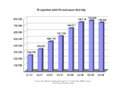 original
 -
 SVG
SVG -
 original
 -
 SVG
SVG -
 original
 -
 SVG
SVG -

-
 original
 -
 SVG
SVG -


Articels: Subprime mortgage crisis and related articels.
Request: For all of them, SVGify if possible, since they are perfect for it (Boxes, colors and text). For the graphs, they should be recreated with (if possible) a standard look, but definitely free of unneeded dimensions (EG. Spurious 3D effects or shading). 68.39.174.238 (talk) 20:49, 7 September 2008 (UTC)
- Question: Who vectorized these and didn't tell me? 68.39.174.238 (talk) 22:34, 29 September 2008 (UTC)
- Answer:Checking who uploaded them would be a good start, although the line graph doesn't look that accurate?. §hep • ¡Talk to me! 23:00, 29 September 2008 (UTC)
- A question for some other people: Do you think having the exact #s at the head of the bars is an improvement or not? 68.39.174.238 (talk) 22:39, 30 September 2008 (UTC)
Opinion:
Sinuiju Special Administrative Region Flag and Emblem
Article(s): Sinuiju Special Administrative Region
Request: SVG please --SelfQ (talk) 11:24, 16 September 2008 (UTC)
Graphist opinion: I gave a shot at converting the flag to Svg. What do you think? §hep • ¡Talk to me! 23:43, 26 September 2008 (UTC)
Sarah Palin
-
 Sarah Palin
 -
Attempt 1: wider crop
-
Attempt 2: Even wider, my personal favorite (despite the waving hand on the right :)
-
Attempt 3: Slightly modified version of Ferrylodge's crop

Article(s): Sarah Palin Request: Hi, this image is at the top of the article. As you'll see at the image page, it was created by cropping a much larger image, zooming, and sharpening. I did all this myself, but my software is crummy. Can you do a better job? Thanks.Ferrylodge (talk) 01:00, 21 September 2008 (UTC) Graphist opinion: Would you object to a wider crop—closer to the lectern, maybe just above the sheet of paper she's holding, and all the way to her right shoulder? Fvasconcellos (t·c) 01:23, 21 September 2008 (UTC)
- The main thing is to have the eyes centered. Some people asked for that at the article talk page. As far as how wide the crop is, please use your best judgment. You folks are the experts, not me. :-) Maybe you could do one with the existing crop, and one with the wider crop?Ferrylodge (talk) 01:27, 21 September 2008 (UTC)
- Will give this a go tomorrow morning. Eyes will be centered :) Fvasconcellos (t·c) 02:00, 21 September 2008 (UTC)
- The main thing is to have the eyes centered. Some people asked for that at the article talk page. As far as how wide the crop is, please use your best judgment. You folks are the experts, not me. :-) Maybe you could do one with the existing crop, and one with the wider crop?Ferrylodge (talk) 01:27, 21 September 2008 (UTC)
(undent) Thanks, I'll look forward to seeing what you come up with. Do you think this image or this image might be better at the top of the article?Ferrylodge (talk) 07:18, 21 September 2008 (UTC)
- Quality-wise, the "tracksuit" image (which was in the article for quite a while) is still the best, despite the awkward composition. I think the one above is the best substitute right now. Fvasconcellos (t·c) 15:19, 21 September 2008 (UTC)
- OK, here we go. I've made three attempts; I recommend no. 2, but I'll leave it up to you to decide which is best :) Please let me know which one you'd like to keep and I'll move it to Commons under a more descriptive filename. Best, Fvasconcellos (t·c) 15:44, 21 September 2008 (UTC)
- Okay, I'll go with your choice, despite the hand (it kind of humanizes the whole thing, makes it look real and spontaneous, and will make for an interesting topic of conversation). #2 it is!. BTW, did you do any sharpening?Ferrylodge (talk) 20:27, 21 September 2008 (UTC)
- On second thought, I think the head's too tiny on #2, so I went with #1 (after a little bit of sharpening). Thanks.Ferrylodge (talk) 21:09, 21 September 2008 (UTC)
- No, I didn't do any sharpening as I didn't think it would be much of an improvement. Would you like any of the above versions kept or should I delete them? Fvasconcellos (t·c) 22:01, 21 September 2008 (UTC)
- On second thought, I think the head's too tiny on #2, so I went with #1 (after a little bit of sharpening). Thanks.Ferrylodge (talk) 21:09, 21 September 2008 (UTC)
- Okay, I'll go with your choice, despite the hand (it kind of humanizes the whole thing, makes it look real and spontaneous, and will make for an interesting topic of conversation). #2 it is!. BTW, did you do any sharpening?Ferrylodge (talk) 20:27, 21 September 2008 (UTC)
- OK, here we go. I've made three attempts; I recommend no. 2, but I'll leave it up to you to decide which is best :) Please let me know which one you'd like to keep and I'll move it to Commons under a more descriptive filename. Best, Fvasconcellos (t·c) 15:44, 21 September 2008 (UTC)
- Thanks for your help and suggestions. I did a crop that is sort of a compromise between #1 and #2, and uploaded it, so I think we're all set now. The extras can be deleted, I think, unless you think the image now at Sara Palin can be substantially improved. Cheers.Ferrylodge (talk) 22:06, 21 September 2008 (UTC)
- The new version is a good compromise. There are plenty of images of Palin on Commons, and I don't think these work-in-progress versions are necessary; that's why I uploaded them locally in the first place. Fvasconcellos (t·c) 22:13, 21 September 2008 (UTC)
- Thanks for your help and suggestions. I did a crop that is sort of a compromise between #1 and #2, and uploaded it, so I think we're all set now. The extras can be deleted, I think, unless you think the image now at Sara Palin can be substantially improved. Cheers.Ferrylodge (talk) 22:06, 21 September 2008 (UTC)
(undent)Fvasconcellos, an editor has created another image that he thinks is better, though I disagree. What do you think? I've inserted the two images side by side (the one on the right is the current image in the article, as I write this).Ferrylodge (talk) 03:49, 23 September 2008 (UTC)
- Yes, that was me. I sharpened and tweaked the levels and highlights so that it is not so washed out. ≈ jossi ≈ (talk) 04:36, 23 September 2008 (UTC)
- More accurate skin tone
- More accurate hair color and detail
- Face features looks sharper
- Noise on blouse is less obvious
- Sharper overall, such as mics, glasses details, etc.
- We could tweak it further by keeping the original background, but using the sharper foreground portion
- ≈ jossi ≈ (talk) 04:39, 23 September 2008 (UTC)
- The subject's shirt is so black in Jossi's image that you can't see the folds and wrinkles. The colors in the background are so bright they look like neon. I'm not convinced that the image on the right can be improved, but surely a compromise would be better than the image on the left.Ferrylodge (talk) 05:06, 23 September 2008 (UTC)
- In all fairness, I do think it is a bit excessive, but the white balance has improved, and I can see still see the detail of her shirt just fine. Are you sure it's not your monitor?
- I actually did do some color correction myself but decided against uploading the version because (as with the sharpening) I didn't think it was a real improvement. I said it above, and I'll say it again: this image is certainly not the best in terms of quality. Let's just try not to make this an issue, shall we? The article has seen more than enough of those as it is... Fvasconcellos (t·c) 12:57, 23 September 2008 (UTC)
- I agree that the color saturation is excessive. It is also dark and has lost detail. I have worked on this image in Photoshop and have other versions with more subtle corrections that look better. IP75 75.25.28.167 (talk) 18:08, 23 September 2008 (UTC)
- I'm just noting that I can see the folds fine, the blouse doesn't look that dark really. Make sure you have your monitor calibrated to this and this. §hep • ¡Talk to me! 23:03, 26 September 2008 (UTC)
- I agree that the color saturation is excessive. It is also dark and has lost detail. I have worked on this image in Photoshop and have other versions with more subtle corrections that look better. IP75 75.25.28.167 (talk) 18:08, 23 September 2008 (UTC)
- The subject's shirt is so black in Jossi's image that you can't see the folds and wrinkles. The colors in the background are so bright they look like neon. I'm not convinced that the image on the right can be improved, but surely a compromise would be better than the image on the left.Ferrylodge (talk) 05:06, 23 September 2008 (UTC)
Sarah Palin again
-
 This photo of Sarah Palin is, in itself, notable, as it is a unique piece of photographic evidence relevant to a high-profile part of her biography.
(Retouched)

Article(s): Sarah Palin (note: top Wikipidea article for the last two months, I think), Gravina Island Bridge
Request: . As you can see, the image quality is poor due to backlight. If anybody could fix this up - fixing the contrast and color balance and, if possible, removing the purple fringing around her head - that would be really appreciated. Thanks. Homunq (talk) 18:54, 22 September 2008 (UTC)
Graphist opinion: Hi Homunq, how is it now? you can compare them here (old) (new), i am still working on it, you can find orginal version HERE. ■ MMXXtalk 19:52, 22 September 2008 (UTC)
- (better here than my talk page) That is much better on the flesh tones. However, the whites (both on the T-shirt and in the background) are still too blue. Thanks for your work. Homunq (talk) 20:02, 22 September 2008 (UTC)
- I think the text on T-shirt is originally blue, compare with the t-shirt label. ■ MMXXtalk 20:13, 22 September 2008 (UTC)
- Good point. However, the paper on her desk and the stuff outside still have a blue cast which I think is an artifact. Anyway, thanks. Homunq (talk) 20:15, 22 September 2008 (UTC)
- Why does it look better when I follow your "new" link than on the image page itself? Baffled, Homunq (talk) 20:18, 22 September 2008 (UTC)
- I think the text on T-shirt is originally blue, compare with the t-shirt label. ■ MMXXtalk 20:13, 22 September 2008 (UTC)
- Could you do the same edit with the uncropped version please?

.jpg)
It can be found here: http://commons.wikimedia.org/wiki/Image:Palin_Nowhere_99901.jpg. Also, we could use a cropped version of Ivy Frye, the troopergate related woman on the left part of the image.Duuude007 (talk) 20:29, 22 September 2008 (UTC)
- What do you think? is it better now? new old LiveChocolate (talk) 22:04, 22 September 2008 (UTC)
- Very nice, yes thanks ^^ Could we also get a cropped version availble of the left person (Ivy Frye) in this enlarged image? cheers :) Duuude007 (talk) 22:42, 22 September 2008 (UTC)
- here it is, I copied the descriptions and license from Image:Palin Nowhere 99901.jpg please update them. LiveChocolate (talk) 11:47, 23 September 2008 (UTC)
- Very nice, yes thanks ^^ Could we also get a cropped version availble of the left person (Ivy Frye) in this enlarged image? cheers :) Duuude007 (talk) 22:42, 22 September 2008 (UTC)
-
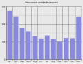 Bar graph

Article(s): Banaba Island
Request: Hello! I want to know if it is possible to extract or to make some graphs and maps from this PDF file. I mean if it is OK to do that, because of the author rights. I need that location map (p. 7), the Mean monthly rainfall graph (Figure 1.2, p. 8), the Mean annual rainfall over Western Kiribati map (Figure 1.3, p. 8), Figure 1.4 and Figure 1.5. If it is possible, it would be great. Thanks in advance, Sebi (talk) 15:53, 26 September 2008 (UTC)
Graphist opinion:
- There is currently nothing suggsting that the images from SOPAC are free from copyright. Sorry. /Lokal_Profil 16:14, 3 October 2008 (UTC)
- OK, I understand that, but the location map can be generated from existing Oceania/Kiribati maps. Thanks, Sebi (talk) 14:15, 6 October 2008 (UTC)
- Has the island geography been updated since 1936? §hep • ¡Talk to me! 14:33, 6 October 2008 (UTC)
- And with the bar graph. Since there wasn't any real data there I made my own. How's that look? §hep • ¡Talk to me! 14:58, 6 October 2008 (UTC)
- Has the island geography been updated since 1936? §hep • ¡Talk to me! 14:33, 6 October 2008 (UTC)
- OK, I understand that, but the location map can be generated from existing Oceania/Kiribati maps. Thanks, Sebi (talk) 14:15, 6 October 2008 (UTC)
Better color? Also, the map in the PDF is pretty much unusable due to quality. Has the island changed since this map? If not, it would be very easy to make a color version. §hep • ¡Talk to me! 21:03, 7 October 2008 (UTC)
- Yes, now it is much better. No, the map has not changed, but I need the location map. Sebi (talk) 12:00, 8 October 2008 (UTC)
- Sorry, I misread your request! I have a location map that is PD. I should be able to upload it later tonight to see if it fits your needs. §hep • ¡Talk to me! 19:09, 8 October 2008 (UTC)
- OK, thank you very much. — Sebi talk 13:48, 9 October 2008 (UTC)
- The map I had won't work. If it's close enough to even identify Banaba, you can't see any of the other islands. Once you cn see the other islands Banaba isn't visible. Sorry. Anyone else have a good map? §hep • ¡Talk to me! 21:46, 11 October 2008 (UTC)
- OK, thank you very much. — Sebi talk 13:48, 9 October 2008 (UTC)
- Sorry, I misread your request! I have a location map that is PD. I should be able to upload it later tonight to see if it fits your needs. §hep • ¡Talk to me! 19:09, 8 October 2008 (UTC)
Map of Queluz National Palace
-
 Description of image

Article(s): Queluz National Palace
Request: New map because, it's a old this !! Cancelos (talk) 12:32, 27 September 2008 (UTC)
Graphist opinion:
- Comment To whoever does this one, it's currently used in an imagemap. The source is in the article, of course that can be redone fairly easily so maybe no worries. §hep • ¡Talk to me! 18:18, 28 September 2008 (UTC)
Map of Ratanakiri
-
 I made this crappy thing a while ago
 -
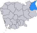 The already existing useful scalable map
 -
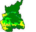 A topographical map made by User:Demoeconomist from Ratanakiri.svg


Article(s): Ratanakiri Province
Request: I'd like to have a vector map of Ratanakiri showing the province's physical geography (not administrative divisions, like we have now). The best map I've found is this. There's also this one. If someone could make something based on the first one, that would be great. Please, no administrative divisions. Also, the tourist sites are not needed. What I'd like is a map that shows the rivers, maybe the roads, and the towns. Thanks a million!! Calliopejen1 (talk) 18:58, 27 September 2008 (UTC)
Graphist opinion: You find a scalable map showing the district Ratanakiri already at commons(the second one above): commons:Image:Ratanakiri.svg
I made the third one above based on it: commons:Image:Ratanakiri_topography.svg--Demoeconomist (talk) 14:45, 12 October 2008 (UTC)
Paul Newman
-

-
Edit 1

Article(s): Paul Newman
Request: trim out unnecessary sky and sharpen image if possible... Chris (クリス • フィッチ) (talk) 12:25, 29 September 2008 (UTC)
Graphist opinion: I was going for face detail so it might be a little sharp heavy. Should it be a tad softer? §hep • ¡Talk to me! 03:16, 30 September 2008 (UTC)
- I also removed the blue hue, I thought it looked out of place. §hep • ¡Talk to me! 16:25, 30 September 2008 (UTC)
- That is so much better! Please upload it over the original! Chris (クリス • フィッチ) (talk) 00:26, 1 October 2008 (UTC)
I just saw this one, I took the liberty of cleaning up all the dust, scratches and other damage as well and uploaded it over the last edit. Please revert it if you don't prefer it. Mfield (talk) 01:06, 1 October 2008 (UTC)
- Thanks! Please upload it over the original! Chris (クリス • フィッチ) (talk) 01:02, 2 October 2008 (UTC)
 Done §hep • ¡Talk to me! 04:11, 12 October 2008 (UTC)
Serbian Empire

Article(s): Serbian Empire
Request: SVG ification. Example w:sr:Грб Душановог Царства према Илирским грбовницима --Lord Leatherface (talk) 09:03, 30 September 2008 (UTC)
Graphist opinion:
First Balkan War
-
JPG Template:Puic
Article(s): First Balkan War
Request: SVG ification.--Lord Leatherface (talk) 10:24, 1 October 2008 (UTC)
Graphist opinion:
Map for German and British fleet dispositions, 16 Dec. 1916

Article(s): SMS Von der Tann, SMS Roon, will eventually be added to others as they are expanded.
Request: SVG-ification, translate legend to English in new version.
Graphist opinion:
Steven Page

Article(s): Steven Page
Request: define head better against dark backdrop... Chris (クリス • フィッチ) (talk) 02:02, 2 October 2008 (UTC)
Graphist opinion:
Making the parsley green/bright
-
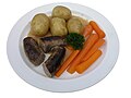 A traditional Danish dish
 -
 Edit
Edit


Article(s): none yet, but Danish cuisine would be appropiate
Request: How do I make the parsley brighter? It is too dark! I have only a little bit of experience with GIMP. Nils Emil (talk) 18:54, 3 October 2008 (UTC)
Graphist opinion: How's this? I may have overdone it a bit (the carrots may be a tad too... colorful :) Fvasconcellos (t·c) 19:39, 3 October 2008 (UTC)
- Hmm, indeed the parsley is better, but rest of the photo now looks weird (sausages too black, carrots too bright). Nils Emil (talk) 21:25, 3 October 2008 (UTC)
- Yep, that's what I thought. Let's try something different—how's this? (Purge your cache if you don't see a difference). Fvasconcellos (t·c) 22:02, 3 October 2008 (UTC)
- It's much better, and indeed usable now. Thanks! May I ask you how you did it? I am making several similar photographs. Nils Emil (talk) 08:03, 4 October 2008 (UTC)
- In GIMP, with the Curves tool. After increasing contrast in the image as a whole, I masked the parsley and worked on the Green channel (again, with Curves) and did a tiny bit of sharpening. Have a look over here for some information on how to use the Curves tool. Best, Fvasconcellos (t·c) 12:51, 4 October 2008 (UTC)
- It's much better, and indeed usable now. Thanks! May I ask you how you did it? I am making several similar photographs. Nils Emil (talk) 08:03, 4 October 2008 (UTC)
- Yep, that's what I thought. Let's try something different—how's this? (Purge your cache if you don't see a difference). Fvasconcellos (t·c) 22:02, 3 October 2008 (UTC)
iPod lineup
-
 Model (make something like this with the new models)
 -
 Or like this, without blurring the screens
 -
 iPod Classic
 -
 iPod nano (only use the front)
 -
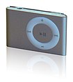 iPod shuffle


Article(s): iPod
Request: Apple announced their new iPod line a week or so ago, and the iPod article is without an image. Unfortunately, we don't have a free iPod Touch 2G pic yet, but in the mean time, I would like a conglomeration (much like the samples above) of the iPods shuffle, nano, and classic (we can add the touch later). I have linked what I think are the best images we have to work with in the gallery, but you can use anything you can find, provided the iPod resembles the ones in the above images (no point in using an old model).
A note about copyright: some users contest that Apple's interface is copyrighted and therefore we must blur the screens. I think this is absurd. It mischaracterizes the iPod, misleads users, and lessens the enc value. The nano is turned off anyway, and the classic (bereft of other iPods) is on the Commons without issue. Make a fair use claim (here, not on Commons), or make the screen look likes it's off (the nano would make a good guide), but don't blur the screen. Ideally, let sleeping dogs lie and worry about making the iPods look nice. Thanks in advance for you patience, understanding, and work.HereToHelp (talk to me) 02:13, 5 October 2008 (UTC)
Graphist opinion:
Smart Telecommunications and TV5 logos
Article(s): Smart Communications and Associated Broadcasting Company
Request: Could you guys, like, vectorize them? I suck at SVG, so maybe if you give these two some TLC... Blake Gripling (talk) 10:29, 5 October 2008 (UTC)
Graphist opinion: These are "Fair use" images. Vectorising them violates the fair use requirement for a low resolution copy since vector can be upscaled to any resolution. They will be deleted. Sorry, no can do. Dhatfield (talk) 15:10, 5 October 2008 (UTC)
- But, I was pretty sure that as long as they were nominally at a low res they were fine. We have plenty of copyrighted SVGs. §hep • ¡Talk to me! 20:03, 5 October 2008 (UTC)
- As well as copyrighted logos lifted off the Brands of The World site... Blake Gripling (talk) 04:16, 6 October 2008 (UTC)
Oeste region
Article(s): pt:Região de Turismo do Oeste, ...
Request: It's this map : http://europedirect.draplvt.min-agricultura.pt/imagens/mapa_regiao_oeste.png
Please Cancelos (talk) 19:55, 5 October 2008 (UTC)
Graphist opinion:I was looking for a different map, and it would help to know where the map is located. Portugal from the looks of it? Also, what article would this go into? Thanks! §hep • ¡Talk to me! 21:12, 6 October 2008 (UTC)
A quick one
-
 From the Fed Board
 -
 SVG
SVG


Articles: United States housing market correction
Request: Please remove the clip art background and make into a normal, sober graph. 68.39.174.238 (talk) 21:11, 6 October 2008 (UTC)
Opinion: I extracted the above from the PDFs, I can't get InkScape to snap the boundaries to the image though. (HELP welcomed with a cookie!) But is this generally what you wanted? §hep • ¡Talk to me! 00:03, 7 October 2008 (UTC)
- Go to "Document properties" (File menu) and click "Fit page to selection". You can keep your cookie.--HereToHelp (talk to me) 01:16, 7 October 2008 (UTC)
- It won't work with this one for me. I have some cracked-out InkScape that won't minimize and only unfreezes when it wants to. If you could do it, feel free to overwrite. §hep • ¡Talk to me! 02:10, 7 October 2008 (UTC)
- Could that SVG be Commonized? 68.39.174.238 (talk) 00:12, 8 October 2008 (UTC)
- Almost forgot. Should be done. §hep • ¡Talk to me! 03:16, 8 October 2008 (UTC)
- Could that SVG be Commonized? 68.39.174.238 (talk) 00:12, 8 October 2008 (UTC)
Universal edit button - PNG to SVG
-
 Universal edit button icon

Article(s): Universal edit button
Request: This icon needs converting into .svg, badly. Please help. If it's done quickly, it'll remain eligible for DYK, and the universal edit button is something that really could do with some widespread awareness and support, as it is an awesome idea. Thanks. fish&karate 07:34, 8 October 2008 (UTC)
Graphist opinion:
- Shouldn't be hard to SVGify, but I'm somewhat concerned about the uncertain attribution chain. Someone really ought to ask John Abbe whether they drew it, or if not, who did, and whether they have a vector version. —Ilmari Karonen (talk) 12:20, 8 October 2008 (UTC)
- Although he uploaded the image universaleditbutton:Image:UEBfullsize.png, which is definetely not a digital zoom of the standard logo universaleditbutton:Image:Wiki.png, he says at universaleditbutton:Questions that it is the highest resolution he "know[s] of". Accordingly, he doesn't seem to be able to render a bigger file using a scalable image. At that community page, they even don't know under which license the image has been created firstly. So, it is better to imitate it and make a new one, as that logo doesn't seem to be so complicated. This attempt exists also at universaleditbutton(see universaleditbutton:Questions).--Demoeconomist (talk) 15:22, 12 October 2008 (UTC)
Scout Wikiproject logo (our own image, so free to tweak)
-

-
 Symmetrical version with filled in trifoil


Article(s): 1500+
Request: Please make the green behind the yellow symmetrical (you can tell it's not), have the hollow trefoil filled in with green (textured like the yellow petals), so that both the boy emblem and the girl emblem have substance, bulk and texture. When I first designed the original, I didn't even think about that, I was trying to simply incorporate both emblems. Now this seems like a natural progression. Chris (クリス • フィッチ) (talk) 01:12, 9 October 2008 (UTC)
- Ps-enlarge stars so they are clearly visible, and remove the black shading behind them. Thanks! Chris (クリス • フィッチ) (talk) 01:16, 9 October 2008 (UTC)
- We generally use this logo on a green background; at smaller sizes the trefoil is very washed out. --—— Gadget850 (Ed) talk - 10:28, 9 October 2008 (UTC)
Graphist opinion:
- I'm on it. /Lokal_Profil 17:40, 10 October 2008 (UTC) —Preceding unsigned comment added by 92.236.228.40 (talk)
- Done. everything in that image was asymmetrical actually. Made it symmetrical and filled in trifoil. Do you want even bigger stars? /Lokal_Profil 23:38, 10 October 2008 (UTC)
- Looks good. Make the stars about 50% larger; compare to Image:BSA universal emblem.svg. --—— Gadget850 (Ed) talk - 10:40, 11 October 2008 (UTC)
- Done. everything in that image was asymmetrical actually. Made it symmetrical and filled in trifoil. Do you want even bigger stars? /Lokal_Profil 23:38, 10 October 2008 (UTC)
- Proportionally, the stars should be about 1/3 the width of the petal, so actually larger, please. Chris (クリス • フィッチ) (talk) 00:59, 12 October 2008 (UTC)
- Chris- How about making the trefoil larger so the height is the height of the FdL? --—— Gadget850 (Ed) talk - 01:14, 12 October 2008 (UTC)
- Usually that proportion is not done, because the trefoil has no lower bulk, see Image:Sweden SSF.svg. Chris (クリス • フィッチ) (talk) 01:22, 12 October 2008 (UTC)
- Chris- How about making the trefoil larger so the height is the height of the FdL? --—— Gadget850 (Ed) talk - 01:14, 12 October 2008 (UTC)
- This is really beautiful work, by the way! Chris (クリス • フィッチ) (talk) 01:25, 12 October 2008 (UTC)
- I reverted one step so the stars are more centered. I think it's great, what about you, Ed? Chris (クリス • フィッチ) (talk) 01:01, 13 October 2008 (UTC)
(once this is complete, please upload it over the original name, so we don't have to change it thousands of times, thanks)
BBFC U Cert

Article(s): BBFC
Request: There is a lot of noise around the edge of this image. Please could someone remove this noise. Thanks Mangwanani (talk) 18:02, 9 October 2008 (UTC)
Graphist opinion:
- Not sure I see what you mean. /Lokal_Profil 20:01, 12 October 2008 (UTC)
- Look around the outside edge of the black triangle. There is a lot of white noise in this area. While this may not be wholly visible in the chequered area it is noticeable on a black background. Mangwanani (talk) 15:45, 13 October 2008 (UTC)
The Prisons Department


Articels: Bureau of Prisons
Request: SVGify the seal, based on the Justice Department's one.
Oppinion:
Nkwenkwe Nkomo

Article(s): Nkwenkwe Nkomo
Request: define head better against dark backdrop... Chris (クリス • フィッチ) (talk) 01:13, 12 October 2008 (UTC)
Graphist opinion:
Georgia COA 1918-1921


Article(s):
Request: In the revision history, there are two variants-a red one and a silver one. Please merge them so that they have the dimensions and the texture of the silver one, and the coloration of the red one. Thanks. Chris (クリス • フィッチ) (talk) 02:25, 12 October 2008 (UTC)
Graphist opinion:
Margaret Thatcher
-
 1
1 -
 2
2 -
 3
3 -
 4
4 -
 5
5 -
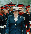 6
6 -
 7
7 -
 Cropped from #3.


.JPG)
Article(s): Margaret Thatcher, among others
Request: I have attempted for many months now to find a good looking, color, free use image of Margaret Thatcher which focuses solely on her. Most are copyrighted, and the ones that we can use usually do not work or do not look decent. Just recently I cropped Image:Margaret Thatcher DF-SD-06-15534.jpg to Image:Margaret Thatcher Reagan funeral.jpg, and made that the main image, replacing Image:Margaret Thatcher 1983.jpg. I don't think it looks bad, but I would prefer an image of her during her tenure as Prime Minister. So I need a graphists opinion: which of the above images could be cropped to focus solely on Margaret Thatcher? And could a graphist perhaps experiment with cropping them, because I do not have the tools to reduce noise or change a background to improve the image when it is cropped. If nothing comes of this, it's okay, but it is worth a shot. My best, Happyme22 (talk) 03:56, 12 October 2008 (UTC)
Graphist opinion:Hi, I cropped the image 3, and also removed President Ronald Reagan's shoulder from the image, but the source image quality wasn't good enough, and i don't know if it is good for article or not, i think the current image looks nice; Is there any better version available? ■ MMXXtalk 21:08, 12 October 2008 (UTC)
- Hi, thanks for your attempt. I still find it to be really cool how you completely removed President Reagan's shoulder from the image! Computers are truly amazing! I don't have a problem with the current image (this one) but I was looking for one of her as Prime Minister. All of the images that were shown above are within this catalog, and direct links to them are on their pages. I'm not sure if there is any better version available, and I doubt it. Perhaps something could be done with image number six? Thanks, Happyme22 (talk) 05:53, 13 October 2008 (UTC)
Colonialism

Article(s): Colonialism
Request: remove spaces on template at left Chris (クリス • フィッチ) (talk) 13:43, 12 October 2008 (UTC)
Graphist opinion:

.svg)
.svg)
Article(s): Colonialism
Request: the US Ethiopia and Saudi flags are wrong... Chris (クリス • フィッチ) (talk) 13:43, 12 October 2008 (UTC)
Graphist opinion:
Torii

Article(s): Shinto template
Request: change from black to E34234 Vermilion... Chris (クリス • フィッチ) (talk) 14:50, 12 October 2008 (UTC)
Graphist opinion: The task here is really simple, but in order to avoid redundant uploads, do you want it to be overwritten to the existing file?--Demoeconomist (talk) 15:37, 12 October 2008 (UTC)
- Yes, please! Chris (クリス • フィッチ) (talk) 15:52, 12 October 2008 (UTC)
- It is always rendered in red, just as for Buddhism Image:Dharma Wheel.svg is gold and not black. Please upload over the original. Chris (クリス • フィッチ) (talk) 00:56, 13 October 2008 (UTC)
- Since Demoeconomist has volunteered to do the job I'll leave it up to them. But I was wondering if you've(Chris) ever downloaded InkScape. Something like this takes two clicks to complete. §hep • ¡Talk to me! 01:03, 13 October 2008 (UTC)
- I have downloaded it, it's on this computer, and not being a tech guy, I wept bitterly in trying to understand it, then gave up for my sanity. Chris (クリス • フィッチ) (talk) 01:30, 13 October 2008 (UTC)
- Huh. That's too bad. §hep • ¡Talk to me! 01:32, 13 October 2008 (UTC)
- A color change doesn't need a vector editor such as Inkscape, by the way. Just open the file in any text editor, find the hex value of the color you want to change and change it :) In this case, #000000 would become #e34234; save it, upload it, and you're home free. Fvasconcellos (t·c) 02:29, 13 October 2008 (UTC)
- Huh. That's too bad. §hep • ¡Talk to me! 01:32, 13 October 2008 (UTC)
Cordoba flag
-
Cordoba flag (to SVGize)
-
SVG coat of arms for center of flag
Article(s): Córdoba, Spain
Request: Can you SVGize the flag. Shouldn't be too difficult since the hardest parts are already done in the coat of arms. 88.163.48.104 (talk) 01:43, 13 October 2008 (UTC)
Graphist opinion: Done. I'm waiting for a copyright issue with the arms (actually the city logo) to be resolved over at Commons—I'll upload as soon as it's clear. Fvasconcellos (t·c) 02:57, 13 October 2008 (UTC)
Marquess of Waterford

Article(s): Marquess of Waterford
Request: trim out black background, leaving only cameo. enlarge if possible... Chris (クリス • フィッチ) (talk) 10:50, 13 October 2008 (UTC)
Graphist opinion:
Article(s): Republic of Ireland
Request: There are no simple outlines of the Republic of Ireland on its own without Northern Ireland. Similar to this would be great but for the Republic of Ireland and possibly green:  Help!--Googlechrome (talk) 18:24, 13 October 2008 (UTC)
Graphist opinion: