
Wikipedia:Graphics Lab/Illustration workshop: Difference between revisions
| Line 765: | Line 765: | ||
'''Opinion:''' That shouldn't be too hard. Would it be okay to base it on the blank world map (see above)? Also, are there any preferences as to colours? I'll have a go at creating an initial SVG. --[[User:DTR|Dave the Rave (DTR)]]<small>[[User_talk:DTR|talk]]</small> 17:54, 12 July 2007 (UTC) |
'''Opinion:''' That shouldn't be too hard. Would it be okay to base it on the blank world map (see above)? Also, are there any preferences as to colours? I'll have a go at creating an initial SVG. --[[User:DTR|Dave the Rave (DTR)]]<small>[[User_talk:DTR|talk]]</small> 17:54, 12 July 2007 (UTC) |
||
:Due to the sheer size of the Base SVG (WOW) I'm having some problems, and I don't really know how to edit it as XML. I'll just trace the original and see if that is acceptable. My apologies. --[[User:DTR|Dave the Rave (DTR)]]<small>[[User_talk:DTR|talk]]</small> 18:29, 12 July 2007 (UTC) |
:Due to the sheer size of the Base SVG (WOW) I'm having some problems editing it in Inkscape, and I don't really know how to edit it as XML. I'll just trace the original and see if that is acceptable. My apologies. --[[User:DTR|Dave the Rave (DTR)]]<small>[[User_talk:DTR|talk]]</small> 18:29, 12 July 2007 (UTC) |
||
::First Upload: How's that? --[[User:DTR|Dave the Rave (DTR)]]<small>[[User_talk:DTR|talk]]</small> 20:28, 12 July 2007 (UTC) |
::First Upload: How's that? --[[User:DTR|Dave the Rave (DTR)]]<small>[[User_talk:DTR|talk]]</small> 20:28, 12 July 2007 (UTC) |
||
Revision as of 20:29, 12 July 2007
The Graphics Lab helps improve all graphical content used by Wikimedia projects stored on the Wikimedia Commons.
The work to improve the quality and clarity of images that are proposed to them by the community. This work most often involves extracting key elements from photos, removing distracting elements, and improving the general appearance of images. Creation of drawings, diagrams and maps is also within the scope of this project if the requests are clear and the work is feasible (less than one hour).
This page is now ready to go and is awaiting your requests!. You can help by joining this project, and by requesting image improvement.
Now it's up to the English community to use this Graphics lab.
Users can request images improvement or creation of images by following the "Request Form" below, adding their request to the bottom of this page. Graphists will look at the request, and improve the image if it's useful to Wikipedia.
Request Form Format:
== Title ==
<center><gallery>
''Name of image'' (e.g. Image:Eutrophication.jpg)
</gallery></center>

'''Article(s):'''

'''Request:''' ~~~~

'''Graphist opinion:'''
Photoclinometry
Article(s): Photoclinometry
Request: If someone could make an image (probably not SVG, I don't know) that depicts the process or result of photoclinometry. It would be much appreciated. → Icez {talk | contrib} 21:49, 11 February 2007 (UTC)
Graphist Opinion:
If you wrote what that was, maybe you would get more offers Rugby471 17:23, 16 May 2007 (UTC)
- Maybe you would be better off asking at Wikipedia:Requested pictures. --Dave the Rave (DTR)talk 21:58, 9 June 2007 (UTC)
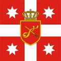
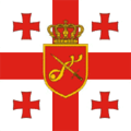
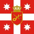
Coat of Arms of Bermuda
-
 Flag of Bermuda
 -
Coat of Arms of Bermuda
-
 Flag of the Governor of Bermuda
 -
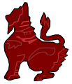
My attempt
-
 based on jpg, rough start


Article(s): Bermuda, Coat of arms of Bermuda, among others
Request: To be honest, with all of the high-quality flags and coats of arms out there on Wikipedia, I was shocked to see this representation of the Bermudan coat of arms. Frankly, it looks as if it was done in MS Paint, or at least the lion part. The sad fact is, though, most of the images out on the internet are also of pretty poor quality. There are a few that I found that may come in handy, though:
- This PDF file comes straight from the Bermudan government website. The coat of arms has rather thick outlining and it's in black and white, but, in theory, it should be the most faithful representation as it comes from the government. It's really the best thing I could find, as there isn't a specific section of the website devoted to the Bermudan flag or coat of arms (the tourism site has a low-quality photo to illustrate its description of the flag).
- Probably the next best thing can be found here, from vexilla-mundi.com. The lion's head is a tad different and whatever part of the lion between the hands and feet that stick out from behind the shield look like something out of a Dr. Seuss book. But compared to others out there, it's not bad.
As far as I searched, the rest were pretty much the same as (if not worse than) the existing image or were too low-quality for them to be usable (I'm referring mainly to photos). I really hope we can improve this because if someone were to recreate my country's flag like this, I'd be pretty peeved. -Nameneko 22:09, 31 May 2007 (UTC)
Graphist opinion:
I will start work on it, an higher quality images of the actual flag would be great though.--Cronholm144 18:17, 29 June 2007 (UTC)
- I started on this today. My product is displayed above; let me know if it is acceptable or if anything needs to be changed. -- VegitaU 23:59, 29 June 2007 (UTC)
How did you make that? SVG is preferable to JPG. Could you export it as such? If not I will use your edition as base for an SVG. Cheers--Cronholm144 00:16, 30 June 2007 (UTC)
- I took the black and white outline off the PDF file the requestor provided, enlarged it, and used a Wacom tablet to paint it bit by bit based on a really crappy low-res color image of part of the Coat of Arms. You'd think the Government of Bermuda website would proudly display their flag, but no... it looks like I have to fly to Bermuda for a decent shot of seeing the real thing.
- Anyways, I'm not proficient enough, it seemes, with Inkscape to make an SVG of this. I just haven't worked with that type of file type. If you upload an SVG version of this, please upload it to Image:Bermuda-Coat-of-Arms-SVG.svg on the Commons. My attempt didn't work and there's no reason not to overwrite it. Thanks. -- VegitaU 01:10, 30 June 2007 (UTC)
No no, your attempt made my life ten times easier. I was working with the black and white, but now that I have you version I can focus on just vectorizing. It will take a while but I will periodically update. Inkscape is a great little tool I encourage you to type svg into commons and start vectorizing the images(images that need to use vector graphics) it pops up. The only problem with jpgs is that they can't be scaled like svgs.--Cronholm144 01:24, 30 June 2007 (UTC)
- I was wondering if you could teach me briefly how you convert JPGs to SVGs (or maybe redirect me to a useful tutorial. I tried what the Commons said about converting it to SVG, using the Trace Bitmap function, but mine didn't turn out at all. -- VegitaU 02:45, 30 June 2007 (UTC)
- I find that trace bitmap is best for simple images or line drawings. --Dave the Rave (DTR)talk 20:11, 3 July 2007 (UTC)
Well, that took awhile... I think I captured the general idea though. Any suggestions VegitaU?--Cronholm144 17:07, 30 June 2007 (UTC)
- Looks good to me. I guess the requester will have to review it. -- VegitaU 19:29, 30 June 2007 (UTC)
- I've made a few more changes. It'll need someone a lot more artistic than me to get it looking as good as the JPG though. CountingPine 18:54, 10 July 2007 (UTC)
Perhaps we use the svg for the flags and the jpg when the seal is standalone--Cronholm144 22:13, 10 July 2007 (UTC)
- Wow. After reading this I'm happy with what we've made here. It looks like the Bermudans have never really settled on one solid version of this picture. It ranges anywhere from a grim-looking bearded thing to a smiling housecat... and there are versions with and without a puddle, blue and white oceans, higher clouds... Well done, everybody. -- VegitaU 02:15, 11 July 2007 (UTC)
Perhaps someone should send an E-mail to Bermuda telling them that we finished their COA for them :-)--Cronholm144 02:21, 11 July 2007 (UTC)
Image:Georgia. Flag of National Guard.gif
-
 PNG Version
 -
 PNG Version
 -
 SVG Version, anyone feel free to finish
 -
 SVG Version, anyone feel free to finish
 -
 SVG Version2, anyone feel free to finish
 -
 SVG Version2, anyone feel free to finish


Article(s): Military of Georgia (country)
Request: There seems to be a bug in these files. The stars / crosses are ok at full size, but they appear misshaped when the images are shrunk to gallery size. Any help would be great. Valentinian T / C 01:47, 16 June 2007 (UTC)
Graphist opinion: I see what you mean, I might as well convert them to svg, they'll be a lot more useful in Wikipedia and it should get rid of any bugs. > Rugby471 talk 06:52, 16 June 2007 (UTC)
- That sounds wonderful. Thanks a lot. Btw, if you create vectors of the crowned shield and the crosses, you'll have the main components of image:Georgia. Main Military flag.gif as well. Valentinian T / C 22:26, 16 June 2007 (UTC)
Okay, turning them into SVG's proved a little more difficult than I anticipated, the only thing that is holding me back, is the crown and the emblem in the middle of the crest. Currently I don't have enough time on my hands to draw them, so what I have done is converted the images to PNG ( that should sort out any bugs ) and uploaded two work in progresses of the SVG's, if any other Graphists sees this, feel free to pick up where I left off on the SVG side of things. Again sorry I couldn't do the SVG's. > Rugby471 talk 09:36, 17 June 2007 (UTC)
- The pngs were also very helpful. Thanks for the help. Valentinian T / C 00:14, 19 June 2007 (UTC)
I've had a go at the emblem in the middle, and updated one of the SVGs. I've put a slight outline on all the shapes, for consistency with the GIFs, but also because the finer details look better with an outline, and I thought it would be better to be consistent.
- It's just the crown that needs vectorising there now. I don't know if it can be copied from another image somewhere, but it would be a bit of a pain to vectorise using the GIF's resolution. CountingPine 17:50, 20 June 2007 (UTC)
- The same crown appears on Image:Georgia_coa.png which has a higher resolution. Valentinian T / C 17:56, 20 June 2007 (UTC)
- @CountingPine good job vectorising those emblems, I've added the emblem to the other SVG > Rugby471 talk 16:34, 21 June 2007 (UTC)
- Btw, the white parts of image:Georgia. Standard of Minister of Defence.svg are actually transparent. They should be converted to plain white. The other image doesn't have this problem. Valentinian T / C 17:12, 21 June 2007 (UTC)
- @CountingPine good job vectorising those emblems, I've added the emblem to the other SVG > Rugby471 talk 16:34, 21 June 2007 (UTC)
- Done > Rugby471 talk 18:30, 21 June 2007 (UTC)
- Just to be a complete pain in the neck :) The shield has one tiny error: the two ends of the band cross each other NE of the sword, but the original image shows the left-hand end of the band on top of the right-hand end. The opposite is the case here. Valentinian T / C 09:45, 22 June 2007 (UTC)
- Not at all, thanks for pointing it out. I'd designed the ribbon with that in mind, but somewhere along the line I must have just messed up the order. a bit. I'll upload a new version. Thanks. CountingPine 16:09, 22 June 2007 (UTC)
- Just to be a complete pain in the neck :) The shield has one tiny error: the two ends of the band cross each other NE of the sword, but the original image shows the left-hand end of the band on top of the right-hand end. The opposite is the case here. Valentinian T / C 09:45, 22 June 2007 (UTC)
- Done > Rugby471 talk 18:30, 21 June 2007 (UTC)
I added a rough crown.--Cronholm144 16:42, 29 June 2007 (UTC)
Crap... I should have read the conversation... I based my crown on the png... I will remake--Cronholm144 16:55, 29 June 2007 (UTC) I added a new crown--Cronholm144 18:10, 29 June 2007 (UTC)
- For what it's worth, I was also working on a crown for the flag. I've uploaded it for the Minister of Defence flag (the one with the red crosses), version 1, so people can have a look at it. CountingPine 23:52, 1 July 2007 (UTC)
Yours is better. How did you figure out the details?--Cronholm144 00:37, 2 July 2007 (UTC)
- I mainly based it on Image:Georgian_COA.jpg. It's by no means a perfect reproduction, but it looks OK at the standard resolution. CountingPine 19:28, 2 July 2007 (UTC)
The original Mercury seven
-
The original Mercury seven
Article(s): Would fit into articles about Project Mercury
Request: I really like this photo, but it's very noisy and the shadows are hard. Maybe it can be improved? --startaq 20:01, 18 June 2007 (UTC)
Graphist opinion: (Disclaimer:I'm not a graphist but I think the photo caught my eye.) I went through Project Mercury and found that it didn't really have a place for it. This is a problem with the article rather than the image; having read and seen The Right Stuff I know the astronauts had to endure all sorts of preparation (like this photo) and yet the article doesn't mention it. I still think that it is worthy of the attention of a qualified graphist.--HereToHelp 23:12, 18 June 2007 (UTC)
- I don't know if there's very much detail available in the shadows... brightening the darkest parts of the image do make more detail available near the eyes of the person to the furthest left, and a small bit of extra detail in the eyes of the person to the furthest right. Other than that, I think brightening won't do much other than increase the noise. --Interiot 23:27, 21 June 2007 (UTC)
 Done Scouting in Burma
These next four requests are related, the Wikipedia:WikiProject Scouting has articles on Scouting in every country, and I am writing those on the nations that Scouting has been suppressed in or where it has lain dormant in for years. Most modern Scout organizations have made readily available good-quality legible variants of their national emblems for educational purposes such as Wikipedia. For defunct or dormant organizations, generally the only images available are poor photocopies passed from hand to hand, or scans of decades-old patches where the insignia is not clear or bright. We have good images for Mainland China, Vietnam and Cuba, but lack in some other areas. With the exception of Ethiopia, all of these are not-presently-in-use, and based on the governments the copyrights may or may not be valid, but with the improvements I am asking for, these would be Wikipedia renditions separate from any copyrighted variant. Our goal is to have these emblems available on Commons once there are usable variants of them. Someday these nations will have their Scouts back, and we want to provide them with good histories they can use as they rebuild.
- Our project facilitator has given you guys The Scouting Barnstar on the talk page here, thank you all! Chris 05:30, 2 July 2007 (UTC)
-
shows the griffin-like supporters that need to be in red along both sides of the central petal
-
-
 text for the scroll
 -
 text for the scroll
 -
to illustrate where there are a couple of minor discrepancies
_red.svg)
Article(s): Scouting in Burma
Request: I would ask that the image be enlarged to show detail, the green brightened up so as not to show as black on some monitors, the details on the griffins crisped-up to show detail, and the text on the scroll also made clearer. Chris 05:56, 27 June 2007 (UTC)
- ps-if it would help, you can completely leave off the green ovoid background, so as to highlight the emblem itself. Thanks! Chris 16:35, 27 June 2007 (UTC)
Graphist opinion: Do you need an exact copy of the griffin but optimized, or do you want it recolored also? Akiramenai 08:55, 27 June 2007 (UTC)
- It doesn't have to be an exact copy, that was just the best one I could find to show detail. It does need to be in red, though. There is another image at Chinthe if it would help. And thank you so much for this! Chris 16:32, 27 June 2007 (UTC)
I made the svg of the text but I don't know how to get it to bend, if someone can do that and put it in the pic, all that would be left is the finalisation.--Cronholm144 15:37, 28 June 2007 (UTC)
- Also, as in the request above, could you enlarge the image to show detail? Image:Laos.jpg below, at 167 × 219 pixels, 100px, is a really good size for details. And for the chinthe to show up well, a brighter red, rather than the maroon, might look crisper. Perhaps red body with maroon outlining? :) Thanks again, folks, you are wonderful! Chris 07:47, 29 June 2007 (UTC)
I'll get on it.--Cronholm144 11:36, 29 June 2007 (UTC)
BTW if you specify the pixel count you can make the image as large or as small as you want.--Cronholm144 16:44, 29 June 2007 (UTC)
- That is so nice, I love it! If I have not thanked you personally, thank you!
- A couple things have jumped out at me, and I have created Image:Burma-1coloredin.jpg to illustrate what I am talking about. (I had to do it as a jpg as I cannot make svgs work on my computer; I see there is discussion of that here.) The space below the griffins (marked in purple to show) is not actually a rectangle; it's just very tiny, but it is where the left, center and right petals are drawn together but still remain slightly separate. I wish I could explain better.
- The other thing I see (and you probably already had this in mind to mirror later), but the bottom parts of the fleur-de-lis and the two sides of the scroll (marked with red asterisks) are not symmetrical in shape to one another. Both shapes are good, and your guess is as good as mine, but it needs to be symmetrical.
- Also, I did not know you could enlarge svgs like that; thank you for showing me! I so appreciate your hard work on my behalf! Chris 06:21, 30 June 2007 (UTC)
- That's great, you got it! Thanks! The only remaining thing I see aside from adding the text is to even out both sides of the scroll (which also seem to be slightly different on the Ethiopian, Laotian and Iranian images). The rounder, taller right side should be the one duplicated. Chris 07:50, 1 July 2007 (UTC)
- Oh, and please trim off all the surrounding excess white edging, it will make the image appear smaller in the articles if left on. :) Chris 21:01, 1 July 2007 (UTC)
- That's great, you got it! Thanks! The only remaining thing I see aside from adding the text is to even out both sides of the scroll (which also seem to be slightly different on the Ethiopian, Laotian and Iranian images). The rounder, taller right side should be the one duplicated. Chris 07:50, 1 July 2007 (UTC)
Bueno! Just the text, now, and this one will be complete! Thank you so much! Chris 22:38, 1 July 2007 (UTC)
- Witin sight of the finish line-on the second and last characters, the c-shaped diacritical marks should not be touching the character beneath them. The white below the emblem needs removed, then this one is done and you guys will have less cause to hate me! :)
The white rmval will come last... I don't know if there is a way to keep the spaces and have a uniform pic. Look closely at the raw you provided. There are no spaces. As for the hate, I took an oath to give back more than it gave to me... so it's really the least I can do.--Cronholm144 12:34, 2 July 2007 (UTC)

- On the text I put and the one you reformatted, there are clearly spaces between both sets of characters. When either image is expanded, the spaces are clear. Perhaps I am not explaining myself well. Above the second character, and again above the last character, there are c shapes, not connected to the main letter. These should also not be connected in the image itself. Chris 02:16, 3 July 2007 (UTC)
Look at the green emblem you provided...no spaces there just isn't room unless I scale down the whole thing but it will look wierd. --Cronholm144 02:40, 3 July 2007 (UTC)
- Ah, I get it now, sorry, I didn't follow. Bear in mind that badge is a 45+ year old little thing the size of a thumb-knuckle, they didn't have the technology to split the letters well then. Nowadays most patches are done by computer. For the sake of correctness, I would ask you to scale the text just slightly, say 5/10 percent. It may not mean much to us, but to them that's their language. Chris 04:17, 3 July 2007 (UTC)
- Also perfect! Stunning work! Thank you so much! Chris 07:09, 3 July 2007 (UTC)
Done Scouting in Laos
-
 large scan of the badge, shows color scheme, but it is dark and shows badly on some monitors
 -
older small line art of the badge, but it shows the scroll and knot and text that the newer one does not
-
first edit
-
my crude rendition of the way I intended the request
-
 Scout Motto in the Lao language, converted to an SVG path

Article(s): Scouting in Laos
Request: I would ask that the images be merged, so to speak, find a median size between them; using the line art, make the details in the deep blue of the badge, except where they are red or white on the badge, and incorporate both the color scheme and the scroll and knot into the new image. Chris 05:56, 27 June 2007 (UTC)
- addendum Image:Laos.jpg, at 167 × 219 pixels, 100px, is a really good size for details. Chris 08:09, 29 June 2007 (UTC)
- Your Image:Laos.svg is brilliant, and I so appreciate your time and help! You are great at graphic art, this lab is really an impressive fount of talent! However, for these emblems, we don't want to use colors we can't really verify, snazzy though they are. I have created (rough, I know) a crude variant of the color scheme warranted, at Image:Laosfullcoloremblem.jpg. The closest colors are probably those of Image:Flag of Laos.svg. I do prefer the shape and proportions of your red section, I love how you did that.Chris 07:12, 30 June 2007 (UTC)
- You are really good at this! Minor tweak-the red is too deep, and the blue is too light and should be uniform throughout, not two different shades-the colors should be those of Image:Flag of Laos.svg. Or at least for the red, the bright primary red used in your Ethiopian one below should work. I tested my monitor theory, the one I made to illustrate looks really orangey at work, but red on my one at home, weird. Chris 07:59, 1 July 2007 (UTC)
- Your Image:Laos.svg is brilliant, and I so appreciate your time and help! You are great at graphic art, this lab is really an impressive fount of talent! However, for these emblems, we don't want to use colors we can't really verify, snazzy though they are. I have created (rough, I know) a crude variant of the color scheme warranted, at Image:Laosfullcoloremblem.jpg. The closest colors are probably those of Image:Flag of Laos.svg. I do prefer the shape and proportions of your red section, I love how you did that.Chris 07:12, 30 June 2007 (UTC)
Graphist opinion:
I would like to have the text in unicode or in some format that will allow me to put it in the graphic i.e. legible :)--Cronholm144 13:35, 29 June 2007 (UTC)
- I have put in that request to every user at Category:User lo for their help with this. I tried to guess at some of the characters, but with some of their vowels and such I was just spitballing and I do not want to do that. Chris 07:12, 30 June 2007 (UTC)
Is there a online dictionary of Lao terms? All we really need is the scout motto, right?--Cronholm144 20:30, 30 June 2007 (UTC)
- I have also put in that request to Peter Souvanna at the closest thing I could find to an online dictionary of Lao terms, and sent him the image with the scroll. Nothing thus far. Chris 07:59, 1 July 2007 (UTC)
- While we're awaiting hearing about the Scout Motto, just some minor thoughts.
- The red still needs brightened to match the flag.
- The scroll should not have the thin black edge around it, unless that has something to do with how you will curve the text once you get it.
- The scroll itself should be symmetrical. The left side of your variant looks crisper.
- I do think there needs to be a thin (matching blue) edge divider around the character in the middle of the red section, else it gets lost on the white background.
The scroll is symmetric (when flipped it is the same in inkscape at least), the petals are probably creating an illusion.--Cronholm144 12:30, 2 July 2007 (UTC)
- The shapes of the flowiness (word?) at each edge, and the lower tie-offs on each side are not symmetrical. Chris 05:09, 3 July 2007 (UTC)
- That's the ticket! Wonderful! Chris 21:22, 3 July 2007 (UTC)
The red tree and the letter need to be vertically stretched slightly. Other than that, the badge looks great. Kaptanteo 07:06, 4 July 2007 (UTC)
- So it's a tree? Do you know what type? Do you know what the text on the scroll says? Thanks! Chris 07:32, 4 July 2007 (UTC)
- I have no idea what kind of tree it is. The text on the scroll means "Be prepared" or "Be ready". The character in the middle of the badge is the first character of the word "ລາວ" (pronounced Lao), the country's colloquial name. Kaptanteo 21:58, 4 July 2007 (UTC)
ຕຣຽມພຣ້ອມ (pronounced like เตรียมพร้อม in Thai) is what it said. Letter "້" should be over "ຣ" cause of font bug on some user. I also add this to the scout motto page. --Octra Bond 08:14, 4 July 2007 (UTC)
- "Triam Phrom" /tliaːm˨ pʰlɔːm˦˩/ (Laotian reads their "r" as "l") = "Prepared", it refers to "Be Prepared". --Octra Bond 00:44, 5 July 2007 (UTC)
- It seems that Octra Bond already got that. --Manop - TH 18:19, 4 July 2007 (UTC)
- Does the image I produced of the text look correct? Mike Dillon 18:36, 4 July 2007 (UTC)
I enlarged, I can do more if you like but it might start to compromise readability.--Cronholm144 17:52, 5 July 2007 (UTC)
- Beautiful, perfect, spot-on! Thank you! Chris 21:32, 5 July 2007 (UTC)
Done Ethiopia Scout Association
-
small and grainy but shows present color scheme and proportions
-
larger line art showing text on scroll, 1970s shape and proportions
-
larger line art showing text on scroll, 1970s shape and proportions svg version 1
-
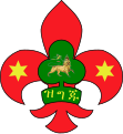 Second update
 -
I uploaded this for illustration, I think Rugby471 is correct in that the green trefoil should be large as he has it
-
![The text: ዝግጁ ([zə.ɡə.dʒu], "ready")](//upload.wikimedia.org/wikipedia/commons/thumb/8/8b/Zegeju.svg/120px-Zegeju.svg.png) The text: ዝግጁ ([zə.ɡə.dʒu], "ready")
The text: ዝግጁ ([zə.ɡə.dʒu], "ready")

Article(s): Ethiopia Scout Association
Request: I would ask that the images again be merged, to show the text on the scroll from the line art, but with the color scheme of the smaller variant, and again to find a median size, and clean up the coloration to uniform. Chris 05:56, 27 June 2007 (UTC)
Graphist opinion: Okay, i'll get to work on creating a vector. > Rugby471 talk ⚔ 15:41, 27 June 2007 (UTC) First update on it is above, I will continuing working on it (obviously), but if there is anything you object to, please say now. > Rugby471 talk ⚔ 16:17, 27 June 2007 (UTC)
- What a great start, thank you so much! I really like what you've done; I think the narrower left hand scaling is the more modern variant, however. At this point though I think either scaling will be great! Thanks again! Chris 16:41, 27 June 2007 (UTC)
I created the alternate 1970's svg, but that lion thing is too small to make out.--Cronholm144 03:19, 28 June 2007 (UTC)
- The lion is the Lion of Judah. It can be seen in the old Ethiopian Empire flag here (Image:Flag of Ethiopia (1897).png is a smaller version). Mike Dillon 03:30, 28 June 2007 (UTC)
Thanks I will get on it. There is the lion, its rough because I had to base it off of a very pixelated image but I think if someone synthesizes the two it will be done. I can't download svgs for some reason so it will have to be someone else--Cronholm144 04:36, 28 June 2007 (UTC)
Uploaded a second update, changed the colors to match Cronholm's one and added the 'banner thing' at the bottom. Only thing now is the lion, unfortunately I can't do it as I don't have enough time. @Cronholm, if that is the finished lion then tell me and i'll put it in my SVG, if it isn't could you upload ( with your svg ) the finished one, cheers. > Rugby471 talk ⚔ 16:43, 28 June 2007 (UTC)
Hey Rugby, I will work on the lion tonight, I think that we should go with the colour scheme in the newest badge, the colours that I picked were awful and last minute. Also, looking at the new badge it appears that they are using the non-uniform star, should we switch? Anyway, I would go ahead and finish everything up by combining yours and mine for a final version but I can't download svg (or I just don't know how). So I think that we should combine my scroll and your trefoil. And maybe switch the stars, then its just a matter of adding the lion.--Cronholm144 17:36, 28 June 2007 (UTC)
|
|
Corrected colors and added the Lion to my Version > Rugby471 talk ⚔ 06:57, 30 June 2007 (UTC)
- This is nigh perfect! Thank you so much to all! I have put in a language request to every user at Category:User am for their help with the text on the scroll itself; maybe we can get a transliteration out of it as well, as Akiramenai has so graciously done with the Farsi text below. Chris 07:40, 30 June 2007 (UTC)
- It looks like this:
- ዝግጁ
- Not that I know any Ge'ez or Amharic, though (not really sure which Ethiopic language this is). Mike Dillon 14:59, 30 June 2007 (UTC)
- It would be Amharic, Ge'ez was an earlier language. Thanks for doing that, Mike, that's a really good educated ge'ez. ;) Chris 17:01, 30 June 2007 (UTC)
- It looks like "ዝግጁ" is actually a word; at least it gets a couple thousand hits on Google: ዝግጁ. This link from AmharicDictionary.com says that it is pronounced [zə.ɡə.dʒu] and that it means "ready", which fits with the "Be Prepared" motto of the Scouts. Mike Dillon 18:20, 30 June 2007 (UTC)
- I've created an SVG version of this word with the text converted to a path. Wikimedia doesn't have the font installed to render this otherwise. See Image:Zegeju.svg. I placed my part of creating it in the public domain, so feel free to integrate it into the other two SVGs. Mike Dillon 18:51, 30 June 2007 (UTC)
- It looks like "ዝግጁ" is actually a word; at least it gets a couple thousand hits on Google: ዝግጁ. This link from AmharicDictionary.com says that it is pronounced [zə.ɡə.dʒu] and that it means "ready", which fits with the "Be Prepared" motto of the Scouts. Mike Dillon 18:20, 30 June 2007 (UTC)
- It would be Amharic, Ge'ez was an earlier language. Thanks for doing that, Mike, that's a really good educated ge'ez. ;) Chris 17:01, 30 June 2007 (UTC)
- It looks like this:
Okay I'll put them in > Rugby471 talk ⚔
- This is really coming out nicely, yeah, GraphicsLab! Three thoughts:
- Please even out both sides of the green scroll-the wraparound on the right side is cleaner looking as it shows it to be three dimensional
- I am wondering if the rounded scroll at the bottom of Image:EthiopiaScoutbadge.jpg should also be added to the image, and have written Matt@amharicdictionary.com about the text on it
- Now that Mike has come up with the exact character shapes, they differ slightly from the line drawing I provided originally. Can the exact shapes be made yellow and put right on the scroll itself? Chris 08:09, 1 July 2007 (UTC)
- I've put the text in both SVG's and uploaded mine to Commons (should have done that first, but if forgot :-) ) Check the Commons version of mine (under same name as wikipedia one) as it is up to date! > Rugby471 talk ⚔ 08:14, 1 July 2007 (UTC)
- Chris has asked me to help with the letters in the artwork. Well, "ዝግጁ" does mean "ready" in Amharic. I don't know how else I can help, but I'll be glad to. Elfalem 15:21, 1 July 2007 (UTC)
- I think Chris also wanted to know what it says on the bottom of Image:EthiopiaScoutbadge.jpg. Mike Dillon 16:32, 1 July 2007 (UTC)
I think we be done. Thanks for the upload Rugby, I was halfway through drawing the characters when I noticed it had already been done. :) I wonder if the rounded scroll is necessary... if it is we will need a trans.--Cronholm144 16:10, 1 July 2007 (UTC)
- You guys are amazing! Yes, please, I would like symmetry (on all five national emblems), bear in mind the Ethiopian black-and-white was originally had drawn, very well but asymmetrically. I will be proceding further with Elfalem to determine what the lower rounded scroll says and what characters are used, that will determine whether it is an integral part of the emblem or something interchangeable. If it ends up saying something like "Ethiopian Scout Association", it is necessary. If it says "Cub Scout" or "Good Job" or something, then we don't need it. Thanks for putting up with me on all this. Chris 20:15, 1 July 2007 (UTC)
- The lower scroll says "ኢትዮጵያ" which is literally, "Ethiopia" Elfalem 20:33, 1 July 2007 (UTC)
- Thank you so much, that's great! Okay, based on that, I don't know whether it needs to be on the emblem or not; what do all of you think? I really appreciate your help! Chris 20:50, 1 July 2007 (UTC)
I will add it in for comparison, give me 10 minutes--Cronholm144 21:05, 1 July 2007 (UTC)
Done--Cronholm144 21:44, 1 July 2007 (UTC)
- That's great! The fourth character should be centered between the third and fifth. Also, for contrast, what would you say to making the bottom scroll the same green as the trefoil? The yellow and white don't show well together. Chris 22:41, 1 July 2007 (UTC)
- This one is also almost done, I appreciate your hard work! The white below and on both sides of the emblem needs removed, then this one is done. Chris 05:18, 2 July 2007 (UTC)
- Absolutely perfect, thank you! Chris 06:45, 3 July 2007 (UTC)
I see you don't need any more help with Amharic translations here - but let me know if you need something in the future Alcinoe 16:25, 3 July 2007 (UTC)
Iran Scout Organization
-
Third Edit
-
straightened and trimmed just to get area of wings and below
-
I can't get it to scan right, it's on satin, but it gives a rough idea
-
I am so sorry to all of you for this-shows Rugby what I am driving at, color scheme and basic designI am so sorry to all of you for this-shows Rugby what I am driving at, color scheme and basic design
-
this one I would like to ask to be made larger to show detail (background design is that of Image:Flag of Iran.svg)
-
based on Akiramenai's
-
more recent variant for shape (scroll only), not really better for details, sorry
-
 Added the unreadable persian text.
Article(s): Iran Scout Organization
Request:
- For the red emblem I would like to ask for a line-drawing or clearer variant; the badge is quite worn.
- The red-white-green emblem I would like to ask to be made larger to show detail. Chris 05:56, 27 June 2007 (UTC)
Graphist opinion:
Red Emblem
Okay, i'll get to work on a vector. > Rugby471 talk ⚔ 16:57, 28 June 2007 (UTC)
- Okay, I know it isn't much, but I've started the line drawing, i have done the outline and a few of the features inside, is this okay so far ? > Rugby471 talk ⚔ 17:12, 28 June 2007 (UTC)
- Actually that's a great start and way better than I could do! I have added the Image:Faravahar.png because I believe it is the concept they're driving at. Besides, I didn't have a Journey album handy. ;) Also, check out The Lion and Sun for ideas on those themes. (weird, that flag shares a lot in common with Ethiopia) And thanks again! Chris 08:15, 29 June 2007 (UTC)
Second Edit, looking okay ? > Rugby471 talk ⚔ 16:52, 29 June 2007 (UTC)
- It is looking great, thanks! If you put the red and the r/w/g/ emblems side by side, proportionally and shape wise the scroll and even the emblem shape are the same, it's just the red one was cast in aluminum so it doesn't have the sharp points the r/w/g one has. If you want to use the r/w/g emblem for an outline shape, I hope it would help and not hinder your great work. I have added Image:Iran Scout Organization membership badge.png to show a more recent variant, unfortunately it is the same small size in terms of detail. Chris 07:59, 30 June 2007 (UTC)
- More like this ? > Rugby471 talk ⚔ 10:19, 30 June 2007 (UTC)
- Actually, I meant the outer shaping of the emblem itself. If possible, could the outer edges be made a single thin line, rather than two basically parallel lines with a hollow between? Bear in mind that this was an aluminum casting and not strictly faithful to the design, because of the thickness they had to use to show detail and still have the cloisonné work out. You've got great detail, and I appreciate your work on our behalf. Your last iteration before this, with the upturned, fuller wings squares with the way it should be. I only put Image:Faravahar.png on here to show what the otherwise-difficult to see image should be; but the fuller version you had is closer than the now-thin one. Also, can you incorporate the scroll (basic shape and text) that Akiramenai and Cronholm are using on the r/w/g variant? Thank you for all your hard work! Chris 08:26, 1 July 2007 (UTC)
Okay i think i've done what you intended now, but before I put in the scroll, we need to decide on the head on the badge, what do you want me to do with that (on the SVG is the exact thing that is on the photo) > Rugby471 talk ⚔ 09:35, 1 July 2007 (UTC)
- The face is that of an anthropomorphized lion, like on the old flag Image:Iran flag with emblem 1964-1979.png. I really appreciate your working on this-I imagine of the five emblems requested, this one is the most troublesome. Chris 20:42, 1 July 2007 (UTC)
- Is there a better quality image of this Lion, or a name for it so I can search for a better quality one, as this really is quite hard to do with the current supplied image > Rugby471 talk ⚔ 17:05, 2 July 2007 (UTC)
- The name is "The Lion and Sun", "shir o khorshid" in Persian. Hope that helps. Chris 05:12, 3 July 2007 (UTC)
- Is there a better quality image of this Lion, or a name for it so I can search for a better quality one, as this really is quite hard to do with the current supplied image > Rugby471 talk ⚔ 17:05, 2 July 2007 (UTC)
|
|
Okay, I searched on Google for a better image and found one ( luckily ![]() ) and have created a vector of the Lion's face
) and have created a vector of the Lion's face
1) Is the lions face okay?
2) I shall now go onto the color, either you can specify a color scheme or I can make a guess on it according to the photograph you gave
3) Do you wish me to include the text like in the r/w/g emblem, at the bottom in the 'banner-like' shape?
- The lion's face is great! The mane itself should be a little symmetrical for the shape of the badge.
- The color scheme should be red and gold, so fairly similar to the red and aluminum pattern of the original. The gold of the lion's face is a great shade!
- Yes, please include the scroll and text directly from the RWG emblem.
- Thank you so much once again for your hard work! Chris 21:26, 3 July 2007 (UTC)
- It's getting there now, but the red has overwhelmed your gold detailing. If possible, could the outer edges be made a single thin line, rather than two basically parallel lines with a hollow between? Thanks again! Chris 06:59, 5 July 2007 (UTC)
- ps-can you use the shape of the emblem, and the scroll as a whole, from the other image, as both are correct proportions? Thx, Chris 07:01, 5 July 2007 (UTC)
- Rugby, thank you so much for being patient with me. My very crude example (sorry about that, my poor artwork is way ugly, I know; I do much better on paper) is actually very close to what I intend for the red emblem, the basic shape and coloration and so on. This is the top-right corner image. I will try and explain as best I can what is called for.
- Don't treat the emblem as though the whole thing is a silhouette or perfect recreation of the aluminum badge. At this point, all you need from the aluminum badge is the sun, the winged emblem, and the lion's head, which you have already done. Maybe revisit it just for the detailing inside the wingspan, but there is also the Faravahar emblem on this page to use for detail on that.
- Now discard the fact that the aluminum badge exists. For our purposes the red aluminum badge is now a non-issue, you've already got what you need from it. The new emblem should not look like a cookie-cutter encompassing all hollow spaces in the emblem, it needs white space where there are hollows between the scroll and emblem.
- Take the collaborative emblem that Akira and Cronholm have developed, and borrow the outline of the emblem, and the scroll in its entirety (if you are allowed to, unless there is something that precludes you form doing so-Cronholm did say something about "using forbidden techniques..." but I was unsure what was meant). Their shape is right, and their scroll is right.
- At present the vast amount of red washes out the gold details. Using the basic tracing you already made, make the sun-wing-lion elements the center of an emblem with the exact shape and the exact scroll of the r/w/g emblem, but in gold instead of the black they use. Leave the red out for now-put it in once you have got the central elements down pat.
- Change the colors of the details of the lion's face-that is perfect and doesn't need re-detailing from anything-make the presently black parts gold, and make the presently gold parts red.
- I really thank you for this, and for being patient with me. Chris 07:34, 6 July 2007 (UTC)
- You've gone quiet, I really hope I have not offended. I stand in awe of the great work you folks do. Thank you so much. Chris 06:58, 7 July 2007 (UTC)
- No, no no don't worry, it is that last night my Mum told me with two minutes to go to when we leave, that we are going to a circus performance for 3 hours ! I never get offended by these things ( even if it does look like it ) you are here to specify what you want and we are here to deliver. Anyway concerning the image now, thankyou for your instructions, I now see what you mean and so have done that. Do you also want me to color the border/scroll elements in the gold ? > Rugby471 talk ⚔ 07:54, 7 July 2007 (UTC)
- Yeah! You got it! (I'm sorry, I've been confusing people lately) Yes, please make the border and scroll details gold as well, and fill in the rays of the sun in gold, leaving the center circle red. Now all we're down to is the winged-thingamabob. You rock! Chris 09:10, 7 July 2007 (UTC)
Done, awaiting your advice on the 'winged-thingamabob' as you put it :-) > Rugby471 talk ⚔ 10:18, 7 July 2007 (UTC)
- Okay, I don't know if you graphic gurus have the ability to curve an existing shape. My ideas are this. On the wings on the Faravahar.png (which are, probably incorrectly, one degree counterclockwise from horizontal), can you warp up the ends so it will look swooping, like in the Scout badge itself? I don't think the proportions are right for it, but it's an idea.
- Failing that, can you take the central portion of the wings of Faravahar.png, incorporate them into your winged portion, and simply extend the feather pattern out to the curved edges? Chris 20:54, 8 July 2007 (UTC)
Okay I understand everything except for the first part about the 'warping' I'll get on this as soon as possible however i've hurt my neck and so it's not so good for me to be on the pc, at the very latest i'll be back on two days from now. Sorry for any inconvenience. > Rugby471 talk ⚔ 16:15, 9 July 2007 (UTC)
- Never an inconvenience, I so appreciate the work you do, take your time and take care of yourself, feel better! Chris 21:12, 9 July 2007 (UTC)
- What I mean is I have seen graphics programs where someone can bend and stretch an existing image to not be in the shape it is, say to curve a line of text or something. Chris 21:14, 9 July 2007 (UTC)
- I don't know which package you used to create these SVGs, but I think the closest you'll get to such an effect in Inkscape is a very simple use of Pattern along Path (see this link on inkscape.org). --Dave the Rave (DTR)talk 16:24, 10 July 2007 (UTC)
Red-White-Green Emblem
I need the script I can't make it out.--Cronholm144 03:37, 28 June 2007 (UTC)
- User:Akiramenai of the Wikipedia:Graphic Lab here has on their user page that they are a speaker of Farsi, perhaps that will help? Maybe making the image perhaps double or triple size will allow the text to be put in easily. Image:Laos.jpg above, at 167 × 219 pixels, 100px, is a really good size to show details. Chris 04:43, 28 June 2007 (UTC)
Size doesn't matter with svgs I can make them as large or as small as I want. What I need is a legible copy of the text.--Cronholm144 13:33, 29 June 2007 (UTC)
- Yes Chris, the persian text says: amade bash, which means "be ready/prepared".
- I will try to make time to finish the vector version.
- thumbs up to the teamwork here* Akiramenai 15:31, 29 June 2007 (UTC)
- Perhaps Akiramenai can provide the Farsi script?; if not, I would be happy to put in a similar language request to every user at Category:User fa-N for their help with the text on the scroll. (there are many more speakers of Farsi on the 'pedia than there are Lao and Amharic) Thanks again, all! Chris 07:59, 30 June 2007 (UTC)
What about the red-white-green emblem? I have uploaded my version(I still have the lossless file so if you think I can improve it somehow please say so) Is this emblem free of copyright or is there a way to post it anyway? I am very bad at copyright rules and I think I may have uploaded my version of the emblem with the wrong copyright rules. But I really need to know what I should change about the image to comply with the rules and keep the quality good at the same time. Akiramenai 18:52, 30 June 2007 (UTC) Any suggestions?
- I reuploaded based on yours and made some tweaks. I added lines to your banner and two shadows to created the illusion added a lanyard and softened the letters and added a triangle thing. I know I have gaping white wholes in my pic, I forgot to take them out.--Cronholm144 20:24, 30 June 2007 (UTC)
- It actually is starting to look nice, what do you mean "triangle thing"? I don't see it. Also, there seems to be a small bit of color in the lanyard itself, what does it represent? Thanks to all, again! Chris 08:26, 1 July 2007 (UTC)
- I think he means the yellow object at the far bottom of the image.
- I can't make out what it is.
- Anyway, added some more shading. I didn't notice the sign was overlapping itself, thanks for the sharp eye Cronholm. Akiramenai 09:35, 1 July 2007 (UTC)
- Also the last letter in the original image is slightly different from what you use in everyday Persian so I edited that in the svg version.Akiramenai 11:38, 1 July 2007 (UTC)
You folks really work well together! WikiProjects should all take lessons! Some thoughts:
- The scroll and all outer edges of the emblems should be symmetrical
- As to the yellow object at the far bottom of the image, again we don't want to use colors we can't really verify. The emblem itself was only produced in red, green and black on white.
- Now that the text has been modified, please center it left to right on the scroll
- Also, now that I have blown this up, there is supposed to be fimbriation on the red and green edges, geometric Farsi text that reads like Image:Flag of Iran.svg
Thanks! Chris 20:42, 1 July 2007 (UTC)
@Akiramenai, Do you know how to use Bezier curves in Inkscape? You seem to use multiple nodes where it is not always advantageous to do so.--Cronholm144 22:06, 1 July 2007 (UTC)
I think that my work should be used to compliment Akiramenai's. For example, I have smoothed out some of the curves on both the scroll and the large lettering using beziering and I have tried to add that @%$# knot but to no avail. I also adjusted the alignment of the center stroke (look closely) of the large letters, it is off kilter in Akiramenai's. If these changes can be incorporated into his then we will be very close.--Cronholm144 22:30, 1 July 2007 (UTC)
- However you folks want to do this is fine with me. However, the edging on Image:Iran1980s.svg is cleaner and doesn't tuck up behind the scroll at the bottom, and the non-shadowed emblem shape is preferable. In addition, your "@%$# knot" ;) needs to be added to it, as well as to Rugby's version. Chris 22:45, 1 July 2007 (UTC)
Using forbidden techniques, I have synthesized the images. All that is left is the knot..... sigh--Cronholm144 23:54, 1 July 2007 (UTC)
- The one you had was great, just black-and-white if you still have it. Can Rugby also use the scroll you have created, as it is the same scroll? Chris 05:20, 2 July 2007 (UTC)
@Cron, Unfortunately I find it easier to use macromedia flash than Inkscape. I only use Inkscape to convert metafiles from Flash to SVG. Please Please Please, if you think you can improve my images by smoothing etc. do so. If SVG is lossless it shouldn't be a big problem, otherwise I can send the metafiles in some way.Akiramenai 09:42, 2 July 2007 (UTC) Akiramenai By the way, the scout logo looks much better now at the top (much smoother). Thank you CRonholm. But the shading I added is gone now ??? :( Akiramenai 09:44, 2 July 2007 (UTC)
Sorry bout that, but Chris said he didn't want it (I realize that it probably took awhile) @Chris and Rugby sure thats fine with me...but I didn't draw it... Akiramenai did.--Cronholm144 12:25, 2 July 2007 (UTC)
Oh ok, It's all good then. All that is left is...."The knot". I'd leave it as it is though. Akiramenai 14:01, 2 July 2007 (UTC)
- This is great! The only other thing I might suggest is that the fimbriation on the red and green edges, geometric Farsi text that reads like Image:Flag of Iran.svg, should be more pronounced. Chris 21:28, 3 July 2007 (UTC)
- You guys will hate me-the knot should be centered beneath the bottom point of the fleur-de-lis. Chris 02:21, 4 July 2007 (UTC)
I'll get on it.--Cronholm144 21:40, 4 July 2007 (UTC)
Uhh... I changed the image a while back... comments?--Cronholm144 07:00, 7 July 2007 (UTC)
- Oh, duh, totally escaped me, thank you! I saw it and meant to respond. The mind is a terrible thing to waste... That is perfect, I am totally happy with it, thank you. Can you follow where I am trying to go with Rugby's red emblem? I think that's the toughest one of the batch, and my explanations seem to make things worse. Thanks again. Chris 07:47, 7 July 2007 (UTC)
I was going to leave that one to Rugby... but I will take a look at it.--Cronholm144 07:55, 7 July 2007 (UTC)
- I just wanted to make sure I was understandable, was seeking second-party verification. At work of late it seems I confuse people. Chris 09:06, 7 July 2007 (UTC)
copyright?
Just a slight warning here - the logos are copyright (by the templates on the original images) so creating SVGs with too high a level of detail could be seen to go beyond fair use (see Wikipedia:Logos). It might be best to create SVGs and then render those as PNGs at 300x400 resolution, which is probably low enough. Since SVGs are vector, not raster, they potentially have any resolution (within reason) so PNGs would be better, although SVGs with a relatively low level of detail should also be OK. Time3000 08:08, 30 June 2007 (UTC)
- Then I should suggest to the Scouting Wikiproject to make a modification to the {{Scoutlogo}} template, for defunct Scouting insignia-these (with exceptions of a later upload) are between 20 and 45 years out of use, so they may actually not have copyright holders any longer. Chris 08:18, 30 June 2007 (UTC)
- Iranian copyright seems to expire after 30 years when it's held by an organisation (|http://www.parstimes.com/law/copyright_law.html), so you're probably OK there. If it's expired, it might be better to use Template:PD-Iran as the copyright tag. Time3000 14:07, 30 June 2007 (UTC)
- We're about two years shy on the red one for that tag to be applicable; thank you for the great research! Chris 17:04, 30 June 2007 (UTC)
- Iranian copyright seems to expire after 30 years when it's held by an organisation (|http://www.parstimes.com/law/copyright_law.html), so you're probably OK there. If it's expired, it might be better to use Template:PD-Iran as the copyright tag. Time3000 14:07, 30 June 2007 (UTC)
Central Citylink map
This a map for the Central Citylink page, a rail brand in the UK. The map I originally uploaded was deemed unsuitable, and I was advised to come to this page. A copy of the map is below. Could you make a version appropriate for Wikipedia? Many thanks, Dewarw 15:51, 7 July 2007 (UTC)
Graphist opinion:No prob. I'm on it.
- Okay... I made a PNG version of the route map. Let me know what you think -- VegitaU 17:22, 7 July 2007 (UTC)
Since I deleted the original on request of the uploader, here is a link to it [1]. -Andrew c [talk] 15:07, 9 July 2007 (UTC)
-
The original Central Citylink Route Map
-
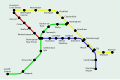 reworked SVG

Thanks a lot! The map is excellent- it will improve certin pages tremendously! Thanks again! Dewarw 17:35, 7 July 2007 (UTC)
I've done an SVG version of the map, which is smaller (in terms of filesize) than the PNG and is also scalable. Apart from that, there's not much difference. Time3000 15:01, 9 July 2007 (UTC)
- I'm concerned that the redrawn versions are still copyright violations of the original. Could a version be made that isn't a tracing of the original, with unique colors as well. I understand that for geography, it is hard to get around tracing (like the state of Florida is always going to look like a panhandle penisula). But this is a heavily stylized, not drawn to scale graphic of a transportation route map. Therefore, we could easily create one that doesn't impose on the copyright of the existing map.-Andrew c [talk] 15:07, 9 July 2007 (UTC)
- OK, I've made a version with a different layout and slightly different colours; any major changes to the colours would just be confusing. The layout doesn't look quite as good and it takes up more space (in dimensions) than the other versions, but it does avoid the copyright problem. Time3000 15:37, 10 July 2007 (UTC)
I do not like this new version, the SVG version is the best so far. Dewarw 17:42, 10 July 2007 (UTC)
It might be good to follow the geography a bit closer. For example, Cardiff is in Wales, which is off the west hand side of England. If it's any help, I've plotted all the stations on a map and joined them up. Perhaps a map can be made to roughly follow that: http://img244.imageshack.us/img244/8906/citylinklc9.png CountingPine 22:01, 10 July 2007 (UTC)
Why has the map been deleted? please return an image soon as the pages are reduced in quality! Dewarw 17:39, 12 July 2007 (UTC)
Beeching II Map
Because of the success of that (Central Citylink) map- could you do the same to this image:

A simplified version (like the Citylink map) would be find, but could you keep it in the shape of the UK as far as possible? The original image is probably unsuitable for the same reasons, although it has not been marked as such.
Many thanks, Dewarw 17:44, 7 July 2007 (UTC)
Uhh, Has anyone helped you? If they haven't I can start now.--Cronholm144 21:42, 8 July 2007 (UTC)
Done, except for one island.--Cronholm144 02:10, 9 July 2007 (UTC)
Looks good! Would it be possible for you to put any of the place names on the map? If you could, it would be a great help. Thanks again, Dewarw 18:43, 9 July 2007 (UTC)
I can't read the place names, I will need a list or higher resolution--Cronholm144 19:53, 9 July 2007 (UTC)
Here is the map in a higher resolution. It is in three parts. If you still cannot get all of the names then I will be able to write them. Dewarw 21:28, 9 July 2007 (UTC)
Here are the names. If it looks like I have missed one please say, or use the higher resolution images. They are top to bottom. Where two/three are at the same level, they are listed side by side. I would only use these names as a last resort as there might be small mistakes.
- ELGIN
- INVERNESS
- ABERDEEN
- MONTROSE
- DUNDEE
- PERTH
- STIRLING
- DUNFERMLINE
- GLASGOW
- EDINBURGH
- BERWICK-UPON-TWEED
- CARSTAIRS
- KILMARNOCK
- AYR
- DUMFRIES
- CARLISLE
- STRANRAER SUNDERLAND
- NEWCASTLE
- WORKINGTON
- MIDDLESBROUGH
- DARLINGTON
- NORTHALLERTON
- SCARBOROUGH
- BARROW
- HEYSHAM HARROGATE
- YORK
- LEEDS
- BLACKPOOL BRADFORD HULL
- GRIMSBY
- DONCASTER
- LIVERPOOL MANCHESTER
- SHEFFIELD
- HOLYHEAD
- LINCOLN
- CHESTER
- CREWE
- STOKE
- DERBY
- GRANTHAM
- NOTTINGHAM KINGS LYNN
- STAFFORD YARMOUTH
- NORWICH
- SHREWSBURY LEICESTER
- WOLVERHAMPTON PETERBOROUGH
- BIRMINGHAM ELY
- RUGBY
- NORTHAMPTON
- WORCESTER
- CAMBRIDGE
- IPSWICH
- BANBURY
- HEREFORD
- BLETCHLEY COLCHESTER HARWICH
- FISHGUARD HARBOUR
- GLOUCESTER
- CARMARTHEN
- OXFORD
- MILFORD HAVEN WATFORD
- SWANSEA DIDCOT SOUTHEND-ON-SEA
- NEWPORT
- LONDON
- SWINDON
- BRISTOL
- READING
- CARDIFF
- BATH
- WESTBURY GUILFORD ASHFORD DOVER
- FOLKSTONE
- SALISBURY WINCHESTER
- TAUNTON
- HASTINGS
- YEOVIL SOUTHAMPTON HASTINGS
- EXETER BOURNEMOUTH NEWHAVEN EASTBOURNE
- WEYMOUTH
- PLYMOUTH
- PENZANCE
- Did you trace that manually? I think we have fairly precise SVG outlines of Britain around here somewhere... ¦ Reisio 02:39, 10 July 2007 (UTC)
Yes, as a last resort. Unfortunately, the accurate svg Britain we have on commons doesn't match well with the Britain in the pic (railroads into the ocean). The country must have changed shape! :)--Cronholm144 03:21, 10 July 2007 (UTC)
Thanks a lot, it is coming on really well. I don't mean to be picky, but I have spotted a few slips. Unfortunately on the map "R"s look like "A"s so it is "Perth" not "Peath."
Others:
- Harwich, not Warwick.
- Fishguard Harbour, not Harbor.
- Hastings, not Hasting
- Southend on Sea not Southead
I am really grateful for this, Dewarw 16:48, 10 July 2007 (UTC)
Done, I will upload momentarily--Cronholm144 20:46, 10 July 2007 (UTC)
Boy Scouts of America regional map
-
original copyvio image
-
use this one as base
-
 or this one
 -
 SVG Base

.svg)
Article(s): Boy Scouts of America
Request: This a map for the Boy Scouts of America page, which has been brought to my attention as a copyvio, a situation I never want. The map I originally uploaded (Image:RegionMap copy.jpg) was deemed unsuitable. I was planning to leave you guys alone for a while ;), but this is important. Could you make a version appropriate for Wikipedia, perhaps lighten the colors to pastel, or change them for legibility? Thanks, Chris 12:07, 10 July 2007 (UTC)
- Please hold off on correcting this image. I have already tagged for deletion, as I am the creator of this work (which my identifing info and copyright notice was edited out, and was converted from gif to jpg). When the smoke clears from all this, I may create a new image specifically for that article. For right now, please ignore the request. Robhmac 14:20, 10 July 2007 (UTC)
- withdraw request at request of Robhmac. Chris 15:32, 10 July 2007 (UTC)
- The information in the image is not subject to copyright since it is a simple compilation of public facts, so there shouldn't be any issue with recreating it from a free base map. Mike Dillon 15:39, 10 July 2007 (UTC)
- withdraw request at request of Robhmac. Chris 15:32, 10 July 2007 (UTC)
Graphist opinion:
- I'll get to work on this if I have time. Anyone is free to beat me to it, shouldn't take long if using that SVG base. --BsayUSD [Talk] [contribs] 14:53, 12 July 2007 (UTC)
Awful scan of old engraving

Article: Attock
Request: To me that looks like a horrendous scan of an old image, but I don't know if anything can be done for it. If not, I would request possibly it be deleted as an awful blurry thing. 68.39.174.238 15:35, 11 July 2007 (UTC)
Graphist opinion: I think the best thing that can be done for it is to reupload the source version at its original size. It's a shame the original was uploaded at such low quality. CountingPine 13:08, 12 July 2007 (UTC)
- The source image is the same low quality. Question is where the image came from in the first place. Valentinian T / C 13:16, 12 July 2007 (UTC)
Sedevacante coatofarms

Article(s): Way too many, including almost every papal conclave one, the template for them (!), and sede vacante.
Request: That a SVG free image be created to replace this noxious fair-use one. The Image:Emblem of the Papacy.svg has the keys and ring in it, so it could be used as a starting place, with someone coming up with the umbrella. 68.39.174.238 11:39, 12 July 2007 (UTC)
Graphist opinion:
I will start work now--Cronholm144 11:44, 12 July 2007 (UTC)
Yay! A-symmetrical and low-res my favorite. I will have something by tomorrow bout this time or before. Cheers--Cronholm144 12:33, 12 July 2007 (UTC)
added pic, prob due to a known error just keep clicking till you get to the image. The problem won't be there with the finished product.--Cronholm144 14:35, 12 July 2007 (UTC)
Possible solution: Save as a plain SVG in Inkscape. If there are any blurs or things this can also interfere. Also, would this new image also be fair-use? --Dave the Rave (DTR)talk 15:31, 12 July 2007 (UTC)
- I don't think so, mostly because that image itself has to be ancient, however I wouldn't know how closely you tried to copy the original image. 68.39.174.238 15:43, 12 July 2007 (UTC)
Map of rabies, etc
-
Source GIF
-
 Base SVG Map
 -
SVG uploaded

.png&action=edit&redlink=1)
Articles: Rabies
Request: An SVG-image, which correct applications of information, and a little text in the image as possible. You may wish to preserve the existing image as an example of what SHOULDN'T be done with a map! 68.39.174.238 15:48, 12 July 2007 (UTC)
Opinion: That shouldn't be too hard. Would it be okay to base it on the blank world map (see above)? Also, are there any preferences as to colours? I'll have a go at creating an initial SVG. --Dave the Rave (DTR)talk 17:54, 12 July 2007 (UTC)
- Due to the sheer size of the Base SVG (WOW) I'm having some problems editing it in Inkscape, and I don't really know how to edit it as XML. I'll just trace the original and see if that is acceptable. My apologies. --Dave the Rave (DTR)talk 18:29, 12 July 2007 (UTC)
- First Upload: How's that? --Dave the Rave (DTR)talk 20:28, 12 July 2007 (UTC)