Sankey diagram
A Sankey diagram (after Matthew Henry Phineas Riall Sankey ) is a graphical representation of quantity flows. In contrast to the flowchart , the quantities are represented by arrows that are proportional to the quantity.
Sankey diagrams are important aids for the visualization of energy and material flows as well as inefficiencies and potential savings when dealing with resources. The representation can also be applied to social science data that change over time (e.g. voter migration between the parties).
history

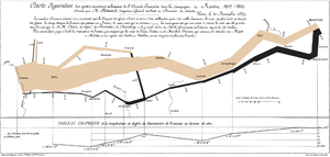
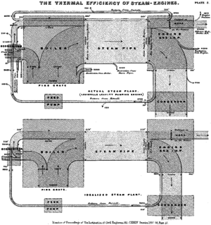
The French civil engineer Charles Joseph Minard published a graphic on the losses of the French army during Napoleon's Russian campaign in 1869, the Carte figurative des pertes successives en hommes de l'Armée Française dans la campagne de Russie 1812-1813 . The Irish engineer Captain Matthew Henry Phineas Riall Sankey used a similar form of representation in 1898 to visualize the energy flows and losses of real and ideal steam engines. Sankey only used the form of representation this once. However, similar information graphics were used on an international scale in the following decade . In 1908, for example, Sankey diagrams comparing heat balances for steam engines / gas engines and blast furnaces / coke ovens were printed in the magazine of the Association of German Engineers .
Sankey diagrams were first used on a larger scale by Alois Riedler (1850–1936), who used the form of representation to visualize performance and energy losses in motor vehicles. Alois Riedler was one of the pioneers in the field of automotive tests on roller dynamometers. In the years that followed, Sankey diagrams gained in importance, especially in Germany. The background was that Germany had to use its resources sparingly due to the reparations payments after the First World War and continuously tried to improve the energy and material yield of technical processes. Sankey diagrams were mainly used in the steel industry, the cement industry and the glass industry.
Over the years, the form of representation of the Sankey diagram fell into oblivion. In recent times, the Sankey diagram has been gaining in importance again due to the increasing use of energy and material flow analysis and management and the growing call for increased material and resource efficiency.
Methodological basics
Sankey had introduced the diagram named after him rather casually and the following illustrations were based on it. So there are actually no rules for creating Sankey diagrams. Nevertheless, certain implicit assumptions are made:
- As a rule, quantities are shown that relate to a time period.
- The quantity quantities are extensive quantities , that is, they can be added.
- The arrow width is proportional to the amount shown.
- As a rule, no stock sizes are taken into account, that is, there is no storage.
- Conservation of energy and mass is tacitly assumed.
Forms of representation and applications
The typical Sankey diagram does not exist. Rather, a large number of different Sankey diagrams have been created and published over the past 100 years. The quantity information can be absolute or relative, for example energy, quantity or cost flows can be mapped.
An energy flow diagram (also energy flow diagram or heat flow diagram ) is a graphic representation of the energy sales per unit of time ( energy flow ) of a technical process (e.g. for thermal power plants).
Data structure
From an information technology point of view, Sankey diagrams are visualizations of directed graphs. The nodes of the graph form the intermediate levels, for example the forms of energy in an energy flow diagram, while the weighted edges depict the flow of quantities between the levels. If the weights of the incoming and outgoing edges of each node add up to 1, all volume flows are displayed. If there are any deviations from this, certain increases and decreases are explicitly left out, for example the troop losses in Minard's diagram. The graphs are usually acyclic because of the temporal dimension that is often shown, but cyclic processes can also be shown, as Sankey's steam cycle shows.
See also
literature
- Mario Schmidt : The use of Sankey diagrams in material flow management ( Umwelt.hs-pforzheim.de PDF; 6.99 MB).
Web links
- sankey-diagrams.com Website where Sankey diagrams are presented and discussed.


