
diagram
A diagram (from ancient Greek διάγραμμα diágramma "geometric figure, outline") is a graphic representation of data , facts or information . Very different types are used depending on the purpose of the diagram. The range from pictorial elements to purely abstract structures is very large.
In contrast to the pictogram (or icon), the main aim of a diagram is to clarify a connection, while a pictogram only represents specific information. Diagrams are also often coded, which means that you have to analyze a diagram with the help of your previous knowledge in order to be able to understand it, while a pictogram is immediately understandable due to its iconic (pictorial) character. However, diagrams can contain pictograms.
Charts can be created in spreadsheet programs.
Historical charts
The use of charts has been known since ancient times. For example, graphs were used to represent family relationships , religious thoughts or legal relationships. But diagrams for the representation of tone systems in music-theoretical manuscripts were also proven early on.

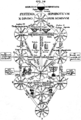
Family tree of Christ as the root of Jesse , 1180

Guidonic hand as a sound system, 1475
Dante's Way out of Purgatory, 1515
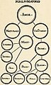
Kabbalah , 1652


Axis charts
Axis diagrams are used to illustrate the relationships between mutually dependent values or measured variables in a coordinate system .
-
Point diagram : Two mutually normal (perpendicular) coordinate axes span an area in which the value pairs are entered as points (crosses, circles); more general and also scatter plot in statistics.
- Bubble diagram : An extension of the point diagram to show another feature through the size of a bubble.
- Line diagram : The points are connected to one another by lines (straight lines, curves); if the area between the axis and the line is filled, it is called an area diagram .
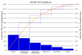
- Bar chart : The distance between the abscissa axis and the data point is shown with a line or a rectangular area perpendicular to the axis.
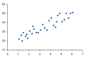
Scatter plot

Bubble chart

Line diagram (with recognizable regularity)

Line diagram (for values that vary)

bar chart

bar graph


-
Pie chart : If the individual values are part of a whole, the values can be drawn in the form of circular sectors to show the proportions of their proportions.
- Pie / pie chart : A variant of the pie chart with a perspective view of a flat circular cylinder .
- Donut chart : A variant of the pie chart; In contrast to these, however, several data series (for example several months) can each be shown in a separate ring.
- Network diagram : For larger data series, an axis is drawn for each value and the axes are evenly distributed over 360 ° around the zero point; the values are then plotted on the axes and connected with each other by straight lines, creating ashape reminiscent ofa spider's web .
- Vector diagram : Shows a dependency on the amount and angle and is mostly used to represent complex numbers or quantities in alternating current technology.

Pie chart

pie chart

Donut chart

Radar diagram

Vector diagram


- Smith Chart : Used for easy graphical calculation of 1 / x. It corresponds to a projection from the line diagram for complex, real positive values into a circular shape.
- Gantt chart : A Gantt chart or bar chart is a project management instrument named after the management consultant Henry L. Gantt (1861-1919), which graphically represents the chronological sequence of activities in the form of bars on a time axis.
- Pareto diagram : The Pareto diagram shows groups according to their importance. See also ABC analysis .

Smith Chart
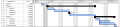
Gantt chart
Pareto diagram


Representation of multivariate functions f that depend on several variables :
- Orthogonal 3D representation: Representation of the point triples (x, y, f (x, y)) through parallel projection .
- Family of curves , family of characteristic curves : Representation by several curves, in which one of the variables is unchangeable, a ( parameter ).
- Contour diagram : Points (x, y) with the same function value f (x, y) arespecifiedfor selected values in a coordinate system like contour lines in a map .
- Heatmap : Points (x, y) in the same function value interval f (x, y) are assigned the same colors.
- Triangle diagram : Each point in the equilateral triangle isassigned three values at the edges / axesthrough parallels to the sides, which together result in a constant value (usually 100%).

Orthogonal 3D representation

Characteristic field with parameters

Contour lines on a map

Height information in regional colors ( heatmap )

Triangle diagram of the solidification temperature of a ternary metal alloy
_Surface_Plot.png)


Graph
This type of diagram is about objects and their relationships with one another. Graph theory forms the mathematical foundation .
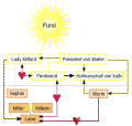
This category therefore also includes diagrams that are used to illustrate structures, for example organizational structures ( organizational charts ), family relationships ( family tree ), flowcharts, concept maps and data structures ( tree diagrams : dendrogram and decision tree ).
The Sankey diagrams are directed graphs. They provide additional information across the width of the arrows.
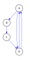
Directed graph with multiple edges
Artistically extended graph

Commutative diagram in mathematics


Quantity diagrams


A Venn diagram also called Venn diagram illustrates especially relationships of quantities to each other. For example, these can contain or overlap, which would mean a subset or an intersection. Most of the time, the quantities are represented as circles or ellipses.
Figurative or cartographic representation


A figurative representation is usually a schematic drawing of a real object with the purpose of explaining a certain issue. However, photos are also used as a basis, but they are provided with graphic means and pictograms (such as arrows, numbering ...).
This type of representation is also called an illustration or technical drawing . The area in which this representation takes place is accordingly also called the drawing plane . The delimitation of the terms is not clear in the German language. But tendencies can be seen. Diagram is used more for schematic, illustration more for artistic and technical drawing more for true-to-scale representations.
Cartographic diagrams are e.g. B. used in the representation of layers of earth or altitude, but also as a city map or similar.
In the USA , an airport diagram must be drawn up for every airport that has a tower and published via the FAA . These charts are updated every 28 days. As an example, the diagram of the John F. Kennedy International Airport in New York is shown (for the legend see Abbreviations / Aviation ).
Special chart types
technology

Processes in production plants are represented by means of a process diagram or flow chart. This contains all machines and lines in a schematic, iconized representation. Special (standardized and non-standardized) symbols make it possible to “read” the plan of a factory or production facility. Examples of this are the cleaning diagram and the grinding diagram of a mill .
Other typical diagram types in technology are the circuit diagram in electronics as well as the process flow diagram and the piping and instrumentation flow diagram in process engineering . The latter two flow diagrams are standardized in EN ISO 10628.
physics
In the field of physics there are some special diagrams:
- Feynman diagram
- Grotrian diagram (term scheme)
- Hertzsprung-Russell diagram ( stellar physics )
- Minkowski diagram
- Mollier-hx diagram
Finance
Special diagrams can also be found in chart analysis on the stock exchange , whereby the diagrams are referred to here as charts. A time-cost-progress diagram shows the current status of costs, the planned dates and the project progress, in order to draw attention to any deviations.
Computer science

But diagrams can also be used to present processes clearly and logically ( flowcharts ). This is particularly important in computer science (see Unified Modeling Language ). The most popular forms of representation here are the flowchart and the structured chart .
statistics
The following diagrams are quite common in the field of statistics :
- histogram
- bar chart
- Box plot : combined plotting of mean and quantiles
- Correlogram
- Mosaic plot : Representation of a data set with several categorical variables
- Sum frequency polygon : approximation of the empirical distribution function
Diagram creation by software
Nowadays, diagrams can be created with Office programs or with visualization programs. Formatting and similar changes can also be generated depending on the performance of the programs. Many statistics programs also offer functions for generating diagrams from the available data.
manipulation
.jpg)
Due to the type of graphic representation, a diagram can try to steer the analysis of the viewer in a certain direction without the latter noticing. A diagram can be based on facts, but still give the viewer a manipulated impression. This can be done, for example, by choosing the axes: small differences can be overemphasized by shifting the zero point of an axis diagram.
Another example is the course of the stock market. If share prices fall rapidly and rapidly on a day, the impression of a stock market crash can arise without specifying the listing period . If you follow the course of the stock market over the whole year, you will notice that the daily ups and downs in stock market prices are normal. When comparing price development and benchmark, manipulations are very popular because an indexed chart is often used here.
Diagrammatics
The diagrammatics is a field of research that deals with how data and knowledge illustrated with the aid of diagrams, can be taught and explained.
See also
- abscissa
- Axis labeling
- Affinity diagram
- Bland-Altman diagram
- Iron-carbon diagram
- Function (math)
- Nassi-Shneiderman diagram (flowchart)
- Iconic turn
- curve
- Coordinate system
- Logarithmic representation
- ordinate
- Process visualization (representation of processes and procedures)
- semiotics
- Scale level
- Visualization
- Visualization programs
Web links

- List of all Wikipedia articles whose title begins with diagram
- List of all Wikipedia articles whose title contains Diagram
- Image statistics charts. Teachsam.de, accessed on November 27, 2015 (explanations and more about different diagram forms).
- Visualization techniques. University of Tübingen, accessed on November 27, 2015 .
- Available chart types. microsoft.com, 2010, archived from the original on May 3, 2010 ; Retrieved November 27, 2015 (English, explanations of available chart types under Office 2007).
- Info design patterns. fh-potsdam.de, July 30, 2008, archived from the original on January 17, 2009 ; Retrieved on November 27, 2015 (English, interactive page with filter function that shows various forms of visualization. With descriptions, application examples and example representations).
- Wolfgang Walla: How to be fooled by statistical graphics. Statistisches Landesamt Baden-Württemberg, 2008, accessed on April 14, 2020 (explanations on manipulating charts).
Individual evidence
- ↑ Ute von Figura, diagrams in music-theoretical manuscripts - characteristics and development , Heidelberg University, Materiale Textkulturen , published on June 3, 2019, accessed on January 10, 2020