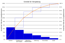
Pareto chart
A Pareto chart is a bar chart in which the individual values are shown in order of magnitude. The largest value is on the far left and the smallest value on the far right in the diagram. The Pareto chart is named after the Italian economist Vilfredo Pareto . It is used, among other things, in statistics . The Pareto diagram is an elementary quality tool and as such is used for error analysis.
definition
The Pareto chart is based on the Pareto principle , according to which most of the effects of a problem (80%) can often be traced back to a small number of causes (20%). It's a bar chart that ranks problem causes by importance. See also the article on Pareto distribution - Narrowing down the sources of error / quick determination of decision aids.
purpose
With the help of the Pareto diagram, those that have the greatest influence are filtered out of many possible causes of a problem. The importance of a cause can be read directly from the diagram.
Example: If the companies successfully dealt with the first three reasons for being late at work, they would have solved about 80% of all cases (see diagram).
See also ABC analysis , XYZ analysis , ABC / XYZ analysis .
Action
First the topic to be worked on is determined. Categories are then created, for example for possible types of errors or causes, or for products, customers, articles, suppliers.
In addition, a size must be determined with which one can clarify the effects of the problem. The most common variables are the frequency of occurrence, or the frequency assessed with costs (number multiplied by the cost rate), or the probability and effect, or in the FMEA the probability of occurrence and the probability of discovering the cause and the significance of the failure consequence.
To create the Pareto diagram, the percentage of each error category is determined from the absolute frequency (or the corresponding measured variable):
The categories are sorted in descending order according to their importance and then plotted on the horizontal axis from left to right. A column is drawn above each error category, the height of which corresponds to the frequency of occurrence. If the columns are stacked on top of one another from left to right, the result is the Pareto curve, from which the summed percentage value can be read.
Web links
- Cloodt Verlag: Pareto diagram (PDF file; 73 kB)
- Create Pareto Diagram (Youtube Video)

