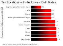
bar chart
The bar graph in very narrow columns also bar chart called, is a diagram obtained by on the x-axis perpendicular, non-contiguous columns (rectangles with meaningless width), the frequency distribution illustrates a discrete (random) variables. The bar chart is particularly suitable to illustrate a few characteristics (up to approx. 15). With more categories the clarity suffers and line diagrams are to be preferred. The bar chart is also unsuitable in the case of metrically continuous data; a histogram is preferable.
Stick diagrams were developed for the first time by the camera specialist August Friedrich Wilhelm Crome .
properties
The bar chart is a height-proportional representation of a frequency distribution, because the height of a column is proportional to the frequency of the corresponding characteristic expression . If all columns have the same width, that is, if the column width is constant over all characteristic values, the height proportionality also implies area proportionality.
In contrast to the line display, a column optically includes all values from the origin to the end value. Therefore, columns are not suitable for every application. Depending on the value, the column can grow up or down.
Special forms
Stacked column chart
Stacked bar charts, also known as stack charts, show relative or absolute frequencies of at least two data series in a rectangular column. The respective frequencies are therefore shown as areas. The individual values are arranged one above the other and the rectangular column shows the total value. This makes it easier to compare overall values. However, the stack diagram is less suitable for reading changes in the proportions shown.
Grouped column chart
The grouped bar chart shows the values of several categories side by side. The various variables can thus be directly compared with one another. However, the aggregated data is difficult to read and compare on this type of chart.
Overlapping column chart
In an overlapping column chart, the columns of a respective characteristic are shown overlapped. This representation variant is often used for several time series. In this regard, the latest time series is in the foreground and, accordingly, older time series are partially covered.
bar graph
The bar chart is very similar to the column chart. It corresponds to a bar chart with the axes reversed. Thus the vertical columns become horizontal bars and it grows in length and not in width. It is therefore more suitable for displaying a lot of data, as it can be more easily continued on other pages. Bar charts are particularly useful for displaying rankings such as the Hattie ranking. A special form of the bar chart is the Gantt chart , which is used in project management , for example, to illustrate time processes.
Others
Other special forms are the Pareto diagram and the waterfall diagram .
Others
One of the world's most beautiful uses of the bar chart in public space is the “climate fence” built in 2014 by the weather museum Alte Schule Schreufa in Frankenberg - Schreufa . As a striking object of the museum (which actually also serves as a fence), the fence slats show the development of the average annual temperature in Germany since 1914 and thus offer an indication of climate change over the past 100 years.
Another popular application in Germany is the election diagram .
literature
- David Ray Anderson, Dennis Sweeney, Thomas Williams: Statistics for business and economics. 2nd edition, South-Western Educational Publishing, London 2010, ISBN 978-1-4080-1810-1 .
- Andreas Büchter, Hans-Wolfgang Henn: Elementary Stochastics - An introduction to the mathematics of data and chance. Springer Verlag, Berlin / Heidelberg 2005, ISBN 3-540-27368-9 .
- Barbara Hey: Presenting in science and research. Springer Verlag, Berlin / Heidelberg 2011, ISBN 978-3-642-14587-2 .
- Ingo Kett, Gerhard Schewe: Management Skills - using relationships, solving problems, communicating effectively. Gabler Verlag, Wiesbaden 2010, ISBN 978-3-8349-8527-9 .
- Wolfgang Kohn, Riza Öztürk: Statistics for Economists. Data analysis with R and SPSS. Springer Verlag, Berlin / Heidelberg 2011, ISBN 978-3-642-14585-8 .
- Hans-Joachim Mittag: Statistics. An interactive introduction. Springer Verlag, Berlin / Heidelberg 2011, ISBN 978-3-642-17846-7 .
- Rainer Schlittgen : The statistics laboratory. Introduction and user manual. Springer Verlag, Berlin / Heidelberg 2005, ISBN 3-540-26520-1 .
- Daniel Wollschläger: Basics of data analysis with R. An application-oriented introduction. Springer Verlag, Berlin / Heidelberg 2010, ISBN 978-3-642-12228-6 .
Web links
- Identification of the largest value in the table and bar chart
- Presentation of progress data in line charts and bar charts (PDF; 589 kB)
Individual evidence
- ↑ Bernd Rönz, Hans G. Strohe (1994), Lexicon Statistics , Gabler Verlag, p. 335
- ↑ Bernd Rönz, Hans G. Strohe (1994), Lexicon Statistics , Gabler Verlag, p. 320
- ↑ "If the form of distribution is metric and not discrete, a histogram is not created, rather than a bar chart." Quoted from the statistics glossary
- ↑ HJ Pinnekamp, F. Siegmann: Descriptive statistics . 4th edition. Oldenbourg, 2001, p. 40 .
- ↑ Andreas Büchter / Hans-Wolfgang Henn: Elementare Stochastik - An introduction to the mathematics of data and chance. 2005, p. 27.
- ↑ a b Barbara Hey: Presenting in science and research. 2011, p. 117.
- ↑ Ingo Kett / Gerhard Schewe: Management Skills - Use relationships, solve problems, communicate effectively. 2010, p. 141.
- ↑ Andreas Büchter / Hans-Wolfgang Henn: Elementare Stochastik - An introduction to the mathematics of data and chance. 2005, p. 26 f.
- ↑ Hattie Ranking: 252 Influences And Effect Sizes Related To Student Achievement ( English ) visible-learning.org. Retrieved May 14, 2020.


