Waterfall chart
Waterfall charts are special types of column charts . A typical waterfall diagram shows how an initial value is increased and / or decreased through a series of further values, thus leading to a final value . In such a diagram, e.g. B. a cost block shown as a column is divided into its individual costs, in which the individual cost columns are transferred like a waterfall to the right or left or the curves or columns, which are made up of individual values, are called a waterfall diagram.
Creation
As of version 2016, the Microsoft Excel spreadsheet program offers the option of generating waterfall diagrams directly.
The spreadsheet program OpenOffice.org-Calc does not offer waterfall charts as a separate chart type. However, they can be generated by cleverly dividing the associated table of values and invisible columns.
It's even easier to create a waterfall chart using the Stock Chart chart type. The data table for the diagram is set up in such a way that the closing price of the previous bar is the starting price of the following bar. The maximum and minimum prices are not filled in. The advantage is that you do not have to work with hidden bars, a change from positive and negative values even beyond the 0 line is unproblematic and the conditional formatting of value-increasing and value-decreasing influences is already pre-formatted.
Applications
Communications engineering
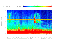
In communications, the diagram, the perspective view of short-term power spectra of a signal from which can be seen clearly the change in the spectral composition take. The curves of a measurement are arranged offset one behind the other or color-coded in the form of a raster diagram .
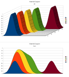
Statistical distributions of measured values over time can also be observed in order to clearly show changes over time. The picture on the right shows an example. Below that, the same values are shown as 2D sums. The distribution of the values is no longer immediately recognizable. The total amount can be read off immediately. The diagram below shows, for example, that the value of 1.9 is never exceeded.
Business consulting
Another example of a waterfall diagram is the EBITDA bridge .
Individual evidence
- ↑ Create a waterfall chart in Office 2016 (English). Retrieved November 5, 2015.


