Scatter plot
A scatter plot , also point cloud called (engl. Scatter plot ), the graphical representation of the observed values of two pairs of statistical characteristics . These pairs of values are entered in a Cartesian coordinate system , resulting in a point cloud . The points can be represented by various symbols.
application
It is hoped that the pattern of the points in the scatter diagram will provide information about the dependency structure of the two characteristics that are represented by the coordinates.
The example diagram opposite contains points that represent the two characteristics "length" and "width" of various artillery ships. The ships are divided into four classes, which are assigned different colors (destroyer, light cruiser, heavy cruiser, battleship). Such a scatter diagram shows various correlations in the recorded data at a glance .
Frequently occurring correlations are clusters (agglomerations) and linear structures. Clusters can be examined with the cluster analysis . Regression analysis is particularly useful for quantifying linear correlations .
If a third (metric) feature is also to be displayed, this can be done by changing the size of the symbols. The resulting chart type is called a bubble chart .
With discrete features
In general, only evenly distributed data is suitable for scatterplots. Observations of discretely distributed features overlap when the same values are present several times. However, there are also ways to represent ordinally scaled features in scatterplots:
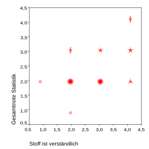
- by "sunflowers": a circle is entered at each pair of coordinates. The number of pairs of values that lie on this point is represented by lines on the circle, so that a stylized sunflower results.
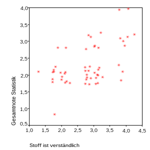
- by means of a " jittered scatter plot": small random numbers are added to the data so that the values are slightly pulled apart and result in a point cloud. However, the values are actually on top of each other. You could call them “pseudometric”.
The following example shows both possibilities based on the evaluation of a statistics lecture in which the characteristics “material is understandable” and “overall grade statistics” (grades from 1 to 4) were entered in a scatter diagram.
| Sunflower Scatterplot | Jittered scatter plot |
|---|---|

|

|
Dot plot
The dot plot or the point diagram is also known as a one-dimensional scatter plot. In it, a variable is displayed either on the x-axis or on the y-axis (as in the graphics). Depending on how many values the observations of the variables assume, the problem arises that you can only see one data point, although (many) other observations can be hidden behind it.
Similar to the sunflower scatter plot, symbols can be used in different ways to represent the number of points. This should be explained using a historical example (horse- kick data from Bortkewitsch ):
- In the graphic on the left, a larger circle symbolizes that more observations are hidden behind it than with a smaller circle (bubble diagram).
- In the graphic on the right, a circle is drawn for each data point; if the same value occurs several times, additional circles are drawn to the right of the first circle.
Another possibility is to draw the observation value on one axis and a random one for the other axis, e.g. B. from a uniform distribution to choose a value. You can also draw a density estimate.
The dot plot allows insights into the distribution of a variable, e.g. B. where the observations are particularly dense or the observations are distributed over only a few values.
Scatterplot Matrix
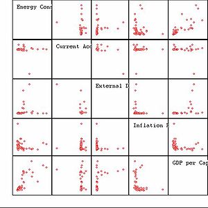
In the scatter diagram matrix of a multivariate data set , two scatter diagrams are drawn for individual pairs of variables, which lie on both sides (top right / bottom left) of the matrix diagonals filled with text .
The only difference between the two scatter diagrams that belong to a pair of variables is which variable is mapped onto the x-axis or the y-axis. I.e. the corresponding point clouds on both sides of the matrix diagonals are mirrored, but not on the above. Diagonals, but rather on their respective x = y lines , which are all perpendicular to the matrix diagonal.
In variations of the scatter plot matrix, instead of the mirrored point clouds, additional information is also displayed, e.g. B. Correlation coefficients or regression functions.
Only the variable names are entered on the diagonal in the graphic on the right. However, there are variations here too, e.g. B. with further information ( box plots , density estimates) about the respective variable.
The scatter plot matrix has several disadvantages:
- The number of variables shown should not become too large, as otherwise the area for each scatter diagram will be too small and thus confusing. The scatter plot matrix shows precisely different projections of the multivariate data for variables (mirrored representations as described above are not counted). In the example shown, and is therefore the number of different projections . The brothers Tukey therefore metrics proposed summary with Scagnostics referred characterizing the nature of the point cloud.
- An interesting data structure need not be visible in the projections of the scatter plot matrix. Then either the Grand Tour or the projection pursuit method should be used.


