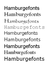
Hamburgefonts
The word Hamburgefonts , traditionally actually Hamburgefons or Hamburgefonstiv, is a dummy text that is particularly suitable for assessing the design and appearance of a font . It contains all the essential forms so that the character of the respective font can be recognized quickly. It consists of the letters that are often designed first when designing a font.
Meaning and function
Until well into the 1980s, personal computers (PCs), equipped with a multitude of scalable fonts, were not part of the basic equipment of almost every household. Typeface design and printing were concentrated largely in the hands of graphic designers ( typographers ), printing companies and to some extent also in those of advertising agencies. The required fonts and font samples were obtained from designers and printers from type foundries and, since the 1960s - as a result of the decline in lead type (letterpress printing ) in favor of offset printing - from other type manufacturers and providers of phototypesetting, photocompositioning and other devices. For layout- For the purpose of small amounts of text and for the production of individual items, writing-on letters were also used in graphic offices.
The use of fonts is also subject to fashions. Designers create new fonts and font families or change common fonts. This is based on a wide range of objectives, such as particularly good legibility, particularly many letters in one line (narrow font styles ), particularly soft or particularly technical, light, heavy or particularly unusual appearance. Type foundries and type manufacturers have published catalogs of the fonts available from them, with which designers and printers can get a first impression of existing and new fonts. Titling, display type ( display type ) and typeface ( body type ) are common in graphic design studios and printing to date terminology. In the font catalogs, in addition to the font names, often only the word "Hamburgefons" or "Hamburgefönstiv" can be read in a wide variety of scripts, and more rarely entire alphabets. In the meaningless word “Hamburgefonts”, round and angular letters appear equally, as are particularly wide and particularly narrow ones. “Hamburgefonts” gives a concise first impression of a font in use. Dummy text is another means of assessing the use of a font based on the intended purpose. This gives an impression of the space required by the text and legibility in common font sizes.
Possibility of confusion
The widespread use of computers in many households and the greater use of the English language today made the English word “font” for “writing” or “fonts” for “writing” known to a wider public. In the English-speaking world, the typeface word "Hamburgefonts" was common with a small deviation. Therefore, “Hamburgefonts” is sometimes mistaken for a font.
Oddities
Another fantasy word was used to compare the width of a font: Here the nonsense word "HillimillihirtzheftpflasterEntferner" found its way into various font catalogs as a benchmark. Originally it was set down and measured to fine-tune the diatype typesetting device .
