
Punctuation
Typeface is a character set , which in a certain font is designed and implemented according to the respective technical conditions. It is used for text production and processing , the set and the pressure and forms the basis of typography .
A punctuation font consists of individual characters , the glyphs : as a rule, lowercase letters, uppercase letters, umlauts, accented characters, digits, ligatures , punctuation marks , special characters and small caps . These are put together manually, by machine or electronically into words, lines and more complex orders. The scope of such a character set depends on the technology and the intended scope of use of a typeface.
For Western European alphabet fonts, the functionality of the characters in a typeface requires that they are horizontal, next to other characters in the inventory, according to a uniform rhythmic and stylistic principle. Only then can they be put together to form a coherent , graphically balanced typeface.
- Different forms of fonts

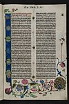
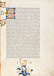
Type apparatus of the 42-line Bible around 1454

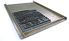
Allocation scheme of a case for Antiqua fonts (125 compartments)
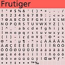
Font of the " Frutiger "


Creation of the first typesetting
The first typeface was created around 1450 by Johannes Gutenberg , who developed the movable letters (types) together with the hand casting instrument . Thanks to his invention, the individual letters cut in metal could be reproduced identically and then combined to form different, homogeneous printing forms . This made it possible to use the advantages of the alphabetical writing system technically. With a manageable set of characters, any text could be set in different arrangements, printed and thus reproduced. This modular principle is also used for digital fonts. Whether network communication (chat, SMS, e-mail) or desktop publishing : Written statements are composed of individual letters.
In the times of lead typesetting, the production of typesetting was a highly specialized craft, partly steeped in professional secrets, which was practiced by a select small group of qualified type designers and die cutters . The design and technical implementation of a typeface often took several years. Notwithstanding this, fifty years after Gutenberg's invention, there were already around 2000 different typesetting.
From lead type to digital type
Until the 1980s - that is, for more than 500 years - a typeface was cast in lead. From the beginning it was used exclusively for printing. For this reason, the various typescripts were colloquially referred to as block letters .
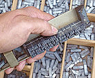
- Handset
Lines in the angle hook
Set text in the placement ship


Casting, setting and printing remained manual work for more than 350 years after Gutenberg. The transition to industrial production did not begin until the 1820s , when the patent for the first typesetting machine was applied for in England. The line casting machine Linotype (1886) from Ottmar Mergenthaler prepared further developments . This combined the casting of the types and the setting into one operation and was mainly used for newspaper printing. Extensive text could be entered quickly using a keyboard. In 1897 the monotype was invented, in which the letters were individually cast and put together by storing them on punched strips. Some of these machines were only replaced with desktop publishing.
After the Second World War, intensive efforts were made to initially replace the manufacture of printing forms made of lead with optomechanical processes. A film exposure chamber was used in place of the casting device. With the development of photo typesetting technology , typeface began to break away not only from its bond with lead, but also from its bond with film material. With the increasing use of electronic components instead of mechanical components, the optomechanical principle was transferred to digitally operating systems. In 1965 Rudolf Hell invented the digital electronic photo typesetting system Digiset , in which the characters were generated electronically. Desktop publishing (DTP) emerged from the mid-1980s and revolutionized the production methods of and with writing. The technical basis for this is still valid today. In the course of this upheaval, the design and template technology of typesetting changed several times.

Today typefaces are produced and used electronically . With the help of adequate software , they are designed based on pixels or vectors and saved in coded digital data formats . In the form of fonts (digital writing carriers) they form the starting material for writing applications in print and in virtual text display / processing in desktop publishing and on the web , as well as for written information on electronic screens of computers and the displays of everyday devices.
Depending on the requirements for the resolution of the respective devices, screen fonts on the one hand and printed or printed fonts on the other hand are partly displayed in separate files. For example, special fonts for mini displays of mobile output devices such as e. B. tablets , smartphones , MP3 players and digital cameras .
The elimination of technical and economic barriers means that anyone can develop a typeface with a typeface editor - in technical terms also font editors ( Fontlab , Fontographer or the free editor FontForge ) - and offer it for sale on the Internet. It is currently estimated that there are millions of fonts on the market. New ones are created around the world every day.
Development of the fonts
The design of typesetting initially followed the models of the most beautiful handwritten book typefaces of the late Middle Ages . These were divided into two groups: north of the Alps in general the Gothic / broken and south, predominantly in Italy, the humanistic / round scripts. This division continued and deepened in the production of printing types. In 1454 Gutenberg designed the types for the 42-line Bible based on the model of a Bible written in Gothic script, in the Textura . From 1467 onwards, through transitional forms (cf. Konrad Sweynheym and Arnold Pannartz ), the antiqua emerged as a humanistic round font. In 1470 Nicolas Jenson designed the first fully trained Antiqua. It was the result of the union of two stylistically very different alphabets into one set of characters: the capital letters ( Roman capitals , e.g. Trajan's column (113 AD)) and the lower case letters (humanistic minuscule, 15th century). This union had already been prepared by the humanists in the handwritten copies of ancient literature (cf. Poggio Bracciolini ). With Jenson's typeface, the basic forms of the Antiqua were finally fixed and canonized. They act as a standard up to the present day and have shaped the viewing and reading habits of many generations.
- Cradle prints in broken and round font
Broken script (Textura Gutenbergs around 1455)
Round font (Antiqua by Nicolas Jenson 1470)


With the broken and round fonts in the cradle prints , basic stylistic directions were marked, in which the design of typesetting should then take place.
- The two basic fonts

Broken Fonts
Round fonts (Antiqua forms)


The italics played a special role . The first cursive was cut in 1501 by the die cutter Francesco Griffo for Aldus Manutius in Venice. At first it served as an independent book font (e.g. in the Aldinen ) until it was assigned the function of a distinctive font from 1702 as the “sister font” of the Antiqua . Since then she heard as font style to a font family of Antiqua.

In Europe, the two types of writing “broken” and “round” have been interpreted and differentiated in a variety of ways; their limits have been explored, but attempts have also been made to exceed them. In connection with technical innovations and inventions, it was time and again the graphic and aesthetic possibilities of expression, the intrinsic value of the written form that motivated, inspired and challenged type designers and die cutters to further develop existing fonts and to design new ones. At the same time, new needs and areas of application for typeface developed. The process of design was always integrated into the great movements in style.
In the course of the centuries, a diverse range of typesetting has developed, which, however, was increasingly dominated by the antiqua forms. The lower number of broken fonts can be explained, on the one hand, by the special position that this font occupied in Europe after the Renaissance . On the other hand, in Germany, where the broken fonts dominated the appearance of printed products for a very long time to create identity (see " Deutsche Schrift "), protracted political disputes, the so-called Antiqua-Fraktur dispute, arose from the end of the 19th century . This was ended abruptly by the Ordinance of 1941. For political reasons, Hitler forbade the use of broken scripts. With this, the Antiqua typefaces finally established themselves as traffic typefaces in Germany. In order to be able to arrange the variety of fonts practically for the work of typographers, various models of font classification were created , including in 1964 the classification according to DIN 16518 by the German Institute for Standardization eV
Typeface development today
High quality, i.e. H. Aesthetically demanding and therefore long-lasting typefaces are developed by professional type designers and mostly marketed by font manufacturers (font manufacturers, font foundries). Type designers are trained at appropriate universities, B. at the Hochschule für Grafik und Buchkunst in Leipzig, which can look back on a 100-year tradition in writing training. In addition, other training institutions offer courses in type design as part of communication design in order to be able to develop visual systems for complex information on various communication platforms such as print, film, web and space.
The development of typesetting is characterized by intensive and complicated work. Despite the automation of the design process, a major challenge for the designer of typefaces is to harmonize the different shapes of the individual letters in their interaction so precisely that they are in the vicinity of any other characters in one word, one line, one Put the text together into a visually coherent whole. An elementary basis for the design of the letters are uniform parameters such as the use of typographical units of measurement and line systems , which, like many terms, were adopted from the lead type era. One focus when designing a typeface is the layout . It includes the definition of the leading and trailing width (meat) of the letter, which is a fundamental requirement for optimizing the spacing between the letters and the spacing of the font and is an important criterion for the quality of a font.
Reading and seeing

The form of writing in general and that of typesetting in particular is characterized by two different access modes: reading and seeing (in the sense of looking). These can be traced back to the "double character of writing": writing is both abstract ( semantic level) and sensually concrete ( semiotic level). In routine reading, attention is focused on the abstract side of the script. Recordings in alphabetical writing are not deciphered letter by letter, but word and line outlines are recorded holistically by means of eye jumps ( saccades ). The details of the form of the typeface evade attention, take a back seat and are not registered or are invisible.
In contrast, the specific form of the writing can be perceived by the senses through a changed perception . It has a pictorial and descriptive character. The term typeface is based on this clarity . The graphic properties of a typeface , its font and its font style trigger associations and associated sensations. They are valued aesthetically . With these expressive qualities ( connotative meaning) a certain optical climate can be created for the reception of the text. The character of the font (including the form of its typographical use), its appearance , can not only have a decisive influence on the reception of the information, but also its communicative effect , both positively and negatively. Both attitudes of perception overlap. Reading and looking are contextual. They can be accentuated differently when receiving written applications.
The design of typefaces takes account of these types of access to fonts by dividing them into two large groups: reading fonts (work fonts / bread fonts ) and display fonts , also called display fonts .
Reading fonts and display fonts
Works fonts are used in bulk typesetting / continuous text for the representation and reception of longer texts. They must be optically free of interference for the transmission of content. Compared to display fonts, they are subdued in their graphic expression and in some ways conservative. The design is tied to the consideration of conventions and perceptual habits that have evolved and manifested in readings over the centuries. For this reason, the development of fonts for reading longer texts requires in-depth knowledge of classic models. The scope for design is relatively limited and places special demands on the designer's creativity.
- Examples of reading or work scripts


In contrast, display fonts are used for short texts, especially for headlines and for special labeling purposes, as well as for lettering in oversized sizes, e.g. B. scoreboards designed. They play a role especially in advertising . Optimal legibility is less important here. The special form of a font serves as a visual “ bait ”. Their increased visibility should attract attention and have a signal effect in order to be able to assert oneself in the overly complex range of perception. Target group-specific stylistic devices are used, which can also be characterized by an expressive, unconventional design language. Reading habits are sometimes deliberately ignored in order to wrest the written form from its naturalness.
- Examples of display fonts


Font families
While many display fonts and script fonts are often designed as individual character sets, a work font exists as a font family . While retaining the basic shape of a particular font type, the font will be changes va able line thickness and width of the letters modifications in the form of so-called font styles prepared. Such differentiations in the printout make it possible to take better account of different applications, especially in reading typography, and to increase reading comfort by fine-tuning the text.
- Examples of font styles

Font weights of the Neue Helvetica

Font styles of the Futura as pangram


For technical reasons, lead typesetting had to be limited to a very limited number of font styles (e.g. italic, lean, bold, bold, etc.). As a milestone in the development of writing was so 1957, the Univers by Adrian Frutiger in phototypesetting scored. With it, the Swiss type designer designed the first system font, a typeface with initially 21 weights.
After that, the development of digital tools such as multiple master fonts opened up completely new possibilities for the production of font weights. In 1994 the Dutchman Lucas de Groot was able to bring out the first digital “superfamily” or font family internationally : the thesis with 144 styles, which he then expanded.
- Examples from the Thesis font family


In the meantime, it is also possible for users to generate various font styles themselves to a certain extent.
Everyday culture and cultural heritage
Scripture is a cornerstone of human civilization . Typefaces are an elementary prerequisite for the efficient functioning of script-based information, communication and orientation. They are indispensable in an information society . The development of digital technologies has led to a comprehensive democratization of font production and use. Typefaces are increasingly permeating our living spaces and have become a steadily growing part of our everyday culture . At the same time, the responsibility of clients, designers and users of typefaces for their functional and aesthetic quality increases.
Gutenberg's achievement was not just about his technical invention. With the development of the Textura -Type based on the models of the best contemporary handwritten book fonts for printing the Bible, he has also set high aesthetic standards for font design and typography. Subsequent generations of typeface designers and die cutters have orientated themselves on this and uniquely expanded and enriched the typeface landscape with their own creations.
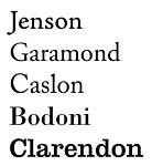
Outstanding classic metal typesetting and then photo typesetting are now part of the cultural heritage z. E.g. the Jenson antiqua (1470), the Bembo (around 1495), the writings of Garamond (around 1530), Caslon (1722), Baskerville (around 1750), Bodoni (around 1790) and Walbaum (early 19th century) ) as well as writings from the more recent past such as Futura (1927), Gill (1928–1930), Times (1931), Palatino (1950), Helvetica (1956) and Univers (1957). Many of these typefaces are not only kept in museums (e.g. the Museum für Druckkunst in Leipzig), but are also experiencing a comeback due to their "revitalization" in fonts. Since some of them are pre-installed on the computers, users come into constant contact with them, such as: B. with Garamond, Helvetica, Times and others. a. .
- Examples of revitalized fonts


The initiative to combine digital technology with aesthetically pleasing type came from Steve Jobs , one of the most famous personalities in the computer industry. In 1984 he was the first to equip a computer, the Mac , with "beautiful writing".
Notwithstanding this, the further development of typesetting including typography after the switch to digital technology is not without problems. Various interest groups representing type designers, typefactors, typographers, graphic designers and friends of this design area are therefore trying to counter a feared decline in type and typography through their joint commitment.
The most important international forum is the Association Typographique Internationale (AtypI). It was founded in 1957 as a non-profit organization . It has members from 40 countries. She sees her task primarily as being committed to the preservation and maintenance of the writing culture, promoting the development of sophisticated digital fonts and outstanding typographic designs, above all by organizing professional exchange at international level within the framework of annual conferences . In Germany there are associations such as the Typographische Gesellschaft München (tgm), TYPO Berlin , Leipziger Typotage and others. a. that influence the design of fonts today by addressing problems in this design area and looking for solutions. In 2015, visits and discussions on “Architecture and Typography” (Typographische Gesellschaft München) and “Writing in Public Space” (Leipzig Typotage) will be the focus of the annual meetings.
In addition, exhibitions help to raise public awareness of this neglected but broad-based area of design. For example, in 2002 the exhibition “Postscript - Tendencies in Digital Font Design ” in the Künstlerhaus Vienna showed a cross-section of contemporary typographic production from the German-speaking countries of Austria, Germany and Switzerland.
In 2010 an exhibition with the title “World made of script” was organized for the art library of the State Museum in Berlin. Oriented towards typography in the 20th century in Europe and the USA ”. With exhibits from the graphic design collection, an “overall cartography of typefaces” was presented, honoring the outstanding achievements of type designers and typographers.
In 2013 and 2014 a ranking “The 100 best typefaces of all time” was organized, with the help of which an understanding about quality standards was to be achieved and which was to provide orientation in the confusing range of typefaces. In addition, competitions are held which are intended to create incentives for high design quality of typesetting.
Professional type design is exemplary in everyday life. a. also through the so-called house fonts . Many institutions use fonts from internationally renowned type designers in order to present themselves to the public with a uniform appearance with recognition value and to be able to communicate the contents of their facilities and their corporate philosophy on a graphically high level.
- Examples of company logos with their own corporate fonts


So z. B. ARD with font styles for Lucas de Groot's thesis . In order to avoid resemblance to the corporate fonts of other institutions, larger companies (e.g. Telekom, Siemens, etc.) commission exclusive font families. For the DB type , the font of the Deutsche Bahn , were Christian Schwartz and Erik Spiekermann with the 2007 Design Prize awarded. Reason: The writing system is a "masterpiece for more information culture". ... "Outstanding functionality and cultivated appearance go well with everyday German culture."
See also
- History of typography
- History of printing
- Gutenberg Museum
- Character generator
- PostScript font formats
- OpenType font format
- Bitmap font
- TrueType
- Vector font
- Hint
- Hamburgefonts
literature
- Albert Kapr , Hans Fischer: typoart - typenkunst . VEB Fachbuchverlag, Leipzig 1973.
- Monika Müller, Hans Peter Willberg : Recognize fonts. Otto Maier Verlag, Ravensburg 1981, ISBN 3-473-61581-1 .
- Albert Kapr, Detlef Schäfer: Photo typesetting: Type design and type production Leipzig. VEB Fachbuchverlag, Leipzig 1989, ISBN 3-343-00525-8 (licensed edition: Verlag Beruf + Schule, Itzehoe 1989, ISBN 3-88013-417-0 ).
- Hans Peter Willberg, Friedrich Forssman : Reading typography. Verlag Hermann Schmidt, Mainz 1997, ISBN 3-87439-375-5 .
- Phil Baines, Andrew Haslam: Desire for writing. Verlag Hermann Schmidt, Mainz 2002, ISBN 3-87439-593-6 .
- Martina Fineder, Eva Kraus, Andreas Pawlik (Eds.): Postscript: On the form of writing today: A / CH / D. Hatje Cantz Verlag, Ostfildern-Ruit 2004, ISBN 3-7757-1415-4 .
- Gernot Grube, Werner Kogge, Sybille Krämer (eds.): Writing / cultural technology between eye, hand and machine. Verlag Fink, Munich 2005, ISBN 3-7705-4190-1 .
- Otl Aicher : typography. Ernst & Sohn, Berlin 1989 (Reprint: Schmidt, Mainz 2005, ISBN 3-87439-683-5 ).
- Karen Cheng: Anatomy of Letters / Basic Knowledge for Type Designers. Designing type. Verlag Hermann Schmidt, Mainz 2006, ISBN 3-87439-689-4 .
- Sybille Krämer, Horst Bredekamp (ed.): Image, writing, number . (Kulturtechnik series). Verlag Wilhelm Fink, Munich 2009, ISBN 978-3-7705-3859-1 .
- Julia Blume, Fred Smeijers: A Century of Writing and Writing Lessons in Leipzig. University of Graphics and Book Art, Leipzig 2010, ISBN 978-3-932865-57-2 .
- Heidrun Osterer, Philipp Stamm. Swiss Foundation for Typography and Typography (ed.): Adrian Frutiger - Typefaces: Das Gesamtwerk . 2nd expanded edition. Verlag Birkhäuser, Basel 2014, ISBN 978-3-03821-524-0 .
Web links
- Gutenberg digital. Göttingen Gutenberg Bible, sample book and Helmasperger's notarial instrument. [17]
- Gutenberg Bible digital: The New Testament. [18]
- Klingspor-Museum Offenbach: International index of metal types. [19]
- Lettering of stairs in the exhibition “World from Writing” 2010. [20]
- Swiss type design [21]
- Eberhard Dilba: Typography Lexicon [22]
- Video: Johannes Gutenberg and book printing. [23]
- Video: Casting and typesetting of type with a Monotype type casting machine and letterpress printing on an original Heidelberg cylinder. [24]
- Video: Helvetica set by hand. [25]
Individual evidence
- ↑ Albert Kapr and Hans Fischer: typoart - typenkunst . VEB Fachbuchverlag, Leipzig 1973, p. 27.
- ↑ Fred Smeijers: the show goes on… In: tino graß: Schriftgestalten . about writing and design. Niggli Verlag, Zurich 2008, ISBN 978-3-7212-0653-1 , p. 62.
- ↑ Leo Kohut: The Agreement for the Protection of Typographical Characters. In: Der Druckspiegel 5/1980, p. 500.
- ↑ Example of a final drawing by Adrian Frutiger: Grotesque draft in three bold designs from 1950–1951 in Walter Käch's class. Excerpt from reading sample: Heidrun Osterer, Philipp Stamm; Swiss Foundation for Typography and Typography (ed.): Adrian Frutiger - Typefaces: Das Gesamtwerk . 2nd expanded edition. Verlag Birkhäuser, Basel 2014, pp. 20/21 ( online , accessed on February 3, 2015).
- ↑ Ralf Herrmann: Differences between typeface / font / character set [1]
- ↑ Phil Baines, Andrew Haslam: Draft Font Today. In: Lust for writing. Basic knowledge of typography. Verlag Hermann Schmidt, Mainz 2002, ISBN 3-87439-593-6 , p. 96.
- ↑ Phil Baines, Andrew Haslam: Draft Font Today. In: Lust for writing. Basic knowledge of typography. Verlag Hermann Schmidt, Mainz 2002, ISBN 3-87439-593-6 , p. 95.
- ↑ List of writers [2]
- ↑ Book Art / Graphic Design [3] [4], accessed on January 18, 2015.
- ↑ Hamburg University of Applied Sciences [5]
- ↑ Achim Schaffrinna: Anatomy of the letters
- ↑ Ralf Herrmann: Typography Wiki: Finishing [6]
- ↑ Christine Stenzer: main actor writing; an overview of writing in film and video from 1895 to 2009. Verlag Königshausen & Neumann, Würzburg 2010, ISBN 978-3-8260-4237-9 , p. 31.
- ↑ Susanne Strätling, Georg Witte: The visibility of writing between evidence, phenomenality and iconicity. Introduction to: Susanne Strätling, Georg Witte (ed.): The visibility of writing . Verlag Wilhelm Fink, Munich 2006, ISBN 3-7705-4250-9 , pp. 7-8.
- ↑ Michaela Langen, Charsten Maurischat, Angelika Weber: Appearance qualities of printed matter . In: Peter Karow: Font Technology. Methods and tools. Springer-Verlag, Berlin / Heidelberg 1992, ISBN 3-540-54918-8 , pp. 405-421.
- ↑ Ralf Herrmann: The top 10 misunderstood typography terms. [7]
- ^ Peter Karow: Type technology. Methods and tools. Springer-Verlag, Berlin / Heidelberg 1992, ISBN 3-540-54918-8 , p. 195.
- ^ Peter Karow: Type technology. Methods and tools. Springer-Verlag, Berlin / Heidelberg 1992, ISBN 3-540-54918-8 , p. 222.
- ↑ Display fonts [8]
- ^ Friedrich Forssman , Ralf de Jong : Detail typography . Verlag Hermann Schmidt, Mainz 2002, ISBN 3-87439-568-5 , p. 58.
- ↑ Lucas de Groot : Hardcore curves. In: Tino Graß: Fonts. About font and design . Niggli Verlag, Zurich 2008, ISBN 978-3-7212-0653-1 , p. 88.
- ↑ Helvetica forever [9]
- ↑ Writings in the Museum für Druckkunst Leipzig - ( Memento of the original from February 2, 2015 in the Internet Archive ) Info: The archive link was inserted automatically and has not yet been checked. Please check the original and archive link according to the instructions and then remove this notice.
- ↑ List of metal type fonts that are digitally available today. In: Bauer / Reichardt: Chronicle of the type foundries in Germany and the German-speaking neighboring countries [10]
- ↑ Samples of serif typefaces
- ↑ Steve Jobs 2005, Stanford University Graduation Speech. [11]
- ↑ Argument 12: "... Scripture lives, but impoverishment threatens it." [12]
- ↑ | Leipzig Typo Days | http://www.typotage.de/
- ↑ Michael Hausenblas: Look, not read. [13]
- ^ Moritz Wullen: Foreword. In: Anita Kühnel (ed.): World from writing - the 20th century in Europe and the USA. Verlag der Buchhandlung Walther König, Cologne 2010, ISBN 978-3-86560-888-8 , p. 11.
- ↑ The best fonts 2013 [14]
- ↑ house fonts [15]
- ↑ ARD Typography ( Memento from September 2, 2014 in the Internet Archive )
- ^ Siemens [16]
- ↑ DB Type. An overview of the new publications of the Bahn Archived copy ( memento of the original from January 23, 2015 in the Internet Archive ) Info: The archive link was inserted automatically and has not yet been checked. Please check the original and archive link according to the instructions and then remove this notice.
- ↑ Press release: "Deutsche Bahn font family awarded the 2007 Design Prize of the Federal Republic of Germany." Deutsche Bahn font family awarded the 2007 Federal Republic of Germany design prize ( Memento of September 30, 2007 in the Internet Archive ). Accessed February 2, 2015).