Letter

Letters (of French lettre from latin littera , letter ' ) or pressure type or types are components of a typeface from lead . Their written bodies have the raised, mirror-inverted image of a character on their heads. They are manually ( hand set ) or mechanically ( machine set ) for brief collected, which in the high-pressure , using platen presses is transmitted or cylinder printing presses, on paper.
Since the establishment of photo typesetting , letters have only been used occasionally in letterpress printing (printing of bibliophile books) and for blind embossing . Due to the required hardness and longer service life, blind embossed letters are made of brass or harder lead alloys.
Structure and dimensions
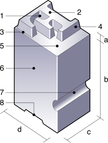
A letter has an elongated, rectangular body, the font or cone for short ( 6 ). On one narrow side, the head ( a ), there is the image ( 2 ), the mirror-inverted relief of the character to be printed. The opposite side is called the foot .
The shoulder height ( b ) extends from the foot to the head (without the typeface). The total height including the typeface is called the font height ( a + b ). In Germany in 1898 it was set at 62⅔ points (= 23.566 mm). The width of the cone is called the thickness ( c ) and determines the distance between the characters. The cone thickness ( d ), also known as the cone height , determines the minimum distance between the lines of text.
Thickness and cone thickness are always slightly larger than the typeface. The distance between individual letters can be increased manually by inserting metal strips (lead, under 1 point made of brass ), cardboard or paper between the cones ( spacing ). A reduction in the distance is achieved by undercutting , the removal of material from the sides of the cone. Undercut letters were supplied by the type foundries, also as ligatures (several letters on a cone, e.g. “fi”, “fl” or “sch”, “ch” etc.).
The font size is not measured by the size of the letters, but by the cone thickness, which is specified in the typographic unit of point . Depending on the font and their relationship between letter height and cone thickness, fonts with the same point size can be of different sizes, but they only have the minimum possible line spacing in common. The different font height with the same point size has been retained in the transition from lead type to digital font. In contrast to this, in bookbinderies the font size is sometimes used for the designation on the boxes. This makes it easier for the bookbinder to choose a font that fits into an existing space (e.g. book spine).
material

Letters are made of letter metal , an alloy of z. B. 67% lead , 28% antimony and 5% tin , sometimes also some copper . The main component lead gives the “stuff” (old name for letter metal) the softness and malleability, tin ensures a good connection of the individual metals and a corresponding toughness. Copper increases the hardness and resilience of the font, but it can also cause problems when casting. Arsenic is a common by-product in the manufacture of lead alloys and also increases the hardness of the metal. Antimony ensures that there are no voids because it expands when it solidifies. Due to the high lead content, lead corrosion can occur under unfavorable conditions . The alloys were mostly contaminated until the 19th century.
Large letters from 48 points (18.05 mm), e.g. B. for posters, were also milled from wood and plastic because of the enormous weight of lead letters.
Cast mark
At some type foundries it was common practice to put cast marks on the side of the letter. This served the advertising and at the same time the typesetter to differentiate the font manufacturers. The casting marks were also important because there were fonts and font styles that were cast by several foundries. Some very successful fonts were modeled on other foundries . The cast mark created clarity.
Wiki from the typesetter's point of view: mirror-inverted on the head
8 Cicero = 96 points (36.10 mm), in wood letters"Great works of the human spirit - invention of the art of printing": German postage stamp from 1983
See also
Web links
Individual evidence
- ↑ Typographical dimensions ( Memento of the original from November 7, 2016 in the Internet Archive ) Info: The archive link was inserted automatically and has not yet been checked. Please check the original and archive link according to the instructions and then remove this notice. designer-workshop.de, see section Font height .
- ^ Römpp Chemielexikon, Volume 1, page 253, 9th edition 1989
- ↑ DAS PFEIFENWERK (organ information) , private website


