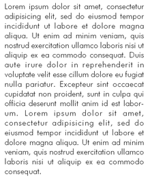
Futura (font)

|
|
| font | Futura |
| category | Sans serif |
| Font classification | geometric grotesque |
| Font designer | Paul Renner |
| Creation | 1927 |
| example | |

|
|
Futura is a typeface and the prototype of a family of "geometric" or "constructed" sans serif linear antiquas . It was designed in 1927 by Paul Renner in the context of the New Frankfurt and influenced the Bauhaus movement. Compared to earlier sans serif antiquas, the stroke widths are very even and the shape of the letters is extremely geometric, which is most clearly visible in the almost circular curves.
The rights to the Futura are administered by the "Professor Paul Renner Erben GbR" based in Munich.
font
The minuscules are equipped with clear, elegant-looking ascenders . Like Futura's capitals, they correspond to the principle of the ancient Roman monumental script . The types constructed with compasses and rulers are made up of the basic geometric shapes of square , circle and triangle . However, these forms have been weakened for better readability - a geometry dogmatism widespread at the Bauhaus was abandoned by Renner after initial attempts. For example, the inlets of the rounding of the “a” in the vertical line are tapered, and the circular shapes are not geometric circles.
It is noteworthy that the "j" only consists of a dash and a point, just as "a" and "b" are made up of a circle and a line. Because of the expansive circular shape (see "O" and "Ö") and the upright minuscule, the font is less suitable for running text, but rather for headings and for highlighting texts.
Historically interesting is the fact that when this font was first introduced, the letters “a”, “g”, “n”, “m” and “r” had shapes that still seem very unusual today (e.g. existed the "n" from a square without a bottom). However, already in the first type sample sheet in 1927 they were only listed as special figures and in the second (1928) not at all.
The font was created during Paul Renner's time in Frankfurt and is related to the New Frankfurt project . Renner had already submitted drafts for signage to the city in 1925, which were then implemented. The cable was designed in Frankfurt's neighboring city of Offenbach .
A similar font, the Super Grotesk , was mainly used in the GDR . This was due to the fact that initially only the briefs from Schriftguß KG / VEB Typoart were available, which only had this typeface in their program.
Due to the increasing need for digital fonts since the end of the 20th century, the Futura was also digitized several times.
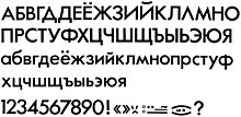
In 1995 Vladimir Yefimov designed the Futura PT font, which is distributed by ParaType Inc. (successor to the ParaGraph Intl font division since 1998). Futura PT appeared in the font weights light, book and light semi-bold and is characterized by the support of the Cyrillic alphabet.
Use (examples)
The Futura was one of the most popular typefaces of the 20th century, especially in the 1950s and 1960s. Both Volkswagen and Ikea used them in a slight modification for their corporate design ; however, both companies now use different fonts. The University of Leipzig and the Technical University Bergakademie Freiberg still use the Futura as their corporate font. Several logos of the parties in the German Bundestag were or are set in the Futura.
In 1941, the National Socialists also abandoned the Fraktur script (see Antiqua-Fraktur-Streit ) and used the Futura, for example, for the official catalog of the annual Great German Art Exhibition .
The Deutsche Bundesbank used the Futura from 1990 to 2001 on Deutsche Mark banknotes .
Director Stanley Kubrick was a fan of this font and uses it for the opening credits and posters in most of his films . The plaque that Armstrong and Aldrin deposited there when they first landed on the moon in 1969 and informed them of the peaceful intent of their mission is also set in the Futura.
Wes Anderson used the Futura for his films The Royal Tenenbaums and The Deep Sea Divers .
The Deutsche Bundesbahn used a variant of the Futura until 1986, but with square dots, for station signs and until today for kilometer boards along the route.
The Ferrovie dello Stato Italiane use Futura bold for station signs and Futura semi-bold for company addresses on rail vehicles.
For the poster series for the James Bond film Diamond Fever , Futura was used instead of the Folio font used in the English world . However, some later products, such as today's DVD / Blu-Ray, rely on Folio.
From around 1973, the First German Television used the Futura font. During this time, the title of the Tagesschau was set in slim Futura. The Thesis font family has been used instead since 1997 .
As a display type in addition to the amount used for the set of Rockwell used Christof Gassner Futura from the mid-1980s as typographic mainstay for the magazine ÖKO-TEST magazine .
A Cyrillic variant of the Futura was also used for the 1980 Summer Olympics in Moscow .
In the US series Dr. House is the font used for the lettering Dr House , or House, MD .
The city of Graz uses Futura in its logo and in its entire corporate identity .
Classification of the script
- According to DIN 16518 , the Futura is categorized in group VId (sans serif linear antiqua, geometrically constructed)
- Classification according to Beinert : Constructed Grotesque (Geometric)
- Hans Peter Willberg would classify it in his classification matrix as "geometric grotesque"
reception
The Gutenberg Museum in Mainz organized a special exhibition on the Futura and its inventor from November 3, 2016 to April 30, 2017. At the same time, an exhibition catalog was published, which sheds light on the development of the Futura.
literature
- Petra Eisele, Annette Ludwig , Isabel Naegele (eds.): Futura. The font. Verlag Hermann Schmidt , Mainz 2016, ISBN 978-3-87439-893-0 .
- Alexandre Dumas de Rauly, Michel Wlassikoff: Futura. Une gloire typographique. Paris, Éditions NORMA, 2011. ISBN 978-2-915542-39-4
- Klaus Klemp, Matthias Wagner K (eds.): Design in Frankfurt: 1920–1990 , exhibition catalog Museum Angewandte Kunst on the occasion of the exhibition "Das Frankfurter Zimmer" with an essay by Dieter Rams, avedition, Stuttgart, 2014, ISBN 978-3-89986 -207-2 . This book is completely set in Futura.
Web links
Individual evidence
- ^ Hubert A. Haushofer obituary in the Frankfurter Allgemeine Zeitung of December 12, 2016, p. 12 (Edition D 1)
- ↑ Andreas Hansert: Georg Hartmann (1870-1954): Biography of a Frankfurt Schriftgiessers, bibliophiles and art patron , 2009 S. 88th
- ^ Futura by ParaType. (No longer available online.) In: www.paratype.com. Paratype, archived from the original ; accessed on March 10, 2019 (English).
- ↑ The Futura in use website provides an overview of the wide range of applications .
- ^ Gerhard Matzig: Riot in the land of letters: Ikea fires the Futura . In: sueddeutsche.de . ISSN 0174-4917 ( sueddeutsche.de ).
- ↑ Something different. In: wortfeld.de. Word field, accessed February 17, 2016 .
- ↑ Jon Ronson: Citizen Kubrick . In: The Guardian . March 26, 2004, ISSN 0261-3077 ( co.uk ).
- ↑ Wolfgang Hartmann: "The Bauersche type foundry and Paul Renner" in: Paul Renner, Harzmuseum der Stadt Wernigerode 2003.
- ↑ Klaus Klemp, Matthias Wagner K (Ed.): Design in Frankfurt: 1920–1990 , p. 58.
- ↑ James Bond 007 on filmposter-archiv.de. Retrieved February 17, 2016.
- ↑ www.highlightzone.de .
- ↑ The changing logo of the Tagesschau on fernsehmuseum-hamburg.de.
- ↑ Christof Gassner (Ed.): "Everyday Ecology Design", Verlag Hermann Schmidt, Mainz, 1994, ISBN 3-87439-308-9 .
- ↑ library.la84.org .
- ↑ Clear forms for earth citizens and moon people in FAZ from November 1, 2016, page 41.


