Grotesque (writing)
The Grotesk , also Sans Serif ( French for “without serif”, “sans serif”) is a font family derived from the Antiqua , which is characterized by the fact that it has no serifs . In addition, the line width of the letters in sans serif fonts is (almost) even, so there is no line contrast or very little. Due to the lack of serifs, sans serif linear antiqua ( DIN 16518 ) differ from the serif linear antiqua . However, only some of the sans serif typefaces are sans serif linear antiquas; the terms are not synonymous.
In the English-speaking world, the term is Rulers familiar in France ruler, the Netherlands linear and Italy linearization.
About the designation
The term grotesque is very common among experts. It refers to the fact that the first typefaces of this type were viewed as grotesque , i.e. a strange but charming distortion, because the non-variation of the line width and the omission of the serifs contradicted all reading habits. Grotesque fonts have simply shaped glyphs that are easy to display on screens and are therefore the standard font on computer systems today; the term grotesque therefore seems strange, which is why the terms sans serif or sans serif are common in the desktop publishing industry.
history

Like the Egyptienne, the sans serif was created in England at the beginning of the 19th century in response to the increased need for eye-catching advertising fonts. In 1803, Robert Thorne showed a sans serif for the first time . The first grotesque was published in 1816 by William Caslon IV , the great-grandson of the type founder William Caslon .
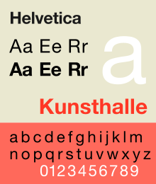
From 1832 sans serif fonts became very popular as bold advertising fonts in England. After it was initially used primarily in occasional printed matter (commercial) , advertising and signage systems and was important as a markup font, its development into bread fonts began in early 1898 with the Akzidenz-Grotesk . While the older sans serif fonts were very strong, many font weights are now available, from the super-light and "lean" to strong and semi-bold forms to the extra bold. One example would be Helvetica , of which there are over 40 variants today.
Similar to the Antiqua typefaces, different design directions developed over time with the Grotesk as well:
- the American grotesque , an American development of the original 19th century grotesque. These include, for example, Franklin Gothic (1904) by Morris Fuller Benton .
- a school based on the classical theory of forms (static or older grotesque) . This design style can be found in the commercial grotesque and in its purest form in the Swiss design concepts of the 1950s and 1960s. Examples are Helvetica , Arial and Univers .
- a geometric-constructivist school (geometric or constructed grotesque) . It had its climax especially in the field of elementary typography in the 1920s and was created in Germany in search of “the typeface of our time” (quote from Jan Tschichold in Die neue Typographie ). The best- known representatives of this trend are the Futura (1927) by the Bauhaus typographer Paul Renner and the Bauhaus (1925–1928) by the typographer Herbert Bayer .
- a school derived from the Renaissance Antiqua (Dynamic or Younger Grotesque) . Its main features are calligraphic, mostly freer design methods and slightly varying line widths. This type of grotesque became popular primarily through the Johnston Sans designed by Edward Johnston in 1916 for signage on the London Underground , as well as through the Gill Sans by Eric Gill , published in the late 1920s . In the long run, this type, also known as “humanistic”, became the most successful and most widely used model.
To this day, serif types are still the basic form in printing . However, sans serifs can be found in all areas of design, especially in typography for the screen , where the serifs hardly increase legibility and even reduce it, especially with small font sizes . Nowadays the wide range of sans serif fonts is unmistakable, which indicates the increased importance of these fonts.
features
At first glance, sans serif fonts have a uniform line width. But that only seems like that, because in reality the line widths almost always differ in order to create a visually even image. This can be seen in the overflows of shafts and curves (e.g. a and n). The line width of the vertical is often slightly larger than that of the horizontal, especially in dynamic grotesque.
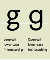
Among the sans serif fonts there are styles that use a “closed” or “one-story” form of the lowercase letter a instead of the usual “open” or “two-story” form. The closed a (ɑ) is similar to that of the italics . There are also one- and two-story forms of the letter g in the sans serif fonts.
classification
| British Standards Classification of Typefaces (BS 2961: 1967) | Matrix Beinert by Wolfgang Beinert | Indra Kupferschmid and Hans Peter Willberg | Fonts | Examples |
|---|---|---|---|---|
| Ruler Grotesque | American grotesque | American grotesque | Franklin Gothic , News Gothic , Officina Sans , Vectora | |
| Ruler Neo-grotesque | Older grotesque | Static grotesque | Akzidenz Grotesk , Helvetica , Arial , Univers | |
| Ruler Geometric | Constructed grotesque | Geometric grotesque | Futura , Avant Garde , Avenir , Century Gothic , Kabel | |
| Ruler humanist | Younger grotesque | Dynamic grotesque | Gill Sans , Syntax , Frutiger , Stone Sans , Meta , Scala Sans , TheSans , Today Sans Serif |
Sans serif fonts that cannot be classified in these categories (for example the Optima , a sans serif Renaissance antiqua) are counted among the antiqua variants for lack of better sortability according to DIN 16518 .
See also
literature
- Manuel Kreuzer: 20 + 1. A comparison of selected sans serif fonts from the past twenty years . August Dreesbach Verlag, Munich 2012. ISBN 978-3-940061-68-3
- Indra Kupferschmid: Letters rarely come alone. Niggli Verlag, Sulgen 2004, ISBN 3-7212-0501-4
- Karl Vöhringer: Getting to know printed matter, applying differentiating . Verlag Forum und Technik, Stuttgart 1989, ( technical publication series of the industrial union Medien 1, ZDB -ID 1064778-8 )
- Hans Peter Willberg : Signpost writing. Verlag Hermann Schmidt, Mainz 2001, ISBN 3-87439-569-3
Web links
- Wolfgang Beinert: The lexicon of Western European typography: the grotesque
- www.typosuche.de - Florian Stürmer, Michael Amarotico - a suggestion not only to order fonts from the Latin alphabet and symbols, but also to incorporate them into a search engine based on stylistic features
Individual evidence
- ↑ Wirth, Ingo (Ed.): Kunst, Mannheim (Cornelsen Scriptor), 3rd edition 2011


