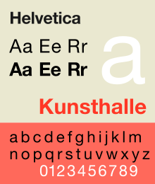
Helvetica (font)
|
|
|
| font | Helvetica |
| category | Sans-serif |
| Font family | Helvetica |
| Font classification | Grotesque |
| Font designer | Max Miedinger , Eduard Hoffmann |
| Creation | 1956 |
| Alternative name | Neue Haas Grotesk |
| example | |

|
|
The Helvetica , originally Neue Haas Grotesk , is a sans serif Linear-Antiqua , even grotesque called or Endstrichlose. It was brought onto the market in 1957 by Haas'schen Schriftgiesserei AG in Münchenstein .
history
The first font styles were designed by the graphic artist Max Miedinger in collaboration with Eduard Hoffmann , the managing director of the Haas'schen font foundry in Münchenstein near Basel. They used the Akzidenz-Grotesk from Berthold and the Normal Grotesk from Haas as models. In 1957, the semi-bold set for the graphique 57 trade fair was published for hand typesetting , initially under the name Neue Haas-Grotesk . The D. Stempel AG , since 1954 a majority stake in Haas'sche type foundry, took the magazine from 1960, - adapted to the technical conditions - as templates for Linotype typesetting machine out. In the course of this, she proposed distribution under the name Helvetia in order to have more opportunities on the international market. The Haas'schen Schriftgiesserei did not like this, however, as an insurance company and a sewing machine factory already bore this name, and instead they suggested the name Helvetica - "the Swiss" or "the Swiss" - under which it has been sold since 1960. The font was in competition with the Folio and the Univers . In the GDR, there was the Maxima font as a domestic alternative .
In 1983 D. Stempel AG designed the Neue Helvetica font family for Linotype AG . For this, the historically grown and not always matching cuts were redrawn and better coordinated. In the Postscript version, the font family now consists of 51 weights.
The original design of the Neue Haas-Grotesk, digitized by Christian Schwartz, has been available again at Linotype since 2011 . It also contains the alternative glyphs designed by Max Miedinger for the R (so-called "flat R") and the a, which found their way into the Arial instead of the Helvetica and were previously used as a distinguishing feature between the two scripts.
meaning
Thanks to its use as the corporate typeface of many companies, Helvetica was omnipresent. Among other things, it was delivered with Apple's macOS and iOS operating systems . Starting with Windows 10, the implementation of Neue Haas Grotesk by Font Bureau is included in the “Pan-European Additional Fonts” package, which can be installed under Settings - Apps - Manage optional features . Open source software often uses a font similar to Helvetica, Nimbus Sans L from URW Type Foundry .
In 2007 the 50th anniversary of the font was celebrated and honored, among other things, by the documentary Helvetica by Gary Hustwit. In addition, the New York Museum of Modern Art dedicated an exhibition to typeface, and in 2008 the book Helvetica forever - History of a typeface was published in which Eduard Hoffmann's protocol booklet was published for the first time. In this 58-page chronicle, he and Max Miedinger meticulously documented the design work and the history of the Helvetica from November 1956 to July 1965.
Fonts inspired by Helvetica
- The CorelDraw Graphics Suite software package contains a largely identical font with all relevant font styles called Swiss or Switzerland as a replacement for Helvetica. The Swiss font was designed by Max Miedinger , who developed Helvetica for Linotype in 1961.
- B & P Graphics ( Dublin , Ireland) published similar fonts called Olympia (for Helvetica) and Olympia 88 (for Helvetica Neue) in 1991 with the CD SERIALS Vol. 2 (Sans Serif Collection ).
- In addition, it will appear under the following names: Aristocrat, Claro, Corvus, Europe Grotesque, Geneva / 2, Hamilton, HE, Helios, Helios / II, Helv, Helvette, Holsatia, Megaron, Megaron / II, Newton, Spectra, Swiss 721, Triumvirate, Vega, Video Spectra
Classification of the script
- According to DIN 16518 , Helvetica is categorized in group VIa (sans serif linear antiqua with a classicistic character) .
- In the classification according to the principle of form , it is classified as a static grotesque .
Helvetica
The Helvetica font is prescribed for this in the EU Tobacco Products Directive, which regulates the warning imprints on tobacco products. In the German version, however, this was incorrectly translated into Helvetica . This notation also entered the national legislation of Germany and Austria.
See also
Individual evidence
- ^ Neue Haas-Grotesk - History, Font Bureau, http://www.fontbureau.com/nhg/history/
- ↑ Debate about Helvetica with iOS 7 - Dirk Hohnsträter, http://inventur-blog.de/01101001/ios-7/
- ^ Victor Malsy, Lars Müller (eds.): Helvetica forever. History of a script . 1st edition. Lars Müller Publishers, Baden 2008, ISBN 978-3-03778-120-3 , pp. 70 .
- ^ Linotype.com: Swiss , Linotype.com: Helvetica
- ^ "Helvetika": Wrong font ends up in Tobacco Law , futurezone.at on April 28, 2014
literature
- Lars Müller: Helvetica - Homage to a Typeface. Baden 2002, ISBN 978-3-03778-046-6 .
- Victor Malsy, Lars Müller (eds.): Helvetica forever. History of a script. With contributions by Axel Langer and Indra Kuperschmid, Baden 2008, ISBN 978-3-03778-120-3 .
Web links
- Helvetica Arial Comparison (English)
- List of weights in the Helvetica font family (Linotype.com)
- List of font weights in the Neue Helvetica font family (Linotype.com)
- Helvetica alternatives at typefacts.de
- http://www.hustwit.com/helvetica/ - Official website for the cinema film ( IMDb entry for the film )

