
Broken grotesque

Broken Grotesk , also Fraktur-Grotesk or Schlichte Gothic , ironically also shaft boot grotesque , describes a form of broken script from the 1930s with objectified forms and (almost) constant line width . Since these fonts are not based on the Antiqua , they are not counted in the grotesque class (or sans serif or sans serif linear antiqua).
Elementary typography

From 1930 onwards, a group of grotesque typefaces came on the market based on Gothic letter shapes. They combine the angular and predominantly vertical lines of the Gothic Textura with the constant line widths of the sans serif fonts. The glyphs seem as if the (imaginary) writer had not kept the angle of the ribbon spring almost the same as traditionally when writing, but rather always rotated it so that almost every line is drawn with almost maximum stroke width. The few exceptions to this are spreads such as the cross line in the small e. In contrast to other broken fonts, the uppercase letters are not or only minimally decorated in relation to the lowercase letters. This makes these fonts look more factual and the capital letters correspond more to modern reading habits.
Since broken fonts do not have serifs like Antiqua fonts, there is no differentiation according to the shape or the absence of serifs. However, the otherwise often occurring in broken scripts are Quadrangel , frills and other decorative statements in the broken Grotesque omitted as a rule.
Examples:
- Wallau (1924–1930) by Rudolf Koch
- Tannenberg (1933–1935) by Erich Meyer
- National (1934) by Walter Höhnisch
- Element (1934) by Max Bittrof
- Potsdam (1934) by Robert Golpon
- Gotenburg (1935–37) by Friedrich Heinrichsen
- Kurmark (1934), cut from the North German Type Foundry, Berlin
- Kursachsen Award (1937) from Peterpaul Weiß
- Großdeutsch (1935) by Herbert Thannhaeuser
- German master (1934) by Berthold Wolpe
- Sachsenwald-Gotisch (1934) by Berthold Wolpe
- Marienburg , Genzsch & Heyse; identical to Germany , Berthold
- Armin-Gotisch (1933) by Fritz Müller
- Staufia (1935), CE Weber
Since all of these fonts were drafted in Germany shortly before or after the seizure of power , for many viewers their content is closely linked to National Socialism . The design can also be understood as an expression of the New Objectivity and as an attempt to apply the design principles of elementary typography to broken fonts.
Most contemporary and subsequent viewers agree that these fonts corresponded to the zeitgeist of the time . An advertising text from 1934 praised the advantages of the new Element font :
“Element - The clear German font of the new typography. The German script lives on as the visible expression of German essence. It is not a thing of the past. And that's why we have an obligation to do more than modify and repeat forms of the past. "

According to Hans Peter Willberg already spoke in the 1930s, "the translator vernacular" of sheepskin boots Grotesque . The linguistic image of a font “marching in shaft boots” can be found in writing in 1960 in Jan Tschichold's well-known work Pleasing printed matter through good typography . However, Tschichold does not refer to the group of broken sans serif fonts, but to a much older font design by Rudolf Koch.
During the National Socialist era , the broken sans serif was used in various projects. The 3 meter high and 15 meter long “Hindenburg” lettering on the airship LZ 129 was designed in 1936 by Georg Wagner. At the same time, the cap ribbons of the sailors and the name inscriptions of the ships of the Kriegsmarine were designed in these fonts. The writings were also found on other uniforms and on public signs. The Tannenberg script was used in the stations of the Berlin North-South S-Bahn , which opened for the 1936 Summer Olympics .
Even after the end of the National Socialist dictatorship, these writings persisted in everyday German life. The red logo of the German pharmacies largely corresponds to the original design from 1936. But beer brands and newspaper heads still use these fonts today. They were also popular with the Evangelical Church until the 1960s.
Typographic classification

The exact typographical classification of the Tannenberg-like fonts is controversial. The type founder Friedrich Genzsch summarized the search for a contemporary form for broken fonts in 1928 in the words:
“It would [...] be as wrong as it is in vain if we wanted to retain or revive any of the historical styles for our present and future. Logically, the development of our machine technology is pushing for the simplest designs and the clearest forms of expression. "
Plain Gothic
The typographer Hans Peter Willberg sees the Tannenberg-style as examples of a simple Gothic in a long tradition of simplified, unadorned broken fonts. He refers in particular to the handwritten textualis prescissa from the 15th century and the neo -Gothic scripts from the turn of the 20th century. Other examples include:
- Hamburg pamphlet (1904) by Friedrich Bauer
- Liebingschrift (1912) by Kurt Liebing; Republished in 1934 as Nuremberg
- Wieynck-Werk (1930) by Heinrich Wieynck
Markup fonts
More in the tradition of coarse, bold broken fonts as markup fonts , especially for advertising, the following fonts are:
- Advertising German (1933) by Herbert Thannhaeuser
- Trump Deutsch Fett (1936) by Georg Trump , H. Berthold AG
Music scene
In the 1970s, several rock bands developed logos with a reduced broken aesthetic, for example AC / DC and Kiss . In the Thrash Metal area, band logos are usually created from broken letters based on the grotesque. These are often kept very simple, such as in Overkill and Kreator , but also playful designs, for example with jagged edges, such as in Exodus , are often found.
Font examples

Airship Hindenburg LZ 129 , 1936

Pharmacies logo, 1936

Wehrmacht pay book (undated)

Tokens (left for newspaper subscription, right for party book) (1944)

SS sleeve stripes (computer set)

Extract from the Stuttgart Declaration , 1946 (computer set)
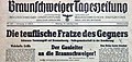
Braunschweiger Tageszeitung 1944. Newspaper head simplified Textura (from 1931?), Text in Antiqua (since 1941?)

Oberhessische Presse , 1951: Broken grotesque or plain Gothic?

Logo of the Hasseröder brewery
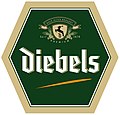
Logo of the Diebels brewery

Logo of the Warsteiner beer brewery

Logo of the Bitburger brewery


See also
- Antiqua-Fraktur dispute
- DIN 1451 - Sans serif antique font for lettering from 1936
literature
- Michael Gugel: Focus on fracture. out of date mocked - forgotten? A portrait . gugelgrafik-Verlag, 2006. ( pdf )
- Peter Rück : The language of writing. On the history of the 1941 ban on Fraktur . First in: homo scribens, Tübingen 1993, pp. 231–272
- Wilhelm H. Lange: From the Schwabacher Judenletter and a small resistance movement…. In: Festschrift Karl Klingspor on the occasion of his eightieth birthday on June 25, 1948, pp. 39–51
Web links
- TypoWiki: detailed list of broken sans serif fonts
- Hans Peter Willberg : The Fraktur and the nationalism. In: The Gazette, May 2001 edition
Individual evidence
- ↑ Reproduced in Typoforum June 8, 2007 ( Memento of the original from March 4, 2016 in the Internet Archive ) Info: The archive link has been inserted automatically and has not yet been checked. Please check the original and archive link according to the instructions and then remove this notice. Image ( Memento of the original from March 4, 2016 in the Internet Archive ) Info: The archive link was inserted automatically and has not yet been checked. Please check the original and archive link according to the instructions and then remove this notice. , (accessed April 7, 2008)
- ^ Fraktur: Form and history of broken fonts, Albert Kapr, Verlag Hermann Schmidt Mainz, 1993.
- ↑ Ralph Herrmann: The Hindenburg lettering , on typografie.info from December 16, 2013, accessed on June 27, 2019.
- ^ Michael Braun: North-South S-Bahn Berlin . GVE, Berlin 2008, ISBN 978-3-89218-112-5 , pp. 118 .
- ↑ In: The contemporary font. October 1928, pp. 16-18. Commented reprint: The German script 3/2004 (pdf) ( Memento of the original of December 23, 2007 in the Internet Archive ) Info: The archive link was inserted automatically and has not yet been checked. Please check the original and archive link according to the instructions and then remove this notice.