
Fraktur (script)
| fracture | ||
|---|---|---|
| Font | alphabet | |
| languages | German , Sorbian ; earlier also others | |
| Usage time | Mid-16th century to 1941 | |
| Used in | German language area | |
| ancestry |
Phoenician alphabet → Greek alphabet → Etruscan script → Latin alphabet → Fraktur |
|
| particularities | Long s (ſ), forced ligatures | |
| Unicode block | Basic + ExtA / B: U + 0000-U + 024F | |
| ISO 15924 | Latf | |

|
||
.jpg)
The fracture (of Latin fractura "break" since the mid-15th century, "blackletter") is a font from the group of broken scripts . From the middle of the 16th to the beginning of the 20th century, it was the most widely used print font in German-speaking countries, and - in competition with Antiqua - also in Northern European countries.
In colloquial language , the collective term Fraktur script is incorrectly used synonymously for broken fonts, for example also for Textura and Schwabacher , which can be clearly delineated by the lack of the elephant trunk characteristic of Fraktur .
Emergence
The Frakturtype emerged at the beginning of the 16th century as a continuation of the Textura . Their formation is closely related to Emperor Maximilian I. connected. Who exactly created the Fraktur has not yet been clarified, as the forms of the type can also be proven in handwritten documents from the area around the University of Vienna and in Nuremberg. Vinzenz Rockner , a secretary of Maximilian I, who supervised the printing of the prayer book (see below) and provided the handwritten templates for the printers' type, comes into question . It remains unclear whether he designed this template himself. The second possible originator is the monk and scribe Leonhard Wagner , who developed a corresponding font at the end of the 15th century, but which remained in the library of his monastery , so it is unclear how well known this manuscript was.
The first Gothic font for letterpress printing was designed by Hans Schönsperger in Augsburg as early as 1513 and used (among other things) in the prayer book illustrated by Albrecht Dürer . Theuerdank, printed in Nuremberg in 1517, is the second important application of the Fraktur in printing . It experienced its aesthetic perfection in the 18th century through type cutters such as G. I. Breitkopf and J. F. Unger .
According to Rudolf Kautzsch, one of the most important characteristics of Fraktur typeface is the “secret contradiction between the Gothic of its commoners and the renaissance of its capital letters”.
development
The Fraktur, like the Antiqua , has adapted and changed over time under the influence of the zeitgeist. The following important types of fracture can be distinguished:
- Renaissance fracture: Theuerdank fracture
- Baroque fracture: Breitkopf fracture
- Classicist fracture: Unger fracture, Walbaum fracture
Font examples for the Fraktur

Theuerdank of 1517

Document from 1768. Latin and French words set in Antiqua

Communist Manifesto, London 1848

Title page of the first edition of the Finnish national epic Kalevala (1835)

Danish edition of a fairy tale by Hans Christian Andersen , 1885


First edition of the Neue Zürcher Zeitung , Switzerland 1780

Bolzano (summer 2003)


Example of Gothic script (computer typesetting)
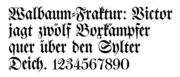
Example for Walbaum Fraktur (1800) (computer set)

Example of a Humboldt fracture (Hiero Rhode, 1938) (computer set)


Use of the fracture in modern times

In Germany, Fraktur typeface was replaced by Antiqua in selected areas of publication at the end of the 19th century . In the course of internationalization, scientific and technical journals changed their typography , for example the journal of the Association of German Engineers as early as 1872 . In other areas, Fraktur typeface was common until after the First World War, after which the Antiqua gradually began to establish itself in the wake of the New Typography .
At the time of National Socialism , Fraktur experienced a renaissance, especially as a markup font , but also as a text font , as it was viewed as a German font. One cited, among other things, Caesar Flaischlen , who had written "On the gentlemanly right of our German script". From June 1933, the Reich Ministry of the Interior pushed ahead with the plan to make typewriters with Gothic script mandatory for authorities. The technical standards committee for typewriters, however, failed in the task of agreeing on binding characters. The typewriter industry, which should have had an interest in increased sales, was also represented in this committee. At a cultural conference of the NSDAP in 1934, Hitler declared: “The National Socialist state [must] guard against the sudden appearance of those backwards who think a 'German art' from the familiar world of their own romantic ideas of the National Socialist revolution as an obligatory inheritance for the future to be able to pass on [...] “So the project of converting the typewriters was not pushed further.
Since 1940 all texts printed for foreign countries were to be set in Antiqua, but the population was not informed about this. The writing policy remained completely unclear for a long time. A decree of the NSDAP regime of January 3, 1941, in which Martin Bormann called the Fraktur-like Schwabacher "Judenschrift" on Hitler's behalf , then declared in a total about-face (and reversing the actual development of the script) the Antiqua as " Normal font ". From then on Schwabacher and Fraktur were considered undesirable, so that newspapers and publishers loyal to the NSDAP switched to the continuous use of the Latin script, especially the Antiqua , especially in the production intended for foreign countries . The Duden was last published in Fraktur in 1941.
However, even the Nazi officials did not believe in this argument. The background to the (extremely expensive) change in the middle of war was probably the opinion that German hegemony in a conquered Europe could not be secured with a special, optically narrow and complicated script that was difficult to learn. The numerous slave laborers were also often unable to understand simple lettering in Fraktur, which hindered war production. Goebbels wrote in his diary on February 2, 1941: “The Fuehrer orders that the Antiqua will in future only be classified as a German script. [What was probably meant: ... that in future only the Antiqua will be counted as a German font.] Very good. Then the children no longer need to learn 8 alphabets at least. And our language can be truly universal language. "Among the" eight alphabets "we each understood then the uppercase and lowercase letters of fracture, German cursive , Antiqua and Latin script .
Goebbels emphasized five advantages of the Antiqua:
- 1. More effective distribution of German ( propaganda ) writings abroad;
- 2. improved ways of managing conquered areas;
- 3. Securing of military-political rule through written-cultural dominance;
- 4. Demarcation from the Soviet Union and adaptation to Western Europe with a uniform European (German) script;
- 5. Economic advantages by improving sales of German books abroad.
From September 1941 only the Latin script was taught in German schools, which until then had only been taught as the second script from grade 2, which freed up teaching time for other subjects. Hardly anyone was informed about the reasons. For population groups who believe they are in conflict between nationalities , e.g. B. the Sudeten Germans, the change was a nuisance.
The Gothic script did not experience a renaissance after the collapse of the Third Reich. In 1951 the Federation for German Writing was re-established in Hanover (since 1989: Federation for German Writing and Language ), which advocates the use of German printed and cursive scripts. However, the topic does not find much public space. However, books were still printed in Fraktur even after 1945. Long after the war, the author Hermann Hesse insisted that his works be printed in Fraktur. Many classics also found very good sales in the 1950s as Fraktur editions , such as a Theodor Storm complete edition from 1953. The Protestant churches stuck to the “German script” for a long time. Many German-language Bible translations appeared in Fraktur until the 1960s. The Catholic Church had traditionally used the Latin script for Latin texts and also made the change earlier for German-language texts. Until the 1980s, individual legal texts in West Germany, for example the bill of exchange law in " Schönfelder ", were printed in Fraktur.
The Neue Zürcher Zeitung was completely set in Fraktur from its founding in 1780 until 1946. Since the conversion in 1946, like some other German-language newspapers (including the Frankfurter Allgemeine , the South Tyrolean daily newspaper Dolomiten and the Luxembourg daily newspaper Luxemburger Wort ), Fraktur has still been used in the newspaper title. The Frankfurter Allgemeine Zeitung also used the headlines of opinion articles in Fraktur until October 4, 2007, but for the past two and a half years without the long s .
On the DM banknotes of 5, 10, 100, 500 and 1000 DM of the third series issued from 1961 as well as on all banknotes of the fourth series issued from 1990 the word banknote was in Fraktur.
In the present day, Gothic or other broken fonts are used in advertising, for lettering on various articles and for street signs. On the packaging of goods , especially food, the Fraktur font indicates a product of traditional type and quality. In winegrowers and breweries it symbolizes age and tradition , in restaurants the house inscription in Fraktur signals a traditional business run with love, or at least cosiness . After all, the Fraktur font, mostly the Gothic script that is more common in English-speaking countries, is popular in music and youth cultures such as metal , punk or Gothic . Broken fonts are on the one hand widespread in fashion at the moment, on the other hand they are also used by neo-Nazis despite the Nazi rejection of Fraktur. However, the rules of writing with regard to the long s for mass-produced products and pub signs made of plastic are now used less often or not at all. The same applies to the ligatures ch, ck, tz and st (actually ſt ), the so-called forced ligatures .
Fraktur is still used among traditional German-speaking Anabaptists to print German texts, while German Kurrentschrift is used as handwriting for German texts. Groups that use both forms of traditional German writing are the Amish , old-order Mennonites , Hutterites, and traditional Russian Mennonites , who now mainly live in Latin America .
Writing and reading aid
"It should be noted that in Latin script s (round antiqua-s) for ſ (long Fraktur-s) and s (round Fraktur-s) without a difference, ss ( Antiqua-ss) for ſſ (long Fraktur-ss) and ſs (long and round Antiqua-s) for ß (Fraktur-Eszett ligature). Instead of ſs (long and round Antiqua-s), ß (Antiqua-Eszett ligature) is also permitted. "

In the course of history, some basic rules have prevailed when using broken fonts, which are mainly found in the German-speaking area. This includes the use of ligatures (also on typewriters and in computer writing) and two different forms of the letter s .
Readers inexperienced in Fraktur have initial difficulties with the following letters in particular:
- That
 , for a U are kept, but it is an A .
 - That
 does not resemble any roman capitals strong, but it is a C .
 - This
 can for F are kept, but it is an E .
 - That
 , for a J or T are held, but it is a F .
 - This
 can for R are held, but it is a G . The letter G is similar to the E , but the lower arc of the G is not closed at E.
 - That
 , for a J or T are held, but it is one I . The letters I and J as capital letters usually have the same typeface. Especially in older Gothic scripts, I and J are completely the same, i.e. there is no separate glyph for the J.
- This
 can for R are held, but it is a K .
 - This
 can for R are held, but it is a N . The letters N and R are similar, with the N missing the closing inner slash.
- That
 , for a D will be held, but it is a O .
 - This
 can also be a D held, but it is a P .
 - That
 , for a G or a - 6 (point - but unusually designed Majuskel
  / minuscule
  ) are held, but it is a south .
 - This
 may for a I or the Roman numeral Ⅰ be held, but it is a T .
 - That
 , for a B are held, but it is a V . The letters B and V are similar, with the V missing the closing inner slash.
- That
 , for a N are kept, but it is a Y .
 - That
 does not resemble any roman capitals strong and can be used for Versalziffer 3 (
  held), but it's a Z .
 - That
 , for a d be kept, but it is the ligature ck .
 - It
 doesn't look much like any lowercase roman, but it is a k . The main difference between the letter k and t is a small loop at the top right. In some Fraktur fonts, this loop is also open.
- That
 can be mistaken for an f , but it's a long s (ſ). It always differs from the f in the recessed short crossbar on the right side, sometimes the left crossbar is also missing to make it clearer.
- This
 can be mistaken for a ſz (ß) (
  ), but it is the ligature tz .
 - This
 can be mistaken for a b or an o , but it's a v . The letter v is in contrast to b no ascender, but a flourish. The letter o lacks ascender and flourishes.

- That
 can be mistaken for an r , but it's an x . The only difference between the letter x and r is an open loop at the base of the drawing.
- That
 can be mistaken for an n or an h , but it's a y . In contrast to n, the letter y has a descender, and unlike h, it has no ascender, but a flourish.

- This
 can be mistaken for a g , but it is a z . In Fraktur fonts with old style figures also resembles the three z :
  .
. - The old style numeral
 can be mistaken for a g if it is single, but it is a 9.


| Antiqua (1) | Math mode (2) |
Unifraktur- Maguntia (3) |
|---|---|---|
| A ≠ U |
|
|
| B ≠ V |
|
|
| C ≠ E ≠ F |
|
|
| E ≠ G ≠ R |
|
|
| F ≠ I ≠ J |
|
|
| K ≠ R ≠ N |
|
|
| O ≠ D ≠ P |
|
|
| S ≠ G ≠ 6 |
|
|
| T ≠ F ≠ I |
|
|
| Y ≠ N |
|
|
| Z ≠ 3 |
|


| Antiqua (1) | Math mode (2) |
Unifraktur- Maguntia (3) |
|---|---|---|
| b ≠ v ≠ o |
|
|
| ck ≠ d | - (4) |
|
| h ≠ y ≠ v |
|
|
| f ≠ ſ | - (4) |
|
| k ≠ t |
|
|
| r ≠ x |
|
|
| ſz (ß) ≠ tz | - (4) |
|
| y ≠ n ≠ u |
|
|
| z ≠ g ≠ 3 | (5) |
|
| 9 ≠ g | (5) |
|


Fraktur in the formula set
Like almost all typographical markup options, Fraktur can also be used sensibly (i.e. meaningful) in the formula set. (In the case of handwritten formulas, Fraktur is replaced by German cursive , possibly in its Sütterlin variant.) Basically , the Fraktur letters must also be clearly identifiable as stand-alone characters. Most of the time, however, there are only a few Fraktur letters, so the risk of confusion is low.
In many cases, the use of Fraktur is considered obsolete and has been replaced by other typographical markup options (e.g. bold italic). In the mathematical set of formulas, small Fraktur letters (e.g. ) were used to represent vectors . The zero vector was then denoted by. Fraktur was used in physical formulas when the vectorial character of a quantity was to be emphasized, e.g. B .:


Today either bold italic or lean italic font with an arrow above should be used for the vector representation, handwritten also simply underlined letters:

Fraktur was previously also used to represent hyperbolic functions (e.g. or ). Today, abbreviations should be used for this in the upright basic script (e.g. or ). Fraktur letters were also used to denote matrices and tensors and as symbols for the real and imaginary part of a complex number. In particular, ideals are still used today in modern textbooks to distinguish them from other variables using Fraktur letters. In connection with the internationally standardized sizes and units, the symbol (U + 2128; English black-letter capital z ) should be used to represent the Z transformation:


The use of Fraktur letters has also been preserved in the naming of Lie algebras . There is a mechanism for assigning such a Lie algebra to a Lie group , and it is common practice to write the name of the group in lower case letters for the name of the associated Lie algebra, so , and so on.

Fraktur in computer typesetting
Since the desktop publishing revolution in the late 1980s, it was possible for the first time to produce and sell high quality fonts at low cost. The large commercial font providers digitized their font collections, albeit only a few Gothic fonts due to a lack of demand. Independent typeface designers have digitized and produced numerous other Gothic typefaces, but their quality varies greatly. For traditional Fraktur typesetting, a font must at least contain important mandatory ligatures and the long s.
Since the Fraktur is not an independent writing system , but only glyphs , the letters of the Latin alphabet for Fraktur are not coded separately in Unicode . For a Fraktur font to be compatible with Unicode, the ligatures required for traditional Fraktur typography must be created using typography systems such as OpenType , Apple Advanced Typography or Graphite . Only the long ſ has its own code U + 017F as a special letter. Many Gothic fonts either have no ligatures or use the ligatures in the place of other characters so that they violate the Unicode standard. The Unicode standard does have certain ligatures. However, these should not be used; because they only serve the downward compatibility with older codings: ff (ff) U + FB00, fi (fi) U + FB01, fl (fl) U + FB02, ffi (ffi) U + FB03, ffl (ffl) U + FB04, st with long s (ſt) U + FB05, st with round s (st) U + FB06.
The ISO 15924 standard defines writing systems and allows the distinction between "Latin" ("Latn") and "Latin (Fraktur variant)" ("Latf"). By specifying the language code “de-Latf” in HTML , a suitable web browser could theoretically automatically display a suitable font for German Fraktur. As a font on Windows computers with Microsoft Office products (97 to 2007) the " Old English Text MT " is widespread (but without a long s), so that encoding <span style='font-family:"Old English Text MT"'>on Windows computers, for example, is usually too successful for the reader to use Fraktur leads - except for the ſ, which can be found in the word Frakturdarſtellung , for example . Another possibility is to have a font downloaded from the server using the cascading style sheets .
There is no dedicated Unicode block for Fraktur, but in the Unicode block letter-like symbols for mathematical purposes are the Fraktur letters for C (U + 212D), H (U + 210C), I (U + 2111), R (U + 211C) and Z (U + 2128) included. Later, with the Unicode block mathematical alphanumeric symbols, the remaining Fraktur letters were added at positions U + 1D504 to U + 1D537. These are not intended for writing continuous text, but only for mathematical formulas. For example, the umlauts, the ß and ligatures are missing.
The Gothic script in Unicode: ??ℭ????ℌℑ????????ℜ???????ℨ??????????????????????????
Books set in Fraktur after 1945 (examples)
- Hermann Hesse: The glass bead game . Suhrkamp Verlag, Berlin 1946
- Hermine Kiehnle: Kiehnle cookbook . Walter Hädecke Verlag, Stuttgart / Weil der Stadt 1951.
- Friedrich Kluge : Etymological dictionary of the German language (in Fraktur up to and including edition 16), 1953.
- Herbert Zimmermann: Latin word studies. Published by Ernst Klett, Stuttgart 1956.
- Joseph Maria Stowasser : Der Kleine Stowasser, Latin-German school dictionary. G. Freytag Verlag, Munich 1971.
- Most beautiful love me German love poems from the Baroque and Rococo. Designed by Jan Tschichold . Lambert Schneider Publishing House, Heidelberg 1957.
- Walter Plata : Treasures of Typography. Broken Fonts. Gothic, Schwabacher and Fraktur in the German-speaking area in the 2nd half of the 20th century. Information and opinions from 17 authors, suggested and introduced by Walter Plata. Polygraph-Verlag, Frankfurt am Main 1968.
- Christian Reuter : Schelmuffsky's very curious and very dangerous travelogue on water and on land. 1st edition. Dieterich, Leipzig 1972.
- Walter Plata: Johann Sebastian Bach for his birthday - a typographical cantata. Association for German Writing and Language, 1985, ISBN 3-930540-01-0 .
- Works of art of writing. Poems in the dress of beautiful pamphlets from six centuries. Association for German writing and language , Hanover 1994, ISBN 3-930540-09-6 .
- Bess Brenck-Kalischer: The mill. A cosmos. Roman, Edition Sirene , 1995, ISBN 3-924095-63-9 .
- Heinrich von Kleist: The broken jug. As calligraphic handwriting by Ruth Harnisch. Publishing house for German writing and language, Hanover 1996, ISBN 3-930540-16-9 .
- OT, Tina Sander: The soul triumphs over the spirit (poems, part 1 [O. T.] in Fraktur, part 2 [Tina Sander] in Antiqua). gawl-Verlag, Bochum 1998, ISBN 3-931333-03-5 .
- Ernest Potuczek-Lindenthal : Peasant rules - paper cuts. Hanseatische Verlagsanstalt, Bremen 1999, ISBN 3-8179-0028-7 .
- Quantity-Güthling: Large Dictionary Latin. Part II: German-Latin. by Otto Güthling . 18th edition. Langenscheidt, Berlin / Munich / Vienna / Zurich / New York 2002.
- Wolfgang Hendlmeier (Ed.): House book of German poetry - set in Fraktur. Federation for German Writing and Language, 2008, ISBN 978-3-930540-25-9 .
See also
literature
- Judith Schalansky : Fraktur mon Amour. Verlag Hermann Schmidt, Mainz 2006, ISBN 3-87439-696-7 .
- Christina Killius: The Antiqua-Fraktur Debate around 1800. Harrassowitz Verlag, Wiesbaden 1999, ISBN 3-447-03614-1 .
- Albert Kapr : Fraktur: Form and history of broken scripts. Verlag Hermann Schmidt, Mainz 1993, ISBN 3-87439-260-0 .
- Heinrich Fichtenau : The textbooks of Maximilian I and the beginnings of the Gothic script. Hamburg 1961.
- Rudolf Kautzsch : The origin of the Fraktur script (= annual report of the Gutenberg Society. Volume 20: Supplements ). Mainz 1922.
Web links
- Lexicon of Western European Typography - Detailed description of the typographical development history of Fraktur
- Hans-Georg Soldat's Fraktur essay (pdf) - extensively researched background on Fraktur history during the Nazi era (587 kB) with special consideration of the Delbanco writings (»DS«)
- Ralf Herrmann: What are the rules for using broken fonts today?
Individual evidence
- ^ Ducange : Glossarium mediae et infimae latinitatis, sv fractura 2 .
- ^ Helmut Hilz: Technical magazines and industrialization - Germany's technical magazine culture up to the First World War . In: From the Antiquarian Bookshop, No. 2/2009, pp. 71–84, p. 83.
- ↑ a b Quoted from Dorsten under the swastika
- ↑ a b c Christel Baumgart: Fraktur, Antiqua, Schwabacher - German script? On the dispute about the Fraktur in the Third Reich ( Memento from September 29, 2012 in the Internet Archive )
- ↑ Martin Bormann's written decree of January 3, 1941
- ↑ Helmut Heiber : The back of the swastika. Munich 1993, ISBN 3-423-02967-6 , p. 224 f.
- ↑ faz.net ( Memento from September 24, 2015 in the Internet Archive )
- ↑ Available from UniFraktur • Free Fraktur font resources
- ↑ a b c ISO 80000-2 : 2009, Quantities and units, Part 2: Mathematical signs and symbols to be used in the natural sciences and technology, December 1, 2009.
- ^ Stefan Hildebrandt : Analysis . Springer , 2002, ISBN 978-3-540-42838-1 , pp. 243 , doi : 10.1007 / 978-3-662-05694-3 ( limited preview in Google Book search).
- ^ Ligatures, Digraphs, Presentation Forms vs. Plain Text , at unicode.org, accessed December 26, 2018
- ↑ Applied at: ligafaktur.de or at unifraktur.sf.net