
Long s


The long s (also long s ) "ſ" is a graphic variant of the letter " s " or, linguistically , a positional allographic variant of the grapheme "s". The "ſ" is characterized by its vertical shaft and forms the first component of the two ligatures "ſʒ" ("ſz") and "ſs", which are assumed to be the origin of the German letter " ß ".
The “ſ” is normally no longer used in today's “round” fonts ( Antiqua fonts), but it is not a violation of the orthography, since the new (as in the old) spelling rules do not contain any provisions for their allographic implementation become.
In contrast to the capital " ẞ ", which has been valid (spelling) since June 29, 2017 , the "long ſ " is only available as a lowercase letter, so designations such as long S or long S should be avoided.
In broken scripts , the use of the “ſ” parallel to the round s is conventionalized according to historically developed rules. The “ſ” in German for the s- graph is written in the initial or initial of a syllable , while the rounded s or final-s is used in the final of a syllable . The long s used to appear in all Romance scripts as well as in German, English, Dutch, West Slavonic and Scandinavian scripts.
Designations

Synonyms for long s
- Long-s, small long-s, shaft-s
- after the position: initial s, initial s, syllable start s
In other languages:
- English: long s, medial s, descending s
- Unicode name: Latin small letter long s
- French: s long
- Italian: s lunga
- Spanish: s larga
Synonyms for round s
- Round-s, short s, short-s, lower-case-s, minuscule-s
- after the position: final-s , final-s
In other languages:
- English: short s, lowercase s ; for final s: terminal s, final s
- Unicode name: Latin small letter s
- French: s rond, notre s ("our s")
Script history
Origin of the minuscule s and the long s


With the semi- uncial script (5th – 8th centuries), a typeface was created in which, compared to the Roman Capitalis script, individual letters formed ascenders and descenders for the first time. It conveys the final transition from the two-line to the four-line writing system , without actually being a minuscule font itself . This independent font blended elements of both the capital as the uncial and the later Roman cursive to something new, it represents the beginning of the development of the ancient Roman capital letters -Schrift ( majuscule ) to a lowercase -Schrift (minuscule). The letter s will now used both in the two-line uppercase form s and in the three-line lowercase form ſ.
The Carolingian minuscule script (9th – 12th centuries) is based on the subsidiary forms of the semi-uncials and changes under the influence of insular , Italian and Visigothic to the form that characterizes them. Due to the cultural-political efforts to standardize in the Franconian Empire , it occupies an epoch-making position in the overall course of western writing development. It is the typeface from which the broken scripts (including the German Kurrent script ) and the Antiqua (via the humanistic minuscule ) have developed.
In detail, the letters of this font are fully adapted to the four-line system. The character of minuscule writing is thus predominant. The ideal of the Carolingian minuscule lies in an alphabet without double forms. In some writing schools, the s appears exclusively as a long s with an ascender.
The round s for the end of a word was added again in some writing schools in the 9th century. It spreads further in the period that followed, initially like superscript, while its appearance in the middle of the word refers to the 12th century.
The integral symbol , introduced by Gottfried Wilhelm Leibniz , is derived from the long s for Latin ſumma (summa) .

Disappearance of the long s in Antiqua


The differentiation between the long and the round s has lost its international importance in antiquity since the 18th century. The long s became unusual in French texts almost suddenly with the revolution . The Paris astronomical yearbook Connaissance des temps, for example, used the ſ up to the year of publication 1792, but from 1793 the s, at the same time the year counting on the revolutionary calendar and the dedication of the book series changed.
Around 1800, large quantities of German-language text were also set in Antiqua for the first time (cf. Antiqua-Fraktur-Streit ). Initially, the long s was used inconsistently. A certain consensus developed in the second half of the 19th century. In principle, no long s was used in antiquity types. The only exception was that Antiqus was written in Antiqua , where sz (Eszett, ß) was written in German Fraktur . For example, Wasser was written with two long s in Fraktur types and two round s in antiquity. On the other hand, Fluss was written with ß in the Fraktur type at that time , but as Fluſs in the Antiqua type . The spelling Fluß was also allowed in antiqua types. The Duden from 1880 summarized the rule as follows:

With the standardization of German spelling in 1901 , the use of a ß-character was also prescribed in antiquity instead of this interim solution. Thanks to an initiative by the book printing and type foundry owners in 1903, most printing works had suitable letters from 1904.
Since then, the use of a long s in antiquity no longer corresponds to the correct spelling. The Duden , which was written in Fraktur , made it clear in 1915 that “the repeated attempt to use a long ſ in the Latin script for the ſ in the German script is inadmissible”. The spelling ſs instead of ß in the Antiqua was only permitted as a makeshift if there was no ß.
The 12th edition of the Duden from 1941 was the last in Fraktur, after the normal writing decree, the reprints were converted to Antiqua from 1942. To assist writers of the broken writing the final-s has been underlined in each case, but not in "vocabulary like keywords and additions, as foreign languages are usually set in round writings", for example: Dre 's the, duali s mu s , but like it or not , Regens chori . This was also done in the joint 13th edition in 1947. The FRG editions omit this from the 14th edition in 1954. The 14th GDR edition from 1951, on the other hand, is in Antiqua with correctly set long s (and ß). In the 15th (1957) and 16th editions (1967) the underlining system is used again, which only disappears with the 17th edition (1975).
Capital letter long s

The Ehmcke-Antiqua , published in 1909, and the Ehmcke-Kursiv by Fritz Helmuth Ehmcke , published a year later, are probably the only fonts with an uppercase -ſ. They also have capitalized forms for ß, ch and ck. Via the detour of a hot type version from Stephenson Blake in England and a Letraset version made from it, it is now available as a computer font under the name Carlton .
Various Latin alphabets introduced in the Soviet Union in writing reforms for Caucasian languages in the 1920s used the long-s for specific phonemes . (These alphabets were replaced by Cyrillic alphabets around 1938. ) In the process, uppercase forms were also developed, which mostly resemble a smoothed variant of the Unicode character U + 0295 latin letter pharyngeal voiced fricative (ʕ).
The long s in German
advantages and disadvantages


As an advantage of the distinction between long and round s in the German language, it is stated that with compound words, which are almost always written together in German, the word fugue is in many cases more clearly recognizable. Because the (round) s is on the one hand, because it marks the genitive of most masculine and neutral nouns and serves as a fugue , very often the last letter of the preceding word part; on the other hand, the (long) s (also in the connections sch, sp, st) is one of the most common initial letters and therefore often the first letter of the following part of the word.
Words like front door , bunny or the like become easier to read and it enables differentiation, for example:
- Guardhouse (wax · stu · be) and guardroom (wax · tu · be)
- Screech (Krei · rule, for crying) and screech (county · chen, for small circle)
- Dispatch ( dispatch ) and dispatch ( dispatch )
- Röschenhof ( Röschenhof , from small rose) and Röſchenhof (Röschenhof, from the proper name Röschen)
- Lachſturm (Lach · storm) and Lachsturm (Lachs · tower)
This was used in the Antiqua-Fraktur dispute as an argument to demonstrate the superiority of broken fonts for the typesetting of German texts.
On the other hand, it can be argued that the long s is easy to confuse with the letter f for inexperienced people, especially since it has almost disappeared from common texts and is no longer taught in schools. In order to better distinguish between ſ and f, Gustav Michaelis asked as early as 1876 that German book printers should jointly decide to drop the "",, countless corrections would certainly not be necessary. However, the f can always be distinguished from the otherwise mostly identical ſ with the help of the horizontal f-bar to the right of the f, regardless of language and writing.
Traditional rules
Until 1901 there were no binding spelling rules, thus none for the use of the long s. The following rules were established at the Orthographic Conference of 1901 :
The round s


The round "s" only appears in the final syllable (mostly only directly at the end of the syllable as a word or partial word ending s), never at the beginning of a lower case word, partial word or at the beginning of a syllable:
- as word ending s:
z. B. the house, the cosmos, the covenant, the Pils (but: in the house, the houses, the Pilſener ) - at the end of prefixes, as joint-s and compositions and composites at the end of the first part of the word, even if the following word begins with a long part s:
z. B. love letter, labor office, Thursday's day, examination result, front door, disposition, dis-harmoniſch, the-ſelbe, host-ſtube, out-ſicht. - in derivatives with word formation suffixes that begin with a consonant, such as -lein, -chen, -bar, etc. Ä. (not before inflection endings with t and possibly Schwa [ə]):
z. B. Growth, wisdom, little house, little mouse, bis-tum, verifiable, wise-wise, malicious (but: he tore, the real thing , see below for connection). - as syllable final s without a [partial] end-of-word having to be present (often also in proper names):
z. B. kos-miſch, brü-kieren, realism, les-biſch, Mes-ner; Os-wald, Dresden, Schleswig, Os-nabrück.
There are exceptions to this, see below.
The long s


The long s is always used when the short s is not used:
- always syllable (meaning are spoken syllables), ie at the beginning of a syllable and before the vowel in the syllable center:
z. B. ſauſen,
einſiegen, ausſt, amnen, ſkandalös , Pſyche, Mi-ſanthrop ( spoken syllables: Mi-san-throp) Also in the initial sound of the suffixes -ſel, -ſal, -ſam: z. B. Rätſel, Labſal, ſeltſam. - in the sound connections ſp and ſt (and since 1901 also ſz ), if they are not created by fugue-s or composition; also before inflection endings ending in -t (…):
z. B. Weſpe, Knoſpe, faſten, fascination, Oſzillograph, Aſt, Haſt, Luſt, einſt, du ſtehſt, mostly, be knte, knuſpern; he tears, you let it fit [new legislation .; traditional: fit], ſechſte, Gſtaad - in digraphs , i.e. combinations of letters that represent a sound ( ſch , in foreign words ſh , also with double-represented consonents ſſ / ſs ):
z. B. Buch, Eſche, Wunſch, wünſchen, Flaſh, Waſſer, Biſſen, Zeugniſſe, Faſs [new legal provisions .; traditional: barrel], but: eschatology.
This also applies to double s created by assimilation : z. B. aſſimiliert, resonance. - before l, n, r, if there is an "e" in between:
z. B. unſre, Pilſner, Wechſler but: Zuchthäusler, Oslo, Osnabrück. - also at the end of a syllable with hyphenation :
z. B. Weſpe - Weſ-pe, Waſ-ſer, unſ-re. - always before an apostrophe: I leave
- in the word transcend , transcendent etc. (the ſ of -ſcendieren swallows the s of the prefix trans )
See also: German orthography in the 19th century , German orthography in the 20th century
Today's Rules and Usage


As a result of the Orthographic Conferences, the current orthography from the beginning of the 20th century provided for a separation of the rules for using the long s for Latin script and broken script. While a long s was no longer to be used in Antiqua, the distinction between long and round s was retained in broken scripts.
The current version of the official German spelling no longer specifies the use of the long s and does not mention any special rules for certain font styles such as broken scripts. Accordingly, a general waiver of the long s is to be regarded as conforming to the rules. If, on the other hand, broken fonts are to be set today with a distinction between a long and a round s, this is mostly done according to the traditional rules that developed into the 20th century. The Duden suggests slightly modified rules that have been chosen in accordance with the new spelling.
In Antiqua, the use of the long s is rare today; it is inconsistent in broken fonts. The rules for the traditional use of the long and round s are largely unknown today and their differentiation is technically not easily feasible with computer fonts and computer programs. As a result, broken fonts appear more and more frequently according to Antiqua sentence rules and only use the round s. Since some computer fonts contain a long s instead of the round s, the reverse can also occur and a long s is used throughout. However, this is not justified by the current antiqua sentence rules or the traditional fracture sentence rules.
A number of companies have replaced the long s with a round s for their products, for example Gilden- Kölsch , Ostfriesentee or Warsteiner . The long s was retained by Jägermeister , for example , although it was also removed from the hunter's saying on the edge of the label in 2005. For more examples see below: Product names with a long s .
The typographer Friedrich Forssman describes the use of the long s in broken fonts as indispensable, but mentions an exception: “In Gothic fonts , the round s can generally also be used, especially in foreign language applications or if there is a risk of confusion in lettering.” Forssman follows up on this own information from previous practice (see picture on the right). Using different rules for a subgroup than for the rest of the broken font styles is not without controversy.
In 2012, the Buchkunst Foundation awarded the Schwabacher book Morgue and other poems , which did not use a long s. The reasoning for the judgment says: "A marginal note for the dogmatists among the typesetters: The renunciation of the long inner S of the broken scripts is not a mistake for our reading habits today."
Rules in other languages
Dutch
The Dutch language used the long s as well as the German language after word components, e.g. B. Rechtsgeleerden, godsdienſten, misverſtand.
English

_in_Exeter.jpg)
The English language uses the long s from a graphical rather than semantic point of view. The following rules apply:
- A round s is used at the end of a word and before an apostrophe: is.
- A round s is used before and after an f, e.g. B. offset, satisfaction.
- A hyphen at the end of a line is always preceded by a long ſ, e.g. B. Shaftſ-bury.
- In the 17th century, s before k and b became a round s, e.g. B. ask, husband; in the 18th century, however, one wrote aſk and huſband.
- Otherwise a long ſ is used, e.g. B. ſong, ſubſtitute.
- ss inside a word becomes ſs in italic text, e.g. B. aſsure, Bleſsings, but: aſſure.
See also: Fraktur Theorem
French
Here, too, the use of long and round s is graphically determined:
- At the end of a word, before an apostrophe or hyphen, and before one of the letters f, b and h, there is a round s: ſans, hommes, s'est, presbyter, ſatisfaction, déshonneur. Otherwise there is a long ſ.
Italian
The round s stands
- in front of accented vowels, e.g. B. sì, paſsò
- after a long ſ before an i: illuſtriſsimo
- before an apostrophe: s'informaſſero
- before b and f
- at the end of the word.
Otherwise there is a long ſ.
Spanish

The round s is used in the following cases:
- before an accented vowel: sí, así, asá
- before b, f and h
- at the end of the word.
Otherwise there is a long ſ.
Latin
From Middle Latin, a long ſ is used in the middle of the word, regardless of word components, e.g. B. nobiſcum, at the end of a word s: properas.
Finnish
In the Finnish language, the s-forms are used purely phonetically, with the s at the end of the syllable, the ſ at the syllable initial and initial: Hämeesſä, tilustan, oſakſi
Representation in computer systems and replacement
Coding
In the international Unicode character coding system , ſ can be found in the Unicode block Latin, extended-A and is in position U + 017F LATIN SMALL LETTER LONG S “ſ” (Latin small letter long s). There is also the character U + FB05 LATIN SMALL LIGATURE LONG ST “ſt” (Latin lowercase letter ligature st), which is not intended for active use, but has only been coded for reasons of compatibility.
In ASCII - character set and the character sets of regulations ISO 8859 , the character is not included, which is why many older computer systems could not represent it.
In the Internet document format HTML , the character itself can be in the source text or represented by a numeric HTML entity ( ſ(hexadecimal) or ſ(decimal)); there is no named entity for it.
As a temporary solution, providers of broken fonts for PCs have coded the long s elsewhere. Since different encodings are used, the utilities and keyboard drivers from the individual providers are not compatible with one another.
keyboard
On keyboards with the assignment T2 in accordance with the revised German standard DIN 2137 : 2012-06, the long s is entered with the key sequence Gruppenumschaltung ⇨followed by ü. This arrangement is based on the key position for characters of the secondary group specified by the international standard ISO / IEC 9995-3 : 2010 .
It can be reached via + on the Neo keyboard layout . Mod3ß
In Microsoft Windows you can enter the ſ in some programs by holding down the left Alt key and typing 383 on the numeric keypad.
The correct representation according to Unicode can be achieved on X11-based systems (such as Linux or Unix systems with a graphical user interface) as follows:
# xmodmap -e "keycode 39 = s S U017F section U017F section"
then you can write the ſ with Alt Gr+ S. This means that the ß, which is actually used twice, disappears. To switch it to Alt Gr+ Umschalt+ instead S, simply swap “U017F” with “section”. An entry in the ~ / .xmodmaprc loads the setting at system start.
Replacement
If the character cannot be displayed because it is missing in the font or character set used , it should be replaced by the normal final s "s".
However, since practically all modern computer systems and fonts are based on Unicode , the character can now be displayed, processed, transmitted and archived worldwide without any problems. A replacement for technical reasons is therefore hardly necessary. Even if the keyboard used does not have the character, it can practically always be inserted using a corresponding function of the operating system or the respective text editor .
Pleading
Typesetting with a long s is relatively easy to do with LaTeX and XeTeX as well as with many programs that support OpenType and AAT fonts.
Application examples
Examples with ſ
Long s in broken scripts


Long s in broken script

Lang-s in Textura ( Berlin-Neukölln )

Street sign in Kiel

Information sign in Gelsenkirchen-Buer


Long s in antique fonts

Paradiſe loſt
first edition of John Milton's Paradise Lost (1667)
Andrées world atlas, Bielefeld / Leipzig 1880:
The Antiqua rate was still the used s in the 19th century to three identical s together to avoid
God bless our hallways! Field cross near Hohenfurch ( Upper Bavaria ), built in 1953

Contemporary history - the Lang-s is still in the logo of the quarterly magazine today

Stuttgarter Künſtlerbund

The Schönhengſtgau. Picture of a German language island (1962)

Württembergiſche
font in Reichenbach an der Fils


.jpg)
.jpg)

Examples with ſ and s
Long and round s in broken letters

( Schedel'sche Weltchronik , 1493)

Eſopus
Broken print with long and round s ( Schedel'sche Weltchronik , 1493)
When leaving the office, the light must be removed
(University of Tübingen )

Long and round s in antique fonts

Memorial plaque at the Salzburg University in Antiqua

Meſſias Chapel


Examples with ſs
German

Groſse Petersgrube - Lübeck street sign from the 2nd half of the 19th century in broken script: ſs as a replacement for ß

Not wrong, because here the ß from long and round s should be achieved by moving closer together. However, it would have been better to use the ß. ( Pirna )

Masatelier instead of a bespoke studio (in Berlin, Kurfürstendamm )

Claſsen instead of Claßen
(in Cologne ). Here, too, ſs is used for ß in Latin script.
Risk of confusion: The ſ (long-s) in the Latin script (above) and the lowercase letter h in the German Kurrent script (below) look very similar.
Johann Strauss father, lithograph by Josef Kriehuber , 1835


_Cla%C3%9Fen.jpg)

English

No ſtate ſhall and aſsembled unleſs ſuch ſtate in articles of confederation, the forerunner of the US Constitution (1777)

Bleſsings and Congreſs in the US Constitution (1787)
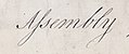
The English word assembly in Latin italics (1788)

Congreſs in the Bill of Rights of the USA (1788)

.jpg)

Italian

Note the word " Conteſsa " (Contessa). Title page of the first edition of the Piano Sonata No. 14, Op. 27 No. 2. Published 1802 in Vienna by Giovanni Cappi e Comp.

Example with ſʒ

Berlin street signs: on the left a ß-ligature from ſ and ʒ (and on the right a tz-ligature from t and ʒ). Based on a text by Herbert Thannhaeuser , 1930s.
Examples of misuse
Incorrect use of the round s
Broken Fonts

Curious: Wrong round s only in the wedding hall , previously twice correct ſ in the Bürgerſaal and Ratsſäle

Memorial plaque on the birth house of Pope Benedict XVI. in Marktl with four wrong round s

Street signs in Mainz: wrong left … aſse (in Antiqua without ß this would be correct as a substitute for ß ), right correct … aße

It is not clear why fruit was written with s and not with ſ as in sausage products ; otherwise correct use of long-s and round-s

Wrong round s on the right sign: Are there Dachs · tübchen, so small tubes for a badger ? Certainly not. Correct would be Dach · ſtübchen.


Antiqua typefaces

Mineral water instead of mineral water , written in Latin script with ſ (long-s) and s (round-s)

In st and sch could see last longer. But here incorrectly used round s at the beginning of the word in selbſt . Shield with Lang-s in antiquity.

Incorrect use of the long s


Wrong long-s at the end of the syllable (street sign in Gothic script in Freiberg )

Dingſlebener Edel-Pils - Dingslebener with a round s at the end of the syllable would be correct

Two wrong ſ on the right pillar:
Gate inſ Remſtal instead of
gate into Remstal
Jeſuſ and daſ instead of
Jeſus and that
(writing on a cross-way plaque in the Höllerhansl chapel in Marhof , Styria)


Newspaper names with a long s
Examples of newspaper heads in broken scripts using the long s according to the rules of the Fraktur theorem.


Germany
|
|
Other countries
- Address Avisen , Norway
- Aftenposten , Norway
- Baslerstab , Switzerland
- West Styrian Rundschau , Austria
Product names with a long s
All examples concern logos with broken fonts.

With rule-compliant use of the long s
- Eschweger Klosterbräu
- Guild Pilsener
- Hasseröder brewery
- Jägermeister (herbal liqueur)
- Elector Kölsch (beer)
- Elector Maximilian Kölsch (beer)
- Neuzeller Kloster-Bräu
- Staufenpost (stationery)
- Ur-Krostitzer brewery
- Wolferstetter brewery
A long s can also be found on labels of:
- Mariacron (brandy)
The Berlin cabaret Die Distel uses a long s in its logo.
With deviations from the rules
- Dingslebener Brauerei (with wrong long s at the end of the syllable)
- Fürsteneck Schwarzwälder Kirschwasser (with three false round s, see picture on the right)
Formerly with Lang-s, today switched to Rund-s
- Freistadt beer
- Fürstenberg brewery
- Gilden Kölsch Brewery
- Köstritzer black beer brewery
- Warsteiner Brewery
See also
Web links
- BabelStone: The Rules for Long S - An English-language article on the historically correct use of the long s in different languages
- Pfeffer Simpelgotisch - A broken OpenType font that sets ſ and s on its own
- S-rules of the BfdS - A clear summary of the S-rules, created by the Federation for German Writing and Language e. V. (PDF file; 365 kB)
Footnotes
- ↑ Herbert E. Brekle: Attempt of a linguistically justified version of the rules of use for the long ſ and the round s. In: Contributions to the history of linguistics. 6, 1996.
- ^ Journal for Germany's book printers, lithographers and related trades. Leipzig, July 9, 1903. No. 27, XV. Vintage. Facsimile in: Mark Jamra: The Eszett ( undated ) Archive link ( Memento from January 1, 2011 in the Internet Archive ) (Retrieved April 17, 2008)
- ↑ JE Wülfing, AC Schmidt (ed.): Duden, spelling of the German language and foreign words according to the official rules valid for Germany, Austria and Switzerland. 9th edition. Bibl. Inst., Leipzig / Vienna 1915 (set in Fraktur), p. XII.
- ↑ Duden, 11th edition, 1934, p. 46.
- ↑ GDR-Duden, 16th edition (1967), 10th reprint, p. X, point 1.3.2.
- ↑ Ralf Herrmann: Schriftgeschichten: The Ehmcke-Antiqua, the script with the big long s. In: typografie.info. December 2, 2013, accessed March 31, 2014 .
- ↑ Proposal to encode Latin letters used in the Former Soviet Union (in Unicode) (PDF; 19.3 MB)
- ^ Frings, Andreas: Soviet written policy between 1917 and 1941 - an action theory analysis . Stuttgart 2007, ISBN 978-3-515-08887-9
- ↑ Röschenhof or Rös'chenhof. Retrieved on September 18, 2014 (A listener of the MDR radio is upset about the greetings for the Röschenhof because its name is supposedly wrongly pronounced.).
- ↑ Gustav Michaelis: The results of the orthographic conference held in Berlin from January 4th to 15th, 1876. Barthol, Berlin 1876, pp. 92–93 ( online in the Google Book Search USA )
- ↑ 25th edition of the Duden, 2009
- ↑ Friedrich Forssman, Ralf de Jong: Detailed typography - reference work for all questions about writing and typesetting. 2nd Edition. Verlag Hermann Schmidt, Mainz 2004, ISBN 978-3-87439-642-4
- ↑ stiftung-buchkunst.de
- ^ The Rules for Long p. June 12, 2006, accessed May 19, 2020 .
- ^ Ligatures, Digraphs, Presentation Forms vs. Plain text. Unicode Consortium , accessed May 10, 2020 .
- ↑ Text: Unicode values of the 8859 character sets