
Bastarda

The Bastarda is a late medieval broken font , as book writing in manuscripts was in use and in offices was used. It belongs to the group of Gothic scripts and is the most common of all medieval scripts. It got its name, derived from the term bastard , because it is a "fake" book font that also has the characteristics of a business font. Some palaeographers call it the Hybrida. As a mixed form, it is, as it were, the fruit of a cross between different types: It combines the cursive business font with elements of the non-cursive, calligraphic book font Textura (Textualis).
Bastarda was developed as a chancellery script in the course of the 14th century. It arose from the need for a font for documents that could be written fluently on the one hand, but also meet aesthetic requirements on the other. In the late 14th century it penetrated the manuscript production and quickly established itself there. As a book and business typeface, it found the most widespread use in a large number of forms, some of which were clustered regionally and some of which were limited to individual centers. In the 15th century it dominated the entire writing system. After the introduction of letterpress printing, it also formed the basis for printing types . Because of the variety of their manifestations, the plural is often used; one speaks of "the bastards".
From the Kanzleibastarda the new German Kurrentschrift developed in the early 16th century .
Definition, system and terminology
In the area of italic Gothic fonts of the late Middle Ages, no uniform system and terminology has prevailed so far. One reason for the serious classification problems is the confusion that results from the vastly increased wealth of forms compared to earlier epochs. A multitude of peculiarities of individual regions, centers and writers as well as the flowing transitions between some fonts make the systematic recording of the phenomena and the introduction of a universally applicable nomenclature difficult . Because of these circumstances, the term bastarda has no definite meaning. Bastards are all Gothic fonts that combine italics and a stock of forms, mainly derived from business cursive, with a more or less pronounced calligraphic claim.
Not only the demarcation from other italics, but also the determination and spatial delimitation of the individual expressions and writing styles within the area of the bastards is problematic. The library scientist Joachim Kirchner (1890–1978), whose table works were very popular, tried from 1928 to classify the book bastards that were widespread in Germany. By bastards he did not mean all cursive book fonts, but only those of good quality with a clear calligraphic claim. He called the simplified, quickly written, aesthetically undemanding book fonts “book cursives”. He did not count these italics among the bastards, but rather placed them in close proximity to the required script. Kirchner endeavored to work out regional peculiarities which should make it possible to assign manuscripts to specific regions based on their writing. Although he formulated his division of the bastards into regional styles cautiously, his system was well received; Especially in Germanic publications, fonts were often described according to its classification. Such a system, however, can at best offer a rough orientation, since many writers - such as beggar monks and students, but also professional writers - were very mobile and individual writing styles were the result of the meeting of different influences and requirements. Karin Schneider checked the differentiation criteria offered by Kirchner for southern Germany and came to the conclusion in 1994 that they were too general and too subjective and that it was very difficult to work out uniform and clearly definable regional fonts within the Bastarda. Accordingly, palaeography can hardly contribute to determining the origin of German-language manuscripts. Schneider's research led to a departure from Kirchner's previously common classification. The distinction between regional types can still be found in manuals.
In 1953 the nomenclature was discussed at a meeting in Paris from which the Comité International de Paléographie Latine emerged. There the Dutch paleographer and codicologist Gerard Isaac Lieftinck presented a new terminology. He divided the Gothic fonts into three types: the non-cursive littera textualis , the liquid utility font littera cursiva and the mixed form between them Bastarda. Within the Textualis and the Cursiva, he distinguished between a relatively undemanding execution (scriptura currens) , a conservative, calligraphic high quality (scriptura formata) and a medium, the usual but well-kept script, for which he did not introduce any special designation.
However, Lieftinck's nomenclature turned out to be problematic. With the name Bastarda he took over a traditional name that was used in the French-speaking area in both Latin (littera bastarda) and French (lettre bâtarde) as early as the late Middle Ages. At that time it had a different meaning than in Lieftinck's system. Therefore, he changed the name and introduced the newly created name Hybrida . In biology, a hybrid is understood to mean an individual who has emerged from the crossing of different species; the meaning therefore corresponds to that of Bastarda .
To distinguish it from the cursive, Lieftinck defined the Hybrida as a book cursive, the long shafts of which do not have any loops; He mentioned the shape of the letters a, f and long s as further distinguishing features . In doing so, he introduced objective, easily verifiable criteria. However, his proposal met with some fierce criticism from experts. One of the weaknesses of his system is that his findings are based on an examination of codices from the Netherlands. When an attempt was made to apply its classification to manuscripts from other regions, it turned out that the presence or absence of loops is not a classification feature that can claim validity for the entire manuscript production. Lieftinck's system cannot easily be generalized. A sharp demarcation between cursiva and hybrida has proven to be impossible, as there are a multitude of transitional and mixed forms. This problem prompted Lieftinck's student Peter Gumbert to expand the nomenclature by introducing a fourth type, which he called "semihybrida". To specify Lieftinck's system, Gumbert introduced a complex “ Cartesian ” model, which he presented graphically as a “Cartesian cube”. However, this did not result in a universally accepted solution to the terminological problems either.
Bernhard Bischoff , one of the most influential paleographers of the 20th century, stuck to the name Bastarda and its traditional meaning. He used it to refer to writings with and without snares. In favor of the traditional naming, he argued that despite all the differences in the real appearance of the bastards, it said that these were fonts that bridged the contrast between cursiva and textura by combining properties of both genres. The modern use of the historical name should be based on this definition. Albert Derolez has a different opinion, who advocates using the historically predefined expression Bastarda only for a certain luxury font , the lettre bourguignonne ("Burgundian script"), and the group of scripts named by Bischoff "Bastard" with Lieftinck's expression "Hybrida" to call. Derolez advocates an expanded version of Lieftinck's system, which he presented in 2003 in an overall presentation of the palaeography of Gothic book scripts. However, this system has not met with unanimous approval either. Malcolm Parkes introduced a classification specifically for British book cursives in 1969. He differentiates between six scripts: "Anglicana", "Anglicana formata", "Bastard Anglicana", "Secretary", "Bastard Secretary" and "Schrift der Universitätsschreiber" (a mixture of "Anglicana" and "Secretary"). Some palaeographers today refer to the type that Lieftinck examined and described as hybrida (in the narrower sense): a loopless variant of the Bastarda, which prevailed in the Netherlands and the Rhineland, but was also used elsewhere. In the German-speaking world, the term Bastarda is still used in the sense of Bischoff's understanding of the term.
features
general characteristics
The general characteristics of the bastards that distinguish them from the textura include, in addition to the cursive, primarily two elements from the office cursive: an f extended below the line and a long s and a single-arched ("one-story") a. The "two-story a" with two arches, which is common in Textura and where the loop bends down to the belly, is very rare in most bastards. The influence of the Textura, a heavily broken book font , is shown in the simple refraction of italic curves, with which the Bastarda was calligraphically enhanced and the Textura was approximated. In the case of a particularly calligraphic design, the bastards also have other features of the texture, including the angular letters a, g and round s , which are composed of single lines, as well as fine decorative lines and decorative ticks. Loops on the ascenders - if they exist - do not represent written air lines in the book bastards; they only have a decorative function and are sometimes designed to be triangular. The main shafts of the letters are usually strongly emphasized and executed with strong pressure lines. The descenders of the shafts are pointed.
Individual expressions
Statements about regional fonts are problematic and only possible with great reservations because of the diverse supra-regional influences and the variety of factors. Nevertheless, styles can be distinguished, some of which were particularly cultivated in certain areas or at individual writing places. The most important characteristics (see illustrations below) are as follows:
- "Bastard Anglicana": A font developed by English scribes for more sophisticated codices from the middle of the 14th century. It combines elements of the Textura, including the two-story a, with properties of the "Anglicana", the late medieval cursive font used in England. The Bastard Anglicana was used for magnificent manuscripts and as a markup font. In doing so, it took over functions of the Textura, which were relatively inconvenient to use.
- "Bastard Secretary": A variant of the English used cursive "Secretary" that was created in the 15th century. It is called "bastard" because it gives the "secretary" a more formal character through combination with elements of the textura, suitable for codices of high demand.
- Bohemian Bastarda: an almost or completely straight font, usually with loops. Their distinguishing feature are very narrow shafts with sharp, sawtooth-like zigzag lines on m, n and i. One style criterion is the tendency towards ornamental stylization. This type, developed in Bohemia, was also widespread in Austria and Bavaria.
- Burgundian Bastarda (lettre bourguignonne or lettre bâtarde) : An elegant, decorative, usually slightly right-leaning font that emerged from the French chancellery cursive and was mainly used for French texts. It is called Burgundian because it was particularly well cared for at the court of two Dukes of Burgundy, Philip the Good (1419–1467) and Charles the Bold (1467–1477), and it was used for magnificent manuscripts. But it was also popular in France; in England it was naturalized in the second half of the 15th century. It differs from other italics in the relative shortness of the ascenders and descenders. Further characteristics are: strong contrast between hairline and shadowline ; individually attached shafts of n and m, the last shaft within the word is mostly broken and slightly bent inwards; small peaks on e, g and s. The spindle-shaped, thickened shafts of f and long s are thinned and pointed down to the hairline. These two letters are broken in the head part. The final s with a high arch and closed belly is also characteristic.
- Florentine Bastarda: A chancellery script (cancelleresca) that was also used for books and is called "Florentine Bastarda" as a calligraphic book font. It is considered one of the most beautiful Gothic cursive fonts. Its existence of forms justifies its classification under the bastards, but it developed independently of the group of bastards north of the Alps. They were often used for texts by contemporary authors. Numerous codices of Dante's Commedia are written in Florentine bastarda. Features are vertical ascenders and descenders, a pointed v, long descenders of the long s and strongly rounded a and d. The ascenders of b, d, h, and l form a triangle or arc to the right.
- Dutch-Low German Bastarda (Hybrida in the narrower sense). Because of its use in circles of the Devotio moderna it is also called Devotenbastarda. She was particularly popular with the Canons of Windesheim and the Brothers of Life Together . The scribes attached great importance to simplicity and clarity. The main feature of this easy-to-read font is the complete absence of loops and curves on the ascenders of b, d, f, h, k, l, long s and v. The lower length of the g is usually open, it is not closed into a loop. The round ending s is always closed ("pretzel-shaped s"). This font is indeed a bastarda in terms of its number of forms, but it was not written in italics, but composed.
- Examples

Bastard Anglicana in a manuscript from the 2nd half of the 15th century (Nova cronica de gestis regum Anglorum) . Oxford, Bodleian Library , Rawl. C 398, fol. 49r

Bastard Secretary in the early 16th century (Collection of extracts from the works of John Lydgate ). Oxford, Bodleian Library, Arch. Selden. B. 10, fol. 205r

Bohemian Bastarda in a manuscript written in Prague in 1414 (Statuta ordinis Carthusiensis) . Vienna, Austrian National Library , Cod. 1670, fol. 3v

Burgundian Bastarda (lettre bourguignonne) in a splendid manuscript ( Die Taten des Girart von Roussillon , French), which was written for Duke Philip the Good of Burgundy in 1447/1450 . The picture shows the Duke receiving the book. Vienna, Austrian National Library, Cod. 2549, fol. 6r

Florentine Bastarda in a manuscript from Dante's Commedia , 14th century. Berlin, State Library , Cod. Ham. 204, fol. 59v

Dutch-Low German Bastarda (Hybrida) in a manuscript from 1466 (extracts from the Old Testament in German). Rostock , University Library, Ms. Theol. 33, fol. 108v


historical development
Early chancellery and book bastards
Already in the late 13th century, documents and business scripts formed most of the typical characteristics of the later book italics. At that time there were also urgent, highly simplified utility book fonts, some of which began to take on italic forms. Semi-italic transitional fonts were created. The prerequisites for the development of the Bastarda were thus given. What was still missing then and in the early 14th century was the transition to full italics and the connection of italic writing with the calligraphic claim that is characteristic of the Bastarda. The decisive impulses for the creation of Bastarda then came from the law firms, where a fluid and at the same time beautiful font that was appropriate for documents was required.
,_Marburg,_Urk._75.jpg)
Although the name Bastarda originally only served to denote book fonts that combine elements of textura and business italics, it is now also used for the office fonts from which the book bastards emerged. The reason for this is the great similarity between these chancellery documents and the book bastards; some largely or completely agree.

The chancellery bastards, the oldest forms of this font, originated in the 14th century. The development started in France. It was there that the first bastards were created and then trained to a calligraphic perfection that could meet high aesthetic standards. With its elegance, the new typeface proved its suitability for book scripts, also for precious manuscripts. As a book font, it had the great advantage over the non-cursive Textura that it enabled the writer to write several letters in a row with one stroke without having to remove the pen. This convenient writing technique quickly made it popular, especially as it could satisfy high demands in terms of beauty and elegance. Another advantage was that it was more suitable for individual modifications than older book fonts. In doing so, she met the then rapidly growing need for a personal style.
A forerunner of the chancellery bastarda was the script of the papal chancellery in Avignon . Even before the middle of the 14th century, it had most of the forms that later became characteristic of the book bastarda. Already around 1340 a script identical to this chancellery script was written in book manuscripts in southern France. Similar phenomena occurred only a little later in the East: Around the middle of the 14th century, the Imperial Chancellery of Charles IV in Prague used a calligraphic document font in which the forms of the later book bastarda appear. It is believed that the Prague chancellery script followed the example of the papal chancellery script. Above all, it was shaped by the influence of a business cursive that was common in Bohemia and Austria at the time. Their role in the creation of the later book bastarda can be clearly seen in two original copies of Charles IV's Golden Bull from 1356 in codex form. These already show the calligraphic style, which is characterized by strong refraction, angularity and decorative forms, which became common in book bastards a few decades later.
Around 1380, the Prague chancellery script began to be used for manuscripts in Bohemia. The influence of this bohemian type of Bastarda soon made itself felt in Austria and southern Germany. The first book bastards appeared there in the late 14th century. Hardly later, early bastards appeared as book fonts in the west and south-west of the German-speaking area. They were probably developed under French rather than Bohemian influence.
In Spain, the cursive book script originated from a calligraphic script font used for particularly solemn documents, the letra de privilegios , which was adopted as book script (redonda de libros) with wide, round letters as early as the end of the 13th century . From the end of the 14th century, Spanish and Portuguese codices - especially vernacular ones - were often written in a book cursive that combines the two-story a of the textura with features of a bastarda.
The loopless bastarda

A subspecies of the bastards is the "loopless" or "loopless" bastarda. Although it has the typical letter forms of the bastards, it is characterized by the absence of curves and loops and a composite spelling. It lacks some of the characteristics of an italic. The motive for this style was a striving for legibility and simplicity, a distance from the trivial and overloaded. Looplessness was widespread in the late Middle Ages. It had a geographical focus (such as frequency in the Netherlands, rarity in England), but a general assignment to specific regions or social groups is not possible.
In the Netherlands as well as in the north-west and west of Germany, the loopless bastarda began to spread in the 1920s. It represented a striking innovation. This northern type of looplessness is first documented in 1396 by a dated manuscript. It is characterized by smooth shafts of b, d, h, l and k, as they were common in the Textualis. The innovation quickly caught on in the area where it was created, but did not completely replace the older Bastarda with bows on the shafts. In southern Germany it remained rare until the middle of the 15th century. Transitional forms are very common. With some of the palaeographers, the name Hybrida, which goes back to Lieftinck's nomenclature suggestion, has become commonplace for this expression of the loopless Bastarda; others understand hybrida to be the totality of loopless types.
The further development in the 15th century
The catalogs of dated manuscripts available today show that the Bastarda was used in the majority of manuscripts of the 15th century and is the most common of all medieval scripts.
In southern Germany in the 15th century there was a divergence between the calligraphically demanding and the simple bastards. The surviving manuscript holdings offer a large number of simple bastards, which show individual characteristics of their scribes, but can hardly be classified more generally. The deliberately stylized, learned, completely uniform book fonts on a high calligraphic level, which come from professional writers and are close to contemporary office fonts, differ from them. These fonts hardly allow individual fluctuations. Characteristics of the professional type of book bastarda are a right oblique alignment and shafts of f and long s that extend deep below the line. The mostly right-angled law firm bastards of this time also show a very even, highly individual typeface and have a strongly elongated f and a long s. It can be seen that the chancellery scripts had a formative influence not only on the creation, but also on the further development of the book scripts.

A special calligraphic tradition developed in the Reich Chancellery. A decorative form of the Bastarda written there are the sweeping swellings of the capital letters, the " elephant trunk ". This is a bohemian style element that was later adopted from Fraktur . In Austria, a "horn surge" was common.
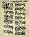
A Bastarda from 1430 in an Austrian manuscript ( Nikolaus von Lyra , Postilla super Pentateuchum ). Vienna, Austrian National Library, Cod. 1518, fol. 1r
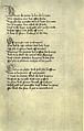
A Bastarda from 1433 in an English manuscript ( John Lydgate , biography of St. Edmund in English verse). London, British Library , Harley 2278, fol. 111r
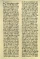
A Bastarda from 1478 in a German manuscript (Pseudo-Hieronymus, Regula monachorum in German translation). Munich, Bavarian State Library , Cgm 7264, fol. 28v


The letterpress
When letterpress printing came along, printers used the handwriting fonts as a model for their letters. Therefore, in the incunabula , the prints of the 15th century, all scripts in use at that time appeared. The Bastarda was adopted by the printing press in its area of distribution. Even Johannes Gutenberg created the oldest pressure hybrids; he used them for two single-sheet prints, the Mainz indulgence letters of 1454 and 1455. However, these two early bastards remained isolated for a long time, and they found no successors in the other centers of German letterpress printing. It was not until 1472 that the use of the Bastarda became more common in Germany. In France, it was the Parisian printer Pasquier Bonhomme who introduced the Bastarda. Between 1475 and 1477 he brought out the first print of a French text, the Grandes Chroniques de France , for which he created a type of lettre bâtarde . More Parisian prints soon followed, in an increasingly rich variety of types. In Lyon , the second most important center of French book printing, the printing bastarda was introduced in the 1580s. At that time, however, Gothic fonts had already passed the peak of their popularity across Europe. First in southern and western Europe, and later also in the north and east, they were pushed back by the antiqua and humanistic cursive .

In the French incunabula production, the Rotunda , a book font of Italian origin, predominated in the south , while Textura and Bastarda dominated in the north. The rotunda was preferred for Latin texts, while the other scripts predominated in French. In the first half of the 16th century, Gothic scripts were on the decline in France; they were superseded by the renaissance types and only appeared sporadically after the middle of the century. In England, William Caxton , the first English printer, only used Textura and the "secretary type" called Bastarda. Textura predominated in English printing plants as early as 1500, and Bastarda disappeared in the 16th century. In the Netherlands, the bastarda was rare in letterpress printing. On the other hand, it experienced an upswing in Germany in the eighties of the 15th century. It was there that the "Upper Rhine Bastarda", which was first used in Cologne in 1484 and also in Mainz and Strasbourg in 1485, shows the characteristic loops of the ascenders at b, d, h and l and gives little emphasis to the ascenders and descenders. It spread quickly and was very popular towards the end of the 15th century, as was the " Schwabacher ", which combines features of the Bastarda with elements of the Rotunda. The Schwabacher, one of the best legible Gothic fonts, left out many of the italic features of the early print bastards. It gained a lot of ground for German texts in the early 16th century and dominated around 1525, but the Upper Rhine Bastarda was still relatively common at that time. Finally, the Fraktur prevailed, which had gained a dominant position around 1600.
In Bohemia the printers followed the prevailing taste in the local manuscript production. In the Bohemian print bastarda “an almost rococo-like playfulness of the letters in the typeface” was developed.
literature
- Bernhard Bischoff : Palaeography of Roman antiquity and the western Middle Ages . 4th edition, Erich Schmidt, Berlin 2009, ISBN 978-3-503-09884-2 , pp. 191-193
- Michelle P. Brown, Patricia Lovett: The Historical Source Book for Scribes. University of Toronto Press, Toronto 1999, ISBN 0-8020-4720-3 , pp. 95-102
- Albert Derolez : The Palaeography of Gothic Manuscript Books. From the Twelfth to the Early Sixteenth Century. Cambridge University Press, Cambridge 2003, ISBN 0-521-80315-2 , pp. 163-175
- Joachim Kirchner : Scriptura Gothica libraria a saeculo XII usque ad finem medii aevi LXXXVII imaginibus illustrata. Oldenbourg, Munich 1966 (table work, contains numerous illustrations)
- Otto Mazal : paleography and paleotype. On the history of writing in the age of the incunabula. Hiersemann, Stuttgart 1984, ISBN 3-7772-8420-3 , pp. 18–22 (Bastarda as handwriting), pp. 138–181 (Bastarda in letterpress)
- Wolfgang Oeser: Observations on the emergence and distribution of loopless bastards . In: Archiv für Diplomatik 38, 1992, pp. 235–343
Web links
- Dianne Tillotson: Medieval writing (several examples)
Remarks
- ↑ Karin Schneider: Paläographie und Handschriftkunde für Germanisten , 3rd, reviewed edition, Berlin 2014, p. 84 ( online ).
- ↑ See Martin Steinmann : From research on Gothic script in the last fifty years. In: Archiv für Diplomatik 50, 2004, pp. 399–415, here: 406 f .; Elke von Boeselager: Schriftkunde , Hannover 2004, p. 38; Karin Schneider: Palaeography and manuscript studies for Germanists , 3rd, revised edition, Berlin 2014, pp. 68–72.
- ↑ Joachim Kirchner: The Gothic fonts in the epoch of handwriting . In: Ernst Crous , Joachim Kirchner: The Gothic Fonts , 2nd edition, Braunschweig 1970 (1st edition Leipzig 1928), pp. 7–25, here: 16–22; Joachim Kirchner: Germanistische Handschriftpraxis , Munich 1950, pp. 21–24.
- ↑ Karin Schneider: The dated manuscripts of the Bavarian State Library in Munich , Part 1, Stuttgart 1994, pp. XXIX – XXXII.
- ↑ Martin Steinmann: From research on Gothic script over the last fifty years. In: Archiv für Diplomatik 50, 2004, pp. 399–415, here: 405–407; Albert Derolez: The Palaeography of Gothic Manuscript Books , Cambridge 2003, p. 168 f.
- ^ For example, Friedrich Beck , Lorenz Friedrich Beck: Die Latinische Schrift , Köln 2007, p. 51 and Hans Foerster, Thomas Frenz: Abriss der Latinischen Paläographie , 3rd, revised edition, Stuttgart 2004, p. 250.
- ^ Gerard Isaac Lieftinck: Pour une nomenclature de l'écriture livresque de la période dite gothique. In: Nomenclature des écritures livresques du IX e au XVI e siècle , Paris 1954, pp. 15–34.
- ↑ Gerard Isaac Lieftinck: Manuscrits datés conservés dans les Pays-Bas , Vol. 1 (text volume), Amsterdam 1964, p. XV and note 6.
- ↑ Martin Steinmann: From research on Gothic script over the last fifty years. In: Archiv für Diplomatik 50, 2004, pp. 399–415, here: 403–405; Charlotte Ziegler: Aspects of the Bohemian and Austrian palaeography of the 15th century using examples from the holdings of the Zwettl Abbey Library . In: Codices manuscripti 4, 1978, pp. 120-130, here: 121.
- ↑ Bernhard Bischoff: Palaeography of Roman antiquity and the occidental Middle Ages , 4th edition, Berlin 2009, p. 191 (first published in 1979).
- ^ Albert Derolez: The Palaeography of Gothic Manuscript Books , Cambridge 2003, p. 124.
- ^ Albert Derolez: The Palaeography of Gothic Manuscript Books , Cambridge 2003, p. 23 f.
- ↑ Martin Steinmann: From research on Gothic script over the last fifty years. In: Archiv für Diplomatik 50, 2004, pp. 399–415, here: 404.
- ↑ Malcolm B. Parkes: English Cursive Book Hands , Oxford 1969, pp. XIV – XXIV.
- ↑ Martin Steinmann: From research on Gothic script over the last fifty years. In: Archiv für Diplomatik 50, 2004, pp. 399–415, here: 405.
- ↑ For example in handbooks: Karin Schneider: Paläographie und Handschriftkunde für Germanisten , 3rd, reviewed edition, Berlin 2014, p. 66; Friedrich Beck, Lorenz Friedrich Beck: The Latin Script , Cologne 2007, p. 51; Hans Foerster, Thomas Frenz: Abriss der Latinische Paläographie , 3rd, revised edition, Stuttgart 2004, p. 250.
- ^ Karin Schneider: The dated manuscripts of the Bayerische Staatsbibliothek Munich , Part 1, Stuttgart 1994, p. XXII; Elke von Boeselager: Writing , Hannover 2004, p. 38.
- ↑ Malcolm B. Parkes: English Cursive Book Hands , Oxford 1969, pp. XVII f.
- ↑ Malcolm B. Parkes: English Cursive Book Hands , Oxford 1969, pp. XXI f .; Albert Derolez: The Palaeography of Gothic Manuscript Books , Cambridge 2003, p. 161.
- ↑ Charlotte Ziegler: Aspects of the Bohemian and Austrian palaeography of the 15th century using examples from the holdings of the Zwettl Abbey Library . In: Codices manuscripti 4, 1978, pp. 120-130, here: 122-126; Bernhard Bischoff: Palaeography of Roman Antiquity and the Occidental Middle Ages , 4th edition, Berlin 2009, p. 193.
- ^ Bernhard Bischoff: Palaeography of Roman antiquity and the occidental Middle Ages , 4th edition, Berlin 2009, p. 192; Otto Mazal: Buchkunst der Gotik , Graz 1975, p. 41 f .; Albert Derolez: The Palaeography of Gothic Manuscript Books , Cambridge 2003, pp. 157-160. See Michelle P. Brown, Patricia Lovett: The Historical Source Book for Scribes , Toronto 1999, pp. 97-101.
- ^ Otto Mazal: Paläographie und Paläotypie , Stuttgart 1984, p. 18; Elke von Boeselager: Schriftkunde , Hannover 2004, p. 38; Albert Derolez: The Palaeography of Gothic Manuscript Books , Cambridge 2003, p. 156 f.
- ↑ Wolfgang Oeser: Observations on the emergence and distribution of loopless bastards . In: Archiv für Diplomatik 38, 1992, pp. 235–343, here: 239–241.
- ^ Karin Schneider: The dated manuscripts of the Bayerische Staatsbibliothek München , Part 1, Stuttgart 1994, pp. XVII – XXI.
- ↑ Karin Schneider: The dated manuscripts of the Bavarian State Library in Munich , Part 1, Stuttgart 1994, pp. XXII f.
- ↑ Karin Schneider: Paläographie und Handschriftkunde für Germanisten , 3rd, reviewed edition, Berlin 2014, p. 56 f., 70 f .; Elke von Boeselager: Writing , Hannover 2004, p. 38.
- ↑ Karin Schneider: The dated manuscripts of the Bavarian State Library in Munich , Part 1, Stuttgart 1994, pp. XXII f .; Karin Schneider: Palaeography and manuscript studies for Germanists , 3rd, revised edition, Berlin 2014, p. 66.
- ↑ Karin Schneider: The dated manuscripts of the Bavarian State Library in Munich , Part 1, Stuttgart 1994, pp. XXIII f.
- ↑ Giorgio Cencetti : lineamenti di storia della scrittura latina , 2nd Edition, Bologna 1997, pp 253 et seq .; Giorgio Cencetti: Paleografia latina , 2nd edition, Rome 1978, p. 129 f .; Bernhard Bischoff: Palaeography of Roman Antiquity and the Occidental Middle Ages , 4th edition, Berlin 2009, p. 191; Albert Derolez: The Palaeography of Gothic Manuscript Books , Cambridge 2003, pp. 172-175.
- ↑ Wolfgang Oeser: Observations on the emergence and distribution of loopless bastards . In: Archiv für Diplomatik 38, 1992, pp. 235–343, here: 239–243; Albert Derolez: The Palaeography of Gothic Manuscript Books , Cambridge 2003, p. 163 f.
- ^ Karin Schneider: The dated manuscripts of the Bayerische Staatsbibliothek Munich , Part 1, Stuttgart 1994, pp. XXIV – XXVI; Albert Derolez: The Palaeography of Gothic Manuscript Books , Cambridge 2003, pp. 166-168.
- ↑ Karin Schneider: Paläographie und Handschriftkunde für Germanisten , 3rd, reviewed edition, Berlin 2014, p. 68.
- ↑ Karin Schneider: The dated manuscripts of the Bavarian State Library in Munich , Part 1, Stuttgart 1994, pp. XXVIII f.
- ↑ Hans A. Genzsch: Calligraphic stylistic features in the font of the Luxemburg-Habsburg Imperial Chancellery. In: Mitteilungen des Österreichisches Institut für Geschichtsforschung 45, 1931, pp. 205–214; Karin Schneider: Palaeography and manuscript studies for Germanists , 3rd, revised edition, Berlin 2014, pp. 77–79.
- ^ Otto Mazal: Paläographie und Paläotypie , Stuttgart 1984, pp. 138–158; Ernst Crous: The Gothic Fonts in Letterpress . In: Ernst Crous, Joachim Kirchner: The Gothic Fonts , 2nd edition, Braunschweig 1970, p. 28 f.
- ^ Ernst Crous: The Gothic fonts in book printing . In: Ernst Crous, Joachim Kirchner: The Gothic Fonts , 2nd edition, Braunschweig 1970, pp. 30–38; in detail Otto Mazal: Paläographie und Paläotypie , Stuttgart 1984, pp. 158–179.
- ↑ Charlotte Ziegler: Aspects of the Bohemian and Austrian palaeography of the 15th century using examples from the holdings of the Zwettl Abbey Library . In: Codices manuscripti 4, 1978, pp. 120-130, here: 126.