
Humanistic italics


The humanistic cursive (from the Latin currere "to run, run") is the original form of the Latin script . It was developed in Italy during Renaissance humanism .
Due to the influence of the rapid execution of movements on the form of the font, it represented the dynamically emphasized counterpart to the humanistic minuscule , the more static book font by Poggio Bracciolini (1380–1459). With its invention, the prerequisites for the development of the italic printing type were created .
Origin of the humanistic italics
The humanistic cursive had no models. It received its character as humanistica corsiva by amalgamating elements of the Italian form of the Gothic cursive with those of the neo-Carolingian minuscule .
Its origin, like the origin of the humanistic minuscule, is a result of the efforts of Francesco Petrarcas (1304–1374) and Coluccio Salutatis (1330–1406) to create a clear, simple and easily legible font as an alternative to the Gothic (= "barbaric") ) To form. The development of the humanistic cursive is closely connected with the name of the Italian Niccolò de 'Niccoli (1364–1437) in Florence. In developing their characteristic features, he played a key role in the environment of the early humanists Coluccio Salutati, Poggio Bracciolini, Pomponio Leto , Leonardo Bruni , Flavio Biondo and others. Niccoli was also a passionate collector of ancient manuscripts, which he copied and edited. He had a reputation for being an excellent writer and trained writers himself. At the beginning of the 15th century, his swift handwriting developed more and more into a concept or “quick script”. This process was supported by the new writing material paper. The earliest written example found in Niccoli's hand dates from 1423.

Niccolò de 'Niccoli's perhaps the most significant change to a single letter was that of the lowercase letter a into the "one-story" form ɑ, which is found in most Latin scripts to this day.
Character of the humanistic italics
In contrast to the statically emphasized humanistic minuscule, which is assembled from individual elements, the italic is characterized by the continuous or little interrupted lines. This flow is supported by the connections / ligatures , by the grinding of the shape and by a more or less pronounced inclination of the base lines .
Since this new written form was not specified (canonized) in detail, a variety of variants were created. Mixed forms / hybrids, in which the Gothic elements dominated once, the Neo-Carolingian features or those of the humanistic minuscule dominated, were no exception. The broad spectrum of humanistic italics ranged from fleetingly written manuscripts with contemporary features ( humanistica currens ) to more form-emphasized fonts, which were written with a quill pen that was cut a little wider and which had a particularly attractive aesthetic effect due to the bold-fine contrast of the lines. As with the humanistic minuscule, the forms of the capitalis from the Roman inscriptions were used to emphasize ( mark ) headings, chapter or sentence beginnings . Initially mostly inconspicuous, small and vertical, these capitals in the text increasingly took on the inclined position of the lower case letters, were partly adapted to the respective style of the writer and only later became the subject of calligraphic expressiveness.
- Examples of the wide range of humanistic italics

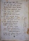
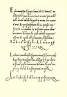
Leonardo Bruni, Italy 1440

JC of Imola, Italy 1467

Pomponio Leto, Rome 1470

L. Cynthius, Italy 1475-1499


Formation and distribution of the style of the Latin form of italics
The Florentine offices made a significant contribution to the stylistic perfection of the italics. Since the 15th century, under the influence of humanistically educated secretaries, a new form of the chancellery , the Cancellaresca italica, developed . In its basic structure, this corresponded to the character of the humanistic cursive and represented a departure from the Gothic chancellery script . As Cancellaresca corsiva and Cancellaresca formata , it had proven itself in the papal chancellery for the design of the breven (littera da brevi) as easy to read, easy and quick font to be written crystallized, which at the same time met high aesthetic demands. The Latin form of the chancellery typeface was distinguished from the partly informal, individually shaped humanistic manuscripts ( humanistica currens ) by a formally taut , narrow style. The elegant effect of the Cancellaresca italica was supported by the expressive contrast in the line design, the alternating movement.
- Examples of the stylistic improvement of italics

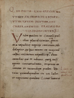
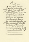
Passage for Leonardo da Vinci 1502

Document, Mantua 1542

Book page, Italy before 1546

Farnese Book of Hours, Rome 1546


The development and application of the new writing style was not limited to the papal chancellery. The Cancellaresca was also maintained in the Florentine State Chancellery for documents, ID cards, entries in official books, etc. In addition, the Cancellaresca italica was preferred by contemporary scholars and artists, mostly humanists , for Latin texts and as a symbol of new education. Since students, scientists and artists north of the Alps became acquainted with this pleasant script during their stay in Italy and valued its properties, a change in the use of script took place, albeit slowly, which was also promoted by the letters of the papal curia .
- Examples of individual forms of italics
Michelangelo , around 1510
Erasmus of Rotterdam , 1514

Copernicus , 1st half of the 16th century

Martin Luther , 1550


The consolidation of the italic style of the Latin script
Among the various manifestations of the Cancellaresca, the names of which were accordingly different, the Cancellaresca formata was characterized by a less oblique basic line position. From this variant the stamp cutter Francesco Griffo da Bologna developed the first italic type made of lead on behalf of the Venetian publisher and printer Aldus Manutius around 1501 . Printing with these narrow and therefore space-saving types initiated the development of paperbacks with the so-called Aldinen . Ludovico degli Arrighi , known as Vincentino, who could look back on a long career as a calligrapher in the papal chancellery, especially as scrittore da brevi apostolici (papal breviary), created the younger version of the italics. His design intentions were less on the economic factor of saving paper, but more on the aesthetic quality of the font.
- Relationship between brevex and italic printing type
First italic type by Francesco Griffo 1501

Cancellaresca in the Breve written by Ludovico degli Arrighi in 1513
Arrighi's italic type 1529

Arrighi's Littera da brevi 1523


Italic printing types existed for a long time as independent text fonts for books. In literature on the history of writing, the 16th century is also referred to as the "Age of Italics" because many books, especially in Italy, were printed in italics. Only gradually did the antiqua replace the italic type as a bread type and italic type was only used for marking, for example, titles and chapter beginnings. In 1702, Phillippe Grandjean de Fouchy in France produced the Romain du Roi, the first correct type association between the two different typefaces Antiqua and Italic (Roman and Italic). Thus the further development of the printed cursive as "sister font" of the Antiqua was initiated. After that, the italic type was usually only used as a supplement or markup font. Today it belongs to a typeface family as the typeface "schnitt" .
The learning of the Cancellaresca italica and its dissemination was mainly promoted by the writers' books. In 1522 Ludovico degli Arrighi was the first to dedicate a textbook ( La Operina ) to this written form . After that, further instructions appeared in Italy, of which those of the scribes Tagliente 1524 and 1446, Verini 1536, Palatino 1540, Cataneo 1545, Amphiareo 1554 and Cresci 1569 gained importance beyond their time.
- Examples of the Cancellaresca in Italian writing master books
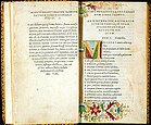
Giovanni Antonio Tagliente, Venice 1524

Giovanni Battista Palatino, Rome 1540

Bernardino Cataneo, Siena 1545

Vespasiano Amphiareo, Venice 1554


The first Cancellaresca north of the Alps was propagated in 1540 by the polymath Gerard Mercator in the Netherlands. For the lettering of his maps and globes he favored the Cancellaresca italica instead of the Gothic script, which then shaped the map style for 200 years. In 1548 Juan Yciar founded calligraphy in Spain in Saragossa with his writer book. In addition, Francisco Lucas, Madrid 1577, made an outstanding contribution to perfecting the Italic style.
- Examples of the Cancellaresca in writing master books outside Italy
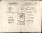
Gerhard Mercator, Louvain 1540

Map font by Gerhard Mercator

Juan de Yciar, Saragossa 1550

Francisco Lucas, Madrid 1570


The written cursive in the post-Renaissance period
Until the middle of the 16th century, the development of the Latin chancellery was mainly determined by the use of the broad pen and the woodcut used to reproduce the templates in the scribes' books. These technical conditions supported the development of a "healthy Renaissance-like core character". Little by little, the simplicity and rigor of form was abandoned by innovations in writing technology. A narrower nib cut resulted in thinner basic strokes . The expressive fat-fine contrast was given up in favor of the leanness of the font. In addition, the deeper cutting of the soft nib led to its greater elasticity. Even at low pressure, a swell developed . Drop-shaped thickenings on the strongly curved ascenders and extensive decorative curves at the beginning and at the end, especially of the capital letters, could not only be better reproduced through the introduction and distribution of copper engraving , but the technical possibilities of the burin itself stimulated artistic designs, which were then combined with the Spring were imitated. Such changes were in line with the style concept of the 17th century and favored the fundamental change in the Latin chancellery script in the spirit of the Baroque. After the middle of the 17th century, the leadership in the further development of italics as cursive was passed into the hands of French, Spanish and Dutch calligraphers. The virtuoso swings , which often developed into opulent feather games, increased more and more.
- Examples of changing the italic writing style

Italic, Italy ca.1600
Jan van de Velde (I) , Amsterdam 1605

Lucas Materot, Avignon 1608

Louis Barbedor, Paris 1647

.jpg)


Further development in France and England to Latin script
After the destruction of the Apostolic Chamber at the Sacco di Roma in 1527, many scribes moved from Rome to southern France, where they further developed the script and gave it more flowing, curved forms. Around 1600 it became the Circumflessa , which was further developed into the French Ronde in the early 17th century . The round was then further developed into a round hand in England in the 17th and 18th centuries . This became the basis of the English copperplate and the English longhand ( script ) that followed from it. This English script ( called Anglaise in France ) spread throughout Europe and America in the 18th and 19th centuries. In the German-speaking world, it is called Latin script to distinguish it from the German Kurrent script , which had developed quite differently.

Example of the round by the calligrapher Charles Paillasson from Diderot's Encyclopédie (1751–1780)

The Round Hand by George Bickham, from The Universal Penman , New York ca.1740–1741


Modern advancements
The original humanistic cursive, with its clearly clearer and more easily legible typeface compared to the Latin script, lives on to this day not only in calligraphy and in italics, but also in handwriting . It formed the starting point for italic fonts developed in the 20th century, including the initial school font Gleichstrich-Kursiv in the GDR and its variant Schulschrift-Kursiv, which was taught in art classes with alternating movements . In the last few decades, the English-speaking italic script has been revived as an easier-to-learn form of cursive, especially in the United States . An example of this is the Getty-Dubay font, developed in 1976 and used by many American school children since then.

The equal stroke italic (middle) and school font italic (bottom)

School Font Italic Alphabet


literature
- Alfred Fairbank, Berthold Wolpe: Renaissance Handwriting. An Anthology. London 1960.
- Berthold Louis Ullman : The Origin and Development of Humanistic Script. Rome 1960.
- Frantisek Muzika: The beautiful script in the development of the Latin alphabet. Artia, Prague 1965.
- Peter Herde : The writing of the Florentine authorities in the early Renaissance (approx. 1400–1460). A contribution to the question of the transition from Gothic to humanistic script. In: Archives for diplomatic and written history, seals and heraldry. 17/1971. Böhlau Verlag, Vienna, Cologne, Weimar, pp. 302–335.
- Albert Kapr : Fonts. History, Anatomy and Beauty of the Latin Letters. Verlag der Kunst, Dresden 1971. ISBN 3-364-00624-5 .
- Erika Urner-Wiesmann: The emergence of italics. In: Journal of Human Studies. 39/40, 1975/76. (1976), pp. 173-202.
- Jan Tschichold : Master book of writing. Maier, Ravensburg 1979, ISBN 978-3-473-61100-3 .
- Reinhard Kunze: DuMont's Handbook of Calligraphy: Introduction to the history, theory and practice of handwritten design. DuMont, Cologne 1992, ISBN 3-7701-2905-9 .
- Bernd Roeck (introduction and translation): Great men and women of the Renaissance: thirty-eight biographical portraits: Vespasiano da Bisticci . Beck, Munich 1995, pp. 347-356, ISBN 3-406-39683-6 .
- Thomas Frenz : Ligature in the script. In: Lexicon of the entire book industry . 2. completely rework. u. exp. Edition. Vol. 4. Hiersemann, Stuttgart 1995.
- Bernhard Bischoff : Palaeography of Roman antiquity and the western Middle Ages. 3rd unchanged edition Berlin 2004. (Basics of German Studies 24), ISBN 3-503-07914-9 .
- Hans Foerster , Thomas Frenz: Outline of the Latin palaeography. Hiersemann, Stuttgart 2004, ISBN 3-7772-0410-2 .
- Hendrik Weber: Italics: what characterizes typography. Niggli, Zurich 2010, ISBN 978-3-7212-0736-1 .
- Stephen Greenblatt : The turning point. How the renaissance began. Siedler Verlag, Munich 2012, ISBN 978-3-88680-848-9 .
Web links
- Anthology of Italian poetry of the 15./16. Century ( [3] ), book written in Cancellaresca around 1530.
Individual evidence
- ^ Albert Kapr : Art of writing. History, Anatomy and Beauty of the Latin Letters. Verlag der Kunst, Dresden 1971, ISBN 3-364-00624-5 .
- ↑ Peter Herde : The writing of the Florentine authorities in the early Renaissance (approx. 1400-1460). A contribution to the question of the transition from Gothic to humanistic script. In: Archives for diplomatic and written history, seals and heraldry. 17/1971. Böhlau Verlag, Vienna, Cologne, Weimar. ISSN 0066-6297 , p. 329.
- ↑ Example of mixed forms in: Vigliano d'Asti: Statuta communitatis Viglani edita per homines et communitatem dicti loci Viglani, diocesis et capitaneatus Astensis. Early 15th century, page 2v.
- ↑ Book (about 300 pages) in Cancellaresca, written between 1496 and 1508. Luca Pacioli : De viribus quantitatis . Facsimiles of the manuscript
- ↑ Example of a lecture postscript in humanistic italics, Wittenberg 1549/50. (In the digital offer of MATEO Annotationes in primum librum )
- ^ Ludovico Vincentino degli Arrighi. In: Signs-Books-Networks. Media history. Internet presentation of the German Museum of Books and Writing (German National Library) in Leipzig. [1]
- ↑ Hendrik Weber: Italics: what distinguishes typography. Niggli, Zurich 2010, ISBN 978-3-7212-0736-1 .
- ↑ Eckehart Schumacher- Gebler (Ed.): Typothek I. Classic Antiqua typefaces in original styles. Verlag SchumacherGebler, Munich 2004, p. 67.
- ^ Ludovico degli Arrighi: La Operina da Imparare di scrivere littera Cancellarescha.
- ↑ Giovanni Andrea Tagliente: Lo presente libro insegna la vera arte de lo excellente scrivere de diverse varie sorti de litere. Italy 1546. (In the digital offer of the Bibliothèque nationale de France [2] )
- ^ Giovanni Battista Verini: Luminario da imparare ascriueri de ogni forte Littera D Giouambattista Uerini…. Milan 1536.
- ^ Giovanni Battista Palatino: Libro nuovo d'imparare a scrivere. Rome 1540.
- ↑ Vespasiano Amphiareo da Ferrara: Opera nella quale s'insegna a scriuere varie sorti di lettere, &… .. 1554. ( In the digital offer of Internet Culturale )
- ^ Giovanni Francesco Cresci: Cancellaresca formata. In: Essemplare di piu sorti lettere ([Reprod.])… (Venetia) -1578. (P. 60). ( In the digital offer of the Bibliothèque nationale de france )
- ↑ Gerard Mercator: Literarum latinarum, quas italicas, cursoriasque vocant scribendarum ratio. (online at: Digitale-sammlungen.de )
- ↑ Juan Yciar: Arte subtilissima.
- ↑ Frantisek Muzika: The beautiful writing in the development of the Latin alphabet. Artia, Prague 1965, p. 234.
- ↑ Pedro Díaz Morante: “New Art of Writing”. Madrid 1630, digitized
- ↑ Lucas Materot: Les œvre. Avignon 1608. ( In the digital offer of the Bibliothèque nationale de France, département Réserve des livres rares )
- ^ Joyce Irene Whalley: The Art of Calligraphy, Western Europe & America ca.1980.