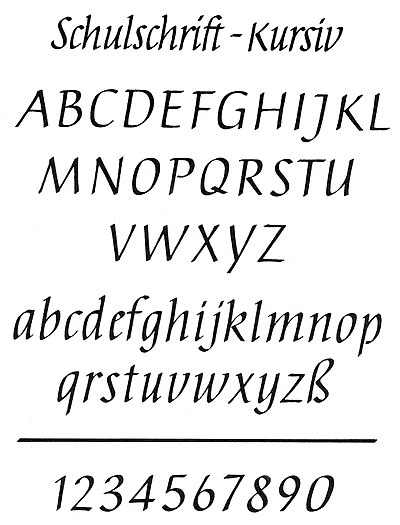
School font italic
The Schulschrift-Kursiv is a form of the Antiqua-Kursiv , which is written with alternating tension ( ribbon spring , calligraphy pen or flat brush, etc.). It was developed for the teaching of writing in art education in the GDR and, in addition to the italic case, written with a feather pen , represents a modification of the original school font from 1968.
aims
When it was introduced into the curriculum in 1972, the intentions of a systematic and continuous writing education and typeface design in the ten-class general polytechnic high school were to be further realized. Since the training in writing ended after the German lessons in 3rd grade, the introduction of the school script cursive in art lessons in 4th and 5th grades should help to consolidate and develop these skills and abilities.
The practical examination of a more sophisticated design of the letters in connection with the typeface as a whole should enable the pupils to be able to perceive and evaluate forms and their interrelationships more consciously and - above all - to express themselves in writing in a sophisticated form beyond the individual handwriting to be able to, e.g. B. in the design of invitations, letters of congratulations, poems or filling out or designing certificates.
An essential prerequisite for this was mastery of the tension spring technology. The base lines are emphasized by the band or alternating line , the less meaningful lines are optically receded. The rhythmic alternation of bold and fine lines as well as the short strokes and strokes reinforce the aesthetic effect of the written font.
With the introduction of the school script italics in the writing lessons of art education, the ideas from which the change in the original school script was based could be better realized, namely the orientation of the script to the forms of the Renaissance italics , in particular the humanistic italics and the Cancellaresca , which are the sources of the Latin scripts .
Problems
The school script in italics could not establish itself in practice. The reasons for this were initially the inadequate material and technical conditions (poor nibs , pen and ink ). In addition, italics had no tradition in art education. Ultimately, the preference for image design content by many art educators led to the fact that the school font italic was removed from the curriculum in 1987.
literature
- Alfred J. Fairbank: A Handwriting Manual . Faber & Faber, London 1954.
- Tom Gourdie: Italic Handwriting . Studio Publications, London 1955.
- Renate Tost : The writing in school. A contribution to the perspective of writing education in the general polytechnic high school. Institute for Book Design, Leipzig 1968.
- Albert Kapr : Fonts. History, Anatomy and Beauty of the Latin Letters. Verlag der Kunst, Dresden 1971, ISBN 3-364-00624-5 , p. 318.
- Elke Müller: 4th grade - school script in italics. Notes on their introduction. In: Journal Art Education 10. People and Knowledge, Berlin 1971, p. 18.
- Renate Tost: Investigations into some fundamental aspects of handwriting design in the general polytechnic high school with special consideration of the school font italic. Diss. Leipzig 1975.
- Renate Tost: The school font in italics. In: Robert Kuhn (ed.): Font design, writings for art education. Vol. 22, People and Knowledge, Berlin 1971, pp. 46-60.
- Albert Kapr: About the improvement of the school exit script in the GDR. In: Albert Kapr: Writing and book art. Essays, speeches, artistic works. Fachbuchverlag, Leipzig 1982, pp. 141–147.
- Hildegard Korger: Script and Writing: a specialist book for everyone who is involved with writing and drawing scripts and their use. Fachbuchverlag, Leipzig 1991, ISBN 3-343-00134-1 , pp. 57-65.
- Walter Bergner: Well-founded promotion of the written culture. To the efforts of the Leipzig Institute for Book Art for school writing and calligraphy. Special print from: Leipziger Jahrbuch zur Buchgeschichte 7, 1997, ISBN 3-447-03938-8 , pp. 223–244.
- Gottfried Pott: Calligraphy: first aid and writing training with sample alphabets . Schmidt, Mainz 2005, ISBN 3-87439-675-4 , pp. 47-55.
Web links
Individual evidence
- ↑ Renate Tost: Grade 4 - For the introduction of the text in italics . In: Art Education 11 (1971), [1] pp. 9–11 (3,450 kB)
- ^ Renate Tost: Writing and writing in school . Typography 11,1970. [2] pp. 257–264 (5,875 kB)
- ↑ Renate Tost: On the development of the simplified original school publication of the GDR 1968 [3] (PDF; 5.8 MB). Dresden 2008, panel 1.
- ↑ italic-handwriting.org/exemplars Society for Italic Handwriting
- ↑ Book in humanistic italics, Italy 1460 [4]
- ↑ Book in humanistic italics, Italy between 1475 and 1490 [5]
- ↑ Book in Cancellaresca, Venice 1541 [6]
- ↑ Document in Cancellaresca, Mantua 1542 [7]


