
Latin script

As Latin script in the German all forms of be cursive referred to the Latin alphabet used and not to the German cursive belong. From the 17th century to the 20th century, when the typewriter emerged, the Latin cursive was the most important correspondence font in all Western languages outside the German-speaking area. It eventually also replaced the German Kurrent script and is the most common cursive script worldwide.
Like any handwritten script , Latin script is also available in a variety of forms that have evolved regionally and over time. So it represents a whole family of script fonts.
For languages written in other alphabets, such as Cyrillic or Modern Greek , there are separate scripts.
Emergence
Humanistic italics
Script fonts are (also commonly cursive medieval Latin cursivus familiar fluently ', in French and English cursive ) called. During the Renaissance , the humanistic cursive arose in humanistic circles in Italy . From this original form the Latin script developed from the 16th century, especially in France and England .
Around the same time with the advent of book printing with movable type, handwritten and printed fonts developed in two separate directions: While until the appearance of the first cursive in modern times, most fonts had unconnected letters and the typography had this feature for technical reasons as well as the For reasons of legibility, it became a characteristic feature of the cursive scripts that were now emerging to connect the letters of a word in a flowing style. Another typical feature of most forms of Latin script is the script's inclination to the right, derived from the humanistic cursive.
Circumflessa and Ronde

After the destruction of the Apostolic Chamber at the Sacco di Roma in 1527, many scribes moved from Rome to southern France . There she and her successors further developed the humanistic cursive and gave it more flowing, curved forms that are in the spirit of the baroque . Around 1600, the circumflessa was created from the humanistic cursive , which was further developed in the early 17th century into the French round , which is characterized by lush curves and curves, especially in the capital letters . The French round plate also borrowed some shapes from the medieval broken rotunda . It is only very slightly inclined. Formative writers like Louis Barbedor (1630–1670) were influential .
A number of sub-forms are again distinguished within the round . In France, the Ronde lasted into the 20th century, as it was taught as cursive in school lessons. For example, they were used by the French Ministry of Finance until shortly after the Second World War, which is why a sub-form of the script is called écriture ronde finnancière .

Example by Louis Barbedor, 1647

Proportions of the écriture ronde

Écriture ronde française (as punctuation)


Round hand
.png)
The Ronde was in the 17th and 18th centuries ( Classicism ) in England more inclined hand Round evolving. The writing was also influenced by a new writing instrument . Up until the mass production of steel nibs in England from 1822, writing was mainly done with quills in Europe . The steel pointed nib (also called Schwellzugfeder ) that has now emerged has created a typeface with a characteristic contrast between thin and thick lines, whereby the thin lines are created with little pressure on the paper during the upswing and the thick lines with more pressure during the downswing. From the 1830s onwards, the pointed nib quickly established itself as a writing instrument everywhere in the western world and replaced the quill pen.
The English cursive script ( called Anglaise in France ) spread throughout Europe in the 18th and 19th centuries and also the European colonies all over the world, including America . It was only difficult to penetrate the German-speaking area, in which the Fraktur also prevailed against the Antiqua for a long time , as its own cursive had established itself there through a separate line of development: Kurrent.
In the German-speaking area

In the German-speaking area as well as in neighboring areas with non-Romanic languages, such as Denmark, Norway or Czech, two cursive scripts coexisted for a long time: the German Kurrent script and the Latin script. Outside of these linguistic areas, only a few spoke German Kurrent script. In the German-speaking world, most people could read and write both scripts.
In German established itself since the 16th century typographic convention in fracture rate German in Gothic script and foreign-language in Antiqua setting. Similarly, in handwritten documents, the German Kurrent script was used for German and Latin script for foreign languages. In addition, the Latin script was also popular for highlighting headings and personal names . So German was also written in the Latin cursive script and therefore the German umlauts required for this , the long s and the ß , were also used in the German version of this script . The long s (ſ) was also used in other languages such as English, French, Spanish, and Italian.
In the Latin cursive as it was written in the German-speaking area, minor regional peculiarities have developed. When writing quickly, the letters n and m often have a "garland shape" similar to the German Kurrent script. That is why it became a widespread custom to draw an additional arc over the letter u, as in the German Kurrent script, to distinguish it from the letter n. This specifically German practice gradually fell out of use in the 20th century.
Under the National Socialists in 1941 the German Kurrent script was banned and the Latin script was declared the new "German normal script". Even after the end of the Nazi regime, the Kurrent script was not reintroduced. This eliminated the need to distinguish between the “German” and the “Latin” script. While the broken typefaces have been preserved in typographic niches to this day, the Kurrent script is hardly used anywhere anymore. Today most people cannot read them, or only with difficulty.
In other language areas
In other linguistic areas, different variations of the Latin script were created. Since many languages use variations of the Latin alphabet with special letters and / or diacritical marks , these special letters and symbols can also be found in the corresponding forms of Latin cursive.
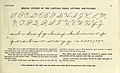
In the United States, a specific form of Latin cursive script , Spencerian script , formed a de facto standard for business correspondence from about 1850 to 1925 until the introduction of the typewriter. This typeface, which Platt Rogers Spencer (1800–1864) developed, is based on oval shapes with distinctive loops in the ascenders and descenders and is intended to combine fast writing with an elegant typeface and good legibility. The Ford and Coca-Cola logos use calligraphic lettering based on the Spencerian script .

Example of the Spencerian script , 1884

The Ford logo

The Coca-Cola logo


Source fonts
Since the 19th and especially in the 20th century, educational forms of Latin cursive script emerged, which were taught as starting scripts in school lessons and had a formative effect on the further development of Latin script in western writing culture . The development of new writing implements such as the cord tension spring and the tension spring , in which no different pressure is used for upward and downward strokes and also no longer any variation in line thickness, as well as the effort to make it as easy to learn and read as possible, led to forms of the Script.
In 1947, the Swiss school script , also known as Schnürlischrift or Schnüerlischrift , was introduced in Switzerland . Since 2007, the unconnected or partially connected basic script has been taught on an experimental basis in various communities . Following a recommendation from the German-Swiss Conference of Educational Directors in 2014, the Zurich Education Council believes that the Swiss school typeface should be replaced by the partially linked German-Swiss basic typeface by the 2018/2019 school year at the latest.

Sütterlin's initial Latin script, 1914

Swiss school typeface, 1947

Latin original, 1953

School leaflet , 1968

Simplified original font, 1972


In the meantime there have been own developments in other language areas. In the US, writing teachers as found Austin Palmer and EC Mills , Spencerian script is not optimal for the requirements of a business magazine. They tried to simplify it and optimize several parameters: the highest possible writing speed, the best possible readability and the least possible fatigue of the writing hand. New writing implements with constant line width were used for this. The Palmer Method , developed around 1888 from the Spencerian Method , shaped the country's cursive script until around 1950. It is particularly wide and some capital letters differ significantly from the forms of Latin cursive script known in Europe. For example, the capital A is “one story” like the small cursive -a (ɑ). In 1978 the original font D'Nealian cursive was introduced in the USA .
Alphabet of the Palmer Method, 1901

Script example of the Palmer Method, 1901

Business writing template from EC Mills , 1909

D'Nealian cursive, 1978


With today's writing implements, the speed advantage of cursive handwriting compared to printed handwriting is only small, which is why many people, even as students, especially in the USA, switch to simpler handwriting with only a few ligatures .
Calligraphic forms


Like any handwriting, Latin cursive is also used in calligraphy for artistic and creative use. In Anglo-Saxon calligraphy, people like to orientate themselves on the particularly beautiful round hand of English typists dating back to the 16th century, as can be found on old copper engravings . This is why these calligraphic fonts are known as the umbrella term Copperplate .
Typographic forms
There are also typefaces that mimic the appearance of a Latin script. According to DIN 16518, they belong to the group of script fonts . Examples:

American Scribe (based on older American script)
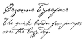
Cézanne (based on the handwriting of the painter Paul Cézanne )

Declaration Script (based on cursive script in the United States Constitution , 1787)

Edwardian Script ( Edward VII British Era )

Artist Script, type foundry D. Stempel , 1902

Zapfino , 1998


See also
Individual evidence
- ^ Marc H. Smith: Du manuscrit à la typographie numérique: présent et avenir des écritures anciennes . In: CNRS (ed.): Gazette du Livre Médiéval . No. 52-53, pp. 51-78.
- ^ Nesbitt, Alexander, 1901-1995 .: The history and technique of lettering , [New Dover ed.]. Edition, Dover Publications, New York 1957, ISBN 978-0-486-20427-7 , OCLC 654540 .
- ^ Joyce Irene Whalley: The Art of Calligraphy, Western Europe & America ca.1980.
- ^ Brian Jones (Ed.): People, Pens & Production in Birmingham's Pen Trade . Brewin Books, 2013 ( table of contents on Amazon, English ).
- ^ Martha Robinson: Developing Spencerian Penmanship at Home: Interview with Michael & Deb Sull . Homeschoolchristian.com. 2001. Retrieved December 11, 2013.
- ↑ Zurich introduces basic font: No more stringed fonts at school blick.ch, January 6, 2016, accessed September 8, 2017.