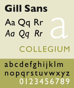
Gill Sans
|
|
|
| font | Gill Sans |
| category | Sans serif |
| Font designer | Eric Gill |
| Creation | 1928-1930 |
| example | |

|
|
The Gill Sans font is a sans serif linear antiqua designed by Eric Gill between 1928 and 1930 .
Emergence
Gill Sans is based on Edward Johnston's font Johnston Sans (co-designed by Gill) and is valued for its calm elegance and versatility. Another special feature of the font is the slight geometric touch. The letter shapes and proportions are based on Renaissance Antiqua .
features
A special feature is that the 32 different font styles are not systematically based on one another, but each have their own character. Italic fonts, in which, like the italics of the Antiqua fonts, some letters have handwriting-like shapes, are only available for the Light and Regular font styles . The ultra-bold cut differs from the rest of the family in details such as a K with arches instead of diagonals, an a without a line or a three-story instead of two-story g . Eric Gill first drew this pattern in 1932, after which it was published by Monotype in 1936. Eric Gill initially called the design Double Elefans . He was then but first as Kayo , derived from the knockout. The knockout in boxing , published and later as Gill Sans Ultra Bold (Series 442) known. Letraset added a condensed cut to the ultra-bold weight in 1980. It is now available in digital form as Gill Kayo Condensed from ITC and Gill Sans Condensed UltraBold from Monotype.
Application history
It became known for its use on the London and North Eastern Railway and later on the British Rail .
In 1978 in the German Democratic Republic (GDR), with the introduction of the road traffic regulations passed in 1977, a modified form of Gill Sans in bold font style for traffic signs and signposts away from highways was prescribed. The Gill replaced the font according to TGL 0-1451, which became mandatory in the GDR in 1963 . With slight deviations, this font was based directly on the pre-war standard of DIN 1451 . It remained on the highways of the German Democratic Republic until 1990.
When Gill Sans shipped it with the Mac OS X operating system , the font found its way into numerous publications.
Since 1997 , Gill Sans has been used by the BBC as a font for its company logo and in the logos of individual programs. The television station 3sat also used this font between 1993 and 2019 in its logo, in on-air elements such as program titles and in written publications.
In 2000, the Greek letters of Hector Charalambous and Panayiotis Haratzopoulos were revised with the permission of the rights holder Monotype and used for the corporate design of the 2004 Olympic Games. Since then, this version has also been commercially available as Gill Sans Hellenic .


