Egyptienne
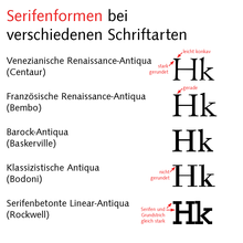
The Egyptienne is a font class derived from the Antiqua , in which the serifs are designed and emphasized like a block. One also speaks of “serif reinforced” fonts. In the English-speaking world, the designation Slab Serif or Square Serif is common, in France Mécanes , in the Netherlands Mechanen and in Italy Egiziani . These fonts were created in the 19th century and flourished there.
Today the Egyptienne is referred to as serif-emphasized linear antiqua according to DIN 16518 , but fonts that do not meet the characteristic of the (almost) constant line width ( linear antiqua ) are also assigned to it. Only representatives of the subspecies of the geometric Egyptienne are usually included in the linear antiqua.
history
The Egyptienne was created in England at the beginning of the 19th century in response to the increased demand for eye-catching advertising fonts. The first Egyptienne was published by Vincent Figgins in 1815 . The Egyptienne typeface was mentioned for the first time in isolated print types in 1820, in an auction directory of the Thorne type foundry. It was called "Egyptienne", although it had nothing to do with the Egyptian script. The name is reminiscent of the name of the ship captured by the English that brought the Rosetta Stone to London in 1802 , at a time when people were very interested in Egyptian art. Even in the 20th century there were still writings that were given an Egyptian name (such as Memphis, Ramses etc.).
The first Egyptienne typefaces were derived from the classicist Antiqua , but were later constructed from sans serif typefaces . Today serif fonts often appear as a component of a larger font system, for example TheSerif or Siemens Slab .
Most non-proportional fonts , such as typewriter fonts , are Egyptienne fonts, as the strong serifs help fill in the space around narrow letters such as "i" and "l" and create a visual connection to the neighboring letters. Serifs with a thinner design would easily break off when you hit a typewriter. A well-known example of such a typewriter font is the Courier .
Features and classification
The most important common feature of the Egyptienne fonts are the accentuated serifs and, in contrast to the classicist antiqua fonts that were popular at the same time , which have a particularly high line contrast with very fine hairlines, much more even line widths with low contrast. In the case of Italienne fonts - if they are counted among the Egyptienne fonts, which is not undisputed - the line contrast is significantly higher again, but the other way round .
Hans Peter Willberg and Indra Kupferschmid distinguish the following types of Egyptienne:
- dynamic Egyptienne : clear line contrast with sloping shadow axis, two-story g, open a, based on the Renaissance Antiqua , but has Egyptienne-like serifs. Examples: PMN Caecilia, TheSerif, Officina Serif, Nexus Mix.
- static Egyptienne : vertical shadow axis, adjusted letter widths, one or two-story g, open a, classicistic character. This species can be further divided into two subspecies:
-
- static Egyptienne with unrounded serifs: Examples: Glypha, Corporate E, Serifa, Aachen.
- static Egyptienne with curves at the serif transition ("Clarendon-like"): Examples: Clarendon , Egiziano, Volta.
- Geometric Egyptienne : no line contrast (linear antiqua), the serifs as strong as all other lines, curves are circular, single-story g, mostly closed a. Examples: Rockwell , Cairo, Lubalin Graph, Memphis.
- decorative Egyptienne (after Willberg): this type includes Egyptienne fonts that have additional decorations.
The Italian has the characteristic that the line contrast is not reduced, but rather reversed. Example:
Examples
See also
literature
- Hans Peter Willberg, signposts. Verlag Hermann Schmidt, Mainz 2001, ISBN 3-87439-569-3
- Indra Kupferschmid, letters rarely come alone. Niggli Verlag, Sulgen ISBN 3-7212-0501-4
swell
- Karl Vöhringer: Getting to know printed matter, applying differentiating . Verlag Forum und Technik, Stuttgart 1989, ( technical publication series of the industrial union Medien 1, ZDB -ID 1064778-8 ).


