
Italians

Italienne ( called Italian in English ) are serif fonts based on the Antiqua , in which the horizontal lines of the glyphs , and thus also the serifs, are significantly bold than the vertical lines.
Mostly, the Italienne belongs to the Egyptienne font class (serif linear antiqua), but this is not undisputed. While the other Egyptienne fonts have little or no line width contrast , Italienne fonts have a distinctly high reverse line width contrast. They can therefore hardly be counted among the linear antiqua typefaces.
history
origin

Italienne fonts reverse the traditional design of the weights to eccentric manner so that the thin lines thick and the thick lines are thin. The idea came up in the UK . The first such font was printed in a font book by Caslon & Catherwood in 1821. The font was called Italienne or ( Grotesque ) Italian in the 19th century because of its exotic appearance , but has nothing to do with the country of Italy . Sometimes they were also called Egyptienne or ( Grotesque or Reversed ) Egyptian , which also has nothing to do with the exotic and nothing to do with the country of Egypt .
There are indications that the Italienne in its original form is not based on the Egyptienne (in the usual sense of the word), but rather on the variants of the classicist antiqua of the 19th century ( called Didone in English ) known as Fat Face . Fat Face fonts, completely different from the Egyptienne fonts, have an extremely high line thickness contrast between hair and shadow lines. The Italienne reverses these extreme hair and shadow lines while maintaining this high contrast. The triangular serifs of the Fat Face font are rotated by 90 degrees if necessary (see the letters T and E in the example on the right).
Like the Fat Face, the Italienne was designed for striking use , where it should attract the attention of the beholder with its dramatic and unusual typeface. It is hardly suitable for body text. Initially, these fonts were often only available in capital letters for use on posters, in titles and headings. As early as 1830, Caslon & Catherwood expanded the stylistic diversity by bringing a three-dimensional variant ( Italian Shaded ) onto the market. In 1846 the English type foundry of Vincent Figgins offered the first lowercase letter set for the Italienne.
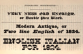
Below an early Italienne ( English Italian ), 1825
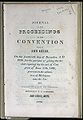
A document printed in 1836. The word PROCEEDINGS is printed in an early Italienne script, the word CONVENTION in a classical antiqua.


Further development

From the middle of the 19th century the further development of the Italians changed from Great Britain to the USA . Your design concept merged there with that of the Clarendon fonts. The American type foundries often offered variants of their Clarendon typefaces with reverse stroke contrast. These are called French Clarendon in English . In this toned down form, they enjoyed great popularity. According to David Shields, the first font of this type is the French Antique by Robert Besley & Co. from 1854.
While some of the original Italienne fonts also have thick strokes in the middle of the glyphs (for example in the horizontal line of the letter H), only the upper and lower horizontal lines are consistently thick in French Clarendon fonts. The serifs are more reserved and there are no more triangular serifs rotated by 90 degrees. The glyphs also tend to be narrow and tall. These new Italienne typefaces had the advantage that the large serifs caught the eye, while the narrow letters met the needs of poster printing. They are the ones best known in Europe under the name Italienne. They are mainly associated with printed matter from the Wild West as well as with theater and circus posters .
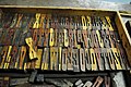
Wooden letters a French Clarendon in Hamilton Wood Type Museum, Wisconsin

Poster from 1914 from Ljubljana (Laibach)


Tuscany
.jpg)
Ornate forms of the Italians are known as Toscanienne (in English Tuscan ). For example, they have forked serifs or other decorations such as lateral spurs. Toscanienne typefaces are also available without the main feature of the Italienne typefaces, the reverse stroke contrast, so that the Toscanienne conceptually does not represent a subgroup, but rather a separate supergroup, which only overlaps with the Italienne in the form of a common intersection.
Modern shapes and other variants

There are a number of other modern adaptations, including the Playbill of Robert Harling (1938), the West Side of Adrian Frutiger and the Figaro of Monotype . Lighter handwritten variants of Italienne fonts were popular for movie posters in the 1950s and 1960s. The Playbill was later bundled with Microsoft software and achieved comparatively wide distribution and popularity in the IT age.
Other variants apply the principle of the reverse stroke contrast of Italienne on sans serif fonts to, or script fonts .
Overall, Italienne fonts are used significantly less in the 20th and 21st centuries, also and especially in poster printing, than in the 19th century. Even if they were originally avant-garde commercial typefaces that broke with essential typographical traditions , from today's perspective they therefore appear “historical” to the viewer.
criticism
Just four years after its first appearance, in 1825, the Italienne was described by Thomas Curson Hansard as a "typographic monstrosity". This condemnation continued into the 20th century. In 1934 it called AF Johnson a "freak" script, and in 1938 Nicolete Gray wrote that the Italienne was "a crude expression of the idea of perversion". In 1940 John Benson and Arthur Carey called it "degenerate".
Walter Tracy offered a more indulgent consideration in 1986: the Italian was created in the "playful spirit". It should therefore not be judged by conventional aesthetic standards.
Web links
Individual evidence
- ↑ Typography glossary. In: uta.fi. people.uta.fi, accessed April 21, 2020 .
- ↑ a b c d e f Wood Type Research - A short history of the Italian. In: woodtyperesearch.com. Retrieved April 21, 2020 (American English).
- ^ A Specimen Book of Printing Types . George Bruce, New York 1828 (Retrieved October 24, 2015).
- ↑ Peter Bilak: Beauty and Ugliness in design type . Retrieved August 10, 2015.
- ^ De Vinne, Theodore Low, The Practice of Typography, Plain Printing Types, The Century Co., NYC, 1902, p. 333.
- ↑ Skylar Challand: Know your type: Clarendon . IDSGN. Retrieved August 13, 2015.
- ^ David Shields: A Short History of the Italian . In: Ultrabold: The Journal of St Bride Library . No. 4, 2008, pp. 22-27.
- ^ A b Frutiger, Osterer & Stamm: Adrian Frutiger - Typefaces: The Complete Works . Walter de Gruyter, 2014, ISBN 9783038212607 , pp. 346–351.
- ^ Provan, Archie, and Alexander S. Lawson, 100 Type Histories (volume 1) , National Composition Association, Arlington, Virginia, 1983, pp. 20-21.
- ^ PT Barnum .
- ↑ Philip B. Meggs, Alston W. Purvis: Meggs' History of Graphic Design . John Wiley & Sons, 2016, ISBN 978-1-118-77205-8 , pp. 155 ( books.google.de ).
- ↑ a b Playbill . Linotype. Retrieved October 11, 2015.
- ↑ David Jonathan Ross: Backasswards! (presentation) . Retrieved August 15, 2015.
- ^ Thomas Carson Hansard: Typographia: a historical sketch of the origin and progress of the art of printing . Thoemmes, Bristol 2003, ISBN 1843713659 .