
Color relationship


,_1885,_%C3%96l_auf_Leinwand,_65x92_cm,_Privatbesitz.jpg)
The color relationship (color combination, color concept, color palette, color scheme, color context, color composition) describes the interaction of two or more individual colors. The properties of each individual color influence the overall effect. However, it is essential that the overall color always creates a new, unique quality. This cannot be reduced to the sum of the effects of the individual colors.
Color relationships can be classified according to their similarity or the size of the contrast. While low-contrast colors tend to appear peaceful, calm and tension-free, color relationships with high contrasts create aggressiveness, restlessness and strong tension.
In general, the term color relationships can be applied to all areas in which color plays a role, e.g. architecture, design, film, photography, clothing, art, handicrafts, mosaics, nature, ornamentation, sculpture, advertising, home furnishings.
In terms of similarity, four color relationships can be distinguished:
- the color equality (monochrome),
- the color relationship (color similarity, color family, color modulation, tone-on-tone painting),
- the color contrast ( color contrast ) and
- the spatial effect of colors.
Color equality

Color equality exists when there is only a single color without shades and variations of this color. The focus is then on the abstract effect of this individual color. The color equality is extremely rare. White projection surfaces or black holes are part of it, as well as the picture “Black Square on White Ground” by Kasimir Malewitsch (1878–1935) or the paintings by Yves Klein (1928–1962) in his typical, international small blue ( International Klein Blue ( IKB)). A surface in a single color can appear boring, empty, monotonous and aimless, but also calming, meditative, concentrated and stimulating to the imagination.
Color affinity


.jpg)
The color relationship exists when a color is combined with similar colors. The three color characteristics (color components, color parameters), i.e. the hue, the lightness and / or the saturation (turbidity), vary more or less. Contrasts are weak or nonexistent.
Monochrome
Monochrome (monochrome, monochrome color scheme, monochrome painting, monochrome or monochromatic color harmony, monochrome color scheme, monochrome painting, monochromism) describes a color relationship in which one color tone serves as the base color (base tone, basic tone, main color). In addition, light-clear (whitened, white-lightened), gray-clouded (grayed) or dark-clear (darkened, black-darkened) shades of the same color are used. For example, blue combined with light blue, blue-gray and dark blue with all the intermediate tones creates a monochrome. The artists of analytical cubism (approx. 1907–1912) use monochrome in their paintings by painting their splintery forms and cuboid structures in earthy gray-brown tones and light-dark shades. You can also find monochrome in ornaments or patterns on wallpaper.
Achromatic color relationship
The achromatic color relationship (achromatic color scheme, grayscale colors, light-dark color scheme, neutral color scheme, unsaturated color scheme) is a special monochrome with the basic color gray in different light-dark shades. Black and white must not come together too hard, otherwise a light-dark contrast is created. Typical examples are grisailles , black and white photos or washed drawings.
Analogous color relationship
The analogous color relationship (analogous color harmony, analogous color scheme) is a particularly common color combination. It consists of a group of two or three adjacent colors on the color wheel. In addition, the colors can be light-clear, cloudy or dark-clear modified. For example, cyan, ultramarine blue and blue-violet, supplemented by light blue, gray-blue and dark blue with all the intermediate tones, create an analogous color relationship. "We already observe this in nature, when, for example, in a dense, good weather atmosphere and when the sun is low, the natural color of objects hit by sunlight is diverted from their original color direction towards the direction of the yellow-red."
Further color relationships
Sometimes colors of similar lightness, darkness or cloudiness form a color relationship.
- Colors of similar brightness are pastel colors (high-key color scheme) such as pink, pale yellow, lime, and sky blue. Impressionist artists (approx. 1860–1890) are known for using light colors, as they preferred light-flooded painting. You can also find pastel colors in ice cream parlors, snowy landscapes or candy floss.
- Similar darkness colors are dark colors (low-key color scheme) such as midnight blue, dark green, maroon, and indigo. You can find them in nocturnal pieces.
- Colors of similar cloudiness are for example the earth colors like burnt sienna, umber, ocher yellow and brown. They were already used in prehistoric cave paintings .
Color contrast
The color contrast is always created by juxtaposing two or more high-contrast colors. The Swiss painter, art theorist and art teacher Johannes Itten (1888–1967) examined the effect of contrasting colors and developed seven color contrasts.
- The color-in-itself contrast (also color contrast, color-to-color contrast, color contrast, polychromy , multicolor) occurs as soon as at least three pure colors that are far apart in the color wheel meet. The color-in-itself contrast can appear glaring, hectic and nervous or dynamic, happy, lively, bright and playful.
- The light-dark contrast (also black-white contrast, tonal value contrast, brightness contrast or chiaroscuro) occurs when light and dark colors are next to each other, such as black and white or yellow and purple. The light-dark contrast can appear threatening, dramatic or cool, melancholy, mystical or thoughtful.
- The cold-warm contrast occurs when warm and cold colors are next to each other. Here activity, energy and liveliness meet peace, clarity and calm.
- The complementary contrast (complementary two-tone, complementary color scheme) occurs when two colors that are opposite in the color wheel meet. The complementary contrast can be intrusive, hectic, irritating, loud, striking and provocative or exciting, dynamic, powerful, distinctive and exciting.
- The quality contrast (chromatic-achromatic contrast, purity contrast, saturation contrast) arises when pure colors are next to cloudy colors. Here emphasis and strength stand against loneliness and restraint.
- The quantity contrast (surface contrast, volume contrast) arises when large or many surfaces are next to small or few. It can have a weighting or structuring effect.
- Simultaneous contrast means that the complementary color always automatically appears around a color. This is a virtual color, the perception of which is created by complex mechanisms in which the entire visual system from the eye to the cerebral cortex is involved.
In contrast to the harmonious, calm color relationship, a color contrast always creates a certain tension. Color contrasts can appear aggressive, dramatic, harsh and loud, but also active, stimulating, powerful, lively and tense.
Spatial effect (depth effect) of colors
A spatial effect can be created through the interaction of two or more colors. A single color without comparison stays flat.
- The aerial perspective (atmospheric perspective, Luftlicht, English: aerial perspective) is created through the air. The further away an object is, the paler and bluer its colors appear. From this experience, light, bluish objects appear to us to be particularly distant compared to objects of different colors.
- The color perspective says that intense, warm colors come to the fore and light, cool colors in the background.
- Intense colors come to the fore and dull colors into the background. This phenomenon plays a role in quality contrast.
- The findings of the figure-ground perception state that shapes that are known, simple, uniform, closed, small, contour-accentuated, shaded, structured or symmetrical are more likely to be perceived as a figure in the foreground and the surroundings as the background behind them. The figure is perceived consciously and differently and forms the center of attention. The other sensory impressions, which are recognized as unimportant, take a back seat and form the "reason".
Note
The color relationships mentioned are only a small selection from an infinite number of possible combinations. They are an aid to orientation. They are rarely used in isolation. Often there are variations and mixed forms.
literature
- Markus Wäger: The ABC of color. Theory and practice for graphic designers and photographers . 1st edition. Rheinwerk Verlag GmbH, Bonn 2017, ISBN 978-3-8362-4501-2 .
- Jennifer Lapp: Introduction to color theory: This is how colors work https://blog.hubspot.de/marketing/farbenlehre-einfuehrung
- Kris Decker: The Basics of Color Theory. https://99designs.de/blog/design-tipps/grundlagen-der-farbenlehre/
- Color scheme. Academic physics. https://www.hisour.com/de/color-scheme-26149/
Individual evidence
- ↑ Ludger Alscher (Ed.): Lexicon of Art in five volumes . 2nd (reprint edition) edition. tape 1 , keyword: color shape. VEB EA Seemann, book and art publisher, Leipzig 1973, p. 673 .
- ↑ Ludger Alscher (Ed.): Lexicon of Art in five volumes . 2nd (reprint edition) edition. tape 1 , keyword: colored design. VEB EA Seemann, book and art publisher, Leipzig 1973, p. 674 .
- ↑ Ludger Alscher (Ed.): Lexicon of Art in five volumes . 2nd (reprint edition) edition. tape 1 , keyword: color effect. VEB EA Seemann, book and art publisher, Leipzig 1973, p. 676 .
- ↑ Markus Wäger: Graphics and design. The comprehensive manual . 2nd Edition. Galileo Press, Bonn 2011, ISBN 978-3-8362-1206-9 , pp. 185 .
- ↑ Markus Wäger: Graphics and design. The comprehensive manual . 2nd Edition. Galileo Press, Bonn 2011, ISBN 978-3-8362-1206-9 , pp. 186 .
- ^ Paul Renner: Order and harmony of colors - a color theory for artists and craftsmen . 1st edition. Otto Maier Verlag, Ravensburg 1964, p. 59 .
- ↑ Markus Wäger: The ABC of color. Theory and practice for graphic designers and photographers . 1st edition. Rheinwerk Verlag GmbH, Bonn 2017, ISBN 978-3-8362-4501-2 , p. 274 .
- ↑ Meyer's large pocket dictionary in 26 volumes . 9th edition. tape 6 , keyword: color vision. Bibliographisches Institut & FA Brockhaus AG, Mannheim 2003, p. 2003 .
Picture gallery

Monochrome: blue shaded with white, gray and black

Achromatic color relationship: different shades of gray

Analogous color relationship: cyan, ultramarine blue and blue-violet, supplemented by light blue, gray-blue and dark blue with all shades in between
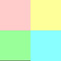
Special color relationship: pastel colors

Special color relationship: dark colors

Special color relationship: earth colors

Aerial perspective

Color perspective

Intense colors come to the fore and clouded colors into the background (quality contrast)

Figure-ground perception


