
Color wheel

The color wheel (also color circle , hue circle , hue circle , color wheel , English circle color, color wheel ) is a system of order in which the colors (chromatic, color-intense, saturated, purely chromatic colors, full-color) are arranged in a circle.
Similar colors appear next to each other (in a circle) and complementary colors (complementary colors, opposing colors, compensation colors) are (often) opposite. Usually six, twelve or 24 colors are arranged side by side in a circle. Color circles follow a theory of color or are based on considerations of such relationships.
General
Color circles differ depending on whether they aesthetic , artistic , physical , physiological , psychological , technical aspects have been created. So there is no universal color wheel.

- Artists use color circles, for example, to derive harmonies from them or to better understand the mixing behavior. Different harmony teachings are based on color circles.
- In industry, for example , color systems are used to be able to reproduce colorants worldwide with the lowest possible deviations.
-
Depending on the area of application, color circles differ in the distribution of colors and their names . Each color wheel is only a model for the representation of pure color stimuli in a certain context. Depending on the real requirements, it is possible to deviate from the circle and switch to graphically complex color systems .

Basics
The "appearance of the colors" used, whether light colors , color stimuli (sensations), color valences (perceptions) or body colors , plays a fundamental role in the construction of a color wheel. In addition, the selection of the complementary colors, the primary colors (primary colors, colors of the first order) or the equidistance according to perception can determine the design and structure of color circles.
Light colors
Physicists study the wavelengths and the spectral composition of the colors of light . These light waves and their physical properties can form a basis for a color wheel. Such color circles or light color systems are used in computer screens, televisions, plasma screens or theater lighting.
Body colors
Color circles can be built up from samples of the available colorants (dyes, pigments, printing inks) on a suitable background (substrate). Such figures are important for artists, for example when mixing harmonious colors in the composition of the picture. Extensive sample books are also used for all areas of industrial production, primarily in the plastics, textile and printing industries. In addition, chemists in pigment and dye research are constantly developing new colorants. These can influence the choice of colors for color circles.
Color perception

Perception tests have shown that the vast majority of people judge colors in almost the same way. Neither the number of distinguishable color stimuli nor the perception of similarities vary significantly. Without this prerequisite, it would not be possible to communicate efficiently using "color" and color names would be meaningless.
There are three essential physiological principles that determine color perception and thus the structure of the color wheel.
- Humans have three types of cones (color sensitive receptors) in the retina. These react to the color stimuli red, green and blue. Accordingly, these three colors can form the (additive) primary colors in the color wheel.
- Another possibility is based on the virtual colors that result from the degradation of the visual pigment. This process becomes noticeable in the successive contrast (afterimage contrast). From this, complementary colors can be determined, which are to be displayed opposite in a color wheel.
- There are also neural processes that convert the sensory impressions of the cones (red, green, blue) into two-channel color information. They are the red-green and yellow-blue channels of the opposite color theory . Due to this fact, circles can be constructed with the four primary colors red, yellow, green and blue.
Color sensation

Psychologists examine the perception of color stimuli and the process of perceiving colors (color valences). As a test setup, normal-sighted test persons sort color samples according to their perception for similarity. The beginning and end of the row are naturally similar, so that a closed figure can be formed. Physical or physiological relationships between color perception do not have to play a role here.
Primary colors


Differences result from the selected primary colors , which are arranged in the color wheel as a triangle or square. Physically, the three primary colors red-orange, green and blue-violet are sufficient (RGB, additive mixture of light colors). Psychologically, red, yellow, green and blue are the basic colors. A body color mixture with specified pigments can be achieved from the three primary colors cyan, magenta and yellow ( cmy , subtractive mixture of body colors).
Complementary colors
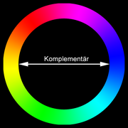
A frequent classification criterion are complementary colors arranged diametrically opposite each other in a circle . Two complementary colors mix to white, gray or black. However, depending on the type of mixture (additive, subtractive or optical mixture) and the selection of colors (light color, body color, virtual color), there are different opposing pairs and other distributions in the color wheel. In addition, some color theorists determine the complementary color pairs purely according to their (personal) perception.
Sensitive equidistance
Difficulties can arise if neighboring elements are required to be equidistant from each other. For example, the difference between light colors selected according to wavelength can be in contrast to the perceived color difference. This problem is the main focus of colorimetry .
Development of the color circles
Aristotle linear color model
Theoretical considerations for an order of colors have existed since ancient times. The Greek philosopher Aristotle (384–322 BC) arranged seven colors along a straight line: a one-dimensional color model. He based his model on how the light changes over the course of the day. He took the transition between the white midday light over the sunset (with a green shimmer) to the dark night sky. He arranged the sequence of colors as follows: white, yellow, red, green, violet, blue and black. The setting sun can show the green glow under clear conditions .
Newton's color wheel


The English physicist Sir Isaac Newton (1643–1727) discovered with the help of a glass prism that different colors in the daylight spectrum are components of white light. He was convinced that light and sound propagation should be treated in a comparable and consistent manner. Because an octave shows seven tone intervals, he formed his color wheel (published in 1704) from seven colors: violet, indigo, blue, green, yellow, orange and red. The size of the seven segments was based on the interval sizes of a Doric scale .
Goethe's color wheel
In contrast to Newton, the German poet and naturalist Johann Wolfgang von Goethe (1749–1832) assumed that white light is not additively composed of different spectral colors, but that, conversely, the colors arise from an interaction of light and darkness. From this he derived his two primary colors yellow (light) and blue (darkness). He also examined two particular phenomena, the colored shadows and the afterimage colors of the successive contrast. The polarity of the afterimage colors caused him to add purple (magenta) as a complementary color to green. His six-part color wheel (published in 1810) consists of the primary colors yellow, purple and blue and the three mixed colors green, orange and violet. In doing so he created one of the first usable color systems, and he wanted to achieve an instruction for painters.
Herring color wheel

The German physiologist and brain researcher Karl Ewald Konstantin Hering (1834–1918) observed that color impressions formulated to the contrary, such as “yellowish blue” or “reddish green” are contradictory. From this he concluded four “psychological” primary color stimuli (elementary color sensations): red, yellow, green and blue. They stand opposite each other as blue-yellow and red-green. Neurophysiological evidence for his counter-color theory (opponent theory) has been available since 1966. In the ganglion cells of the retina, the nerve impulses of the cones (red, green, blue) are converted into two-channel color information, consisting of a red-green and a yellow-blue channel. Ewald Hering's color wheel from 1878 comprised sixteen colors, with three secondary and tertiary colors between the primary colors.
Itten's color wheel
The Swiss art educator and painter Johannes Itten (1888–1967) developed a twelve-part color wheel while teaching at the Bauhaus in Weimar from 1919 to 1923. Its basis is formed by the three primary colors (colors of the first order): red, yellow and blue. Between these he placed the secondary colors (colors of the second order): orange, violet and green, mixed from two primary colors. Six “tertiary colors” expand Itten's color wheel to a total of twelve colors. The three primary colors quickly reach their limits when it comes to creating bright colors. Mixing them results in more or less cloudy colors . The opposite colors are not "opposing" complementary colors, as they do not neutralize each other to gray, but lead to "dirty" brown tones. Itten created his color wheel according to the requirements of art education , using complementary colors that he perceived as opposing. The advantage of his color wheel was that he was able to clearly show the basic principles of color mixing in a simple geometric model.
Küppers color hexagon
The German printing technician and lecturer Harald Liebedank Küppers (born 1928) thought Itten's color wheel was wrong in many respects and contrasted Itten's didactic scheme with his “basic scheme of color theory”. Two additive primary colors can be mixed to one subtractive primary color and vice versa the mixture of two subtractive primary colors results in an additive primary color. He developed his color wheel from the additive primary colors (light colors) red-orange, green and blue-violet and the subtractive primary colors (printer colors) cyan, magenta and yellow. For this he chose a hexagon. Küppers combined the screen and printer basic colors in a simple, mutually complementary and manageable model. His color theory aimed at the circle of media designers . The disadvantage of the color hexagon lies in the small gradations between magenta and red, while yellow really stands out between yellow-orange and yellow-green.
Liedl's harmonic color wheel
The Austrian mathematician Roman Liedl (1940–2019) arranged the colors cyan, magenta and yellow in an equilateral triangle. He shifted the (primary) light colors red, green and blue so that the complementary colors determined with the help of the successive contrast could now lie opposite one another in a circle. His color wheel forms the basis of another theory of harmony. In this he shows color combinations whose harmonious effect can be derived from the similarity or contrast of the combined colors.
Picture gallery of further color circles

Color wheel by Boutet (1708)

Wilhelm von Bezold (1874)
Color wheel (1904)

Color wheel (1908)

Four-way counter-color circle (1917)

Mechanical device for color observation (1895)

Scriabin's key colors related to the circle of fifths

From the color wheel to the equatorial plane

Triad of the primary colors

Shape adaptation to an RGB color space
Color wheel in the HSV color space
Color wheel (additive color mixing)

Modern Newtonian color wheel

Color wheel with CMYK values and emotional statements


.png)


See also
Web links
literature
- Wolf Stadler (Ed.): Lexicon of Art in twelve volumes. Painting - architecture - sculpture . 1st edition, fourth volume, Dego - Gai, Karl Müller Verlag, Erlangen 1994, ISBN 3-86070-452-4 .
- Meyer's Encyclopedic Lexicon in 25 volumes . 9th edition, Volume 8: Enz-Fiz. Bibliographisches Institut AG, Mannheim 1973.
- Hans Irtel: color atlases . In: Spectrum of Science . Special: colors. Editor-in-chief Reinhard Breuer, 1st unchanged new edition, Spektrum der Wissenschaft Verlagsgesellschaft mbH, Heidelberg 2004, ISBN 3-936278-80-6 .
- Narciso Silvestrini, Ernst Peter Fischer: Color systems in art and science . Ed .: Klaus Stromer, 1st edition, DuMont Buchverlag, Cologne 1998, ISBN 3-7701-4397-3 .
- Markus Wäger: The ABC of color. Theory and practice for graphic designers and photographers . 1st edition, Rheinwerk Verlag GmbH, Bonn 2017, ISBN 978-3-8362-4501-2 .
Individual evidence
- ↑ The primary colors of the additive color mixture (red-orange, blue-violet and green) are arranged in a triangle. And the primary colors of the subtractive color mixture (yellow, magenta and cyan) are in between.
- ↑ Meyer's Encyclopedic Lexicon in 25 volumes . 9th edition. tape 8 : Keyword color wheel. Bibliographisches Institut AG, Mannheim 1973, p. 518 .
- ↑ Markus Wäger: The ABC of color. Theory and practice for graphic designers and photographers . 1st edition. Rheinwerk Verlag GmbH, Ravensburg 2017, ISBN 978-3-8362-4501-2 , p. 180 .
- ↑ Hans Irtel: color atlases . In: Reinhard Breuer (Ed.): Spectrum of Science. Special: colors . 1st edition. Spectrum of Science Verlagsgesellschaft mbH, Heidelberg 2004, ISBN 3-936278-80-6 , p. 22/23 .
- ↑ Hans Irtel: color atlases . In: Reinhard Breuer (Ed.): Spectrum of Science. Special: colors . 1st edition. Spectrum of Science Verlagsgesellschaft mbH, Heidelberg 2004, ISBN 3-936278-80-6 , p. 27 .
- ↑ Roman Liedl: The splendor of colors. A theory of harmony . 1st edition. BI - Wissenschaftsverlag, Mannheim, Leipzig, Vienna, Zurich 1994, ISBN 3-411-16691-6 , pp. 13 .
- ↑ Newton designed the segment size of his color wheel according to the interval sizes of the Doric scale.
- ↑ Markus Wäger: The ABC of color. Theory and practice for graphic designers and photographers . 1st edition. Rheinwerk Verlag GmbH, Bonn 2017, ISBN 978-3-8362-4501-2 , p. 180 .
- ↑ Narciso Silvestrini, Ernst Peter Fischer: Color systems in art and science . Ed .: Klaus Stromer. 1st edition. DuMont Buchverlag, Cologne 1998, ISBN 3-7701-4397-3 , p. 13/14 .
- ^ Günter Baumgart, Angela Müller, Gerhard Zeugner: color design. Building decor - writing - drawing . 1st edition. Cornelsen Verlag, Berlin 1996, ISBN 3-464-43401-X , p. 21 .
- ↑ Narciso Silvestrini, Ernst Peter Fischer: Color systems in art and science . Ed .: Klaus Stromer. 1st edition. DuMont Buchverlag, Cologne 1998, ISBN 3-7701-4397-3 , p. 36/37 .
- ↑ Markus Wäger: The ABC of color. Theory and practice for graphic designers and photographers . 1st edition. Rheinwerk Verlag GmbH, Bonn 2017, ISBN 978-3-8362-4501-2 , p. 186 .
- ^ Günter Baumgart, Angela Müller, Gerhard Zeugner: color design. Building decor - writing - drawing . 1st edition. Cornelsen Verlag, Berlin 1996, ISBN 3-464-43401-X , p. 21 .
- ↑ Wolf Stadler (Ed.): Lexicon of Art in twelve volumes. Painting - architecture - sculpture . 1st edition. Fourth volume, Dego - Gai. Karl Müller Verlag, Erlangen 1994, ISBN 3-86070-452-4 , p. 224 .
- ↑ Cf. Roman Liedl: The Splendor of Colors. A theory of harmony . 1st edition. BI - Wissenschaftsverlag, Mannheim, Leipzig, Vienna, Zurich 1994, ISBN 3-411-16691-6 , pp. 123 .
- ↑ Markus Wäger: The ABC of color. Theory and practice for graphic designers and photographers . 1st edition. Rheinwerk Verlag GmbH, Bonn 2017, ISBN 978-3-8362-4501-2 , p. 192 .
- ↑ Narciso Silvestrini, Ernst Peter Fischer: Color systems in art and science . Ed .: Klaus Stromer. 1st edition. DuMont Buchverlag, Cologne 1998, ISBN 3-7701-4397-3 , p. 86 .
- ↑ Markus Wäger: The ABC of color. Theory and practice for graphic designers and photographers . 1st edition. Rheinwerk Verlag GmbH, Bonn 2017, ISBN 978-3-8362-4501-2 , p. 188 .
- ↑ Markus Wäger: The ABC of color. Theory and practice for graphic designers and photographers . 1st edition. Rheinwerk Verlag GmbH, Bonn 2017, ISBN 978-3-8362-4501-2 , p. 190 .
- ↑ Roman Liedl: The splendor of colors. A theory of harmony . BI - Wissenschaftsverlag, Mannheim, Leipzig, Vienna, Zurich 1994, ISBN 3-411-16691-6 , pp. 29 .
- ↑ Roman Liedl: The splendor of colors. A theory of harmony . BI - Wissenschaftsverlag, Mannheim, Leipzig, Vienna, Zurich 1994, ISBN 3-411-16691-6 , pp. 43 .
- ↑ Seven and twelve color circles by Claude Boutet from 1708 from the publication Traité de la peinture en mignature , The Hague, 1708, after a reproduction in The Creation of Color in Eighteenth-Century Europe , signed with CB, possibly for Claude Boutet or the editor Christophe Ballard. According to text on Commons.
- ^ Wilhelm von Bezold: The theory of colors with regard to art and applied arts . Braunschweig 1874, published by George Westermann
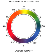
- ^ From: Hugo B. Froehlich, Bonnie E. Snowmit: Text Books of Art Education, Book III . 1904, with RGB as primary and CMY as secondary colors.
- ↑ From: J. Arthur H. Hatt: The Colorist . D. van Nostrand Co., 1908, red, green, violet as "plus colors" and complementary magenta, yellow and cyan as "minus colors", names for colors rotated by 15 °
- ↑ Construction of complementary colors from 1917, from: Charles Hubbard Judd: Psychology, General Introduction
- ↑ A color wheel as used by Hering in his experiments. From: Edward Wheeler Scripture: Thinking, Feeling, Doing . Flood and Vincent, 1895.
- ↑ The color area shown encompasses the upper part of a color ball with the achromatic point at the zenith, while the (here) circumferential line results in the color circle of the "pure" colors.
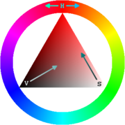
- ↑ Color triangle based on the HSV color space model.
- ↑ with shown complementary colors yellow and blue for the additive color mixture
