
Wikipedia:Graphics Lab/Illustration workshop
The Graphics Lab is a project to improve the graphical content of the Wikimedia projects. Requests for image improvements can be added to the workshop pages: Illustrations, Photographs and Maps. For questions or suggestions one can use the talk pages: Talk:Graphics Lab, Talk:Illustrations, Talk:Photographs and Talk:Maps.
This specific page is the requests page for the graphics lab. Anyone can make a request for an image to be improved, or created for a Wikipedia articel. The standard format for making a request is shown below, along with general advice, and should be followed.
This page is deprecated and will not be monitored. Please use one of the three workshop pages. This specific page is {{{1}}}
See also
- Category:Images for cleanup
- Category:Images for redraw
- meta:Philip Greenspun illustration project/Requests
Turkish
-
 GIF
GIF -
 SVG shield


Article(s): Coat of arms of Turkey
Request: SVG ification. Arrange. Wheat, star, moon, shield, plume in coat of arms. Animal is wolf.--Lord Leatherface (talk) 20:53, 10 August 2008 (UTC)
Graphist opinion: This request is already on this page. --SelfQ (talk) 21:19, 10 August 2008 (UTC)
- That request appears to have disappeared (Probably as "stale"). 68.39.174.238 (talk) 17:30, 17 August 2008 (UTC)
- I have been looking for a very long time for another version of this image. it would seem that there is none. The shiled itself is an easy part to do, the only main problem ( and the reason why it has not been done) is becouse of the seal bellow the shield and the wheat/feathers arround it. they are no clear enough nor there is a clear text (that i can read) in wich it describes what it should contain. so there is no way to realistically retrace it as svg -LadyofHats (talk) 11:20, 23 August 2008 (UTC)
- Could someone do the shield, at least (Since that seems easy), so when a better resolution image turns up, the rest can be done fairly easily? 68.39.174.238 (talk) 01:14, 3 September 2008 (UTC)
Alberta Taciuk Processor - convert to SVG
-
Alberta Taciuk Processor (ATP)
Article(s): Oil shale extraction
Request: The PNG is public domain (U.S. Gov). Looks ideal for converting into an SVG file. -- Kaldari (talk) 23:55, 14 August 2008 (UTC)
Graphist opinion: I've had a good go at this one, but the resolution of the image is simply too low to get anything usable. I've also had a look at the source but I can't extract anything from that of significantly better quality. If all you want is a very abstracted view of the main chambers only (the colored bits) it would be possible to create that from scratch. The fine detail underneath the processor, however, is virtually unreadable even when magnified. Debate 木 12:28, 19 August 2008 (UTC)
- Is that stuff down there absolutely critical? EG. I can tell that one part of it is a stairwell, which isn't very helpful other than giving scale... 68.39.174.238 (talk) 03:22, 28 August 2008 (UTC)
- According to the diagram there appears to be a range of other mechanical bits and pieces (motor, shale feed, riding rings, etc), in addition to some of the internal detail, that are too blurry to easily convert to SVG. Whether they are critical to the diagram or not is something only Kaldari can answer. Debate 木 08:58, 28 August 2008 (UTC)
coat of arms of Sikkim
-
 appears to be the inner design
 -
largest variant I could find, but the background is funky
-
another interpretation of the colors, full instead of outline
.svg)
Article(s):
Request: larger variant, color if one can be found or made -- Chris (クリス • フィッチ) (talk) 18:36, 31 August 2008 (UTC)
- Here it is displayed larger in red http://www.sikkiminfo.net/government.htm Chris (クリス • フィッチ) (talk) 13:23, 2 September 2008 (UTC)
- another variant at http://www.flaggenlexikon.de/fsikkim.htm
Graphist opinion: Way too small and way too much detail to extract anything of value, unfortunately. Debate 木 13:24, 2 September 2008 (UTC)
- Anyone else? Chris (クリス • フィッチ) (talk) 07:07, 14 September 2008 (UTC)
A simple equation

Articels: Equals sign
Request: SVGify this equation, so that it can be displayed as part of a {{double image stack}} alongside the original (hard to read by modern eyes) equation. 68.39.174.238 (talk) 22:30, 1 September 2008 (UTC)
Oppinion: How's this? Debate 木 09:31, 2 September 2008 (UTC)
- The second looks a little internally strange. EG. Is the "x" in a different fontface? 68.39.174.238 (talk) 00:27, 3 September 2008 (UTC)
- I freely admit that I'm no expert in mathematical symbology, but that's the way the x is displayed when written as an equation in Word, as well as how it's displayed in the mathematical mark-up you used above (ie : <math>14\sqrt{x}+|15|=|71|\,\!</math>), so I presume that the typeface of the x is mathematically significant. Nonetheless, the type-face can be easily changed if required. Debate 木 02:59, 3 September 2008 (UTC)

- For this it doesn't have to be perfect. I strongly suspect that a featured image could be found of some part of this, but will let others decide... 68.39.174.238 (talk) 23:41, 3 September 2008 (UTC)
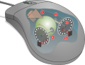
Computer mouse mechanism
-
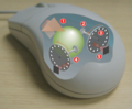 Computer mouse mechanism
 -
 SVG
SVG


Article(s):Mouse_(computing)
Request: -- make into an SVG Thisglad (talk) 10:23, 6 September 2008 (UTC)
Graphist opinion: How would that do? --pbroks13talk? 07:27, 17 September 2008 (UTC)
- That's excellent. Well done. Is it possible to add the the curved arrow next to number 1 or is that too complicated for an SVG? Thisglad (talk) 07:34, 18 September 2008 (UTC)
- Okay. I was reading the FP review for the original image, and there was some question of whether or not the arrow should be there. Either way, hows that? --pbroks13talk? 07:55, 19 September 2008 (UTC)
- Not my request, but did you leave out the "scroller"(geesh lol) on purpose? It's between the two buttons, can't think of a technical name. §hep • ¡Talk to me! 13:23, 19 September 2008 (UTC)
- thanks for adding that, I'm also not sure how needed that arrow is but felt that others might object to the difference. Can you add a shadow to svg similar to the shadow in the PNG? Thisglad (talk) 00:33, 20 September 2008 (UTC)
- Okay. I was reading the FP review for the original image, and there was some question of whether or not the arrow should be there. Either way, hows that? --pbroks13talk? 07:55, 19 September 2008 (UTC)
(undent)Not sure if these would help with the center wheel: Image:Souris schema svg.svg or Image:Mouse buttons.svg. Although It appears they might both use the same wheel? and this one Image:Input-mouse.svg §hep • ¡Talk to me! 20:43, 23 September 2008 (UTC)
- Eh, not so much. The angle is completely different. I tried to make one. What do you think? --pbroks13talk? 17:28, 24 September 2008 (UTC)
Image:Cricket - Stumps.png
-
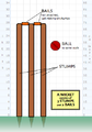 Cricket stumps :)
 -
 SVG
SVG


Article(s): Cricket among others.
Request: Hello again. Requesting another SVG if anyone has some time. Cheers, Ben (talk) 19:34, 7 September 2008 (UTC)
Graphist opinion: I gave it a shot, SVGs already existed in Polish and Tamil so I used those. How's that? §hep • ¡Talk to me! 22:26, 26 September 2008 (UTC)
A few graphs on the housing buble
-
-
 original
 -
 SVG
SVG -
 original
 -
 SVG
SVG -
 original
 -
 SVG
SVG -

-
 original
 -
 SVG
SVG -


Articels: Subprime mortgage crisis and related articels.
Request: For all of them, SVGify if possible, since they are perfect for it (Boxes, colors and text). For the graphs, they should be recreated with (if possible) a standard look, but definitely free of unneeded dimensions (EG. Spurious 3D effects or shading). 68.39.174.238 (talk) 20:49, 7 September 2008 (UTC)
Oppinion:
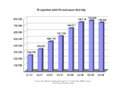
Tax comparison chart. 2008 U.S. presidential campaign
-
 Basic GIF image. Need a bar chart.

| Federal tax change in 2009 if their tax plans fully in place. | ||
| McCain | Obama | |
|---|---|---|
| Income Average |
Average tax bill |
Average tax bill |
| Over $2.9M | -$269,364 | +$701,885 |
| $603K and up | -$45,361 | +$115,974 |
| $227K-$603K | -$7,871 | +$12 |
| $161K-$227K | -$4,380 | -$2,789 |
| $112K-$161K | -$2,614 | -$2,204 |
| $66K-$112K | -$1,009 | -$1,290 |
| $38K-$66K | -$319 | -$1,042 |
| $19K-$38K | -$113 | -$892 |
| Under $19K | -$19 | -$567 |
| CNN,[1][2] Tax Policy Center,[3] BarackObama.com,[4] JohnMcCain.com[5] | ||
- ^ "What they'll do to your tax bill". By Jeanne Sahadi. June 11, 2008. CNNMoney.com. Article and chart.
- ^ "Your Money: McCain vs. Obama. Personal Taxes". CNNMoney.com.
- ^ TPC Tax Topics. 2008 Election. "Analysis of the 2008 Presidential Candidates' Tax Plans." The Tax Policy Center.
- ^ Barack Obama and Joe Biden: The Change We Need. Taxes. BarackObama.com (official Barack Obama campaign site).
- ^ McCain-Palin 2008. New Initiatives In The McCain Economic Plan. JohnMcCain.com (official John McCain campaign site).
Articles:
- Political positions of Barack Obama#Taxation
- Political positions of John McCain#Budget, taxes, and deficits
- Comparison of United States presidential candidates, 2008#Economic issues
- And many more, especially in other languages, if an SVG chart is used as the base chart.
Request: I would like some SVG bar charts. Possibly in some of the formats found here: [1]. See the bar charts on pages 38, 39, 46. I want to use CNN's numbers and labels, though, as in the above chart. They make a lot more sense. "Quintiles" have been converted to income ranges. Percentages have been converted to dollar numbers. --Timeshifter (talk) 13:26, 8 September 2008 (UTC)
Graphist opinion: I'll take this one. I'll do a gnuplot graph along the lines of the ones you suggest from the TPC report. — ʞɔıu 07:34, 9 September 2008 (UTC)
- Thanks! Any other charts and graphs, too. --Timeshifter (talk) 12:01, 10 September 2008 (UTC)
- I haven't been able to get to this, and it's time-sensitive so I'm going to let someone else take it. I'm sorry for the delay. — ʞɔıu 13:28, 12 September 2008 (UTC)
- I understand. Thanks for trying. I did create a basic GIF image for starters, Image:Obama McCain taxes.gif. See in the above gallery. Here are some bar chart possibilities if anybody can help: Commons:Bar chart (many bar charts organized by type).
(unindent)Maybe income tax percentages would be better than actual dollar amounts. Since the change in tax rates as a range of percentages is much smaller than the dollar changes. Percentages were used in the bar charts on pages 38, 39, 46 of [2].
Maybe dollar amounts could be used if the table was broken up into 2 bar charts. One would cover the lower 7 income brackets. The other bar chart would cover the upper 2 income brackets. I think this would look good, and be easily understood without having to have a wide range in variation of length in the bars. --Timeshifter (talk) 12:57, 13 September 2008 (UTC)
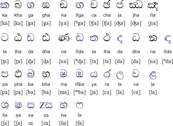
Sinhala letters follow up
-

-
 SVG
SVG -
 SVG WiP
 -
 my amateurish modifications


.svg)
.svg)
Articles: Sinhala alphabet
Request: Given the nice result of the first try, could you convert the *pdf given above into an *svg and color the segments like shown in the *png?Jasy jatere (talk) 16:02, 8 September 2008 (UTC)
- I just notice that the content in the pdf must be reduced to the table as well, the first two letters are not necessaryJasy jatere (talk) 16:02, 8 September 2008 (UTC)
Graphist opinion: How's that? --pbroks13talk? 23:55, 8 September 2008 (UTC)
- looks good. There are some details which could be improved.
- last character in the k-row, red part: only the bottom "bowl" thick like that, the rest of the red part must be much thinner. Compare the different thickness of lines for p
- the two red characters in the l row have to have a hair stroke on the left, which is very thin. you can use the right column of this table http://www.omniglot.com/images/writing/sinhala_cons.gif as a model.
- for k and r, the pdf has lines of different thickness as well. Could you try to catch that in an svg?
- the r (6) seems unbalanced and very "hand-written", which has to do with line weight as well, I think
- Thanks for you help! Jasy jatere (talk) 10:40, 9 September 2008 (UTC)
- I'd started a work on it but hadn't had a chance to upload until now. I've used the unicode characters from the Sinhala alphabet page (specifically p, k, r and ḷ from the consonants table and the a, u and ū from the vowels table. However, as you can see in the svg above I haven't completed the ku and kū because I can't see which characters in the table match the shapes in the pdf. Do you know which shape it should be, or if it is even in those tables, part of another character, etc? — ₪₪ ch1902 ₪₪ 11:19, 9 September 2008 (UTC)
- for Lu/Luu, you can use the shapes provided for ä/ää.
- for ku/kuu, there are no shapes you could copy in the imgs. The hook for short u is very similar to a Latin 'c'. The hook for uu varies, but if you take the right part of ruu and clip the 'tail' and bend it and then scale the whole thing down, you come close to it (hope that was clear ...)
- Lu/Luu are missing the hairstroke on the left
- smaller notes:
the right arm of p should not touch the belly - The relative differences in thickness seem a bit too much, the thick parts can become a bit less Jasy jatere (talk) 12:56, 9 September 2008 (UTC)
- got inkscape and meddled a bit with the img. The L's are fine now. I do not know how to 'cut' stuff, so the red parts for ku and kuu still have their topmost line, which should probably deleted. The z-like part in kuu, ruu and Luu needs to be thicker, but I do not know how to do that either, so I would appreciate help there Jasy jatere (talk) 00:03, 12 September 2008 (UTC)
Scout Handbook
Article(s): Boy Scout Handbook
Request: cleanup image -- Chris (クリス • フィッチ) (talk) 16:20, 8 September 2008 (UTC)
Graphist opinion: Since this is the current edition, it would probably be easiest for someone to just rescan their copy. This one looks weird because it's been laminated and exposed to some water. Unfortunately, I don't have a copy of the 11th edition, or I'd do it myself. I presume we can't just swipe amazon's image? — ʞɔıu 07:40, 9 September 2008 (UTC)
- We absolutely can. As long as we have a fair-use rationale, it's fine. --pbroks13talk? 19:14, 9 September 2008 (UTC)
- Can we do so and match the brightness to the color of this one? Chris (クリス • フィッチ) (talk) 18:03, 12 September 2008 (UTC)
Australian Bicentenary
Image:17881988bicentenarylogo.jpg
Article(s): Australian Bicentenary
Request: enlarge and cleanup -- Chris (クリス • フィッチ) (talk) 08:13, 9 September 2008 (UTC)
Graphist opinion:
Kipling's India
-

-
perhaps using this brighter map

Article(s):
Request: wikify -- Chris (クリス • フィッチ) (talk) 03:47, 10 September 2008 (UTC)
Graphist opinion:
Paintings by Ruskin
-
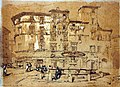 Piazza Santa Maria del Pianto, Rome, by John Ruskin
 -
 An Italian Village, by John Ruskin


Article(s): John Ruskin
Request: -- Yann (talk) 21:31, 10 September 2008 (UTC)
- Wait, what's the request? 68.39.174.238 (talk) 21:37, 10 September 2008 (UTC)
Graphist opinion: I tried to modify the first image for the moment. Unfortunately the the photographed picture is a reproduction print with a very visible halftone raster. I tried to get rid of it using selective gausian blur. What do you think? Unfortunately during the image upload an error occurred on Wikimedia Commons and your original picture disappeared from the history. If you do not have a copy I have it on my hard disk. --pabouk (talk) 15:42, 12 September 2008 (UTC)
Electron configurations


Article(s): Electron configuration, Atomic orbital
Request: I think these all are of very low quality.. → Nitya Dharma / ? 13:19, 12 September 2008 (UTC)
Graphist opinion: I agree that they're low quality and perhaps these should be SVG-ified, but I'll just mention that the images were created using Orbital Viewer which outputs to "TIFF, PPM, BMP, AVI, and VRML files." Also, it's Windows-only. So you won't be able to use the same source to generate the images.— ʞɔıu 13:33, 12 September 2008 (UTC)
- I did the series, but I don't have the time to scale & composite them, add text & make backgrounds transparent. Please will someone pick up from here. Note that the name format is [orbital][N]M[Mcode].png where orbital is S, P, D or F; N is 1 to 7 and M is 0, -1 to 1, -2 to 2 or -3 to 3, depending on orbital. A selection of renders are shown here but I didn't want to spam 44 images to the Lab so the full gallery can be found at User:Dhatfield/Sandbox2. Dhatfield (talk) 03:11, 25 September 2008 (UTC)
- Note that the S series was done without adjusting the zoom to show relative scale and the others were scaled. Dhatfield (talk) 03:14, 25 September 2008 (UTC)
Image:Bongo and Bush.jpg
-
Omar Bongo and George W. Bush
Article(s):Gabon, Politics of Gabon, List of heads of state of Gabon, Omar Bongo, Léon M'ba, Bongo from Congo
Request: Could someone crop this so that only Mr. Bongo is showing?-- Your friend Eddy of the wiki[citation needed] 20:49, 14 September 2008 (UTC)
Graphist opinion:
- If it were not for a guy in the background, this would have been a better photo. User:Zscout370 (Return Fire) 07:23, 15 September 2008 (UTC)
The Ohio State University logo redo
Article(s): Ohio State University
Request: Our current logo is not an accurate representation of the official logo and I was told to "sofixit". I was wondering if one of the gurus here could help? Here's what we have now: Image:OSU.svg and it needs to be: http://afrotc.osu.edu/common/home_osu.gif
The background needs to be: PANTONE 200 or CMYK: four-color process formula: 0 cyan 100 magenta 65 yellow 15 black or Hexadecimal: #990000 or RGB values: 153, 0, 0 Thanks! §hep • ¡Talk to me! 21:22, 15 September 2008 (UTC)
Graphist opinion: Honestly? Use the logo provided by the university, under fair use if necessary. Whoever made the SVG version did a great job, but it's just not accurate enough; the visual integrity of a logo is sacred! Color is not the only issue: the O in OHIO, for instance, has much more severe oblique stress in the actual logo (that is, the "axis" of the O is tilted much farther to the left; the stroke of the letter is thickest at the bottom left and top right), and the SVG's T · H · E and UNIVERSITY don't match the original—they should be set in Palatino, not hand-drawn. See if you can spot the difference in the "R". Fvasconcellos (t·c) 15:14, 19 September 2008 (UTC)
- By the way, you can request a logo from the University in EPS format (easily converted to SVG without any modifications) here. Fvasconcellos (t·c) 01:17, 20 September 2008 (UTC)
- If the do send me a copy could you convert it? §hep • ¡Talk to me! 22:46, 20 September 2008 (UTC)
- Sure. Fvasconcellos (t·c) 01:18, 21 September 2008 (UTC)
- If the do send me a copy could you convert it? §hep • ¡Talk to me! 22:46, 20 September 2008 (UTC)
Logo of the International Hydrographic Organization
-
 Logo of the International Hydrographic Organization

Article(s): International Hydrographic Organization, United Nations General Assembly observers
Request: SVG and put on a transparante background please --SelfQ (talk) 11:24, 16 September 2008 (UTC)
Graphist opinion:
Sinuiju Special Administrative Region Flag and Emblem
Article(s): Sinuiju Special Administrative Region
Request: SVG please --SelfQ (talk) 11:24, 16 September 2008 (UTC)
Graphist opinion: I gave a shot at converting the flag to Svg. What do you think? §hep • ¡Talk to me! 23:43, 26 September 2008 (UTC)
The Scout Association of Hong Kong
Article(s):
Request: Please rotate to straight, remove background and reduce file size, there's no reason for this to be so large. Thanks! -- Chris (クリス • フィッチ) (talk) 16:18, 18 September 2008 (UTC)
Graphist opinion: Edit1 - How's that? Mfield (talk) 02:50, 25 September 2008 (UTC)
- That is perfect, thank you so much for that! Please overwrite the original! Thanks again, that's really cool! Chris (クリス • フィッチ) (talk) 03:03, 25 September 2008 (UTC)
Portrait of Aaron Sorkin
-
 Aaron Sorkin and Eric Garcetti at a Generation Obama event.
 -
 Crop
Crop


Article(s): Aaron Sorkin Request: Hi: I would like to request that a kindly wikigraphist help me with creating a portrait out of the above image of Aaron Sorkin for the Infobox for the Aaron Sorkin article. This is a much more flattering picture of him than the one being currently used. I would really appreciate any help with this. Thank you. Homely Features (talk) 21:37, 20 September 2008 (UTC) Graphist opinion: How's this? I tried cropping it closer (and wider), but it looked a bit unbalanced. Fvasconcellos (t·c) 01:35, 21 September 2008 (UTC)
- Your crop is great. Thanks. I'm not sure if I accurately placed it in the Infobox. I removed the 110px setting to blow it up. Could be too big. However, at least now there's a decent photograph to match the remarkable wikibiography of Aaron Sorkin. Thank you for helping me. Homely Features (talk) 03:02, 21 September 2008 (UTC)
- Anytime. Fvasconcellos (t·c) 15:45, 21 September 2008 (UTC)
Sarah Palin
-
 Sarah Palin
 -
Attempt 1: wider crop
-
Attempt 2: Even wider, my personal favorite (despite the waving hand on the right :)
-
Attempt 3: Slightly modified version of Ferrylodge's crop

Article(s): Sarah Palin Request: Hi, this image is at the top of the article. As you'll see at the image page, it was created by cropping a much larger image, zooming, and sharpening. I did all this myself, but my software is crummy. Can you do a better job? Thanks.Ferrylodge (talk) 01:00, 21 September 2008 (UTC) Graphist opinion: Would you object to a wider crop—closer to the lectern, maybe just above the sheet of paper she's holding, and all the way to her right shoulder? Fvasconcellos (t·c) 01:23, 21 September 2008 (UTC)
- The main thing is to have the eyes centered. Some people asked for that at the article talk page. As far as how wide the crop is, please use your best judgment. You folks are the experts, not me. :-) Maybe you could do one with the existing crop, and one with the wider crop?Ferrylodge (talk) 01:27, 21 September 2008 (UTC)
- Will give this a go tomorrow morning. Eyes will be centered :) Fvasconcellos (t·c) 02:00, 21 September 2008 (UTC)
- The main thing is to have the eyes centered. Some people asked for that at the article talk page. As far as how wide the crop is, please use your best judgment. You folks are the experts, not me. :-) Maybe you could do one with the existing crop, and one with the wider crop?Ferrylodge (talk) 01:27, 21 September 2008 (UTC)
(undent) Thanks, I'll look forward to seeing what you come up with. Do you think this image or this image might be better at the top of the article?Ferrylodge (talk) 07:18, 21 September 2008 (UTC)
- Quality-wise, the "tracksuit" image (which was in the article for quite a while) is still the best, despite the awkward composition. I think the one above is the best substitute right now. Fvasconcellos (t·c) 15:19, 21 September 2008 (UTC)
- OK, here we go. I've made three attempts; I recommend no. 2, but I'll leave it up to you to decide which is best :) Please let me know which one you'd like to keep and I'll move it to Commons under a more descriptive filename. Best, Fvasconcellos (t·c) 15:44, 21 September 2008 (UTC)
- Okay, I'll go with your choice, despite the hand (it kind of humanizes the whole thing, makes it look real and spontaneous, and will make for an interesting topic of conversation). #2 it is!. BTW, did you do any sharpening?Ferrylodge (talk) 20:27, 21 September 2008 (UTC)
- On second thought, I think the head's too tiny on #2, so I went with #1 (after a little bit of sharpening). Thanks.Ferrylodge (talk) 21:09, 21 September 2008 (UTC)
- No, I didn't do any sharpening as I didn't think it would be much of an improvement. Would you like any of the above versions kept or should I delete them? Fvasconcellos (t·c) 22:01, 21 September 2008 (UTC)
- On second thought, I think the head's too tiny on #2, so I went with #1 (after a little bit of sharpening). Thanks.Ferrylodge (talk) 21:09, 21 September 2008 (UTC)
- Okay, I'll go with your choice, despite the hand (it kind of humanizes the whole thing, makes it look real and spontaneous, and will make for an interesting topic of conversation). #2 it is!. BTW, did you do any sharpening?Ferrylodge (talk) 20:27, 21 September 2008 (UTC)
- OK, here we go. I've made three attempts; I recommend no. 2, but I'll leave it up to you to decide which is best :) Please let me know which one you'd like to keep and I'll move it to Commons under a more descriptive filename. Best, Fvasconcellos (t·c) 15:44, 21 September 2008 (UTC)
- Thanks for your help and suggestions. I did a crop that is sort of a compromise between #1 and #2, and uploaded it, so I think we're all set now. The extras can be deleted, I think, unless you think the image now at Sara Palin can be substantially improved. Cheers.Ferrylodge (talk) 22:06, 21 September 2008 (UTC)
- The new version is a good compromise. There are plenty of images of Palin on Commons, and I don't think these work-in-progress versions are necessary; that's why I uploaded them locally in the first place. Fvasconcellos (t·c) 22:13, 21 September 2008 (UTC)
- Thanks for your help and suggestions. I did a crop that is sort of a compromise between #1 and #2, and uploaded it, so I think we're all set now. The extras can be deleted, I think, unless you think the image now at Sara Palin can be substantially improved. Cheers.Ferrylodge (talk) 22:06, 21 September 2008 (UTC)
(undent)Fvasconcellos, an editor has created another image that he thinks is better, though I disagree. What do you think? I've inserted the two images side by side (the one on the right is the current image in the article, as I write this).Ferrylodge (talk) 03:49, 23 September 2008 (UTC)
- Yes, that was me. I sharpened and tweaked the levels and highlights so that it is not so washed out. ≈ jossi ≈ (talk) 04:36, 23 September 2008 (UTC)
- More accurate skin tone
- More accurate hair color and detail
- Face features looks sharper
- Noise on blouse is less obvious
- Sharper overall, such as mics, glasses details, etc.
- We could tweak it further by keeping the original background, but using the sharper foreground portion
- ≈ jossi ≈ (talk) 04:39, 23 September 2008 (UTC)
- The subject's shirt is so black in Jossi's image that you can't see the folds and wrinkles. The colors in the background are so bright they look like neon. I'm not convinced that the image on the right can be improved, but surely a compromise would be better than the image on the left.Ferrylodge (talk) 05:06, 23 September 2008 (UTC)
- In all fairness, I do think it is a bit excessive, but the white balance has improved, and I can see still see the detail of her shirt just fine. Are you sure it's not your monitor?
- I actually did do some color correction myself but decided against uploading the version because (as with the sharpening) I didn't think it was a real improvement. I said it above, and I'll say it again: this image is certainly not the best in terms of quality. Let's just try not to make this an issue, shall we? The article has seen more than enough of those as it is... Fvasconcellos (t·c) 12:57, 23 September 2008 (UTC)
- I agree that the color saturation is excessive. It is also dark and has lost detail. I have worked on this image in Photoshop and have other versions with more subtle corrections that look better. IP75 75.25.28.167 (talk) 18:08, 23 September 2008 (UTC)
- I'm just noting that I can see the folds fine, the blouse doesn't look that dark really. Make sure you have your monitor calibrated to this and this. §hep • ¡Talk to me! 23:03, 26 September 2008 (UTC)
- I agree that the color saturation is excessive. It is also dark and has lost detail. I have worked on this image in Photoshop and have other versions with more subtle corrections that look better. IP75 75.25.28.167 (talk) 18:08, 23 September 2008 (UTC)
- The subject's shirt is so black in Jossi's image that you can't see the folds and wrinkles. The colors in the background are so bright they look like neon. I'm not convinced that the image on the right can be improved, but surely a compromise would be better than the image on the left.Ferrylodge (talk) 05:06, 23 September 2008 (UTC)
Sarah Palin again
-
 This photo of Sarah Palin is, in itself, notable, as it is a unique piece of photographic evidence relevant to a high-profile part of her biography.
(Retouched)

Article(s): Sarah Palin (note: top Wikipidea article for the last two months, I think), Gravina Island Bridge
Request: . As you can see, the image quality is poor due to backlight. If anybody could fix this up - fixing the contrast and color balance and, if possible, removing the purple fringing around her head - that would be really appreciated. Thanks. Homunq (talk) 18:54, 22 September 2008 (UTC)
Graphist opinion: Hi Homunq, how is it now? you can compare them here (old) (new), i am still working on it, you can find orginal version HERE. ■ MMXXtalk 19:52, 22 September 2008 (UTC)
- (better here than my talk page) That is much better on the flesh tones. However, the whites (both on the T-shirt and in the background) are still too blue. Thanks for your work. Homunq (talk) 20:02, 22 September 2008 (UTC)
- I think the text on T-shirt is originally blue, compare with the t-shirt label. ■ MMXXtalk 20:13, 22 September 2008 (UTC)
- Good point. However, the paper on her desk and the stuff outside still have a blue cast which I think is an artifact. Anyway, thanks. Homunq (talk) 20:15, 22 September 2008 (UTC)
- Why does it look better when I follow your "new" link than on the image page itself? Baffled, Homunq (talk) 20:18, 22 September 2008 (UTC)
- I think the text on T-shirt is originally blue, compare with the t-shirt label. ■ MMXXtalk 20:13, 22 September 2008 (UTC)
- Could you do the same edit with the uncropped version please?

.jpg)
It can be found here: http://commons.wikimedia.org/wiki/Image:Palin_Nowhere_99901.jpg. Also, we could use a cropped version of Ivy Frye, the troopergate related woman on the left part of the image.Duuude007 (talk) 20:29, 22 September 2008 (UTC)
- What do you think? is it better now? new old LiveChocolate (talk) 22:04, 22 September 2008 (UTC)
- Very nice, yes thanks ^^ Could we also get a cropped version availble of the left person (Ivy Frye) in this enlarged image? cheers :) Duuude007 (talk) 22:42, 22 September 2008 (UTC)
- here it is, I copied the descriptions and license from Image:Palin Nowhere 99901.jpg please update them. LiveChocolate (talk) 11:47, 23 September 2008 (UTC)
- Very nice, yes thanks ^^ Could we also get a cropped version availble of the left person (Ivy Frye) in this enlarged image? cheers :) Duuude007 (talk) 22:42, 22 September 2008 (UTC)
Flag-map of Bhutan

Article(s): several
Request: redo so it doesn't cut off the dragon head... Chris (クリス • フィッチ) (talk) 09:53, 25 September 2008 (UTC)
Graphist opinion: How's that? — ₪₪ ch1902 ₪₪ 17:25, 25 September 2008 (UTC)
- Perfect, just exactly what was needed, thank you! Chris (クリス • フィッチ) (talk) 17:44, 25 September 2008 (UTC)
Article(s): Banaba Island
Request: Hello! I want to know if it is possible to extract or to make some graphs and maps from this PDF file. I mean if it is OK to do that, because of the author rights. I need that location map (p. 7), the Mean monthly rainfall graph (Figure 1.2, p. 8), the Mean annual rainfall over Western Kiribati map (Figure 1.3, p. 8), Figure 1.4 and Figure 1.5. If it is possible, it would be great. Thanks in advance, Sebi (talk) 15:53, 26 September 2008 (UTC)
Graphist opinion:
University of East Anglia Coat of Arms
-
University of East Anglia Coat of Arms
Article(s):University of East Anglia
Request: It would be great if this image could be made into an SVG with a transparent background. Note that the image is fair user. Please see the article University of East Anglia to observe the image in question. -- Flaming Ferrari (talk) 00:04, 13 September 2008 (UTC)
Graphist opinion: