Centaur (font)

|
|
| font | Centaur |
| category | Serif |
| Font classification | Venetian Renaissance Antiqua |
| Font designer | Bruce Rogers |
| Type foundry | Monotype |
| Creation | 1915 |
| example | |

|
|
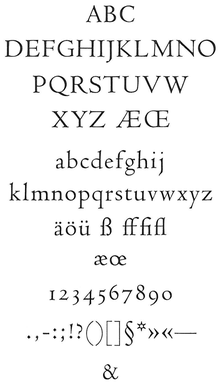
The Centaur is a font that the American type designer Bruce Rogers first for the hand set had created. It bears the name of a work for which it was first used in 1916, a private print of the translation of Le Centaure by Maurice de Guérin . In 1929 the Monotype Corporation incorporated this typeface into its program to make it accessible for machine typesetting.
The italics for the Centaur is the Arrighi by Frederic Warde.
History of origin
The Centaur belongs to the group of the Venetian Renaissance Antiqua , which originated in the incunable period. The first printers who settled in Italy at the time were all Germans. Back home, they had copied the manuscripts of that time - with their Gothic letters - as faithfully as possible as types. On the other side of the Alps, they now had to recognize that the humanist movement, with its center in Florence, also determined book design. In the rejection of everything Gothic, the humanistic script, which goes back to the Carolingian minuscule , was replaced by the Gothic letters that were previously found here in the manuscripts .
The German printers found it difficult to break free from their own understanding of forms. Despite the approximation to the humanistic minuscule , Gothic style elements often determined the overall appearance.
It is thanks to Nicolas Jenson , famous printer in Venice, to have created an Antiqua with the type cut by him and shown for the first time in his work Eusebius in 1470 , which leaves all Gothic relics behind. His writing surpasses all previous ones in terms of clarity and legibility and impresses with its balance and regular rhythm. It is considered the ideal of a perfect print. This made it a model for the printing types of many private presses. In the document history, it marks a major step, at least until the release of Aldus - letters .
The Centaur is a very free re-enactment of Eusebius - Type . It is lighter than the original, dispenses with the final line above the “A” and inwardly drawn head serifs for the “M”. The capitals are a bit smaller overall, which benefits the overall picture.
Nicolas Jenson's Antiqua is, due to the unity of its typesetting and the harmony it exudes, the epitome of a perfect type for many. Influenced by William Morris' return to the Renaissance, Jenson's Eusebius- Type encouraged a number of type artists to fall back on the shapes of this Venetian Renaissance Antiqua and - especially when it came to creating typefaces for private presses - to orientate yourself on it.
One of them is the Montaigne , designed in 1902 for the Riverside Press by the same Bruce Rogers who later drew the Centaur. While the Montaigne is a real replica of the Eusebius script, the Centaur - it was cut by Robert Wiebking from Chicago - is an independent script creation that is based on the historical model - and often down to the last detail - that at the same time but takes into account the changed technical requirements. In the Centaur, for example, the relatively dark coloring of the typesetting, which is characteristic of Venetian scripts, was abandoned; the overall effect of the writing has become considerably lighter. In addition, the contours are sharper and more pointed.
classification
- According to DIN 16518 , the Centaur belongs to group I (Venetian Renaissance Antiqua)
literature
- Eckehart Schumacher-Gebler (Ed.): Typothek I. Classical Antiqua typefaces in original styles. Verlag SchumacherGebler, Munich 2004, ISBN 3-920856-34-1 .
- Eckehart Schumacher-Gebler: About this issue. In: E. Schumacher-Gebler (Ed.): Gottfried Keller: Romeo and Juliet in the village. Verlag SchumacherGebler, Munich 2004, ISBN 978-3-920856-39-1 (Library SG. Volume 6), pp. 93-95.
Web links
- List of Centaur Fonts (Linotype)
- A text page set in the Centaur (SG library) (PDF file; 633 kB)