serif
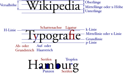
In microtypography, a serif is the (more or less) fine line that terminates a letter stroke at the end of Antiqua fonts, perpendicular to its basic direction.
A well-known serif font is Times ; a well-known sans serif font is Helvetica .
Origin of the term
The Duden and Oxford English Dictionary cite the Dutch schreef "Strich, Linie" as the probable origin of the word , whereby a borrowing of the corresponding English word is also assumed for the word used in German.
Historical origin
The serifs have their origin in Greek lapidary script . The writing initially scratched in stone was later chiseled. Since it is difficult to chisel right angles, the serifs emerged as runs. Writing on stone with a wide writing implement supported the development of the serifs and also led to the varying line widths. Another less common theory sees the origin of the serif not in the chisel technique, but in drawing letters with a brush. The pulling out of the brush produced the serif as a drawing-related element, which was later transferred to the chiseled letters. The first serifs were still inconspicuously short and were emphasized and used as a decorative element until the Roman Empire, comparable to the serifs of today's Egyptienne .
Font classification
In the font classification serif play an important role. By assessing the strength and shape of the serifs, fonts can be classified into different classes.
The appearance of serifs has changed over the centuries. While it was still strong in the French and the Venetian Renaissance Antiqua and the transition to the letter stroke was clearly rounded, the stroke width contrasts in the Baroque Antiqua were clearly more pronounced, making the serifs straighter and finer. In the neo-classical Antiqua , the serifs were just delicate, completely horizontal strokes without a transition to the main stroke.
With the advent of industrialization at the beginning of the 19th century, the development was reversed: The Egyptienne or serif-emphasized linear antiqua was invented for advertising and posters . With these fonts there is (almost) no line thickness contrast any more, which means that the serifs are just as pronounced as the base and hairlines. These fonts were the typical typewriter fonts.
Also at the beginning of the 19th century, sans serif typefaces, the so-called grotesque or sans serif linear antiqua, were developed . The sans serif fonts have established a permanent place in typography from the beginning of the 20th century .
In the case of non-proportional fonts such as Courier , serifs can be used to fill the space that is created around narrow letters such as “i” and “l”.
Dependence of the form on the technology
The shape of the serif is partly due to technical reasons. If the material surrounding it is removed by the stamp cutter during the production of a letter, rounded corners are created at the transition from the serif to the adjacent line. These corners are determined by the shape of the cutting tool and the type of section and groove called (or "Serifenrundung").
For example, if the letter is cut out or pricked, a sharp right angle is created . Finer lines are also possible. The letters look "as if engraved". With computer printing, however, there are other conditions. In principle, any shape is possible, but there are limits due to the limited resolution, for example due to the raster of the screen or the print raster . Longer texts on screens (with correspondingly small letters) are less tiring when reading if a sans serif font is selected than if one tries to display blurred serifs below the actual screen resolution.
Further decorative finishes
In a broader sense, the term serif also encompasses other decorative finishes, such as the droplets or flames on Hebrew letters like ש , which are pronounced in most Hebrew scripts, or the rings in Thai script . Than comparable ornamental accounts can also view the cube feet of many broken fonts in paleography as Quadrangeln be called.
Web links
- Why the serifs have nothing to do with the chisel , German review of Edward M. Catich's book “The Origin of the Serif” on typografie.info


