Francesco Torniello

Francesco Torniello da Novara (* around 1490; † 1589 in Treviglio , Italy ) was a Milanese typographer , writer and Franciscan who was known for the first written geometric specification of a font for Latin capital letters . He can therefore be seen as a pioneer of mathematical typography .
Life
The Tornielli were a wealthy, extensive family during the Renaissance , some of whom lived in Barengo , which belongs to the province of Novara , and some in the city of Novara itself. However, there is no surviving evidence that Francesco belonged to any of these two branches of the family and from there then later moved to Milan. Two brothers, Francesco and Giovanni Antonio Torniello da Novara, are documented in 1525 in Milan when Duke Francesco Sforza granted them citizenship in Milan.
In the work Museo Novarese by the Milanese historian Lazzaro Agostino Cotta (1645-1719) from 1701, Francesco Torniello is described as an expert in geometry and arithmetic who worked as a writer. The only work that has survived, however, is only a book entitled Opera del modo de fare le littere maiuscole antique , which was published in Milan in 1517.
A Francesco Torniello entered the Franciscan Order in 1519 and gained some prominence through his sermons. It cannot be proven with certainty that it is one and the same person, but according to Giovanni Mardersteig there are several indications for this: So the age fits together and the Franciscan is also in relation to his professional activity before his entry into described the order as a scribe. The Franciscan then published another work entitled De Unitate Ecclesia Dei , of which no copy is known. He died at a very old age in the Franciscan monastery in Treviglio in 1589.
plant
Thanks to Tornielli's detailed and admiring reference to Luca Pacioli in his work , we know that he must either have met him or at least the work Divina Proportione was available to him. This work contains u. a. geometric representations of all Latin capital letters. At that time Pacioli's typeface represented the climax of a development in the Renaissance, which strived to adopt the Latin letters of old inscriptions and gravestones as faithfully as possible and to perfect their geometric design. This development began in 1460 with a manuscript by Felice Feliciano (1433–1479) archived in the Vatican and was continued by Damianus Moyllus (1439–1500) in 1483 or 1484. At that time, these fonts were not primarily intended for letterpress printing, but as a template for artistic inscriptions. The only tools available for designing the individual letters were rulers and compasses . Up to and including Pacioli's work, however, only the finished designs were shown together with a few construction elements such as the circles used and the surrounding rectangle or square. However, there was no complete written specification to match the diagrams.
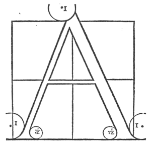
In this regard, Torniello's Opera del modo de fare le littere maiuscole antique , printed and published in Milan by Gotardo da Ponte in 1517, broke new ground. It starts with Torniello defining an 18 × 18 grid that serves as the coordinate system. The double side length of a grid field was defined as a point . This is the first known definition of a point as a typographical unit of measurement. However, it cannot be assumed that Pierre Simon Fournier knew the work of Torniello when he also introduced the point as a typographical unit of measurement in 1737. The point as a unit of measurement and the grid made the geometric specification in writing much easier for Torniello, as the following example for the letter "A" illustrates:
The letter A is formed by the square. The thickness of the right leg should be one ninth of the vertical; it should start outside the square, where it touches the circle that goes through half a point to the left of the center through the horizontal line above, and ends in the lower corner of the square with the circles as you see them drawn. All outer circles have a radius of one point and the inner circles have a radius of half a point, measured from the center of a circle to its circumference. The left leg should be half the thickness of the right and the inside line should have a starting point that meets the center of the top line of the square and end half a point before the baseline, one point within the left vertical of the square. The cross line should be one-third the thickness of the right leg, with the top line meeting the horizontal in the center of the square.
| Comparison of some capital letters by Pacioli (left) and Torniello (right) | |
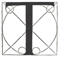
While Torniello largely adopted the designs from Pacioli, he deviated significantly from his model with the letters "M", "R", "S" and "T". In particular, the letters “S” and “T” were enriched with calligraphic details that were also copied by later typographers. For example, the design of the parallel diagonally cut upper serifs of the “T” can be found in Albrecht Dürer's alphabet . Only the "M" was considered less successful in Giovanni Mardersteig's comparative analysis. Torniello also added the “Z” to his alphabet, which can be seen as evidence that these fonts were also increasingly used for non-Latin texts.
The letters “R” and “S” also indicate other peculiarities of Torniello's design drawings. So he drew the complete circle segment for all arcs used together with the specification of the respective radius, which was measured in points. The associated coordinates have been specified in the accompanying text.
Further development in the Renaissance
Torniello's work and the alphabets of his predecessors, especially Pacioli and Sigismondo Fanti (1514), had a major impact on further development. Giovam Baptista Verini published in Florence in 1526 in the third volume of his work Luminario, an alphabet that was largely derived from the designs of Pacioli and Fanti, but took over from Torniello the definition of the point as the ninth part of the side length. In contrast to Pacioli and Torniello, the much larger circles in the serifs are noticeable, so that they appear much heavier.
In 1528 Albrecht Dürer published his designs for his alphabet, which he had already made in 1525, in Nuremberg . Dürer knew his Italian predecessors quite well and was mainly guided by Pacioli and Torniello. He was the first to depict both variants, the filled-in letters based on Pacioli and the construction sketches based on the Torniello model. Dürer also took over the grid from Torniello. However, the sizes of the serifs are more similar to Pacioli's. They are thus a little less delicate than those from Torniello, but significantly smaller than those from Verini.
Shortly afterwards, but with full knowledge of Albrecht Dürer's work and the Italian models, Geoffroy Tory published his work Champ Fleury in Paris in 1529 . He took over from Albrecht Dürer the dual representation corresponding to the Torniellos and Paciolis and also used a grid, which, however, in contrast to that of Torniello, is dimensioned to 10 × 10. For the serifs, however, much larger circles were used, which are more like those of Verini than the smaller circles of Torniello or Pacioli.
The departure from the circle as a tool of typography was initiated by Ludovico degli Arrighi in 1523 and in particular by Francesco Cresci in his work Essemplare di più sorti lettere from 1560. Cresci re-studied the ancient inscriptions and came to the conclusion that constructions based on the compass did not do justice to the originals. For example, the adjacent “B” is based on the corresponding shape in the inscription on the pedestal of Trajan's Column in Rome . In his summary Cresci therefore writes in conclusion: I have come to the conclusion that Euclid, the prince of geometry, if he returned to our world, would never think of constructing the curves of the letters in this way with the help of circles drawn with compasses that they match the proportions and style of the ancient letters.
literature
- Luca Pacioli : De Divina Proportione . Antonio Capella, Venice 1509. (There is a reprint of this work that was published in 1998 by the Tipografi Associati Sassari with a foreword by Fabio Massimo Bertolo, as well as an electronic online version of the bilingual edition by Constantin Winterberg, 1888: [1] . The work contains the alphabet of Pacioli in the appendix.)
- Francesco Torniello da Novara: Opera del modo de fare le littere maiuscole antique . Gotardo da Ponte, Milano 1517. (Only four copies of the original work are known, one of them in the Biblioteca Columbina in Seville , one in the Pepys Library in Cambridge and two in the Biblioteca Ambrosiana in Milan.)
- Francesco Torniello, Luca Pacioli and Giovanni Mardersteig: The Alphabet of Francesco Torniello da Novara . Officina Bodoni, Verona 1971. (This work contains a complete reproduction of the work of Francesco Torniello. In addition there is a comparison with the alphabet by Luca Pacioli and a detailed introduction by Giovanni Mardersteig, which formed an important basis for this article. From this book only 160 copies printed in total.)
- Donald M. Anderson: Cresci and His Capital Alphabets . Visible language 4/1971, pages 331-352. (The article goes into the entire typographical history of the Renaissance in detail in order to shed more light on the sometimes very sharp argument between Cresci and his predecessors.)
- Donald E. Knuth : Mathematical Typography . Bulletin of the American Mathematical Society (new series) 1 / March / 1979, pages 337-372. Republished in the anthology Donald E. Knuth: Digital Typography , CSLI Publications, Stanford 1999. ISBN 1-57586-010-4 . (This article also provides an overview of the history of mathematical definitions for letters.)
- Donald Knuth: The Letter S . The Mathematical Intelligencer 2/1980, pages 114-122. Republished in the anthology Donald E. Knuth: Digital Typography , CSLI Publications, Stanford 1999. ISBN 1-57586-010-4 . (This article goes into detail on the problem of representing the letter "S". Among other things, the geometric description for "S" is presented by Francesco Torniello and then translated into the METAFONT language and then supplemented and refined somewhat by the author.)
Web links
| personal data | |
|---|---|
| SURNAME | Torniello, Francesco |
| ALTERNATIVE NAMES | Torniello da Novara, Francesco |
| BRIEF DESCRIPTION | Italian typographer and Franciscan |
| DATE OF BIRTH | around 1490 |
| DATE OF DEATH | 1589 |
| Place of death | Treviglio |


