Scale diagram

A scale diagram is used to illustrate proportions. For example, all planets can be displayed true to scale next to each other in order to make their size relationships to one another visible (planetary scale diagram). At Skal a chart ( singular ) is contrary to the Skal en chart ( plural only) scale considered and therefore often dispensed scale axes. Strictly speaking, a reference is also made between two scales in the scale diagram, a nominal scale (e.g. names of the planets) and a cardinal scale (e.g. sizes of the planets).
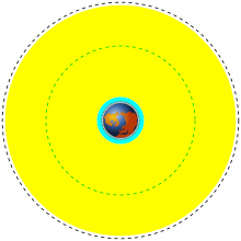
Another example is the scale diagram of some known Earth orbits shown here . On the inside you can see the earth surrounded by a blue-green ring that marks the Low Earth Orbit (LEO), i.e. the area of low orbits. In this area, 370 km above the surface of the earth, the orbit of the international space station ISS is shown with red dots . Further out, the Medium Earth Orbit (MEO), i.e. the area of medium Earth orbits, is visible in yellow . In the MEO you can find the orbits of the satellites of the Global Positioning System (GPS) in green dash-dotted lines . The geosynchronous or geostationary orbit with 35794 km above the earth's surface on the z. B. the television satellites of the SES Astra or Eutelsat are running.
Incorrectly displayed accompanying quantities
Scale diagrams are set up in such a way that the respective scale, usually a size ratio, is as easy to recognize as possible. This means that other aspects are difficult to recognize or even displayed incorrectly. In a planetary scale diagram, the sizes of the planets are shown correctly, but this is only possible if the distances between the planets are shown significantly too small. Similarly, the scale diagram of the orbits shows the radii of the earth and its orbits correctly, but the positions of these orbits are correspondingly incorrectly mapped. A geosynchronous satellite can only run synchronously with the earth exactly over the equator and thus appear stationary. If this orbit lies in the plane of the drawing, the earth should be shown in the plan view of one of the polar caps . The orbits of the GPS satellites are also not in the same plane as the geosynchronous orbit. When looking at such scale diagrams, it is therefore always important to note that they are only designed for the scale that is to be illustrated. Other sizes or relationships shown here are often incorrect and must therefore not be interpreted .

