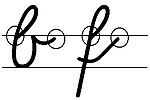
Simplified original font
The simplified output script ( VA ) is a Latin script . It was developed and restructured from the Latin original script (LA) introduced in 1953 . It was developed in 1969 and has been tested since 1972. The spelling of the letters has been simplified and the shapes are closer to the print letters.
In some German federal states, the VA is available to schools alongside other fonts .
General
The difficulties in learning the Latin starting script developed from the “German normal script” prompted the development of an optimized script . The aim of the simplified original script was to correct inconsistencies in the Latin script and to develop a script that was easier to learn. This also complied with a recommendation of the Conference of Ministers of Education and Cultural Affairs (KMK) from 1970.
The simplified output font is based on the Latin output font and is also based on the printed font (DS). During the development, attention should be paid to a consistent and logical writing flow, the analogy to print, a slight motorized implementation and the avoidance of unnecessary decorative formal elements.
Changes in the Simplified Base Script compared to the Latin Base Script
In the simplified output font, almost all lowercase letters start and end on the upper middle band.
This is of great importance for the flow of writing, as so-called “breakpoints” are always “starting points” of the letters. In the Latin starting script, connecting the letters is seen as technically easier, but more difficult to learn because there are four different options. Almost all of the lowercase letters in the simplified output font start and end in the same place.
The letter connections are standardized in the simplified output font. In the Latin source script, there are several letter combinations for the same letter. (Example: Latin base script above, simplified base script below). The simplified original font disrupts the flow of writing by "jerky" transitions, but enables school book publishers to use standardized printing types instead of costly handwritten sample texts.
The “upstroke” (or “bow”, for example in the “b”), which only appears in the last letter of the word when combined, is striking in the simplified starting script. However, this "upstroke" is an essential part of every letter, as it should enable a fluid, uniform connection of the letters. As the letter is the small "z" with sub-loop emphasize that in this form has a centuries-old tradition in the writing , Kurrent- and Fraktur has.
The capital letters of the Simplified Base Type are different from the Latin Base Type. The printed matter was taken into account because the students learn it first.
criticism
The educational scientist Wilhelm Topsch proved in 1996 that there had been no other scientific reports than those of its inventor Heinrich Grünewald for the introduction of the simplified original script in the 1970s. The study is also full of errors, contradicting data and unproven claims. The proportion of girls in the group for the simplified output script was significantly higher at 56% than in the comparison group for Latin script at only 44%. In a further study, which was carried out by the Regensburg colleague Sigrun Richter in 1997, no advantage of the simplified original font could be identified.
With the switch to the simplified output font, there was also increased criticism as to whether an output font with fluent letters connected to one another would make sense at all. The pupils would have to learn significantly more characters as a result. The deputy chairman of the primary school association Ulrich Hecker described "all the flourishes and swings " as "historically outdated". The ensuing from primary school association until 2011 and developed ajar in block letters basic font should not be a standard font and allow the students more freedom towards own handwriting.
See also
literature
- Heinrich Grünewald: Learning to write. Factors - analyzes - methodological procedures. Verlag Kamp, Bochum 1981, ISBN 3-592-71920-3 ( Kamps pedagogical paperbacks 92 practical pedagogy ).
- Gabriele Krichbaum: How children learn to write. An educational plea for the simplified output font. Dieck Agency, Heinsberg 1985, ISBN 3-88852-139-4 .
- Gabriele Krichbaum (Ed.): Design more than manage! Volume 5: Introduction of the simplified output in primary schools. Information - arguments - strategies - materials. Primary School Working Group, Frankfurt am Main 1987 ( Contributions to the reform of the primary school. Special volume S 49, ISSN 0175-632X ). (no longer available)
- Wilhelm Topsch: The end of a legend . The simplified original font on the test bench. Analysis of empirical work on the simplified original font. Auer Verlag, Donauwörth 1996, ISBN 3-403-02855-0 .
Web links
- University of Essen: Simplified original document - Pros & Cons (PDF file; 783 kB)
- Free downloader of the open source font (OTF font, for free unlimited use; 291 kB)
- The original: Free download Simplified initial font, unlined (many special characters, TT font; 338 kB)
- The time of March 24, 2011: Cursive: With swing, but legible!
- Frankfurter Allgemeine Wissen from August 24, 2010: cursive, goodbye?
Individual evidence
- ^ Taz.de, April 6, 2011, No educational interests
- ↑ Frankfurter Allgemeine Wissen from August 24, 2010: Handwriting, goodbye?
- ↑ Kölner Stadtanzeiger from September 6, 2010: The end of the calligraphy

