
Source font

A starting font is a font sample that is used for visual orientation when learning to write manually in school . In the sense of a model or model, it visually supports the demanding process of developing skills and abilities in handwritten writing as part of the acquisition of written language , a cultural technique .
Source fonts are represented as alphabets ( uppercase and lowercase letters ), which are generally supplemented by digits and punctuation marks . For detailed information on the execution of movements and the design of individual letters and their integration into words, various learning materials such as writing exercise sheets or corresponding booklets are usually provided.
Historical context
Historically, there was previously the older approach of giving students a beautiful, legible and efficient cursive font as a standard font for learning. Students should always bring their writing closer to perfecting this specification. Typeface teachers like Rudolf von Larisch and Ludwig Sütterlin changed this traditional approach in the first third of the 20th century by using a starting script as a default instead of a target script .
The original font is not a desired target handwriting. It therefore doesn't have to be particularly beautiful or efficient, but above all simple and clear. The students should develop an individual handwriting from it. The fact that this goal is not always achieved does not change the popularity of the concept.
In 1916, the handwriting teacher Fritz Kuhlmann took an even more extensive approach: the pupils should develop an individual handwriting not from an original cursive but from a printed font . The urge for speed should lead the pupil to invent connections of letters and fluid, uninterrupted trains. This approach did not work at the time, but it was revived in 2011 under the name Grundschrift and has been tried again since then.
Basics
The following information is included in a source document:
- the character of the line as a form-forming element ( e.g. cord pull , alternating pull or swell pull ),
- the ratio of line width to font size,
- the design of the characteristic features of the individual characters,
- the size and width proportions of the letters and their formal elements,
- the position of their main axes (angle of inclination),
- the links and ligatures as well
- the execution of the movement in detail and as a whole ( ductus ).
In Germany, source scripts are anchored in the curriculum for German lessons. It contains statements about the binding nature of the respective sample font.
Original fonts also have the function of illustrating the creative coordination of the individual aspects with one another (angle of inclination, size and width proportions, reversal of movement in the form of angles, curves, cover lines or loops, letter spacing and connections ). The original fonts exemplify a certain style principle that helps the learners not only to give the individual letters a distinctive shape, but also to create a certain visual order in the typeface. Such an order is aimed at the merging of the parts into a clearly manageable whole and forms an essential prerequisite for the legibility of the lettering. An aid in the difficult process of ordering are rulings . There are different views on the use of rulings when learning to write.
The design of original fonts represents the interface between font design and didactics of mother tongue lessons. Learning to write with graphic motor skills is part of the very complex process of written language acquisition in primary school. In the history of writing education, notions of the structuring of the process of acquiring skills and abilities in handwriting have been subject to major changes. This affects the design of the respective source fonts.
Development in Germany
Standard and original fonts up to 1941
In Germany had after the Carolingian minuscule (9th - 12th century) is a cursive enforced that the Gothic Italic (the 14th century) - a standing in everyday use cursive form of Gothic script (from the 12th century) - connected. This development was continued by the Nuremberg scribe Johann Neudörffer (1497–1563), who played a key role in the creation of Fraktur . In his writing book "A good order and short instruction [...]" (Nuremberg, 1538) he created a style unit of the letters of the German cursive script - more precisely German current script - which was preserved for a long time. As the school system expanded in the 16th century, reading and writing skills became common among ever broader classes.
In addition to the German cursive script , the humanistic cursive was developed as a cursive script for Latin and non-German texts, and from this the Latin script was developed . In the German-speaking world it was necessary and common for the educated to learn two scripts, the German and the Latin script.
In 1714, a standard font was first introduced in Prussia, which is said to go back to the Berlin teacher Hilmar Curas ( Joachimsthalsches Gymnasium ). Their pointed forms, inclined to the right, avoiding curves as far as possible, also established themselves in other German territories and became characteristic of the German Kurrent script.
The Berlin graphic artist Ludwig Sütterlin (1865–1917) changed this typical style of the German Kurrent script. He relied entirely on the concept of the original font - which as such does not have to be beautiful or efficient, but above all clear and simple - and the pull-in pen for beginners. He developed his own font, which stood vertically on the line, divided ascenders, middle and descenders in a ratio of 1: 1: 1, and had geometric-like spikes and curls. The Sütterlin script - which was available in two versions, as German (Kurrent) and Latin script - was used in Prussian schools in 1924 and from 1930 in most other German states as the starting school font.
In Hesse, another type teacher, Rudolf Koch , developed his own concept, which he presented in 1927: the Offenbach type . Koch rejected the equal-tension spring and Sütterlin's original font principle. His cursive script - which was also available in German (Kurrent) and Latin script - was written with a broad pen and should in principle be retained in later life, although it takes on personal traits. With the introduction of Sütterlin's script in Hesse in 1930, however, the Offenbach script remained unused. Likewise, the chopstick script developed by Maximilian Schlegl in the 1930s did not establish itself .
During the Third Reich , the NSDAP Gauleiter Hans Schemm introduced his own original font in Bavaria in 1933 with the Bavarian “Volksschrift”. This contained numerous changes compared to the German Sütterlin script, such as the replacement of the small loops with U-shaped arches, clear differences for c, C, d, y, I, J, T and Y, vertical umlaut marks, for the number 7 and circles the number 0 as with the O. The Reich Ministry of Education liked this font, but wanted uniformity across the Reich. With a decree of September 7, 1934, which came into force at the beginning of the school year 1935/36, the "traffic writing" was introduced throughout the Reich. This was a variant of the Bavarian “Volksschrift”, in which the font was inclined slightly to the right. This was possibly a consequence of the realization that in practice not all pupils, in accordance with the original idea of the original script, had their own handwriting within a few years and that the stenciled forms of Sütterlin's original script were still found in the handwriting of young people.

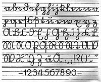
Script example by Hilmar Curas , 1714, who coined the Prussian standard script (Kurrent)

Alphabet of the Kurrent script, around 1865 (the penultimate line shows the umlauts ä , ö , ü and the corresponding capital letters Ae , Oe , Ue ; the last line shows the ligatures ch , ck , th , sch , sz and st )
German Sütterlin script, from 1924
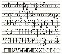
Latin Sütterlin script

The Offenbach font by Rudolf Koch , German alphabet, 1927

Offenbach script, Latin alphabet


Original fonts since 1941
German normal script

In 1941 all broken and current fonts were abolished with the Ordinance on Normal Fonts on behalf of Adolf Hitler . Now only Latin script was taught in schools and everything was converted to it. For this purpose, a new original font was created, which was given the name "German Normalschrift". It was developed on the basis of the Latin Sütterlin script, with a slant to the right, more pleasing forms and simplifications such as the elimination of the loops for x, X and T and the descender for z, Z, F and H, but also the addition of loops for the capital letters C, D and L. The long s was no longer included in it. The letters N, M, P, T and X, but not V, W and Y, are similar to the Offenbach font, based more closely on the Antiqua , the P no longer has a descender, and X and Z are given a horizontal line . The number 7 was again written with an oblique line.
Latin original script

The Latin starting script (LA) was developed by the Iserlohner Schreibkreis from the German normal script and was introduced in the then Federal Republic of Germany as the starting school script on November 4, 1953 by the decree of the Conference of Ministers of Education and Cultural Affairs . The LA was only introduced in Bavaria in 1966. The Latin original script shows only minor changes compared to the German normal script. The letter S was given a shape similar to the L, some small loops became inverted, x and X got their loops back.
School output font and simplified output font
In the German Democratic Republic (GDR), an initial font was initially used that essentially corresponded to that of the LA, with only small changes such as the letter t or the omission of the horizontal line in the Z.
In connection with the introduction of a new curriculum, this initial font was changed in 1968. The decisive factors were both didactic and aesthetic reasons. To the same time as learning to read the document with learning the script to begin, the capital letters were simplified. The movement sequence in the lower case letters has been tightened. This school exit document (SAS) was partially adopted in the old federal states in 1991.
In the Federal Republic of Germany, the Simplified Output Script (VA) was developed in parallel in 1969 to overcome difficulties in using the Latin output script. Similar to the SAS, the forms of the VA were approximated to the block letters. For this purpose, the start and end points of almost all lowercase letters were placed on the upper middle band, which should standardize the connection of the letters and thus simplify the writing process. In the VA, the letter z was again given its underling. The VA has been tested since 1972.

Cursive handwriting of the GDR from 1958

School exit document, in the GDR since 1968
Simplified original font, since 1972


Basic font

With the basic font, interested schools in some federal states have been testing a new script pedagogical concept since 2011, which was developed by a group of experts on behalf of the primary school association. The idea behind the basic script is that cursive script is no longer taught in any form and only printed script serves as the starting script. The pupils should develop a personal handwriting from the printed font completely independently and without role models.
Original fonts used in the federal states
In Germany, the Latin output font, the simplified output font, the school output font and the basic font are used. It is the task of the respective federal states to issue rules for the use of the fonts, whereby either no font is prescribed, several fonts are available to choose from (W) or a font is mandatory (P).
| BW | BY | BE | BB | HB | HH | HE | MV | NI | NW | RP | SL | SN | ST | SH | TH | |
|---|---|---|---|---|---|---|---|---|---|---|---|---|---|---|---|---|
| Latin original script | W. | - | - | - | - | - | W. | W. | W. | - | - | - | W. | |||
| Simplified original font | W. | W. | - | W. | - | W. | W. | W. | W. | - | - | - | - | |||
| School original | - | W. | P | W. | W. | W. | W. | W. | - | P | P | P | W. | |||
| Basic font | - | - | - | - | W. | - | W. | W. | - | - | - | - | - | |||
| No font specification | No font specification | No font specification |
- Baden-Württemberg
- The Baden-Wuerttemberg curriculum allows the choice between Latin base script and simplified base script for the introduction of bound script (cursive script) in primary schools. Each school can choose one of the two script fonts, but this is binding for this school. In order to avoid problems after a change of school, affected students are allowed to continue working in the script they learned first.
- Bavaria
- In the period from 1948 to 1965, in addition to the Latin original script, the German Kurrent script as an "art script" was taught at the Bavarian primary schools. With older teachers this was still the usual "handwriting". With the 2001/2002 school year, a curriculum that was gradually updated over four years came into force; after that, the Latin starting script was no longer binding for all primary school children, but the simplified starting script. With the so-called curriculum plus, schools in Bavaria have been able to choose between the simplified starting script and the school starting script since the 2014/2015 school year.
- North Rhine-Westphalia
- The starting font for reading and writing in North Rhine-Westphalia is printed. In the course of the liquefaction of the writing process and the individual expression of the writing, the students later develop their personal handwriting from the print. Due to its proximity to the printed font, the simplified output font can be used for orientation. This usually happens at the end of the first or the beginning of the second year of primary school.
- Bremen
- In the public schools of the State of Bremen there are no specifications whatsoever regarding the script used. Even block letters can be written. The only requirement of the curriculum that the scriptures be legible to the teacher is that they are legible.
- Hamburg
- The original school typeface is the binding first script. With the 2011/2012 school year, the individual primary schools will be free to replace the initial school font with the basic font recommended by the primary school association .
- Berlin, Saxony, Saarland
- The original school typeface is the binding first script.
- Brandenburg, Mecklenburg-Western Pomerania
- You can choose between the original school font and the simplified starting font.
- Thuringia and Hesse
- In the primary school curriculum in Thuringia since 2010 and in Hesse's educational standards since 2011, only learning one type of print is required. Teaching a source script is at the discretion of the teacher.
Development in Austria


The oldest school typeface for all of Austria dates back to 1775 and was initiated by Johann Ignaz von Felbiger ("Instructions for beautiful writing [...] for the use of German schools in the imperial and royal states", Vienna 1775) under Empress Maria Theresa. The next standardization dates from 1832. However, hardly anyone adhered to these regulations; teachers have drafted their own templates, some even within a school.
The “Richtformen 1924” were declared binding by the City School Council for Vienna , while the other federal states used their own school scripts before and afterwards.
Until the school year 1938/1939, the Kurrent script, established as the “official and protocol script” (and not the Sütterlin script common in Germany ), was taught and taught as the first script in primary schools. The school books were in Fraktur and Kurrent script.
After the annexation of Austria by Nazi Germany in 1938, Austria was also affected by the nationwide abolition of the Kurrentschrift with the introduction of the "German Normalschrift" in 1941. With the decree of the Federal Ministry for Education of May 22, 1951, the Kurrent script was reintroduced as a duplicate in the form of calligraphy, but this was only rarely practiced.
The "Latin initial script" (LA) introduced in the FRG in 1953 was introduced in 1963 in Austria's elementary schools with largely identical letters. In Austria, however, “P” and “R” were written in one go, i.e. with a continuous upward loop on the left. The "r" was continued after the line down to the baseline from there with a small right-turning loop (standing on the baseline) and was thus very similar to the Kurrent font previously used. In 1967/1970 this loop was made into a small arch and a second point reversal on the baseline, and around 1970 it was further simplified to a single point reversal - as already carried out in 1953 in the FRG.
In 1995 a new version of the “Austrian School Typeface” was adopted. The loops inside the letters a, d, g, o and many capital letters were removed. The P and R are no longer written in one go, the X is similar to the Antiqua-X and the digits are more straightforward. Since the 1995/96 school year, teachers have been free to choose: the new "Austrian School Font 1995" or the older "Austrian School Font 1969" can be used as the starting font for the writing course.
Development in Switzerland
The currently taught Swiss school script (also known locally as "Schnürlischrift") was introduced in 1947.
In 2006, Hans Eduard Meier developed the no -frills German-Swiss basic font , which is similar to the German basic font , and proposed it as a contemporary alternative. The basic font has been approved as an alternative in the canton of Lucerne since 2006. Other cantons are waiting or are still discussing the use of the font. In 2008, a study by the Central Switzerland University of Education found that students who had learned to write with the basic script were able to write more text in the same amount of time than those who had learned the school script. In addition, the typeface was more legible and the students agree more often with the statement “I like to write”.
France
The French Ministry of Education recommends the modèles d'écriture scolaire A and B by Laurence Bedoin-Collard, Héloïse Tissot and Marion Andrews , published in June 2013 . They were developed as part of a competition organized by the Ministry of National Education.
Denmark
In 1875, broken scripts were abolished and replaced by cursive script with loops ("løkkeskrift"). 1952 was Formskrift the Norwegian Alvhild Bjerkenes introduced by secondary and writing teacher Christian Clemens Hansen in Denmark and was in the next 20 to 30 years, the dominant teaching writing in schools.
Sweden
In 1959 the school authority ( Skolöverstyrelsen , SÖ ) examined the possibility of introducing a standardized writing course. Until then, there was no binding, uniform method. The output respective writings and textbooks used were Skrivkursen Tomten , Skrivkursen Runa , Min skrivbok , Normalskriften , functional hand-style , Stockholm styles and Skrivkursen Pennan . After a phase of research and experimentation, the authority introduced the Skolöverstyrelsestilen ( SÖ-stilen ) in 1975 , which was designed by the calligrapher Kerstin Anckers and based on the humanistic cursive by Ludovico Vicentino degli Arrighi . After fierce criticism, the binding force of this school typeface was lifted ten years later and it is now partly taught again with older scripts, although the official repeal was only to minimize state regulations.
United States
The Spencer Method had been the main standardized handwriting system in the United States since the 1840s. Around 1888, the award-winning Palmer Method was developed as a simplification of the Spencer Method that was supposed to be simpler, faster, and soon became the most popular handwriting system. The accompanying Palmer's Guide to Business Writing of 1894 sold one million copies in the United States in 1912. In the 1950s, the use of the method declined and was finally replaced by the Zaner-Bloser method of 1976, in which first block letters and then italics were taught in order to enable the use of writing as quickly as possible and thus develop writing skills. In 1978 the D'Nealian method was introduced to ease the transition from block letters to cursive and reverted to a more italic style based on the Palmer script, with block letters showing many similarities to their corresponding italic counterparts. Popular recent treatises are Handwriting Without Tears ( "Handwriting without tears") and the humanistic cursive script of Getty-Dubay .
Hong Kong
In Hong Kong, elementary school students learn to write using the rule script . The character shapes to be taught are specified in the 2009 Hong Kong Chinese Lexical Lists for Primary Learning ( 香港 小學 學習 字詞 表 ) published by the Regional Education Bureau .
See also
literature
- Erik Blumenthal : School writings of the different countries . Bern / Stuttgart 1957.
- Kurt Warwel: School exit publications in German-speaking countries. In: Spectrum of Science 7, 1986.
- Mechthild Dehn: The italic as the base font. An impetus for discussion and testing. In: The primary school magazine 69, 1993, pages 30, 35 and 36.
- Wilhelm Topsch : The end of a legend. The simplified original font on the test bench. Analysis of empirical work on the simplified original font. Auer publishing house. Donauwörth 1996, ISBN 3-403-02855-0 .
- Elisabeth Neuhaus-Siemon: Aspects and Problems of Writing Lessons . In: Hartmut Günther, Otto Ludwig (Ed.): Writing and writing. An interdisciplinary handbook of international research . 2nd half volume, Berlin / New York 1996, ISBN 978-3-11-019413-5 .
- Gabriele Faust-Siehl, Ariane Garlichs u. a .: Original font . In: The future begins in elementary school . Primary School Working Group. Rowohlt Taschenbuchverlag, Reinbek near Hamburg 1996, ISBN 978-3-499-60156-9 .
- Wilhelm Topsch: initial fonts . In: Basic competence in written language acquisition. Methods and action-oriented practical suggestions. 2nd revised and expanded edition. Beltz, Weinheim u. a. 2005, ISBN 3-407-25368-0 .
- Jürgen Hasert: School writings. In: Didactics of the German Language , Volume 1. Schöningh, Paderborn 2006, ISBN 978-3-8252-8235-6 .
- Wolfgang Menzel : Plea for a font without standardized connections . In: Grundschule aktuell , number 110, May 2010, pages 23-25
Web links
- Primary School Association: Comparison of German source documents (PDF; 148 kB)
- Examples of transcription Kurrentschrift Zurich 1496, 1656, 1685, 1712
- Trithemius: Something about handwriting. May 31, 2006, archived from the original on July 13, 2013 .
- Handwritten thoughts from an American on the subject
- Source fonts for the computer for free download from Pelikan
Individual evidence
- ↑ Sonja Steiner-Welz: From the font and the fonts . Reinhard Welz Vermittler Verlag eK, 2003, ISBN 978-3-937636-47-4 , p. 127 ( books.google.de ).
- ↑ Sonja Steiner-Welz: From the font and the fonts . Reinhard Welz Vermittler Verlag eK, 2003, ISBN 978-3-937636-47-4 , p. 133 ( books.google.de ).
- ↑ Sonja Steiner-Welz: From the font and the fonts . Reinhard Welz Vermittler Verlag eK, 2003, ISBN 978-3-937636-47-4 , p. 135 ( books.google.de ).
- ↑ Sonja Steiner-Welz: From the font and the fonts . Reinhard Welz Vermittler Verlag eK, 2003, ISBN 978-3-937636-47-4 , p. 113 ( books.google.de ).
- ↑ Sonja Steiner-Welz: From the font and the fonts . Reinhard Welz Vermittler Verlag eK, 2003, ISBN 978-3-937636-47-4 , p. 137 ( books.google.de ).
- ↑ Sonja Steiner-Welz: From the font and the fonts . Reinhard Welz Vermittler Verlag eK, 2003, ISBN 978-3-937636-47-4 , p. 139 ( books.google.de ).
- ↑ LehrplanPLUS elementary school, curriculum for the Bavarian elementary school [1] , pages 46, 156, 318–321.
- ↑ a b c Primary School Association ( Memento from August 31, 2014 in the Internet Archive ) (PDF; 680 kB)
- ↑ Hamburg Primary School Education Plan, German, page 14. (PDF; 637 kB)
- ↑ Framework guidelines / curricula for primary schools. In: bildungsserver.de. Retrieved October 8, 2018 .
- ↑ https://kultusministerium.hessen.de/schulsystem/schulwahl/schulformen/grundschule/haeufig-stellen-fragen-faq-zum-thema-lesen-und#Welche%20Schreibschrift%20lernt%20mein%20Kind ?
- ↑ Brigitte Strasser's exhibition documentation for the Klagenfurt School Museum
- ↑ Federal Ministry for Education, Art and Culture GZ 38.554 / 32-I / 1/94
- ↑ tagesanzeiger.ch: Is the Schnürlischrift writing its last chapter? Accessed April 30, 2011
- ↑ Ministère de l'éducation nationale: Modèles d'écriture scolaire DOCUMENT D'ACCOMPAGNEMENT. June 2013, accessed on July 10, 2020 (French).
- ↑ Utbildningsförlaget (ed.): Handskrivning: commentary material läroplan för grundskolan 80 . Stockholm 1989, ISBN 91-47-02945-5 , Vad har hänt med svensk handskrivningsundervisning ?, p. 6-9 (Swedish, online ).
- ↑ Karlsson, Mats: Skrivstilen som havererade (sv) . In: Språktidningen , April 2009.
- ^ Robin DVC Tyler: Palmer Method of Penmanship . NYU Dead Media Archive. April 12, 2010. Retrieved April 12, 2010.
- ↑ Susan Apps Bodilly: One room schools: stories from the days of one room, one teacher, 8 grades . Wisconsin Historical Society, 2013, ISBN 978-0-87020616-0 , p. 61, (accessed January 24, 2015).
- ↑ Anne Trubek: Handwriting Is History . Pacific Standard. Archived from the original on February 4, 2010. Retrieved December 17, 2009.
- ↑ Jean Alston, Jane Taylor: Handwriting: Theory, Research and Practice . Nichols Publishing. 1987.
- ↑ D'Nealian Handwriting Method Abandons 'ball-and-stick' approach . October 6, 1993. Retrieved January 23, 2018.
- ↑ Jeffrey Makala: Born to Please, Art of Handwriting Instruction, Spencerian and Palmer methods . University of South Carolina. Retrieved January 24, 2015.
- ↑ 香港 小學 學習 字詞 表 特殊教育 需要 補充 篇 (智障 學生 適用) , The Government of the Hong Kong Special Administrative Region, Education Bureau, Hong Kong 2009.