Fraktur: Difference between revisions
more extensions |
more links |
||
| Line 3: | Line 3: | ||
The [[German language|German]] word '''Fraktur''' refers to a family of [[typeface]]s. The term derives from the past [[participle]] of [[Latin]] ''frangere'' ("to break"), ''fractus'' ("broken"). As opposed to [[Antiqua]] (common) typefaces, modelled after antique [[Roman]] writing, the lines in Fraktur letters are broken up, approximating handwriting. In this broad sense, some refer to handwriting itself as Fraktur also. |
The [[German language|German]] word '''Fraktur''' refers to a family of [[typeface]]s. The term derives from the past [[participle]] of [[Latin]] ''frangere'' ("to break"), ''fractus'' ("broken"). As opposed to [[Antiqua]] (common) typefaces, modelled after antique [[Roman]] writing, the lines in Fraktur letters are broken up, approximating handwriting. In this broad sense, some refer to handwriting itself as Fraktur also. |
||
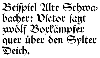
<div style="float:right;margin:5px;border:1px;border-style:solid">[[Image:Fraktur_alte_schwabacher.png]]<br>''Fig. 1: Alte Schwabacher''</div> |
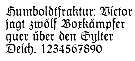
<div style="float:right;margin:5px;border:1px;border-style:solid">[[Image:Fraktur_alte_schwabacher.png]]<br>''Fig. 1: Alte Schwabacher''</div><div style="float:right;margin:5px;border:1px;border-style:solid">[[Image:Fraktur_humboldtfraktur.png]]<br>''Fig. 2: Humboldtfraktur<br>(Hiero Rhode, 1938)''</div><div style="float:right;margin:5px;border:1px;border-style:solid">[[Image:Fraktur_werbedeutsch.png]]<br>''Fig. 3: Werbedeutsch<br>(Herbert Thannhaeuser, 1934)''</div> |
||
<div style="float:right;margin:5px;border:1px;border-style:solid">[[Image:Fraktur_humboldtfraktur.png]]<br>''Fig. 2: Humboldtfraktur<br>(Hiero Rhode, 1938)''</div> |
|||
<div style="float:right;margin:5px;border:1px;border-style:solid">[[Image:Fraktur_werbedeutsch.png]]<br>''Fig. 3: Werbedeutsch<br>(Herbert Thannhaeuser, 1934)''</div> |
|||
In a more narrow sense, the term "Fraktur" refers to typefaces that resemble the artistic handwritings of [[cloisters]] in the [[Middle Ages]]. Most commonly known is the ''Alte Schwabacher'' variant (Fig. 1), which was the predominant typeface in use in Germany from about 1480 to 1530. Most importantly, all of the works of [[Martin Luther]], leading to the [[Protestant Reformation]], as well as the [[Apocalypse]] of [[Albrecht Dürer]] (1498) were printed in this typeface. It was probably first used by Johannes Bämler, a printer from [[Augsburg]], in 1472. The origins of the name are unclear; some assume that the typeface was designed by a face cutter from the village of Schwabach who worked externally and was thus refererred to as the ''Schwabacher''. |
In a more narrow sense, the term "Fraktur" refers to typefaces that resemble the artistic handwritings of [[cloisters]] in the [[Middle Ages]]. Most commonly known is the ''Alte Schwabacher'' variant (Fig. 1), which was the predominant typeface in use in Germany from about 1480 to 1530. Most importantly, all of the works of [[Martin Luther]], leading to the [[Protestant Reformation]], as well as the [[Apocalypse]] of [[Albrecht Dürer]] (1498) were printed in this typeface. It was probably first used by Johannes Bämler, a printer from [[Augsburg]], in 1472. The origins of the name are unclear; some assume that the typeface was designed by a face cutter from the village of Schwabach who worked externally and was thus refererred to as the ''Schwabacher''. |
||
| Line 22: | Line 20: | ||
== Sources, external links == |
== Sources, external links == |
||
* http://www.spd-schwabach.de/content/service/schrift/ |
* [http://www.spd-schwabach.de/content/service/schrift/ Information about Schwabacher (in German)] |
||
* [http://www.steffmann.de/english/index.htm Website of Dieter Steffmann] (has a large number of digitized Fraktur fonts, in English) |
|||
* http://www.asherwin.com/frakturscript2.html |
* http://www.asherwin.com/frakturscript2.html |
||
* http://www.waldenfont.com/products/kur/history.asp |
* http://www.waldenfont.com/products/kur/history.asp |
||
Revision as of 14:00, 2 May 2003
The German word Fraktur refers to a family of typefaces. The term derives from the past participle of Latin frangere ("to break"), fractus ("broken"). As opposed to Antiqua (common) typefaces, modelled after antique Roman writing, the lines in Fraktur letters are broken up, approximating handwriting. In this broad sense, some refer to handwriting itself as Fraktur also.
In a more narrow sense, the term "Fraktur" refers to typefaces that resemble the artistic handwritings of cloisters in the Middle Ages. Most commonly known is the Alte Schwabacher variant (Fig. 1), which was the predominant typeface in use in Germany from about 1480 to 1530. Most importantly, all of the works of Martin Luther, leading to the Protestant Reformation, as well as the Apocalypse of Albrecht Dürer (1498) were printed in this typeface. It was probably first used by Johannes Bämler, a printer from Augsburg, in 1472. The origins of the name are unclear; some assume that the typeface was designed by a face cutter from the village of Schwabach who worked externally and was thus refererred to as the Schwabacher.
As opposed to other countries, in Germany, typesetting in Fraktur was entirely common still in the 19th century. Many books from the time used Schwabacher as the preferred typeface. Fraktur went out of fashion during the early 20th century because of the obvious communication problems with non-native German speakers.
However, in an attempt to deliberately differentiate Germany from the rest of the Western world, it was reinforced by Nazi Germany (1933-1945), which pronounced that Antiqua typefaces were not Aryan. During that time, new, more artificial Fraktur typefaces were designed (see Fig. 2 and 3). This policy was officially held up until January 3, 1941, when Martin Bormann issued a circular letter to all public offices which suddenly declared Fraktur to be Judenlettern (Jewish letters) and prohibited further use. It has been speculated that the regime had realized that Fraktur would inhibit communication in the territories occupied during World War II as well.
Despite being an old German tradition, the use of Fraktur therefore has a strong Nazi connotation to many. Today, Fraktur is thus merely used for decorative typesetting any more; for example, a number of traditional German newspapers still print their name in Fraktur on the first page.
Isolated Fraktur letters are also used in mathematics, e.g. to denote Lie groups. (is this correct?)
Related articles
Sources, external links
- Information about Schwabacher (in German)
- Website of Dieter Steffmann (has a large number of digitized Fraktur fonts, in English)
- http://www.asherwin.com/frakturscript2.html
- http://www.waldenfont.com/products/kur/history.asp
- http://www.cooper.edu/art/lubalin/bletterpub.html


