
histogram

A histogram is a graphic representation of the frequency distribution of cardinally scaled features . It requires the division of data into classes ( English bins ), which can have a constant or variable width. Right next to each other, rectangles with the width of the respective class are drawn, the areas of which represent the (relative or absolute) class frequencies. The height of each rectangle then represents the (relative or absolute) frequency density, i.e. the (relative or absolute) frequency divided by the width of the corresponding class.
application
Histograms are used in descriptive statistics and in image processing . One uses histograms, for example,
- if you want to see the course of the frequency distribution and not just summary data such as the arithmetic mean and the standard deviation ,
- if you suspect that several factors influence a process and you want to prove them,
- if you want to define meaningful specification limits for a process.
In physical research or applied fields (e.g. analytics), measured spectra are displayed as histograms, see e.g. B. Multi-channel analyzer .
Construction of a histogram
The following steps are necessary when constructing a histogram:
- Divide the set of values into classes (specify the width of the rectangles)
- Determine absolute / relative class frequency (determine the area of the rectangles)
- Determine frequency density (determine the height of the rectangles)
- Graph the histogram
Division into classes
To construct a histogram, the range of values of the sample is divided into k contiguous intervals , the classes . It is important to ensure that the marginal classes are not open. This means that the first and last class must have a lower and upper limit, respectively. The classes don't have to be equally wide. However, at least in the middle range, classes of the same size simplify the interpretation. A rectangle is then built over each class, the area of which is proportional to the respective class frequency. In the histogram, these classes correspond to the width of the individual rectangles.
Determination of class frequency
There are two approaches to creating a histogram: The class frequency reflects either an absolute or a relative value. The absolute value corresponds to the number of values that belong to a class. The relative value, on the other hand, expresses what percentage of the values belong to a class. Depending on the application, working with both absolute and relative values can have advantages. In the histogram, the class frequency corresponds to the area of the rectangles.
Determination of the frequency density

Since the area of the jth rectangle is equal to the class frequency n j , the height of the rectangle, the so-called frequency density h j , is calculated as the quotient n j / d j of the class frequency n j by the class width d j . This becomes immediately clear when you consider that the area of a rectangle is the product of width (class width) and height (frequency density). The class with the highest frequency density is called the modal class . If the classes are equally broad, the frequency density and absolute or relative frequencies are proportional to one another. In this case, the heights of the rectangles are comparable and can be interpreted as frequency (taking into account the class width as a proportionality factor).
Statistical fluctuation in class frequency
Often the determined class frequencies will scatter when the data acquisition is repeated. For example, in the case of an election forecast, the question of the precision of the numbers collected arises. The expected range of fluctuation of the class frequency tends towards the infinitely growing number of classes

Estimation of the number of classes

In order to be able to draw a histogram, a sufficiently large number of measured values must result in a meaningful course. An incorrect classification of the classes can lead to a misinterpretation of the histogram. There are various rules of thumb for determining the number of classes or rectangles :
| Number of measurements | Number of bars |
|---|---|
| <50 | 5 to 7 |
| 50 to 100 | 6 to 10 |
| 100 to 250 | 7 to 12 |
| > 250 | 10 to 20 |
If necessary, the number of bars can also be calculated using the Sturges rule:


But Sturges rule should not be used anymore because they firstly the scattering ignored. On the other hand, it chooses the number of classes too small for even in the case of an (ideal) normally distributed true density.

Alternatively, the class width can be determined using the Scott rule

![h = \ frac {3 {,} 49 \ cdot \ sigma} {\ sqrt [3] {n}}](https://wikimedia.org/api/rest_v1/media/math/render/svg/948dbdf3ed0076828691aafb3742663f22c06336)
or, as a rule, according to Freedman and Diaconis
![h = \ frac {2 \ cdot (Q_3-Q_1)} {\ sqrt [3] {n}}](https://wikimedia.org/api/rest_v1/media/math/render/svg/e0d0239894c9729467766b88f4a29f02f5b5e812)
be calculated. Here are the standard deviation , the number of measurements and the interquartile range .


Scott's rule is only defined for normally distributed data. For other cases, Scott introduced correction factors based on skewness and excess.
properties
A histogram is an area- proportional representation of the present frequencies. The area of a rectangle corresponds to where the relative class frequency is the class and a proportionality factor.


Is equal to the sample size, that is , the area of each rectangle is equal to the absolute class frequency. In this case, in which the sum of the area of the rectangles corresponds to the sample size n, the histogram is called absolute . If exactly the relative class frequencies are used to construct the histogram ( ), the histogram is referred to as relative or normalized. Since the areas of the rectangles now correspond to the relative class frequencies, the areas in this case add up to 1.


In a histogram the rectangles border, unlike the bar chart directly to each other, that is, there are no gaps between them. Because the width of the rectangles corresponds to the formed intervals (classes), which are also directly adjacent to one another.
In contrast to the bar chart, the x-axis of a histogram must always be a scale, the values of which are ordered and equally spaced.
Three characteristics of a histogram can be used to assess the distribution shown:
- the general course of the curve
- the scatter
- the centering ( position parameters (descriptive statistics) )
Example of a histogram
The number of cars per 1000 inhabitants is available as an indicator of prosperity for 32 European countries. The values are divided into classes as follows:
| Class j | Number of cars per 1000 |
Number of countries (absolute class frequency) n y |
Class width d j |
Rectangular height (frequency density) h j = n j / d j |
| 1 | over 0 - up to 200 | 5 | 200 - 0 = 200 | 0.025 |
| 2 | over 200 to 300 | 6th | 100 | 0.06 |
| 3 | over 300 to 400 | 6th | 100 | 0.06 |
| 4th | over 400 to 500 | 9 | 100 | 0.09 |
| 5 | over 500 to 700 | 6th | 200 | 0.03 |
| Sum Σ | 32 |
With the help of the table you can get the following histogram:

The class boundaries and class mean are plotted on the abscissa . As a rule, the ordinate is not given for a histogram , because otherwise there is a risk of interpreting the height of a rectangle instead of its area as a frequency. If, on the other hand, all classes are of the same width, the class frequency n j can be used for the height of the rectangles and this can be plotted on the ordinate.
Average shifted histogram
The left picture shows four histograms for the same data set. Although the class widths in each histogram are 2.0, the beginning of the first class is shifted (-6.0, -5.5, -5.0 and -4.5). Although the same data set was used in each case, different histograms come out.
In addition to the problem of the number of classes or the breadth of classes, the choice of the (left) class boundaries also plays a role. David Scott therefore proposed the Average Shifted Histogram.
In the right picture, the four histograms were superimposed and the histogram heights were then averaged for each value . This gives the average-shifted histogram. Usually more than four histograms are superimposed and averaged.

The average-shifted histogram solves the problem of choosing the (left) class boundaries, but not the problem of choosing the optimal class widths.
The average-shifted histogram should be classified between the histogram and the core density estimate .
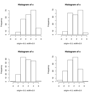
Four histograms for the same data set. The class widths are 2.0 in each histogram. Only the beginning of the first grade shifts from -6.0 to -5.5 and -5.0 to -4.5.

Average-shifted histogram, calculated from the overlapping of the four individual histograms.


Histogram in image processing

In digital image processing , a histogram is understood to be the statistical frequency of gray values or color values in an image. The histogram of an image allows a statement about the occurring gray or color values and about the contrast range and brightness of the image. In a colored image, either a histogram can be created for all possible colors or histograms for the individual color channels. The latter usually makes more sense, since most of the processes are based on gray-scale images and so immediate further processing is possible. The number of color channels in an image depends on the mode, i.e. there is one channel per color separation. Therefore, CMYK images have four color channels, RGB color images only three.
A histogram visualizes the distribution of the brightness values of an image. The individual frequencies of occurrence of the color values are plotted as bars above an axis that represents the value range of the color values. The higher the bar above a color value, the more frequently this color value occurs in the image.
Histograms are often found in the field of digital photography. Well-equipped digital cameras show a histogram on the display during the search for a subject as an aid for a more balanced picture in real time or for pictures that have already been saved. Viewing a histogram allows the photographer to check the result or the planned photo more precisely than the camera display allows. For example, you can recognize typical errors such as under- and overexposure and correct them with appropriate exposure correction . Since the brightness and, above all, the contrast range of the image play a major role in later processing and utilization, it is worthwhile to pay attention to the histogram display when taking photos.
A classic use of histograms in the image processing is the equalization (Äqualisierung, English equalizing ), in which the histogram is transformed with a disguising. As a result, a better distribution of the coloring can be achieved, which goes beyond a mere contrast enhancement.
Example high-key and low-key photography

In low-key recordings, the details are concentrated in the low tonal values . The rash is therefore strongest in the lower area. (There are many pixels with low tonal values.)
The opposite applies to high-key recordings, i.e. many pixels with high tone values and hardly any fluctuations in the low tone values.
With overexposed images, the probability curve “hugs” on the right (light) side and the maximum may not even be reached. Not all bright details are reproduced because a certain brightness area is cut off and the one below is defined as white.
history
Probably the first time a histogram appeared in 1786 in the work The Commercial and Political Atlas by the Scottish engineer and economist William Playfair , who lived around 1800 and who had previously also introduced the bar and pie chart . In 1833, the Frenchman André-Michel Guerry also used histograms to visualize data. The histogram was further developed by the Belgian statistician and social scientist Adolphe Quetelet around 1846. However, the term "histogram" ( historical diagram ) was first used by the English mathematician Karl Pearson in a series of lectures in 1891 and was finally introduced in 1895 in its current meaning.
See also
Web links
Individual evidence
- ↑ a b Bernd Rönz, Hans G. Strohe: Lexicon Statistics . Gabler Verlag, 1994, p. 157
- ^ Larry Wasserman, All of Nonparametric Statistics . Springer, 2005, p. 127
- ^ Arens et al .: Mathematics . Spektrum Akademischer Verlag, 2008, p. 1226
- ^ D. Freedman, R. Pisani, R. Purves: Statistics . Third edition. WWNorton, 1998.
- ↑ Thomas A. Runkler: Data Mining: Methods and Algorithms of Intelligent Data Analysis . 1st edition. Vieweg + Teubner, 2010, p. 47 .
- ↑ Erhard Cramer, Udo Kamps: Fundamentals of probability theory and statistics: A script for students of computer science, engineering and economics . 2nd Edition. Springer, 2008, p. 45 .
- ^ Wolfgang Brauch, Hans-Joachim Dreyer, Wolfhart Haacke: Mathematics for engineers . Springer, 2013, ISBN 978-3-322-91830-7 , pp. 658 ( limited preview in Google Book search).
- ↑ Bernd Rönz, Hans G. Strohe (1994), Lexicon Statistics , Gabler Verlag, p. 250
- ^ Herbert A. Sturges: The choice of a class interval . In: Journal of the American Statistical Association . No. 21 , 1926, pp. 65-66 .
- ^ RJ Hyndman: The problem with Sturges' rule for constructing histograms . In: Technical report . Melbourne University.
- ↑ David W. Scott: On optimal and data-based histogram . In: Biometrika . tape 3 , no. 66 , 1979, pp. 605-610 , doi : 10.1093 / biomet / 66.3.605 .
- ^ David Freedman, Persi Diaconis: n the histogram as a density estimator: theory . In: Journal of Probability Theory and Allied Areas . tape 57 , no. 4 , 1981, p. 453-476 , doi : 10.1007 / BF01025868 .
- ^ A b Jürgen Bortz: Statistics for human and social scientists . 6th edition. Springer, 2005, p. 31-32 .
- ^ David Scott: Multivariate Density Estimation: Theory, Practice, and Visualization . John Wiley, 1992, ISBN 978-0-471-54770-9 .
- ↑ That means: histogram . test.de , August 25, 2011; Retrieved January 7, 2013
- ↑ Playfair, William; The Commercial and Political Atlas: Representing, by Means of Stained Copper-Plate Charts, the Progress of the Commerce, Revenues, Expenditure and Debts of England during the Whole of the Eighteenth Century , London 1786
- ^ André-Michel Guerry: Essai sur la Statistique Morale de la France . Paris 1833.
- ↑ "He explained that the histogram could be used for historical purposes to create blocks of time of 'charts about reigns or sovereigns or periods of different prime ministers'." quoted from The Rutherford Journal
- ↑ Sheldon M. Ross: Introductory Statistics . 2nd Edition. Elsevier Academic Press, 2005, pp. 56-57 .
- ↑ Yadolah Dodge: The Concise Encyclopedia of Statistics . Springer, 2008, p. 236-237 .
- ↑ Eileen Magnello: Karl Pearson's Gresham Lectures: W. F. R. Weldon, Speciation and the Origins of Pearsonian Statistics . In: The British Journal for the History of Science . tape 29 , no. 1 . Cambridge University Press, 1996, pp. 48 .
