
Quantity diagram

Set diagrams are used to graphically illustrate set theory . There are different types of set diagrams, in particular Euler diagrams (after Leonhard Euler ) and Venn diagrams (after John Venn ).
Set charts can help illustrate relationships between sets, but are generally not useful as mathematical evidence . Only set diagrams that represent all possible relations of the sets represented are suitable as evidence ; such diagrams are called Venn diagrams. The disadvantage of Venn diagrams is that if there are more than three sets involved, they quickly become confusing because with n objects they have to represent 2 n possibilities. Venn himself could represent up to four, eventually even five, involved sets using ellipses.
Examples
Euler diagrams
Euler diagrams are primarily used to make set-theoretical facts, for example the subset property, clear. The following illustrations are common.

; is an element of .

; is not an element of .

; is a subset of .


Further examples of Euler diagrams are:

Euler diagram of the number ranges

Membership of the European states and non-European states in the European institutions

Euler diagram of the British Isles
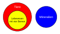
All living things with four legs are animals, but no mineral is an animal.


Venn diagrams
Venn diagrams show all relations between the considered sets. Therefore one can read off connections from them and from the existence of individual relations infer the existence of other relations.

(Intersection)

(Union set)

(Difference amount)

( Complement of A)


Extension to several quantities

Venn's construction with n = 3

Venn's construction with n = 4

Venn's construction with n = 5
Venn's construction with n = 6

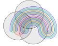
Venn's elegant solution with 4 ellipses


Venn diagrams are best known for showing three sets with circles. Venn, however, had the ambition to find “elegant symmetrical figures” that represent a larger number of sets, and he showed a diagram for four sets in the form of an ellipse. He then gave a construction method with which one can display Venn diagrams for "any" number of sets, with each closed curve intertwined with the others, starting from the diagram with three circles. A “hose” is drawn over the last quantity display. This cuts all other quantities.
Differences between Venn and Euler diagrams
The difference between the two types of set diagrams becomes particularly clear if you look at both diagrams for a specific example. Take the following three quantities.


The Euler and Venn diagrams of these three sets look like this.
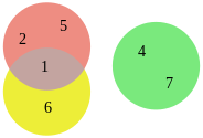
Euler diagram

Venn diagram


While Euler diagrams only show the actual overlap between the quantities, Venn diagrams show all possible overlaps of the surfaces (even if they do not contain any objects).
Johnston Charts
Johnston diagrams are a two-valued propositional interpretation of set diagrams, especially Venn diagrams. In a Johnston diagram, a circle (a set) P is interpreted as the set of facts under which a statement P is true. The area outside the circle (the complement of the set) P is interpreted as the set of circumstances under which the statement is false. To say that a statement is true, paint the whole area outside its circle in black; in this way one indicates that the circumstances under which the statement is not true cannot apply. Conversely, to say that a statement is wrong , paint the area inside its circle in black; it is said that the circumstances under which the statement is true cannot apply. If you combine two statements P , Q by a conjunction , i. H. if one wants to express that both statements are true, one paints the entire area outside the intersection of the circles P , Q in black; it is said that none of the states of affairs under which both P and Q do not apply can exist.
Johnston diagrams are thus a mapping of classical propositional logic to elementary set theory, whereby the negation is represented as a complement, the conjunction as an intersection and the disjunction as a union . The truth values true and false are mapped to the universal set and the empty set, respectively.
history
Leibniz was already using set diagrams to represent syllogistics around 1690 . Christian Weise , rector of the grammar school in Zittau , used quantity diagrams around 1700 to represent logical connections. Johann Christian Lange (1669–1756) published the book Nucleus Logicae Weisianae in 1712 , in which Weise's logic is treated. Leonhard Euler , Swiss mathematician in the 18th century, introduced the Euler diagram, which he first used in a letter dated February 24, 1761.
John Venn , a British mathematician in the 19th century, introduced the Venn diagram in 1881. In 1964, works by Charles Sanders Peirce , which he wrote in the last quarter of the 19th century and which describe the existential graphs , are recognized for the first time .
- Application example syllogistics
The following graphics show how Venn diagrams have been used to illustrate syllogisms since the 17th century . The validity of a conclusion can be checked with this method. (So you can see, for example, that the Modus Darapti is only valid if there is a non-empty middle term.)
No element exists in black areas ( general statement ).
In red areas there is at least one element x ( existence statement ).

Proof of the modus Barbara using Venn diagrams:
There is no M outside of P, there is no S outside of M; so there is no S outside of P. |

Such Venn diagrams can easily be converted into Euler diagrams, as the following graphic shows. Venn diagrams have the advantage that one cannot forget an overlap, so they are also suitable for evidence. In contrast, with Euler diagrams, it is more intuitive to grasp which quantities lie within one another or which overlap.

Web links
literature
- Gereon Wolters : Venn diagrams , in: Jürgen Mittelstraß (Hrsg.): Encyclopedia Philosophy and Philosophy of Science. 2nd Edition. Volume 8: Th - Z. Stuttgart, Metzler 2018, ISBN 978-3-476-02107-6 , p. 280 f. (with bibliography).
Individual evidence
- ^ De Formae Logicae per linearum ductus. ≈1690, published only posthumously in 1903 in: Couturat: Opuscules et fragmentes inedits de Leibniz. Pp. 292-321
- ^ A b Moritz Wilhelm Drobisch : Logic according to its simplest relationships. 5th edition. Leopold Voss publishing house, Hamburg Leipzig 1887 p. 99
- ↑ grifflogik.de , accessed on August 30, 2008