Goudy Old Style
The Goudy Old Style , shortens sometimes simply Goudy named, is a classic oldstyle -Serifenschrift and the most well-known signature of the American type designer Frederic W. Goudy . In terms of classification, it is classified - according to DIN standard 16518 - in the group of French Renaissance antiquities. It is now available in digitized form from various providers.
Emergence
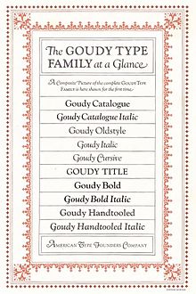
Between 1908 and 1915 Frederic Goudy designed three classic serif fonts with the name “Goudy Old Style”. The first was a commissioned work for Lanston Monotype , the American offshoot of the typesetting machine manufacturer Monotype . Not identical to the font known today as Goudy Old Style , it was soon sold under the company's internal identifier 38-E . Goudy produced a second typeface called "Goudy Old Style" in 1912. Soon renamed Goudy Antiqua , it later operated under the names Goudy Lanston and Ratdolt . The actual until today under the name Goudy Old Style known face developed in 1915 as a commission for the type foundries -Zusammenschluss American Type Founders (ATF). Due to the success of the font, the basic style was soon supplemented by italic and bold font styles. There were also modified variants - created either in collaboration with ATF type designer Morris Fuller Benton or by Benton alone: the inline decorative variant Goudy Handtooled (1915), the Goudy Catalog as a slightly stronger version of the Goudy Old Style (1915) and the Ultra-fat version Goudy Heavyface (1925) launched to compete with Cooper Black and is also popular in advertising typography .
Frederic Goudy shared little in the success of his typeface, which soon began. He sold all rights to ATF for a one-off payment of US $ 1500; He did not receive any further royalties - although his creation developed into a successful typeface bestseller over the decades.
Properties and variants
Goudy himself made the Goudy Old Style as a reminiscence of the writings of the Renaissance . According to his own words, he was mainly inspired by the capital letters of the Renaissance era - especially those of the Basel book printer Johann Froben . As with other fonts by Goudy, the idiosyncratic, individualistic implementation was a typical distinguishing feature - in this specific case the diamond-shaped dots on the lowercase letters i and j, the curved, rounded horizontal lines on the uppercase letters E and L and the upward-pointing ear shape on the small one G. Another unique selling point compared to other typefaces that were created at the beginning of the 20th century: the comparatively reduced ascenders and descenders . Due to its modern proportions and their good readability is Goudy Old Style both as a set of books - text typeface and in the advertising typography wide use.
The Goudy Old Style is currently available from various font providers - for example, Bitstream , Linotype , Monotype and Adobe . In terms of digitization technology, the individual versions also differ in some details. The standard version currently consists of five styles: Regular, Italic, Bold, Bold Italic and Extra Bold. The Heavyface version from 1926 (Adobe), the Goudy Catalog and the Goudy Handtooled from 1915 (both Linotype) are also sold as separate font offers .
Individual evidence
- ↑ Great typographers: Frederic W. Goudy , Frank Müller / Jürgen Funke, Invers, issue 4/2001 (PDF)
- ↑ a b Font portrait Goudy Old Style , Schriftgestaltung.com, accessed on December 15, 2015
- ↑ Goudy Old Style . Info text on Bitstream's Goudy Old Style at myfonts.com, accessed on December 15, 2015
- ↑ Search Results for: Goudy Old Style , search query for Goudy Old Style in the font portal MyFonts.com on December 15, 2015
