Maghreb script
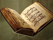
The Maghrebian script - the Maghribi Duktus - ( Arabic الخط المغربي, DMG al-ḫaṭṭ al-maġribī ) is an elegant Arabic book font , which was used from the 10th century in the Maghreb (Northwest Africa) and in al-Andalus ( Iberian Peninsula ). For a long time, parchment was the dominant writing material ; Maghribi Korans are usually relatively small and square.
Systematics
The Maghribi style used by dynasties such as the Almoravids , Almohads , Merinids , Wattasids , Nasrids or Hafsids developed from the older Kufi style and is sometimes counted as part of the Kufic font family. According to its regional centers, there are essentially three styles (which later merged):
While a large, wide typeface is typical for the first two (African) variants, the letters in the Andalusian Maghribi style are usually quite small and set a little more densely.
The Sudani style used in West Africa (e.g. in Nigeria ) is closely related to the Maghreb script and is therefore sometimes viewed as another Maghribi variant.
Characteristic
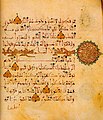
Typical of the Maghribi style, which is easy to recognize and has hardly changed over time, is that the letters usually have a uniform thickness and - sometimes reaching far into the line below - are written with a free, elegant curve, which result in noticeable curves and arcs. Often some letters are elongated horizontally (to fill in the line), the letter shafts (from Alif and Lam ) inclined slightly to the left at the top.
On the other hand, some orthographic peculiarities are characteristic, in addition to the (otherwise unusual) spelling of the ā in words such as hādha as Alif, primarily the writing of the two letters Fa (ف) and Qāf (ق) belongs: In the first one, in the Maghribi style, the diacritical point is placed below (instead of above); in the latter, however, only one point (instead of two points) above - as in the normal Fa (compare, for example, the spelling ofفي قلوبهم in the figure on the left).
With regard to the auxiliary characters , it is also noticeable that these (compared to the letters) are rather delicate and very colorful. So that's Hamzat al-qat often marked by a red or yellow dot that Hamzat al wasl , however, by greenery. Sukun and Schadda are not infrequently blue; Fatha and Kasra are placed straight instead of at an angle.
Examples
Literature and web links
- O. Houdas: "Essai sur l'écriture maghrebine" in: Nouveaux mélanges orientaux , IIe série vol. xix., Publications des Langues Vivantes Orientales, Paris 1886
- N. van den Boogert: Some notes on Maghribi script http://www.islamicmanuscripts.info/reference/articles/boogert_notes_maghribi_script.PDF
- Andalusian Koran from Seville BSB (Cod.arab. 1)


