
Wikipedia:Graphics Lab/Illustration workshop: Difference between revisions
→Smokey hat: new version uploaded |
→Smokey hat: new version uploaded |
||
| Line 915: | Line 915: | ||
:Ah, I think that was meant to be puckering or shading, like the photo above. [[User:Kintetsubuffalo|Chris (クリス • フィッチ)]] ([[User talk:Kintetsubuffalo|talk]]) 04:16, 27 March 2008 (UTC) |
:Ah, I think that was meant to be puckering or shading, like the photo above. [[User:Kintetsubuffalo|Chris (クリス • フィッチ)]] ([[User talk:Kintetsubuffalo|talk]]) 04:16, 27 March 2008 (UTC) |
||
::Also, I really prefer the buff color of her hat to the chamois color of the present graphic, can that be brought over? [[User:Kintetsubuffalo|Chris (クリス • フィッチ)]] ([[User talk:Kintetsubuffalo|talk]]) 20:55, 27 March 2008 (UTC) |
::Also, I really prefer the buff color of her hat to the chamois color of the present graphic, can that be brought over? [[User:Kintetsubuffalo|Chris (クリス • フィッチ)]] ([[User talk:Kintetsubuffalo|talk]]) 20:55, 27 March 2008 (UTC) |
||
:::Changed to a more tan color. The only thing I can guess is that those strange boxes were supposed to be shading or gaussian blur elements. Since |
:::Changed to a more tan color. The only thing I can guess is that those strange boxes were supposed to be shading or gaussian blur elements. Since blur and effects aren't supported in many browsers or unpredictably by the media wiki software, I made them simple lines. [[User:Jeff Dahl|Jeff Dahl]] ([[User talk:Jeff Dahl|Talk]] • [[Special:Contributions/Jeff Dahl|contribs]]) 00:06, 28 March 2008 (UTC) |
||
==Burma== |
==Burma== |
||
Revision as of 00:06, 28 March 2008
This page is deprecated and will not be monitored. Please use one of the three workshop pages. This specific page is {{{1}}}
See also
- Category:Images for cleanup
- Category:Images for redraw
- meta:Philip Greenspun illustration project/Requests
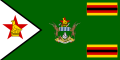
More Zimbabwean Coats of Arms
-
 Bulawayo COA
 -
 + 7 days}}.
 -
 Mutare flag
 -
Gweru COA
-
Gweru flag
-
Easy?
-
![help with a redraw. foud the image here: http://users.picknowl.com.au/~hanuman/mwenezi/organisations.htm]](//upload.wikimedia.org/wikipedia/commons/e/ed/Pix.gif) help with a redraw. foud the image here: http://users.picknowl.com.au/~hanuman/mwenezi/organisations.htm]
help with a redraw. foud the image here: http://users.picknowl.com.au/~hanuman/mwenezi/organisations.htm]


![help with a redraw. foud the image here: http://users.picknowl.com.au/~hanuman/mwenezi/organisations.htm]](/wiki/File:Pix.gif)
Article(s): Bulawayo, Chitungwiza, Mutare, Gweru, Marondera, Zimbabwe, MDC
Request: To make SVG versions of the above images. Its a lot to ask and if it can't be done, it can't be done. The flags can be made using the coats of arms once an SVG has been made for them so no need to make the COAs twice. The writing on the Chitungwiza Banner should read Pamberi Nekushandria Pamwe. The Bulawayo flag is the Bulwayo COA on a blue bkgd. It looks different in the image above but use the image as in the COA as this is the proper version. SVG Zimbabwe COA and enlarge for clarity if possible. Many thanks Mangwanani (talk) 17:16, 19 January 2008 (UTC)
Graphist opinion:
- OK, the MDC flag was easy. Some of these coats of arms, however, are at a low resolution—I'm concerned about losing detail if we try to vectorize them. That may just be me, though :) Why is the Chitungwiza COA tagged as a logo? Fvasconcellos (t·c) 13:35, 23 January 2008 (UTC)
- Most of them are tagged as logos probably because when I uploaded them I couldn't find the right tag. To be fair they are logos in a sense... I thought the low resolution may be a problem but if it can't be done, it can't be done. The Bulawayo one is of a high resolution and the flag for it can be made by sticking the logo onto a blue background. The flag that is shown above for the Blwo flag I don't think is right as I never remember seeing the flag with a logo like that so I would stick to the logo shown as I got that off official documentation. Thanks Mangwanani (talk) 16:59, 23 January 2008 (UTC)
- Sorry I keep adding to it but it would be great if they could all be done. Mangwanani (talk) 19:46, 23 January 2008 (UTC)
- Don't apologize :) I'll list those already done below. Fvasconcellos (t·c) 10:58, 24 January 2008 (UTC)
-
 Yes :)
 -
 Air Force done
 -
 Southern Rhodesian Air Force until 1953
 -
 1964-1968

.svg)
.svg)
.svg)
- Could the colours for the Air Force flag be a bit darker? More of a teal and a navy? Mangwanani (talk) 17:01, 24 January 2008 (UTC)
- I used the color approximations listed at the Commons' Pantone approximation chart for British flag colours, they would look a bit different than those used in the GIF. They'll look closer to what you expect depending on monitor settings—for instance, if I set the color temperature of my LCD display to 6500K, the Air Force ensign looks teal, and if I set it to 9300K, the flag looks sort of a sky blue. The colors I chose are used by most SVGs of British-style ensigns, which makes for more consistency across articles; I can change them if you'd like, though. Fvasconcellos (t·c) 17:25, 24 January 2008 (UTC)
- No its fine if theres a standard way of doing it. I'm still new to all this but you have a way of working which works so I shall try not to interefere! I still don't know about the Rhodesian flag and COA which was done some time back. I still think the COA looks too green... Mangwanani (talk) 20:24, 24 January 2008 (UTC)
- I used the color approximations listed at the Commons' Pantone approximation chart for British flag colours, they would look a bit different than those used in the GIF. They'll look closer to what you expect depending on monitor settings—for instance, if I set the color temperature of my LCD display to 6500K, the Air Force ensign looks teal, and if I set it to 9300K, the flag looks sort of a sky blue. The colors I chose are used by most SVGs of British-style ensigns, which makes for more consistency across articles; I can change them if you'd like, though. Fvasconcellos (t·c) 17:25, 24 January 2008 (UTC)
- Ok, so the flags were deleted before you could make SVG versions of them. However, all the flags/COAs I listed can be found here [1]. Thanks. Mangwanani (talk) 17:27, 28 January 2008 (UTC)
- Argh—I should have downloaded them first, I only got the Marondera COA and flag. Oh well, FOTW it is. Fvasconcellos (t·c) 18:26, 28 January 2008 (UTC)
You'll have to get them from FotW now, Commons dropped the bomb on us! 68.39.174.238 (talk) 19:02, 28 January 2008 (UTC)
- Someone should go there and administer a good Whacking with a Wet Trout. Sagredo⊙☿♀♁♂♃♄ 04:34, 29 January 2008 (UTC)
- I added an older insignia to the airforce collection. It seems most of the examples I saw had a ratio of 1:2. Is this generally correct for this type of flag? aliasd·U·T 04:13, 29 January 2008 (UTC)
- FOUL, TIME OUT, WHOA!!! jackaranga, why are you not tagging these with the proper {{Non-free symbol}} tag? That's what it's there for, and it's a lot less deletionist and confrontational than tagging them for deletion. Chris (クリス • フィッチ) (talk) 23:24, 5 February 2008 (UTC)
- Has any more progress been made with these images before Commons remove them all? Mangwanani (talk) 17:31, 19 February 2008 (UTC)
- Sorry, but not really. I've been out of commission lately—rather, my computer has. Again, I apologize. Fvasconcellos (t·c) 10:16, 20 February 2008 (UTC)
- Added one of my own SVGs. The spear probably needs tyding up a tad... Mangwanani (talk) 16:21, 2 March 2008 (UTC)
- Sorry, but not really. I've been out of commission lately—rather, my computer has. Again, I apologize. Fvasconcellos (t·c) 10:16, 20 February 2008 (UTC)
- Has any more progress been made with these images before Commons remove them all? Mangwanani (talk) 17:31, 19 February 2008 (UTC)
-
 Zimbabwe Presidential Flag
 -
 Bulawayo COA by Mariana
 -
 Flag
Flag


This is my version, however, I think I corrupted the file by inserting a bitmap image... Mangwanani (talk) 17:45, 8 March 2008 (UTC)
- I'll have a look. Fvasconcellos (t·c) 03:00, 16 March 2008 (UTC)
- Indeed you did :D Fvasconcellos (t·c) 13:44, 16 March 2008 (UTC)
- I'm trying to make the Zim COA (see below) and once that's made it can be used for a whole host of other images but I'm struggling as my knowledge of Vector graphics is so limited...Mangwanani (talk) 19:54, 16 March 2008 (UTC)
- Indeed you did :D Fvasconcellos (t·c) 13:44, 16 March 2008 (UTC)
- I'll have a look. Fvasconcellos (t·c) 03:00, 16 March 2008 (UTC)
I have made the coat, could someone please use it to ake the flag? -LadyofHats (talk) 02:27, 16 March 2008 (UTC)
- Flag done. As for the COA, let me just say—wow. Fvasconcellos (t·c) 03:00, 16 March 2008 (UTC)
- That's exactly what I said... Mangwanani (talk) 12:28, 16 March 2008 (UTC)
- Flag done. As for the COA, let me just say—wow. Fvasconcellos (t·c) 03:00, 16 March 2008 (UTC)
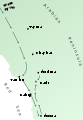
Burning ship map
-
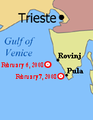 Position map
 -
 larger map
 -
 Possibly from here?


Article(s): M/S UND Adriyatik
Request: SVG-ification for legibility, if possible show a larger chunk of the Adriatic and country names so position is clearer? This is currently hardly legible, but the article is linked from ITN on the main page. -- Circeus (talk) 18:57, 9 February 2008 (UTC)
Graphist opinion: I'll do it. -- I. Pankonin (t·c) 02:47, 16 February 2008 (UTC) Nevermind I thought the map of the Adriatic was SVG. I don't have the tools for this. -- I. Pankonin (t·c) 02:49, 16 February 2008 (UTC)
- Could you open the png in Inkscape, draw on it, and then export the drawing as a png. —Preceding unsigned comment added by 67.42.172.193 (talk) 06:54, 20 February 2008 (UTC)
- Can get an SVG from above but I don't know how to crop in Inkscape! :S Mangwanani (talk) 21:55, 15 March 2008 (UTC)
- I don't think there's a simple way of cropping to a selection like in PS. Simplest way I think is to create a rectangle, move it to the top layer, select all of your objects and rectangle and then go to Object > Clip > Set. The shapes are still outside of the rectangle, they just aren't shown. — ₪₪ ch1902 ₪₪ 12:42, 16 March 2008 (UTC)
- One way to do this is easily is to make the entire drawing, then set the page size to cover the area you want. When the drawing is uploaded to wikipedia or viewed in a browser window, it will only show what is inside the page area. Jeff Dahl (Talk • contribs) 03:36, 25 March 2008 (UTC)
- Can get an SVG from above but I don't know how to crop in Inkscape! :S Mangwanani (talk) 21:55, 15 March 2008 (UTC)
Cheatsheet to Vectorized


Article(s): For Wikipedia use, especially the {{welcome}}
Request: -- 210.203.61.15 (talk) 14:26, 11 February 2008 (UTC) Can someone convert these pdf into SVG, or redo it in SVG. Since SVG is understood by MediaWiki (display an image) and SVG is easier to translate, that should be really helpful to have them in SVG format. The wikipedia-Logo is not available in SVG, and will need to be deleted.
Graphist opinion: All done... Some fonts were messed up, but all in all, i think it looks good. Any problems? Let me know... Please fix the licenses on both vector images. I hate doing that bit, also can you add descriptions? Thanks XcepticZP (talk) 12:33, 13 February 2008 (UTC)
- Muahahah !!! Many Thanks !! I will tell the French about this news, to get more translations. You can also encourage your wikipedia to use the english SVG within the {welcome} template. ;) Yug (talk) 16:34, 13 February 2008 (UTC)
- ...:)Glad you like... PDF --> SVG conversions are incredibly easy for me, so feel free to send those my way any time. If you feel the request has been fulfilled, please change the request to done. Thanks XcepticZP (talk) 17:04, 13 February 2008 (UTC)
- O.O !!! I just noticed that you upload your files on wikipedia english !! => big mistake O.o. That's fine, you just need to know that for all free images you have to upload them on wikimedia commons (see http://commons.wikimedia.org , you need to log in). Also, from now, you will have to upload all your free images on commons to allow ALL wikipedians (like Frenchs like me) to see your images. ;)
- English wikipedia should just host your Fair use images, which can be use only on the englsih Wikipedia. Yug (talk) 15:42, 15 February 2008 (UTC)
- ^,..,^y really.... ! muahaha ! So I'm sorry to announce that your work is not finish, their are a dozen of such pdf on commons:Category:Wikimedia promotion... (soory... that make lot of work to convert them into pdf.) Please, remember you to categorize them as {{Wiki Cheatsheet}} (add this when you upload your fille on commons this will add the licence template and the category ^__^y) if you continue to convert somes . Don't rush : the French and english ones were the more need, so no worry you stop here. Yug (talk) 15:18, 15 February 2008 (UTC)
- ...:)Glad you like... PDF --> SVG conversions are incredibly easy for me, so feel free to send those my way any time. If you feel the request has been fulfilled, please change the request to done. Thanks XcepticZP (talk) 17:04, 13 February 2008 (UTC)
The vector versions are showing major kerning problems on my system (XP, firefox). I normally don't see many problems with SVGs, so this there any way to fix? Could also convert text to paths, but would have a much larger file size. Jeff Dahl (Talk • contribs) 02:14, 17 February 2008 (UTC) Also opening them in inkscape shows the problem is more than just a browser rendering problem. Why not just stick with the raster version--the need for fast page loads for a welcome message/cheat sheet might outweigh the limitations of not having the vector version. Jeff Dahl (Talk • contribs) 02:17, 17 February 2008 (UTC)
- I do see the problem. It says "Simply dick on the link", among many other problems.
 . I never quite understood why wikipedia doesn't have solid support for this. And frankly, svg text never comes out right if not converted to path. At least for me, anyways. I think it is readable, though. And I don't see any rendering problem in Illustrator. XcepticZP (talk) 18:11, 17 February 2008 (UTC)
 - I have problems loading the fonts as well -- how large are these with text converted to paths? That would be a useful comparison for laoding. I'm using FF2.0.0.7 on Mac OSX. +sj + 03:37, 11 March 2008 (UTC)
- Converting to paths with this much text would make the file enormous--too large to serve its intended purpose. These cheatsheets are intended for brand new users, so whatever they're presented with ought to render reliably. Can we close out this request? Jeff Dahl (Talk • contribs) 03:48, 26 March 2008 (UTC)
Seal of Lancaster, Pennsylvania
-
 Seal of Lancaster, PA
 -
 SVG'd rose
 -
i had to invent the wagon up from cero, but i hope you like the result.-~~~~


Article(s): Lancaster, Pennsylvania
Request: Could someone convert this in to a vector image? This image could probably be reclassified as public domain as its a least 100 years old. Dtbohrertalk•contribs 22:43, 12 February 2008 (UTC)
- I've added the SVG'd version of the rose for anyone so they don't have to do that. Does anyone have the info/blaxon of the shield on the inside of the rose? 68.39.174.238 (talk) 22:48, 12 February 2008 (UTC)
- The inside of the shield has three sheaves of wheat (similar to the ones on the seal of Pennsylvania) on the bottom, three white globes in the middle and a Conestoga wagon on the top. A crown sits on top of the shield. --Dtbohrertalk•contribs 23:22, 12 February 2008 (UTC)
Graphist opinion: ok i found a bit better version of this seal in here so i used that one to make it. as i said in the image i had to invent the car from cero, becouse in none of the seals was really visible. another thing is that there are main diferences in both seals, by example in one the crown has 7 points while in the other it has 9. ( this is important in heraldry).also my source had aditional flowers on the bottom, while the one you showed us has none. still i hope you like it.LadyofHats (talk) 13:47, 14 March 2008 (UTC)
- That's very good. If you feel like it, I found an image in a digitized book of a proposed flag of Lancaster from 1907 that uses a similar seal you could look at. --Dtbohrertalk•contribs 17:31, 15 March 2008 (UTC)
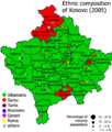
Kosovo ethnic 2005
-
-
 Helpful SVG file
 -
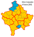 Guide for Ethnic


Article(s): Kosovo
Request: scales poorly, SVGify. -- Chris (クリス • フィッチ) (talk) 21:22, 17 February 2008 (UTC)
Graphist opinion:
- Someone to take this SVG, add names, and improve the background color of the both maps ? 220.135.4.212 (talk) 08:25, 16 March 2008 (UTC)
- Here's a rough guide line for the Ethnic map... Mangwanani (talk) 12:38, 16 March 2008 (UTC)
- The colors are better and brighter, they even match the flag, did you mean to do that? That's a great start! Chris (クリス • フィッチ) (talk) 19:15, 16 March 2008 (UTC)
- Didn't mean to match the flag but thought better colours were needed. Mangwanani (talk) 16:16, 17 March 2008 (UTC)
Vectorization of COA and Seal
-
COA Mozambique
-
 Seal of Barranquilla, There is an alternate version here

Article(s): Mozambique and others, Barranquilla
Request: SVG image. Thanks Mangwanani (talk) 19:21, 20 February 2008 (UTC)
Graphist opinion:
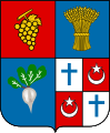
Several African COA
-
Botswana COA
-
 My bad attempt
 -
COA of Namibia
-
My attempt
-
 Swaziland COA
 -
 Shield already(?) SVG'd.
 -
Lesotho COA
-
Vectorised
-
Malawi COA
-
Seychelles COA
-
Zimbabwe COA
-
 Vectorised
 -
 Correct bird
 -
Does this help?
-
 Outline


Article(s): Botswana, Namibia, Swaziland, Lesotho, Malawi, Seychelles and respective sub-articles.
Request: SVG image. Thanks Mangwanani (talk) 19:24, 20 February 2008 (UTC)
Graphist opinion:
- Bostwana
After playing with Inkscape for the first time, here is my attempt at it... (Botswana) Mangwanani (talk) 15:46, 2 March 2008 (UTC)
- A part is black and should be red, can you fix it. (at the right of the blason, and in the hands of the right antilope ) 220.135.4.212 (talk) 12:06, 17 March 2008 (UTC)
- Partly fixed. I'm not doing too good on this one... Mangwanani (talk) 19:24, 26 March 2008 (UTC)
- Namibia
I'm having a go at Namibia — ₪₪ ch1902 ₪₪ 16:04, 16 March 2008 (UTC)
- OK, Namibia done. I matched the colours to the svg flag rather than the raster COA. — ₪₪ ch1902 ₪₪ 20:53, 16 March 2008 (UTC)
- Namibia looks great. Can we make the Welwitschia look more plant like rather than stringy? Mangwanani (talk) 21:13, 16 March 2008 (UTC)
- Ack sorry I didn't realise they were so stringy! Added the plant from the original COA. — ₪₪ ch1902 ₪₪ 23:30, 16 March 2008 (UTC)
- Yup, like it. Namibia done. Mangwanani (talk) 16:28, 18 March 2008 (UTC)
- Ack sorry I didn't realise they were so stringy! Added the plant from the original COA. — ₪₪ ch1902 ₪₪ 23:30, 16 March 2008 (UTC)
- Namibia looks great. Can we make the Welwitschia look more plant like rather than stringy? Mangwanani (talk) 21:13, 16 March 2008 (UTC)
- Zimbabwe
I dug out one of my old school books and found I had the Zimbabwe Coat of Arms there. Its a bad drawing done when I was small. Does this help for the SVG? Mangwanani (talk) 17:31, 16 March 2008 (UTC)
- Here's an SVG outline which can be worked on... Mangwanani (talk) 18:12, 16 March 2008 (UTC)
- I'd give it a try but I can't even tell what is on the floor in front of the shield :( — ₪₪ ch1902 ₪₪ 20:53, 16 March 2008 (UTC)
- From left to right - Wheat, cotton, corn. Mangwanani (talk) 21:11, 16 March 2008 (UTC)
- Well someone has vectorised the image. It is, however, not finished. The colours of the kudus aren't quite right, the words need a bullet between them, the wavy lines need to be blue and white, Great Zimbabwe needs more brick work, the gun isnt quite (see the bitmap and the pic from my school book) and the wreath should be green and gold. Additionally, the Zimbabwe bird is wrong. See Image:Zimbabwe Bird.svg for correct version. Mangwanani (talk) 18:32, 26 March 2008 (UTC)
- I have fixed the bird, waves and wreath. Does the shield look wonky to anyone else? Mangwanani (talk) 18:49, 26 March 2008 (UTC)
- Well someone has vectorised the image. It is, however, not finished. The colours of the kudus aren't quite right, the words need a bullet between them, the wavy lines need to be blue and white, Great Zimbabwe needs more brick work, the gun isnt quite (see the bitmap and the pic from my school book) and the wreath should be green and gold. Additionally, the Zimbabwe bird is wrong. See Image:Zimbabwe Bird.svg for correct version. Mangwanani (talk) 18:32, 26 March 2008 (UTC)
- From left to right - Wheat, cotton, corn. Mangwanani (talk) 21:11, 16 March 2008 (UTC)
- I'd give it a try but I can't even tell what is on the floor in front of the shield :( — ₪₪ ch1902 ₪₪ 20:53, 16 March 2008 (UTC)
- Lesotho
I've done Lesotho. It seems there was a typo on the scroll on the raster version, according to all other sources I could find the motto is "Khotso, Pula, Nala" not "Khoto, Pula, Nala". It's corrected on the vector version.
- Could you make the crocodile slightly more scaly as in the raster? Mangwanani (talk) 12:04, 27 March 2008 (UTC)
OBE Circlet
-
 OBE Circlet

Article(s): OBE
Request: Something is seriously wrong with this picture. Could something be done to make it look a bit better. :S Thanks Mangwanani (talk) 20:21, 21 February 2008 (UTC)
Graphist opinion: Actually, I think that's correct. The white shield in the center and the scroll beneath are both common parts of a coat of arms. The point of the picture is that the OBE circlet can be added to any coat of arms, so I don't think we need to do anything for this. — ʞɔıu 18:27, 10 March 2008 (UTC)
- I think his suggestion was vectory or similar: Viewing the image itself is quite jarring: The banner, etc. were obviously added to a overenlarged circle (Correct if wrong). 68.39.174.238 (talk) 03:38, 11 March 2008 (UTC)
- I don't know whether a vector would be better but the image is hugely pixellated. I have had a play myself but havn't got very far. Mangwanani (talk) 20:10, 14 March 2008 (UTC)
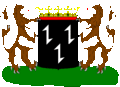
BSAC
-
 Southern Rhodesia BSAC flag
 -
 Mangwanani version
 -
 Fvasconcellos version, accepted by Mangwanani
 -
 BSAC COA
 -
 My attempt
 -
 To be fixed
 -
 Fixed?
 -
 Two for the price of one


.svg)
.svg)
Article(s): Several
Request: Vectorise flag and logo. Thanks Mangwanani (talk) 18:47, 22 February 2008 (UTC)
- What's the need of the full BSAC coat? Looking @ the flags shows only the lion-crest and "B. S. A. C.". 68.39.174.238 (talk) 04:15, 23 February 2008 (UTC)
- Eh? :S Mangwanani (talk) 17:15, 23 February 2008 (UTC)
- The defacement of the BSAC flag is clearly not the entire coat, but just the crest of it and some text. 68.39.174.238 (talk) 17:50, 23 February 2008 (UTC)
- Yeah, but my request was to vectorise the COA as well as the flag. Mangwanani (talk) 18:04, 23 February 2008 (UTC)
- The defacement of the BSAC flag is clearly not the entire coat, but just the crest of it and some text. 68.39.174.238 (talk) 17:50, 23 February 2008 (UTC)
- Eh? :S Mangwanani (talk) 17:15, 23 February 2008 (UTC)
Graphist opinion: Have attempted a trace of the crest... Mangwanani (talk) 15:23, 2 March 2008 (UTC)
- ...and now the flag. Mangwanani (talk) 19:16, 2 March 2008 (UTC)
- I think the thing under the lion is supposed to be more like a twisted, multicolored towel. 68.39.174.238 (talk) 20:17, 2 March 2008 (UTC)
- It is but I don't know how to do it...Mangwanani (talk) 16:26, 3 March 2008 (UTC)
- I've tweaked the flag a little. How's that? The lion looks amazing, by the way. Fvasconcellos (t·c) 21:03, 5 March 2008 (UTC)
- Thanks. I was quite impressed with the lion myself, even with my lack of experience. Your version of the flag is, not surprisingly, better than mine. Think we'll go for your version. Mangwanani (talk) 21:22, 5 March 2008 (UTC)
- I've tweaked the flag a little. How's that? The lion looks amazing, by the way. Fvasconcellos (t·c) 21:03, 5 March 2008 (UTC)
- It is but I don't know how to do it...Mangwanani (talk) 16:26, 3 March 2008 (UTC)
- I think the thing under the lion is supposed to be more like a twisted, multicolored towel. 68.39.174.238 (talk) 20:17, 2 March 2008 (UTC)
- Could you fix the above flag in the manner of the flag you made for the BSAC? ThanksMangwanani (talk) 17:19, 7 March 2008 (UTC)
- Sure. Aren't Governors' flags supposed to look like this? Fvasconcellos (t·c) 21:42, 7 March 2008 (UTC)
- Never mind. Flags of the World suggests this is the correct design. Fvasconcellos (t·c) 21:49, 7 March 2008 (UTC)
- And done. Managed to knock down the file size too. Fvasconcellos (t·c) 22:12, 7 March 2008 (UTC)
- I also threw in the 1951–1965 flag of the Governor, as described in FOTW. Fvasconcellos (t·c) 22:59, 7 March 2008 (UTC)
- As you say, thats what Flags of the World suggests. Have no idea whether the wreath should be added or not... They look great though. Thanks a million. What do you think about the BSAC crest? Mangwanani (talk) 17:32, 8 March 2008 (UTC)
- Never mind. Flags of the World suggests this is the correct design. Fvasconcellos (t·c) 21:49, 7 March 2008 (UTC)
- Sure. Aren't Governors' flags supposed to look like this? Fvasconcellos (t·c) 21:42, 7 March 2008 (UTC)
- There's some strange stuff on the left... and the background didn't show up correctly (Too light). Also, was it supposed to be in black and white? I thought most coats would have colors. 68.39.174.238 (talk) 18:39, 20 March 2008 (UTC)
- If you can find a BSAC COA in colour I would love to see it... Mangwanani (talk) 13:28, 25 March 2008 (UTC)
- http://www.fotw.us/Flags/zw-bsac.html#CoA 68.39.174.238 (talk) 19:36, 25 March 2008 (UTC)
- If you can find a BSAC COA in colour I would love to see it... Mangwanani (talk) 13:28, 25 March 2008 (UTC)
- There's some strange stuff on the left... and the background didn't show up correctly (Too light). Also, was it supposed to be in black and white? I thought most coats would have colors. 68.39.174.238 (talk) 18:39, 20 March 2008 (UTC)
East Anglia
-
Norwich COA
-
 Norwich SVG
 -
 Norfolk COA
 -
 My rather interesting attempt
 -
Suffolk COA
-
 Suffolk SVG
 -
 Shield


Article(s): Norwich, Norfolk, Suffolk
Request: SVG images. Thanks -- Mangwanani (talk) 19:12, 24 February 2008 (UTC)
Graphist opinion: Oh, why not. Norwich seems easy enough—I'll give it a go, although I can't for the life of me imagine why it's tagged as an unfree logo. Fvasconcellos (t·c) 13:30, 26 February 2008 (UTC)
- OK, Norwich done. How's that? The colors and strokes are a bit different from the JPG, of course, but it is a coat of arms—it could have been much different :) Fvasconcellos (t·c) 17:50, 29 February 2008 (UTC)
- No, that's wonderful! Thanks. How do the other two look? Are they possible? Mangwanani (talk) 18:36, 29 February 2008 (UTC)
- Have added my rather interesting attempt (first time on Inkscape) Mangwanani (talk) 19:35, 1 March 2008 (UTC)
- Hey, that's not bad at all! Was it a trace? Fvasconcellos (t·c) 00:37, 2 March 2008 (UTC)
- Yup. Not doing very well with it. Starting to realise how hard it really is.... Mangwanani (talk) 12:04, 2 March 2008 (UTC)
- Have worked on it a bit. From looking around, the feathers seem to be those of the Prince of Wales so have added them... Mangwanani (talk) 15:17, 2 March 2008 (UTC)
- Yep, that's it. There's only one feather on each side, though. I've been working on a version of my own on the side :D Fvasconcellos (t·c) 15:54, 2 March 2008 (UTC)
- That's fine. Yours will be better as you have more experience. If I can't trace it I havn't got a clue how to do it at all... Mangwanani (talk) 16:08, 2 March 2008 (UTC)
- It's not that hard once you get the hang of it; the learning curve is quite steep, that's all :) The Suffolk coat is nearly done. Fvasconcellos (t·c) 00:32, 3 March 2008 (UTC)
- That's fine. Yours will be better as you have more experience. If I can't trace it I havn't got a clue how to do it at all... Mangwanani (talk) 16:08, 2 March 2008 (UTC)
- Yep, that's it. There's only one feather on each side, though. I've been working on a version of my own on the side :D Fvasconcellos (t·c) 15:54, 2 March 2008 (UTC)
- Have worked on it a bit. From looking around, the feathers seem to be those of the Prince of Wales so have added them... Mangwanani (talk) 15:17, 2 March 2008 (UTC)
- Yup. Not doing very well with it. Starting to realise how hard it really is.... Mangwanani (talk) 12:04, 2 March 2008 (UTC)
- Hey, that's not bad at all! Was it a trace? Fvasconcellos (t·c) 00:37, 2 March 2008 (UTC)
- Have added my rather interesting attempt (first time on Inkscape) Mangwanani (talk) 19:35, 1 March 2008 (UTC)
- No, that's wonderful! Thanks. How do the other two look? Are they possible? Mangwanani (talk) 18:36, 29 February 2008 (UTC)
- OK, Suffolk done. Tell me what you think; again, it's somewhat different from the JPG, and it's quite a large file (messy code :P), but I hope it's adequate. Fvasconcellos (t·c) 14:03, 3 March 2008 (UTC)
- It's quite different to the jpg. The helmet's colours are also a bit off... Mangwanani (talk) 18:41, 3 March 2008 (UTC)
- Well, that's an easy fix. It looks quite different because it's also based on another source (one I find more reliable, as it includes the blazon and the PNG had no specified source at all). The mantling does look quite different, but it's not inaccurate; there's really no hard and fast rule. Would you like it to be closer to that of the PNG? Fvasconcellos (t·c) 22:44, 3 March 2008 (UTC)
- I can't remember which is the proper one anymore. I'll do some research and see if I can find something... Mangwanani (talk) 18:41, 6 March 2008 (UTC)
- Well, that's an easy fix. It looks quite different because it's also based on another source (one I find more reliable, as it includes the blazon and the PNG had no specified source at all). The mantling does look quite different, but it's not inaccurate; there's really no hard and fast rule. Would you like it to be closer to that of the PNG? Fvasconcellos (t·c) 22:44, 3 March 2008 (UTC)
- It's quite different to the jpg. The helmet's colours are also a bit off... Mangwanani (talk) 18:41, 3 March 2008 (UTC)
Not getting further with the Suffolk, however, how does the Norfolk one look now? Mangwanani (talk) 20:08, 14 March 2008 (UTC)
- Not done, but doable; will try to finish it over the next couple of days. Would you like anything changed in the Suffolk arms? Do bear in mind I deliberately made it different, as coats of arms are basically interpretations of their blazon done with a good deal of artistic license :) The shade of blue in particular looks different from the PNG, but it's the "azure" used in most coats of arms on the Commons. Fvasconcellos (t·c) 21:00, 14 March 2008 (UTC)
- Suffolk's good enough and as I can't remember nor find the correct version we'll go with your vector version. If someone says elsewise then we can change it. Thanks Mangwanani (talk) 17:19, 15 March 2008 (UTC)
- The road signs when driving through Suffolk simply say: Welcome to Suffolk and have a picture of just the shield. No other arms...
- Suffolk's good enough and as I can't remember nor find the correct version we'll go with your vector version. If someone says elsewise then we can change it. Thanks Mangwanani (talk) 17:19, 15 March 2008 (UTC)
Portuguese Forest
I'm sorry, my english is fairly poor, I prefer to write my demand also in French
-
 1
1 -
 2
2


Article(s):
Request: Hello, I would like to know if it were possible to make three charts, one with the rate arborisation by city and other, the various types species (trees) in the areas (in Portugal) and the last with all the zones left in fume.
The charts will be in French, Portuguese and English, thank you, Cancelos (talk) 11:20, 27 February 2008 (UTC)
Bonjour, je voudrais savoir si il était possible de faire trois cartes, une avec le taux d'arborisation par commune et l'autre, les différents types d'espèces (d'arbres) dans les régions (au Portugal) et la dernière avec toutes les zones partit en fumées.
Les cartes seront en français, Portugais et Anglais, merci, Cancelos (talk) 11:20, 27 February 2008 (UTC)
Graphist opinion:
Badr campaign
-
Badr campaign
-
 Vector attempt

Article(s):
Request: I'd like to see this converted using a better quality map of Arabia that we have on Wikipedia into an SVG. This would remove a tenuous fair use and we could use that image as a source for the locations. -- gren グレン 00:03, 27 February 2008 (UTC)
- I think I might give this a shot, but what you do mean by "better quality map of Arabia" ? A higher resolution? A more detailed map? better representation using icons? Λua∫Wise (Operibus anteire) 17:58, 28 February 2008 (UTC)
- Such as this map from this page (US gov). Taking a more detailed map like that using Mecca as a basis point if it would be possible to at least make a higher resolution version (vectorizing if you want...) I don't care about color scheme or whatnot as long as it's usable. I think that map looks decen it's just small. The nice thing about SVG would be it would make it relatively easy to change the color scheme to match other maps from the page which in an ideal article would have some coordination. gren グレン 08:09, 7 March 2008 (UTC)
Graphist opinion: I'm not entirely sure on whether this will help, but I had a go at vectorizing the image. I couldn't get the text to bend because Wikimedia doesn't support it currently, and the spacing doesn't work also. I've released it under GFDL/CC licenses. Tom (talk) 19:26, 21 March 2008 (UTC)
- It sounds like you need to convert the bendy text into a path on your side before you upload it.— ʞɔıu 02:33, 22 March 2008 (UTC)
Norwich City FC
-
Norwich City FC coa
-
My SVG
Article(s): Norwich City F.C.
Request: SVG image. Its a featured article - could do with a decent blazon. Thanks -- Mangwanani (talk) 19:35, 27 February 2008 (UTC)
Graphist opinion: My attempt. Lion not quite right... Mangwanani (talk) 14:38, 2 March 2008 (UTC)
- As nice as it looks, this is a logo—I don't think it could have been vectorized; yours is a derivative work :( We'd have to find a vector version that's already available, such as in a club PDF. Fvasconcellos (t·c) 15:13, 2 March 2008 (UTC)
- Oh. Mangwanani (talk) 15:15, 2 March 2008 (UTC)
- I know you have good intentions Mangwanani, but you really need to watch out for copyright now, after your previous warnings. You had a final warning for copyright infringement so don't hesitate to ask questions beforehand at Wikipedia:Image copyright help desk. Jackaranga (talk) 23:26, 9 March 2008 (UTC)
Takeda Shingen
-
 Takeda Shingen
 -
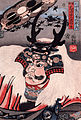 Yellow removed


Article(s): Takeda Shingen Kōyō Gunkan
Request: There's something odd about this image when you look at it at full resolution - I realise there's probably some paper texture there, but the chromatics look a little off, like there's some chromatic aberration. What do you think? -- Shoemaker's Holiday (talk) 05:23, 1 March 2008 (UTC)
Graphist opinion: There is indeed something going on. I really don't know what it is either. Perhaps the original painting is on canvas, and that's whats showing through. Removing the yellows gives this, (although I'm not sure Utagawa Kuniyoshi would consider it an improvement.) Sagredo⊙☿♀♁♂♃♄ 01:40, 6 March 2008 (UTC)
- Hmm. Not sure - some of the yellows are clearly intentional - maybe we could combine the images? By the way, I was fiddling about with a half-toned image, and think it might be badly-fixed half-toning, as I got a similar effect. Shoemaker's Holiday (talk) 16:37, 9 March 2008 (UTC)
Philmont Scout Ranch
Article(s): Philmont Scout Ranch
Request: can anything be done to just plain make a better map? -- Chris (クリス • フィッチ) (talk) 17:26, 1 March 2008 (UTC)
Graphist opinion: I tried to find a map on google, but turned up nothing. If you find any image, non-free or not, with sufficient detail then an svg can be made from it. But the one you posted is a tiny thumbnail, nothing can be done there, sorry. XcepticZP (talk) 20:16, 2 March 2008 (UTC)
- Ok, found a good place... [[4]]. Those maps just need to be stitched together and voila. OR, a general svg can be made of the whole ranch. XcepticZP (talk) 20:26, 2 March 2008 (UTC)
- I tried stitching them together manually. They don't align, courtesy of bad scanning I'm guessing. XcepticZP (talk) 20:33, 2 March 2008 (UTC)
- Here's a better location. Sadly, I don't have the tools to do the stitching. Xceptic, could you try again? Also, note that if that doesn't work, we can probably get the relevant maps directly from the LibreMap project. -- ʞɔıu 22:15, 9 March 2008 (UTC)
- I tried stitching them together manually. They don't align, courtesy of bad scanning I'm guessing. XcepticZP (talk) 20:33, 2 March 2008 (UTC)
- Please be careful of copyright. Jackaranga (talk) 23:18, 9 March 2008 (UTC)
- So long as we're using the USGS maps (which all of the ones mentioned here are), they're public domain. But yeah, we should be careful of that if we're using a BSA-published map, or something. -- ʞɔıu 06:07, 10 March 2008 (UTC)
- If you need help using Public Domain cartographic information maybe I can help. You can get free elevation data for the USA down to a precision of 30m (I think even 10 for some parts but I have never used this). Jackaranga (talk) 14:36, 10 March 2008 (UTC)
US state seals (easy?)
-
Delaware seal
-
 Delaware flag

-
Connecticut seal
-
 Connecticut flag

-
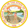 Minnesota seal
 -
 Minnesota flag
 -
 from mn.gov
.png)


Article(s): Dozends
Request: Can the seals of each respective state (which are requested for deletion BTW, except Connecticut) be vectorized, the elements of each seal can be found in the flag of the respective state, which are all vectorized. Thanks. --escondites 13:55, 3 March 2008 (UTC)
Minnesota has a large version on their website which should solve that one. Apparently, they're picky about how it's done. [5] Sagredo⊙☿♀♁♂♃♄ 19:30, 3 March 2008 (UTC)
Connecticut is more interesting. [6]
So is Delaware. [7] Sagredo⊙☿♀♁♂♃♄ 19:44, 3 March 2008 (UTC)
- I see the problem with MN. But what's wrong with the seals of CT and DE? --ANONYMOUS 12:41, 4 March 2008 (UTC)
Connecticut
Reproduction of State Arms and Seal: Please be advised that permission is required to reproduce the state arms and seal under Section 3-106a of the Connecticut General Statutes:
Sec. 3-106a. Reproduction of arms and seal. The official arms and seal of the State of Connecticut, or imitation thereof, whether as a reproduction, imprint or facsimile, shall be made and used only under the direction and with the approval of the Secretary of the State for purposes specifically authorized by the constitution and laws of the state or related directly or indirectly to the official business of the state, provided the secretary may in his judgment approve other reproductions of said arms or seal of the state for memorials and for purposes he considers educational.
To request permission to reproduce the "state arms and/or seal", please write to Connecticut Secretary of the State, Legislation and Elections Administration Division, 30 Trinity Street, Hartford, CT 06106 http://www.kids.ct.gov/kids/cwp/view.asp?a=2731&q=314190
Delaware
§ 2306. Use of Great Seal and Privy Seal; restrictions; reproduction of seals and other insignia subject to approval; penalties.
(a) The Secretary of State as the keeper of the Great Seal and the Privy Seal shall restrict the use of the Great Seal and the Privy Seal to documents, records, publications and other business transactions of the State.
(b) The seals, coat of arms, state flag, emblems and other insignia of this State may be used, reproduced or published with the written consent of the Secretary of State, provided that use is restricted to educational uses such as encyclopedias, reference books, historical publications or similar uses which do not involve advertising or other means of personal gain or which abrogate the rights of the citizenry of the State. http://delcode.delaware.gov/title29/c023/index.shtml#P64_2169
They will need to be contacted, in writing, and I would guess their response will be to send a rather low resolution image.
I see no problem with using the large png from Minnesota. [8] Sagredo⊙☿♀♁♂♃♄ 19:59, 4 March 2008 (UTC)
- Didn't we go through the same thing with all the Federal agency logos (EG. CIA, FBI, DoD, etc.)? They say "Don't reproduce us", but there's a exemption in the law that covers us? 68.39.174.238 (talk) 20:34, 4 March 2008 (UTC)
- Any art or text produced by the federal government, federal agencies, or their employees is in the Public Domain (although not necessarily available to the public for privacy or security reasons), works produced by State governments are not necessarily in the Public Domain, it depends on the State. At least this is what I believe to be the case. However on the commons they don't seem to care, there are insignia and flags from all over the world marked as Public Domain, even though there is no legal basis for the claim. It seems acceptable to just use GFDL Self, I have tried to get these deleted before but people thought I was trolling, and turned a blind eye, so it's probably OK. Take Image:Flag of Kosovo.svg for example, the claim that the flag of Kosovo was invented by a random person on the internet is laughable, yet nobody cares. Just do the same for these seals. Jackaranga (talk) 02:16, 5 March 2008 (UTC)
- Seals are a special case as they can be used to deceive people that a person or organization is in some related to the government. Therefore many state regulate their use. A federal Law exempting educatioinal use of federal symbols is unlikely to apply to the states. It's a matter of going through one at a time. I'm find some that states that post large images for the public to use, and others where it is a felony to reproduce the seal with authorization. Some carefully describe the colors, and others seem not to care. The incomplete list is here. You are welcome to check my work or to contribute.
- Eventually we arrive at a list of a dozen or so states that must be contacted. Get it into a nice form with address and so forth. Make the amount of work left minimal. Then give it to the dozen or so real people who work for WP. Hopefully it will come back with images we are allowed to use. I don't think any state will refuse, but I suspect that many of these will supply a low resolution image, and not allow anything better.
- If done improperly we could have a deletionist find one without a required permission and mindlessly nominate all for deletion. The list isn't too far away from making the proper requests easy to make. Sagredo⊙☿♀♁♂♃♄ 07:40, 5 March 2008 (UTC)
- Any art or text produced by the federal government, federal agencies, or their employees is in the Public Domain (although not necessarily available to the public for privacy or security reasons), works produced by State governments are not necessarily in the Public Domain, it depends on the State. At least this is what I believe to be the case. However on the commons they don't seem to care, there are insignia and flags from all over the world marked as Public Domain, even though there is no legal basis for the claim. It seems acceptable to just use GFDL Self, I have tried to get these deleted before but people thought I was trolling, and turned a blind eye, so it's probably OK. Take Image:Flag of Kosovo.svg for example, the claim that the flag of Kosovo was invented by a random person on the internet is laughable, yet nobody cares. Just do the same for these seals. Jackaranga (talk) 02:16, 5 March 2008 (UTC)
- I'm guessing that's "felony without authorization". 68.39.174.238 (talk) 15:15, 5 March 2008 (UTC) PS. New York's appears to be the flag, but without the crown: Seal of New York.
- I've got most of the work done. There are 13 States that should be contacted. I still have a couple of territories to check out. Then make a list of addresses and such and send it to someone like User:Angela. Unless someone has a better idea. Sagredo⊙☿♀♁♂♃♄ 20:44, 5 March 2008 (UTC)
- I'm guessing that's "felony without authorization". 68.39.174.238 (talk) 15:15, 5 March 2008 (UTC) PS. New York's appears to be the flag, but without the crown: Seal of New York.
- Suborn some state legislat[or/ure]s to suppress these provisions? 68.39.174.238 (talk) 01:30, 7 March 2008 (UTC)
- Pennsylvania isn't on the banlist of lame protectionist states. 68.39.174.238 (talk) 18:36, 20 March 2008 (UTC)
List of Quebec Provincial Highways
-
An example image
-
Another example.
Article(s): List_of_Quebec_provincial_highways
Request: -- There are hundreds of these to be converted to svg. Perhaps there is an easy way to do this? Any help appreciated, thanks :) 137.215.6.50 (talk) 17:19, 3 March 2008 (UTC)
Graphist opinion: Are all these really necessary? It seems to me that just having one or two as examples would be enough. Apart from that though, having a base SVG without a number and then using a template something like Template:GBthumb to overlay a number would be better both in terms of number of images and ease of use on pages. Time3000 (talk) 17:32, 3 March 2008 (UTC)
- Hopefully, the wiki software supports the font which is used, we can then create a script to make all the files, but we will need a bot flag to upload them all or it will take forever, and may cause problems for a user if he were to upload them without a flag. Jackaranga (talk) 01:50, 4 March 2008 (UTC)
- I will outline my plan hopefully it will work:
- 1.Create the first SVG (download the correct font) (leave the numbers as text)
- 2.Write a script to create all the files (incrementing the number in each one)
- 3.Convert the number in each file to a path using the Inkscape command line (because Mediawiki doesn't have the correct font installed for the SVG rendering)
- 4. Use an upload bot to upload them all to the commons. Jackaranga (talk) 20:33, 6 March 2008 (UTC)
- Any chance of that script being able to center the text object on the shield as well? :D Incrementing the numbers will invariably make the text asymmetrical from one file to another if it's not centered. Fvasconcellos (t·c) 20:42, 6 March 2008 (UTC)
- In Inkscape when you choose "centre lines" in the "text and font" properties window, the text stays centred, like in Word when you use the centre tool. Jackaranga (talk) 20:50, 6 March 2008 (UTC)
- Yes, I know; it's just that I've gotten some sketchy results in the past from using text properties. Oh well, maybe it was just me. Fvasconcellos (t·c) 14:23, 7 March 2008 (UTC)
- Ok, I've started the svg. After it is done, we'll continue as you suggested. XcepticZP (talk) 13:44, 7 March 2008 (UTC)
- Here are a couple of prototypes:
-
png
-
png
-
 Hand made (uploaded by a bot)
 -
 made using a process a bot can reproduce ((uploaded by a bot))


- Finished ! Still need to replace the pngs in the articles though. The full list is at commons:User:File Upload Bot (Jackaranga)/Quebec Highway
- That's remarkable. Nice work :) Fvasconcellos (t·c) 00:32, 12 March 2008 (UTC)
Evolution-tasks.png
-
 The original
 -
 SVG-ified


Article(s): 100's of different places. Lots of templates and talk pages.
Request: -- Could this be SVG-ified? It looks really small, but that doesn't mean a new one can't be made from scratch. XcepticZP (talk) 19:57, 7 March 2008 (UTC)
Graphist opinion:
- My best shot:
 . Tell me if anything needs to be changed. Tom (talk) 19:39, 21 March 2008 (UTC)
- IMO adding the shadow of the pencil would make it better, and that doesn't seem to hard to do. Pro bug catcher (talk • contribs). 22:00, 21 March 2008 (UTC)
- My best shot:
- What about the shadow of the pencil? I also like the colour of the old board better and also the 3D design of the clip, apparent in the old one. Can you replicate those? ----Seans Potato Business 21:33, 24 March 2008 (UTC)
Australia Day Fireworks

Article(s): Wikipedia:WikiProject Holidays
Request: sharpen and Wikify if can -- Chris (クリス • フィッチ) (talk) 00:07, 8 March 2008 (UTC)
Graphist opinion: Cropped everything except the main firework explosion. Fixed color and brightness. Reduced blur slightly. Reduced jpg file size with no loss in quality. I think it looks much better now. But if someone is willing, a SVG firework explosion could be designed as a replacement for this image. XcepticZP (talk) 18:35, 8 March 2008 (UTC)
- I'm intrigued, explain? :) Chris (クリス • フィッチ) (talk) 19:26, 8 March 2008 (UTC)
- Just make an svg that looks like an explosion of fireworks. It could work. XcepticZP (talk) 19:01, 10 March 2008 (UTC)
- I really like the ethereal quality of this image now that you've modified it. But since its status on Commons is up for grabs, that may not be a bad idea. Please proceed. Chris (クリス • フィッチ) (talk) 01:41, 11 March 2008 (UTC)
- Just make an svg that looks like an explosion of fireworks. It could work. XcepticZP (talk) 19:01, 10 March 2008 (UTC)
Organization of the Scout Movement of Kazakhstan
-
the eagle on the badge should be the one from the Scout flag (second image), not the national flag
-
-
 use the blue from this for the bottom stripe
 -
use the purple from this for the top stripe


Article(s): Organization of the Scout Movement of Kazakhstan
Request: SVGify all three, also, the eagle on the badge should be the one from the Scout flag (second image), not the national flag. The badge on the Scout flag is more correct in color and proportions. -- Chris (クリス • フィッチ) (talk) 00:07, 8 March 2008 (UTC)
- If that is not possible, fix png to match each other. Chris (クリス • フィッチ) (talk) 08:14, 9 March 2008 (UTC)
Graphist opinion:
- We can't make derivative works of copyrighted material ! Please do not make this kind of request, they will land other users in trouble for copyright violation. If you want an SVG of a non-free logo, you have to find a vector version available already, for example in a PDF document. Jackaranga (talk) 23:35, 9 March 2008 (UTC)
- There are at present four other logos with requests on this page. Have you nothing better to do with your time than to screed copyvio paranoia? Chris (クリス • フィッチ) (talk) 23:48, 9 March 2008 (UTC)
- Please everyone keep calm. I think we are all trying our best to stay within law on copyrighted material. I guess I don't fully understand what I'm allowed to do and not. If I redraw a logo as a bitmap is this acceptable? We have had quite a number of requests come through the graphics lab with respect to redrawing or vectoring copyrighted logos and my understanding is that it is OK. Anyway, strictly speaking the graphics lab works only on freely licensed images, as stated on the front page. Perhaps we can move this discussion to the talk page, and maybe Jackaranga can cite some previous discussions on the issue. Jeff Dahl (Talk • contribs) 00:32, 10 March 2008 (UTC)
- Two cents? It is perfectly fine to upload extant vector versions of unfree images. When an unfree image is extracted from a PDF or converted to SVG from EPS or whatever, we are simply processing it. Modifying the content would constitute creating a derivative work, unless modifications were so great as to damage original accuracy and effectively make the new image worthless as a replacement. Fair use doctrine (or whatever you want to call it) protects the right to reproduce a copyrighted work. I do not recreate or vectorize copyrighted images because it goes against my personal principles and my personal set of ethics, if you will. IANAL, and this should perhaps be taken to the Image copyright help desk. Fvasconcellos* (t·c) 01:16, 10 March 2008 (UTC)
- I want to thank all of you guys who have saved all of these Scout emblems and made them far better. There is not a Scout association in the world that is going to fault you for improving the graphic representation of their public face. They are not businesses, they are public service organizations, and the ones I have asked of you have been historic ones, or from underdeveloped places that have no website (145 countries) or their information is published in obscure non-English sources. You guys have my constant thanks. Chris (クリス • フィッチ) (talk) 04:41, 10 March 2008 (UTC)
- What is the difference between making an exact vector version of a logo and taking the vector version from a PDF apart from the hassle of finding a PDF? Mangwanani (talk) 19:07, 11 March 2008 (UTC)
iPod 5G vs. 6G image
-
5G and 6G iPod Classics side-by-side
-
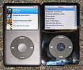 First image, perspective corrected + crop
 -
different version of the pic, equally as bad as the first.

Article(s):IPod classic
Request: Please remove the background from the image and rotate the iPods so that they are vertically aligned. It Is Me Here (talk) 07:42, 14 March 2008 (UTC)
Graphist opinion: When you say rotate so that they are vertically aligned do you want them straigtened up or put one on top of the other? I'm a little confused here. Mangwanani (talk) 17:13, 15 March 2008 (UTC)
- Just funny sounding language. As far as I understand his words, I think he wants you to just rotate the individual ipods so that the edges of the ipods are at right angles to the edges of the image. XcepticZP (talk) 20:38, 15 March 2008 (UTC)
- Thats what I wondered but wasnt sure... Mangwanani (talk) 20:41, 15 March 2008 (UTC)
- That's what I meant, yeah - it would just look neater if the iPods were vertical (i.e. at 90 degrees to the bottom edge of the picture). It Is Me Here (talk) 22:20, 20 March 2008 (UTC)
- This could also use some perspective correction. It's certainly doable, but removing the background will make the picture look wonky. Friendly note to photographer—if you had something white lying around to cover the carpet with, that would have made things a whole lot easier :) Fvasconcellos (t·c) 21:11, 25 March 2008 (UTC)
- OK, here's an attempt, with the original background (but cropped closer to the iPods). Fvasconcellos* (t·c) 23:13, 25 March 2008 (UTC)
- This could also use some perspective correction. It's certainly doable, but removing the background will make the picture look wonky. Friendly note to photographer—if you had something white lying around to cover the carpet with, that would have made things a whole lot easier :) Fvasconcellos (t·c) 21:11, 25 March 2008 (UTC)
- That's what I meant, yeah - it would just look neater if the iPods were vertical (i.e. at 90 degrees to the bottom edge of the picture). It Is Me Here (talk) 22:20, 20 March 2008 (UTC)
- Thats what I wondered but wasnt sure... Mangwanani (talk) 20:41, 15 March 2008 (UTC)
Wikipedia
-
 Screenshot of Wikipedia portal

Article(s): Wikipedia
Request: The screenshot of the portal be SVGfied. Apart from that the Wikipedia Logo of the planet as a giant puzzle should be a seperate image & be svgfied as well. -- [[User:Shirishag75|Shirishag75]] (talk) 02:07, 16 March 2008 (UTC)
Graphist opinion: I disagree, screenshots aren't the sort of thing that SVG makes sense for. I think this should be left as a png.— ʞɔıu 07:19, 16 March 2008 (UTC)
- Idem. No need. That's like vectorised a picture : no comparative gain.
- A solution may be to simply copy the HTML code of the page into a SVG. I never tried, but I think it's possble. 220.135.4.212 (talk) 07:54, 16 March 2008 (UTC)
- This should be kept in png. There is no reason to convert it to svg.--Henrikb4 (talk) 13:49, 25 March 2008 (UTC)
Pioneer Column
-
 Pioneer Column

Article(s): Pioneer Column
Request: Get rid of splodgy bits and possibly lighten for deail. Thanks-- Mangwanani (talk) 19:35, 16 March 2008 (UTC)
Graphist opinion: (neat image, I wonder why the rugby shirts?) Chris (クリス • フィッチ) (talk) 19:43, 16 March 2008 (UTC)
- If you look closely, it's actually the decoration on their uniform, á là the typical uniform of Hussars.
M*A*S*H sign

Article(s): Wikipedia:WikiProject M*A*S*H
Request: free-use graphic version of this for the new Wikipedia:WikiProject M*A*S*H -- Chris (クリス • フィッチ) (talk) 04:44, 18 March 2008 (UTC)
- I don't get the request: According to the image page, it is tagged PD. Is this incorrect? 68.39.174.238 (talk) 18:03, 21 March 2008 (UTC)
- The photo itself may be public domain, but because the subject is someone else's creative work, I do not know if the Wikipedia:WikiProject M*A*S*H will get in trouble for using it on templates. My request is for a graphic representation of the sign to be made. If I had any skills like you guys (I don't), it would strike me as kind of fun.
- Meanwhile, can the photo itself also be brightened for detail? Chris (クリス • フィッチ) (talk) 00:18, 22 March 2008 (UTC)
Graphist opinion:
Urania riphaeus engraving
-

-
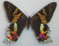 topside to give an idea of the real colors
 -
 underside to give an idea of the real colors


Article(s): Chrysiridia rhipheus
Request: The one there now is from [9], I modified it myself. But [10] is a source that could be used to replace the image. Or better yet (this is why I'm asking here) take the image from here [11] (First result with google search "Uranie riphée" for me), arrange the colors, remove the "new" writing, and upload the result. Pro bug catcher (talk • contribs). 15:53, 18 March 2008 (UTC) See also In Google Books. Pro bug catcher (talk • contribs). 21:30, 22 March 2008 (UTC)
Pinkerton
-

-
 Went back to LoC, found higher-resolution copy, worked from that.
 -
 Update, started to remove string, but have flu and wasn't able to finish yet.


Article(s): Pinkerton National Detective Agency
Request: rotate to straight, trim, lighten for detail -- Chris (クリス • フィッチ) (talk) 06:29, 19 March 2008 (UTC)
Graphist opinion: I've had a go. There's some oddites - like that string - that made this image a bit awkward. I had to selectively remove some highlights, and don't think this end result is perfect. I found the levels adjustment a little awkward because the sky kept blowing out whenever I tried to fix the shadowed lower part of the picture. Eh, well. This'll do for tonight. It's actually slightly trapezoidal [or wedge-shaped], so it cannot be made perfectly straight - this isn't uncommon for Victorian engravings - but I tried to compromise. Shoemaker's Holiday (talk) 22:37, 21 March 2008 (UTC)
- That is great and I really appreciate it! Can anyone help with those adjustment levels? Thanks! Chris (クリス • フィッチ) (talk) 00:20, 22 March 2008 (UTC)
- Just a warning: The photograph is very very slightly blurred. Not enough to matter in normal use, but enough that fine details are just a little lighter and more "spread out" than they should be, meaning they could easily be lost or damaged unless any levels adjustment from this point on is extremely careful, and at the least, makes use of masking to protect the more delicate areas. I saved a unadjusted copy, by the way, so if you think this version is too dark, it's not too hard to go back and tweak some more. Shoemaker's Holiday (talk) 00:47, 22 March 2008 (UTC)
- Saw it on a better monitor, the clarity is good, so you just want to go after that string? Chris (クリス • フィッチ) (talk) 04:31, 25 March 2008 (UTC)
- Pretty much. =) Shoemaker's Holiday (talk) 10:25, 25 March 2008 (UTC)
Pennſylvanian state logo
-
 Central shield and eagle crest from here.
 -
 Traced SVG


Articels: Many, including Seal of Pennsylvania
Request: SVGify the seal 68.39.174.238 (talk) 00:14, 20 March 2008 (UTC)
Oppinion: How does that work? I wasn't sure how to incorporate the flag part (specific part wanted?), if there is I'll fix it. §tepshep • ¡Talk to me! 02:03, 20 March 2008 (UTC)
No, I use VectorMagic to edit the bitmap, then make it SVG, I pop it into InkScape and make it transparent. It takes all of 15 minutes to get right if anything gets truly messed up. §tepshep • ¡Talk to me! 17:45, 20 March 2008 (UTC)
- It seems to break down the detail though: For one, the ships rigging becomes sortof a blurred blob. 68.39.174.238 (talk) 03:08, 21 March 2008 (UTC)
- And what I meant with the flag was that the ship, plow and grain were already vectorized on the flag, just in a different shaped shield. Same with the eagle. 68.39.174.238 (talk) 03:09, 21 March 2008 (UTC)
Never said you had to use it, just thought I'd offer some help. No harm done? §tepshep • ¡Talk to me! 04:06, 21 March 2008 (UTC)
- Nono, it's fine. If the flag can't be used or noone else does, then your version is still good enough to be used in place of the raster'd seal. 68.39.174.238 (talk) 18:01, 21 March 2008 (UTC)
Range map
-
 Range of Song Thrush.

Article(s): Song_Thrush
Request: I don't know if a GIF is appropriate. → Pepper / ?
Graphist opinion: I'll take this one. That's one loooow resolution map you got there.— ʞɔıu 09:09, 23 March 2008 (UTC)
- Man, the lack of resolution in this map is really frustrating, and it's not sourced. Also, I have found information online that says that the Song Thrush is quite well-established in Australia and New Zealand. I'm wondering if we shouldn't just ditch this map altogether and wait for someone to come up with something more accurate.— ʞɔıu 07:22, 27 March 2008 (UTC)
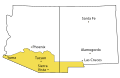
Arizona Territory map
-

-
 might be useful --~~~~
 -
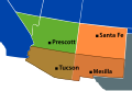 What do you think, 68?


Article(s):Arizona Territory (CSA)
Request: Wow, this map really needs some help. Someone should really SVGify it.— ʞɔıu 08:41, 21 March 2008 (UTC)
- I request that if you do, you use better colors. 68.39.174.238 (talk) 18:00, 21 March 2008 (UTC)
- Aye Aye.— ʞɔıu 02:23, 22 March 2008 (UTC)
Graphist opinion: Don't mind if I do. :-) — ʞɔıu 08:41, 21 March 2008 (UTC)
- OK, I've got something put together. What do you guys think? Are these colors OK? I wish I knew how to crop in Inkscape…— ʞɔıu 08:53, 23 March 2008 (UTC)
- Basically two ways—you can use a clipping path (create a crop-sized rectangle, place above the paths you'd like to crop, select all, do
Object > Clip > Set) or Boolean intersection (create a crop-sized rectangle, place above the paths you'd like to crop, select all, doPath > Intersection, repeat until all paths are cropped). The latter method is far more complicated, but can produce smaller file sizes in some cases. Fvasconcellos (t·c) 14:19, 23 March 2008 (UTC)- Aaah, Intersection! Of course! Thanks for the pointer, Fvasconsellos.— ʞɔıu 20:12, 23 March 2008 (UTC)
- Basically two ways—you can use a clipping path (create a crop-sized rectangle, place above the paths you'd like to crop, select all, do
The borders seem jagged for some reason (May just be me), also Oklahoma was not a state then. I would try and get the other territories/states (KS, CO, UT & NV) borders correct for whatever point in time this is supposed to be at (IE. Drop the "Modern Nevada border" part) (Advice only, since this isn't my request). 68.39.174.238 (talk) 21:15, 23 March 2008 (UTC)
More Algerian coats of arms (11)


- SVG versions
-
 Mondovi
 -
 Beni Mered
 -
 El Kerma
 -
 Bouzaréah
 -
 Béni Saf
 -
 Biskra
 -
 Béjaïa
 -
 Mercier-Lacome
 -
 Touggourt
 -
 Boufarik
 -
 Algiers
.svg)
.svg)
.svg)
.svg)
.svg)
.svg)
.svg)
.svg)
.svg)
.svg)
.svg)
Article(s): Touggourt, Dréan, Bouzaréah, Béjaïa, Boufarik, Biskra, Béni Saf, Algiers... etc
Request:Please make SVG coats of arms for the following cities in Algeria (PD) using the ones that can be seen on these sites. The elements shown here might be useful (more such elements can be found in the French Wiki) -- ANONYMOUSPUSSY 10:56, 21 March 2008 (UTC):
- Touggourt
- Dréan/Mondovi
- Mercier-Lacome/Sfizel
- Bouzaréah
- Béjaïa/Bougie
- Biskra
- Boufarik
- Béni Saf
- Beni Mered
- Valmy/El Kerma
- Algiers
Graphist opinion: Three completed ones below above :) — ₪₪ ch1902 ₪₪ 17:37, 21 March 2008 (UTC)
That country has the most bizzare coats. However they are better done than most of my countries'... 68.39.174.238 (talk) 21:10, 23 March 2008 (UTC)
Dark quenching to SVG
-
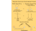 Dark quenching mechanisms
 -
 SVG
SVG


Article(s): Dark quencher
Request: Perhaps this can be made into a clearer SVG with an improved colour-scheme. Instead of vs. vs. vs. all the way down, perhaps a nice thin blue line or something... maybe just blank space. -- --Seans Potato Business 14:59, 21 March 2008 (UTC)
Graphist opinion:Here is a vector version. The label "quenched probe" seems misleading though, because once the probe is separated from the quencher it is no longer quenched. Please let me know if this is satisfactory, it probably could be improved but I would like input on what to do. Also need to convert the text to paths, which I will do on the next update. Jeff Dahl (Talk • contribs) 21:00, 24 March 2008 (UTC)
- Thanks. I think the diagram may have been poorly thought out to begin with. I think that perhaps what the author was trying to convey was that the quenched probe is added to the target and then cleaved by the exonuclease activity of Taq DNA polymerase.
- A couple of other comments; I think it should be 'Quenched probe' and not 'Quenched probe' and perhaps the other phrases ought to begin also with capital letters. Also, the arrows for R* to R appear to be in superscript and I think regular would be easier to read. Thanks again --Seans Potato Business 21:17, 24 March 2008 (UTC)
- I think the superscript problem is caused by the text not being converted to path, once I convert it, it should look OK. I'll take care of the root flow problem as well.
- "...should be 'Quenched probe' and not 'Quenched probe'..." huh?
- my understanding of these types of probes is that when the fluorophore is near the quencher then there is no visible fluorescence, since it is absorbed by the quencher. Once the quencher is removed by some distance, say by the binding to the target or by being cleaved, then the fluorescence is no longer quenched and is visible. My understanding is that the binding or the enzymatic cleavage are two different ways this can happen. Last year I did some work with the latter type, a FRET assay based on enzymatic cleavage. In that case, the rate of reaction is measured by the rate of fluorescence increase. Jeff Dahl (Talk • contribs) 02:14, 25 March 2008 (UTC)
- Okay, I made those changes and while it looks fine in Inkscape 0.45, in my browser, there's an unexplained black box. If you see it also, perhaps you can suggest what's going on. --Seans Potato Business 21:31, 24 March 2008 (UTC)
- There you go. See User_talk:Time3000#Help_with_an_SVG for an explanation of the problem and the solution I used. Pro bug catcher (talk • contribs). 01:42, 25 March 2008 (UTC)
- Uploaded new version converting text to paths, this should fix the rendering problem with the arrows. Not sure if this is still giving black boxes as I didn't have a problem to begin with. Jeff Dahl (Talk • contribs) 02:27, 25 March 2008 (UTC)
Cypric Coats
-
Note the date in this on is erroneous, it should be 1983
-


Articels: The respective coat-pages
Request: SVGify and correct the 2nd one in the SVG. 68.39.174.238 (talk) 23:24, 21 March 2008 (UTC)
Opinion: I would just like to mention how ironic it is to have an olive branch-wielding dove be on the CoA for half of Cyprus. When it comes to their symbolism, the Cypriots don't fuck around! :-)— ʞɔıu 07:08, 22 March 2008 (UTC)
- It's on both halves. 68.39.174.238 (talk) 13:07, 22 March 2008 (UTC)
African Great Lakes
-
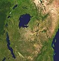 And Chris said, Let there be light: and there was light.

Article(s): African Great Lakes
Request: lighten for detail -- Chris (クリス • フィッチ) (talk) 02:15, 22 March 2008 (UTC)
Graphist opinion:
Love it, thanks, marking as done! :) Chris (クリス • フィッチ) (talk) 20:53, 24 March 2008 (UTC)
Wilmington, Delaware
-
 use this as a base

Article(s): Wilmington, Delaware
Request: larger possibly svg variant using the logo at http://www.ci.wilmington.de.us/ -- Chris (クリス • フィッチ) (talk) 02:15, 22 March 2008 (UTC)
Graphist opinion:
Purmerend coat of arms
-
 Coat of arms of the city of Purmerend

Article(s): Purmerend, Purmerbuurt
Request: I request someone make a superior looking version, the current one seems very mspaint-ish.
Here is a external examples of what it sould look like: drawing
(sidenote, yes the lions have erect penises)
-- SelfQ (talk) 17:35, 22 March 2008 (UTC)
Graphist opinion:
Maps of Arizona
-
 Raster version
 -
 SVG version
 -
 Raster version
 -
 SVG version
 -
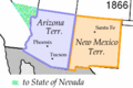 Raster version
 -
 SVG version


Article(s): Gadsden Purchase, Arizona in the American Civil War, several others.
Request: SVGification. I don't feel like doing these right now, so I'm not claiming them. It would be good if we could maintain a common color scheme for the three "Wpdms" maps (these two and the third in the other Arizona Map request above). — ʞɔıu 09:04, 23 March 2008 (UTC)
Graphist opinion:I'll do these. I'm not sure how the colors relate to each other between the pictures, so I'll just copy the colors from the source images. If anyone wants to, they can change the the color afterwards :) XcepticZP (talk) 21:20, 23 March 2008 (UTC)
- For the last one, I strongly request you use a better color than "spraypaint from Windows Paintbrush". 68.39.174.238 (talk) 03:00, 24 March 2008 (UTC)
Flowchart fix

Article(s): Draft for discussion
Request: -- For some reason the image renders perfectly in both Internet Explorer and Opera, but it's horribly unusable when used on Wikipedia pages, whether included full size or thumbnailed (can be seen at the above link and by clicking through the Image: page). Some text is being omitted, half the image is covered by rectangles. It's been requested for discussion but can't be used in this state and I can't see how to fix it. Can anyone take a look at it and figure how to make a version that mediawiki will render correctly in a Wikipedia page? It's not very complicated as svg's go. Thanks! FT2 (Talk | email) 18:10, 23 March 2008 (UTC)
- It's also hideous (But in a different way) in Firefox 2.0.0.12. Image:BLP flowchart.svg is fine in both. 68.39.174.238 (talk) 21:08, 23 March 2008 (UTC)
- The original was machine encoded, as a draft only, and all but impossible to modify. Best ignored. Its Image:BLP flowchart 2.svg that's the problem, it doesn't seem to render properly in mediawiki as it does on browsers. FT2 (Talk | email) 02:06, 24 March 2008 (UTC)
Graphist opinion: The problem was that in some places the font size was being scaled to 120% of the original size, but ImageMagick (MediaWiki's rendering engine) was interpreting this as a literal 120 point (I think) - the black boxes were actually letters. I've fixed that, and partially fixed the problem with the overlayed text when it's rendered with Gecko, e.g. in Firefox; the problem there was that it wasn't recognising the 'dy="1.4em"' in the tspan elements, but a simple change of units to pixels fixed that. There are still some strange things going on with Gecko, but I'm not sure what to do with those. Time3000 (talk) 12:31, 24 March 2008 (UTC)
Fédération Indochinoise des Associations du Scoutisme
Article(s): Fédération Indochinoise des Associations du Scoutisme
Request: rotate to straight and trim a little -- Chris (クリス • フィッチ) (talk) 00:38, 24 March 2008 (UTC)
Graphist opinion:
Smokey hat
-

-
rendering problems in old version
-
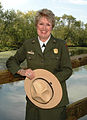 shows depth of shading


Article(s): multiple templates
Request: make a little more natural looking, rotate fleur-de-lis so it looks like it sits naturally on the hat -- Chris (クリス • フィッチ) (talk) 00:38, 24 March 2008 (UTC)
Graphist opinion: Uploaded new version over the old. I skewed and rotated the emblem and removed the brown boxes in favor of simple lines to denote the curves in the hat. Jeff Dahl (Talk • contribs) 03:34, 26 March 2008 (UTC)
- Brown boxes? I am sorry, I don't follow. Chris (クリス • フィッチ) (talk) 05:43, 26 March 2008 (UTC)
- Ah, I think that was meant to be puckering or shading, like the photo above. Chris (クリス • フィッチ) (talk) 04:16, 27 March 2008 (UTC)
- Also, I really prefer the buff color of her hat to the chamois color of the present graphic, can that be brought over? Chris (クリス • フィッチ) (talk) 20:55, 27 March 2008 (UTC)
- Changed to a more tan color. The only thing I can guess is that those strange boxes were supposed to be shading or gaussian blur elements. Since blur and effects aren't supported in many browsers or unpredictably by the media wiki software, I made them simple lines. Jeff Dahl (Talk • contribs) 00:06, 28 March 2008 (UTC)
- Also, I really prefer the buff color of her hat to the chamois color of the present graphic, can that be brought over? Chris (クリス • フィッチ) (talk) 20:55, 27 March 2008 (UTC)
Burma
Article(s):
Request: lighten for detail -- Chris (クリス • フィッチ) (talk) 00:38, 24 March 2008 (UTC)
Graphist opinion: Some really horrendous JPEG artefacts on this - if this is the best image we have to work with, I don't think we'll get any more detail from simple level adjustments. Shoemaker's Holiday (talk) 05:41, 27 March 2008 (UTC)
- Ah, wait - I see Kintetsu's the uploader - I'll e-mail him. Shoemaker's Holiday (talk) 05:43, 27 March 2008 (UTC)
- I wish I could help. This was sent to me as a scan in an e-mail in 2006, from the regional Scout office. It took up fully a quarter of my available space, and when printed was 11 pages. I had to immediately shrink it to usable, then delete it. I am sorry.
- The lighten for detail is actually because I have a crappy monitor at home that darkens everything, but at work and library they are light, so I figure the most useful thing would be to consider it for a wide range of monitors. Sorry I can't be more help, and thank you so much for yours! Chris (クリス • フィッチ) (talk) 07:52, 27 March 2008 (UTC)
- I really don't think there's anything that can be done - any tweaking is just going to bring out the artefacts and make it look worse =/ —Preceding unsigned comment added by Shoemaker's Holiday (talk • contribs) 18:31, 27 March 2008 (UTC)
- Bummer. Chris (クリス • フィッチ) (talk) 20:54, 27 March 2008 (UTC)
Monty Hall problem images
-
 image for Monty Hall problem
 -
 image for Monty Hall problem
 -
 image for Monty Hall problem
 -
 image for Monty Hall problem
 -
 image for Monty Hall problem
 -
 image for Monty Hall problem
 -
 image for Monty Hall problem


Article(s): Monty Hall problem, to replace images in Solution section (per Monty Hall problem/draft)
Request: Convert to svg, with aspect ratios of the doors, colors and everything else consistent with Image:Monty open door.svg, Image:Monty closed doors.svg and Image:Monty open door chances.svg. -- Rick Block (talk) 01:55, 24 March 2008 (UTC)
- Note the existing, slightly different, images in the article are svg. In these existing images, the selected door is not always door 1 and the switches don't always lead from door 1 - and I don't think the door's aspect ratio quite matches the other images in the article. -- Rick Block (talk) 13:43, 25 March 2008 (UTC)
Graphist opinion:
More Wpdmsery


Articels: Many having to do with the Texan independance war, etc.
Request: SVGification, preferably in less glaring colors. 68.39.174.238 (talk) 03:08, 24 March 2008 (UTC)
Oppinion: You can't call these colours glaring, I lifted them off other maps but if they should be different just say. — ₪₪ ch1902 ₪₪ 17:24, 24 March 2008 (UTC)
- YES; that's MILES better. I'm marking it VVA now... 68.39.174.238 (talk) 22:21, 24 March 2008 (UTC)
- Actually, one last thing: Can you add "United States" to the middle upper right-ish, since we have Mexico labeled too? Thanx, 68.39.174.238 (talk) 22:23, 24 March 2008 (UTC)
- Perfect. 68.39.174.238 (talk) 12:07, 25 March 2008 (UTC)
TB in 2005
-
 Tuberculosis in 2005

Article(s): Tuberculosis
Request: A better one maybe. → Pepper / ? 20:34, 24 March 2008 (UTC)
- Question: What do the colors mean (IE. Where is the legend)? Also, to whoever takes this: Be very careful, this map is very defective in its borders... 68.39.174.238 (talk) 22:40, 24 March 2008 (UTC)
- The legend is in the image page, Anyway it's this: Cases per 100,000; Red = >300, orange = 200-300; yellow = 100-200; green 50-100 and grey <50. Data from WHO, 2006. [12]
- Yeah, I was filling in Image:BlankMap-World6.svg to export as a PNG and noticed some inconsistencies. For example the area between Pakistan and China, Yemen and above Bangladesh. If they are just meant to be different areas of the same country that's OK but I take the black lines to be borders, which makes no sense in those areas. — ₪₪ ch1902 ₪₪ 23:14, 24 March 2008 (UTC)
- I'd just go with the data and apply it to a blank map. That's what I did with Image:Polio worldwide 2005.png and its companion SVG; the original JPG had several inaccuracies, so I just used the WHO data. Fvasconcellos* (t·c) 02:14, 25 March 2008 (UTC)
- I thought of that too, but upon opening the spreadsheet there are a dozen sheets with different data and I have nooooo idea which sheet or which data it is. Nothing seems to stand out as "cases per 100,000" :-/ — ₪₪ ch1902 ₪₪ 13:40, 25 March 2008 (UTC)
- I see. Maybe 2006 data from the 27th page of this report (http://www.who.int/tb/publications/global_report/2008/pdf/report_without_annexes.pdf) is more useful. → Pepper / ? 15:09, 25 March 2008 (UTC)
- I thought of that too, but upon opening the spreadsheet there are a dozen sheets with different data and I have nooooo idea which sheet or which data it is. Nothing seems to stand out as "cases per 100,000" :-/ — ₪₪ ch1902 ₪₪ 13:40, 25 March 2008 (UTC)
- I'd just go with the data and apply it to a blank map. That's what I did with Image:Polio worldwide 2005.png and its companion SVG; the original JPG had several inaccuracies, so I just used the WHO data. Fvasconcellos* (t·c) 02:14, 25 March 2008 (UTC)
- Yeah, I was filling in Image:BlankMap-World6.svg to export as a PNG and noticed some inconsistencies. For example the area between Pakistan and China, Yemen and above Bangladesh. If they are just meant to be different areas of the same country that's OK but I take the black lines to be borders, which makes no sense in those areas. — ₪₪ ch1902 ₪₪ 23:14, 24 March 2008 (UTC)
Graphist opinion:
Anjouan flag
-
our own Jeff Dahl is a genius at doing hands in Islamic symbolism
Article(s): 2008 invasion of Anjouan, others
Request: as this is being used in a current event, please make fingers better proportioned, more human. Unless the island is populated by hobbitses, in which case my apologies. -- Chris (クリス • フィッチ) (talk) 20:58, 25 March 2008 (UTC)
Graphist opinion: Apparently, the fingers are indeed a bit stumpy :) Fvasconcellos (t·c) 21:09, 25 March 2008 (UTC)
- It says there that there is not a lot of documentation, save for the white hand and crescent on a red field. "According to Article 2 of the Loi fondamentale de L’île autonome de Ndzuani, «L’île Autonome d’Anjouan dispose de ses propres symboles qui cohabitent avec les symboles de l’Union des Comores. L’emblème de l’île Autonome d’Anjouan est le drapeau rouge frappé au centre d’une main droite ouverte au dessus d’un croissant de couleur blanche.» " Can we find a better source? It looks weird. Chris (クリス • フィッチ) (talk) 00:32, 26 March 2008 (UTC)
- A cursory Image Google suggests that alot of people (organizations), aren't even sure which way the thumb points. 68.39.174.238 (talk) 00:40, 26 March 2008 (UTC)
- Yes, I noticed. Drapeau rouge frappé au centre d’une main droite ouverte au dessus d’un croissant de couleur blanche—red field charged with an open right hand above a crescent, all white. Wouldn't "open right hand" suggest thumb pointing right? I'm glad there's no specified finger length :) Fvasconcellos* (t·c) 00:47, 26 March 2008 (UTC)
- A cursory Image Google suggests that alot of people (organizations), aren't even sure which way the thumb points. 68.39.174.238 (talk) 00:40, 26 March 2008 (UTC)
The Last Request

Articels: Last mile
Request: SVGify and correct grammar/capitalization. Maybe also use more common English phrases. 68.39.174.238 (talk) 22:03, 25 March 2008 (UTC)
- I don't quite get this. Is this some kind of grand metaphor? Jeff Dahl (Talk • contribs) 01:44, 26 March 2008 (UTC)
- It's a GIF image that should (probably) be redone as an SVG with some changes. 68.39.174.238 (talk) 12:13, 26 March 2008 (UTC)
- I guess you could say that, Jeff. The article is on a concept in communications delivery, the summary does a pretty good job of explaining it. This article is only used once, on that page. But man, is it ugly.— ʞɔıu 07:29, 27 March 2008 (UTC)
- It's a GIF image that should (probably) be redone as an SVG with some changes. 68.39.174.238 (talk) 12:13, 26 March 2008 (UTC)
Oppinion:
SVG these flags please
-
Flag of Seborga
-
Flag of the Hutt River Province
-
 Flag of Purmerend
 -
 Flag of Purmerend, SVG
 -
 Flag of Hilversum


-
 COA of Hilversum
 -
 Vector version


Article(s):many
Request: I was working on some of these articles and though that someone with some free time could help me and make these flags and that one coa into nice svg files. Cheers. --SelfQ (talk) 22:09, 25 March 2008 (UTC)
Graphist opinion: One down, four to go :) Fvasconcellos* (t·c) 23:48, 25 March 2008 (UTC)
- Thanks man. The COA look like this in real life by the way: clicky I hope you will agree with me that the current one is completely inacurate. also the yellow dropletts on the hilversum flag follow the same design. again thanks and good luck with the rest of them! --SelfQ (talk) 20:03, 26 March 2008 (UTC)
SVG Mexican Coat of arms
-

-

-
 Already SVG'd current coat, to work from?


Article(s):Coat of arms of Mexico
Request:I want to improve the article but I don't like how this images look like. Bewareofdog 02:50, 26 March 2008 (UTC)
Graphist opinion:
Censorship
-
 Raster version.

Article(s): Censorship and around 30 others.
Request: -- Can this be SVGified? Might have to draw a new pair of lips! XcepticZP (talk) 11:09, 26 March 2008 (UTC)
Graphist opinion: In principle it could be SVGified, but the lips would come out looking very clip-arty - the current lips seem to be from a photograph. If you don't mind a clip-art look though(?), it's fairly easy. Time3000 (talk) 18:07, 26 March 2008 (UTC)
- I don't think it matters if the lips aren't photo-realistic. As long as its reasonably interpreted by the artist to display that! So yes please. XcepticZP (talk) 19:00, 26 March 2008 (UTC)
Wiktionary Logo
-
 Raster version
 -
 SVG
SVG
Article(s): 100's of articles.
Request: -- Convert to SVG, please. XcepticZP (talk) 11:11, 26 March 2008 (UTC)
- That's already on commons :) — ₪₪ ch1902 ₪₪ 14:16, 26 March 2008 (UTC)
- Hehe, thanks... I just thought it a common courtesy by the person that converts a raster to SVG to change all references to the new version. I really hate it when they don't put an effort. Thanks for letting me know XcepticZP (talk) 19:02, 26 March 2008 (UTC)
- Hold on there, that's a trace! Anyone with Times New Roman and Lucida Sans on their system can whip up another version of this. I'll see what I can do. Fvasconcellos (t·c) 19:16, 26 March 2008 (UTC)
- Hehe, thanks... I just thought it a common courtesy by the person that converts a raster to SVG to change all references to the new version. I really hate it when they don't put an effort. Thanks for letting me know XcepticZP (talk) 19:02, 26 March 2008 (UTC)
Graphist opinion: OK, how's this (far right)? There's not much visible difference, but it doesn't look traced, and the file size has been halved :) If you think it's an improvement, let me know and I'll overwrite the SVG on Commons. Fvasconcellos (t·c) 01:50, 27 March 2008 (UTC)
- I approve, if it matters. 68.39.174.238 (talk) 03:25, 27 March 2008 (UTC)
- So do I, I think it looks much better your way! Go ahead and overwrite... XcepticZP (talk) 18:21, 27 March 2008 (UTC)
 Done :) Fvasconcellos (t·c) 19:39, 27 March 2008 (UTC)
- So do I, I think it looks much better your way! Go ahead and overwrite... XcepticZP (talk) 18:21, 27 March 2008 (UTC)
Eintracht Frankfurt jersey
Article(s):Eintracht Frankfurt
Request: -- Could someone please create the away and the third jersey, respectively. Maybe this template helps you. Template:Football_kit. If you have further questions, don't hesitate to contact me. Help is much appreciated! -Lemmy- (talk) 13:26, 26 March 2008 (UTC)
Graphist opinion:
SVG of stub icon(e)
-
 Vector version.
 -
 Music notes
 -
 notes on staff


Articles: African music stub templates
Request: SVGification. 68.39.174.238 (talk) 18:38, 26 March 2008 (UTC)
Graphist Opinion:Ok, I'm on this one. Btw, request text is at the top for you to copy. XcepticZP (talk) 19:04, 26 March 2008 (UTC)
- Completed. Not sure if you need me to resize it, though? Let me know. XcepticZP (talk) 13:48, 27 March 2008 (UTC)
- Why a 128th note/semi-hemisemidemiquaver? Shoemaker's Holiday (talk) 18:29, 27 March 2008 (UTC)
- Here are some music notes, you could also delete the lower bar and have joined 8th notes. Jeff Dahl (Talk • contribs) 23:50, 27 March 2008 (UTC)
Coat of Arms of Sweden
-
 Coat of Arms of Sweden
 -
Lesser Coat of Arms

![[2]](https://commons.wikimedia.org/wiki/Image:Cheatsheet-fr.svg)
![[3]](https://commons.wikimedia.org/wiki/Image:Cheatsheet-en.svg)
.svg)
Article(s): Several
Request: SVG images. Thanks-- Mangwanani (talk) 19:14, 26 March 2008 (UTC)
Graphist opinion: There are a couple of SVG versions of these on Commons (see Category:Coats of arms of Sweden), although they don't exactly match either of the above; as I've mentioned before, that's the "problem" with coats of arms :) Fvasconcellos (t·c) 01:55, 27 March 2008 (UTC)