
Wikipedia:Featured picture candidates
| Featured article (FA) tools |
|---|
|
Wikipedia:Featured pictures is a list of images and diagrams that are beautiful, striking, shocking, impressive, titillating, fascinating, or in short just brilliant (see also Wikipedia:Featured articles). Taking the common saying that "a picture is worth a thousand words", the images featured on Wikipedia:Featured pictures should illustrate a Wikipedia article in such a way as to add significantly to that article. If you believe that you have found or created an image that matches these expectations then please add it below into the Current nominations section. Conversely, if you believe that an image that currently exists in the Wikipedia:Featured pictures gallery should not be there, the Nomination for removal section of this page can be used to nominate it for delisting.
For delisting, this page is similar to Wikipedia:Votes for deletion.
Images listed here should be either in the public domain or covered by the GNU Free Documentation License. While we tolerate some degree of fair use, a simple image gallery is of limited educational value (a requirement for fair use), and showcasing other people's work without their permission may be considered unfair.
For listing, if an image is listed here for fourteen days with four or more supporting votes including the nominator if it was not a self-nomination, and the general consensus is in its favor, it can be added to the Wikipedia:Featured pictures list. Here are some guidelines to consider (decisions are made on a case-by-case basis):
- Picture A. 7 in favour, 2 against. This deserves to be a featured picture and would be added to Wikipedia:Featured pictures and Wikipedia:Featured pictures visible as well as the current archive.
- Picture B. 4 in favour, 2 against. This one doesn't have a consensus and gets added only to the current archive.
The archive contains all votes and comments collected on this page and also vote tabulations.
Also, be sure to sign (with date/time) your nomination ("~~~~" in the editor).
When the time comes to move an image to Wikipedia:Featured pictures make sure you also add it to Wikipedia:Featured pictures visible.
How to add your nomination
If you have problems formatting your nomination, someone else will fix it, don't worry! However, you may find it useful to copy this form and paste it in the edit box:
<br style="clear:both;" />
===[[Media:name.jpg|Name of image]]===
[[Image:FILENAME|thumb|CAPTION]]
Add your reasons for nominating it here,
say what article it is used on and who created the image. - ~~~~
* Votes go here - ~~~~
* And here - ~~~~
Once you have nominated the picture, use the Wikipedia template for featured picture candidates on the correspondent image page.
Current nominations
Please add all nominations and self-nominations to the top of this list.
EU Map

Brilliant in its concise simpleness, elegant, easy to understand. Essential to fully understanding the article, European Union.
- Support. Particularly like how the user also created and posted a Blank Version that was used in other languages. A wonderful example of creating an open-source, collaboration-friendly illustration. - [[User:Davodd|DAVODD «TALK»]] 01:33, Oct 20, 2004 (UTC)
- Oppose. Would support a colored version. [[User:Neutrality|Neutrality (hopefully!)]] 01:46, Oct 20, 2004 (UTC)
- Umm. What? Are you on a greyscale display device? It has colour.
- Support. Clear and informative. James F. (talk) 01:52, 20 Oct 2004 (UTC)
- Oppose. It is a map. Its information is claear, which any good map should offer. It is not scintillating, arresting, breathtaking, or in any other way noteworty as anything more than a map. Denni☯ 02:15, 2004 Oct 20 (UTC)
- Oppose. Informative indeed, but not featured picture worthy. --ScottyBoy900Q∞ 04:17, 20 Oct 2004 (UTC)
- Oppose. Just a map, not even a superb one at that. Too small to see the southern Slavic countries clearly.
- Would you rather it be out of scale? Or do you have a suggestion to rectify this? [[User:Davodd|DAVODD «TALK»]] 00:49, Oct 21, 2004 (UTC)
- Oppose. It's just a map. Alphax (talk) 07:00, Oct 21, 2004 (UTC)
Canal lock

Very professional image, great colors and focus, lovely clouds as well. Shot by fellow wikipedian Matt Crypto and featured in Canal lock.
- Support. -- [[User:Solitude|Solitude\talk]] 17:54, Oct 19, 2004 (UTC)
- Support. Nice colors, good shot -- Chris 73 Talk 22:46, Oct 19, 2004 (UTC)
- Oppose. Nice picture, but doesn't do a good job of illustrating the canal lock article. All the interesting stuff (the canal, the sluices, the gates, the water in the lock chamber) is out of sight. Image:Canal-sequence.jpg is much better. Gdr 22:56, 2004 Oct 19 (UTC)
- Support, but it'd be nice to have the location noted on the description page, too. -- DrBob 22:54, 19 Oct 2004 (UTC)
- Support. James F. (talk) 00:59, 20 Oct 2004 (UTC)
- Oppose. This photo makes no sense to a viewer without the information in the article. Moreover, it does not provide the photographic essence of what a canal lock is. It's a fine technical shot, but put up your hand if you say "Wow!" Denni☯ 02:18, 2004 Oct 20 (UTC)
- Oppose, but I do like it. I agree with the idea that possibly, it's just not the right angle. --ScottyBoy900Q∞ 04:21, 20 Oct 2004 (UTC)
- Oppose, although I'm really chuffed with the positive comments people have made about this photo! I've had a browse through the current Featured Pictures and I'm not convinced that this image is quite in the same league, either aesthetically or illustratively. (See [1] for some funkier photos of the same part of the world). — Matt 15:12, 20 Oct 2004 (UTC)
The Red Hat Society
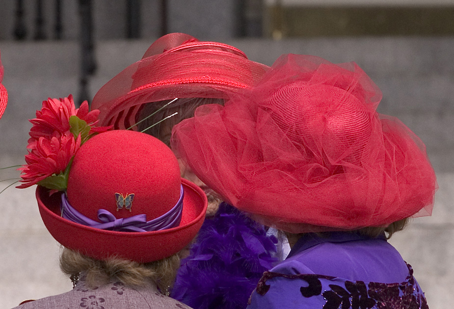

A photograph that illustrates precisely what the Red Hat Society is. Dmgerman 11:05, 19 Oct 2004 (UTC)
- Oppose. Adequate, but I don't like the composition. Distracting background. GWO 11:45, 19 Oct 2004 (UTC)
- Oppose Ugly. --ScottyBoy900Q∞ 13:45, 19 Oct 2004 (UTC)
- Oppose While it is very representative of the society, I don't "believe it is one of the finest images on Wikipedia". Cavebear42 15:29, 19 Oct 2004 (UTC)
- Oppose. A photo of say, 1000 red hats would be better. Alphax (talk) 07:03, Oct 21, 2004 (UTC)
Bonsai Trident Maple
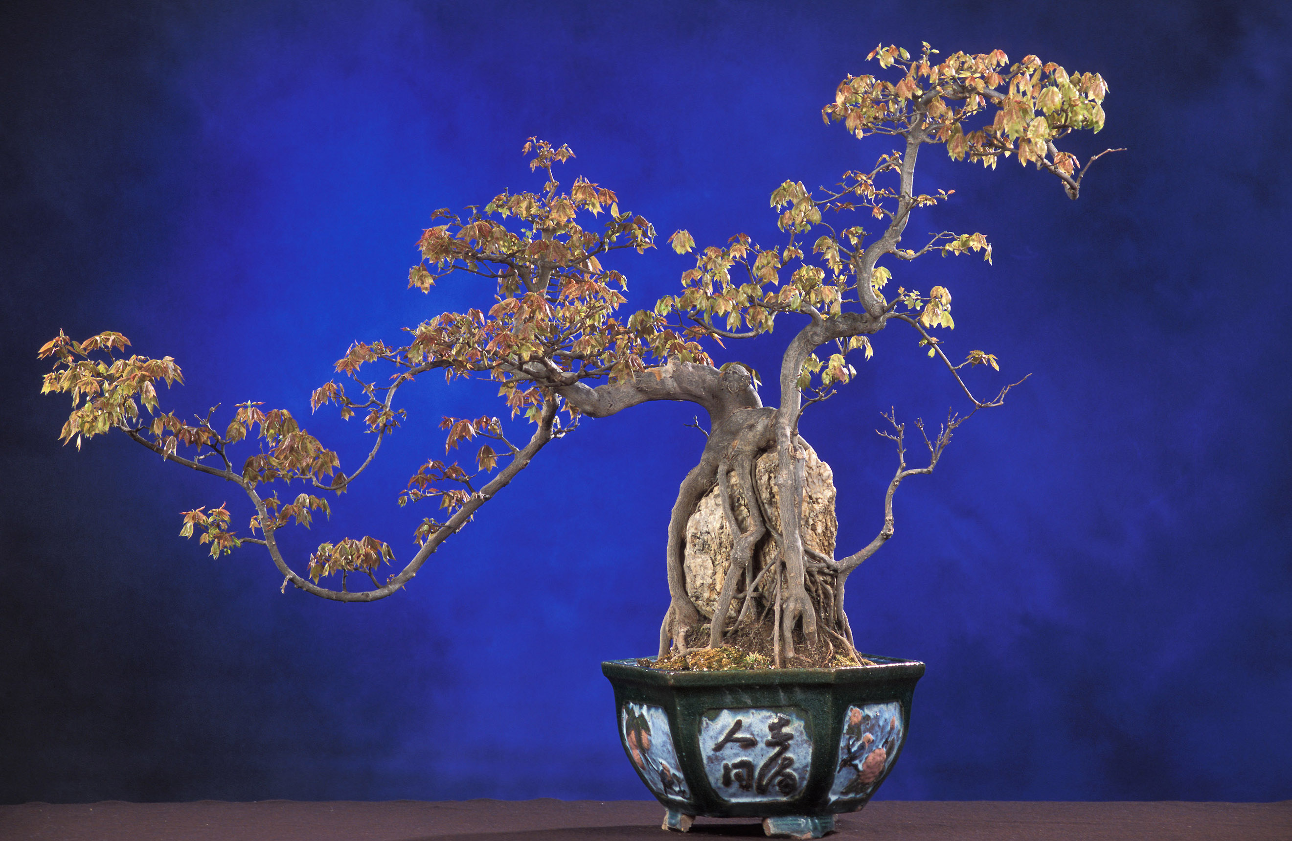

Trust Schumacher, Small is Beautiful. A very well balanced USDA photograph of a Bonsai tree. -- Solipsist 23:18, 18 Oct 2004 (UTC)
- Support. -- Solipsist 23:18, 18 Oct 2004 (UTC)
- Support. Definitely -- Chris 73 Talk 00:22, Oct 19, 2004 (UTC)
- Support. We need more non geeky images like this. Janderk 08:20, 19 Oct 2004 (UTC)
- Support. Chmouel 10:33, 19 Oct 2004 (UTC)
- Support. Striking. --Cantus 01:22, Oct 20, 2004 (UTC)
- Support. Nice color, and composition. [[User:MacGyverMagic|Mgm|(talk)
]] 11:24, Oct 20, 2004 (UTC)
- Oppose. --ScottyBoy900Q∞ 14:20, 20 Oct 2004 (UTC)
- Support. Very nice. I love the rock in the middle, causing the roots to stretch over it. Looks great. --Might and power 22:19, 20 Oct 2004 (UTC)
- Support. Very elegant. Alphax (talk) 07:04, Oct 21, 2004 (UTC)
Eagle Nebula
I really like this image. I got the idea to upload it after seeing references to it over the past few days. I also uploaded a closer up image (Image:Eagle nebula closeup.jpg) but I believe the wider image of the whole nebula is just as vibrant and amazing. Click on it to see it larger. Looks great. Someone is bound to bring up the fact that it's a little fuzzy. To that I say...you get a clearer picture of an object 7,000 light years away and we'll use that. --ScottyBoy900Q∞ 22:56, 18 Oct 2004 (UTC)
- Support larger whole image. --ScottyBoy900Q∞ 22:56, 18 Oct 2004 (UTC)
- Support image as shown on the right, better than the closeup -- Chris 73 Talk 00:23, Oct 19, 2004 (UTC)
- Support full image. James F. (talk) 00:59, 20 Oct 2004 (UTC)
- Support. Love it. --Cantus 01:23, Oct 20, 2004 (UTC)
- Oppose. Fuzzy and is missing a substantial portion of the nebula due to cropping. Better, less-fuzzy and more complete picture here: [2]. A better up-close picture is here: [3] and here: [4] - [[User:Davodd|DAVODD «TALK»]] 01:05, Oct 21, 2004 (UTC)
- I was debating whether or not to upload the closer picture of the "fingers," but decided not to because it did now show the entire image. Now that I see the other larger image of the complete nebula, I do admit that I like it, but I also like the one I submitted for this vote. Anyone else have any comments about this new image? --ScottyBoy900Q∞ 03:01, 21 Oct 2004 (UTC)
- Support full image, don't like the closeup. Alphax (talk) 07:07, Oct 21, 2004 (UTC)
![[2]](http://antwrp.gsfc.nasa.gov/apod/image/0206/eagle_kp09_big.jpg)
Blue Marble
I've just realised that we don't feature this picture of the Earth taken from Apollo 17 known as The Blue Marble. This view of the Earth has become an icon and is often used to illustrate the fragility of the environment. -- Solipsist 22:08, 18 Oct 2004 (UTC)
- Support -- Solipsist 22:08, 18 Oct 2004 (UTC)
- Definite support. I've actually had this in my profile for a while now. --ScottyBoy900Q∞ 22:14, 18 Oct 2004 (UTC)
- Support. Oh yes.-- Chris 73 Talk 22:41, Oct 18, 2004 (UTC)
- Support. [[User:Neutrality|Neutrality (hopefully!)]] 22:44, Oct 18, 2004 (UTC)
- Support. BUT can't we get a higher res version. Obviously the 6.5 mb version is overkill, but someone should take it and resize it to a 1.5 or 2mb jpg. --Prisonblues 23:39, 18 Oct 2004 (UTC)
- Support. ed g2s • talk 19:07, 19 Oct 2004 (UTC)
- Support. James F. (talk) 00:59, 20 Oct 2004 (UTC)
- Oppose. Poor quality, blurry. Better, higher-detailed images of Earth exist. [[User:Davodd|DAVODD «TALK»]] 00:52, Oct 21, 2004 (UTC)
- Comment - you can see the large square "pixels" that make up this image, instead of a smooth high-resolution quality image. The boundary of the globe is noticeably jagged. I guess it has historical interest, but I'm not convinced that excuses the lack of image quality. I may have to think about this before I make a decision. The successful photos of scenes of warfare from WW-I are not "picture perfect" either, yet certainly tell their tale spectacularly. - [[User:Bevo|Bevo]] 03:18, 21 Oct 2004 (UTC)
- Comment - well I was going to upload the larger version mentioned by Prisonblues, but I see that ed g2s has already done it. Admittedly the full NASA .tiff shows some surprising problems with dust and scratches, but Ed's version looks pretty good to me - are these concerns over blurs and pixelation just a wiki-cache problem? Does a <CTRL>-Reload help -- Solipsist 06:42, 21 Oct 2004 (UTC)
London Millennium Bridge
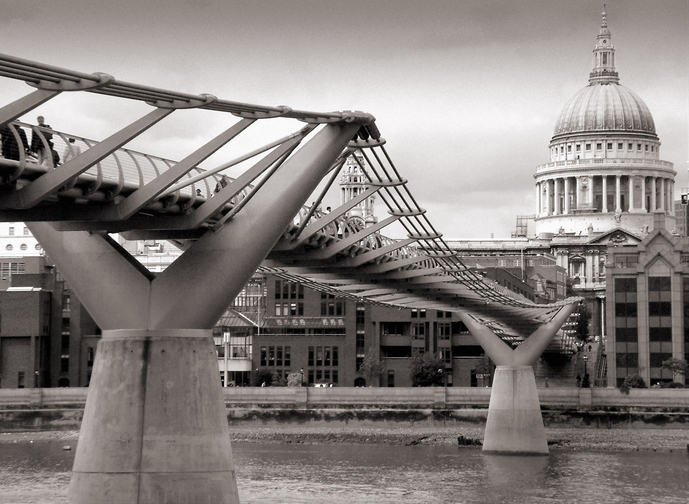

Nice to see a moody monotone image of the London Millennium Bridge. It looks like this shot was taken before the bridge's novel latteral wobble was corrected. The picture's copyright status is a little odd, but looks more or less equivalent to Creative Commons by attribution. -- Solipsist 20:52, 18 Oct 2004 (UTC)
- Was actually taken post-damping (24 May 2004) -- PaulLomax 09:01, 20 Oct 2004 (UTC)
- I
standwobble corrected. What I should have said was 'It looks like this shot was taken after the bridge's novel latteral wobble was corrected.' Thanks for the better quality version. -- Solipsist 06:49, 21 Oct 2004 (UTC)
- I
- Was actually taken post-damping (24 May 2004) -- PaulLomax 09:01, 20 Oct 2004 (UTC)
- Support -- Solipsist 20:52, 18 Oct 2004 (UTC)
- Support. I'm a big architecture fan so I gotta say yes. --ScottyBoy900Q∞ 22:00, 18 Oct 2004 (UTC)
- Neutral. According to page refereced "Email me madmax@thunderdome.co.uk for licensing/purchasing enquiries" This does not say that we can use it as the tag on picture states. Did someone email him and he gave permission maybe? Cavebear42 22:30, 18 Oct 2004 (UTC)
- Well Paul Lomax uploaded it. I doubt he emailed himself, but he did take the trouble to use a carefully chosen copyright tag. I think we are OK. -- Solipsist 23:28, 18 Oct 2004 (UTC)
- Oppose. Nice, bit the image is compressed way too much to 41KB making JPEG artifacts clearly visible. Will support if a higher quality version is uploaded and the license is changed to something more standard. Janderk 08:18, 19 Oct 2004 (UTC)
- Neutral. nice shoot but a better quality of the picture would be better. Chmouel 10:38, 19 Oct 2004 (UTC)
- Oppose -
really bad quality (and small) JPEG.(this has been fixed, I see) ed g2s • talk 19:05, 19 Oct 2004 (UTC) - Opposed - agree 100% with Janderk. -- ChrisO 18:51, 19 Oct 2004 (UTC)
- Comment. I have uploaded a larger version of the JPEG, based on the full-size version found on Paul's website. I have also emailed the photographer to ask for permission to license it under the CC-BY-SA. Let's wait for his response so we can evaluate a proper quality image or none at all. -- [[User:Solitude|Solitude\talk]] 08:21, Oct 20, 2004 (UTC)
- License is now CC-BY-NC-SA - hope this helps. Thanks for the support -- PaulLomax 09:01, 20 Oct 2004 (UTC)
- Support. The picture is now licensed under CC-BY-SA, thank you Paul! I would like to note that the tally for the updated large high-quality photo is now 3-0, not counting oppose votes cast for the initial small version. -- [[User:Solitude|Solitude\talk]] 13:14, Oct 20, 2004 (UTC)
- Support, good work on the licensing issues. Lorax 22:56, Oct 20, 2004 (UTC)
Japanese toilet bidet
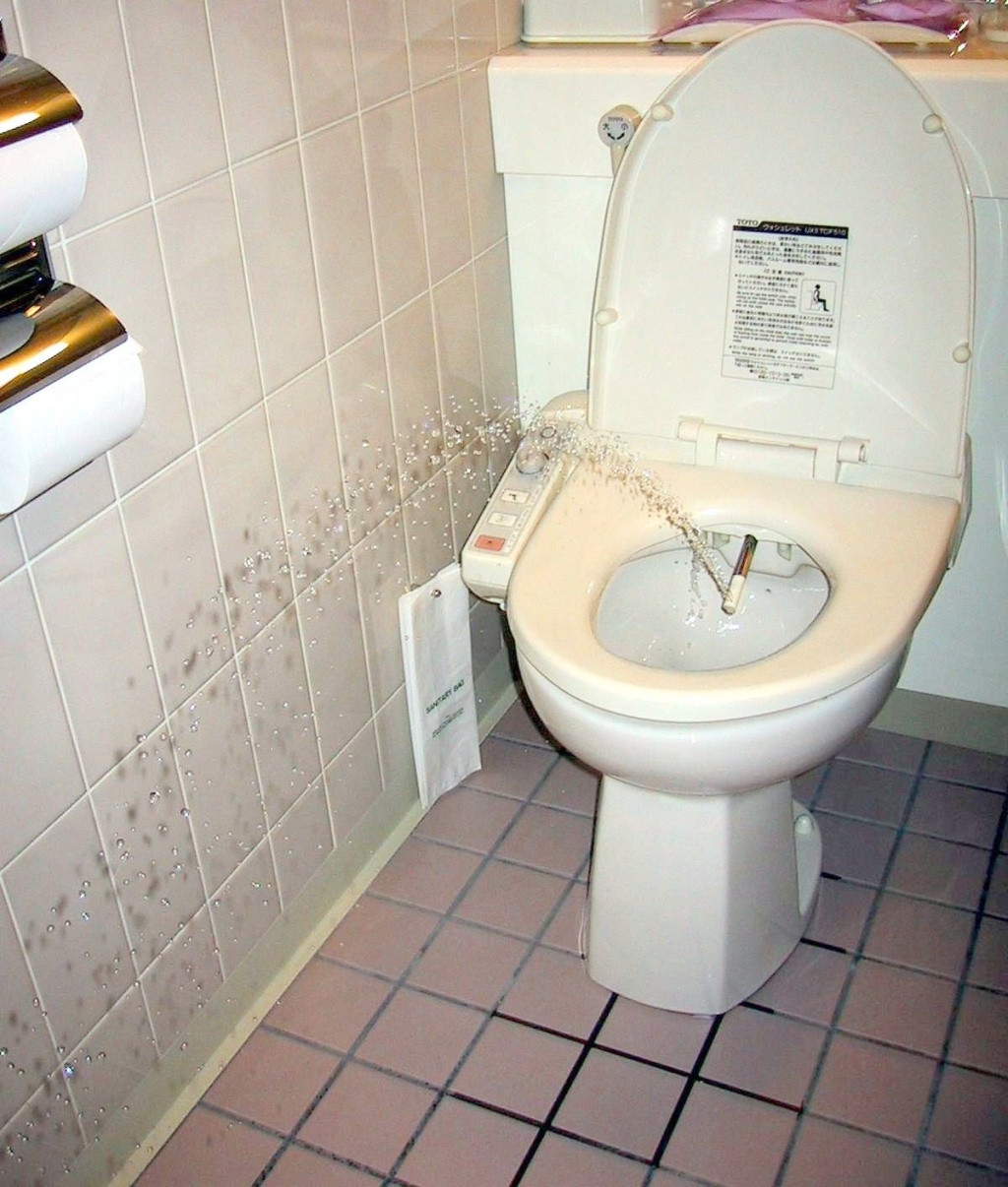

(Self-nomination) Shocking, titillating, fascinating? Probably yes for most non-Japanese. It also add significantly to the understanding of the article about the Japanese toilet. -- Chris 73 Talk 15:10, Oct 18, 2004 (UTC)
- Oppose. Humorous but still definitely no. --ScottyBoy900Q∞ 21:57, 18 Oct 2004 (UTC)
- Oppose. The Porcelain Strikes Back - I like it, but not as a featured picture. -- Solipsist 23:31, 18 Oct 2004 (UTC)
- Oppose. Very funny (did you get sprayed at all?), definitely useful for the article, but the quality of the photo (grainy, flash indoors in a constrained space) isn't high enough, I think. Definitely more illustrative than the Japanese TV ads that show bidets spraying peaches in space to the sound of the music from 2001, though. -- Oarih 09:00, 19 Oct 2004 (UTC)
Pillar coral
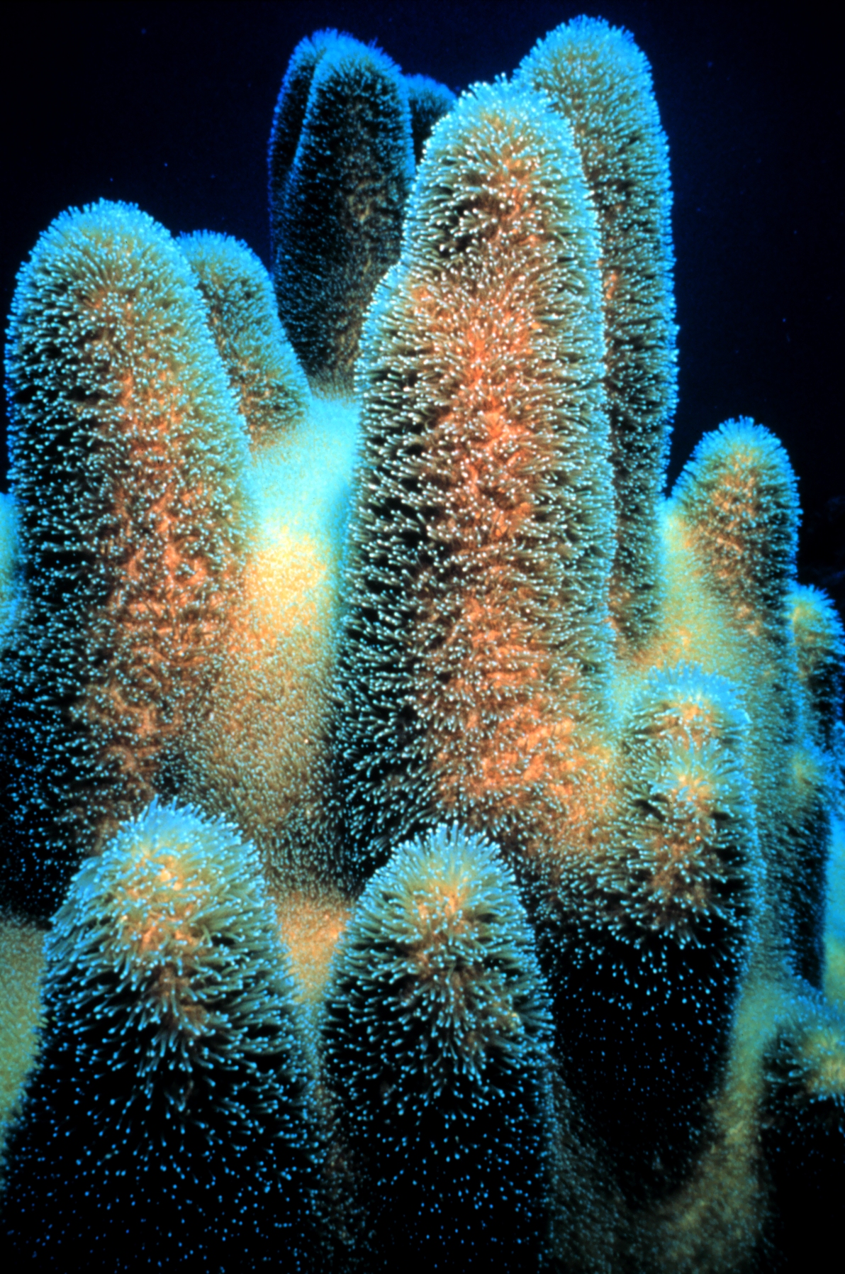

One of the NOAA's better photographs of coral. Rather reminds be of the Eagle Nebula. So good, I had to write a stub for the Pillar coral article to use it, although it could also be used on the general coral page. -- Solipsist 08:29, 16 Oct 2004 (UTC)
- Support. -- Solipsist 08:29, 16 Oct 2004 (UTC)
- Support. Markalexander100 08:36, 16 Oct 2004 (UTC)
- Support. Denni☯ 18:46, 2004 Oct 16 (UTC)
- Support. Steschke 21:02, 2004 Oct 17 (UTC)
- Support -- Chris 73 Talk 06:30, Oct 18, 2004 (UTC)
- Support. I'm actually gonna go look for a good Eagle Nebula picture now. --ScottyBoy900Q∞ 22:03, 18 Oct 2004 (UTC)
- Support. James F. (talk) 00:59, 20 Oct 2004 (UTC)
American one-cent coin

Fascinating. [[User:Neutrality|Neutrality (hopefully!)]]
- Support. Interesting shot. --ScottyBoy900Q∞ 04:44, 16 Oct 2004 (UTC)
- Neutral. Although it's nice to see it in such close detail, I think the composition could be better. The scratches on the right of the coin are a little distracting. -spencer195 05:45, 16 Oct 2004 (UTC)
- The scratches, for me, give the penny a personality. [[User:Neutrality|Neutrality (hopefully!)]] 18:34, Oct 16, 2004 (UTC)
- Oppose. Should be the whole coin, centered. Even then it might be boring. -- William M. Connolley 09:36, 16 Oct 2004 (UTC)
- Oppose. Steschke 21:03, 2004 Oct 17 (UTC)
- Oppose, agree with William M. Connolley -- Chris 73 Talk 06:42, Oct 18, 2004 (UTC)
Aurora from Alaska
I was going to nominate Image:Aurora-SpaceShuttle-EO.JPG, but in the process of checking for other Aurora pictures, I came across this one which I kind of prefer. -- Solipsist 19:48, 15 Oct 2004 (UTC)
- De-nominating since the image is copyright. -- Solipsist 14:40, 16 Oct 2004 (UTC)
- support. - Solipsist 19:48, 15 Oct 2004 (UTC)
- Support. Is there a larger version to be found though? --Prisonblues 22:47, 15 Oct 2004 (UTC)
- Oppose. Looks nice, but the image is blurry even though it's small. Also feel it would be better without the house, since it looks like the aurora is somehow coming out of the chimney or something. - Oarih 02:38, 16 Oct 2004 (UTC)
- Oppose sadly. I'm sure there's a better aurora picture out there somewhere. --ScottyBoy900Q∞ 03:21, 16 Oct 2004 (UTC)
- This picture is not NASA PD, see http://science.nasa.gov/spaceweather/aurora/gallery_01jan04.htm where it states
"Unless otherwise stated, all images are copyrighted by the photographers.", this picture is then listed 3rd from bottom. As such it its not eligible for FP status. With so many NASA aurora photos around, I doubt if we can even claim fair use. ed g2s • talk 12:48, 16 Oct 2004 (UTC)
- I think you are right. That page also has a link to the photographer's aurora web site at http://www.aurorawebcam.com/ which also states copyright. Better move it to copyvio. -- Solipsist 14:23, 16 Oct 2004 (UTC)
Very Large Array

The Very Large Array is still one of the biggest telescopes in the world, illustrated with rather a nice photo from User:Hajor. -- Solipsist 19:41, 15 Oct 2004 (UTC)
- Support. - Solipsist 19:41, 15 Oct 2004 (UTC)
- Support. Looks crisp and interesting. --ScottyBoy900Q∞ 03:23, 16 Oct 2004 (UTC)
- Support. Steschke 21:19, 2004 Oct 17 (UTC)
- Support -- Chris 73 Talk 06:29, Oct 18, 2004 (UTC)
- Oppose. 640x480 is too small. Will support if larger version uploaded. ed g2s • talk 11:40, 18 Oct 2004 (UTC)
- So you're judging pictures by their size not their quality? --ScottyBoy900Q∞ 22:05, 18 Oct 2004 (UTC)
- Support, but would be much happier if of a larger size. James F. (talk) 00:58, 20 Oct 2004 (UTC)
Village of Passchendaele
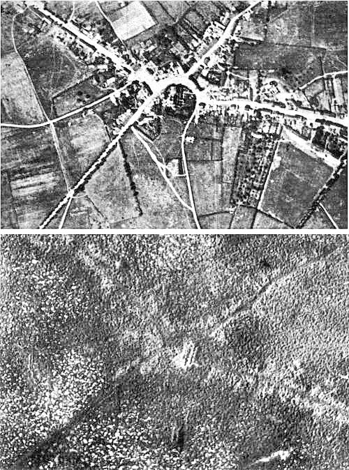

On Passchendaele. It illustrates the total devestation of this infamous WWI battle better than words could. (Public domain) - fabiform | talk 17:51, 15 Oct 2004 (UTC)
- oppose, needs explaining, too careful examination. Isn't Polygon Wood already featured? Dunc|☺ 17:53, 15 Oct 2004 (UTC)
- support – Quadell (talk) (help)[[]] 18:10, Oct 15, 2004 (UTC)
- Support. In this case, a picture is worth way more than a thousand words. Denni☯ 01:56, 2004 Oct 16 (UTC)
- Support strongly as long as it's explained good. --ScottyBoy900Q∞ 03:23, 16 Oct 2004 (UTC)
- War is hell. Support. [[User:Neutrality|Neutrality (hopefully!)]] 04:14, Oct 16, 2004 (UTC)
- Oppose. I judge solely on the picture, which must be striking by itself with out any explanation. In the context of an article this would be a very illustrative addition. As an image that can attract interest it fails. --Oska 14:45, Oct 16, 2004 (UTC)
- Explain how this image is not striking? I knew what it was before even reading the caption. I think it sends a very striking picture.--ScottyBoy900Q∞ 15:35, 17 Oct 2004 (UTC)
- It is not visually striking. The top image is simply a fairly average black and white aerial shot of a village. The bottom image is another low resolution aerial shot of the same area but now with most features removed making it even less visually interesting. I know that conceptually, the idea that a whole village has been wiped out is striking, but what is striking there is the idea, not the picture. Mentally stunning ideas are important but not the province of this forum, in my opinion, unless they are matched with a similarly striking picture. — By the way you display your bias for using images as props when you say that it sends a very striking picture rather than saying that it is a striking picture. --Oska 06:17, Oct 18, 2004 (UTC)
- I suppose visually striking is in the eyes of the beholder. I believe it to be very visually striking. And in regards to your other comment, you're right, I do see images as props. Is it not you displaying your own bias that they can't be used as such? --ScottyBoy900Q∞ 22:12, 18 Oct 2004 (UTC)
- It is not visually striking. The top image is simply a fairly average black and white aerial shot of a village. The bottom image is another low resolution aerial shot of the same area but now with most features removed making it even less visually interesting. I know that conceptually, the idea that a whole village has been wiped out is striking, but what is striking there is the idea, not the picture. Mentally stunning ideas are important but not the province of this forum, in my opinion, unless they are matched with a similarly striking picture. — By the way you display your bias for using images as props when you say that it sends a very striking picture rather than saying that it is a striking picture. --Oska 06:17, Oct 18, 2004 (UTC)
- Explain how this image is not striking? I knew what it was before even reading the caption. I think it sends a very striking picture.--ScottyBoy900Q∞ 15:35, 17 Oct 2004 (UTC)
- Support. I find it very interesting -- Chris 73 Talk 06:29, Oct 18, 2004 (UTC)
- Comment. 1). The photo is Imperial War Museum Q 42918A. 2). For some reason, all the published sources I have rotate the photos so that west is at the top. 3). This photo was one of my first attempts at scanning and is pretty dreadful -- way too dark. Geoff/Gsl 06:44, 18 Oct 2004 (UTC)
- Support. Clearly shows how bad war can get. Janderk 19:54, 19 Oct 2004 (UTC)
- Comment. Are these two images supposed to be approximately the same scale? Are these two images supposed to be oriented approximately the same with respect to axis? I just can't seem to convince myself that they are of the same geography. I know that's basicly the point (that the warfare disrupted the surface to a large extent), but I'm still not convinced they are images of the same area. - [[User:Bevo|Bevo]] 03:28, 21 Oct 2004 (UTC)
Red water

Dunc|☺ 16:43, 15 Oct 2004 (UTC)
- support – Quadell (talk) (help)[[]] 18:10, Oct 15, 2004 (UTC)
- Nor shocking or titillating, but otherwise more than worthy. Does, however, require some assistance for strong left-leaning. (No politics here, folks). Support horizon-corrected image. Denni☯ 02:16, 2004 Oct 16 (UTC)
- Support the original uncropped image. --ScottyBoy900Q∞ 03:25, 16 Oct 2004 (UTC)
- Support the horizon-corrected version. --Steschke 21:05, 2004 Oct 17 (UTC)
- Support either version -- Chris 73 Talk 06:29, Oct 18, 2004 (UTC)
- Support. James F. (talk) 00:56, 20 Oct 2004 (UTC)
Midnight sun at Nordkapp, Norway

The beauty of a midnight sun is something anyone should see sometime in their life. This photograph shows the simplicity and splendor of such a setting. - Engmark 14:41, 2004 Oct 15 (UTC)
- Oppose, on the somewhat shaky grounds that I cannot view anything like the whole of this 1600 by 1200 image on my 1024 by 768 screen, so the "simplicity and splendour" remains unseen by me! - Adrian Pingstone 16:03, 15 Oct 2004 (UTC)
- I certainly don't think this should stop an image for being featured! (My browser is smart enough to fit the image to the screen, maybe more wikipedia readers have this ability. Anyway, larger resolutions are better). --Sv.
- That's the worst objection I've seen here! Surely you've forgotten your smiley. Try making a sandbox at User:Arpingstone/sandbox and add [[Image:Midnight sun.jpg|thumb|1024px|Midnight sun at [[Nordkapp]], [[Norway]]]], then view at liesure. A better objection is that the image page suggests the photograph was taken at 15 minutes past midnight, so it isn't really the midnight sun at all :) -- Solipsist 17:11, 15 Oct 2004 (UTC)
- I certainly don't think this should stop an image for being featured! (My browser is smart enough to fit the image to the screen, maybe more wikipedia readers have this ability. Anyway, larger resolutions are better). --Sv.
- Support. ✏ Sverdrup 16:52, 15 Oct 2004 (UTC)
- Support. - Solipsist 17:11, 15 Oct 2004 (UTC)
- support – Quadell (talk) (help)[[]] 18:10, Oct 15, 2004 (UTC)
- Oppose, because unless you watch it not setting, its just a sunset, and thus not particularly striking -- William M. Connolley 22:15, 15 Oct 2004 (UTC).
- Context is what's important in the encyclopaedia. Pictures shouldn't be expected to stand completely on their own. — David Remahl 22:26, 15 Oct 2004 (UTC)
- Actually that's a good point. I have seen the midnight sun illustrated as a composite of timelapse images taken every hour. - Solipsist 05:07, 16 Oct 2004 (UTC)
- Context is what's important in the encyclopaedia. Pictures shouldn't be expected to stand completely on their own. — David Remahl 22:26, 15 Oct 2004 (UTC)
- Support. — David Remahl 22:26, 15 Oct 2004 (UTC)
- Support. --Prisonblues 22:48, 15 Oct 2004 (UTC)
- Oppose. This could be 1600h in the middle of December where I live. No sense of direction in this photo means the real message is not being delivered. Agree with William. Denni☯ 02:18, 2004 Oct 16 (UTC)
- Oppose. --ScottyBoy900Q∞ 03:26, 16 Oct 2004 (UTC)
- Support. →Raul654 21:04, Oct 17, 2004 (UTC)
- Support -- Chris 73 Talk 06:44, Oct 18, 2004 (UTC)
- Support. James F. (talk) 00:55, 20 Oct 2004 (UTC)
- Oppose. It's a nice picture, but just another sunset without knowing the context. The associated midnight sun article is sorely lacking content. -- Netoholic @ 01:40, 2004 Oct 20 (UTC)
Biological cell
Very useful diagram. – Quadell (talk) (help)[[]] 20:42, Oct 14, 2004 (UTC)
- Oppose. Useful, but unappealing. --ScottyBoy900Q∞ 22:25, 14 Oct 2004 (UTC)
- Oppose, I'm finding it difficult to visualise it in 3 dimensions as intended (though I'm a very 2 dimensional person) Dunc|☺ 22:33, 14 Oct 2004 (UTC)
- Oppose. Good content but ugly diagram, especially at full resolution. --Prisonblues 22:49, 15 Oct 2004 (UTC)
- Oppose. The picture is marred, in my opinion, by the use of colors that are unnecessarily muddy and idiosyncratic. Denni☯ 02:21, 2004 Oct 17 (UTC)Denni☯ 02:21, 2004 Oct 16 (UTC)
- Oppose. Nice pic, but the numbers and jaggy lines are weird. [[User:Davodd|DAVODD «TALK»]] 01:18, Oct 21, 2004 (UTC)
Sponge
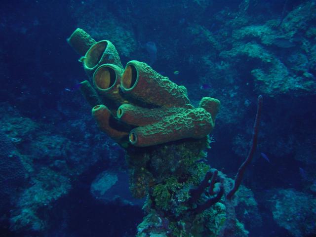

This is beautiful, and it's GFDLed by the uploader. – Quadell (talk) (help)[[]] 20:42, Oct 14, 2004 (UTC)
- Neutral. I love it, but i think it may be too dark. Great photo though. --ScottyBoy900Q∞ 22:26, 14 Oct 2004 (UTC)
- Meets my criteria for FP. If the contributor can lighten it up a bit, that would be great, but I support as is. Denni☯ 23:58, 2004 Oct 14 (UTC)
- Support the color corrected one. I took the liberty of adjusting the colors. (not much red at 30m, even in the caymans). I was surprised myself what a HUGE difference it makes (Press CTRL Reload if you see the old one). Compare the new image with the old one. -- Chris 73 Talk 07:25, Oct 15, 2004 (UTC)
- Oppose the second version: too artificial. (A picture taken at a depth of 30m should show the colours you see at that depth, not the colours you would see at the surface). Could you put the revised version under a separate filename, so we can choose between them? Markalexander100 07:37, 15 Oct 2004 (UTC)
- Support the first version. The "enhanced" version doesn't look very good. Should we try to just lighten the image a bit? ✏ Sverdrup 07:46, 15 Oct 2004 (UTC)
- Oppose. Good to have a photograph like this from a Wikipedian and I like the resemblance to a glove. Unfortuantely this is the sort of thing that the NOAA can do rather well. I've added a better picture to the sponge article.
Also, are we sure this is a sponge? They look a little more like the casings of a sea worm.Actually there is a similar looking Yellow Tube sponge here -- Solipsist 06:52, 16 Oct 2004 (UTC)
Neutral, I took the picture :-) It is a sponge which measured approx. 3 feet, on a "wall" in Cayman at 100-130 feet. As a rule, I never colour correct my pictures. Even at shallow depths the colours on the sponges were somewhat muted, and nowhere near as bright as those of the corrected version. Dlloyd 10:57, 17 Oct 2004 (UTC)
- I would like to apologize again if you felt that I was stepping on your toes by changing the image. Please do not list all of your image contributions for deletion (Category:Candidates for speedy deletion and Wikipedia:Images for deletion), they are quite good and we DO appreciate your contributions! -- Chris 73 Talk 04:16, Oct 18, 2004 (UTC)
- Oppose. The sponges are nice, but the light and visibility weren't. Janderk 19:56, 19 Oct 2004 (UTC)
Shadow puzzle
I can't believe this is true - but it is!!! Probably the best illustration of this awesome illusion.
- Support. JOHN COLLISON | (Ludraman) 19:32, 14 Oct 2004 (UTC)
- Support. This can't be right. This guy must have found a way to put a measuring bug in every image editing progam. -- Solipsist 19:43, 14 Oct 2004 (UTC)
- Support. – Quadell (talk) (help)[[]] 19:44, Oct 14, 2004 (UTC)
- Support. When I put this pic on WP I could not convince myself they were the same grey. So I printed the larger pic, cut out one of the squares, slid it over and, yes, they are identical greys!! - Adrian Pingstone 20:20, 14 Oct 2004 (UTC)
- Support. I have also uploaded a version that I made in POV-Ray if you'd rather have one made for Wikipedia: PaulStansifer 21:12, 14 Oct 2004 (UTC)

Oppose. Yeah it's cool, but is it really featured picture worthy? I think not.Changed my mind Support. --ScottyBoy900Q∞ 22:28, 14 Oct 2004 (UTC)- Oppose. I'm in ScottyBoy's camp. Denni☯ 00:02, 2004 Oct 15 (UTC)
- Support the first version, which is cleaner. Markalexander100 01:41, 15 Oct 2004 (UTC)
- Support the first one -- Chris 73 Talk 07:30, Oct 15, 2004 (UTC)
- Support strongly. I've seen a forum where the posting of this figure triggered lengthy discussions about optical illusions and the mechanisms of visual perception (along with visual tests such as the one performed by Adrian). If that doesn't make a diagram or figure featured picture-worthy, then I don't know what does. Perhaps it should be paired with the same figure superimposed with a solid bar of the same colour connecting the two squares, though, to reveal the illusion. I guess that would require using the second (imo less attractive) version made by Paul since the original is not GFDL or in the public domain. - Oarih 10:02, 15 Oct 2004 (UTC)
- Although the original isn't under GFDL which would support modification, if you follow the source link you can find the grey bar version exactly as requested, which is also copyright but freely usable. -- Solipsist 10:22, 15 Oct 2004 (UTC)
- I created the POV-Ray version because I thought that that would give it a cleaner look. It would be easy to change if you think that there's something specific that would make it more useful for Wikipedia. (The wood frame, for example, I just put in to look cool.) PaulStansifer 17:15, 15 Oct 2004 (UTC)
- I think it would look better without the wood frame and if the dark side of the blue cylinder were a little lighter. Lorax 23:00, Oct 15, 2004 (UTC)
- I've uploaded a new version, sans frame, and with an adjusted color. I've decreased the amount of perspective, but not eliminated it (I think that a little bit is good here). The letters are still in red, because I think that the original picture's use of opposite colors for "A" and "B" is "cheating" by using a different (albeit related) affect. PaulStansifer 06:08, 16 Oct 2004 (UTC) (P.S. since I just overwrote the old one, it may take some time before the thumbnail updates)
- Support - [[User:Bevo|Bevo]] 19:30, 15 Oct 2004 (UTC)
- Support, because it is so hard to believe -- William M. Connolley 21:59, 15 Oct 2004 (UTC). Slight preference for the second one. Query: the original of the first image has the authors name on. Is it clear the permission to reproduce includes permission to remove the name?
- Support. I would prefer the second version, if it could be adjusted to use the same isometric projection. — David Remahl 22:36, 15 Oct 2004 (UTC)
- Support the 2nd version. Well, it's an amazing graphic. --Menchi 02:56, 16 Oct 2004 (UTC)
- The new POV-Ray version is better than the earlier one, but it's still not as effective as the original: both the squares on the POV-Ray version look quite dark to me, while the squares on the original seem to contrast more. Markalexander100 06:34, 16 Oct 2004 (UTC)
- Support original image. I can tell that the squares are of the same brightness in the second if I squint. Actually the same applies for the first, but I have to squint harder there. Fredrik | talk 16:45, 17 Oct 2004 (UTC)
- Support first version - the apparent (though not real) contrast between the squares is greater in the 1st one. (still, I like how in the 2nd one the hex value of the colours is 3D 3D 3D. :-) Evercat 23:33, 17 Oct 2004 (UTC)
- Support. James F. (talk) 00:55, 20 Oct 2004 (UTC)
- Support. Either version, but prefer the 2nd because it comes with pob-ray source. Lorax 22:54, Oct 20, 2004 (UTC)
Enola Gay

Quite an impressive and useful illustrative photo of a historically significant plane - the Enola Gay. Taken by User:Lorax.
- Support - Solipsist 18:40, 14 Oct 2004 (UTC)
- Oppose - background is distracting, not all of the plane is visible. Regrettable. If you got a shot of the plane in the open air, I probably would support. - Ludraman 20:32, 14 Oct 2004
- Oppose. I tried to take this exact same picture at the A&SM but I couldn't find a single shot I wanted to upload. the background there is so cluttered its very hard to get a nice shot of anything. --ScottyBoy900Q∞ 22:29, 14 Oct 2004 (UTC)
- Oppose, same reasons as above -- Chris 73 Talk 07:32, Oct 15, 2004 (UTC)
Bored girl

She is so cute! Awwww -_- Used in boredom. —Joseph | Talk 05:54, Oct 14, 2004 (UTC)
- Oppose: not sharp. Markalexander100 05:58, 14 Oct 2004 (UTC)
- Oppose: agreed not sharp. I would like to also see us supporting pictures that are stated free rather than just not stated not free. Cavebear42 17:39, 14 Oct 2004 (UTC)
- I don't understand. The image is stated free. The site license says "You may use any of the photos in our system free of charge for any commercial or personal design work if you obey the specified restrictions concerning each photo you download" and the individual restrictions are "There are no usage restrictions for this photo." – Quadell (talk) (help)[[]] 17:51, Oct 14, 2004 (UTC)
- I'll retract my statement about copyright. While I still support original photos and explictly stated free licences, this is clearly public domain. Cavebear42 18:14, 14 Oct 2004 (UTC)
- I don't understand. The image is stated free. The site license says "You may use any of the photos in our system free of charge for any commercial or personal design work if you obey the specified restrictions concerning each photo you download" and the individual restrictions are "There are no usage restrictions for this photo." – Quadell (talk) (help)[[]] 17:51, Oct 14, 2004 (UTC)
- Support: The very slight haziness increases the bored feel. – Quadell (talk) (help)[[]] 17:51, Oct 14, 2004 (UTC)
- Oppose. --ScottyBoy900Q∞ 22:30 14 Oct 2004 (UTC)
- Oppose. A very boring (and obviously staged) photo. Denni☯ 00:03, 2004 Oct 15 (UTC)
- Oppose. --Prisonblues 22:46, 15 Oct 2004 (UTC)
Horse in field

Nice colors of a typical rural Australian horse. It shows what the field the horse feeds on, as well as the hayshed which makes up part of his diet.
- Support Self Nomination. --Fir0002 22:24, 13 Oct 2004 (UTC)
- Object to only half a horse, bad lighting, and generally non-spectacular photograph. Denni☯ 22:49, 2004 Oct 13 (UTC)
- Support. [[User:Neutrality|Neutrality (hopefully!)]] 03:38, Oct 14, 2004 (UTC)
- Oppose. Don't like the shadows and the fact that it's not the whole horse. --ScottyBoy900Q∞ 04:02, 14 Oct 2004 (UTC)
- Oppose. Unfortunately, the eye is in the shadow, so the image looks dull -- Chris 73 Talk 04:03, Oct 14, 2004 (UTC)
- Oppose - it's a bit half-assed. ;-) -- ChrisO 18:56, 19 Oct 2004 (UTC)
Beach Towel (occupied)
.jpg.jpg)
.jpg)
Good but not sleazy pic with a good color composition and a nice model. Used for Sunlight (Sunbathing) and Towel -- Chris 73 Talk 09:56, Oct 13, 2004 (UTC)
- Support (Nominator) -- Chris 73 Talk 09:56, Oct 13, 2004 (UTC)
- Comment -- that's a small beach towel! Imagine trying to lie on it on a sandy beach... +sj+
- Support - perfect illustration for the two articles - Adrian Pingstone 11:42, 13 Oct 2004 (UTC)
- Oppose - Maybe it's just me, but when I visualize a typical beach towel it is more tacky and kitschy than the one in this picture. For the sunbathing article, I would think that a photograph of several individuals with some kind of context (on an apartment roof, front lawn, beach or whatever) would be better. - Oarih 12:12, 13 Oct 2004 (UTC)
- Oppose. A beach towel on a lawn? -- William M. Connolley 18:15, 13 Oct 2004 (UTC)
- Oppose. --Oska 00:18, Oct 14, 2004 (UTC)
- Oppose (but not totally unpleasant) --ScottyBoy900Q∞ 04:03, 14 Oct 2004 (UTC)
- Oppose - what William M. Connolley said. ~leif 05:50, 14 Oct 2004 (UTC)
- Oppose. This is not your typical beach towel, beach towel in general want to "show off", so they'll combine impossible colors and patterns, at least not be boring blue, blue is for your own bathroom (and I mean the international meaning of the word). -- Solitude 06:59, Oct 14, 2004 (UTC)
- Oppose. I agree with William M. Connolley. It's clearly a lawn towel. Cavebear42 22:07, 14 Oct 2004 (UTC)
American white ibises
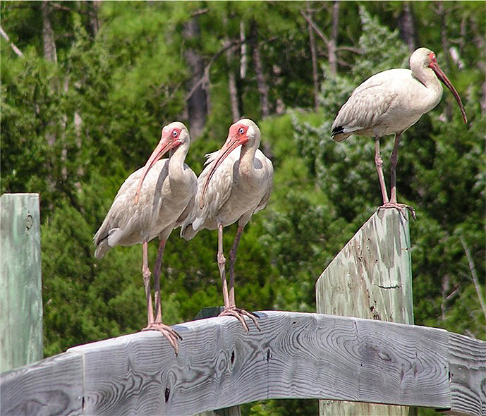

A trio of white ibises, captured at close range by Dutch wikipedian Jcwf (and slightly cleaned up). Nominated for the clarity and humor of the composition (perhaps I just think ibises are comical?). Used in White ibis. +sj+ 10:23, 13 Oct 2004 (UTC)
- Support - very amusing - Adrian Pingstone 11:42, 13 Oct 2004 (UTC)
- Neutral for now - Looks a lot better on the full image, and the composition is excellent. However, I think the picture has been over-sharpened. The original looks a little soft, so halfway between the two might be about right. The trouble is the Ibis on the right doesn't fit against its background. It looks a little fake, as if its been composited into the shot. And the grain on the wood is perhaps too pronounced to be natural. -- Solipsist 17:41, 13 Oct 2004 (UTC)
- Support -- William M. Connolley 18:15, 13 Oct 2004 (UTC)
- Support. Love the background too. Meshes well. --ScottyBoy900Q∞ 19:03, 13 Oct 2004 (UTC)
- Support Markalexander100 08:54, 14 Oct 2004 (UTC)
- Support! [[User:Neutrality|Neutrality (hopefully!)]] 01:43, Oct 20, 2004 (UTC)
Bald eagle longshot

A Bald Eagle photographed at Combe Martin Wildlife and Dinosaur Park, North Devon, England by Adrian Pingstone. I prefer the pose for the subject's grace, fine coiffure, and dancer's pose; but those who dislike the surroundings might prefer the close-up. Both images have been modified slightly. The latter is used in bird of prey; a wider version of the former is used in bald eagle. +sj+ 10:23, 13 Oct 2004 (UTC)
- Support the one on the left; he looks like a clever chap! Dunc_Harris|☺ 10:29, 13 Oct 2004 (UTC)
- Support the full body picture -- Chris 73 Talk 10:43, Oct 13, 2004 (UTC)
- Nominating two pictures always is a problem. Anyway, my thoughts are: The picture of the head only is brilliant, and I'd support its promotion, while the full body picture is somewhat dull. ✏ Sverdrup 11:13, 13 Oct 2004 (UTC)
- Support - I prefer the closeup - Adrian Pingstone 11:42, 13 Oct 2004 (UTC)
- Support the head shot. I was going to say it was hard to support this Bald Eagle when this one didn't get promoted. However, on a side by side comparison it think I might prefer Adrian's shot, apart from the background. -- Solipsist 17:31, 13 Oct 2004 (UTC)
- Support the headshot. --ScottyBoy900Q∞ 19:04, 13 Oct 2004 (UTC)
- Wow! Support both/either. [[User:Neutrality|Neutrality (hopefully!)]] 20:17, Oct 13, 2004 (UTC)
- Support the closeup. Woa!! It's breathtaking! Unbelievably sharp and detailed. The whole-one is a bit too farway and white. Not really suppporting that. --Menchi 22:53, 15 Oct 2004 (UTC)
- Oppose. Nice photo, but the unnatural background destroys it. It may as well have been taken at the zoo. Where is the interest in that? --Might and power 07:05, 20 Oct 2004 (UTC)
North Devon Jackdaw
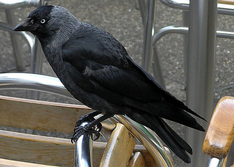

A jackdaw amid some chrome cafe furniture, also photographed by Adrian P (and sharpened). I can't quite put my finger on it, but something about this photo grabs me. Used in jackdaw. +sj+ 10:23, 13 Oct 2004 (UTC)
- Oppose -- too messy. Dunc_Harris|☺ 10:27, 13 Oct 2004 (UTC)
- Oppose (and I took it!) - background is just a little too messy - Adrian Pingstone 11:42, 13 Oct 2004 (UTC)
- Oppose - agree with Dunc and Adrian. The outline of the jackdaw is fairly clean, so if anyone could be bothered you could probably photoshop out the chairs and replace them with a branch and a bit of sky. But even then I doubt it would be a feature candidate. -- Solipsist 17:47, 13 Oct 2004 (UTC)
- Oppose --ScottyBoy900Q∞ 19:05, 13 Oct 2004 (UTC)
Splitting log with an axe
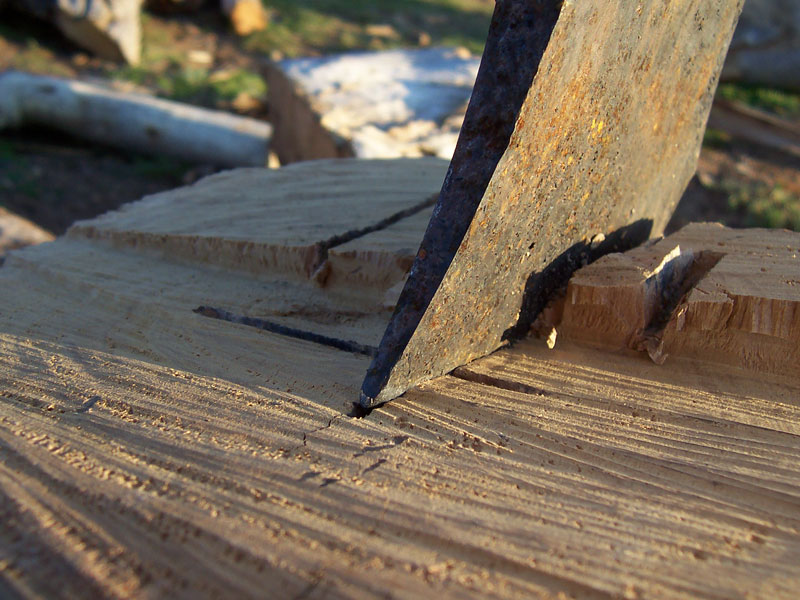

Shows the use of an ancient tool. Fits in beautifullly in the axe page
- Support. Self Nom. --Fir0002 06:58, 13 Oct 2004 (UTC)
- Oppose. It's a nice shot, but there is not much axe in it. Also, the saw cutting the wood left grooves that at first glance looked like the grain of the wood, and I was wondering why the axe was splitting the wood at a 90° angle to the grain. -- Chris 73 Talk 09:17, Oct 13, 2004 (UTC)
- Oppose; it's a very good picture, but it does not illustrate the article axe well enough. ✏ Sverdrup 11:16, 13 Oct 2004 (UTC)
- Oppose, agree with Sverdrup and Chris - Adrian Pingstone 11:42, 13 Oct 2004 (UTC)
- Oppose, ditto chris 73 -- William M. Connolley 18:15, 13 Oct 2004 (UTC)
- Oppose. --ScottyBoy900Q∞ 19:06, 13 Oct 2004 (UTC)
- Oppose. How does it illustrate an axe? I thought it was a bench... The blade being some elbow rest or ...something metallic.... It is a very confusing photo. --Menchi 02:54, 16 Oct 2004 (UTC)
JPEG example flower.jpg

Dramatically illustrates the quality/size tradeoff in JPEG. Illustrating a technical principle so well is rare. GFDL work by David Crawshaw. Twinxor 06:45, 13 Oct 2004 (UTC)
- Support. Twinxor 07:01, 13 Oct 2004 (UTC)
- Oppose. The white background makes it hard to really follow the degrading of the image. Very nice idea, though. -- Chris 73 Talk 09:26, Oct 13, 2004 (UTC)
- Oppose; maybe a better picture to do a similar thing to would be Image:Sunflowers.jpg? Dunc_Harris|☺ 09:54, 13 Oct 2004 (UTC)
- Oppose, the changing loss of quality is not well shown - Adrian Pingstone 11:42, 13 Oct 2004 (UTC)
- Oppose. Don't like white background. Pretty flower though. --ScottyBoy900Q∞ 19:06, 13 Oct 2004 (UTC)
Colorado potato beetle
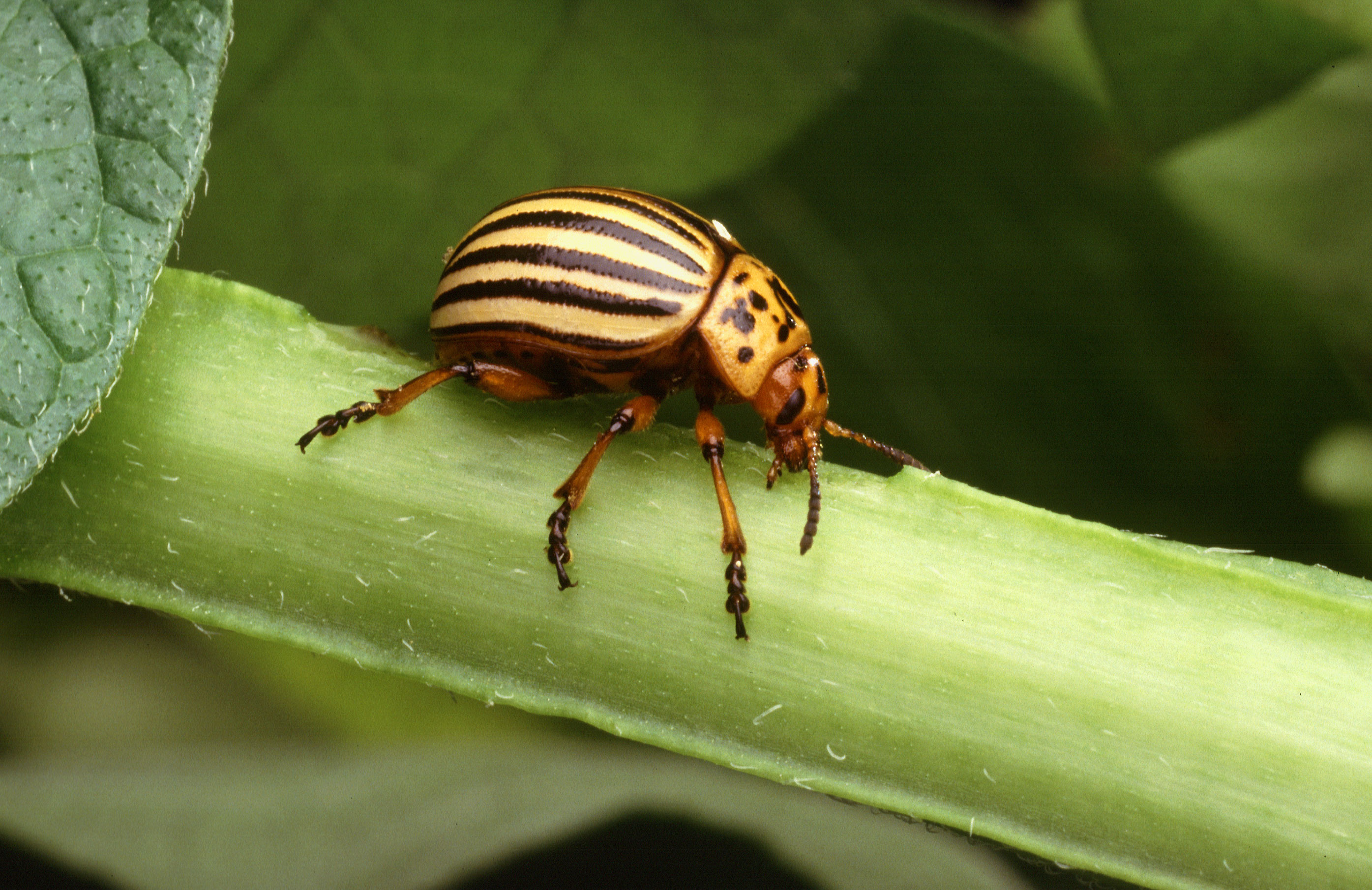

Another US agriculture one. Dunc_Harris|☺ 17:02, 12 Oct 2004 (UTC)
- Support. I took the liberty of uploading a larger version of the image and adding a link to the source. -- Chris 73 Talk 09:21, Oct 13, 2004 (UTC)
- Support. --ScottyBoy900Q∞ 22:31, 14 Oct 2004 (UTC)
Wax play on back

Self-nomination. I think it's pretty, I like the composition and I consider it a good illustration for the subject. Also, it's tasteful. - grendel|khan 08:21, 2004 Oct 12 (UTC)
- Support grendel|khan 08:21, 2004 Oct 12 (UTC)
- Support. Simon A. 16:53, 12 Oct 2004 (UTC)
- Oppose. [[User:Neutrality|Neutrality (hopefully!)]] 22:43, Oct 12, 2004 (UTC)
- Oppose. Good illustrative photo for the article in that it shows well how much wax may be used in this type of activity. I don't see much to recommend it as a feature picture though. It's not visually striking to me at all. --Oska 22:46, Oct 12, 2004 (UTC)
- Support - nice shot, nice model -- Chris 73 Talk 09:14, Oct 13, 2004 (UTC)
- Support. Yes, pretty AND a little odd... — Matt 10:51, 13 Oct 2004 (UTC)
- Support. But along with Image:BDSM collar back.jpg I have to worry about what might come next. - Solipsist 17:58, 13 Oct 2004 (UTC)
- Oppose. --ScottyBoy900Q∞ 19:07, 13 Oct 2004 (UTC)
- Support – Quadell (talk) (help)[[]] 20:05, Oct 13, 2004 (UTC)
- Support. - Oarih 05:40, 14 Oct 2004 (UTC)
- Support. ~leif 05:50, 14 Oct 2004 (UTC)
- Oppose. The colours are not visually pleasant. The plastic bag in the front is distracting too. I admire the subject's endurance of hot wax, however. Incidentally, it reminds me of the shower cleanup scene of the 90s remake of Psycho. No, Anne! [joking] --Menchi 23:08, 15 Oct 2004 (UTC)
- Oppose. Interesting picture, the problem is that the featured images section already contains the BDSM collar picture. One image about this sexual behavior subject seems enough. The Wikipedia featured images section should be an encyclopedia collection covering a broad range of subjects, not a BDSM collection. Janderk 09:02, 18 Oct 2004 (UTC)
- I think this is an unfair reason for opposition. I suggest that we should simply judge pictures on their own merits (with regard to their article context) and not with the aim of creating a balanced collection of Featured Images. If it's a great image, it should be featured (and if it's not, it shouldn't). — Matt 10:04, 18 Oct 2004 (UTC)
- Another comment: The collar image shows off the B&D (Bondage and Discipline) side, but of course there's no S&M implied. This wax-play shot is clearly S&M, but without the B&D. (She's not tied down, for instance.) So the two shots show off different fetishes. They're as different as, say, amphibians and lizards. No one would object to a good amphibian pic, just because we already had a lizard featured pic. – Quadell (talk) (help)[[]] 11:58, Oct 18, 2004 (UTC)
- Oppose. Would be better with a bit more of the body form, and by losing the distracting plastic tarp. -- Netoholic @ 01:46, 2004 Oct 20 (UTC)
- Oppose. Come off it you guys. The only reason you're nominating this photo is because it has a naked women in it. Whats beautiful, striking, shocking, impressive, titillating, fascinating, or in short just brilliant about an ugly combination of waxes. Featured picture! [I oppose this form of expression]. No way. --Might and power 07:09, 20 Oct 2004 (UTC)
- Your offensive comment has been refactored, without destroying context nor the core of your argument. -- [[User:Solitude|Solitude\talk]] 12:05, Oct 20, 2004 (UTC)
- I supposed I'd run into this sort of thing sooner or later. The model is naked, yes, but is obscured both by scads of wax and by the framing of the image itself. I thought we were here to be relatively neutral about the merits of the image. I didn't think this was a soapbox for subjects that bother you. Shouldn't you be over on VfD trying to get rid of wax play, if the subject offends you so much? (And I think your hysteria reveals that the image at least fits the 'titillating' criterion). I can understand people opposing the image on artistic grounds (and thank you all for your suggestions, but I didn't expect anti-perv bias here. I suppose I've been living in a bubble. grendel|khan 16:17, 2004 Oct 20 (UTC)
- Support. Picture provokes an emotional reaction from viewer, even if unpleasent. Brilliantly fitting for an article in BDSM. The plastic illustrates the reality of this lifestyle. [[User:Davodd|DAVODD «TALK»]] 01:15, Oct 21, 2004 (UTC)
- Support. I've considered the possible psychological damage to children caused by seeing someone's back, but I think the risk is worth taking. Markalexander100 02:16, 21 Oct 2004 (UTC)
SEM image of pollen
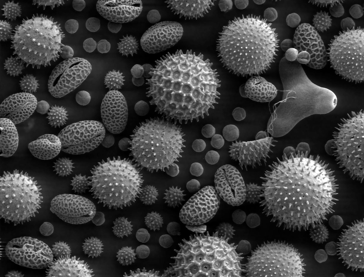

- A closer view of pollen for anyone who wasn't persuaded by the Scanning Electron Microscope image below - although this one is not taken by a wikipedian. -- Solipsist 07:16, 12 Oct 2004 (UTC)
- Support - Solipsist 07:16, 12 Oct 2004 (UTC)
- Support -- Chris 73 Talk 07:53, Oct 12, 2004 (UTC)
- Support. Yes, this one I do like. -- Solitude 11:29, Oct 12, 2004 (UTC)
- Support. Just added the pic to the SEM page as well. Simon A. 16:53, 12 Oct 2004 (UTC)
- At first glance appears to be golf balls! Support. [[User:Neutrality|Neutrality (hopefully!)]] 19:47, Oct 12, 2004 (UTC)
- Support. Excellent example of the use of SEMs where identification of pollen in soil samples is very important in paleo-geography research. --Oska 22:31, Oct 12, 2004 (UTC)
- What a collection! Reason enough to have made those fidgety scopes in the first place. Support. +sj+ 07:34, 13 Oct 2004 (UTC)
- Support. Excellent! timo 15:38, 13 Oct 2004 (UTC)
- Support. Awesome. --ScottyBoy900Q∞ 19:09, 13 Oct 2004 (UTC)
- Support. Excellent, stunning. --Wpopp 08:55, 14 Oct 2004 (UTC)
- Strong support. --Prisonblues 22:51, 15 Oct 2004 (UTC)
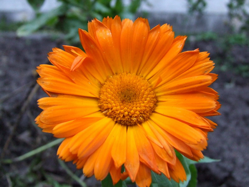
Marigold (Calendula officinalis)

- Great GFDL image from the German Wikipedia. [[User:Neutrality|Neutrality (talk)]] 04:18, Oct 12, 2004 (UTC)
- Oppose - very ordinary and a liitle soft in focus - Adrian Pingstone
- Support. I like. --ScottyBoy900Q∞ 19:10, 13 Oct 2004 (UTC)
- oppose, out of focus; like a dodgy movie or something. Dunc_Harris|☺ 21:04, 13 Oct 2004 (UTC)
- Comment: The image should have some information on attribution or its source. I guess this might be on the German version of this image. -- Solipsist 16:12, 14 Oct 2004 (UTC)
Pylon from below
This image, used in the neglected Pylon article, was created by "brokenarts" from http://www.sxc.hu The page declares: "There are no usage restrictions for this photo." Pretty, for an undoctored photo. – Quadell (talk) (help)[[]] 21:16, Oct 11, 2004 (UTC)
- Oppose.
Photo is too low resolution, the sky is dull and the angle is off slightly. [[User:Norm|Norm]] 21:47, 11 Oct 2004 (UTC) - Oppose. --ScottyBoy900Q∞ 02:43, 12 Oct 2004 (UTC)
- Oppose. Good idea, too low resolution. --Fir0002 05:53, 12 Oct 2004 (UTC)
- Oppose. I uploaded a larger resolution image (CTRL - reload if you see pixels)), but it still looks to me like a computer game B/W screenshot. There are much better images available on the site (search for Pylon). -- Chris 73 Talk 08:05, Oct 12, 2004 (UTC)
- Oppose - too jagged Twinxor 06:45, 13 Oct 2004 (UTC)
- Oppose - neat picture, but it doesn't really show what a Pylon looks like at all. ~leif 05:50, 14 Oct 2004 (UTC)
Tomb of the Unknowns

.png)
A little something I took on my last trip to Washington. →Raul654 17:11, Oct 11, 2004 (UTC)
- Oppose. I like it, but think it's kinda boring. No offense. --ScottyBoy900Q∞ 18:51, 11 Oct 2004 (UTC)
- Oppose. It's obvious it was an overcast day and unfortunately, the contrast is too low because of it. Also, the sentry should be cropped out entirely since he's chopped off. Autiger 19:34, 11 Oct 2004 (UTC)
- Neutral. Good photo, but the ugly wreath and cropped-off soldier are distracting. It illustrates the article quite nicely, though. [[User:Neutrality|Neutrality (talk)]] 04:10, Oct 12, 2004 (UTC)
- Oppose. Doesn't strike me. Simon A. 16:54, 12 Oct 2004 (UTC)
- The sky's all wrong, Image:USCasualtiesC130DoverAFB.jpg does a better job given its relevance today and the stupidity of the War, or from an earlier period something like [5] [6] maybe has a certain "oh shit" factor. Dunc_Harris|☺ 22:50, 12 Oct 2004 (UTC)
- Oppose. Too dark, not a good composition, and the metal thingie holding the flowers looks cheap. -- Chris 73 Talk 09:11, Oct 13, 2004 (UTC)
![[5]](http://www.battlefield-tours.com/Menin%20Gate%20(names).jpg)
![[6]](http://www.battlefield-tours.com/Thiepval%20(names_3).jpg)
Orion Nebula

This is one of my favorite things to look at with my telescope. I figured I'd nominate this since this is one of my favorite pictures of the nebula.--ScottyBoy900Q∞ 03:37, 11 Oct 2004 (UTC)
- Support. [[User:Neutrality|Neutrality (talk)]] 03:45, Oct 11, 2004 (UTC)
- Support. A beauty. --Fir0002 07:13, 11 Oct 2004 (UTC)
- Support -- Chris 73 Talk 11:43, Oct 11, 2004 (UTC)
- support -- a 100x better than #Kepler.27s_Supernova Dunc_Harris|☺ 16:50, 11 Oct 2004 (UTC)
- Support. Brilliant photo. Its hard to imagine such beauty lies in the black sky above us. I mean sure, stars a great, but that is stunning. --Fir0002 05:56, 12 Oct 2004 (UTC)
- Support. Actually a very different type of animal compared to Kepler's_Supernova, but I might have to reconsider my vote on the Supernova remnant. -- Solipsist 07:32, 12 Oct 2004 (UTC)
- Support. The best pic of the Orion nebula I've seen so far. Simon A. 16:55, 12 Oct 2004 (UTC)
- Strongly support. Great find, ScottyBoy.--Eloquence*
- Support. James F. (talk) 00:51, 20 Oct 2004 (UTC)
Strelitzia

On the subject of the lack of flower photos, this one looks good. Dunc_Harris|☺ 19:36, 9 Oct 2004 (UTC)
- Support - William M. Connolley 20:17, 9 Oct 2004 (UTC).
- Support. Beautiful. Denni☯ 03:18, 2004 Oct 10 (UTC)
- Support. --ScottyBoy900Q∞ 03:16, 11 Oct 2004 (UTC)
- Support Janderk 11:41, 11 Oct 2004 (UTC)
- Support -- Chris 73 Talk 11:44, Oct 11, 2004 (UTC)
- Support. Autiger 01:42, 12 Oct 2004 (UTC)
- Support. -- Solipsist 07:27, 12 Oct 2004 (UTC)
- Support. Just great. Simon A. 16:56, 12 Oct 2004 (UTC)
- Support. Very clean, nicely contrasted on black background. Sense of motion. Tim McCormack 18:09, 2004 Oct 13 (UTC)
- Support. Nice one. -spencer195 05:48, 16 Oct 2004 (UTC)
- Support. James F. (talk) 00:51, 20 Oct 2004 (UTC)
Barlach Magdeburger Ehrenmal

(Self nomination) Photo of historically significant art, used for Degenerate art, Ernst Barlach, and Cathedral of Magdeburg -- Chris 73 Talk 14:59, Oct 9, 2004 (UTC)
- Support. Very nice shot. --ScottyBoy900Q∞ 03:16, 11 Oct 2004 (UTC)
- Support
Neutral for now. It's well lit with bold outlines and internal detail. The story behind the statue is an interesting one too.However, the large view is a little grainy. And for some reason the central figure rather reminds me of Hitler even though there isn't actually a moustache. That can't be helped but completely subverts the intended meaning for me. -- Solipsist 07:26, 12 Oct 2004 (UTC)- I played around with GIMP a bit, trying to reduce the grain (Do CTRL-Reload). "Hitler" is supposed to be a french officer. The sculpture is from 1929, ten years before Hitler came to power. -- Chris 73 Talk 09:15, Oct 12, 2004 (UTC)
- Hitler came to power in 1933, four years after 1929. Nazi Germany invaded Poland in 1939, causing the UK and France to declare war. Dunc_Harris|☺ 10:27, 12 Oct 2004 (UTC)
Oppose. At least the large version seems to be out of focus. --Wpopp 09:16, 14 Oct 2004 (UTC)- Still playing around with the Gimp. Removing grain reduces focus, improving focus increases grain. In the current version I have removed the grain only from the background, which has less features, and the foreground is still in focus. Out of all versions so far, this one is the one i feel most happy with. -- Chris 73 Talk 12:15, Oct 14, 2004 (UTC)
- OK, Chris, opposition withdrawn. --Wpopp 09:18, 15 Oct 2004 (UTC)
- Still playing around with the Gimp. Removing grain reduces focus, improving focus increases grain. In the current version I have removed the grain only from the background, which has less features, and the foreground is still in focus. Out of all versions so far, this one is the one i feel most happy with. -- Chris 73 Talk 12:15, Oct 14, 2004 (UTC)
Cathedral of Magdeburg


(Self-Nomination): Very nice shot of the largest cathedral in east Germany. Used in Magdeburg, Cathedral of Magdeburg, and Clerestory. -- Chris 73 Talk 14:48, Oct 9, 2004 (UTC)
- Supprt. I was thinking of nominating this myself. →Raul654 02:05, Oct 10, 2004 (UTC)
- Support. Looks great. --ScottyBoy900Q∞ 03:15, 11 Oct 2004 (UTC)
Oppose. The picture is slightly crooked, which is distracting for me.Neutral. Okay, it isn't leaning. It looks like it's leaning when the image is on the right side of the screen, but when I center the pic, it looks fine. Weird. – Quadell (talk) (help)[[]] 04:05, Oct 16, 2004 (UTC)- I disagree. I think the lines are in almost perfect alignment. For checking I created Image:MagdeburgAngles.jpg, where I added a few strictly vertical lines, and e.g. the one in the center is going straight through the end stones of the ceiling, the center window, and the stone at the bottom. To check the distortion and center, I have also flipped the lower half of the image, so the right side is now on the left side. The lines of the columns align almost perfectly, and the only thing I had to do was to move the lower half about 1% to the right, indicating that the image would need to be cropped on one side by about 1%, which i think is negilible. Maybe it's a variation of the Café wall illusion? -- Chris 73 Talk 02:11, Oct 12, 2004 (UTC)
- Support. I'm not sure how that illusion would apply. It does look as if it is leaning very slightly to the right. It might be related to the left hand wall being lighter, or it might be that a horizontal line drawn between the pillars either side of the front row of chairs suggests a very slight rotation of ~0.4° (or perhaps its a skew). Surely that's about as good as it gets and the verticals are more important. -- Solipsist 07:42, 12 Oct 2004 (UTC)
- Neutral - could someone clone out the visitor at the very left? He/she is slightly distracting.--Eloquence*
- Support. I thought it was leaning myself... drawing a horizontal line from pillar bases it is, a bit, by maybe 5-10 pixels, but this isn't so much -- William M. Connolley 22:13, 15 Oct 2004 (UTC).
- Support. But the image isn't as sharp as architectural photos could be. (Out of focus?) Maybe it's an artifact of being scanned or saved as JPG too many times? --Menchi 22:47, 15 Oct 2004 (UTC)
Zermatt and Matterhorn

A very effective shot Zermatt in the Swiss alps, although it is the Matterhorn which makes the picture. Taken by User:Stan Shebs. - Solipsist 13:24, 9 Oct 2004 (UTC)
- Support. - Solipsist 13:24, 9 Oct 2004 (UTC)
- Support -- Chris 73 Talk 14:16, Oct 9, 2004 (UTC)
- Support, with respect to Zermatt. The picture has great composition, and illustrates the location of Zermatt very well, compensating for weak points of the photo. ✏ Sverdrup 14:59, 9 Oct 2004 (UTC)
- Support - I'm all too aware of the weak points, but don't suppose the Foundation will fly me back for a reshoot. :-) This is a scan of a 35mm, if there are suggestions for how to improve, will be happy to rescan/reprocess. Stan 18:31, 9 Oct 2004 (UTC)
- support -- I like it but would like to see a version with the village cropped out for comparison. Dunc_Harris|☺ 19:02, 9 Oct 2004 (UTC)
- Well then it would be of Zermatt... but User:Stan Shebs also took the closer shot of just the mountain at the top of Matterhorn. I think this one has a better balance and range of interest though. -- Solipsist 19:14, 9 Oct 2004 (UTC)
- Support - William M. Connolley 20:17, 9 Oct 2004 (UTC).
- Support. I'd love to see this in person. --ScottyBoy900Q∞ 03:14, 11 Oct 2004 (UTC)
- Support. Simon A. 17:00, 12 Oct 2004 (UTC)
- Support. Great composition; the shocked look on the face of the steeple sealed it for me. +sj+ 07:33, 13 Oct 2004 (UTC)
Wind turbines

A USDA-ARS photograph of wind turbines by Scott Bauer. Quite dramatic and also shows the development of wind turbines. -- Solipsist 13:14, 9 Oct 2004 (UTC)
- Support - Solipsist 13:14, 9 Oct 2004 (UTC)
- support Dunc_Harris|☺ 19:00, 9 Oct 2004 (UTC)
- Support. Great photo. --Fir0002 22:59, 9 Oct 2004 (UTC)
- Support. --ScottyBoy900Q∞ 03:13, 11 Oct 2004 (UTC)
- Oppose. While the sunset makes the shot 'arty' it distracts the viewer's focus from the turbines and it means they only see the structures in silhouette. Too much of the photo is a display of the supporting scaffolding of the turbines, and the two turbines at the front are seen side-on which is not very helpful. --Oska 22:42, Oct 12, 2004 (UTC)
- Oppose - messy, and none of the turbines are seen clearly - Adrian Pingstone 13:25, 13 Oct 2004 (UTC)
Field of Sunflowers

Oh no its a flower picture! However we don't actually have that many featured flowers, and nothing like this one. Used at Sunflower to show a commercial crop. A USDA photo by Bruce Fritz - Solipsist 13:08, 9 Oct 2004 (UTC)
- Support - Solipsist 13:08, 9 Oct 2004 (UTC)
- Support. I uploaded a larger version of the image, press CTRL reload if you see picels -- Chris 73 Talk 14:17, Oct 9, 2004 (UTC)
- Support. Janderk 15:56, 9 Oct 2004 (UTC)
- Oppose - hackneyed (sp?) - William M. Connolley 20:17, 9 Oct 2004 (UTC).
- Support. --ScottyBoy900Q∞ 03:13, 11 Oct 2004 (UTC)
- Support. Very nice. Autiger 01:41, 12 Oct 2004 (UTC)
- Support. Nice. Better than the windows 'bliss' background. Sky looks really good with all the sunflowers. --Fir0002 05:55, 12 Oct 2004 (UTC)
Period photo of Jubilee
This is a period photograph (1954) of an ex-LMS Jubilee Class Sandwich with a train. It's not making much smoke (which shows its being driven well, but not spectacuarly), but it's all in focus. There is a minor bit of damage on about the fifth/six carriages back. There is lots of other detail in the picture, viz the telegraph poles (since all removed), the jointed track (now replaced by welded) and the bridge girders. The loco is painted green, btw, and has a British Railways early logo on its tender. The carriages are in blood and custard livery. (see http://www.jubilees.co.uk ) Dunc_Harris|☺ 12:45, 8 Oct 2004 (UTC)
- Support. Maybe this can be worked into the London, Midland and Scottish Railway article? -- Chris 73 Talk 15:19, Oct 9, 2004 (UTC)
- Oppose - just not very striking - William M. Connolley 20:17, 9 Oct 2004 (UTC).
- Oppose. Agree with William M. Connolley. --ScottyBoy900Q∞ 03:11, 11 Oct 2004 (UTC)
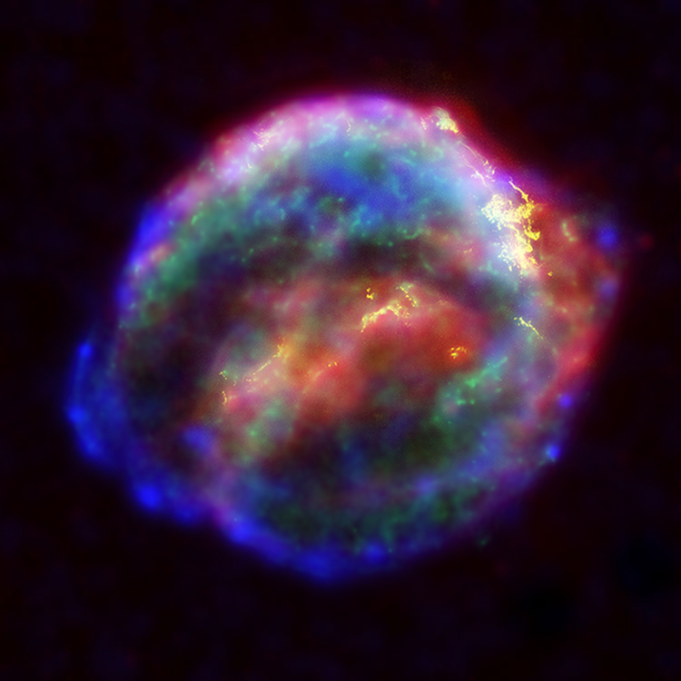
Kepler's Supernova

Beautiful NASA image of remnants of Kepler's Supernova, SN 1604, the last supernova in the Milky Way observed with certainty by man kind. Janderk 10:18, 8 Oct 2004 (UTC)
- Support Janderk 10:18, 8 Oct 2004 (UTC)
- Strong support. I very nearly nominated it myself when you added it to the Kepler article. Its a false colour image, but that's pretty much required if you are going to incoporate X-ray data. -- Solipsist 10:25, 8 Oct 2004 (UTC)
- support -- Chris 73 Talk 10:48, Oct 8, 2004 (UTC)
- oppose; no wow factor, just a mushed up bunch of colours. Dunc_Harris|☺ 12:45, 8 Oct 2004 (UTC)
- Support. →Raul654 08:38, Oct 9, 2004 (UTC)
- Support - William M. Connolley 20:17, 9 Oct 2004 (UTC).
- Support WOW Amazing. --ScottyBoy900Q∞ 03:10, 11 Oct 2004 (UTC)
- Support. One that made me say "Wow". Markalexander100 00:34, 13 Oct 2004 (UTC)
- Support. James F. (talk) 00:52, 20 Oct 2004 (UTC)
Peacock

Dunc_Harris|☺ 19:54, 7 Oct 2004 (UTC)
- Support - best photo I've seen in quite awhile. [[User:Neutrality|Neutrality (talk)]] 01:31, Oct 8, 2004 (UTC)
- Support - but I bet there are peacock images of the whole bird (including all of its plumage) that might be just as nice. --ScottyBoy900Q∞ 02:37, 08 Oct 2004 (UTC)
- Support - I quite like the focus on the head and neck rather than getting the whole tail. -- Solipsist 07:25, 8 Oct 2004 (UTC)
- Support - I took the pic (can I vote?) - Adrian Pingstone 19:10, 9 Oct 2004 (UTC)
- Yes you can, and I support as well. -- Solitude 06:47, Oct 11, 2004 (UTC)
- Support - William M. Connolley 20:17, 9 Oct 2004 (UTC).
- Comment from the photographer: luckily no-one has mentioned that the pic looks to be leaning but, just in case anyone has been thinking so, it's the peacock that's leaning not the pic! - Adrian Pingstone 10:49, 12 Oct 2004 (UTC)
- Oppose. Compositionally this photo just doesn't work for me. It's hard for me to say why. Perhaps the small patch of grass is distracting, but also I think the amount of the bird shown. Neither the bird with all it's tail or a close-in of mainly the bird's body. For such a visually stunning bird I think we could have a much more striking picture. --Oska 22:51, Oct 12, 2004 (UTC)
Horse Chestnuts
A taste of autumn. Used to illustrate the seeds of the horse chestnut tree, but mostly I just like the textures and colours. Taken by me a couple of weeks ago. - Solipsist 17:29, 7 Oct 2004 (UTC)
- Support (self nomination). - Solipsist 17:29, 7 Oct 2004 (UTC)
- Support. Perfect focus, good composition, colors, yups! -- Solitude 17:59, Oct 7, 2004 (UTC)
- Support. As good as it gets. As this is a self-nomination: Would it be possible to change the license to GFDL? Janderk 19:23, 7 Oct 2004 (UTC)
- Support. I see no problem with the licence. Dunc_Harris|☺ 19:24, 7 Oct 2004 (UTC)
- Support. -- Chris 73 Talk 22:19, Oct 7, 2004 (UTC)
- Support. Very nice picture, adds to the article. I like your attention to detail, showing how they look at different stages and having the background being horse-chestnut leaves. Lorax 00:16, Oct 8, 2004 (UTC)
- Support. Wonderfully composed! Denni☯ 01:36, 2004 Oct 8 (UTC)
- Support. Exceptional! Great composition and incredibly illustrative. Autiger 05:03, 8 Oct 2004 (UTC)
- Support. Beautiful photo, very nice colors/composition and the lack of jpeg compression is really good. --Fir0002 06:00, 8 Oct 2004 (UTC)
- Support! Is it available in a higher resolution? I would love to use it as my desktop background. — David Remahl 23:43, 8 Oct 2004 (UTC)
- Support. Like the colors. --ScottyBoy900Q∞ 03:08, 11 Oct 2004 (UTC)
- Support. I noticed this image on Solipsist's image page and was going to nominate it myself. It is an excellent photograph, visually striking while also strongly informative of the featured item. --Oska 22:59, Oct 12, 2004 (UTC)
- Support. One of my favourite WP images, but I'm a sucker for conkers (er...) — Matt 15:24, 20 Oct 2004 (UTC)
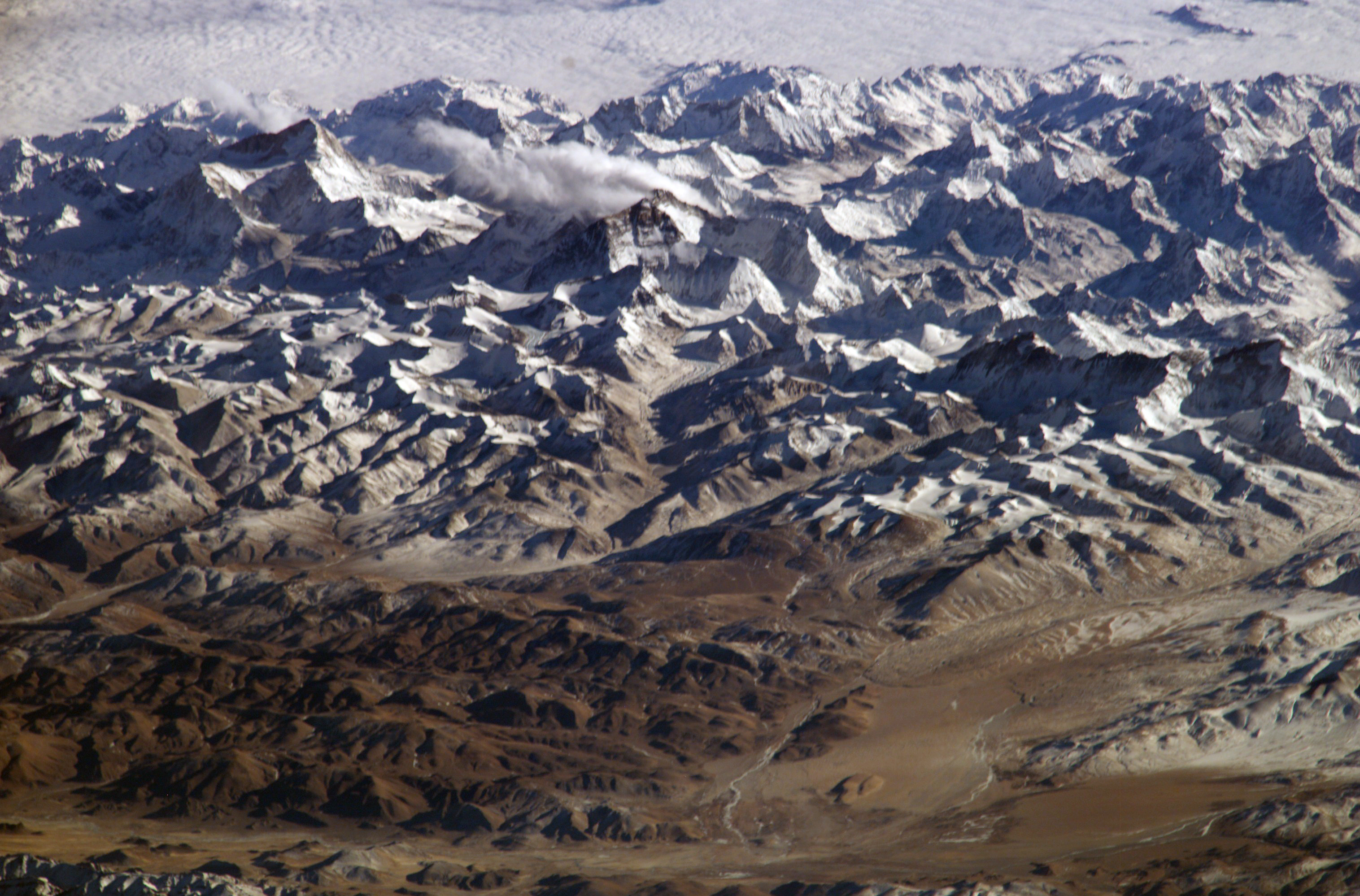
The Himalaya Mountains


It's large, it's striking, and it is of a scale rarely seen in photography of any kind. The oblique angle is also interesting, and the colors are especially vivid and clear for an image from orbit. A PD NASA image, but impressive no less. - Matthewcieplak 12:25, 7 Oct 2004 (UTC)
- Support -- Matthewcieplak 12:25, 7 Oct 2004 (UTC)
- Support! That is a stunning picture. But could you add the source and the {{PD-USGov-NASA}} tag to the image page? -- Chris 73 Talk 07:37, Oct 7, 2004 (UTC)
- Support alternative 1: I wondered which mountain was where and where people would climb mount everest. Anyway after doing some research I created alternative 1 with annotations, trying to make the image more informative for an encyclopedia. Janderk 15:18, 7 Oct 2004 (UTC)
- Support. As an image I prefer it without annotations. But the labels are useful, so I would support either way. -- Solipsist 17:17, 7 Oct 2004 (UTC)
- support unannotated version (the annotations spoil it as a photo. But I agree its nice to have them identified, so I think the unannotated pic should link to the annotated version) - William M. Connolley 20:05, 7 Oct 2004 (UTC).
- Support Himalayas.jpg - [[User:Bevo|Bevo]] 09:24, 8 Oct 2004 (UTC)
- Support. -- Kaihsu 15:42, 2004 Oct 8 (UTC)
- Support the first, unmarked version. This looks much better blown up than the small thumb version. --ScottyBoy900Q∞ 03:07, 11 Oct 2004 (UTC)
Nominations older than 14 days, the minimum voting period, decision time!
Old nominations should be archived when they are removed from this page: October archive.
When you promote an image, please perform the following:
- Add the image to Wikipedia:Goings-on - latest on top
- Add the image to Wikipedia:Featured pictures - note the two sections (wikipedian / non-wikipedian)
- Add the image to Wikipedia:Featured pictures visible - note the two sections (wikipedian / non-wikipedian)
- Update the picture's tag: {{FPC}} -> {{FeaturedPicture}}
- Optionally you can check Wikipedia:Picture of the day and feature the image as upcoming POTD.
Nomination for removal
Here you can nominate featured pictures you feel do not longer live up to featured picture standards.
Note: Support = Delist | Oppose = Keep
Lagoon Nebula

No match to Featured Picture standards criteria.
- Nominated for delisting by [[User:Bevo|Bevo]] 20:59, 6 Oct 2004 (UTC)
- Support delisting. As proof that there are better space images I nominated the remnants of Kepler's supernova. Janderk 10:23, 8 Oct 2004 (UTC)
- Support delisting. It might take a professional team, but the Orion Nebula above shows so much more. - Solipsist 16:03, 14 Oct 2004 (UTC)
- Keep - in the "created by wikipedians" section, this is the best Nebula pic there.Cavebear42 16:02, 19 Oct 2004 (UTC)
- I would agree with you if the Orion and Eagle Nebula images weren't nominated above. Both will probably make it into the featured images soon. I voted for removal because those other two are much more striking. Janderk 20:04, 19 Oct 2004 (UTC)