
Heat map
A heat map (English heat = 'heat', 'heat'; map = 'map', e.g. thermal image like a thermal imaging camera ) is a diagram for the visualization of data based on a function (mathematics) with which a two-dimensional set of definitions (e.g. the points on a house wall or a map) can be mapped onto the number line (e.g. the scale on a thermometer) and displayed in color. This visualization is used to provide an intuitive and quick overview of a large amount of data and to make particularly striking values easily recognizable.
The term heat map is fuzzy. It ranges in the narrow interpretation of (high) temperatures on a map to tree maps with unsystematic color coding. The provisions are widely used
- two-dimensional set of definitions: rows and columns of a table, axes of a mathematical function , screen coordinates (photo, website)
- Color coding of the dependent values: Representation using a temperature scale (which can be recognized as such), ordinal-scale or graded assignment of the hue, following a (section) of the spectrum or the color wheel; monochrome variation of saturation or brightness; but also black and white or gray values, shaded, dotted, hatched or graphically differentiated in other ways.
The name heatmap is derived from the fact that some colors are associated with temperatures.
history
The use of heat maps goes back at least to Toussaint Loua , who in 1873 presented statistical data for the arrondissements of Paris as a table with shaded fields, first in black and white, then in color.
Sneath (1957) presents the result of a cluster analysis by permuting the rows and columns of a matrix in order to place similar values close together according to their accumulation. The idea of adding cluster trees to rows and columns in a data table goes back to Robert Ling in 1973. Leland Wilkinson developed the first computer program ( SYSTAT ) in 1994 to generate cluster heatmaps with great color depth.
Color coding
If the dependent variable is a scalar , it can be mapped naturally on a temperature scale. If you assign a color to a temperature in a second step, blue is considered a cold color , red, orange and yellow are warm colors , this explains the name heatmap.
The connection between color and temperature is culturally shaped and not mandatory. The choice of the color scale is therefore arbitrary and up to the creator of the heatmap.
With fixed endpoints of the scale, the question of transition colors arises. An incandescent lamp with increasing current flow first glows red (warm), then turns yellow and finally white (hot). Complemented by the cold blue, a color scale can look like this: Black (achromatic, coldest) - blue - purple - red - yellow - white (achromatic, hottest).
A wider use of the color wheel advances from blue to green, yellow and orange to red. Violet can appear here as the coldest color below blue. Red is then the hottest, violet the coldest, in contrast to the incandescent lamp model, where purple and red represent mean temperatures.
Color is a vague term in this context. It can be made more precise, for example, by hue, saturation and brightness or by red, green and blue components or other parameter models. This allows either further dimensions (data series) to be displayed in a diagram or problems such as color ametropia or black-and-white printouts can be defused by restricting them .
variants


Heat map
A heat map in the narrower sense represents a temperature distribution on a map, such as the (summer) temperatures in the city or on a topological subway map.
Heat map is the literal German translation of heat map. To what extent this describes the same concepts or creates a false friend , whether the loan word can become established in its English or German spelling in the German-speaking area is unclear.
Thermal image
A thermal image represents temperatures color-coded in two dimensions. Since the measured value is in principle already a temperature, there is no abstraction step from the measured value to a temperature scale. Thermal images represent the original form of the heatmap and explain their name.
False color image
In the case of false color images, the colors or grayscale of an original image are recoded to new colors in order to increase the contrast or the intuitive perception.
Clustered heat map
If there is no order on the axes of the table, the rows (columns) can be permuted without loss of information . If the swap is carried out in such a way that similar rows (columns) follow one another, the table receives an additional structure and the clusters are clearly visible.
Choropleth map
In a choropleth map , the colored areas do not follow a rigid rectangular grid, but are assigned to the irregularly shaped areas on a map, such as types of vegetation, climatic zones or administrative boundaries. Some people mistakenly use the more handy heatmap instead of the correct term choropleth map for the sake of convenience.
Tree Map
A tree map is not based on a two-dimensional table, but on a hierarchical set of nodes. It is doubtful to what extent the term heat map is justified here, especially if the colors do not follow an intuitively comprehensible system or trivial values such as the path length are color-coded instead of the partition size in a file system. The same applies to mosaic diagrams .
Alternatives
Instead of using color, a variable value can also be represented using other characteristics. Combinations with colors in general and a heatmap in particular are possible.
Bubble chart
Instead of a color, the dependent variable value can also be represented by a geometric figure, for example a circle in a bubble diagram . The value is then either proportional to the diameter or the area. In a table with three independent parameters, the circle becomes a sphere. This display is particularly useful when the axes are ordered and the table is sparsely populated .
bar chart
In a column chart , the variable values are represented by the height of columns. Further dimensions can be gained by adding further columns per table field. Maxima can be recorded very well, smaller values in the background are covered by larger values in the foreground. The same applies to a surface diagram .
Applications
A selection of applications for heatmaps (list not exhaustive):
- Molecular biology
- Visualization of gene expression data ; Illustration of how experimental conditions affect the production (expression) of mRNA for a group of genes.
- Web design
- Visualization of clicks, mouse movement or gaze duration (eye tracker) for the purpose of development and success control, supports the optimization of the layout, the usability and the placement of elements and advertising materials on online shops, blogs, portals and normal websites.
- Function graph
- alternatively or as a reinforcement, a function graph can be provided with a heat map on a two-dimensional definition set .
- Sports
- Length of stay of football players in a certain area of the playing field
- Geolocation
- News and their accumulation on a world map. In the same way, photos, precipitation, births and deaths and any other geolocalizable date can be visualized.
- Stock exchange
- Price movement relative to the previous day, backed up with background information
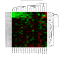
Cluster heat map in the gene expression analysis with cluster trees on the axes

Web analysis : click density on a website

Length of stay on the football field

Combination of heat map and surface diagram


software

- R (Statistics Software) - Free statistics software, quasi-standard in the academic field, contains several functions for drawing heatmaps
- Gnuplot - universal and free command line oriented program for function graphs , enables drawing of 2D and 3D heat maps. Similar programs are PyXPlot , Matplotlib, and others.
- The diagram type of the heatmap is widespread in biology , so that there is a large number of manufacturers who offer suitable software.
- Microsoft Excel can be made to generate heat maps by using the surface chart. Since the legend's default colors are incompatible with a heat map, the colors can be changed to create user-friendly and intuitive heat maps. LibreOffice and OpenOffice.org do not offer this type of diagram directly, but the images can be generated using conditional formatting.
properties
People with color ametropia can perceive the information in a heatmap with bright colors worse, incorrectly or not at all. This should be taken into account when considering accessibility . The color can vary depending on the output medium: Each screen displays colors differently; During printing, there is a change from additive to subtractive color mixing , which changes the color impression. The limitation to monochrome color scales or gray values can help here.
Web links
- Online tool to search for tweets and visualize them in a map on tweetmap.fh-mainz.de
- JavaScript library for creating dynamic web heatmaps on patrick-wied.at
Individual evidence
- ↑ Michael Friendly, Daniel J. Denis: Milestones in the history of thematic cartography, statistical graphics, and data visualization. 2001, accessed on August 15, 2011 (English): "First-known use of a semi-graphic table to display a data table by shading levels"
- ^ Leland Wilkinson, Michael Friendly: The History of the Cluster Heat Map . November 18, 2008, p. 11 (English, uic.edu [PDF; 2.7 MB ; accessed on August 15, 2011]).
- ↑ Map reveals hotspots of the tube. In: News. BBC Mobile, August 24, 2009, accessed on August 15, 2011 (English, article linked to a heat map of the London Underground lines): "The heat map monitored most underground lines in zones one and two on July 28 last year - the hottest day of the year. "
- ↑ Pete Warden: FAQ - Why call it OpenHeatMap when it generates choropleths? In: OpenHeatMap. github, September 13, 2010, accessed on August 15, 2011 (English): "I can never remember how to spell cloro ... churo ... that word"
- ↑ Newsmap. Marcos Weskamp, accessed on August 15, 2011 (News collector as tree map. (Arbitrary) categories are mapped to color tones, the message age to the brightness (the older the darker)).
- ↑ Mike Glindmeier: More data, more live, more mobile. SPIEGEL-ONLINE, August 4, 2011, accessed on August 15, 2011 (example of a heat map): "You can use the squares to understand the movement profile of the respective player."
- ↑ Ilya Grigorik: World News With Geographic heatmaps. January 31, 2007, accessed August 15, 2011 .
- ^ Peter Simpson: FTSE Market Heatmap Monitor. Panopticon, archived from the original on February 16, 2013 ; Retrieved on August 15, 2011 (English, price movements on the FTSE 100): "A heat map monitors price changes within the constituents of the FTSE 100 Index."
- ↑ gnuplot demo script: heatmaps.dem. gnuplot, May 30, 2009, accessed on August 15, 2011 (English, examples with source code for generating heatmaps in SVG format).