
Warming stripes
_-_Climate_Lab_Book_(Ed_Hawkins).png)
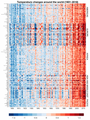
The Warming Stripes ( engl. Heating strip ), and heat strip or air strips are a scientific visualization of climatologists Ed Hawkins to make that uses a series of colored, chronologically arranged strips to long-term temperature variations visible. The Warming Stripes employ a “ minimalist ” style that uses only colors and dispenses with distracting details to give non-scientists an intuitive understanding of global warming .
story
Ed Hawkins, Professor of Climate Science at the University of Reading , attracted a lot of attention in 2016 with an animated “climate spiral”. The Washington Post described it as "the most impressive visualization of global warming ever"; it was seen during the opening ceremony of the 2016 Summer Olympics .
In 2017, climate physicist Ellie Highwood , who also works at the University of Reading, published a knitting pattern for a crocheted blanket in the pattern of the Warming Stripes with Hawkins' support . As a result, the idea was further developed internationally as a “climate scarf”.
In May 2018, Ed Hawkins published a first version of the Warming Stripes on his blog. In addition to a graph for the global rise in temperature, he added versions for Central England and Toronto and, in July 2018, also for Germany, Switzerland and Vienna . He wrote:
“Climate change is a complex global issue that requires easy communication about its impact at the local level. This series of visualizations illustrates how we have witnessed temperature changes around the world over the past hundred years and beyond. The color of each stripe represents the temperature for a single year, sorted by the earliest available data in each location to date. All other superfluous information is removed so that the temperature changes are easily and undeniably visible. "
After Hawkins released the Warming Stripes, the graphic went viral internationally . A localized version download website was used over a million times in the first week after its release.
The original concept of visualizing historical temperature data has since been expanded to include the use of animations, to visualize sea level rise and climate models, as well as to visually compare temperature progressions with other data such as the CO 2 content of the atmosphere , glacier melt or rainfall .
Warming stripes laid one on top of the other with average values from all countries in the world

Visualization of two climate policy options based on the warming stripes
.png)

Coloring
Warming stripes always represent temperature anomalies of a place, a region or the entire surface of the earth. As usual in meteorology, a range of blue colors is used for relatively cool temperatures and red colors for warm temperatures. In the Hawkins color scheme, the center of the color scale is placed on the mean temperature of the selected region in the period 1971-2000. Years with cooler temperatures receive one of eight shades of blue, which show increasing saturation with increasing deviation. Years with higher temperatures receive increasingly saturated red tones accordingly. The minimum temperature anomaly of the period shown is given the blue with the highest saturation, the maximum the corresponding red. The decisive factor in choosing 1971–2000 as the reference period was that around half of the global warming observed up to the mid-2010s had been reached during this period . As a result, the temperature or color gradations are usually roughly the same for anomalies in both directions.
Because the end points of the color scale are selected according to the extreme values of the region under consideration, the colors of the warming stripes are always a relative visualization related to the region. The colors used come from a much-used palette for cartography.
use
The warming stripes found their way into everyday culture via colored clothing and other objects and became a widely used symbol of the climate protection movement .
Various newspapers and magazines used the Warming Stripes on their front pages, including the Economist . A version with historical temperature data for Vienna appeared on the front page of the Wiener Zeitung in August 2018 .
In September 2019, the Freiburger Verkehrs AG used the warming stripes to design a "climate protection tram". From the end of 2019, the warming stripes could be seen in a projection on the facade of the German Maritime Museum in Bremerhaven in the evening .
In June 2020, the new design of the facade of the train station in Cottbus caused a stir because - according to the architects, it happened to be reminiscent of the warming stripes.


The Warming Stripes at the UN Climate Change Conference 2019

Extinction Rebellion demonstration in the colors of the Warming Stripes in October 2019 in Berlin

Logo of the Special Committee of the US House of Representatives to the climate crisis


reception
The warming stripes are given great importance in the visualization of global warming due to their comprehensibility. According to one voice, “they have replaced the polar bear on the melting iceberg as a symbol of the climate crisis”.
On the website klimafakten.de it said in 2018:
“The result is extremely simple and can therefore be grasped intuitively extremely quickly - and the almost artistic beauty of his graphics is reminiscent of classics of abstract painting. [...] If you didn't know better, you could think of this graphic as a piece of modern art. It could hang on the wall of a museum, woven as a carpet decorate noble living rooms. Perhaps it will actually do that at some point and thus spread the facts about global heating in a very special way. Even when you look at it for the umpteenth time, the 'Warming Stripes' do not lose their aesthetic appeal, which is broken by knowing what they are showing - and the unsettling idea of what this means. "
In 2019 the Warming Stripes were awarded in the visualization competition "Vis for Future" at the Potsdam University of Applied Sciences . The jury justified its decision:
"Whether global or local - the climate strips have managed to develop an effect through their innovative, minimalist design and to convey a message that is still urgent."
Joachim Müller-Jung wrote in the Frankfurter Allgemeine Zeitung about the " plot that allows the world climate crisis to be understood better than any number":
"At first glance and for everyone, the drama of recent warming is recognizable - actually, the 'state of emergency', the crisis that climate activists and researchers alike lament today, immediately catches the eye: it is the unprecedented acceleration of climate change in the recent past. You don't need a lot of numbers, the colors speak a clear language here. "
Ed Hawkins was recognized by the Royal Society in 2018 for "actively communicating climate science and its various implications to a broad audience"; In 2020 he was accepted into the Order of the British Empire "for services to climate science and science communication" .
Web links
- Ed Hawkins: Warming stripes , Climate Lab Book, Open climate science, May 22, 2018 (English) - original publication of the Warming Stripes
- #ShowYourStripes - Website for downloading current and regional Warming Stripes
- Zeit Online: Much too warm here - interactive website for generating local warming stripes for German cities
Individual evidence
- ↑ Spiralling global temperatures. In: Climate Lab Book. May 9, 2016, accessed August 9, 2020 .
- ↑ Jason Samenow: Unraveling spiral: The most compelling global warming visualization ever made. In: The Washington Post. May 10, 2016, accessed on August 9, 2020 .
- ↑ a b c d Umair Irfan: Why this climate change data is on flip-flops, leggings, and cars. In: Vox. March 4, 2019, accessed on August 9, 2020 .
- ^ Ellie Highwood: The art of turning climate change science to a crochet blanket. In: Atmospheric Sciences. June 15, 2017, accessed August 8, 2020 .
- ↑ Markus Mack: This self-knitted scarf shows how much the earth has warmed up in 138 years. In: ze.tt. December 12, 2019, accessed August 8, 2020 .
- ^ Ed Hawkins: Warming stripes. In: Climate Lab Book. May 22, 2018, accessed August 8, 2020 .
- ↑ Helena Wittlich: The best representations of climate change. In: Tagesspiegel Digital Present. September 27, 2019, accessed August 8, 2020 .
- ^ Ed Hawkins: The story behind the viral graphic that electrified the climate movement. September 20, 2019, accessed August 8, 2020 .
- ↑ American Meteorological Society IIPS (Interactive Information and Processing Systems) Subcommittee for Color Guidelines: Guidelines for Using Color to Depict Meteorological Information: IIPS Subcommittee for Color Guidelines . In: Bulletin of the American Meteorological Society . September 1993, doi : 10.1175 / 1520-0477 (1993) 074 <1709: GFUCTD> 2.0.CO; 2 .
- ↑ a b c Erica Bugden: Do you really understand the influential warming stripes? In: Voilà. December 3, 2019, accessed on August 9, 2020 .
- ↑ The climate issue . In: The Economist . September 21, 2019.
- ↑ The heat will be over soon, but only for this year . In: Wiener Zeitung . 23 August 2018, p. 1, 13 .
- ↑ Climate protection tram is supposed to draw attention to global warming. In: Freiburger Verkehrs AG. September 12, 2019, accessed August 8, 2020 .
- ^ The Freiburger Verkehrs-AG now has its own climate protection tram. In: Badische Zeitung. September 10, 2019, accessed August 8, 2020 .
- ^ Ed Hawkins Warming Stripes on the roof of the German Maritime Museum. In: German Maritime Museum. December 2, 2019, accessed August 8, 2020 .
- ↑ Michael Sauerbier: Does the railway in Cottbus warn of climate change? In: Berliner Zeitung. June 10, 2020, accessed August 8, 2020 .
- ↑ Incredibly beautiful: Earth's overheating as a colored bar code. In: klimafakten.de. June 6, 2018, accessed August 8, 2020 .
- ↑ “Vis for Future” visualization competition - these are the winners. In: University of Applied Sciences Potsdam. September 27, 2019, accessed August 8, 2020 .
- ↑ Joachim Müller-Jung: Climate change in a graphic: Excessively overheated! In: Frankfurter Allgemeine Zeitung . June 26, 2019 ( faz.net [accessed August 8, 2020]).
- ↑ Our changing climate: learning from the past to inform future choices. In: Royal Society. April 30, 2019, accessed on August 9, 2020 .
- ↑ [2020] New Year Honors List. United Kingdom . In: The London Gazette . December 28, 2019, p. N18 ( thegazette.co.uk ).