Justified
When justified or closed line breaks are in the typography to the method to set a text so that the lines are brought to the same width. With texts in the Latin alphabet , this is mainly done by expanding the spaces between words.
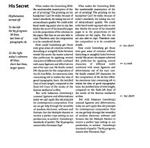
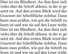
The edges appear to be optically flush on both the left and the right. However, on closer inspection, one can often see that thin characters (such as a hyphen ) and round characters (such as the letter "o") actually protrude slightly beyond the actual edge of the text, as this even gives the optical impression of flush through an optical illusion reinforced; so also in the example shown on the right.
The last line of a text formatted in justified text is usually oriented towards the left margin of the paragraph , and the text expires according to its remaining length. In rare cases, for example with some poems or to achieve a special visual effect, the last line can also be centered on the width of the column.
The first line of a paragraph is often slightly indented in order to make the beginning of the paragraph recognizable even if the last line of the previous paragraph happens to take up (almost) the entire width.
A forced justification is used when the last line of a paragraph is extended to the full line length.
Methods for designing the justification

With justification, care should be taken that there are no too large gaps between the words. These "holes in the text" are caused by too few characters per line; therefore, the number of characters per line (including spaces ) should not be less than about 40 when it comes to typographically demanding texts. In the newspaper industry, however, the lines are almost principally around or below this size, because then the justification brings out its real advantage.
To resolve this contradiction, several methods are possible in order to make the words appear as harmonious and even as possible. Automatic functions of modern word processing and desktop publishing programs and fonts ( fonts and their styles ) can be used in electronic typesetting in particular . The visual quality of the generated justification is very different due to the program.
- Increased word separation at the end of the line
- Changed word spacing, both methods are known collectively as exclude :
- The expulsion increases the spaces between words
- The introduction reduces the word spacing
- In addition, the is letter spacing used:
- The expanding (locked set) by increasing the distances between the letters
- The condensation (close contact) by reducing the spacing between letters
- But this leads to apparent Awards (emphasis by blocking set or incidental) of words. This is avoided in modern high-end printing typesetting software, for example through complicated condensing or expanding, which is typographically adapted to each individual letter of the font and which also relates to the font size ( intelligent font scaling ) . In some cases, the individual letters themselves can be made slightly wider or narrower.
application
Typical areas of application for justified are texts in newspapers , magazines and books . In the case of other printed matter, depending on the amount of text used and the intended effect, a decision must be made on a case-by-case basis between justified, flatter and center-axis typesetting. Justification is rather uncommon in web design because for a long time it was not possible to automatically break words at the end of a line and therefore long gaps can easily arise in the text. Since CSS 3 can indeed (with the hyphens property) automatic hyphenation by the browser are enabled, but not all browsers support this yet, because so far many CSS 3 features are not official standard and were not implemented (as of March 2015). Whether automatic hyphenation is possible can also depend on the language in question, since Firefox and Internet Explorer , for example, use “ hyphenation dictionaries ” that are not yet available for all languages.
The strict alignment of the lines requires the reader's eye to concentrate. It is also more difficult for the eye to grasp the individual words if the word spacing is larger than usual. The focus of the eye is normally on a word plus the last / first two letters of the preceding or following word. In order to achieve a smooth reading flow, one should make sure that the word spacing is not too large in a justified sentence, otherwise the eye is tired and it becomes more difficult for the reader to grasp the content. The block set is used, because he the type area completely fills. In the one-column sentence it is used more for supposed aesthetic reasons, but in the multi-column sentence it is indispensable in order to make the column boundaries clearly come into their own. With modern single-column layouts, justification is no longer used as often for the reasons listed above.
See also
- Legibility , the quick recognition of text - on the question of justified or fluttering?
- Readability , the ability to understand text quickly
literature
- Albert Ernst: Interaction - text content and typographic design . Königshausen and Neumann, Würzburg 2005, ISBN 3-8260-3146-6 .
- Rudolf Paulus Gorbach (ed.): Reading recognition. A symposium of the Typographische Gesellschaft München on November 13 and 14, 1998 . Typographische Gesellschaft, Munich 1998, DNB 95965786X (without ISBN).
- Helmut Hiller, Stephan Füssel: Dictionary of the book . 7th edition. Vittorio Klostermann, Frankfurt am Main 2006, ISBN 3-465-03495-3 .
Individual evidence
- ↑ Software patent: EP580900 Process for outputting text on high-resolution output devices (Web link: Text excerpt ( memento of the original from January 17, 2008 in the Internet Archive ) Info: The archive link was inserted automatically and has not yet been checked. Please check the original and archive link accordingly Instructions and then remove this note. , On GaussProject gauss.ffii.org)
- ↑ https://developer.mozilla.org/de/docs/Web/CSS/hyphens , accessed on March 16, 2015
- ↑ http://dev.w3.org/csswg/css-text-3/#hyphens , accessed on March 16, 2015
- ↑ Mozilla maintains a list of supported languages: https://developer.mozilla.org/en-US/docs/Web/CSS/hyphens#Languages_support_notes , accessed on March 16, 2015
Web links
- Online block set simulator (English) ( Memento of 19 August 2011 at the Internet Archive )
