
Wikipedia:Featured picture candidates: Difference between revisions
-6 |
add gretzky |
||
| Line 9: | Line 9: | ||
Place new nominations at the TOP of the group |
Place new nominations at the TOP of the group |
||
--> |
--> |
||
{{Wikipedia:Featured picture candidates/Wayne Gretzky}} |
|||
{{Wikipedia:Featured picture candidates/Spinning Dancer}} |
{{Wikipedia:Featured picture candidates/Spinning Dancer}} |
||
{{Wikipedia:Featured picture candidates/Butterfly vindula arsinoe}} |
{{Wikipedia:Featured picture candidates/Butterfly vindula arsinoe}} |
||
Revision as of 10:06, 12 February 2008
| Skip to: |
 Featured pictures are images that add significantly to articles, either by illustrating article content particularly well, or being eye-catching to the point where users will want to read its accompanying article. Taking the adage that "a picture is worth a thousand words", the images featured on Wikipedia:Featured pictures should illustrate a Wikipedia article in such a way as to add significantly to that article, according to the featured picture criteria.
If you believe an image should be featured, create a subpage (use the "For Nominations" field, below) and add the subpage to the current nominations section. For promotion, if an image is listed here for ten days with five or more reviewers in support and the consensus is in its favor, it can be added to the Wikipedia:Featured pictures list. Consensus is generally regarded to be a two-thirds majority in support, including the nominator and/or creator of the image; however, anonymous votes are generally disregarded, as are opinions of sockpuppets. All users may comment. However, only those who have been on Wikipedia for 25 days and with at least 100 edits will be included in the numerical count. If necessary, decisions about close candidacies will be made on a case-by-case basis. Nominations started in December are given three extra days, due to the holidays slowing down activity here. The archive contains all opinions and comments collected for candidate nominations and their nomination results. If you nominate an image here, please consider also uploading and nominating it at Commons to help ensure that the pictures can be used not just in the English Wikipedia but on all other Wikimedia projects as well.
A featured picture can be nominated for delisting if you feel it no longer lives up to featured picture standards. You may also request a featured picture be replaced with a superior image. Create a subpage (use the "For Delists" field, below) and add the subpage to the current nominations section. Please leave a note on the talk page of the original FPC nominator (and creator/uploader, if appropriate) to let them know the delisting is being debated. The user may be able to address the issues and avoid the delisting of the picture. For delisting, if an image is listed here for ten days with five or more reviewers supporting a delist or replace, and the consensus is in its favor, it will be delisted from Wikipedia:Featured pictures. Consensus is generally regarded to be a two-thirds majority in support, including the nominator. Note that anonymous votes are generally disregarded, as are opinions of sockpuppets. However, images are sometimes delisted despite having fewer than five in support of their removal, and there is currently no consensus on how best to handle delist closures, except that:If the image to be delisted is not used in any articles by the time of closure, it must be delisted. If it is added to articles during the nomination, at least one week's stability is required for the nomination to be closed as "Kept". The nomination may be suspended if a week hasn't yet passed to give the rescue a chance. Outside of the nominator, all voters are expected to have been on Wikipedia for 25 days and to have made a minimum of 100 edits. If necessary, decisions about close candidacies will be made on a case-by-case basis. As with regular nominations, delist nominations are given three extra days to run if started in December.
|
Featured picture tools: |
|
Step 1:
Evaluate Evaluate the merit of a nomination against the featured picture criteria. Most users reference terms from this page when evaluating nominations. |
Step 2:
Create a subpage
To create a subpage of Wikipedia:Featured picture candidates for your nomination, add a title for the image you want to nominate in the field below (e.g., Wikipedia:Featured picture candidates/Labrador Retriever) and click the "Create new nomination" button.
To create a subpage for your delist, add a title for the image you want to delist/replace in the field below and click the "Create new delist nomination" button.
|
Step 3:
Transclude and link Transclude the newly created subpage to the Featured picture candidate list (). |
|
How to comment for Candidate Images
How to comment for Delist Images
Editing candidates
Is my monitor adjusted correctly?  In a discussion about the brightness of an image, it is necessary to know if the computer display is properly adjusted. Displays differ greatly in their ability to show shadow detail. There are four dark grey circles in the adjacent image. If you can discern three (or even four) of the circles, your monitor can display shadow detail correctly. If you see fewer than three circles, you may need to adjust the monitor and/or computer display settings. Some displays cannot be adjusted for ideal shadow detail. Please take this into account when voting.  Displays also differ greatly in their ability to show highlight detail. There are light grey circles in the adjacent image. If you can discern three (or even four) of the circles, your monitor can display highlight detail correctly. If you see fewer than three circles, you may need to adjust the monitor and/or computer display settings (probably reduce the contrast setting). Some displays cannot be adjusted for ideal highlight detail. Please take this into account when voting.  On a gamma-adjusted display, the four circles in the color image blend into the background when seen from a few feet (roughly 75–150 cm) away. If they do not, you could adjust the gamma setting (found in the computer's settings, not on the display), until they do. This may be very difficult to attain, and a slight error is not detrimental. Uncorrected PC displays usually show the circles darker than the background. Note that the image must be viewed in original size (263 × 68 pixels) - if enlarged or reduced, results are not accurate. Note that on most consumer LCD displays (laptop or flat screen), viewing angle strongly affects these images. Correct adjustment on one part of the screen might be incorrect on another part for a stationary head position. Click on the images for more technical information. If possible, calibration with a hardware monitor calibrator is recommended. |
- To see recent changes, .
Current nominations
Wayne Gretzky


- Reason
- Taken from PPR as I was archiving. A good high-res shot of Gretzky, to the best of my knowledge the best ice-hockey player ever. This is most likely scanned from film; it has a bit of noise, but is reasonable, and I can't see anything else that even comes close in terms of overall quality (size, pose, action, etc). Some people may grumble over some parts being cutoff, but it seems to compare well to many other 'famous people' FPs.
- Articles this image appears in
- This is a noise reduced version of Image:Wgretz.jpg. I have nominated the improved version from PPR - obviously it will replace the original in all articles if promoted. Original is in Wayne Gretzky, National Hockey League, New York Rangers, and about seven other articles.
- Creator
- Original uploader was Hakandahlstrom; larger version uploaded by IrisKawling. Edit by Krm500.
- Support as nominator jjron (talk) 10:04, 12 February 2008 (UTC)
- Oppose Noise everywhere (esp. on his face). It has other flaws, but noise is the one that will be difficult to get away from. You might be able to make a little bit of progress on the noise with a pseudo-posterisation technique, but I'm not getting my hopes up just yet. Samsara (talk • contribs) 12:41, 12 February 2008 (UTC)
- I'm fairly positive that what you call noise is actually film grain (that was before the digital cameras for those who remember ;-) ). And I'd strongly advise against any posterisation techniques to remove it. --Dschwen 15:56, 12 February 2008 (UTC)
- I tried to remove some of it, this is the edited version, the original file is in the peer review. Maybe someone can do a better job then me with it? --Krm500 (talk) 16:33, 12 February 2008 (UTC)
- I don't know how the cause being film grain excuses the fact that it compromises the quality of the image. Samsara (talk • contribs) 12:01, 13 February 2008 (UTC)
- I'm fairly positive that what you call noise is actually film grain (that was before the digital cameras for those who remember ;-) ). And I'd strongly advise against any posterisation techniques to remove it. --Dschwen 15:56, 12 February 2008 (UTC)
- Support, I like it. --Chinese3126 (talk) 16:22, 12 February 2008 (UTC)
- Support edit. per nom. Preceding unsigned comment added by Clegs 22:56, 12 February 2008
- Support edit 1...though I'm probably a bit biased, being a hockey fan. We need more sports images and this is a great shot. A pity some parts are cut off. CillaИ ♦ XC 23:15, 12 February 2008 (UTC)
- Comment Here is the original photo from the author on flickr. As you can see I've applied general color correction to eliminate the yellowish hue, and a slight crop. So any further touchup attempts should probably be made using the original, no? However I'm not sure how much more can be done. IrisKawling (talk) 00:42, 13 February 2008 (UTC)
- Comment http://www.flickr.com/photos/dahlstroms/252547547/ indicates the author licensed it as 'all rights reserved' was the license changed from Creative Commons, or was this licensing ever valid ? Shifthours (talk) 06:58, 13 February 2008 (UTC)
- GFDL/CC licenses are irrevocable and the uploader appears to be the owner of the photo. Suggest sending a Flickr mail to make sure. MER-C 08:47, 13 February 2008 (UTC)
- Hakandahlstrom uploaded the photo himself at my request, licensing it under CC. I just color corrected it for him and transfered it the commons. IrisKawling (talk) 09:30, 13 February 2008 (UTC)
- The uploader has worked as a professional sports photographer, and has contributed with many high quality images in the past. You can trust him regarding image ownership. I recently contacted him asking if he had a better resolution photo, he didn't want to upload any higher resolution or any new images since some of his work had been stolen here on wikipedia, but hoped the current size would be enough for a FPC. I think it's a shame that the image policy is the way it is, because many photographers stop contributing. I would gladly release my images for use by the Wikimedia Foundation and all educational use, but having to releasing them for any large corporation to use is bs IMO. --Krm500 (talk) 11:21, 13 February 2008 (UTC)
- Support good shot! H92110 (talk) 06:51, 14 February 2008 (UTC)
- Weak support edit 1. Composition is not the greatest, but the noise reduction has dealt with the major problem. Samsara (talk • contribs) 12:34, 14 February 2008 (UTC)
- Oppose Poor composition - cut off arm and hockey stick. Sharpness is poor also after the noise reduction --Fir0002 01:20, 15 February 2008 (UTC)
- I'd say at least 70% of Wikipedia:Featured pictures/People have cutoff bits (not including what is obviously cutoff in a head-and-shoulders portrait). You can pretty clearly tell he's playing hockey, and it's not like it's being used to illustrate hockey sticks or gloves. In other words, I don't think the cutoff bits are that relevant, which I said in the nom anyway. --jjron (talk) 09:34, 15 February 2008 (UTC)
- Weak oppose. It's the composition that kills it for me - I know portraits can be cut off at the shoulders, but for a hokey player's stick to be cut off just seems out of place. Pstuart84 Talk 19:03, 15 February 2008 (UTC)
- Support Composition may not be perfect, but this is high-quality and uber-encyclopedic, and it's not like we're going to get a better photo of the world's best hockey player ever playing hockey. Calliopejen1 (talk) 20:22, 15 February 2008 (UTC)
Promoted Image:Wgretz edit2.jpg MER-C 08:09, 18 February 2008 (UTC)
Spinning Dancer

- Reason
- This image is very popular around the net and I was surprised not to see it on wikipedia. Thus I uploaded the image and thought it be good if it was a FP because it is a great optical illusion. It is also doing well at commons FPC
- Articles this image appears in
- The Spinning Dancer, Optical Illusion
- Creator
- Nobuyuki Kayahara
- Strong Support as nominator Muhammad(talk) 06:34, 12 February 2008 (UTC)
- Support That is one of the coolest things I've seen in a while - you keep staring at it and then it'll suddenly change direction --Fir0002 09:25, 12 February 2008 (UTC)
- Weak Support Not very encyclopedic, but too cool to not support. Dengero (talk) 11:26, 12 February 2008 (UTC)
- Oppose. This may seem petty to some people, but I'm fairly certain that to anyone who has ever actually had to execute spins in dancing, the fact that this lady is really badly off balance will be such a major distraction as to nullify any other interest the image may have. Let me put that in plain language: if you applied gravity to her, she would fall over. I'm sure she could be animated to in balance without disrupting the illusion. Samsara (talk • contribs) 16:28, 12 February 2008 (UTC)
- Well, look where the image is used--two optical illusion articles. Who knows if it would even work if the dancer were on balance? gren グレン 07:24, 13 February 2008 (UTC)
- I'm puzzled that nobody seems to know how it works, and about 1/3 of people cannot make it work. I'm beginning to doubt that this is a proper optical illusion at all, and I certainly doubt our ability to write a coherent article about it. Most crucially, if we can't have a discussion about whether it is possible to create an alternative image that addresses certain criticisms brought up in this discussion, then we should not promote it at all. Additionally, show me how an image that you don't understand can be encyclopaedic. Samsara (talk • contribs) 11:55, 13 February 2008 (UTC)
- I believe it works because the image is a silhouette. Thus when the lifted leg passes the standing leg, it may be passing either in front of or behind the standing leg. Depending upon which your brain settles on (for want of a better phrase) you will see the woman rotate either clockwise or counterclockwise. Pstuart84 Talk 17:15, 13 February 2008 (UTC)
- I'm puzzled that nobody seems to know how it works, and about 1/3 of people cannot make it work. I'm beginning to doubt that this is a proper optical illusion at all, and I certainly doubt our ability to write a coherent article about it. Most crucially, if we can't have a discussion about whether it is possible to create an alternative image that addresses certain criticisms brought up in this discussion, then we should not promote it at all. Additionally, show me how an image that you don't understand can be encyclopaedic. Samsara (talk • contribs) 11:55, 13 February 2008 (UTC)
- Well, look where the image is used--two optical illusion articles. Who knows if it would even work if the dancer were on balance? gren グレン 07:24, 13 February 2008 (UTC)
- Support - I'm finding that the only way I can get it to spin the other way is to cover up everything but to the lowest foot, then get it to rotate the other way, then uncover everything. — BRIAN0918 • 2008-02-12 16:29Z
- Comment That's just sick, mostly spins counterclockwise for me but if I look away it can change. --Krm500 (talk) 16:39, 12 February 2008 (UTC)
- Comment. I probably am not normal. I stared at it several minutes and for me she just keeps spinning clockwise. -- Darwinek (talk) 22:29, 12 February 2008 (UTC)
- Try doing what I suggested above. The key is to cover everything up except the bottom foot, and then imagine that rotating the other way. The rest will "magically" accommodate this new direction. I'm at the point now where I can get it to switch back and forth at will. — BRIAN0918 • 2008-02-12 23:58Z
- Huh, I do it by accident when I read a comment and look back at the picture. vlad§inger tlk 02:28, 13 February 2008 (UTC)
- I find that when I look at it, it gets "stuck" in one direction, either counter or clockwise, but then if I look at it out of the corner of my eye it "switches" to the other direction and then gets stuck in that. Try looking at it, turning away so that it's in your peripheral vision and see if it changes then. --Nealparr (talk to me) 07:40, 4 March 2008 (UTC)
- Huh, I do it by accident when I read a comment and look back at the picture. vlad§inger tlk 02:28, 13 February 2008 (UTC)
- Support. --Camptown (talk) 00:07, 13 February 2008 (UTC)
- Oppose- You canna' change the laws of Physics, Jim! pschemp | talk 00:23, 13 February 2008 (UTC)
- Your opinion is unlikely to count unless you provide a reason to oppose. de Bivort 03:22, 13 February 2008 (UTC)
- I did provide a reason. It isn't encyclopedic because it is breaking the laws of physics...gravity being the major thing here. A real person doing this would fall down. Just because its "cool" dosn't mean its FP material, especially since it isn't scientifically accurate. It also isn't the best example of an optical illusion since not everyone can see the direction change. pschemp | talk 06:07, 13 February 2008 (UTC)
- That's absurd - this isn't a scientifically accurate image on the far simpler grounds that it's bobbing up and down without any upward movement/thrust. But it's not illustrating anything scientific and therefore doesn't need to be scientifically accurate any more than this does. It's an illustration for a noteworthy Optical Illusion not an illustration for dancing --Fir0002 06:41, 13 February 2008 (UTC)
- Its a crappy optical illusion, much better ones exist that illustrate the concept. It is extremely important that it doesn't work for everyone, that reduces its encyclopedic value down to zero when we are talking about the concept of an optical illusion. The title is the spinning dancer, yet doesn't show an accurate spinning dancer, since that movement isn't possible in life so even the name is misleading. Also, just because it illustrates an article about itself, doesn't mean it FP worthy either. It is nothing special, misleading and a poor example of an illusion. People who vote for it because it is "cool" or "amazing" are the absurd ones. Find a real reason - one supported by FP standards. pschemp | talk 06:55, 13 February 2008 (UTC)
- Well, its status as an important optical illusion is an issue to be discussed in the optical illusion article or in an AfD for The Spinning Dancer. But it is quite relevant in its own article. Being nothing special is another story. gren グレン 07:28, 13 February 2008 (UTC)
- Every picture in every article is "relevant". That doesn't make every picture on WP FP worthy. This is simply not an example of Wikipedia's best owrk and no one so far has supported it for any reason related to FP standards. pschemp | talk 14:23, 13 February 2008 (UTC)
- 1) Yes, it does make them worthy, provided they meet the FP standards. We aren't here to judge article notability. 2) Your assertion that people haven't supported it for FP standards violates the Good Faith assumption. 3) You see the figure as rotating in three dimensions right? That's part of the illusion whether you can switch directions or not - after all, there is no depth info here. 4) I suggest you take a breather and reconsider your whole approach to this nomination. de Bivort 15:20, 13 February 2008 (UTC)
- Any picture that depicts a 3D scene qualifies for your argument no. 3. That includes all images save for a few 2D illustrations, and some artwork scans. For existing 3D animated FPs, see Image:Mug and Torus morph.gif, Image:Villarceau circles.gif, Image:8-cell-simple.gif and Image:Shallow water waves.gif. Samsara (talk • contribs) 16:28, 13 February 2008 (UTC)
- That it has 2 3d interpretations (CW and CCW) is what I was referring to. Like a Necker cube. Your examples of depth-conveying images are not considered illusions because they are typically perceived in a single way, rather than in one of two ways. That some people cannot easily switch the perception from the CW mode to the CCW mode does not reduce the extent to which this is a classified as an illusion. de Bivort 17:26, 13 February 2008 (UTC)
- That's the exact opposite of your earlier comment. Returning to the original issue, it's not a very good illustration, because it seems to spin invariantly clockwise (I assume the reference point is above the figure) for three people here - Pschemp, Darwinek and myself. I'd hope we can produce a better version of it so that it works for everybody. That failing, I have a difficulty with recognising its notability as an optical illusion, or its encyclopaedic value on such a basis. Samsara (talk • contribs) 17:47, 13 February 2008 (UTC)
- Support per nom de Bivort 03:22, 13 February 2008 (UTC)
- support amazing -Fcb981(talk:contribs) 05:19, 13 February 2008 (UTC)
- Support Interesting User:Smundra 08:30, 13 February 2008 (UTC) —Preceding unsigned comment added by 59.160.71.15 (talk)
- Comment and no vote. To me, she always moves clockwise; no illusion. I've tried the suggestions mentioned above. I guess my brain is just wired a certain way. Spikebrennan (talk) 18:39, 13 February 2008 (UTC)
- Just block out the top part from around the waist and imagine it spinning the other direction. 41.222.30.20 (talk) 18:55, 13 February 2008 (UTC)
- Oppose. I don't see this as particularly notable or encyclopedic, sorry. It's popularity on the web seems to be based on the notion that it represents some kind of personality test, which has been conclusively determined to be false (as the article on it says). As an illustration of optical illusion, it's no better than any of the others in that article. Chick Bowen 01:56, 14 February 2008 (UTC)
- Oppose per Chick Bowen. And it only spins clockwise for me. CillaИ ♦ XC 02:31, 14 February 2008 (UTC)
- Support I believe this illusion is not concerned with physics, rather it is supposed to demonstrate the confusion caused by what the eyes see and what the brain perceives. This is exactly what the image does. The mechanism of this illusion is described here. This I know, is not hoax. Those who have opposed because they can not see it spinning 2 ways should kindly read what I have provided. H92110 (talk) 06:52, 14 February 2008 (UTC)
- Oppose because of errors in the animation. A rotating wireframe cube gives the same illusion, by the way. --Janke | Talk 09:52, 14 February 2008 (UTC)
- Comment The images which explain this illusion are uploaded and linked on the image page.Image:Right spinning dancer.gif and Image:Left spinning dancer.gif --Muhammad(talk) 15:15, 14 February 2008 (UTC)
- Support Well executed illusion, fascinating when it works. vlad§inger tlk 03:22, 15 February 2008 (UTC)
- ADDITIONAL INFO and help to "reverse" can be found here - this site states it's indeed "difficult" to get reversal. Also, note that the "floating" has been corrected - but in b&w, it doesn't look as good... --Janke | Talk 17:08, 15 February 2008 (UTC)
- Support. DurovaCharge! 11:55, 17 February 2008 (UTC)
- Support Funky! I had to view the image out of the corner of my eye to get it to switch directions. howcheng {chat} 08:31, 18 February 2008 (UTC)
Oppose I'm just not seeing the illusion. Juliancolton (Talk) 15:35, 18 February 2008 (UTC)- Strong Support Outstanding! This is the coolest image I have seen here all year. Its an excelent find. TomStar81 (Talk) 17:56, 18 February 2008 (UTC)
- Oppose I don't like how she bounces up and down and disobeys the laws of gravity. (Yes, yes, I know the picture is illustrating the illusion and not the laws of physics, but it bothers me nonetheless.) I also don't like the asymmetric background gradient. Calliopejen1 (talk) 05:52, 19 February 2008 (UTC)
- Moderate Support I see it now. If you stare at it long enough, it will just change directions. Juliancolton (Talk) 13:55, 19 February 2008 (UTC)
- Comment According to the article used as the first ref on The Spinning Dancer article, all of those who see it as spinning clockwise have "got excess spleen qi in your left frontal crockus. This means that you’re a vibrant personality whose passions are apparent to everyone around you, but sometimes you are indecisive. If you see her spinning counter-clockwise, the right ascension of your natal chart lies in your sagittal broab and there are Fire humours dribbling out your left nostril. You should see a doctor as soon as possible." LOL --Nealparr (talk to me) 08:19, 4 March 2008 (UTC)
- Strong Oppose It's on commons and an FP already, it shouldn't even be here on en.wiki as it's a dupe! It should have an NCD tag. — Rlevse • Talk • 11:01, 4 March 2008 (UTC)
For those having difficulty seeing the illusion:
Concentrate on the spinning dancer on the left and the one on the right should spin in the same direction
|
|

|
Before Closing Nomination
This message is for the one who closes this nomination. I would like to point out that many people have opposed simply because the illusion "does not obey the laws of physics". This image is demonstrating a biological phenomenon and not something concerned with physics. Others have opposed because they can not see the the 2-way spin. This too, I believe is not a sufficient reason, as it is possible to see it spin both ways with a bit of concentration. Muhammad(talk) 10:53, 19 February 2008 (UTC)
Promoted Image:Spinning Dancer.gif MER-C 03:59, 20 February 2008 (UTC)
Butterfly vindula arsinoe.jpg


- Reason
- Nice sharp image of the butterfly, shows the wing markings on the lower side of the wings clearly.
- Articles this image appears in
- Vindula arsinoe and Heliconiinae
- Creator
- Benjamint
- Support as nominator Benjamint 03:58, 12 February 2008 (UTC)
- Weak support - One of the best butterfly pictures. The only thing I don't like is the relatively small size. Was it really necessary to downsample? -- Alvesgaspar (talk) 11:00, 12 February 2008 (UTC)
- Support This is a really stunning macro. you managed to what looks like back-light the wing, it looks stunning. -Fcb981(talk:contribs) 05:21, 13 February 2008 (UTC)
- Comment - I really want to support, but it is really small...do you have the original? pschemp | talk 06:11, 13 February 2008 (UTC)
- Comment. Looks like a composite - the butterfly's been cut and pasted onto the background. --203.164.131.126 (talk) 11:10, 13 February 2008 (UTC)
- Support Looks natural to me. Muhammad(talk) 14:59, 13 February 2008 (UTC)
- Support encyclopedic crop, size meets criteria. Samsara (talk • contribs) 17:59, 13 February 2008 (UTC)
- Support crop per all above.--HereToHelp (talk to me) 21:19, 13 February 2008 (UTC)
- Support original. H92110 (talk) 06:53, 14 February 2008 (UTC)
- Support --Richard Bartz (talk) 13:06, 15 February 2008 (UTC)
- Support crop well done. Cacophony (talk) 01:44, 17 February 2008 (UTC)
Promoted Image:Butterfly vindula arsinoe.jpg MER-C 08:08, 18 February 2008 (UTC)
Holbein's "The Ambassadors"

- Reason
- (1) Good scan of interesting Renaissance portrait; (2) dude-- what's the deal with that freaky skull.
- Articles this image appears in
- Hans Holbein the Younger, The Ambassadors (Holbein), Ushak carpet, Anamorphosis, Georges de Selve
- Creator
- Hans Holbein the Younger, ca. 1497-1543.
- Support as nominator Spikebrennan (talk) 19:21, 11 February 2008 (UTC)
- Support. Borderline on the res, but what an amazing painting. Samsara (talk • contribs) 20:39, 11 February 2008 (UTC)
- Oppose - For a painting which is more than 2 x 2 meters, this reproduction is really too small -- Alvesgaspar (talk) 23:36, 11 February 2008 (UTC)
- Weak Oppose. Gotta go with Alvesgaspar on this one. If you can get a larger version, I will definitely support. Clegs (talk) 02:39, 12 February 2008 (UTC)
- Support per freaky skull. :) As suggested above, would love to see a larger version. faithless (speak) 09:32, 12 February 2008 (UTC)
- Weak support Could we get a larger file, please? DurovaCharge! 17:14, 12 February 2008 (UTC)
- this is a larger scan, but I think it's more artifacted. Do you agree? Spikebrennan (talk) 18:56, 15 February 2008 (UTC)
- Doesn't appear to be a photographic issue of a file issue. I've never seen the original; is your nominated version a restoration? DurovaCharge! 11:58, 17 February 2008 (UTC)
- I have no idea; check the image page for clues. I am neither a photographer nor a photo restorer; I just troll Wikipedia for images that have been uploaded by others and nominate them if they strike me as worthy of nomination. Spikebrennan (talk) 21:59, 17 February 2008 (UTC)
- Dang, wish I had time this week. The Navajo family took several days and someone asked me to work on the Warsaw Ghetto uprising for a Commons FP nom. Drop this into the workshop if it doesn't pass? Usually I work on photography, but I've done a few other media lately... DurovaCharge! 06:31, 18 February 2008 (UTC)
- I have no idea; check the image page for clues. I am neither a photographer nor a photo restorer; I just troll Wikipedia for images that have been uploaded by others and nominate them if they strike me as worthy of nomination. Spikebrennan (talk) 21:59, 17 February 2008 (UTC)
- Doesn't appear to be a photographic issue of a file issue. I've never seen the original; is your nominated version a restoration? DurovaCharge! 11:58, 17 February 2008 (UTC)
- this is a larger scan, but I think it's more artifacted. Do you agree? Spikebrennan (talk) 18:56, 15 February 2008 (UTC)
- Oppose, amazing painting but... it's the scan that matters. gren グレン 06:17, 15 February 2008 (UTC)
- Oppose per Alvesgaspar and gren. Pstuart84 Talk 19:04, 15 February 2008 (UTC)
Not promoted MER-C 07:49, 18 February 2008 (UTC)
Merry Cemetery
- Reason
- It is a encyclopedic image of a major cultural and folklore related site in Romania
- Articles this image appears in
- Merry Cemetery, Stan Ioan Pătraş
- Creator
- Mario1987
Support as nominator Mario1987 (talk) 19:15, 11 February 2008 (UTC)- Oppose I can think of too many ways in which this could be a much better picture. First of all, shooting against the sky hasn't helped, only forced some foreground objects to be underexposed. On this bleak winter day, the colours ended up undersaturated. This would be much better shot either from a higher vantage point on a slightly sunnier day, or in summer, when there's foliage in the background to keep out the bright sky and allow foreground objects to be correctly exposed. Samsara (talk • contribs) 20:52, 11 February 2008 (UTC)
- Oppose per Samsara. Clegs (talk) 23:06, 11 February 2008 (UTC)
- Oppose. per Samsara, couldn't put it better. Dengero (talk) 11:28, 12 February 2008 (UTC)
- Strong Oppose - sky is blown, very unsharp almost everywhere, vignetting, chromatic aberration on almost every edge. Please read the criteria, look at current FPs and make an honest judgement before nominating an image. You may also consider using PPR before nominating if you're not sure. —Vanderdecken∴ ∫ξφ 11:29, 12 February 2008 (UTC)
- Comment Yes, there are problems that prevent a support vote. This is also a really interesting location. Would it be possible to reshoot under better conditions? There's an FP in here; keep trying. DurovaCharge! 17:16, 12 February 2008 (UTC)
Not promoted --Dengero (talk) 00:41, 13 February 2008 (UTC)
Brolga


- Reason
- Nice full picture of this rather large wetland bird in an attractive setting, clearly showing all the key markings. I also like the way this image almost perfectly reflects the brolga's pose in the classic (though slightly inaccurate) 1865 brolga illustration
 by John Gould.
 - Articles this image appears in
- Brolga
- Creator
- jjron
- Support as nominator jjron (talk) 07:23, 11 February 2008 (UTC)
- Weak oppose Although it illustrates the bird well, the lighting is not the best, and at full size it is slightly blurry. A quick edit and a cropping could improve this image. Juliancolton (Talk) 14:56, 11 February 2008 (UTC)
- Support. I disagree with Julian. I think this is as close to perfect as it gets. Shame it was moving its foot at that exact moment, but on the up side, at least we have one foot in full view. Samsara (talk • contribs) 16:27, 11 February 2008 (UTC)
- Support I think its a good picture and I love the background. It gives it a natural feeling. Muhammad(talk) 16:48, 11 February 2008 (UTC)
- Oppose - picture looks too normal - this argument seems stupid even to me, but it's true. Galileo01 (talk) 21:39, 11 February 2008 (UTC)
- Ditto. Fails to impress. vlad§inger tlk 02:31, 13 February 2008 (UTC)
- Oppose per Juliancolton...its the lighting.D-rew (talk) 00:43, 12 February 2008 (UTC)
- Oppose Lighting and composition could do with improvement. BG is not so good as well. -Fcb981(talk:contribs) 01:37, 12 February 2008 (UTC)
- I can maybe understand people grizzling about the lighting, especially if they haven't bothered to look at it full size, but honestly, the background is excellent, and composition does a great job of illustrating the bird. --jjron (talk) 07:21, 12 February 2008 (UTC)
- I looked at it at full res, and it is quite nice and sharp. That said, the background is a very slightly muddled, green, patchy mass that spoils some enjoyment of the image for me. And the light is (both at thumbnail and full res) is not the best wiki, and certainly you, can do. -Fcb981(talk:contribs) 15:24, 13 February 2008 (UTC)
- Heh, fair enough. The background is a sort of swampy lake, which to me was pretty nice for a wetland bird picture, but perhaps all FPs should be done against a clear blue sky. Sure it would theoretically be possible to get a brolga in better lighting, but this was taken in dappled shade on a very bright day, which is always tricky; I didn't want to blast away with full flash, preferring the natural lighting, but trying to avoid overexposing the sunny bits. I agree the overall lighting looks a little murky at thumbnail, but I liked the lighting at fullsize. The birds aren't especially rare, but going on the article, apparently not that easy to get decent photos of, given they're quite well known. BTW, haven't you railed against people using the "we can do better" argument when used against your noms? ;-) --jjron (talk) 07:51, 14 February 2008 (UTC)
- Support per nom. de Bivort 15:23, 12 February 2008 (UTC)
weak supportIt's not as flashy or clear as maybe some of our other bird FPs (which have had the bar jacked up repeatedly over the last few years), but it illustrates the bird clearly and in a natural-looking environment. Matt Deres (talk) 02:57, 13 February 2008 (UTC) Please consider this a Support for either of Fir's edits. I have no preference between them; the grasses didn't distract me ;-). Matt Deres (talk) 00:23, 16 February 2008 (UTC)- Weak support per nom H92110 (talk) 06:52, 14 February 2008 (UTC)
- Support Edit 1 or 2, Weak Oppose Original- original is pretty flat and lacks wow, but it's a good depiction of the brolga despite the motion blurred foot. The edits give it the necessary punch to bring it to FP level IMO --Fir0002 02:01, 15 February 2008 (UTC)
I can't quite decide what to do with this nomination. Either way, I'd like to know which of the edits is preferred. Thanks. MER-C 04:07, 20 February 2008 (UTC)
Promoted Image:Brolga-1-Healesville,-Vic,-3.1.2008 edit.jpg -- due to a unanimous consensus for promotion of an edited version of the image, as comments in opposition refer to the original image, and raise issues, such as lighting, remedied in the edited version. John254 01:14, 21 February 2008 (UTC)
Felbrigge Psalter

- Reason
- The Felbrigge Psalter is the oldest book from England to have an embroidered bookbinding. The needlework on this mid-thirteenth century manuscript probably dates from the early fourteenth century, which puts it more than a century earlier than the next oldest embroidered binding to have survived. Both the design and execution depicting the annunciation are exceptionally high quality. Linen and gold on linen with later leather binding edge.
- Articles this image appears in
- Felbrigge Psalter
- Creator
- Anne de Felbrigge
- Support as nominator DurovaCharge! 06:43, 11 February 2008 (UTC)
- Support Absolutely brillant picture of a piece of history. The artifact age makes it even more of a treasure, because it could fall apart tomorrow, making this picture even more valuable. Geoff Plourde (talk) 06:32, 12 February 2008 (UTC)
- Support How could any bibliophile not? faithless (speak) 09:26, 12 February 2008 (UTC)
- Comment. I'm not sure whether or not you can verify this is the actual shape of the book. It's clearly longer on the left-hand side than the right-hand side, perhaps suggesting the picture was taken from the left. While it's possible that a book of this age could be a somewhat irregular shape, if it's really a standard rectangular book shape, perhaps some perspective correction is in order? --jjron (talk) 10:31, 12 February 2008 (UTC)
- This image was a plate from a hundred-year-old study of historic embroidered books. So in all likelihood it's a digitized file of a chromolithograph and photographic distortion isn't an issue. The study itself comments in a general sense that many of these rare books were subjected to badly done rebinding during the eighteenth and nineteenth century. My best guess is that the irregular shape is the fault of an inferior craftsman who tried to preserve this book about 200 years ago. DurovaCharge! 17:25, 12 February 2008 (UTC)
- Oppose A modern photograph of the object would be more appropriate. To me, the odd shape looks like skew resulting from imperfect camera position when the original chromolithograph was done, and is a more likely explanation than bad bookbinding. Jeff Dahl (Talk • contribs) 18:12, 12 February 2008 (UTC)
- Chromolithography is not a photographic process, and this is a high quality public domain image. A modern photograph would be copyrighted. DurovaCharge! 18:19, 12 February 2008 (UTC)
- So the chromolithograph is a printing process, but how was the image prepared for printing? It appears to have been photographed in preparation for printing by chromolithography. Anyway, the original object is impressive, but a modern photograph (why couldn't a free version be made?) would be a better approach. Jeff Dahl (Talk • contribs) 06:41, 13 February 2008 (UTC)
- Chromolithography is not a photographic process, and this is a high quality public domain image. A modern photograph would be copyrighted. DurovaCharge! 18:19, 12 February 2008 (UTC)


- Color photography of this order did not exist a hundred years ago when this image was made. This is a 650-year-old book with a partially reworked binding approximately 200 years old. As the two more recent examples show, minor irregularities in shape are normal for embroidered manuscript covers of such antiquity. These things are made of cloth and leather. Rare manuscripts of this sort are almost never made available to amateur photographers, except in a few instances where they are encased behind glass and subject to glare problems. DurovaCharge! 07:48, 13 February 2008 (UTC)
- The bottom line is that this is analogous to a hand-colored b&w photo of an artifact which still exists. The coloring has been added artificially in a separate process, and we can't trust it to be an accurate reproduction. Hand-coloring might be OK when the image can't be reproduced, such as a historical event. But even though rare manuscripts may not be made available to amateur photographers, they are routinely digitized, posted on the internet, and there are many ways to claim them as PD. Jeff Dahl (Talk • contribs) 19:54, 13 February 2008 (UTC)
- Due to the age of this book, it would be one of the things that I, if I were at the British Museum, would not digitize. This isn't like any other object and the risk of damage from digitizing is too great. Geoff Plourde (talk) 18:53, 14 February 2008 (UTC)
- I examined a free picture of the Psalter and the quality is terrible. This chromolithograph is of far superior quality than any photograph. The artifact has deteriorated to the point where the cover is not very discernable. Geoff Plourde (talk) 18:56, 14 February 2008 (UTC)
- Due to the age of this book, it would be one of the things that I, if I were at the British Museum, would not digitize. This isn't like any other object and the risk of damage from digitizing is too great. Geoff Plourde (talk) 18:53, 14 February 2008 (UTC)
- The bottom line is that this is analogous to a hand-colored b&w photo of an artifact which still exists. The coloring has been added artificially in a separate process, and we can't trust it to be an accurate reproduction. Hand-coloring might be OK when the image can't be reproduced, such as a historical event. But even though rare manuscripts may not be made available to amateur photographers, they are routinely digitized, posted on the internet, and there are many ways to claim them as PD. Jeff Dahl (Talk • contribs) 19:54, 13 February 2008 (UTC)
- Color photography of this order did not exist a hundred years ago when this image was made. This is a 650-year-old book with a partially reworked binding approximately 200 years old. As the two more recent examples show, minor irregularities in shape are normal for embroidered manuscript covers of such antiquity. These things are made of cloth and leather. Rare manuscripts of this sort are almost never made available to amateur photographers, except in a few instances where they are encased behind glass and subject to glare problems. DurovaCharge! 07:48, 13 February 2008 (UTC)
- Support and I'm a fan of irregularity - we can't buy this book from Amazon and photograph it. --Joopercoopers (talk) 14:58, 13 February 2008 (UTC)
Promoted Image:Felbrigge.jpg MER-C 08:05, 18 February 2008 (UTC)
Seven Devils Panorama

- Reason
- The panorama has almost flawless stitching, vibrant colors, encyclopedic value, and beauty. This is one of only three pictures of these mountains on Wikipedia.
- Articles this image appears in
- Seven Devils Mountains
- Creator
- Adumbvoget
- Support as nominator Adumbvoget (talk) 02:50, 11 February 2008 (UTC)
- Oppose - blurred, unappealing composition, bad colour fringing, JPG compression artifacts, washed out. Definitely not Wikipedia's best work. —Vanderdecken∴ ∫ξφ 14:57, 11 February 2008 (UTC)
- Regretful Oppose per quality issues. I've gone backpacking all through there, it's absolutely gorgeous. Clegs (talk) 23:08, 11 February 2008 (UTC)
- Oppose. As per above. Dengero (talk) 11:29, 12 February 2008 (UTC)
Not promoted MER-C 04:44, 17 February 2008 (UTC)
Chester Cathedral at dusk


- Reason
- I think it may have 'the juice'.
- Articles this image appears in
- Chester Cathedral
- Creator
- Joopercoopers (talk)
- Support as nominator Joopercoopers (talk) 23:39, 10 February 2008 (UTC)
- Weak Support A bit fuzzy, more apparent top left where the branches connects with the dark blue sky. Dengero (talk) 23:46, 10 February 2008 (UTC)
- Oppose First, the thing that pops out at me the most is the glare from the lights on the structure itself, which could easily be edited out with a computer program. Second, the branches from the tree block much of the building, and it makes it difficult to see the structure as a whole. Third, the lights on the left corner detract from the picture. Juliancolton Talk 23:54, 10 February 2008 (UTC)
- Ok, I'll have a look at addressing your concerns regarding the lights to the left and toning down the floodlighting - the trees are more problematic - they're so close to the building that really shooting in December is about as good as we can get - short of them mysteriously being cut down in the middle of the night........any suggestions? --Joopercoopers (talk) 00:01, 11 February 2008 (UTC)
- Lol. I didn't see anything, it must have been the wind ;) Anyway, you might consider cropping just enough to eliminate the tree trunk and some of the major branches. After that is done and the lighting is adjusted, it could be a good image. Juliancolton Talk 00:46, 11 February 2008 (UTC)
- Ok, how do you find edit1? --Joopercoopers (talk) 01:05, 11 February 2008 (UTC)
- Weak Support Edit1 It looks much better, although the flood lighting in the middle is still slightly too bright. Give it one more tone-down, and it should be good. Juliancolton Talk 01:45, 11 February 2008 (UTC)
- Ok, how do you find edit1? --Joopercoopers (talk) 01:05, 11 February 2008 (UTC)
- Lol. I didn't see anything, it must have been the wind ;) Anyway, you might consider cropping just enough to eliminate the tree trunk and some of the major branches. After that is done and the lighting is adjusted, it could be a good image. Juliancolton Talk 00:46, 11 February 2008 (UTC)
- Ok, I'll have a look at addressing your concerns regarding the lights to the left and toning down the floodlighting - the trees are more problematic - they're so close to the building that really shooting in December is about as good as we can get - short of them mysteriously being cut down in the middle of the night........any suggestions? --Joopercoopers (talk) 00:01, 11 February 2008 (UTC)
- Oppose. Lights are a tad too bright, and we also have compression noise in the sky. I suspect you edited this using curves. I wonder if we can recover some colour depth if you upload the original. I suspect, though, that the composition you have chosen is really HDR terrain, so you may not get the result we'd like without reshooting the scene with several different exposures. Samsara (talk • contribs) 00:28, 11 February 2008 (UTC)
- Thanks for the reply. If you use curves to stretch out the highlights, you'd be compressing the colour depth in the sky, and eliminating the artefacts there. However, I don't think anything will fix the blown out highlight in the lower centre of the image. Your time will be better spent just reshooting with a tripod if you can. If you don't have a tripod, this may help you. Regards, Samsara (talk • contribs) 01:08, 11 February 2008 (UTC)
- Oppose Composition is awful as most of the subject is covered in tree branches. The main subject is far too dark. The overall quality is rather bad: the image is noisy, unsharp, and and muddy with artifacts. The angle is awful, it is fairly distorted... The list goes on. -Fcb981(talk:contribs) 01:36, 12 February 2008 (UTC)
- Comment Definitely not Edit 2, aside from the other issues, there is some sort of ghost image in the bottom right corner, and the whole structure seems distorted. vlad§inger tlk 02:36, 13 February 2008 (UTC)
- I was just on the case....See edit 3 - I can sort the cropping and ghosting out if the consensus is that's the way to go. --Joopercoopers (talk) 02:39, 13 February 2008 (UTC)
- And now edit 4 with cropping and ghosting sorted. --Joopercoopers (talk) 13:20, 13 February 2008 (UTC)
- Weak support edit 4 (the one whose image name ends in "edit 3.jpg"). Samsara (talk • contribs) 14:40, 13 February 2008 (UTC)
- Weak Support Edit 4 Juliancolton (Talk) 14:43, 13 February 2008 (UTC)
- Oppose all verticals verticals verticals Mfield (talk) 16:45, 14 February 2008 (UTC)
- Well I could - but I'm not convinced making such an unnatural alteration will benefit the image or it's encyclopedic value - part of the perspective effect, confers height and depth to an image - why do away with that? If we get loads of opposes on that basis I'll do it, but for now I'd rather wait. --Joopercoopers (talk) 20:12, 14 February 2008 (UTC)
Not promoted MER-C 04:44, 17 February 2008 (UTC)
Closeup of the Mandelbrot set


- Reason
- The old low-resolution .jpg [1] used to be a featured picture, but was delisted for having jpeg compression artifacts and being at a low resolution.
- Articles this image appears in
- Fractal
- Creator
- Gopher292
(Edit: I support Edit 1 instead as it has much better colors.) Gopher292 (talk) 23:30, 12 February 2008 (UTC)
Support if there are other alternatives This is very encyclopedic, but I hate the colour. A few more alternatives? Dengero (talk) 23:34, 10 February 2008 (UTC)
- What are you supporting? There are no alternatives.
- neutral
Opposethis color map is much too dark, especially in the thumbnail. de Bivort 23:37, 10 February 2008 (UTC)Red is much nicer, but there are some aliasing issues in the detailed parts, and I'm nots sure how we should think about promoting an arbitrary number of mandelbrot views. de Bivort 23:32, 14 February 2008 (UTC) - Oppose. A much better version of the Mandelbrot set is already featured. - Goodmanjaz (talk) 16:03, 11 February 2008 (UTC)
- The red is nicer, but I still think the other set is much better. - Goodmanjaz (talk) 17:59, 15 February 2008 (UTC)
- Oppose per above. Clegs (talk) 23:10, 11 February 2008 (UTC)
- Support Edit 1 Turned it red. Much easier to see than the original. We already have an FP of the Mandelbrot set but this fulfills the criteria as well. Reguiieee (talk) 20:16, 12 February 2008 (UTC)
- Support Edit 1 Love the new colours. --Joopercoopers (talk) 14:52, 13 February 2008 (UTC)
- Question, is that much blank space neccesary, or is there a way to manipulate it so that the subject fills more of the image?D-rew (talk) 18:30, 13 February 2008 (UTC)
- The Mandelbrot set is just numbers, infinite numbers ploted on the graph. Except that the numebrs follow a certain pattern again and again smaller and smaller. So the blank spots are probably one big bandelbrot set, or we are looking at the set near its edges (1 if my memory serves me right). Dengero (talk) 00:00, 14 February 2008 (UTC)
- Oppose. As I recall we covered the Mandelbrot set on FPC with an illustrative series not so long ago. Pstuart84 Talk 19:00, 15 February 2008 (UTC)
- Support edit 1 The new colors are better; the red helps show detail a little better. SpencerT♦C 20:45, 15 February 2008 (UTC)
- Oppose Every pixel is a different color. There's no way to make out the form and flow of the really small bits. And yes, the featured set that we already have is superior. Not that we can't have more, but because they set the bar real (really really) high.--HereToHelp (talk to me) 20:52, 16 February 2008 (UTC)
Not promoted MER-C 04:44, 17 February 2008 (UTC)
Mustard Edit
- Versions
-
 Edit Noise reduction and lightening of background
 -
 Edit 2 Noise reduction only
 -
 Unedited Version


- Reason
- OK in the interests of transparency as per discussion here I'll do a renom. Note this version had already been promoted over the original by MER-C, however this got reverted because some users felt the original had the majority of support in the original nom. So just to make it clear to everyone this picture is already a FP and this nomination is only here to choose between the versions - if you don't think this image should be an FP you'll need to nominate it for delisting
- Articles this image appears in
- Mustard (condiment) (if promoted)
- Creator
- Rainer Zenz edited by Fir0002
- Speedy Replace with Edit Obvious improvement Fir0002 09:39, 10 February 2008 (UTC)
- Comment The edit has reduced noise, but I prefer the shading in the original. The edit looks more flat and edited than the original does, and the noise is only in the white background, so doesn't effect the actual subject much. Is there a way to reduce the noise but keep the shading the same. At the moment I think I prefer the original over the edit because of this. Chris_huhtalk 12:01, 10 February 2008 (UTC)
- Comment - As far as I know this is not the right place to propose a replacement. And the FP is the original, not the edited version, otherwise nothing of this makes sense -- Alvesgaspar (talk) 13:27, 10 February 2008 (UTC)
- Support original, Oppose edit - The original should have been promoted, not the edit. People may vote in an seemingly inconsistent fashion, but that's no reason to promote an edit that people didn't really consider. -- RM 20:14, 10 February 2008 (UTC)
- The original IS FP, now this edit is done, which is why we vote here, and since the edit is better, Support Edit Yzmo talk 21:28, 10 February 2008 (UTC)
- Re: RM "there's no reason to promote an edit that people didn't really consider"... that's entirely the point of this nomination. Consider the edit now! What should/shouldn't have happened is entirely irrelevant --Fir0002 22:40, 10 February 2008 (UTC)
- I'll admit, I don't know if there is still controversy over this issue, but I prefer the original. Comparing them at the same magnification, I prefer the original's level of contrast. -- RM 23:29, 10 February 2008 (UTC)
- Re: RM "there's no reason to promote an edit that people didn't really consider"... that's entirely the point of this nomination. Consider the edit now! What should/shouldn't have happened is entirely irrelevant --Fir0002 22:40, 10 February 2008 (UTC)
- The original IS FP, now this edit is done, which is why we vote here, and since the edit is better, Support Edit Yzmo talk 21:28, 10 February 2008 (UTC)
- Comment/
Weak opposefor the moment - the lightening in the edit seems to have caught the edges of some of the mustards where they come near to or over the edge of the spoon - most obviously the very tip of the bottom left mustard has gone grey-green; less obviously so have the top-left and bottom-right edges of the middle right mustard, and very marginally the top-left of the top-right mustard. I appreciate this is a tricky task, and the error is by no means huge; but perhaps enough at the moment to make me marginally prefer the original, as the shading and noise reduction only affect the background so don't affect encyclopedicity, whereas the errors affect the subject. If these things can be fixed I do marginally prefer the new shading, and getting rid of the background noise is good. TSP (talk) 00:15, 11 February 2008 (UTC) - Replace with Edit (as done in original promotion, and as is standard practice to promote an obviously improved version of an image). --jjron (talk) 07:14, 11 February 2008 (UTC)
- Support Edit 2, second preference original as per TSP. Samsara (talk • contribs) 18:55, 11 February 2008 (UTC)
- Replace with Edit. Better version. Kaldari (talk) 00:48, 12 February 2008 (UTC)
- Support Edit 2 - Just barely...the lightened one is too much change. pschemp | talk 05:19, 12 February 2008 (UTC)
- Support Edit 1 --Joopercoopers (talk) 15:01, 13 February 2008 (UTC)
Replaced with Image:Senf-Variationen edit2.jpg. MER-C 08:06, 18 February 2008 (UTC)
Coat of Arms of Pope Benedict XVI

- Reason
- Excellent picture that appears to meet the criteria and is some of our best image work. Also, is a new innovation in heraldry due to miter and pallium inclusion.
- Articles this image appears in
- Bear, Dominus Iesus, Pope Benedict XVI, Papal Tiara, Division of the field, Mitre, Prophecy of the Popes, Papal coat of arms, Works of Pope Benedict XVI, Theology of Pope Benedict XVI, Early life of Pope Benedict XVI, Corbinian, Coat of arms of Pope Benedict XVI, Template:Benedict XVI, Deus Caritas Est, Joseph Ratzinger as Prefect of the Congregation for the Doctrine of the Faith, Pope Benedict XVI Islam controversy, Pope Benedict XVI and Islam, List of journeys of Pope Benedict XVI, Sacramentum Caritatis, Summorum Pontificum, Spe Salvi
- Creator
- User:Piom
- Support as nominator MBisanz talk 08:29, 10 February 2008 (UTC)
- Oppose. Not very special or stunning looking. (Also old discussion: Feature one coat or flag, and you'll have to feature all...) --Janke | Talk 08:53, 10 February 2008 (UTC)
- Oppose Firstly I have a few issues with the shield's accuracy. What was it based off? Because the colours don't match A - they are closer to B but which is the correct version?
Then there's the crown - in this version it looks more like A but that's quite different from B. But if A had the correct form than what's with the bear's tail? In this version it doesn't match A or B AFAI can tell.Secondly why do the PL/EN copyright notice things render with the SVG? Lastly per Janke - there's nothing to seperate this particular SVG shield/flag from the rest. --Fir0002 08:59, 10 February 2008 (UTC)
- This C is the official version. In hearldry, the individual items may be rendered slightly differently by each artist. I have no idea about the PL/EN issue. And the thing that makes this COA different than others is that it has a mitre replacing the tiara, which was used for 600 years, and it includes the pallium, which has never been used in hearldry before. MBisanz talk 09:12, 10 February 2008 (UTC)
- So it's the same as B? I'm assuming that it's just a dodgy scan in B and C which give them the different hues to X? Because the colour is close but it's not the same - for example the "gold".
I'm no expert so I don't know whether the heraldry does have different rendering but I would strongly prefer if this version followed the official coat of arms far closer.Specifically on the person: (and I'll refer to this nom as "X" and the official version as B) I dislike the gaping mouth of X versus B's closed lips,the differences in the crown structure, the lack of detail in the hair of X,the sausage shaped collar of X versus the sharp lines of B,and the differences in the finishing of the shirt.Specifically on the bear: the awkward rendering of the bear's pack - it looks like a saddle in B and in X it doesn't look like much really, the legs look somewhat clumsily drawn (they lack claw detail visible in B)and the tucked in tail of X.Lastly the red section of the shield doesn't join properly with the black border (there's a white gap) - I'd fix it but I don't know how. I know this may seem like nit picking - but for a COA or map the detail and quality really has to set it apart from others. --Fir0002 09:32, 10 February 2008 (UTC)- There is no such thing as an official version of a coat of arms. -- I. Pankonin (t·c) 10:40, 10 February 2008 (UTC)
- Thanks for the link --Fir0002 22:45, 10 February 2008 (UTC)
- There is no such thing as an official version of a coat of arms. -- I. Pankonin (t·c) 10:40, 10 February 2008 (UTC)
- So it's the same as B? I'm assuming that it's just a dodgy scan in B and C which give them the different hues to X? Because the colour is close but it's not the same - for example the "gold".
- This C is the official version. In hearldry, the individual items may be rendered slightly differently by each artist. I have no idea about the PL/EN issue. And the thing that makes this COA different than others is that it has a mitre replacing the tiara, which was used for 600 years, and it includes the pallium, which has never been used in hearldry before. MBisanz talk 09:12, 10 February 2008 (UTC)
- Oppose If by some miracle a coat of arms is ever promoted to FP (extreme examples of quartering aside), this rendition will not be the first. A much better example was recently shot down for the second time. -- I. Pankonin (t·c) 10:40, 10 February 2008 (UTC)
- Oppose. I can't see how you can have a featured picture of something that is not well-defined, as evident from the link provided by I. Pankonin above. Essentially what that link is saying is that any representation of a CoA is as good as any other, other criteria (e.g. SVG format) being met. Samsara (talk • contribs) 00:26, 11 February 2008 (UTC)
- I think it would take a lot of visual appeal for a CoA to be featured. It has to be drawn amazingly, almost like the animals were real and were actually photographed holding up a shield or walking across it, but it still has to be SVG. It's almost a catch-22. I disagree with what you say here though. That a COA has to be technically correct according to the blazon doesn't mean that none of the other criteria apply. All that link is saying is that as long as you follow the rules, it's technically correct and acceptable from a heraldic point of view. One can still judge visual appeal in an FPC nomination. -- I. Pankonin (t·c) 13:07, 12 February 2008 (UTC)
- BTW, when I was talking about photographic quality, I meant for others to accept it as FP, not myself. IMO the UK coat of arms should be featured except for a minor technical detail. Others rejected it as too "cartoonish". -- I. Pankonin (t·c) 13:12, 12 February 2008 (UTC)
Not promoted --Dengero (talk) 00:41, 13 February 2008 (UTC)
Polar Bear at Edinburgh Zoo

- Reason
- High quality encyclopaedic and attractive image, showing the whole of a female polar bear. Shows the polar bear in amuch greater detail than the current FP
- Articles this image appears in
- Edinburgh Zoo
- Creator
- Edinburgh Blog
- Support as nominator — Jack · talk · 04:08, Sunday, 10 February 2008
- Oppose Yes, it has much more detail than the current FP, but at the expense of the bear's natural habitat, which causes it too loose to much value and fails to distiguish it above other zoo shots. thegreen J Are you green? 04:43, 10 February 2008 (UTC)
- Weak Oppose Agreed as per above, although I also agree this picture provides much more detail than the current FP. —Preceding unsigned comment added by Dengero (talk • contribs) 06:44, 10 February 2008 (UTC)
- Support Nice shot. thegreenj raises a good point, though considering that in a few decades it is quite likely that most polar bears will be in zoos rather than in the wild, we might need to rethink what 'natural habitat' means. :) faithless (speak) 10:14, 10 February 2008 (UTC)
- Comment, since its already on everybody's mind when looking at a zoo picture of a polar bear I would like to see some mention of the predicted plight of them in regards to climate change.D-rew (talk) 18:37, 10 February 2008 (UTC)
- No need to promote alarmism. Polar bears are doing just fine. -- I. Pankonin (t·c) 23:17, 10 February 2008 (UTC)
- I won't be trapped in some debate here, but I'm not saying that the caption be some sort of alarming statement. Just that climate change and how polar bears will be affected will already be on people's mind's seeing the image, and I think it is at least worth a mention.D-rew (talk) 23:52, 10 February 2008 (UTC)
- Comment Is that a twig hanging on to its front leg, or a smudge on the glass you may have been shooting through? Samsara (talk • contribs) 20:21, 10 February 2008 (UTC)
- Weak Oppose Noisy with several pieces of dirt or something on the camara lense. Also, the content of the image is nothing special, and would be better off with a more interesting angle. Juliancolton Talk 23:58, 10 February 2008 (UTC)
- Oppose. The animal is too dirty. Royalbroil 02:25, 11 February 2008 (UTC)
- Oppose for unencylopedic setting (so obviously a zoo photograph) Spikebrennan (talk) 03:37, 11 February 2008 (UTC)
- Oppose - not the natural habitat, therefore UE. —Vanderdecken∴ ∫ξφ 14:58, 11 February 2008 (UTC)
- Oppose per unencyclopedic habitat (There are cement sidewalks in the Arctic ice floes?) Clegs (talk) 23:13, 11 February 2008 (UTC)
- Neutral, leaning to oppose - Great image, but I do have to agree with the oppose comments (that the animal is not in the natural habitat). Macy's123 (review me) 00:51, 12 February 2008 (UTC)
- Comment I don't mean to sound argumentative, nor am I suggesting anyone change their mind: we're all entitled to our opinion here. However, I feel I have to address the argument of those opposing this picture because it was taken in a zoo rather than in the wild. I do not see this as a legitimate argument and, more importantly, there is precedent that zoo-photos can also be featured pictures: Image:Mexican wolf lounging.jpg and Image:Jaguar at Edinburgh Zoo.jpg being the two examples that I know of. There are also other featured pictures of animals not taken in their natural habitat: Image:Day old chick black background.jpg, Image:Melanerpes-erythrocephalus-003.jpg, Image:Brachypelma edit.jpg, Image:Mouse spider.jpg and others. I'm not saying there aren't legitimate reasons to oppose (though I supported), I'm just saying that I don't see a problem with the location. Cheers, faithless (speak) 09:13, 12 February 2008 (UTC)
- I agree with you. It's called Polar Bear at Edinburgh Zoo after all.--Svetovid (talk) 11:06, 12 February 2008 (UTC)
- Those examples are also quite exceptional (both in composition and technical aspects) as well as being taken in a zoo - the good points outweigh the bad. However, they're also all closeups - the only one I think it's obvious that the subject is in a zoo is the Mexican wolf. This polar bear pic, whilst illustrating a polar bear, is still a fairly average photo (not all sharp, grey lighting, the horrible rusty metal thing at bottom right), with the arguments against it compounded by also not being in its natural habitat. —Vanderdecken∴ ∫ξφ 11:35, 12 February 2008 (UTC)
- Oppose - not the natural habitat. FF23 (talk) 17:55, 12 February 2008 (UTC)
Not promoted --Dengero (talk) 00:40, 13 February 2008 (UTC)
Typical house in Alentejo, Portugal

- Reason
- A high quality picture and an encyclopaedic depiction of a typical Portuguese house.
- Articles this image appears in
- Porto Covo, Sines, Portugal
- Creator
- Joaquim Alves Gaspar
- Support as nominator Alvesgaspar (talk) 00:08, 10 February 2008 (UTC)
- Neutral It looks like a great picture, but the white balance is off and the tree on the right is cut plus plus its tilted a bit. Noah¢s (Talk) 00:31, 10 February 2008 (UTC)
- Comment Suggest cropping/rotation? DurovaCharge! 00:33, 10 February 2008 (UTC)
- Info - No tilt, just the effect of perpspective and the not pefect geometry of the whole building (please notice the verticals). I might try a crop later, thank you -- Alvesgaspar (talk) 09:50, 10 February 2008 (UTC)
- Instead of cropping it, how about taking more of it? Include the tree and tilt the angle the right way up. Then it would be a great picture. Dengero (talk) 06:42, 10 February 2008 (UTC)
- Oppose It's neither stunning/interesting or particularly enc. I don't see how this particular building illustrates a whole town (Porto Covo) or the municipality of Sines (and having it illustrate the "parishers" of Sines further reduces the enc value of this pic). Furthermore the technical quality is quite poor (sharpness) for such an easily reproducible shot. The scene would also have been improved if the trees weren't in their "dead" winter state but had some leaves. --Fir0002 09:04, 10 February 2008 (UTC)
- Oppose. Nice colours, may do well on Commons, but it's not an encyclopaedic crop. We need to see the whole house. Samsara (talk • contribs) 20:25, 10 February 2008 (UTC)
- Oppose per Fir and Samsara. Spikebrennan (talk) 22:09, 10 February 2008 (UTC)
- Oppose. It is tilted, and the image is of the middle of the house which does not illustrate the entire structure. It is nothing special, and in no way is FP worthy. Juliancolton Talk 00:01, 11 February 2008 (UTC)
- Oppose. We can't see the whole house because of the trees. Galileo01 (talk) 21:42, 11 February 2008 (UTC)
Not promoted --Dengero (talk) 11:01, 12 February 2008 (UTC)
Bumblebee robbing nectar


- Reason
- A high reslution and good quality photograph of a bumblebee in its natural environment, comparing favourably with the existing pictures. These are hard subjects to shoot due to being normally fast and restless when feeding. The picture is an improved version of this Commons FP.
- Articles this image appears in
- Bumblebee, Bombus terrestris, Nectar robbing
- Creator
- Joaquim Alves Gaspar
- Support original, as nominator Alvesgaspar (talk) 23:41, 9 February 2008 (UTC)
- Oppose edit 1 - not relevant -- Alvesgaspar (talk) 12:49, 15 February 2008 (UTC)
- Support Original Very Nice Dengero (talk) 06:38, 10 February 2008 (UTC)
- Support Edit1 Excellent image. Juliancolton Talk 00:03, 11 February 2008 (UTC)
- Weak Support Edit 1 Sharpness is not great but it's an interesting scene which almost makes up for it. Weak Oppose Original shadows are too dark losing interesting detail and the leaf is annoying. --Fir0002 00:53, 11 February 2008 (UTC)
- Support
whichever :) -- Laitche (talk) 13:29, 11 February 2008 (UTC)both. (^^; -- Laitche (talk) 20:02, 11 February 2008 (UTC) - Support edit 1. Good illustration of the behaviour. Samsara (talk • contribs) 20:19, 10 February 2008 (UTC)
Promoted Image:Bumblebee October 2007-3a.jpg MER-C 08:10, 18 February 2008 (UTC)
J'Accuse

- Reason
- This might qualify as the most famous newspaper editorial of all time: Emile Zola was France's leading writer, the Dreyfus Affair was its most famous scandal, and Zola published this public condemnation of the government in order to force his own prosecution for libel, so that he could raise evidence in defense of Dreyfus that had been suppressed from Dreyfus's case. Sounds convoluted? It was, but it wasn't a passing scandal either; the affair was a landmark in the history of antisemitism and Zionism. High resolution legible file; English translation available at Wikisource. The headline reads I accuse...! Letter to the president of the republic from Emile Zola
- Articles this image appears in
- Dreyfus affair, J'accuse (letter), L'Aurore
- Creator
- Emile Zola
- Support as nominator DurovaCharge! 21:16, 9 February 2008 (UTC)
- Support - an extremely important historical document. The image pages on EN and commons don't seem to specifically state it, but is this actually a scan of a 110-year-old newspaper (as it appears) or is this some kind of facsimile, like a printing from a microfilm or something? Just curious. Great find, Durova; not a typical FP, but quite deserving, IMO. Matt Deres (talk) 02:36, 10 February 2008 (UTC)
- Support. Thanks for nominating it, it's great. Neutralitytalk 03:35, 10 February 2008 (UTC)
- Support - Of course! -- Alvesgaspar (talk) 09:37, 10 February 2008 (UTC)
- Support Great historical significance, legible and therefore very informative. faithless (speak) 10:03, 10 February 2008 (UTC)
- Support. Obvious featured picture. - Darwinek (talk) 12:36, 10 February 2008 (UTC)
- Support. Not like this one needs my vote, but I just wanted to say I learned something new and important from it! This is the stuff text FPs are made of.D-rew (talk) 18:46, 10 February 2008 (UTC)
- Support, of course (per nom). Spikebrennan (talk) 22:09, 10 February 2008 (UTC)
Promoted Image:J’accuse.jpg --Dengero (talk) 22:59, 12 February 2008 (UTC)
Rock Cycle


- Reason
- Very informative diagram that illustrates this fundamental geology concept. This diagram has a high resolution and encyclopedic.
- Articles this image appears in the
- Rock cycle
- Creator
- Woudloper
- Support as nominator ZeWrestler Talk 19:41, 9 February 2008 (UTC)
Weak OpposeSupportRather than have the lengthy legend in the caption, it should be in the image. Even better would be eliminate the numbers completely, and replace them with the names of the rocks. Then, I would be able to support this.Very well done. Clegs (talk) 20:02, 9 February 2008 (UTC)- I've made the requested modification. --ZeWrestler Talk
- Comment Is it possible to lower the noise? Dengero (talk) 06:34, 10 February 2008 (UTC)
- Its been a while since I've used photoshop, what would I do to go about that?--ZeWrestler Talk 07:09, 10 February 2008 (UTC)
- Question, Does a circle around the inset images mean it is a process and a square mean it is a type of rock? If so I would like to see some mention of it, because right now I feel the diagram confuses processes and types of rocks.D-rew (talk) 18:41, 10 February 2008 (UTC)
- You know I haven't noticed that before, but looking over the diagram types of rocks have square images, and processes have circles. It can easily be mentioned in the caption if you feel it is necessary. --ZeWrestler Talk 19:15, 10 February 2008 (UTC)
- Yes, I meant circles to be processes, and squares to be "reservoirs". Woodwalker (talk) 16:53, 13 February 2008 (UTC)
- This being a diagram I always try to advocate as much information as neccesary presented in the simplest manner, so, now that I've thought about it, I think it would be better if the difference was more inherent in the image. If you didn't notice its doubtful most others would catch it! I'm not sure of the best method to go about this, but I think that modifying the caption should at best be plan B.D-rew (talk) 19:36, 10 February 2008 (UTC)
- Comment, needs some references for verifiability. Also, I think the look is a little hokey... I dislike the background coloring--if they're meant to represent depth there should be some indicator of that and maybe better coloring... Also, I think better fonts could be chosen or maybe it's the color. It looks a little amateurish to me... gren グレン 20:27, 10 February 2008 (UTC)
- Would the Rock cycle be reference enough, or are you referring to each image within the diagram? Also, given everyone's comments here, should I just build diagram meeting everyone's criteria?--ZeWrestler Talk 22:02, 10 February 2008 (UTC)
- The references used in rock cycle if reliable would be enough. Just, even images should be independent referenced. gren グレン 07:33, 13 February 2008 (UTC)
- Would the Rock cycle be reference enough, or are you referring to each image within the diagram? Also, given everyone's comments here, should I just build diagram meeting everyone's criteria?--ZeWrestler Talk 22:02, 10 February 2008 (UTC)
- Comment I contacted Woudloper requesting the original PSD file so that I could change the bg and clean it up a bit but he only had a PSD with the numbers as layers - the rest was flattened. However the original had better quality which I think is incorporated in Edit 2, and I think the new text style is a little more stylish --Fir0002 09:34, 12 February 2008 (UTC)
- I'll support the edit by Fir0002--ZeWrestler Talk 15:00, 12 February 2008 (UTC)
- I like edit 2; the image not having any text was my deliberate choice so that it could be used in other languages; but I don't mind it having text at all. Thanks all. Woodwalker (talk) 16:53, 13 February 2008 (UTC)
- so then you support it?--ZeWrestler Talk 05:53, 14 February 2008 (UTC)
- I am not sure if I should as the original creator? Woodwalker (talk) 08:59, 14 February 2008 (UTC)
- As far as I know, you are allowed to. Someone please correct me if I'm wrong about that. --ZeWrestler Talk 03:52, 15 February 2008 (UTC)
- I am not sure if I should as the original creator? Woodwalker (talk) 08:59, 14 February 2008 (UTC)
- so then you support it?--ZeWrestler Talk 05:53, 14 February 2008 (UTC)
- Oppose. For me this fits into the category of good pictures for their article but not Feature-worthy. I don't think it looks great. Pstuart84 Talk 19:06, 15 February 2008 (UTC)
Not promoted MER-C 04:42, 16 February 2008 (UTC)
Arches National Park by Night

- Reason
- A vast majority of pictures are taken during the day. Few are taken at night.
- Articles this image appears in
- Arches National Park
- Creator
- Alwynloh
- Support as nominator Alwynloh (talk) 08:50, 9 February 2008 (UTC)
- Oppose Quality is bad. The stars are very blurred, the whole sky looks fake, and it's very noisy. Doesn't really illustrate anything either. Sorry, it's pretty as a thumbnail, but not an FP. Clegs (talk) 20:06, 9 February 2008 (UTC)
- Strong Oppose Looks somewhat like a background out of Star Trek, sorry, just not up to quality standards. Dengero (talk) 06:32, 10 February 2008 (UTC)
- Strong Oppose - horrific noise, blurry, lighting is bad, not to mention the heavy JPG artifacting. Sorry, not a chance. Try WP:PPR before FPC next time. —Vanderdecken∴ ∫ξφ 11:25, 10 February 2008 (UTC)
- Oppose per clegs, a pretty thumbnail, but the 'big image' quality isn't there. I like the idea, and an picture of a similar setting could be really neat, but especially damning is that the focus is on the tree thereby leaving the arches and sky to look like hell. The tree is by far the least interesting thing in the picture.D-rew (talk) 18:51, 10 February 2008 (UTC)
- Comment, I like the contrast and the look of it a lot... but it's not an encyclopedic image--but it is a really nifty one. gren グレン 20:28, 10 February 2008 (UTC)
- Oppose - low technical quality as mentioned above. Also, it doesn't illustrate the National Park.--Svetovid (talk) 22:09, 10 February 2008 (UTC)
Not promoted --Dengero (talk) 11:02, 12 February 2008 (UTC)
Yellow-tailed Black Cockatoo


- Reason
- A high quality image of an unusual species of cockatoo - I say unusual as I only ever see them once a year if that. Good technical and enc value = a worth FP candidate IMO.
Please Note: Do not judge the image by the picture on the image description page which has become oversharpened because of the media-wiki downsizing script.
- Articles this image appears in
- Yellow-tailed Black Cockatoo
- Creator
- Fir0002
- Support as nominator Fir0002 11:21, 9 February 2008 (UTC)
- Support Alternative 1, although it is a tad too sharp. Dengero (talk) 12:08, 9 February 2008 (UTC)
- week oppose They are both indeed a bit oversharpened as they start sprouting halos. Lycaon (talk) 15:47, 9 February 2008 (UTC)
- Reduced sharpening on both - this should correct your concern --Fir0002 22:12, 9 February 2008 (UTC)
- Support both - both look good. --ZeWrestler Talk 15:49, 9 February 2008 (UTC)
- Oppose all three. Top one is an unfortunate angle, lower one shows too little of the bird. Samsara (talk • contribs) 16:50, 9 February 2008 (UTC) Flight picture does not lend itself to identifying the bird. We also already have a host of pictures showing birds in flight for general purposes, including several brilliant FPs. Samsara (talk • contribs) 13:29, 12 February 2008 (UTC)
- Could you elaborate on "unfortunate angle"? For a wild bird this angle is about as good as you'll ever get - normally they'd be more obscured like in the alt, but the original is exceptionally well composed as it has the tail visible as well as the body. Please make sure that you don't let past incidents affect your vote - judge the picture only and if you don't feel you can then don't vote. Note: I'm not accusing you, just giving you a suggestion. --Fir0002 22:12, 9 February 2008 (UTC)
- Oppose both. Weird halo around bird. Sky looks artificial. --Janke | Talk 19:41, 9 February 2008 (UTC)
- Please remember that the angle (this bird was perched near the top of a medium size tree) this shot was taken at means the background sky is high above the horizon where the sky tends to be a deep blue - particularly on sunny days like this one --Fir0002 22:12, 9 February 2008 (UTC)
- Support with preference to the original. The sky looks like a wonderful sunny summer sky. What's wrong with it? Encyclopedic pose, and nice and sharp. Kudos! Clegs (talk) 20:10, 9 February 2008 (UTC)
- Ha, interesting, seeing as these were taken in the middle of winter! : ) thegreen J Are you green? 04:40, 10 February 2008 (UTC)
- Comment The smaller-radius halos are gone now, but there's still a large radius one around each bird, making the sky look off. thegreen J Are you green? 23:00, 9 February 2008 (UTC)
- My guess is that Fir selectively lightened the birds to accentuate the detail (if so, mentioning wouldn't hurt). That's probably not much different from using exposure blending or HDR, which both can result in similar halos. --Dschwen 04:41, 10 February 2008 (UTC)
- Yeah you can think of this as a HDR; the new Camera RAW processor in Photoshop has two nifty sliders - recover and fill. These effectively bring back blown highlights and lift dark shadows in much the same way as a conventional multi shot HDR - except here multiple images wouldn't be possible since the bird is moving so instead I'm using the large dynamic range stored in the RAW file. Without this the parrot would be largely black without much detail - particularly in the tail. So I think the pros overcome the (minor IMO) cons. --Fir0002 09:09, 10 February 2008 (UTC)
- Hah, has Fir0002 decided to use RAW format now? I thought you could do everything you needed to with JPG? ;-) Diliff | (Talk) (Contribs) 22:11, 11 February 2008 (UTC)
- I guess we live and learn ;-). JPG still does the job in virtually every setting for me but in bright midday sun there certainly is advantages to RAW's extra dynamic range --Fir0002 05:15, 13 February 2008 (UTC)
- Hah, has Fir0002 decided to use RAW format now? I thought you could do everything you needed to with JPG? ;-) Diliff | (Talk) (Contribs) 22:11, 11 February 2008 (UTC)
- Yeah you can think of this as a HDR; the new Camera RAW processor in Photoshop has two nifty sliders - recover and fill. These effectively bring back blown highlights and lift dark shadows in much the same way as a conventional multi shot HDR - except here multiple images wouldn't be possible since the bird is moving so instead I'm using the large dynamic range stored in the RAW file. Without this the parrot would be largely black without much detail - particularly in the tail. So I think the pros overcome the (minor IMO) cons. --Fir0002 09:09, 10 February 2008 (UTC)
- My guess is that Fir selectively lightened the birds to accentuate the detail (if so, mentioning wouldn't hurt). That's probably not much different from using exposure blending or HDR, which both can result in similar halos. --Dschwen 04:41, 10 February 2008 (UTC)
- Support with preference toward the alternative. faithless (speak) 09:57, 10 February 2008 (UTC)
- Oppose both - The second one isn't showing the entire bird and so isn't encyclopedic enough and the first one still looks oversharpened, making the border where the bird and sky meet look un-natural. And the WOW factor is completely absent. pschemp | talk 01:36, 11 February 2008 (UTC)
- Come off it pshcemp - considering you nominated Wikipedia:Featured picture candidates/Wild Boar which has far more of the animal obscured, saying that the enc of the alt is reduced by the tail being covered is completely unfair. And incidentally the boar suffers from over sharpening on the snout as well as offering little in the way of WOW. However with regrads I think I can help you with WOW in Alternative 2 --Fir0002 01:57, 11 February 2008 (UTC)
- Just once Fir, I'd like you concentrate on the actual picture being discussed but now twice here, you've resorted to a lame attempt to hint that people who don't support your pictures have bad judgement. So I have to say I'm sorry, I am entiteled to my opinion and to whatever extent I choose to explain it. A bird is not a boar. That picture was encyclopedic for other reasons, including habitat and the actions of the pig. In this rather boring picture of a bird, there is no other action going on so it needs to show the whole thing. I really can't take you seriously when all you do is lash out at anyone who disagrees. However, I have better manners than to dredge up past incidents as "proof" of your bad judgement. Cut the crap and focus on the task at hand. pschemp | talk 02:03, 11 February 2008 (UTC)
- Ugh this is frustrating. Can I ask you a question pshcemp? How do you judge your own photos - or the photos you nominate for FP? How do you judge wether you think they're worthy of being nominated? For me it is by comparing them to other photos which have passed through FPC recently. So, and lets take an extreme hypothetical, if I saw a panorama with fairly obvious stitching errors pass through this process with accolades, I would expect to receive a similar reception for a panorama of my own with stitching errors. So to apply that here: wild boar and cockatoo are both wild animals so the subject is similar. Both are in their natural habitat. So if I see that people are OK with most of the boar being obscured by it's natural habitat (the mud) in the linked nom I expect people to be ok with the cockatoo's tail being obscured by its habitat (the tree) here. I don't see any "action" in the pig photo giving higher enc value to it than the cockatoo. Boars wallow in mud, cockatoos rest in trees. Fairly straight forward I should think - and hardly deserving of the above tirade against my character. Think about it with this simple analogy: think of our (Aust) legal system - we have laws (our WIAFP? criteria) but we also rely heavily on judical precedents (how other photos are judged). So by questioning comments I see as having unsound basis I'm just focussing on the task at hand as you are urging. Feel free to similarly question my own votes if you feel it would improve the outcome of the nomination. --Fir0002 02:26, 11 February 2008 (UTC)
- Every picture is different. No two are alike and thus no two should be judged by the same standards. pschemp | talk 02:33, 11 February 2008 (UTC)
- I don't see that at all. True all photos are different (they wouldn't be much good if they were all the same) but they definitely should be judged by the same standards. Back to the law analogy - all crimes are different as they (usually) involve different people but they certainly are (and should) be judged equally. What sense would there be for WIAFP? to exist if not to try bring some standards to judging? How could we categorize images as Wikipedia's best if each image was judged with different standards? --Fir0002 02:48, 11 February 2008 (UTC)
- I think the general feeling was that the boar was running under a "typical behaviour of an animal in its natural habitat" banner. Since it was encyclopaedic of a behaviour, it didn't need to be encyclopaedic for the species. Samsara (talk • contribs) 02:59, 11 February 2008 (UTC)
- Exactly. Let me be clear because you've misinterpreted my statement Fir. I always use FP standards, but that isn't the standards I meant. Since each picture is different, different considerations are made according to the standards due to the unique featuers. This means you can't compare the artistic elements 1:1 from picture to picture. (Technical one yes though.) pschemp | talk 03:07, 11 February 2008 (UTC)
- OK, so long as we're clear on the need to have technical standards. And yes artistic standards are obviously very flexible, but to me the enc value (as a criteria in WIAFP?) falls more under the technical standards umbrella, in which case cross comparisons between other recent noms is useful. In response to the point Samsara raised I would submit that this also falls under the "typical behaviour of an animal in its natural habitat" banner - sitting in a tree is very much typical behaviour in a natural habitat for a cockatoo. --Fir0002 03:29, 11 February 2008 (UTC)
- I think we can safely exclude "resting" as a behaviour, just as "death" is not usually regarded as a behaviour. Regards, Samsara (talk • contribs) 03:46, 11 February 2008 (UTC)
- I'm not so sure - if an animal spends a large proportion of its time doing a particular thing, I think it becomes part of its typical behaviour. And this is the case with the cockatoo sitting in the tree. I mean a koala sleeping is typical part of its behaviour, whereas this might not be the most enc behaviour for a different animal. From my experience (living in the country) I would say that the only time you don't see a cockatoo sitting in a tree (like this one) is when its flying past you. Hence photographing this cockatoo in this posture (or exhibiting this behaviour) is just as enc as a boar wallowing in mud. --Fir0002 04:14, 11 February 2008 (UTC)
- That's clearly false since they have to feed and mate to survive (as individuals and species, respectively). Let's not continue this line of reasoning. It's not fruitful. Foraging, mating, cleaning, nest-building, are behaviours. Resting is not. Wikipedia has no article on it, and until this moment just now, it hadn't occurred to you to add the picture to such an article. This is a dead duck, almost literally. Samsara (talk • contribs) 04:45, 11 February 2008 (UTC)
- I'm not so sure - if an animal spends a large proportion of its time doing a particular thing, I think it becomes part of its typical behaviour. And this is the case with the cockatoo sitting in the tree. I mean a koala sleeping is typical part of its behaviour, whereas this might not be the most enc behaviour for a different animal. From my experience (living in the country) I would say that the only time you don't see a cockatoo sitting in a tree (like this one) is when its flying past you. Hence photographing this cockatoo in this posture (or exhibiting this behaviour) is just as enc as a boar wallowing in mud. --Fir0002 04:14, 11 February 2008 (UTC)
- I think we can safely exclude "resting" as a behaviour, just as "death" is not usually regarded as a behaviour. Regards, Samsara (talk • contribs) 03:46, 11 February 2008 (UTC)
- OK, so long as we're clear on the need to have technical standards. And yes artistic standards are obviously very flexible, but to me the enc value (as a criteria in WIAFP?) falls more under the technical standards umbrella, in which case cross comparisons between other recent noms is useful. In response to the point Samsara raised I would submit that this also falls under the "typical behaviour of an animal in its natural habitat" banner - sitting in a tree is very much typical behaviour in a natural habitat for a cockatoo. --Fir0002 03:29, 11 February 2008 (UTC)
- Exactly. Let me be clear because you've misinterpreted my statement Fir. I always use FP standards, but that isn't the standards I meant. Since each picture is different, different considerations are made according to the standards due to the unique featuers. This means you can't compare the artistic elements 1:1 from picture to picture. (Technical one yes though.) pschemp | talk 03:07, 11 February 2008 (UTC)
- I think the general feeling was that the boar was running under a "typical behaviour of an animal in its natural habitat" banner. Since it was encyclopaedic of a behaviour, it didn't need to be encyclopaedic for the species. Samsara (talk • contribs) 02:59, 11 February 2008 (UTC)
- I don't see that at all. True all photos are different (they wouldn't be much good if they were all the same) but they definitely should be judged by the same standards. Back to the law analogy - all crimes are different as they (usually) involve different people but they certainly are (and should) be judged equally. What sense would there be for WIAFP? to exist if not to try bring some standards to judging? How could we categorize images as Wikipedia's best if each image was judged with different standards? --Fir0002 02:48, 11 February 2008 (UTC)
- Every picture is different. No two are alike and thus no two should be judged by the same standards. pschemp | talk 02:33, 11 February 2008 (UTC)
- Ugh this is frustrating. Can I ask you a question pshcemp? How do you judge your own photos - or the photos you nominate for FP? How do you judge wether you think they're worthy of being nominated? For me it is by comparing them to other photos which have passed through FPC recently. So, and lets take an extreme hypothetical, if I saw a panorama with fairly obvious stitching errors pass through this process with accolades, I would expect to receive a similar reception for a panorama of my own with stitching errors. So to apply that here: wild boar and cockatoo are both wild animals so the subject is similar. Both are in their natural habitat. So if I see that people are OK with most of the boar being obscured by it's natural habitat (the mud) in the linked nom I expect people to be ok with the cockatoo's tail being obscured by its habitat (the tree) here. I don't see any "action" in the pig photo giving higher enc value to it than the cockatoo. Boars wallow in mud, cockatoos rest in trees. Fairly straight forward I should think - and hardly deserving of the above tirade against my character. Think about it with this simple analogy: think of our (Aust) legal system - we have laws (our WIAFP? criteria) but we also rely heavily on judical precedents (how other photos are judged). So by questioning comments I see as having unsound basis I'm just focussing on the task at hand as you are urging. Feel free to similarly question my own votes if you feel it would improve the outcome of the nomination. --Fir0002 02:26, 11 February 2008 (UTC)
- Just once Fir, I'd like you concentrate on the actual picture being discussed but now twice here, you've resorted to a lame attempt to hint that people who don't support your pictures have bad judgement. So I have to say I'm sorry, I am entiteled to my opinion and to whatever extent I choose to explain it. A bird is not a boar. That picture was encyclopedic for other reasons, including habitat and the actions of the pig. In this rather boring picture of a bird, there is no other action going on so it needs to show the whole thing. I really can't take you seriously when all you do is lash out at anyone who disagrees. However, I have better manners than to dredge up past incidents as "proof" of your bad judgement. Cut the crap and focus on the task at hand. pschemp | talk 02:03, 11 February 2008 (UTC)
- Come off it pshcemp - considering you nominated Wikipedia:Featured picture candidates/Wild Boar which has far more of the animal obscured, saying that the enc of the alt is reduced by the tail being covered is completely unfair. And incidentally the boar suffers from over sharpening on the snout as well as offering little in the way of WOW. However with regrads I think I can help you with WOW in Alternative 2 --Fir0002 01:57, 11 February 2008 (UTC)
- Support original but would like to perhaps see a slightly tighter crop. There's a lot of tree on either side and a crop could perhaps leave a little tree to give context, but take out what I see to be excess. Neutral Alt1, its fine, but I like the original more since it shows the whole animal including the long tail. Weak Oppose Alt 2 because it is difficult to tell what is going on especially in thumbnail. Perhaps a brightening and a slight sharpening around the facial region would resolve the problem?D-rew (talk) 02:46, 11 February 2008 (UTC)
- Weak oppose original and alt 1, neutral alt 2 per Janke. Following Fir's explanation, I can't help but think that the masking could have been done a bit better. thegreen J Are you green? 21:47, 11 February 2008 (UTC)
No consensus MER-C 04:44, 17 February 2008 (UTC)
Montreal Skyline Panorama

- Reason
- Good quality shot, shows city and surrounding geography well. I took 5 shots with a Canon Easyshare CX7330, stiched them together, and improved the colour/contrast.
- Articles this image appears in
- Montreal
- Creator
- User:MTLskyline
- Support as nominator MTLskyline (talk) 04:45, 9 February 2008 (UTC)
- Comment I'm no guru on photography, but this panaroma hurts my eyes o.0 Dengero (talk) 05:21, 9 February 2008 (UTC)
- Oppose The image is a bit on the small side for a panorama and the sky is entirely blown out...the contrast has been upped a little too much. CillaИ ♦ XC 06:05, 9 February 2008 (UTC)
- Oppose - sky is horribly blown, way too small for a panorama. No chance. —Vanderdecken∴ ∫ξφ 17:02, 9 February 2008 (UTC)
- Oppose far too small for a panorama, and the sky is completely blown. Clegs (talk) 20:12, 9 February 2008 (UTC)
- Oppose per Dengero and Clegs. Macy's123 (review me) 22:00, 9 February 2008 (UTC)
- Comment, not a bad attempt. But, you should look at Wikipedia:Featured pictures/Places/Panorama for examples of expected quality on FPC panoramas. gren グレン 20:32, 10 February 2008 (UTC)
Not promoted --Dengero (talk) 00:40, 13 February 2008 (UTC)
Airbus Emergency Landing


- Reason
- A rare shocking picture showing a plane making a emergency landing. This is a very unique image, because very few pictures exist during airplane crashes, and its rare that they're released under a free license suitable for Wikipedia. I realize the plane is a bit off center, but if you count the smoke as part of the picture it looks centered. I was kinda surprised this wasn't a featured picture.
- Articles this image appears in
- Airbus A320 family, JetBlue Airways, Emergency landing, and JetBlue Airways Flight 292
- Creator
- Andrew Marino at airliners.net, uploaded by Neurophyre (talk · contribs)
- Support as nominator Noah¢s (Talk) 02:40, 9 February 2008 (UTC)
- Weak support A tiny bit small, and not enough leadroom in front of the plane, but considering that it's rare...--HereToHelp (talk to me) 02:59, 9 February 2008 (UTC)
- Support Definitely encyclopedic and not an easy shot to get. A careful noise reduction would help. DurovaCharge! 03:04, 9 February 2008 (UTC)
- Support Edit 1, the image certainly has its problems (most notable i think is the short lead-in), but the wow factor makes this one a go for me. The edit did a good job in reducing the noise without going overboard.D-rew (talk) 18:15, 9 February 2008 (UTC)
- Support It's got enough WOW factor to convince me over the picky little things. Clegs (talk) 20:08, 9 February 2008 (UTC)
- Support original Great picture, but edit 1 looses too much background detail over some noise that never really disturbed me anyways. thegreen J Are you green? 00:33, 12 February 2008 (UTC)
- Support original I agree with thegreen J Are you green? --Trounce (talk) 17:34, 15 February 2008 (UTC)
Promoted Image:JetBlue292Landing.jpg MER-C 04:46, 16 February 2008 (UTC)
Landsat image of Island of Hawai'i

- Reason
- Enormous, valuable satellite image
- Articles this image appears in
- Hawaii, Hawaii (island)
- Creator
- Hawaii Land Cover Analysis project, NOAA Coastal Services Center
- Support as nominator Spikebrennan (talk) 21:33, 8 February 2008 (UTC)
- Weak oppose Interesting, but way too contrasty and garish; processed to simulate true color sounds almost like a joke... Details are lost because of this, and yes, blown out highlights in the clouds, too! ;-) Find a lower contrast version, and I'll support. --Janke | Talk 22:33, 8 February 2008 (UTC)
- Oppose - False colour images serve two different purposes imo: to emphasize certain terrain characteristics (relief or coverage, in general) or just to be beautiful. Alvesgaspar (talk) 23:43, 8 February 2008 (UTC)
- Weak Oppose by Janke. —αἰτίας •discussion• 01:31, 9 February 2008 (UTC)
- Oppose per Janke. Clegs (talk) 20:16, 9 February 2008 (UTC)
- Comment should be placed on Landsat program and satellite image. Samsara (talk • contribs) 20:33, 10 February 2008 (UTC)
- Good thought-- added to Landsat program. Spikebrennan (talk) 22:07, 10 February 2008 (UTC)
Not promoted MER-C 07:58, 14 February 2008 (UTC)
Leopard Tortoise

- Reason
- This is a good, considerably high resolution picture of a tortoise. It is the best leopard tortoise picture on wikipedia, and might just be the best tortoise picture. It shows the tortoise's facial features and its tongue which can not be seen in other pictures. It also shows very clearly the scales around the tortoise's eyes and on its head. These details can not be shown on a full view of the tortoise, which makes this image even more encyclopedic.
- Articles this image appears in
- Leopard Tortoise
- Creator
- Muhammad
- Support as nominator Muhammad(talk) 08:39, 8 February 2008 (UTC)
- Oppose for this to have encyclopedic value, it needs to show more than the face of the tortoise. Clegs (talk) 15:21, 8 February 2008 (UTC)
- This picture is special in the sense that it shows the facial details wonderfully well, as if you are crouching down looking at the tortoise. Such detail can not be caught on a full view of the tortoise. A full view, I repeat can not show what this picture shows. So, just as a full view is encyclopedic, so is this head shot. Hope you understand. Muhammad(talk) 15:49, 8 February 2008 (UTC).
- Consider
 . Would you say it should not be an FP because it does not show the whole dragonfly? Muhammad(talk) 06:15, 9 February 2008 (UTC)
- The point, though, is that there's nothing special about this head over any other reptilian head. The other picture is the best pic I have ever seen of compound eyes. This, on the other hand, is a nice portrait, but not specially encyclopedic of anything. —Preceding unsigned comment added by Clegs (talk • contribs) 20:18, 9 February 2008 (UTC)
- Weak oppose Image is not bad, but it looks like “over-flashed” (see the eye of the tortoise). The depth of field lacks a bit as well. Altogether not enough, sorry. —αἰτίας •discussion• 17:00, 8 February 2008 (UTC)
- Weak oppose - there is a shadow in the image and also the lighting seems a little harsh --Hadseys ChatContribs 17:22, 8 February 2008 (UTC)
- Oppose On EV basis. I actually really enjoy the image, and I can see that it enhances the detail around the face. But ultimately those details don't seem to be important to the reader's understand of a Leopard Tortoise. The article doesn't mention anything about the face being important to the tortoise's identity. That's not really a problem for the image until you consider that the carapace, which is extensively discussed, is missing entirely from the image. Perhaps in a different context, with a different creature, this image would work for EV, but I think this one fails FPC5. SingCal 19:15, 8 February 2008 (UTC)
- Support. The comments here seem to me to be a bit picky, especially in light of some of what I saw amongst the ostensible best FPs of the year. I'd prefer the whole animal, but I think that this is pretty good. Unschool (talk) 20:24, 8 February 2008 (UTC)
- Support - Agree with Unschool, this is a superb picture. I can't understand why it is so important to show the whole animal. -- Alvesgaspar (talk) 23:05, 8 February 2008 (UTC)
- Weak Support Crop is a bit tight... But the lighting is really nice on this one and the angle is more informative. Oh, and its no problem taking a look at pictures. Good luck. -Fcb981(talk:contribs) 00:30, 9 February 2008 (UTC)
- Weak Oppose If the caption emphasies the largeness of the animal, the crop is just a bit on the tight side. Very good quality though. Dengero (talk) 01:28, 9 February 2008 (UTC)
- The caption mentions it being the fourth largest species of tortoise. However, this tortoise was just around a foot long. If the caption is slightly altered, would you change your vote? Muhammad(talk) 06:15, 9 February 2008 (UTC)
- Oppose lighting is far too harsh. Mfield (talk) —Preceding comment was added at 02:49, 9 February 2008 (UTC)
- Support I find this to be a highly informative picture. It was argued above that a picture of the whole animal would be better; I don't necessarily agree with that. True, it would show something which this picture obviously doesn't, but then you would be sacrificing the facial detail provided with this shot. You can't have it both ways, and I don't think either is necessarily preferable. As for the lighting and other issues mentioned, I'm by no means an expert photographer, and trust that others can pick this stuff out much better than I can, but this is still a very attractive, high-quality image in my amateur opinion. faithless (speak) 08:30, 9 February 2008 (UTC)
- Oppose per the lighting (flash) problem. This could be easily retaken in better quality (i.e. better lighting). Samsara (talk • contribs) 09:55, 9 February 2008 (UTC)
- Not very easily retaken. After all the tortoise doesn't walk around with its tongue stuck out.
- FPC critria no 3 says
It is a photograph, diagram, image or animation which is among the best examples of a given subject that the encyclopedia has to offer.
- This is currently the best leopard tortoise picture. Muhammad(talk) 12:12, 9 February 2008 (UTC)
- One criterion alone is not sufficient. Tortoises use their tongue whenever they are feeding. Samsara (talk • contribs) 15:29, 9 February 2008 (UTC)
- You surely dont mean that. This image clearly meets more than one criterion. Muhammad(talk) 17:55, 9 February 2008 (UTC)
- This is maybe the best example of a tortise head, but one of the worse examples of a leopard tortise. There is nothing in the picture by which to identify what species of tortise this is. Sorry to come down hard on this, but this is one area I feel strongly about. If this were on the Commons, I would support it for its artistic value. But WP is first and foremost and encyclopedia, and this portrait has nothing particularly encyclopedic about it. Clegs (talk) 20:24, 9 February 2008 (UTC)
- You surely dont mean that. This image clearly meets more than one criterion. Muhammad(talk) 17:55, 9 February 2008 (UTC)
- One criterion alone is not sufficient. Tortoises use their tongue whenever they are feeding. Samsara (talk • contribs) 15:29, 9 February 2008 (UTC)
- Muhammad, I see that you've chosen to ignore the fact that this photo could be easily retaken any time that you offer a tortoise food. Mouth opens, tongue comes out. This is a reliable occurrence. Bring your camera, give the scene some nice ambient light, and Bob's your uncle. Samsara (talk • contribs) 20:03, 10 February 2008 (UTC)
- Support as per the previous version from this series that I supported. There's no issue with it 'only' being a headshot, there's plenty of headshot FPs. --jjron (talk) 06:01, 11 February 2008 (UTC)
- Support No reason not to. Geoff Plourde (talk) 07:07, 15 February 2008 (UTC)
No consensus MER-C 04:51, 16 February 2008 (UTC)
Quilter, 1940

- Reason
- A piece of Americana: a frontierswoman stands outside her log cabin home in a gingham dress and sturdy black shoes while she displays her proudest artistic achievement: a hand pieced and embroidered quilt that depicts all the state flowers and birds (there were 48 states when this photo was taken). Harsh lighting suits this portrait: the deep lines on her broad featured face suggest a hard life - note the complete absence of flowers, birds or any other living thing on her "lawn". Scenes like this could have taken place anytime from 1840 to 1940 and we're lucky to have one in Kodachrome. Restored version of Image:Russellquilter.jpg.
- Articles this image appears in
- History of quilting and Quilt
- Creator
- Lee Russell, U.S. Gov't public domain
- Support as nominator DurovaCharge! 07:34, 8 February 2008 (UTC)
- Support per nom. —αἰτίας •discussion• 16:52, 8 February 2008 (UTC)
- Support per nom. Much more interesting than one might expect an illustration of History of Quilting to be. Spikebrennan (talk) 22:15, 10 February 2008 (UTC)
- Oppose 1940 is not that rare. If it was 1890 and a color photograph I'd support. 1940 just doesn't cut it for a old photograph of this kind of subject. There isn't anything particularly special about her. -Fcb981(talk:contribs) —Preceding comment was added at 01:42, 12 February 2008 (UTC)
- But, this is a early example of good color photography. That in itself is valuable. Geoff Plourde (talk) 06:23, 12 February 2008 (UTC)
- Firstly it's not being used to illustrate that, and secondly we seem to have a plethora of 'good color photography' from around this time. --jjron (talk) 07:28, 12 February 2008 (UTC)
- Not exactly a plethora: most of the good PD color photography from this era comes from the U.S. Farm Security Administration. Color files are a tiny fraction of that body of material. Several of their photographers didn't understand the medium, a fair portion of it seems to have been developed incorrectly, and as for the better part - Wikipedians are well on our way to picking it clean (pick, pick). DurovaCharge! 17:34, 12 February 2008 (UTC)
- Firstly it's not being used to illustrate that, and secondly we seem to have a plethora of 'good color photography' from around this time. --jjron (talk) 07:28, 12 February 2008 (UTC)
- Support Excellent example of early color. Geoff Plourde (talk) 06:23, 12 February 2008 (UTC)
- Oppose basically per Fcb. The interesting part of this photo (and what it's being used to illustrate) is the quilt, but I don't think it is a great illustration of that. The reason for the nom itself seems to support this idea as the reason focuses on the woman and the setting. --jjron (talk) 07:33, 12 February 2008 (UTC)
- Support. Can't think of a better illustration of an amateur quilter. Samsara (talk • contribs) 00:13, 14 February 2008 (UTC)
Promoted Image:Russellquiltera.jpg MER-C 07:57, 14 February 2008 (UTC)
Perspective view of the Box Tunnel entrance in winter

- Reason
- Picture gives an idea of how Box Tunnel relates to its surrounding landscape, showing its bowed entrance, the colour of the local stone used in its construction, contrasted by the winter landscape in which it is set.
- Articles this image appears in
- Box Tunnel
- Creator
- Rodhullandemu
- Support as nominator Rodhullandemu (Talk) 02:28, 8 February 2008 (UTC)
- Oppose Composition is lacking (looks like a snapshot), foreground and person are distracting, strong vignetting. Not FP material, sorry. --Janke | Talk 07:43, 8 February 2008 (UTC)
- Oppose per Janke. Clegs (talk) 15:22, 8 February 2008 (UTC)
- Oppose per Janke. —αἰτίας •discussion• 16:49, 8 February 2008 (UTC)
- Oppose per Janke. Dengero (talk) 00:58, 9 February 2008 (UTC)
- OK, you can stop now. I get the message. --Rodhullandemu (Talk) 01:00, 9 February 2008 (UTC)
Not promoted --Dengero (talk) 10:59, 12 February 2008 (UTC)
Subbuteo

- Reason
- Brilliant use of focus used to create a nice feel to the picture.
- Articles this image appears in
- Subbuteo
- Creator
- Inkwina
- Support as nominator WEBURIEDOURSECRETSINTHEGARDEN round of applause 21:02, 7 February 2008 (UTC)
- Oppose Nothing's really in focus except for the blue weight underneath the piece. Clegs (talk) 21:08, 7 February 2008 (UTC)
- Oppose as per above. Dengero (talk) 02:26, 8 February 2008 (UTC)
- Oppose by Clegs. —αἰτίας •discussion• 16:48, 8 February 2008 (UTC)
- Oppose per Clegs. Purple Is Pretty (talk) 23:48, 8 February 2008 (UTC)
- Weak oppose. DOF is a slight problem, but what's really missing is the ball. Samsara (talk • contribs) 18:15, 9 February 2008 (UTC)
- Oppose per Clegs. Macy's123 (review me) 21:55, 9 February 2008 (UTC)
- Oppose per Clegs Noah¢s (Talk) 03:02, 11 February 2008 (UTC)
Not promoted --Dengero (talk) 10:56, 12 February 2008 (UTC)
Lake Como panorama

- Reason
- I think it's wonderful: it provides a full view of the three branches of Lake Como (so it's encyclopaedic) but is also aesthetically pleasant, due to the perfect weather conditions. No manipulations.
- Articles this image appears in
- Lake Como
- Creator
- it:Utente:Marcus90
- Support as nominator Marcus90 (talk) 15:49, 7 February 2008 (UTC)
- Oppose badly artifacted and rather washed out. Clegs (talk) 15:56, 7 February 2008 (UTC)
- Oppose per Clegs, plus its only been in an article for 3 days. Mfield (talk) 15:59, 7 February 2008 (UTC)
- Weak Oppose, nice picture but too bright. WEBURIEDOURSECRETSINTHEGARDEN round of applause 21:05, 7 February 2008 (UTC)
- Weak Oppose a bit too much fog in the image. Ilikefood (talk) 22:06, 7 February 2008 (UTC)
- Oppose by Clegs and Mfield. —αἰτίας •discussion• 16:48, 8 February 2008 (UTC)
- Weak Oppose Good image but not featured article material in my opinion. Samasnookerfan (talk) 22:08, 9 February 2008 (UTC)
- Weak Oppose per Clegs. Juliancolton (Talk) 17:06, 11 February 2008 (UTC)
Not promoted --Dengero (talk) 10:56, 12 February 2008 (UTC)
Lincoln's Second Inauguration
.jpg)
- Reason
- (caption borrowed from Lincoln's second inaugural address). Only known photograph of Lincoln giving a speech.
- Articles this image appears in
- Lincoln's second inaugural address, Abraham Lincoln
- Creator
- Alexander Gardner, 1821-1882, photographer. (according to [2])
- Support as nominator Spikebrennan (talk) 14:34, 7 February 2008 (UTC)
- Oppose It's very difficult to find him. I'm still not sure that I did. Clegs (talk) 15:47, 7 February 2008 (UTC)
- Weak Oppose - Took me a minute to find him. he is in the very center of the image. I am not a fan of the image quality when it is shown in full size. --ZeWrestler Talk 19:33, 9 February 2008 (UTC)
- Comment - So, is he the guy with the handlebar mustache standing next to the man with the high top hat? -- Grandpafootsoldier (talk) 20:56, 9 February 2008 (UTC)
- Weak Oppose - Took me a minute to find him. he is in the very center of the image. I am not a fan of the image quality when it is shown in full size. --ZeWrestler Talk 19:33, 9 February 2008 (UTC)
- No, he's the guy standing up reading from a piece of paper (at least I think so). Clegs (talk) 23:21, 11 February 2008 (UTC)
- Yeah, that looks right, and sounds right, since that guy seems to be the centre of attention and looks to be the only person vaguely giving a speech (or unless Lincoln just happened to grow a handlebar moustache for this occasion). FWIW unfortunately I can't really see enough here to support, but whatever happened to brilliant speeches like that? --jjron (talk) 07:54, 13 February 2008 (UTC)
- There's a white table just above the stone wall. Lincoln is standing just to the left of this. Booth is the hatless guy in the top deck, who looks like this:
 and who is standing immediately to the left of a guy with a bowler hat. Spikebrennan (talk) 03:24, 14 February 2008 (UTC) Isn't anyone else finding it striking that this image is (1) apparently the only photograph of one of the most famous speeches in the history of the United States being delivered, and (2) both Lincoln and John Wilkes Booth (his assassin) are in the picture? Spikebrennan (talk) 03:26, 14 February 2008 (UTC)
- Weak Oppose. As a Lincoln picture fan opposing this one is tough to me, but as previously commented on, it is difficult to find Lincoln, and worst of all he is out of focus. I understand that nothing can be done about that, that the image is very historic, and that for some people it will outweigh the problems of the picture. But I am a simple man and a simple photo-judge, if the focal point of the picture isn't in focus and difficult to find I have trouble voting for it. D-rew (talk) 19:05, 10 February 2008 (UTC)
- Consider it as an illustration of the inauguration, rather than of Lincoln as an individual. This is apparently the only known photograph of Lincoln giving the (deservedly famous) address. (For the benefit of those who might not be familiar with the event, this was the speech that concluded: "With malice toward none; with charity for all; with firmness in the right, as God gives us to see the right, let us strive on to finish the work we are in; to bind up the nation's wounds; to care for him who shall have borne the battle, and for his widow, and his orphan -- to do all which may achieve and cherish a just and lasting peace, among ourselves, and with all nations.") Spikebrennan (talk) 22:17, 10 February 2008 (UTC)
- SUPPORT - It's Alex Gardner's photo of Lincoln as he was speaking. Come on!
Additionally, the man indicated in the crowd as being Booth, clearly is not. This man's face is full, not lean. He parts his hair on the right, not the left, as did Booth. His mustache is more like Hitler's than Booth's. There are however, two individuals who look very much like Powell(Paine)and Booth on either side of this man. Both wear hats and are equadistant from the man(not Booth)holding his hat. In fact, after a very close analysis of both, it's likely that this is Booth and Paine. As for the theory that other conspirators are in the group, directly below the President, though it makes for good drama, most, if not all, of the people immediately below the President, on the sidewalk, were either soldiers, plaine clothes detectives or police. The security presence was several thousand. Including sharpshooters on neighboring rooftops, cavalry in the streets and thousands of troops.
Not promoted MER-C 07:57, 14 February 2008 (UTC)
Vietnam Veterans Memorial design

- Reason
- The most important public art competition of its era was won by a 21-year-old college student. No restoration attempted: a couple of pencil smudges and water drips are part of what make this remarkable. Architectural sketches with legible handwritten description, submitted 1980-1981. I've just finished several days' correspondence with the Library of Congress reference department to confirm that this actually is PD-US.
- Articles this image appears in
- Vietnam Veterans Memorial and Maya Lin
- Creator
- Maya Lin
- Support as nominator DurovaCharge! 05:49, 7 February 2008 (UTC)
- Support per nom. dvdrw 06:53, 7 February 2008 (UTC)
- Support i had never seen her proposal before, and this image makes it seem even more amazing that her design was chosen. Fascinating. de Bivort 04:54, 8 February 2008 (UTC)
- Support The abstract and minimally detailed submission are rather fitting given the subtle nature of the memorial. You can transcribe the text if you like and think it will contribute to the article; but it's perfectly legible in the image.--HereToHelp (talk to me) 23:23, 8 February 2008 (UTC)
Promoted Image:MayaLinsubmission.jpg --Dengero (talk) 23:00, 12 February 2008 (UTC)
Bee on Yellow Coneflowers
- Versions
-
 Original - Bee feeding on a twisted pair of yellow coneflowers
 -
 Original Edit 1 by Fir0002 - NR, sharpened, downsampled
 -
 Alternative 1
 -
 Alternative 2


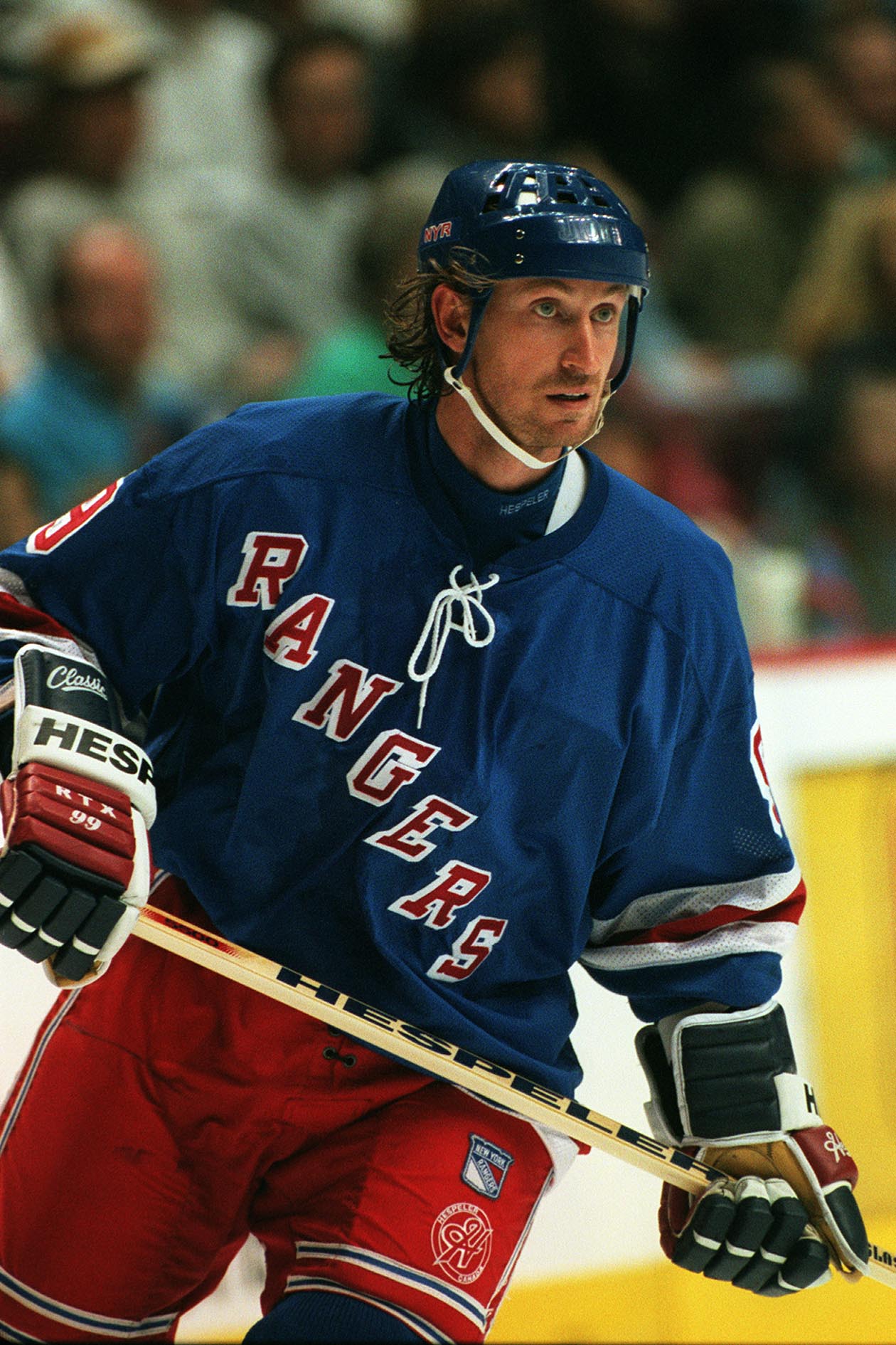
![[1]](https://en.wikipedia.org/wiki/Image:Mandelpart2.jpg)
- Reason
- Sharp, beautiful, educational, high resolution. DoF is shallow enough for a nice background, but most of the flower is still sufficiently detailed.
- Articles this image appears in
- Echinacea paradoxa
- Creator
- Ram-Man
- Support as nominator, Neutral for downsampled I don't like the idea of limiting people's choice to downsampled images for an image that looks "bad" at 30in x 20in, as would the downsampled image. -- Ram-Man 04:30, 7 February 2008 (UTC)
- Support Original Edit 1 Nice composition and enc - original's quality is quite bad at 100%, fortunately this is largely fixed in the downsampled version. --Fir0002 09:37, 7 February 2008 (UTC)
- The original was taken with an SLR, a very sharp macro lens, a tripod, and a fast shutter speed. Of course *all* unprocessed digital images look "bad" at 100% due to Bayer interpolation. Are you suggesting we downsample and/or photo process all images just to optimize them for web viewing? The Wikimedia software already does this, and for large magnifications the downsampled image would look terrible. -- RM 17:19, 7 February 2008 (UTC)
- I disagree - while the quality of my images at 100% isn't as good as when I downsample, coupled with high grade lenses even my outdated 20D can get much better resolution at 100% than this. For example this image is a 100% crop of the original. And yes IMO if the quality is not up to FP standard then either it should be downsampled to correct this or it shouldn't be a FP. Simple. --Fir0002 10:17, 9 February 2008 (UTC)
- The original was taken with an SLR, a very sharp macro lens, a tripod, and a fast shutter speed. Of course *all* unprocessed digital images look "bad" at 100% due to Bayer interpolation. Are you suggesting we downsample and/or photo process all images just to optimize them for web viewing? The Wikimedia software already does this, and for large magnifications the downsampled image would look terrible. -- RM 17:19, 7 February 2008 (UTC)
- Neutral for original, Oppose downsampled version - For ethical reasons. Author is around and perfectly able to edit his pictures if he wants to. For a question of courtesy, I don't think it is a sound practise to create new versions of the pictures nominated for FP without previous agreement of the author/nominator -- Alvesgaspar (talk) 14:48, 7 February 2008 (UTC)
- It is sound. It is done here all the time. There is no problem with that Fir has done at all. Clegs (talk) 15:42, 7 February 2008 (UTC)
- That's a very dubious "ethical" attitude to have on a collaborative project like Wikipedia - images should be improved by the community as should articles. It is encouraged rather than being bad etiquette to create constructive edits. If you can fix it do it - that's a philosophy core to Wikipedia. --Fir0002 10:17, 9 February 2008 (UTC)
- It's destructive because it removes information from a file and limits its general usage. It's optimized for a specific viewing scenario. It won't look the same on 72dpi vs. 100dpi monitors. The original looks fantastic at 180dpi, but the downsampled one would look worse. That's the ethical issue. -- RM 15:48, 9 February 2008 (UTC)
- Support Edit 1 Very good editing job! Highly encyclopedic. Clegs (talk) 15:58, 7 February 2008 (UTC)
- Support Great quality picture, and as Clegs says, encyclopedic. Macy's123 (review me) 00:42, 8 February 2008 (UTC)
- Weak Support “Original Edit 1 by Fir0002” Okay. —αἰτίας •discussion• 16:46, 8 February 2008 (UTC)
- Oppose edit1. I agree with RamMan on this one. Plus the edit introduces posterization in the bg. A few months ago there was a picture exhibition in Berne and Zurich by WikiMedia Switzerland, whith prints of some selected swiss-themed images. The lesson to learn from those guys (by their own account) is: the original, no matter how bad it supposedly looks at 100%, will always yield better print results than any downsampled version. Plus on a more personal note I would find it sad/discouraging to see the efforts of a contributor to provide full size original files are somewhat tainted by featuring a downsampled version. --Dschwen 04:31, 10 February 2008 (UTC)
- Support original and Oppose edit1 per Dschwen. Lycaon (talk) 10:22, 10 February 2008 (UTC)
- Support alternative 2, oppose others - why do people only want to see the sexual parts? Samsara (talk • contribs) 20:38, 10 February 2008 (UTC)
Promoted Image:Yellow Coneflower Echinacea paradoxa Twisted Pair Bee 2000px.jpg MER-C 04:57, 16 February 2008 (UTC)
Monarch Butterfly

- Reason
- This is one of the best pictures of this particular subject (and is the disputed taxobox image). It is highly detailed, has a pleasing, non-distracting background, and is high resolution. It clearly shows it feeding with its proboscis and no body parts are obstructed by other objects.
- Articles this image appears in
- Monarch butterfly
- Creator
- User:Ram-Man
- Support as nominator -- Ram-Man 03:55, 7 February 2008 (UTC)
- Strong Support- It's beautiful, and illustrates the subject perfectly. Ilikefood (talk) 22:10, 7 February 2008 (UTC)
- Oppose Sorry, but that's nowhere in focus. —αἰτίας •discussion• 16:43, 8 February 2008 (UTC)
- Nowhere? The focus is dead-on, but the DoF could've been slightly higher (at the cost of center sharpness), but I needed the fast shutter speed. Compare the DoF to other FPs: 1 2 3 4 5. For the sharp focus areas, this may be the sharpest, highest resolution butterfly FP we have. -- RM 17:23, 8 February 2008 (UTC)
OpposeNeutral insufficient DOF but nice --Richard Bartz (talk) 15:22, 9 February 2008 (UTC)- Support, beautiful, crisp, everything a FP should be. WEBURIEDOURSECRETSINTHEGARDEN round of applause 23:53, 9 February 2008 (UTC)
- Support. Only rear edge of wing slipping out of focus. I'm always impressed when people get the antennae right. Samsara (talk • contribs) 20:44, 10 February 2008 (UTC)
- Support --Laitche 13:36, 11 February 2008 (UTC)
Promoted Image:Monarch Butterfly Danaus plexippus on Echinacea purpurea 2800px.jpg --Dengero (talk) 23:01, 12 February 2008 (UTC)
Goldmantelziesel.jpg

- Reason
- High quality/high encyclopedic relevance. Very well done. FP on commons.
- Articles this image appears in
- Golden-mantled Ground Squirrel
- Creator
- Saperaud
regards, —αἰτίας •discussion• 02:40, 7 February 2008 (UTC)
- Support reasons see above —αἰτίας •discussion• 02:40, 7 February 2008 (UTC)
- Support well-composed, good depth of field, and that all important cuteness factor. Thumbs up. DurovaCharge! 04:28, 7 February 2008 (UTC)
- Support Good composition. Clegs (talk) 16:00, 7 February 2008 (UTC)
- Support Very good quality. Ilikefood (talk) 22:10, 7 February 2008 (UTC)
- Support Relevance. -- RM 22:17, 7 February 2008 (UTC)
- Support. Sure thing. Samsara (talk • contribs) 21:13, 10 February 2008 (UTC)
- Support Excellent image. Juliancolton Talk 00:30, 11 February 2008 (UTC)
Promoted Image:Goldmantelziesel.jpg --Dengero (talk) 23:01, 12 February 2008 (UTC)
Muir and Roosevelt


- Reason
- This picture shows how Teddy Roosevelt as an environmentalist worked to preserve the environment through the national park system and by working with preservationists such as John Muir.
- Articles this image appears in
- John Muir , Theodore Roosevelt
- Creator
- Underwood & Underwood
- Support as nominator The Emperor561 (talk) 01:34, 4 February 2008 (UTC)
- Support Edit 1 the original is a little small but encyclopedic enough IMHO, I cleaned it up and tweaked contrast and levels. Mfield (talk) 14:56, 7 February 2008 (UTC)
- Support Edit 1 Cleaned up version is better than the original. --ZeWrestler Talk 19:35, 9 February 2008 (UTC)
- Support edit 1 Good quality for its age. Schcambo (talk) 19:15, 10 February 2008 (UTC)
- Support Edit 1. Good restoration of a famous and encyclopedic photograph. Spikebrennan (talk) 02:20, 11 February 2008 (UTC)
Promoted Image:Muir and Roosevelt restored.jpg --Dengero (talk) 22:52, 12 February 2008 (UTC)
Malcolm X


- Reason
- Good scan of an encyclopedic, PD portrait of a recent historical figure (most of our FPs of images are much older because of the difficulty in obtaining more recent PD photographs)
- Articles this image appears in
- Malcolm X, List of converts to Islam
- Creator
- Ed Ford, World Telegram staff photographer (but it's PD, see image page)
- Support as nominator Spikebrennan (talk) 22:54, 6 February 2008 (UTC)
- Not my photo; not my thunder. Do what you will. Spikebrennan (talk) 05:05, 7 February 2008 (UTC)
Support edit 1 - slightly better due to enhanced contrast and removal of some minor flaws. Matt Deres (talk) 12:09, 11 February 2008 (UTC)
- Support edit 1 excellent enc value. Calliopejen1 (talk) 22:50, 13 February 2008 (UTC)
- Support edit 1. Samsara (talk • contribs) 00:08, 14 February 2008 (UTC)
Promoted Image:Malcolm X NYWTS 2a.jpg MER-C 07:57, 14 February 2008 (UTC)
Bufflehead


- Reason
- This image has amazing clarity, and it extremely sharp.
- Articles this image appears in
- Bufflehead
- Creator
- commons:User:MDF
- Support as nominator - Milk's Favorite Cookie 22:34, 6 February 2008 (UTC)
- Weak Support Original, Oppose Alternative A. The original is great except for the resolution being on the low side. The alternative is too unsharp. -- RM 04:12, 7 February 2008 (UTC)
- Support both Both are very sharp, good color, and very encyclopedic poses. Clegs (talk) 18:18, 7 February 2008 (UTC)
- Weak support both Crop is tight at the tail. Samsara (talk • contribs) 21:16, 10 February 2008 (UTC)
- Weak Oppose alternitive, neutral original Juliancolton Talk 00:28, 11 February 2008 (UTC)
- This is not a vote, please provide a reason for your oppose. MER-C 07:04, 12 February 2008 (UTC)
Promoted Image:Bucephala-albeola-010.jpg MER-C 11:18, 13 February 2008 (UTC)
Panorama of French Public Library
- Reason
- This is a beautiful panorama of the French Public Library and everything that surrounds it, including Bercy Bridge.
- Articles this image appears in
- Bibliothèque nationale de France
- Creator
- user:Benh
- Support as nominator - Milk's Favorite Cookie 21:48, 6 February 2008 (UTC)
- Support Very nicely done; good colors, good stitch. Clegs (talk) 18:20, 7 February 2008 (UTC)
- Support It strikes me as odd that this is receiving even less attention than a very poor pano of Montréal above - maybe it needs to be in North America? Also please note, this is already an FP on commons. Schcambo (talk) 19:23, 10 February 2008 (UTC)
- Support, meets all the criteria but the caption should be improved by saying that it's in Paris. That may sound trivial, but too many people are horrible at basic geography.--Svetovid (talk) 22:07, 10 February 2008 (UTC)
- Comment. It's not clear to me from the caption which of these buildings are the library. Also, I always have copyright concerns when we're dealing with photographs of contemporary French architecture-- have these been considered and resolved? (I know the photo is tagged as PD, but there are special concerns under French copyright law when what is depicted is a recent architectural work). Spikebrennan (talk) 03:41, 11 February 2008 (UTC)
- Question. So all the buildings in this picture are part of the French National Library? That's the only conclusion I can draw from the captions and image page; if so it's remarkably big. --jjron (talk) 06:57, 11 February 2008 (UTC)
Promoted Image:Bnf 20070218.jpg MER-C 11:18, 13 February 2008 (UTC)
Swallow chicks

- Reason
- Shows the birds well, clear, good quality image.
- Articles this image appears in
- Hirundo and Welcome Swallow
- Creator
- Benjamint
- Support as nominator Benjamint 09:54, 4 February 2008 (UTC)
- Comment: The birds' tails seem to be fairly blurry when viewed at full size. -- Altiris Helios Exeunt 10:27, 4 February 2008 (UTC)
- Support. It's an excellent composition, and I can forgive the blurry tail since the patterning is still clearly visible. Samsara noadmin (talk) 14:13, 4 February 2008 (UTC)
- Support per nom and Samsara. Clegs (talk) 15:06, 4 February 2008 (UTC)
- Comment The image looks oversaturated. The other images at Welcome Swallow look more like natural colors. Maybe tone it down a bit? — BRIAN0918 • 2008-02-04 16:28Z
- Comment - Colors look off to me as well. Kaldari (talk) 23:41, 4 February 2008 (UTC)
- Support the adjusted one The one you have adjusted to fix the coloring is very good. Juliancolton (The Giants Win!) 21:33, 5 February 2008 (UTC)
- Support edit 1. — BRIAN0918 • 2008-02-06 20:24Z
- Oppose both Colours still look unnaturally saturated. Lycaon (talk) 20:36, 6 February 2008 (UTC)
- Can you submit an alternative? The 2nd one is much closer to reality. — BRIAN0918 • 2008-02-06 21:00Z
- It doesn't work that way. You can't boost and then lower stauration in the same way that you can't boost and lower contrast. The original picture (whether or not the submitted original is it) has a full range of saturations. When saturation is boosted, the middle range is stretched out, but areas with an already high saturation won't go higher. When you take this image and lower the saturation again, the areas with a high saturation will be at a much lower saturation than they originally were. Quick example—note the decrease in saturation on the bumper from the first image to the third. thegreen J Are you green? 22:07, 6 February 2008 (UTC)
- Can you submit an alternative? The 2nd one is much closer to reality. — BRIAN0918 • 2008-02-06 21:00Z
- Oppose per Lycaon. thegreen J Are you green? 02:17, 9 February 2008 (UTC)
 Support Edit 1 – The edit appears to have corrected the problem I had with the strong (probably unrealistic) blue colour appearing at the edge of the birds. Apart from that I cannot really fault the composition or the other technical aspects of this picture. Centy – reply• contribs – 21:41, 12 February 2008 (UTC)
Promoted Image:Swallow_chicks444-2.jpg MER-C 11:18, 13 February 2008 (UTC)
Operation Desert Storm Map


- Reason
- Clear, accurate map that shows complex troop movements during a critical phase of Operation Desert Storm.
- Articles this image appears in
- Gulf War
- Creator
- US Army, vectored by Jeff Dahl
- Support as nominator Jeff Dahl (Talk • contribs) 04:26, 4 February 2008 (UTC)
- Comment. I find the mix of unit insignias and national flags odd. It's interesting from a grognard perspective, but confusing-- U.S. military units are not expressly identified as such; and not all of the symbols used on the map are explained in the legend. Is there any available information about the pre-attack positioning of Iraqi forces? Spikebrennan (talk) 15:09, 4 February 2008 (UTC)
- I found a map showing Iraqi forces and added the information to this map in an alternate. I'll fix the legends in both. I thought the flag/unit icons were self explanatory, but I'll consider suggestions. Jeff Dahl (Talk • contribs) 21:08, 4 February 2008 (UTC)
- Edit 1 is certainly an improvement. I would suggest replacing the flags/U.S. Army division insignia with APP-6A markers like you did for the Iraqi forces. Also, I don't think that the meaning of the green tint of some of the land near the Tigris is explained in the "Elevation in Feet" bar in the legend. Spikebrennan (talk) 14:13, 6 February 2008 (UTC)
- Strong support gppande This is a awesome map created by the author with all the minute details properly shown. Wikipedia needs more good quality maps like this and map makers like this author. I know a lot of effort must have gone in making this. —Preceding comment was added at 08:10, 5 February 2008 (UTC)
- Comment. Can a more specific tag instead of the blue 'Coalition forces' in JFC-N go there? Surely it's possible now to identify who it was (Egyptians, if memory serves, or that may be the green box next door), and correct a bit of our systematic bias by identifying the formations involved. Buckshot06 (talk) 20:26, 5 February 2008 (UTC)
- The green (Saudi) flag represents the Saudi led forces, including Saudi/Kuwaiti task forces. Yes, the blue coalition banner includes two Egyptian divisions making up much of the force, and Syrian forces (which did not advance with the rest of the coalition). Since the Syrians did not advance, it makes sense to split it out. I'll upload a new version shortly. Jeff Dahl (Talk • contribs) 02:59, 6 February 2008 (UTC)
- Yes, looks better now. Buckshot06 (talk) 21:26, 10 February 2008 (UTC)
- Comment Great job Jeff. I think the legend needs information about the different kinds of arrows, for instance the 101st Airborne and the French movement west of As Salman. -- I. Pankonin (t·c) 09:12, 8 February 2008 (UTC)
- I'd be a little wary about adding too much. It would need to be referenced. As of now this map is deemed reliable because it is from a government made map but if it is changed sources will need to be provided which might be difficult. gren グレン 19:58, 8 February 2008 (UTC)
- Thanks everyone. I checked an army field manual (101-5-1) which confirms the 101st Airborne arrow represents troop movements by an airborne unit. The normal arrows are for ground troops. The same field manual says the double headed arrows for the French and 3d ACR are for security forces. Jeff Dahl (Talk • contribs) 22:30, 8 February 2008 (UTC)
- I'd be a little wary about adding too much. It would need to be referenced. As of now this map is deemed reliable because it is from a government made map but if it is changed sources will need to be provided which might be difficult. gren グレン 19:58, 8 February 2008 (UTC)
Promoted Image:DesertStormMap v2.svg ("close to perfect" == support, thus quorum met) MER-C 08:12, 14 February 2008 (UTC)
Nominations older than 7 days - decision time!
Nominations in this category are older than seven days and are soon to be closed. Votes will still be accepted until closing of the nomination.
Older nominations requiring additional input from voters
These nominations have been moved here because consensus is impossible to determine without additional input from those who participated in the discussion. Usually this is because there was more than one edit of the image available, and no clear preference for one of them was determined. If you voted on these images previously, please update your vote to specify which edit(s) you are supporting.
Closing procedure
When NOT promoted, perform the following:
- Place the following text at the bottom of the WP:FPC/subpage:
- {{FPCresult|Not promoted| }} --~~~~ [[Category:Ended featured picture nominations]]
- Do NOT put any other information inside the FPCresult template. It should be copied and pasted exactly.
- Move the nomination entry to the bottom of the June archive. This is done by simply moving the line {{Wikipedia:Featured picture candidates/Image name}} from this page to the bottom of the archive.
- Remove the {{FPC}} tag from the image and any other suggested versions. If any of those images were on Commons, be sure to tag the description pages with {{missing image}}.
When promoted, perform the following:
- Place the following text at the bottom of the WP:FPC/subpage:
- {{FPCresult|Promoted|Image:FILENAME.JPG}} --~~~~ [[Category:Ended featured picture nominations]]
- Replace FILENAME.JPG with the name of the file that was promoted. It should show up as:
- Promoted Image:FILENAME.JPG
- Do NOT put any other information inside the FPCresult template. It should be copied and pasted exactly.
- {{FPCresult|Promoted|Image:FILENAME.JPG}} --~~~~ [[Category:Ended featured picture nominations]]
- Move the nomination entry to the bottom of the June archive. This is done by simply moving the line {{Wikipedia:Featured picture candidates/Image name}} from this page to the bottom of the archive.
- Add the image to Template:Announcements/New featured pages - newest on top, remove the oldest so that 10 are listed at all times
- Add the image to Wikipedia:Goings-on - newest on bottom
- Add the image to the appropriate section of Wikipedia:Featured pictures - newest on left and remove the oldest from the right so that there are always three in each section.
- Don't forget to update the count too.
- Add the image to the proper sub-page of Wikipedia:Featured pictures - note the two sections (wikipedian / non-wikipedian) - newest on bottom
- The caption should for a Wikipedian should read "Description at Article, by Photographer". For a non-Wikipedian, it should be similar, but if the photographer (or organization) does not have an article, use an external link. Additionally, the description is optional -- if it's essentially the same as the article title, then just use "Article, by Photographer". Numerous examples can be found on the various Featured Pictures subpages.
- Add the image to Wikipedia:Featured pictures thumbs - newest on top
- Update the picture's tag, replacing {{FPC}} with {{FeaturedPicture|image_name}} (replace image_name with the nomination page name, i.e., the image_name from Wikipedia:Featured_picture_candidates/image_name), and remove {{FPC}} from alternatives of the promoted image. If the alternatives were on Commons, be sure to tag the description page with {{missing image}}.
- If an edited or alternative version of the originally nominated image is promoted, make sure that all articles contain the Featured Picture version, as opposed to the original.
- Notify the nominator by placing {{subst:PromotedFPC|Image:file_name.xxx}} on the nominator's talk page. For example: {{subst:PromotedFPC|Image:Blue morpho butterfly.jpg}}
- If the image was created by a Wikipedian, place {{subst:UploadedFP|Image:file_name.xxx}} on the creator's talk page. For example: {{subst:UploadedFP|Image:Blue morpho butterfly.jpg}}
Nomination for delisting
|
Here you can nominate featured pictures you feel no longer live up to featured picture standards. You may also request a featured picture be replaced with a superior image. Please leave a note on the talk page of the original FPC nominator (and creator/uploader, if appropriate) to let them know the delisting is being debated. The user may be able to address the issues and avoid the delisting of the picture. For delisting, if an image is listed here for fourteen days with five or more reviewers supporting a delist or replace, and the consensus is in its favor, it will be delisted from Wikipedia:Featured pictures. Consensus is generally regarded to be a two-third majority in support, including the nominator. However, images are sometimes delisted despite having fewer than five in support of their removal, and there is currently no consensus on how best to handle delist closures. Note that anonymous votes are generally disregarded, as are opinions of sockpuppets. If necessary, decisions about close candidacies will be made on a case-by-case basis.
Use the tool below to nominate for delisting.
|
Coconut shy

- Reason
- Coconut shies barely visible, irrelevant signs in the background, tent cut off on all sides.
- Nominator
- Pstuart84 Talk
- Delist — Pstuart84 Talk 00:14, 11 February 2008 (UTC)
- Delist Hopefully it will stick this time. I nominated this for delisting awhile back and it got kept despite my protests. It is also tilted un-ENC among other things. -Fcb981(talk:contribs) 01:11, 11 February 2008 (UTC)
- Delist per nom. It captures the garishness well, but doesn't illustrate anything properly. Matt Deres (talk) 01:38, 11 February 2008 (UTC)
- Comment According to the image description page it has already been delisted "This was formerly a featured picture." --Fir0002 02:58, 11 February 2008 (UTC)
- Delist: per nom; it's also on the small side.—DMCer™ 04:59, 11 February 2008 (UTC)
- Delist per nom. I can't believe I've never even noticed this amongst the FPs before. --jjron (talk) 07:08, 11 February 2008 (UTC)
- Keep per my thinking during previous delist discussion. de Bivort 22:04, 11 February 2008 (UTC)
- Keep. Signs in the background are fantastic. This guy is an original, they don't make them any more. Essential funfair atmosphere. Samsara (talk • contribs) 23:29, 11 February 2008 (UTC)
- Comment Whether the coconuts are visible is somewhat irrelevant given that this picture is also included in Funfair, which does not deal with coconuts. Samsara (talk • contribs) 23:29, 11 February 2008 (UTC)
- Comment Well thanks to Pstuart84 for mentioning the delisting candidacy this time. I'm not that bothered whether this picture is delisted or not, since I gave up on illustrating Wikipedia over a year ago, when I got tired of folks in the Featured Pictures arena getting too hung up on irrelevant technicalities, such as marginally blown highlights, horizons off by < 1° and most especially I got tired of ever increasing demands for more and more pixels even though they are unlikely to be of any benefit to Wikipedia (even should a print edition one day materialise in the never never). I only noticed the last delisting suggestion on this picture months after the event, but was nevertheless disappointed to see that many people in FPC were still hung up on these sorts of anal considerations rather than trying to encourage the best illustrations for the widest range of subjects.
- Now I've a lot more respect for this delisting suggestion since it is trying to focus on the content. However, I should note that many of you seem to be a little confused as to what a coconut shy actually is. A coconut shy is not the coconut, nor is it the cup and stick that the coconut rests on, rather it is the whole stall in which that game takes place. It doesn't specifically include the stall owner, although all coconut shys would have one and they could be seen as an integral part of the illustration. A useful analogy would be an illustration of a bowling alley which ought to show the bowling lane, just as much as the pins.
- On another note, I tend to see this picture as an example of salvage ethnography (and I recall helping ensure that we had a number of examples of Edward Curtis illustrations for The North American Indian as FPs). Travelling showmen largely live their lives apart from the rest of society and have their own subculture. It is a lifestyle that is in decline and I wouldn't be surprised if has essentially disappeared in the next 50 years. Already the last bare-knuckle boxing booth has closed in the UK when its owner died of old age a couple of years ago. -- Solipsist (talk) 14:37, 12 February 2008 (UTC)
- I don't generally like quoting wikipedia on wikipedia but: "A coconut shy (or coconut shie) is a traditional game frequently found as a sidestall at funfairs and fêtes. The game consists of throwing wooden balls at a row of coconuts balanced on posts. Typically a player buys three balls and wins each coconut successfully dislodged. In some cases other prizes may be won instead of the coconuts." So maybe a better analogy would be a picture of the outside of a bowling ally being used to illustrate bowling in general. See, at least according to our article, Coconut shy is the game. -Fcb981(talk:contribs) 05:39, 13 February 2008 (UTC)
- Come on Fcb - if you insist on analogies, at least let them be accurate. If this were a bowling image, you would see the pins, they would just be small within the frame that also shows the lanes and ball returns and shoe rental desk. de Bivort 06:04, 13 February 2008 (UTC)
- And of course, you might want to check who wrote the article on the coconut shy and much of the article on the Aunt Sally too. -- Solipsist (talk) 07:46, 13 February 2008 (UTC)
- Come on Fcb - if you insist on analogies, at least let them be accurate. If this were a bowling image, you would see the pins, they would just be small within the frame that also shows the lanes and ball returns and shoe rental desk. de Bivort 06:04, 13 February 2008 (UTC)
- I don't generally like quoting wikipedia on wikipedia but: "A coconut shy (or coconut shie) is a traditional game frequently found as a sidestall at funfairs and fêtes. The game consists of throwing wooden balls at a row of coconuts balanced on posts. Typically a player buys three balls and wins each coconut successfully dislodged. In some cases other prizes may be won instead of the coconuts." So maybe a better analogy would be a picture of the outside of a bowling ally being used to illustrate bowling in general. See, at least according to our article, Coconut shy is the game. -Fcb981(talk:contribs) 05:39, 13 February 2008 (UTC)
 Delist – As per my comments from the previous nomination, main problems being the coconuts are hardly visible, and the tent is cut off. Centy – reply• contribs – 21:46, 12 February 2008 (UTC)
- Delist for the same reasons I gave in the previous delist discussion: This isn't a good illustration of a coconut shy. The subject of the photo is clearly the man, and the coconuts themselves are partially obscured and hidden in a sea of distracting "other stuff." Also, the red channel is blown in several areas -- I'm not referring to the lightbulbs. -- Moondigger (talk) 05:32, 14 February 2008 (UTC)
- Delist per Moondigger Clegs (talk) 00:59, 15 February 2008 (UTC)
- Delist per nom. Not encyclopedic. Cacophony (talk) 01:43, 17 February 2008 (UTC)
- Keep. The article is encyclopedic for funfair (as an example of a traditional coconut shy).. and also for the article coconut shy - deceptively, despite the name the coconuts should only make up the small part of the picture that they do here. shasYarr!/T|C 10:53, 20 February 2008 (UTC)
- Keep Good color, composition OK. The image is striking and captures the atmosphere of the fair and carnival games. Jeff Dahl (Talk • contribs) 03:43, 25 February 2008 (UTC)
- Keep, because it's used in funfair... which is more than just that specific game but the whole atmosphere. gren グレン 12:47, 26 February 2008 (UTC)
- Keep. The delist nom breaks my heart-- this has always been one of my favorite FPs. I agree that it's encyclopedic for Funfair. Spikebrennan (talk) 14:57, 27 February 2008 (UTC)
- Delist - Per above --ZeWrestler Talk 23:03, 27 February 2008 (UTC)
No consensus MER-C 08:15, 28 February 2008 (UTC)
Mccoy Tyner 1973 gh.jpg

- Reason
- While I think this is an interesting shot, I do not think it reflects the very best that Wikipedia has to offer due to the small size of the image and lack of detail. It also fails to be encyclopedic since it doesn't actually illustrate what this gentleman is doing (if we didn't already know). I have placed a note on the uploader's talk page.
- Nominator
- Matt Deres (talk)
- Delist — Matt Deres (talk) 02:16, 6 February 2008 (UTC)
- Delist per nom. Clegs (talk) 21:36, 6 February 2008 (UTC)
- Delist: Due to its small size. I think it illustrates the activity just fine, as the intent is to portray his expression, but the contrast just looks too artificial and leaves a lot to be desired.—DMCer™ 02:14, 7 February 2008 (UTC)
- Keep as FP, res is lowish but otherwise it's a great and encyclopedic image of McCoy Tyner doing his thing. --KFP (talk | contribs) 20:28, 7 February 2008 (UTC)
- Delist per nom. If 'his thing' is being obscured by a blurry box then maybe he's 'doing' it, but I honestly can't see much to recommend this (I'll be honest, I didn't know who this was, and whenever I've seen this in FP I've wondered what he was doing. I had guessed he was a musician, but always thought he was probably playing the guitar behind that blurry box - I had to go to the article to determine that he's probably playing the piano here, and the box is the piano. It's actually a nice, rather artistic, photo, but it doesn't meet most of the key FP criteria). --jjron (talk) 12:16, 8 February 2008 (UTC)
- Question Why does it have to show him "doing his thing"? This is McCoy Tyner, that alone should be enough. Portraits of notable individuals meet the enc criterion, nothing else required. Samsara (talk • contribs) 19:52, 11 February 2008 (UTC)
- I agree with that, but I don't think it's a very good portrait as such (despite its artistic merits). If he was clearly 'doing his thing' that may compensate for it not being such a good photo of him, but this sort of falls into a middle no-man's land - it's not a particularly illustrative photo of the man, and he's not clearly doing what he's famous for. The only reason it came up was that this was the reason given for a 'keep' vote. And either way, it is still clearly well outside some other criteria. --jjron (talk) 07:42, 12 February 2008 (UTC)
Delisted MER-C 11:19, 13 February 2008 (UTC)
Suspended nominations
This section is for Featured Picture candidatures whose closure is postponed for additional editing, rendering, or copyright clarification.